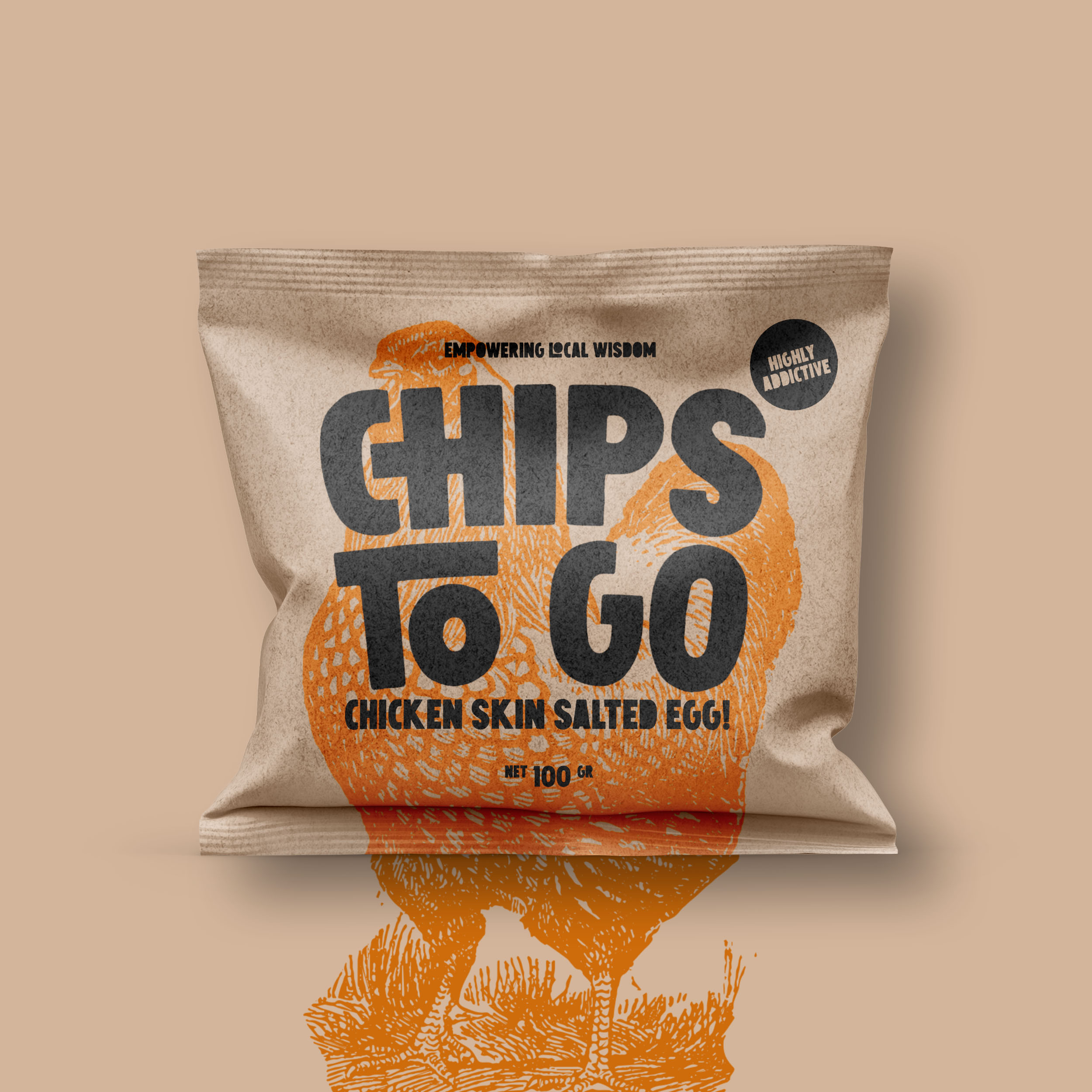
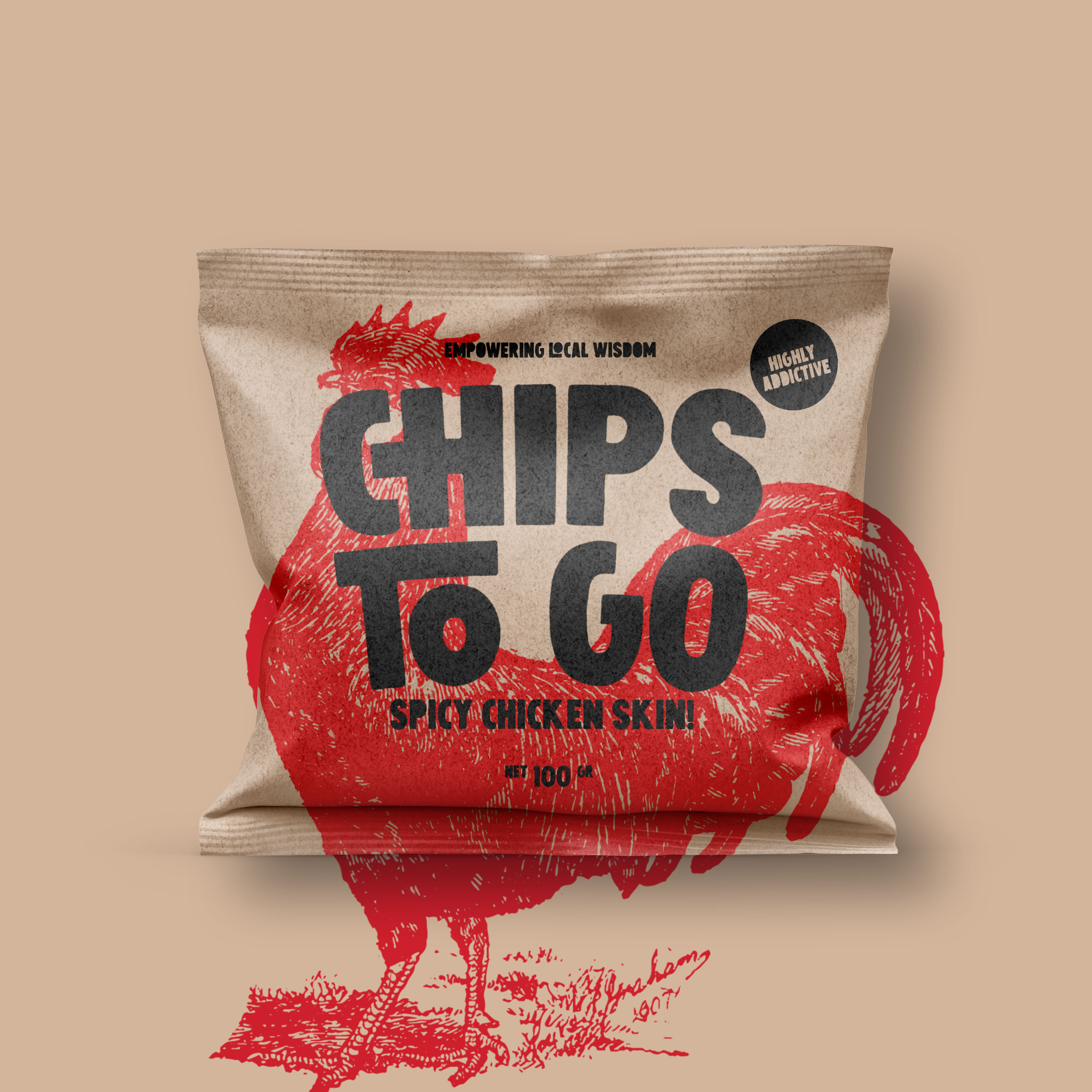
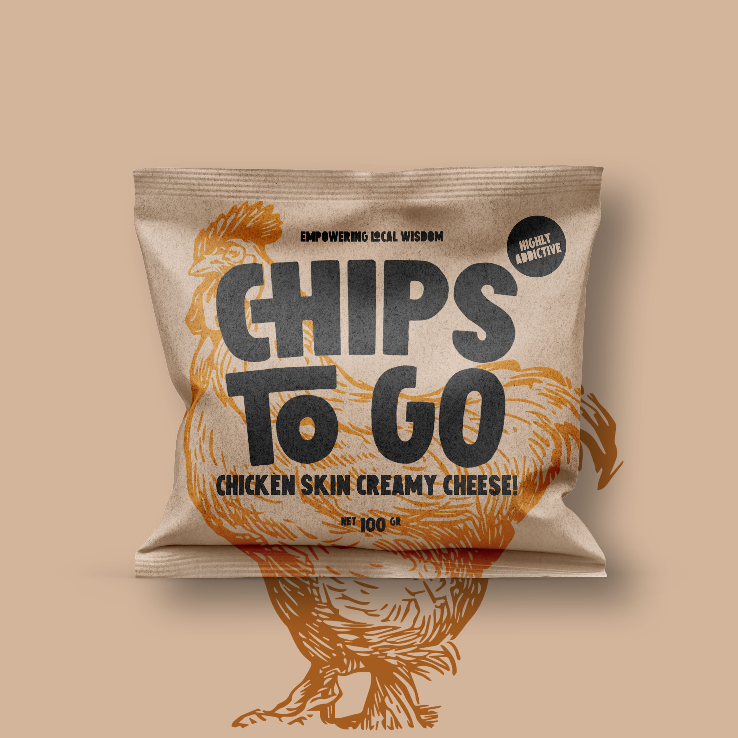
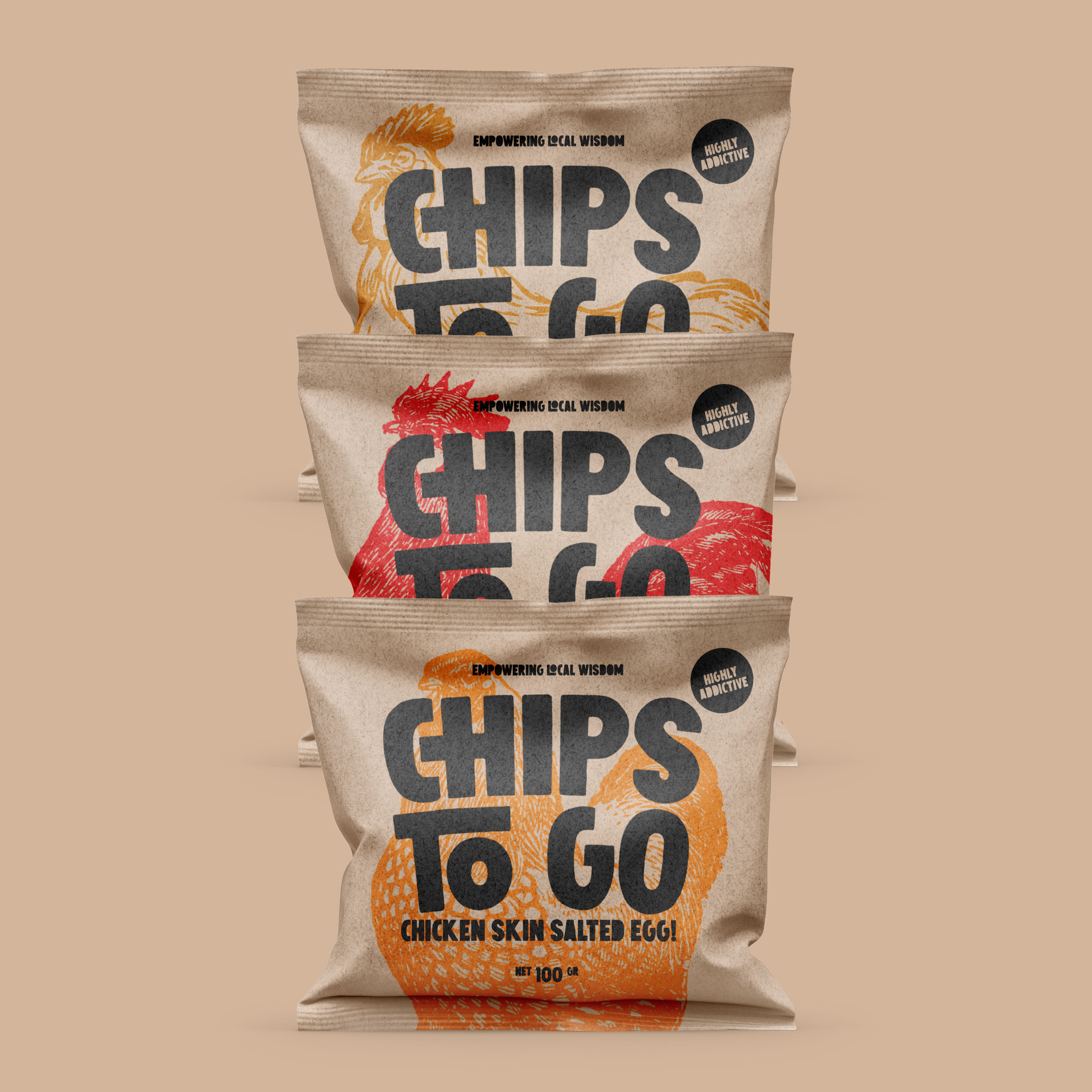
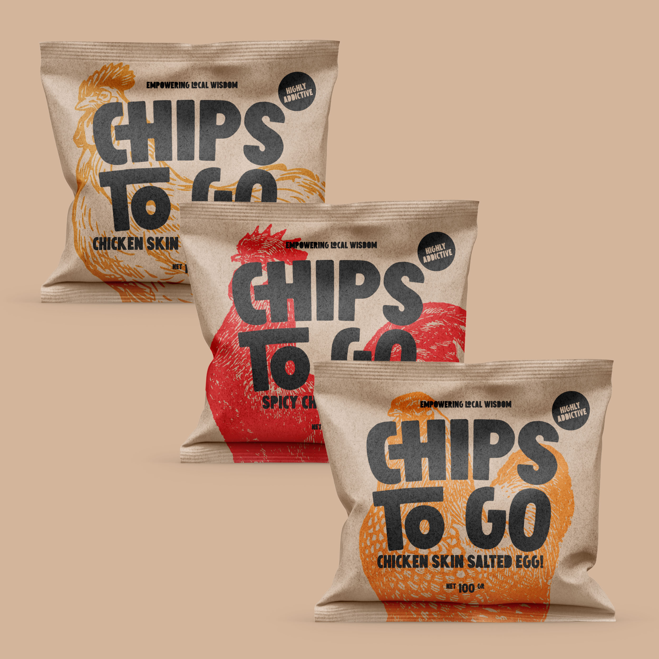
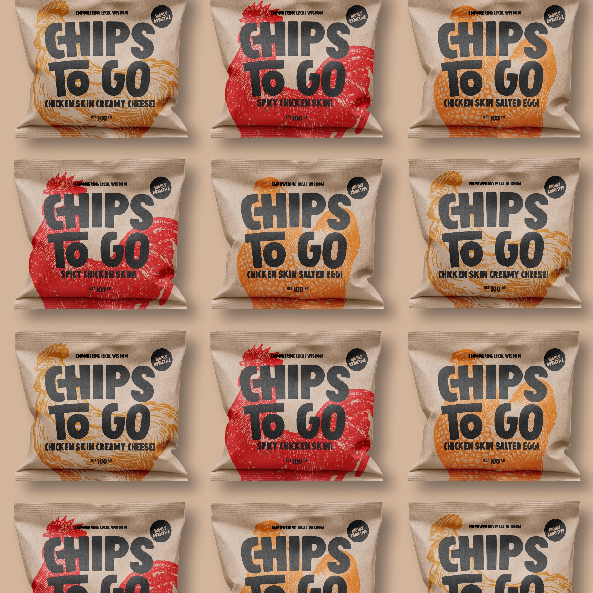
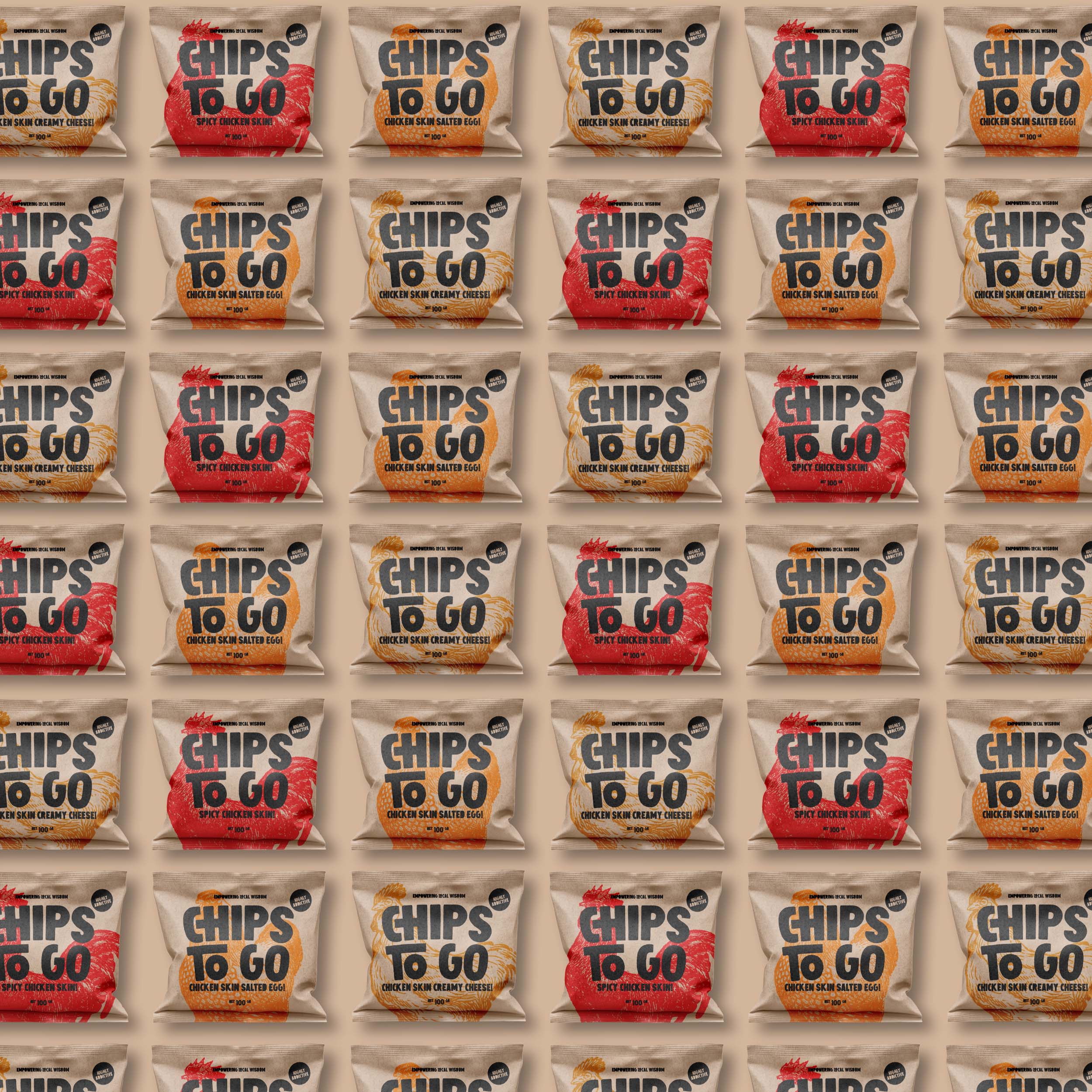
This is a series of Chips To Go brand products that are present empowering local wisdom as part of the added value of brand proportions. Chips To Go wants to revive local snacks but is touched in a modern and professional way.
In the design, we make the logo bigger than usual but it does not eliminate the aesthetic side of the packaging design. One of our reasons is because Chips To Go is a new brand, we want consumers to know their brand names better than others. Chips To Go, Chips To Go, Chips To Go.
For packaging materials we use food-grade kraft paper that can be recycled. This is in line with the concept of empowering local wisdom.
https://www.youtube.com/watch?v=VhRtBdmRJzo
CREDIT
- Agency/Creative: Widarto Impact
- Article Title: Packaging Design for Chips To Go “Empowering Local Wisdom”
- Organisation/Entity: Agency, Published Commercial Design
- Project Type: Packaging
- Agency/Creative Country: Indonesia
- Market Region: Asia
- Project Deliverables: Brand Architecture, Brand Identity, Brand Naming, Brand Strategy, Branding, Identity System, Illustration, Packaging Design, Research, Retail Brand Design
- Format: Pouch
- Substrate: Pulp Paper
FEEDBACK
Relevance: Solution/idea in relation to brand, product or service
Implementation: Attention, detailing and finishing of final solution
Presentation: Text, visualisation and quality of the presentation


