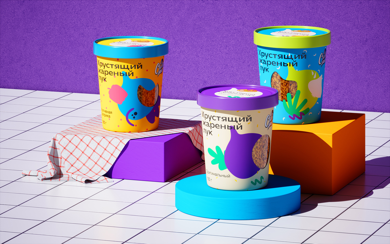
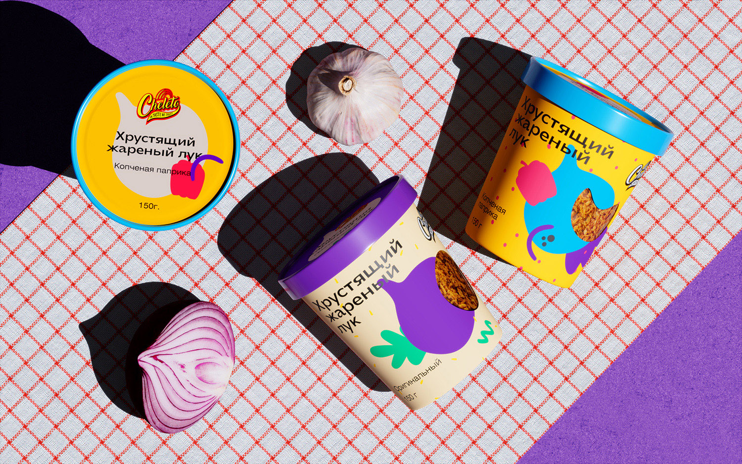
Crispy fried onion Cheleto is a popular quick snack that can be used as an independent dish or as an addition to the main dish. The peculiarity of this line lies in the flavor diversity: original, spicy tomato, basil, smoked paprika, everyone will find a unique combination for themselves .
Cheleto is proud of his chosen one. Since 2015, for 6 years now, brand has been paying attention to each bulb and doing its best to ensure that healthy and tasty food is on every surface in our country as often as possible.
Cheleto works with cafes, bakeries, restaurants and other projects.
In order to stand out on the shelf, increase sales, expand the geography of representation and sales coverage, the brand must compare and attract attention at first sight. To solve such problems, the Cheleto brand team came to us for rebranding of packaging.
We have prepared several options for packaging design: updated, but successive to the previous design, modern-handmade, reflecting the unique properties of fried onions and its crunch, and eccentric, reminiscent of a real modern party.
In terms of positioning, it was decided to move towards a modern party, since the main target audience of the brand is young people.
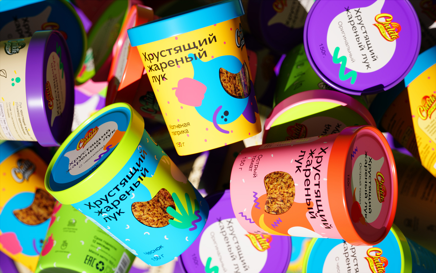
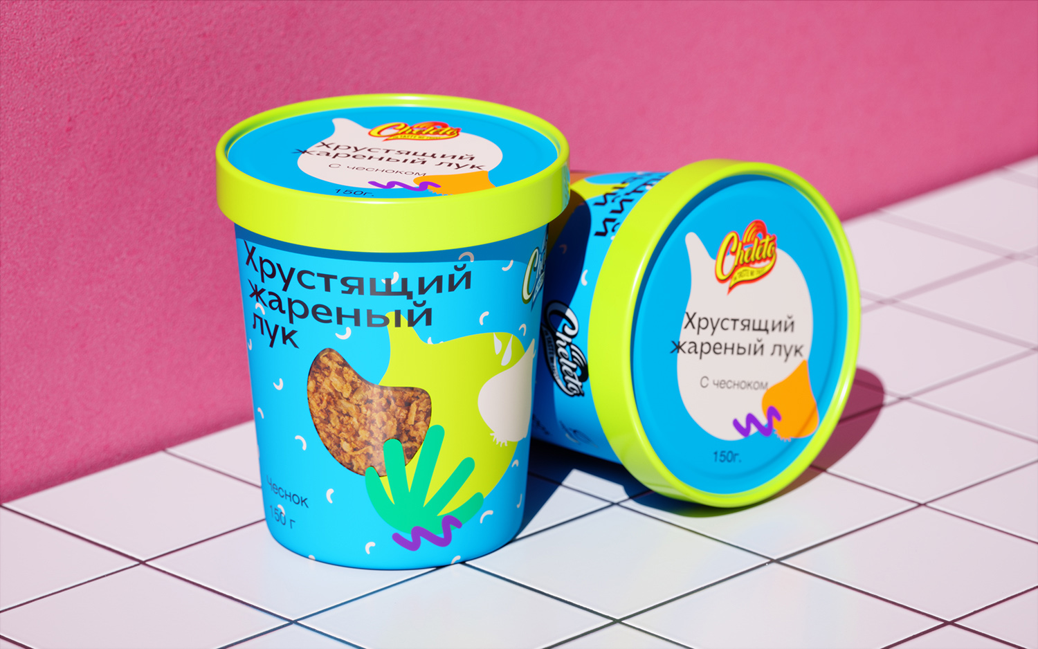
Cheleto’s crunchy onion is the first snack brand on the shelf that tells the story of youth hangouts and their rich, vibrant colors. The main catchy graphics are developed on the basis of the idea of a riot of tastes, so characteristic of the youth style of eating. In taste we trust – the brand’s slogan fits our idea like never before.
We left only the brand logo the same in order to maintain continuity with the old style at the request of the client. The main packaging style was completely redesigned to confirm our hypothesis.
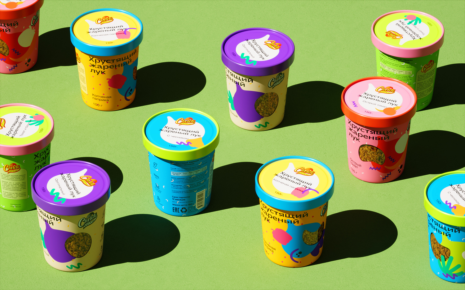
We started our work with 4 main taste positions: original, spicy tomato, basil, smoked paprika, and two weight form factors. We tried to separate the products using color coding characteristic of the categories, but slightly deviating from the first associations, in order to give the tastes fantasy, lightness and inspiration. From different combinations, together with the client, we came up with more minimalistic, but bright solutions.
CREDIT
- Agency/Creative: Ovsyanka
- Article Title: Packaging Design for Сrispy Fried Onions Сheleto
- Organisation/Entity: Agency
- Project Type: Packaging
- Project Status: Published
- Agency/Creative Country: Russia
- Agency/Creative City: Moscow
- Market Region: Europe
- Project Deliverables: 3D Design, Art Direction, Brand Design, Brand Identity, Logo Design
- Format: Wrap
- Substrate: Pulp Paper
- Industry: Food/Beverage
- Keywords: onion packaging
-
Credits:
Art Direction: Maria Kazanova
Art Direction: Vika Lamina


