“Soy sauce” is an important role in Chinese cuisine. It also can be considered an indispensable product in the kitchen. The moment of us that eat together at the dinner table is a familiar taste of hometown.
In times of epidemic, people can’t help to think of the freedom of gathering without worrying. The design of Kimlan series soy sauce not only reminds us of the nostalgic taste of home, but also connects us to the simple joy of eating with friends and family.
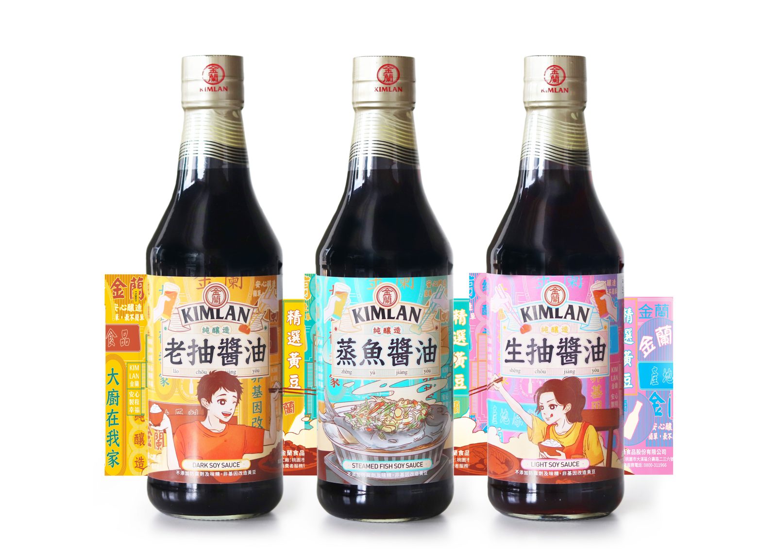
Kimlan Series Soy Sauce is departure from the established image of “soy sauce” and “aged and brewed”. It use a new illustration style to present the series of “Soy sauce”. “Soy sauce” does not only revolve around key words such as “aged and long-brewed”, but can also be colorful, playful, full of layers and stories. We hope this design can make more people know the culinary culture of Asia. In addition, we hope to evoke the human touch of dinner parties.
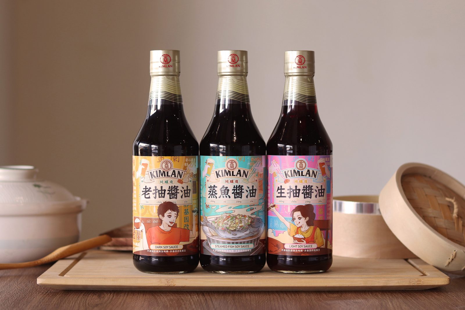
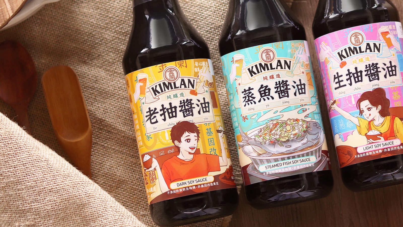
The background of the product is represented by a crowded neon sign in Hong Kong, and the simple labeling style commonly used for condiments is abandoned in favor of an illustration style to present the picture of a dinner party.
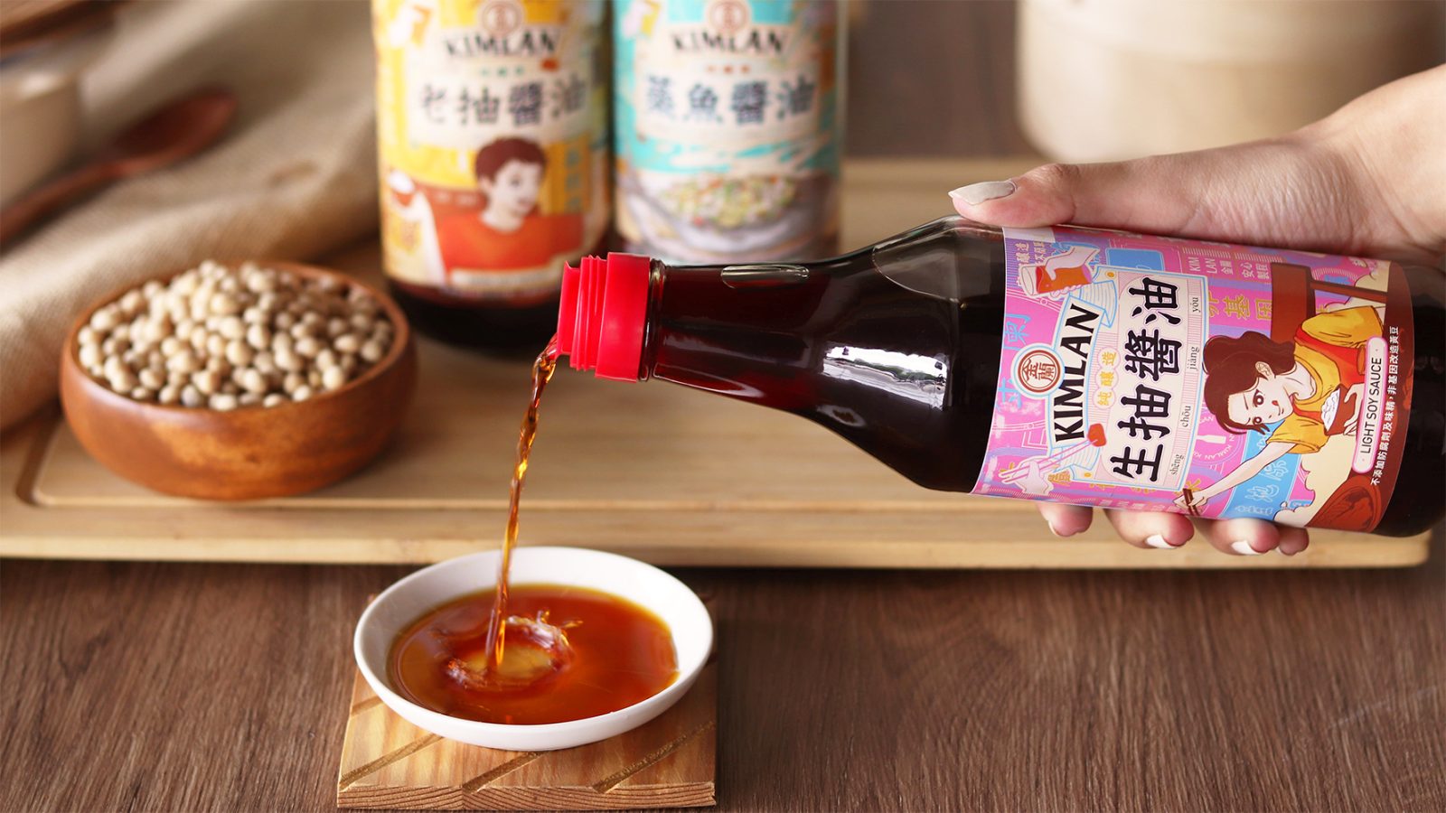
The three types of soy sauce present by three lively and vintage color tones: pink, yellow and green. The illustrations that the darker old soy sauce metaphorically presented in yellow and the lighter raw soy sauce in bright pink.
The classic style of the decorative border, the Asian cuisine, and the crowded Hong Kong neon sign all showcase the Chinese character. Using visually attracting everybody eye and the style of the illustrations appealing to the middle and lower age groups. Furthermoer, more people will know the authentic cuisine and culinary culture of Asia by Kimlan Series Soy Sauce.


CREDIT
- Agency/Creative: Styleplus Design
- Article Title: Packaging Design Creation for Kimlan Series Soy Sauce
- Organisation/Entity: Agency
- Project Type: Packaging
- Project Status: Published
- Agency/Creative Country: Taiwan
- Agency/Creative City: Zhongzheng Dist
- Project Deliverables: Illustration, Packaging Design
- Industry: Food/Beverage
- Keywords: WBDS Agency Design Awards 2022/23
-
Credits:
Designer : Jason Wang
Designer: Chieh Liu


