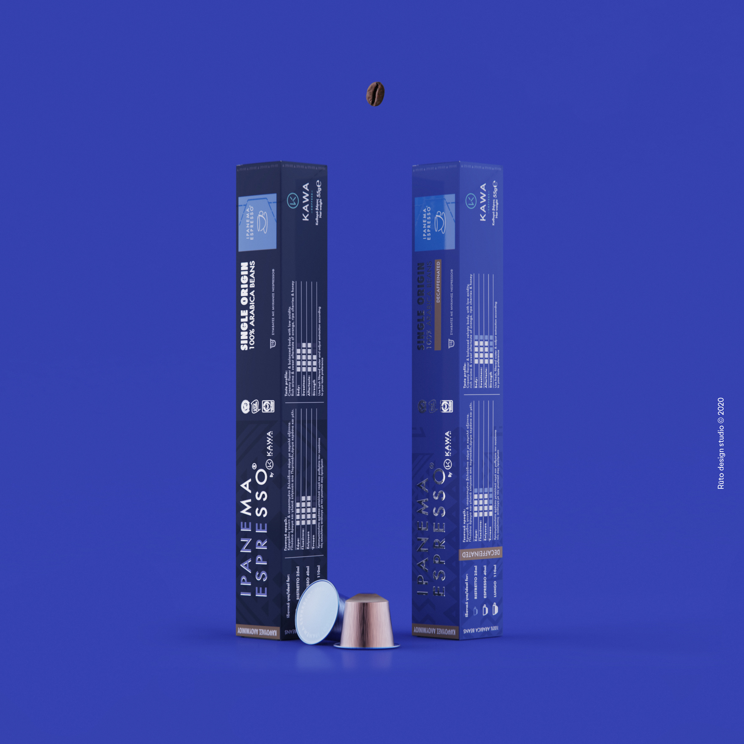
The Briefing: Kawacom commissioned us to redesign the Ipanema Espresso product identity and retouch the logotype for the Greek and South European market. The project started with the launch of a new product, Ipanema Espresso Single Origin Nespresso capsules. The identity should be modernised but still be directly recognisable to the old clients.
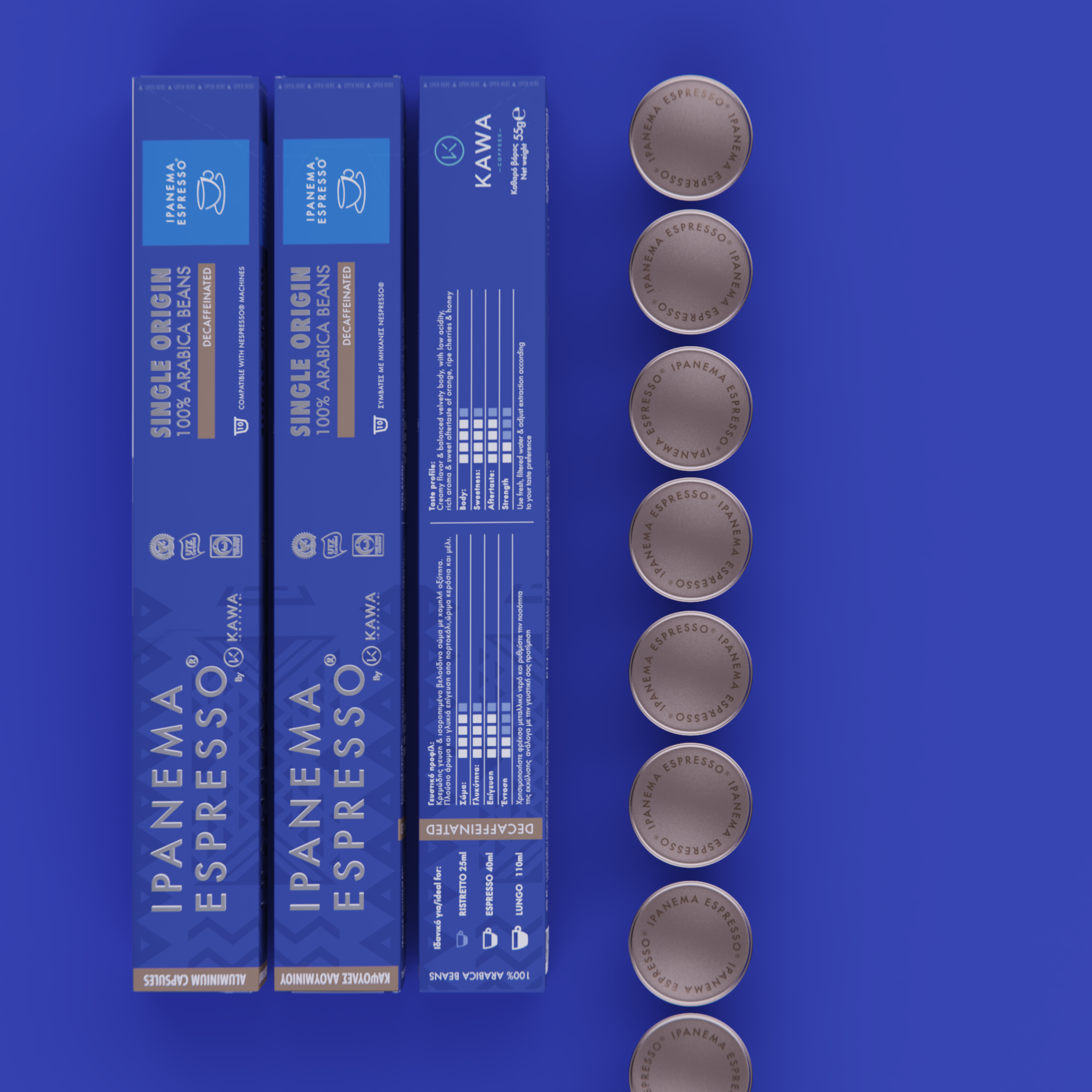
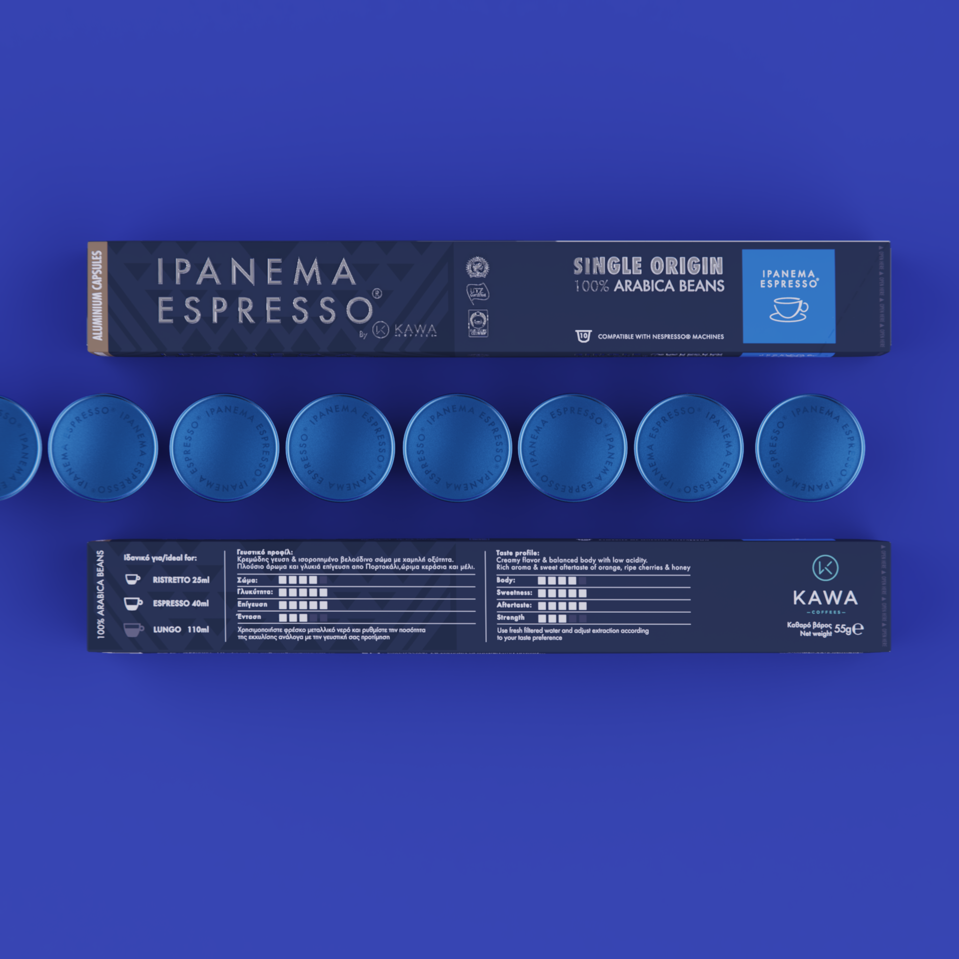
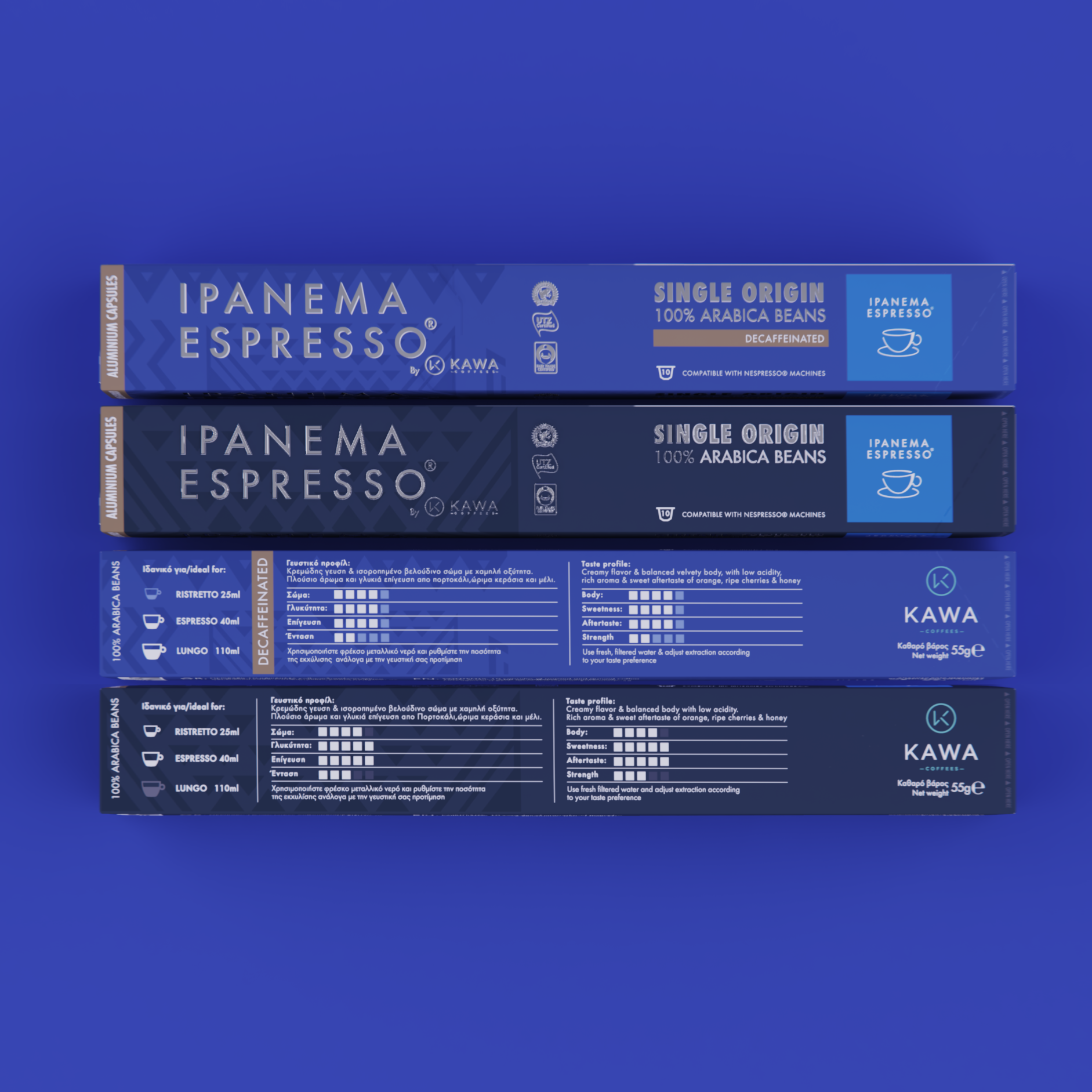
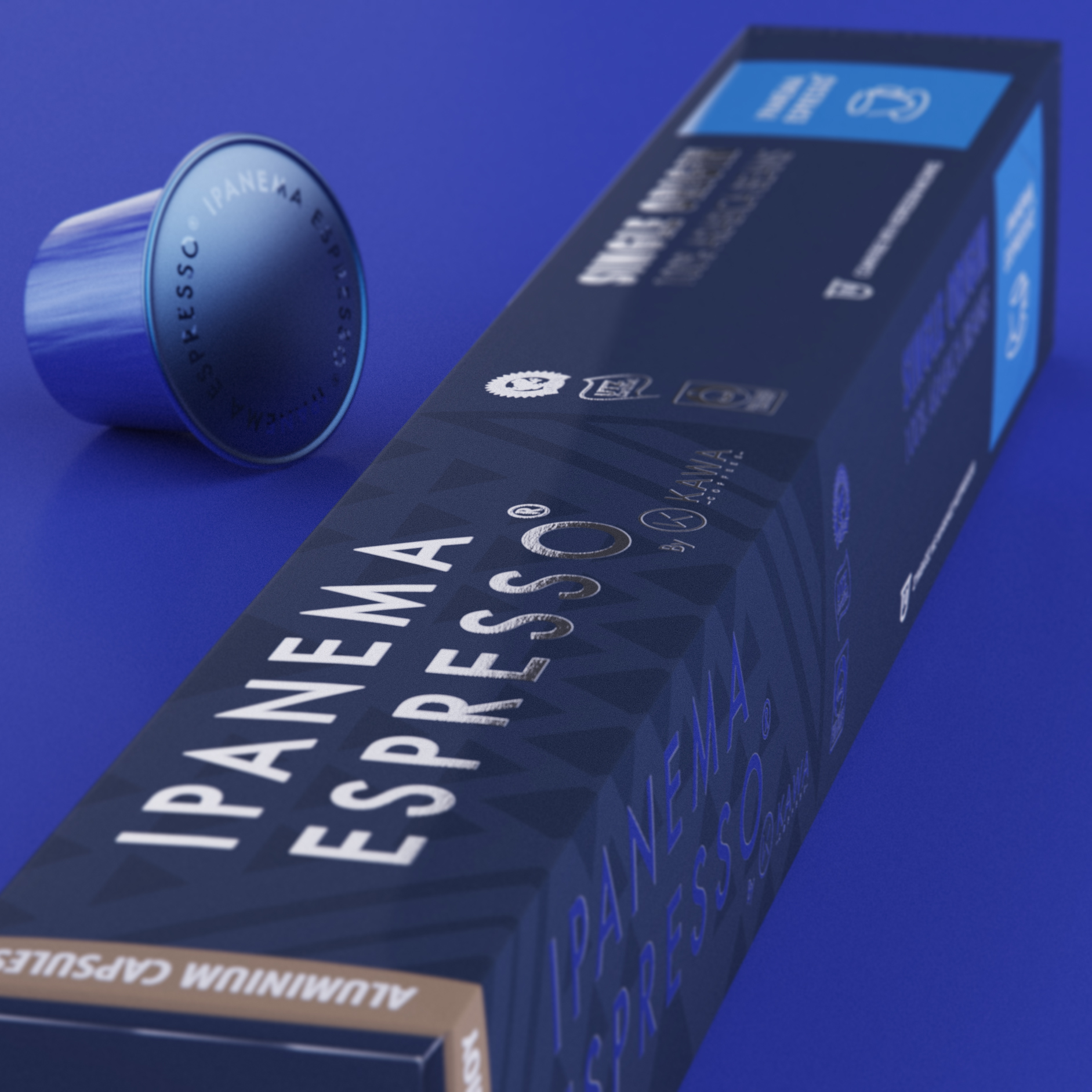
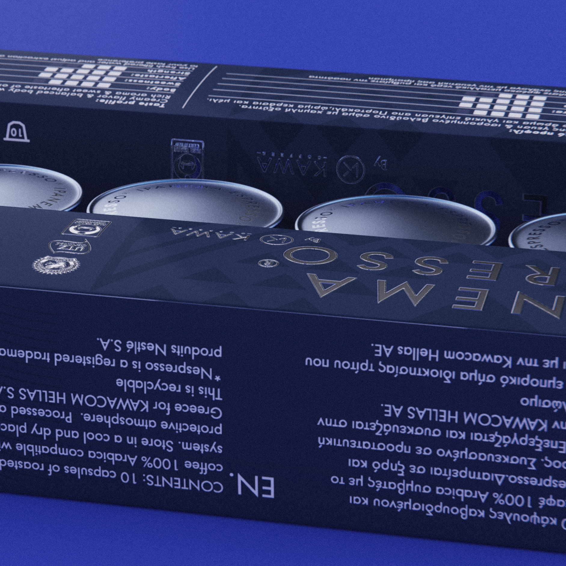
The Design: After a long process we decide to go on with strong and modern typography, smooth and bold logotype, simplified colour palette and visual elements. By keeping the main theme of the cup, we created a much lighter and elegant symbol, without loosing its solid presence due to the square that enclose it. The various tones of blue keeps the different products connected, while the patterns on the packaging is a clear reference Ipanema Espresso country of origin.
CREDIT
- Agency/Creative: Ruto design studio
- Article Title: Packaging Design and Visual Retouch for Ipanema Espresso
- Organisation/Entity: Agency, Published Commercial Design
- Project Type: Packaging
- Agency/Creative Country: Greece
- Market Region: Europe
- Project Deliverables: Graphic Design, Packaging Design, Rebranding, Research
- Format: Box
- Substrate: Pulp Paper


