


Noto
Scoop-worthy! Adding Character To Vegan Ice Cream
Noto, born in 2018, has received a lot of love from health enthusiasts for the quality and taste they had to offer.
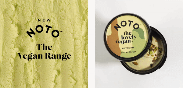
Come 2020, and we were brought in to create a distinct packaging approach for their vegan range, to ensure the on-shelf and post purchase experience is as engaging as their ‘hard to believe it’s vegan’ range tastes.
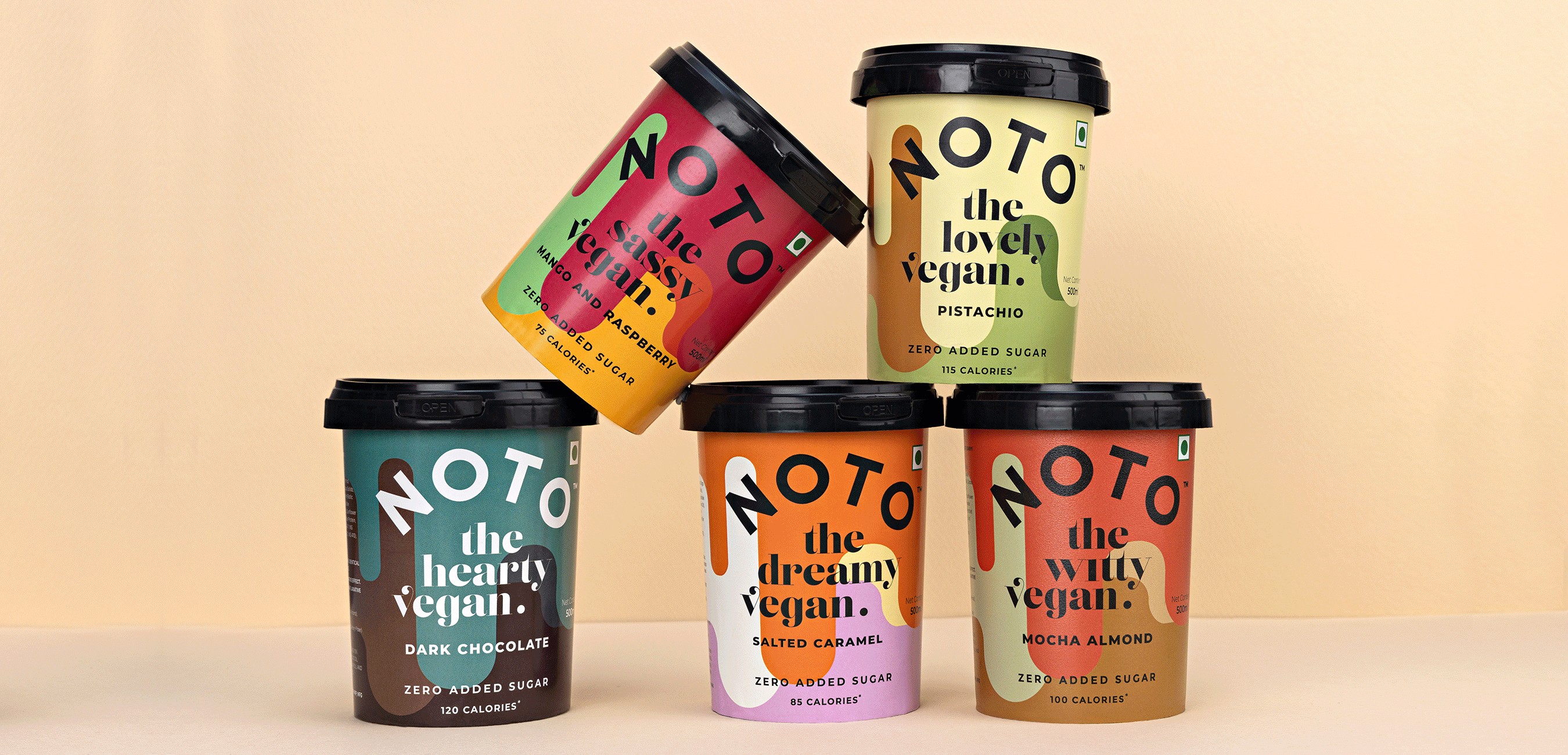
What Sort Of Vegan Are You?
Ice cream brands have traditionally used photographs or ingredients on pack. If you hide the brand name, chances are, you might not be able to tell one from another. There’s always the half bite, the scopes and the raining fruits. While there’s nothing wrong with employing the traditional route to packaging design, one does run the risk of merging with the crowd.
Most new-age vegan, or non-dairy ice creams tend to focus on similar attributes. While there’s nothing wrong with showcasing the product on pack, as a new entrant in the vegan ice cream space, it was important for Noto to establish that they are different from the lot. To begin with, most people who’ve tried the Noto Vegan range are surprised it is dairy free. The creaminess, the flavours and the overall texture of this range are, dare we say, almost the same as regular milk based ice cream.
For a vegan, low-calorie ice cream focusing on a healthy lifestyle, Noto Vegan had to find it’s own unique voice.
Through the packaging design, we focused on direct expression, characterisation and information hierarchy.
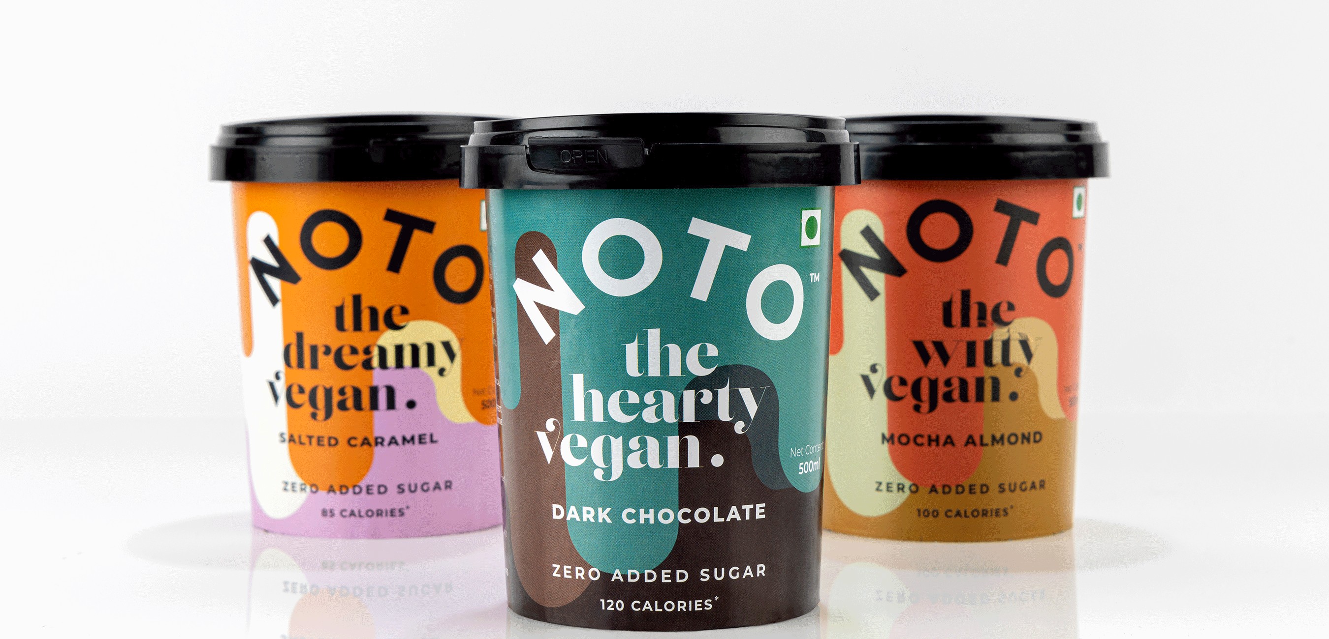
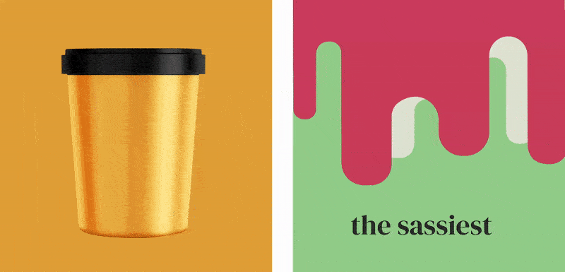
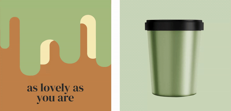
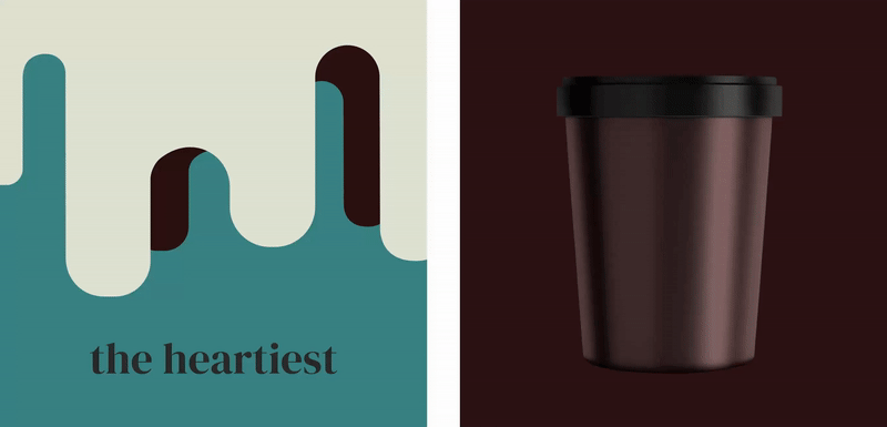
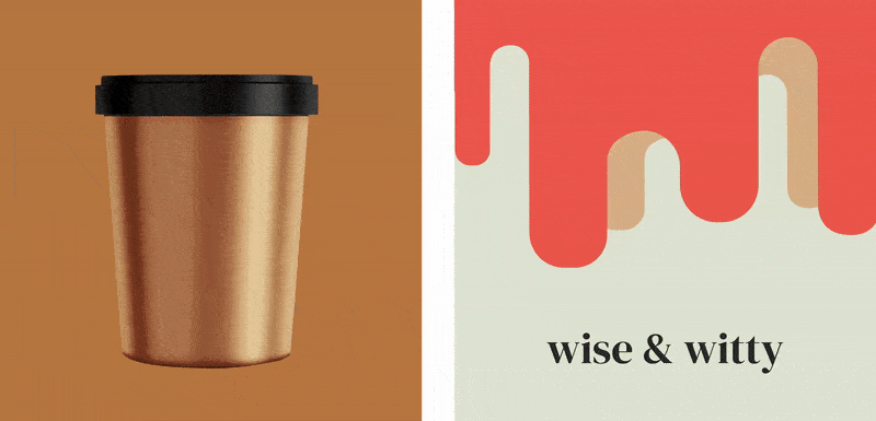
Bold, bright hues were introduced to interpret the taste, inviting the consumer to paint a vivid mental picture, supported by flavour characterisation. Our attempt was to break the convention of product photography to express taste.
With a flavourful personality, Noto’s new generation, conscious ice cream disrupts the vegan shelf, dressed in richly coloured patterns, bold typography and a clutter breaking outlook.


CREDIT
- Agency/Creative: Stratedgy
- Article Title: Packaging Design and Naming Convention for Noto Vegan Ice Cream
- Organisation/Entity: Agency
- Project Type: Packaging
- Project Status: Published
- Agency/Creative Country: India
- Agency/Creative City: Mumbai
- Market Region: Asia
- Project Deliverables: Packaging Design
- Format: Jar
- Substrate: Plastic
- Industry: Food/Beverage
- Keywords: Packaging Design, Ice cream, Vegan
-
Credits:
Creative Director: Krupa Kapadia


