


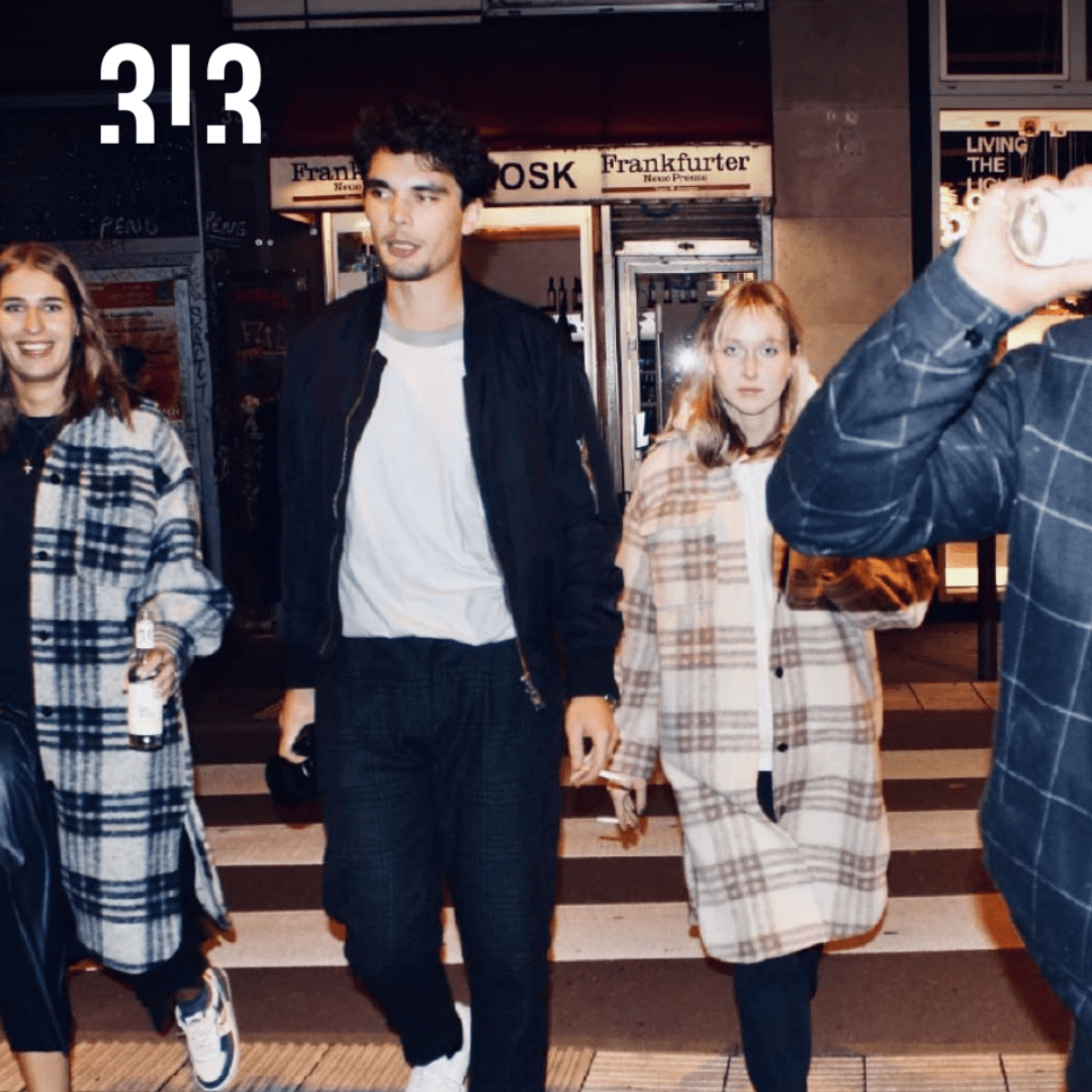
313 Hard Selzer is a product of Frankfurt startup 313 Studios. The product is for the German market and it is intended for the younger population between 18 and 30 years.
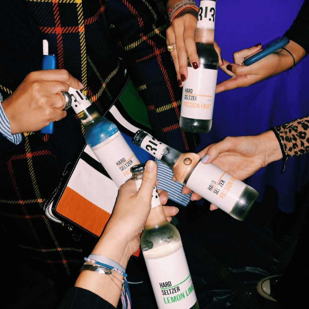
At the moment they provide two different flavors, lemon/lime, and passion fruit. 313’s target audience demographic focuses on relatively young people.
Inspiration for the design was driven by ingredients, flavors great dedication to satisfying the needs of the final consumer of the product.
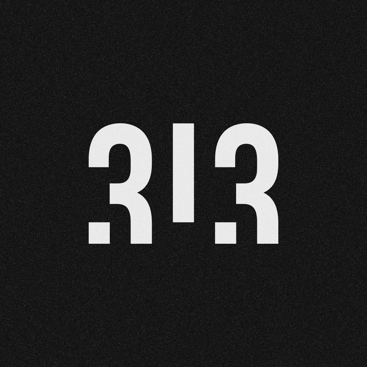
The design process, after research, started with logo design. The logo is very minimal but bold. Idea was to design a logo that will stand out from the competition, but still be very modern and appropriate for the target audience. Central part of the logo is number 313, the name of the Hart Seltzer itself. We used a black and white combination and kept the design very basic and minimal. However, I wanted to add some movement to the logo. We agreed that we need some dynamic, this is a product intended for young people. Impression of the movement was accomplished with a slight dis level between numbers. By cutting off the bottom of the numbers 3 and 1.
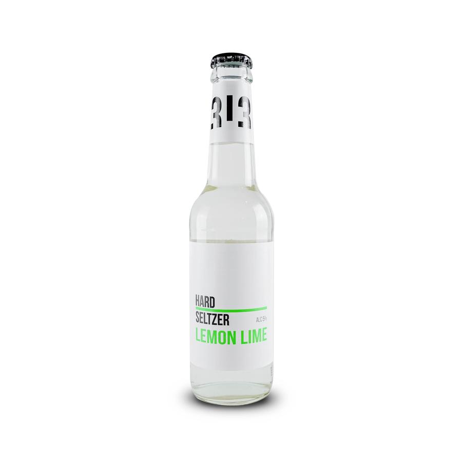
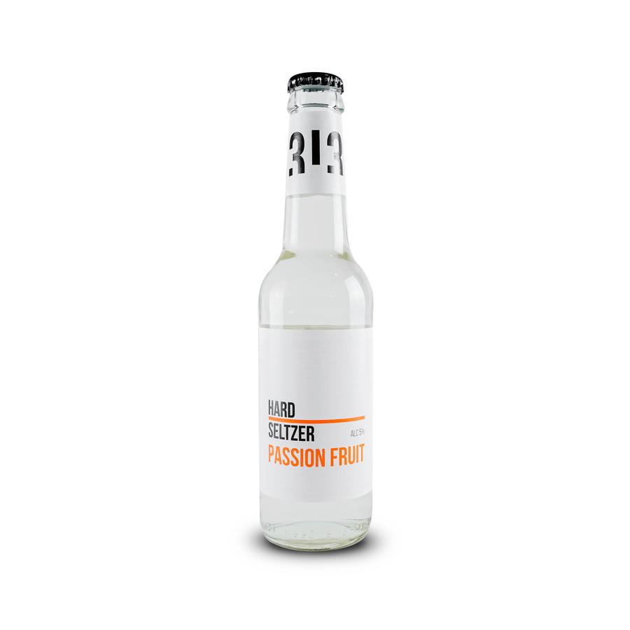
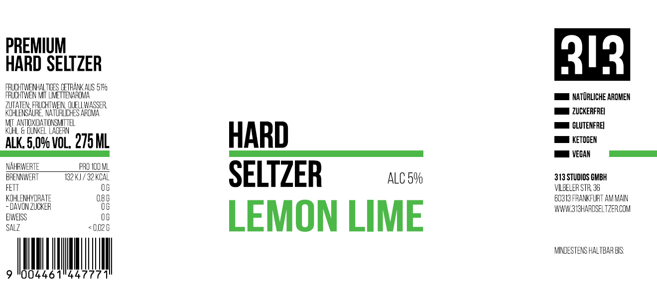
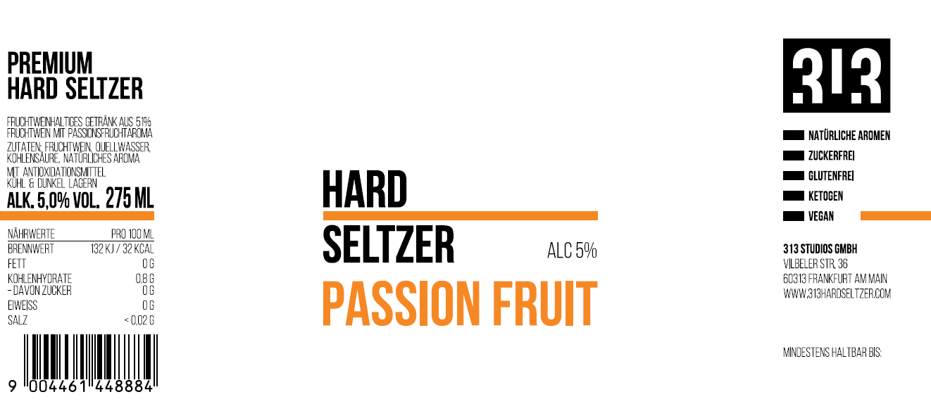
After we agreed on the logo design, we started to develop a label design. Still very minimal with the black logo as a central point on the top white label. We used just one accent color for each flavor on the bottom label. Very bright orange for passion fruit and bright green for lemon/lime flavor. On the front of the label are just basic information. The type of product, Hard Selzer is black with a thick line in the color of flavor between words, which makes balance with the bold big name of the flavor on the bottom part of the label. As I said we have two different flavors, and the flavor name is on the bottom of the label in a color that refers to the flavor. All text is aligned to the left. In addition to that, we have a very thin mark for a percentage of the alcohol in the beverage on the top right side.
On the back of the labels is necessary product information. On the left side are a type of product, ingredients, percentage of alcohol, and volume of the bottle. Then divided with the same line that continues from the front part of the label, under that are nutrition information and barcode. On the right side of the back of the label is the large logo, information about products (for example gluten-free, vegan…) Under the thick line which continues through the whole label we have company information and expiration date.
The product is packed in clear glass bottles of 275 ml with an aluminum lid in black color.
CREDIT
- Agency/Creative: Jelena Antic
- Article Title: Packaging and Logo Design for 313 Hard Seltzer
- Organisation/Entity: Freelance, Published Commercial Design
- Project Type: Packaging
- Agency/Creative Country: Serbia
- Market Region: Europe
- Project Deliverables: Brand Identity, Brand Strategy, Branding, Packaging Design
- Format: Bottle
- Substrate: Glass Bottle


