designVENA – Hobby Shampoo
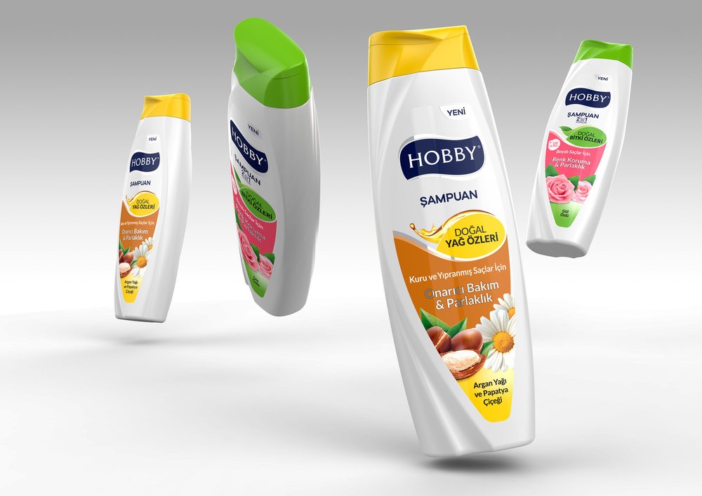
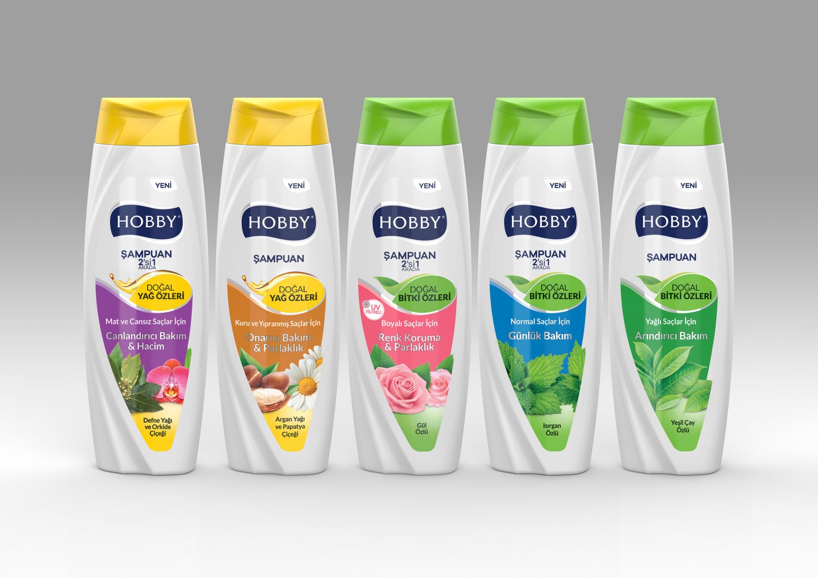
Curved forms resembling the hair waves were used in order to have the design create the shampoo perception. The curves, which added an elegant and feminine expression to the bottle, have also increased its resistance. Another purpose of these curves was to guide the consumer towards the bottle cap opening and closing details. Taking into consideration the producer’s production conditions, both sides of the bottle were designed so that any of them could be the front side. The designs were determined as two main groups, the Natural Oil Extracts and Natural Plant Extracts. In the area emphasized by a drop shaped foil, the main groups were differentiated using the green and yellow colors, while these same colors were used on the bottle cap and in the area below the label in order to consolidate the group perception. The plain colors and explicit content visuals used in the middle part of the design, have presented the variants in a simplified expression.


CREDIT
- Agency/Creative: designVENA
- Article Title: Packaging and Graphic Design For Hobby Shampoo From Turkey
- Organisation/Entity: Agency Commercial, Published
- Project Type: Packaging
- Agency/Creative Country: Turkey
- Market Region: Multiple Regions
- Format: Bottle
- Substrate: Plastic


