You Don’t Have to be the first to be cool. This project has been nurtured and brought to life over three years. Together with the client, we’ve gone through every step of branding: from strategy to the final product on the shelf. They say even love doesn’t last that long. But now Yommy is out there, and the world has noticed it. We can say, without being too modest, how awesome we are. Everything is still on point—the strategy, the visuals, and of course, the brand itself with its line of herbal products.
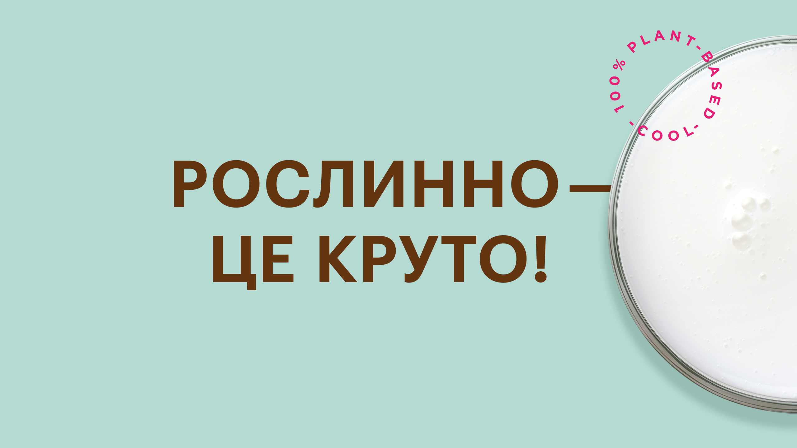
You Don’t Have to follow a vegan lifestyle to enjoy plant-based foods. Yep, you read that right—the second paragraph starts just like the first. In fact, there are six similar refrains in the brand’s manifesto. It’s become our stance and a key part of the strategy we’ve crafted, all aimed at breaking free from the labels of “alternative,” “weird,” or “vegan” associated with plant-based products. Our brand is for anyone who dares to defy stereotypes and is open to savoring something new. Because being plant-based isn’t just cool, it’s downright delicious. So, when we came up with the brand name, we added a dash of coolness to it: Yommy. It’s a playful blend of “yummy” and “yogurt” plus “milk,” and even a bit of “yo!” and “my.” It might sound cosmopolitan, but trust us—it’s authentically Ukrainian, through and through.
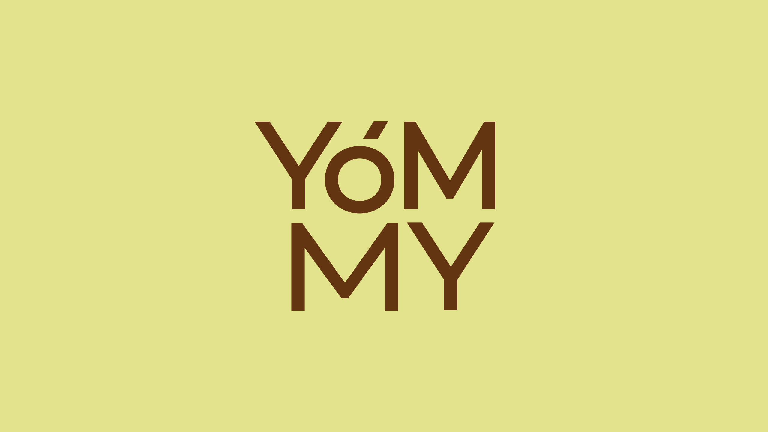
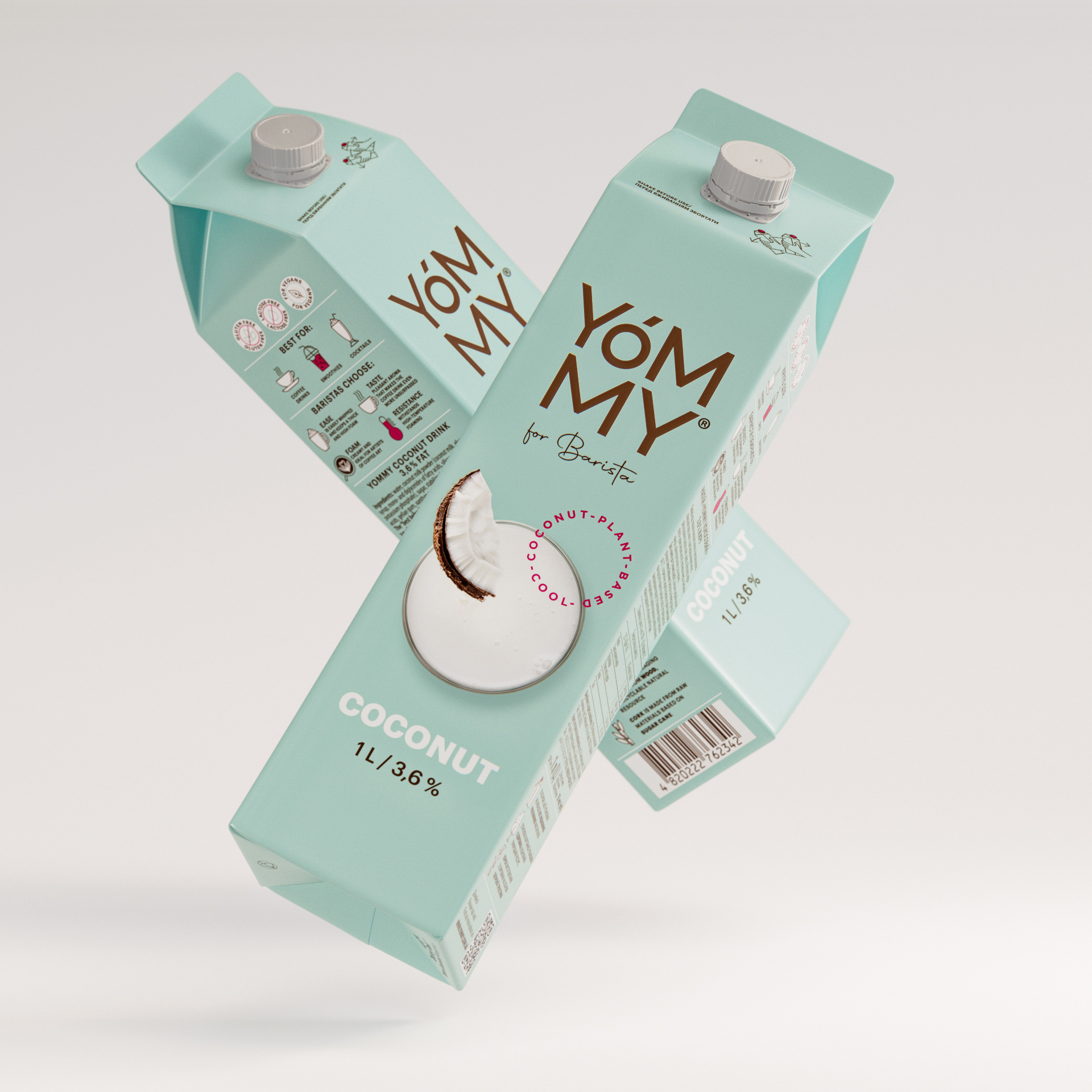
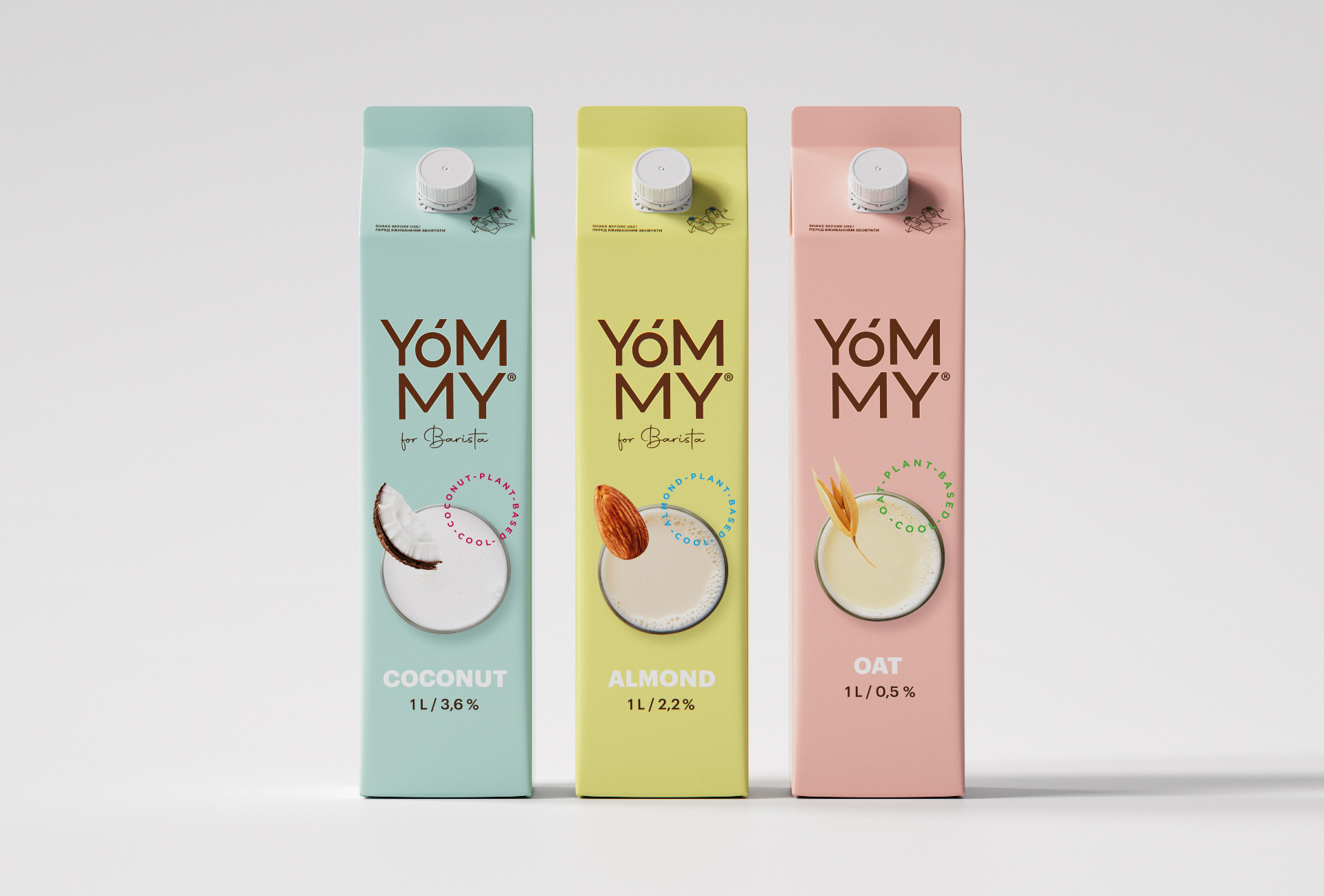
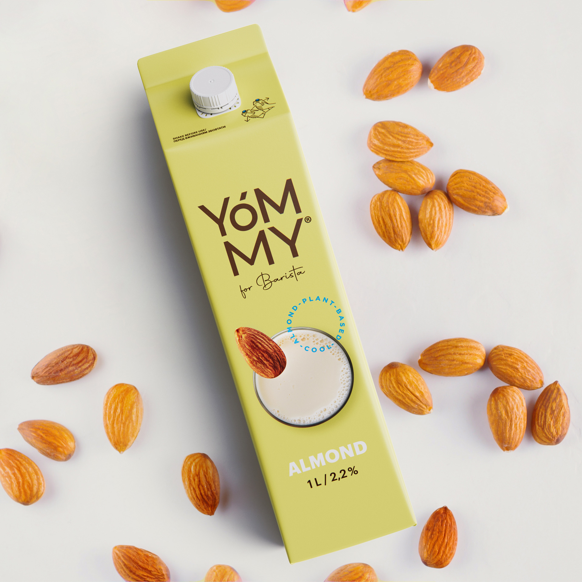
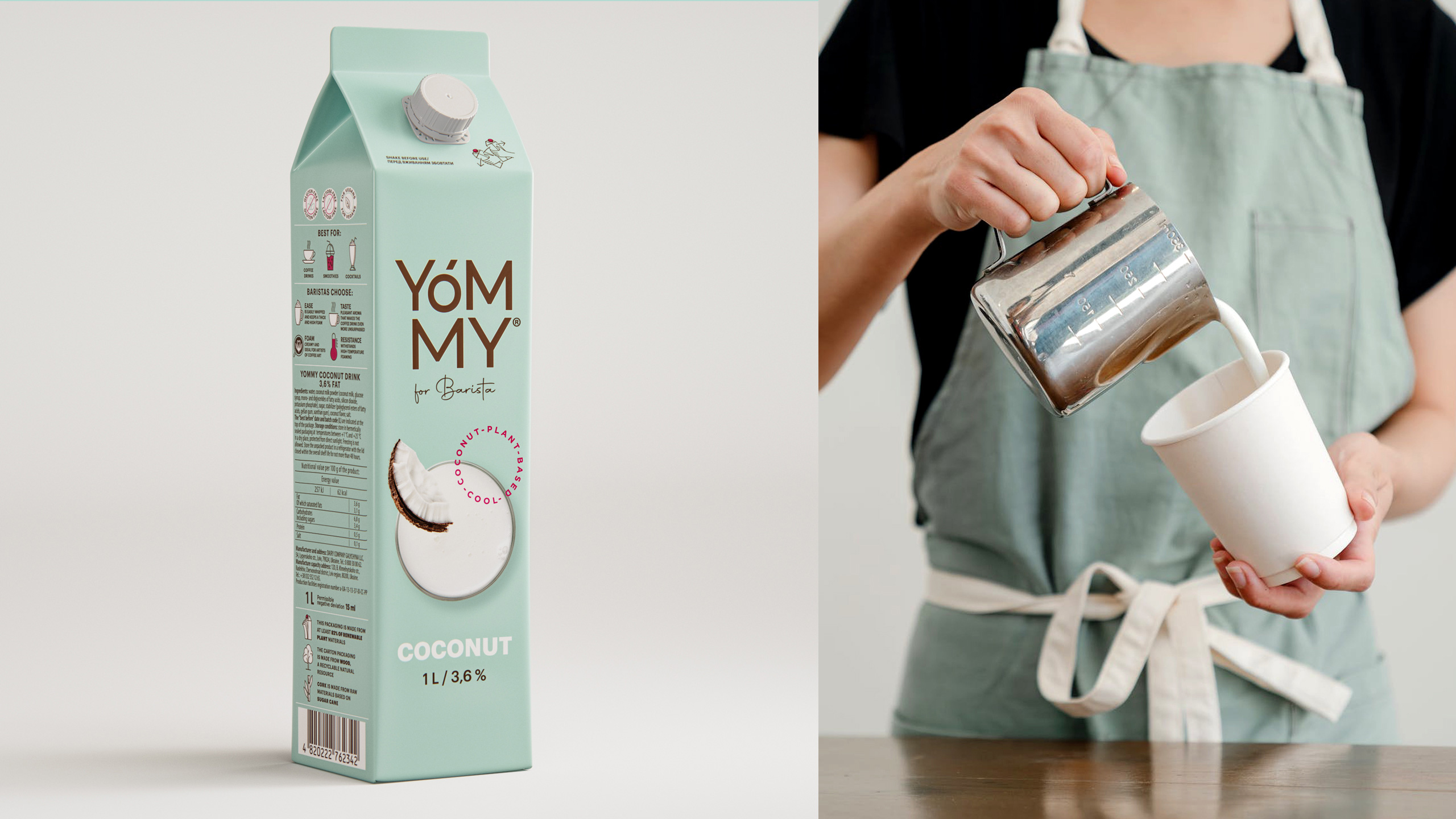
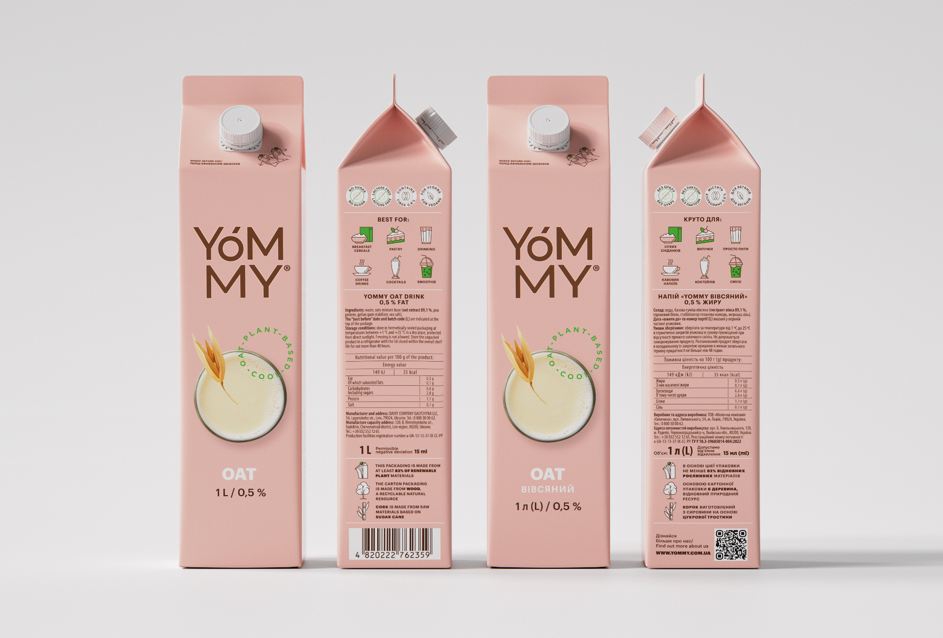
And To Top It Off, we elevated the highlights with our graphics when we crafted the logo. We opted for a sleek font block that’s compact yet eye-catching, placing emphasis on symmetry for easy readability. To enhance the natural essence of our plant-based concept, we adorned it with a warm coconut-cereal-coffee color. In our design concept, we sought to showcase the product’s cohesiveness by incorporating circular elements. We used a round glass of milk, labeled with the letter “O” to symbolize unity and added diacritical marks to represent the flavor ingredients. Furthermore, we included a stylized round seal and bubbles within the glass, accentuating the visual appeal. To complete the package, we developed a system of round icons that harmonize with the overall aesthetic. It’s a sight to behold, especially when we break free from the confines of strict color coding. We took the liberty to offer elegant, modern pastel shades that have unanimously captivated connoisseurs in focus groups. It’s all about beauty in every aspect.
Yommy Comes In Two Colors, representing two delightful flavors in our lineup. One is specially crafted for baristas, clearly indicated on the packaging. But that doesn’t mean there are any limitations or special requirements for enjoying Yommy at home. You have the freedom to choose and mix as you please, catering purely to your personal taste. Remember our manifesto? You don’t have to be a barista to enjoy Yommy. And to discover what makes it taste so cool, just take a glance at the sides of our packages.
But One Thing Is Absolutely Essential: you must find and taste Yommy. Better yet, try each and every one of them. And then keep going, exploring even more. There’s no stopping you! Embrace the coolness of plant-based goodness.

CREDIT
- Agency/Creative: Dozen Agency
- Article Title: Packaging and Brand Design for Yommy Plant Based Products
- Organisation/Entity: Agency
- Project Type: Packaging
- Project Status: Published
- Agency/Creative Country: Ukraine
- Agency/Creative City: Kyiv
- Market Region: Europe
- Project Deliverables: Brand Design, Logo Design, Packaging Design
- Format: Bag
- Substrate: Pulp Carton
- Industry: Food/Beverage
- Keywords: Packaging, design, Kyiv, Ukraine, milk, dairy
-
Credits:
Art Director: Elena Gavriluk


