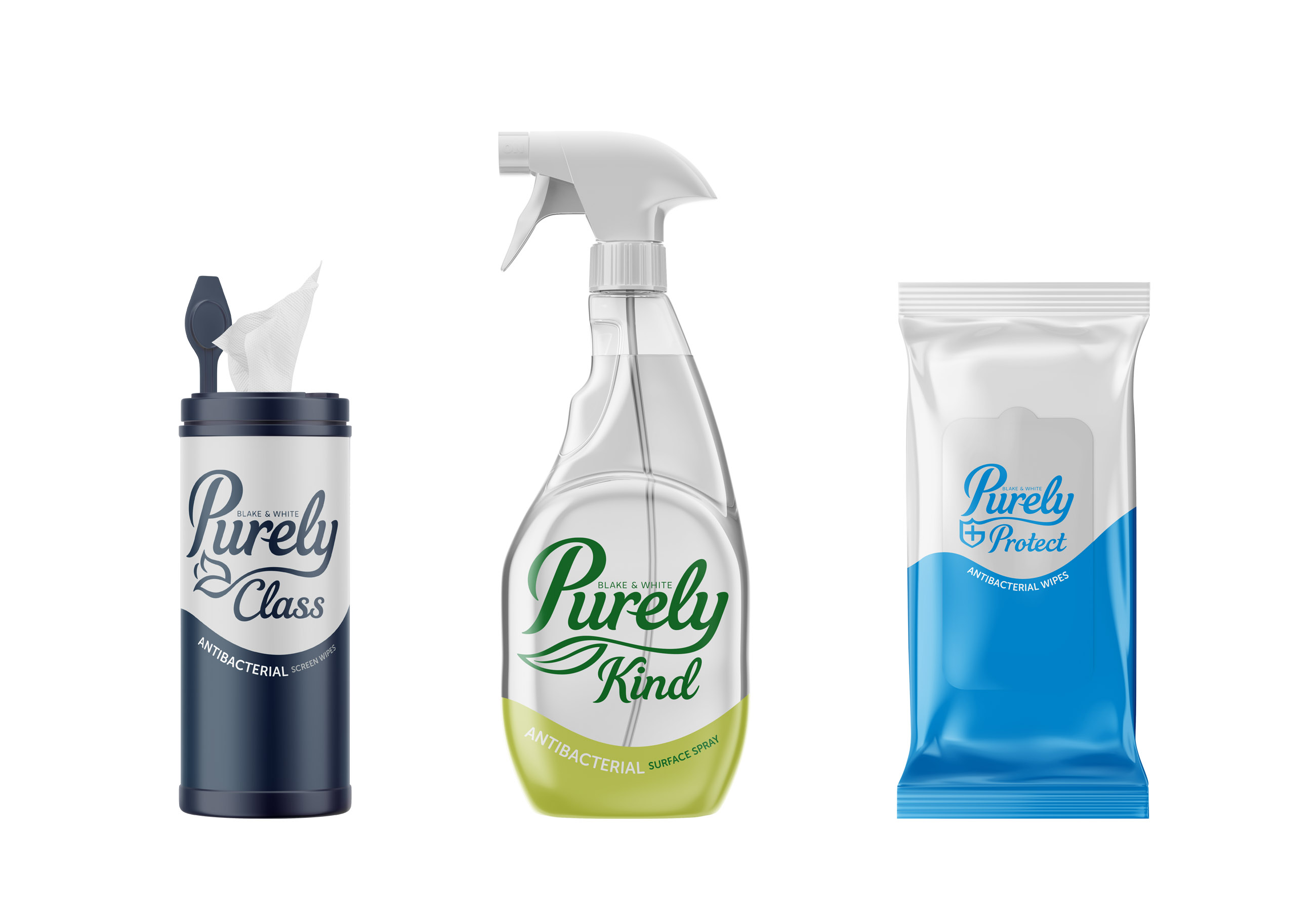
The name Purely was born from an approach to the way the business worked. They simply provide a range of cleaning products that work.
Purely are a new name to the cleaning product market. The brand is around a premium product for the janitorial market delivered with simplicity; well crafted products split over a brand architecture of Everyday, Eco-friendly, Premium and Protection each having around 60 products in their category.
From our research it became clear that the market is saturated with a lack of consideration to the consumer as a package. A bland array of one label that has all the back of pack legal copy on crammed on one label with no structure. A visual cluster of a logo and tonnes of content crammed onto a label.
Purely are all about their customers which range from large businesses with fleets of staff to the end user. We wanted to deliver a product range that delivered a sense of care from the brand to the consumer. To show a clear system to identifying the architecture within the brand and understanding the products within each range. The products usually end up on display from retail facilities to homes so it was important that although these are cleaning products they look presentable and in not like a chemical product.
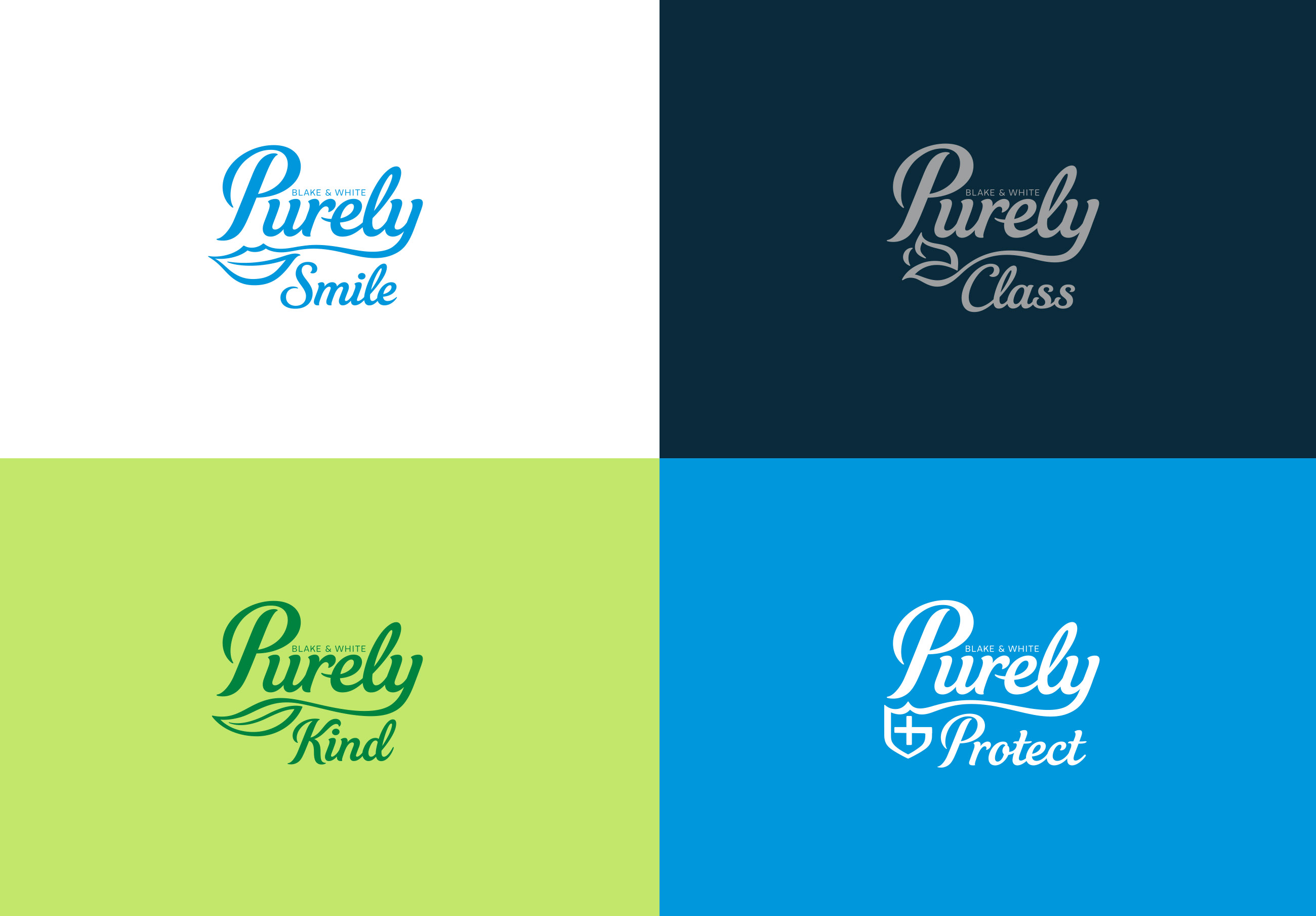
The core objective was not to just deliver a strong brand but one that would work over not only a large range of products and vessel shapes but also with a brand architecture split into four markets and sub-brands. So the brand needed to be easily split into these sub brands but retain clear synergy across all of the products.
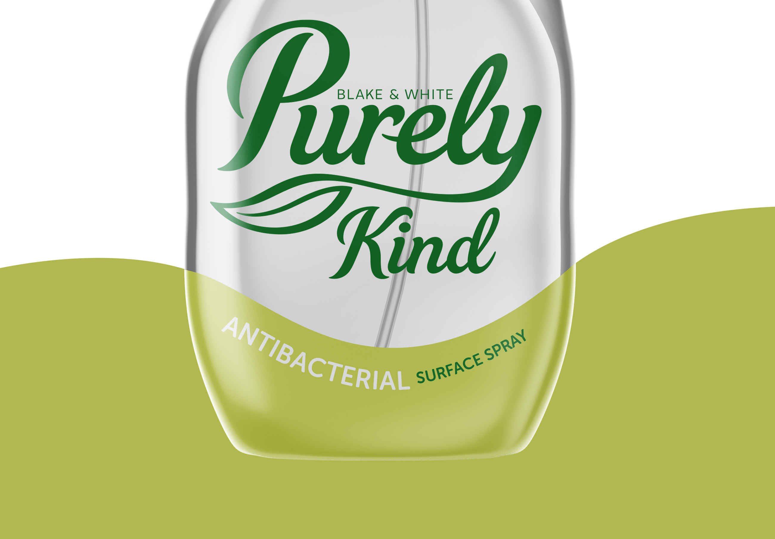
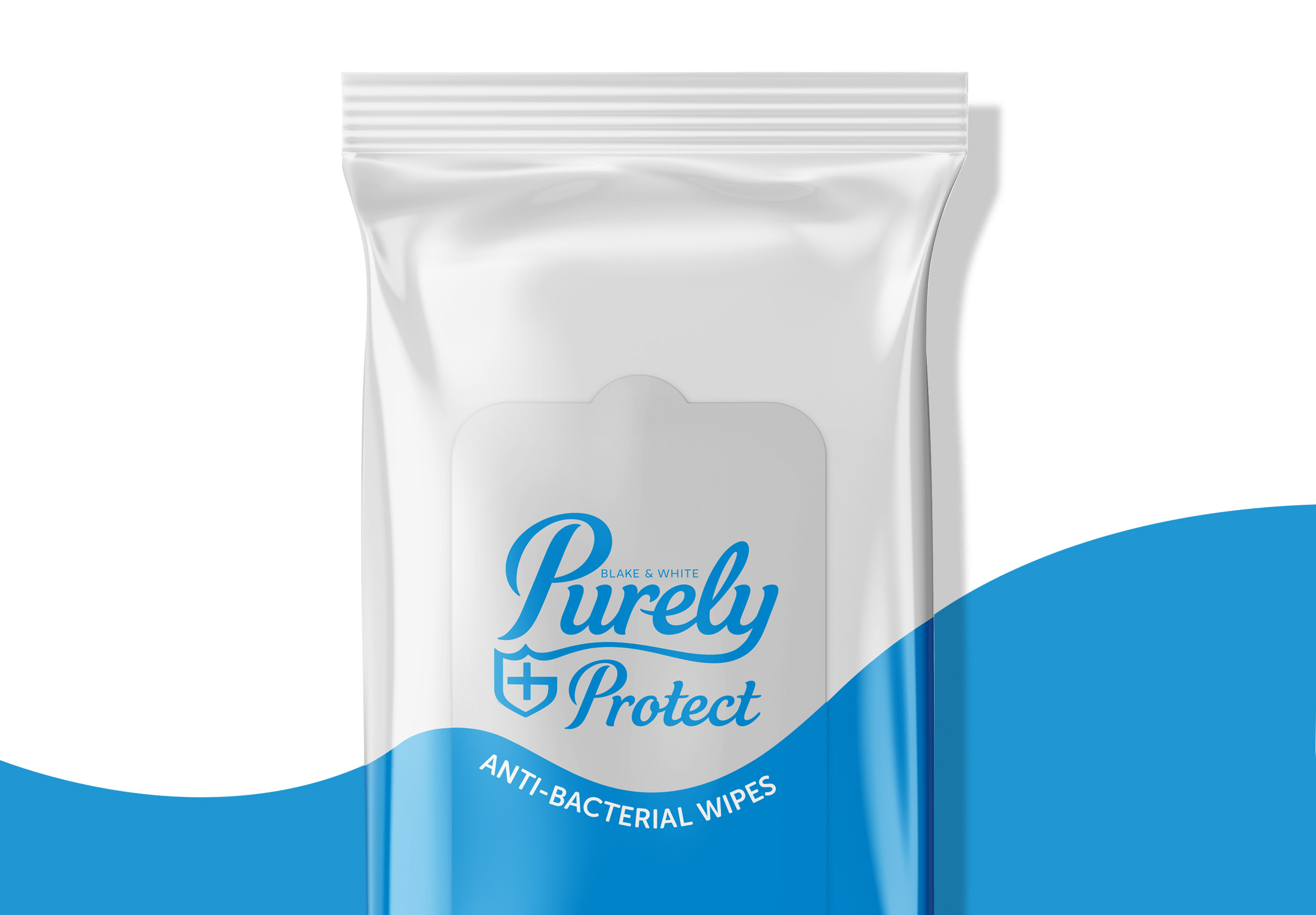
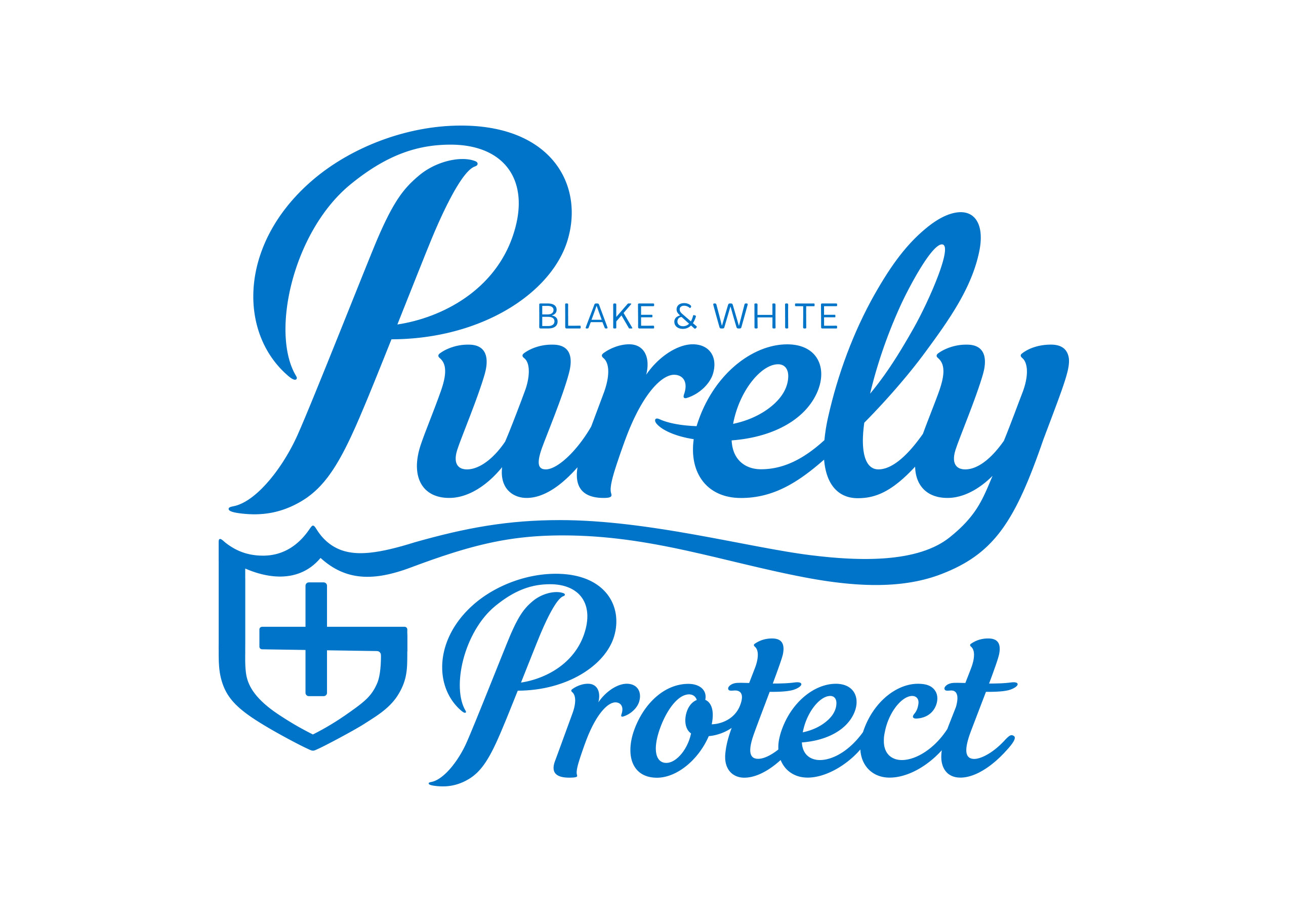
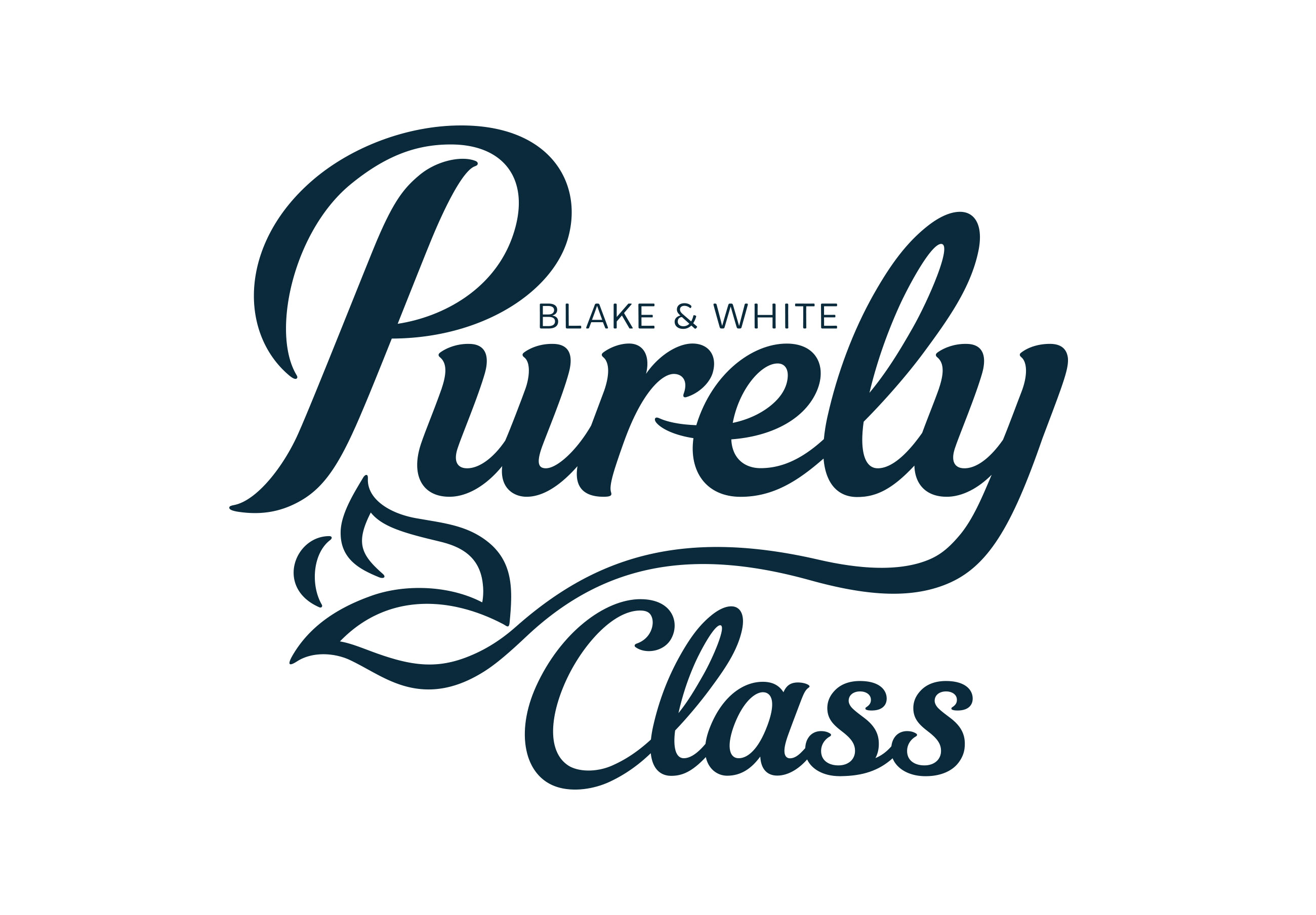
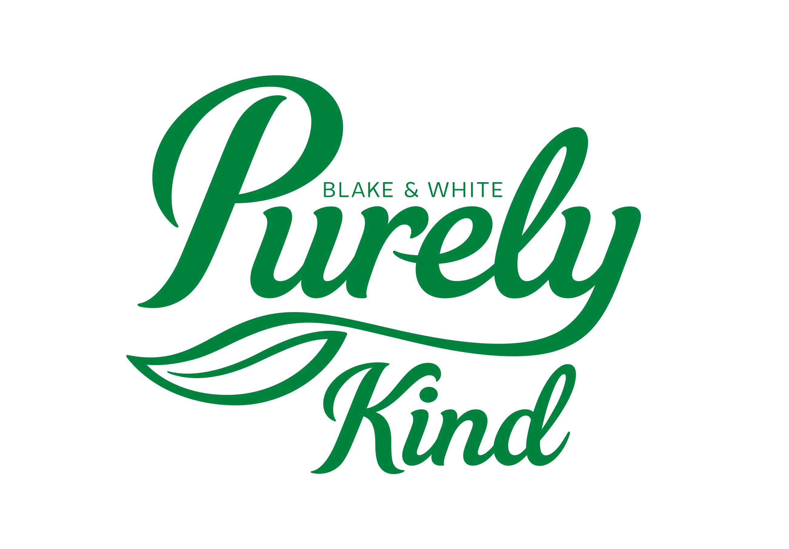
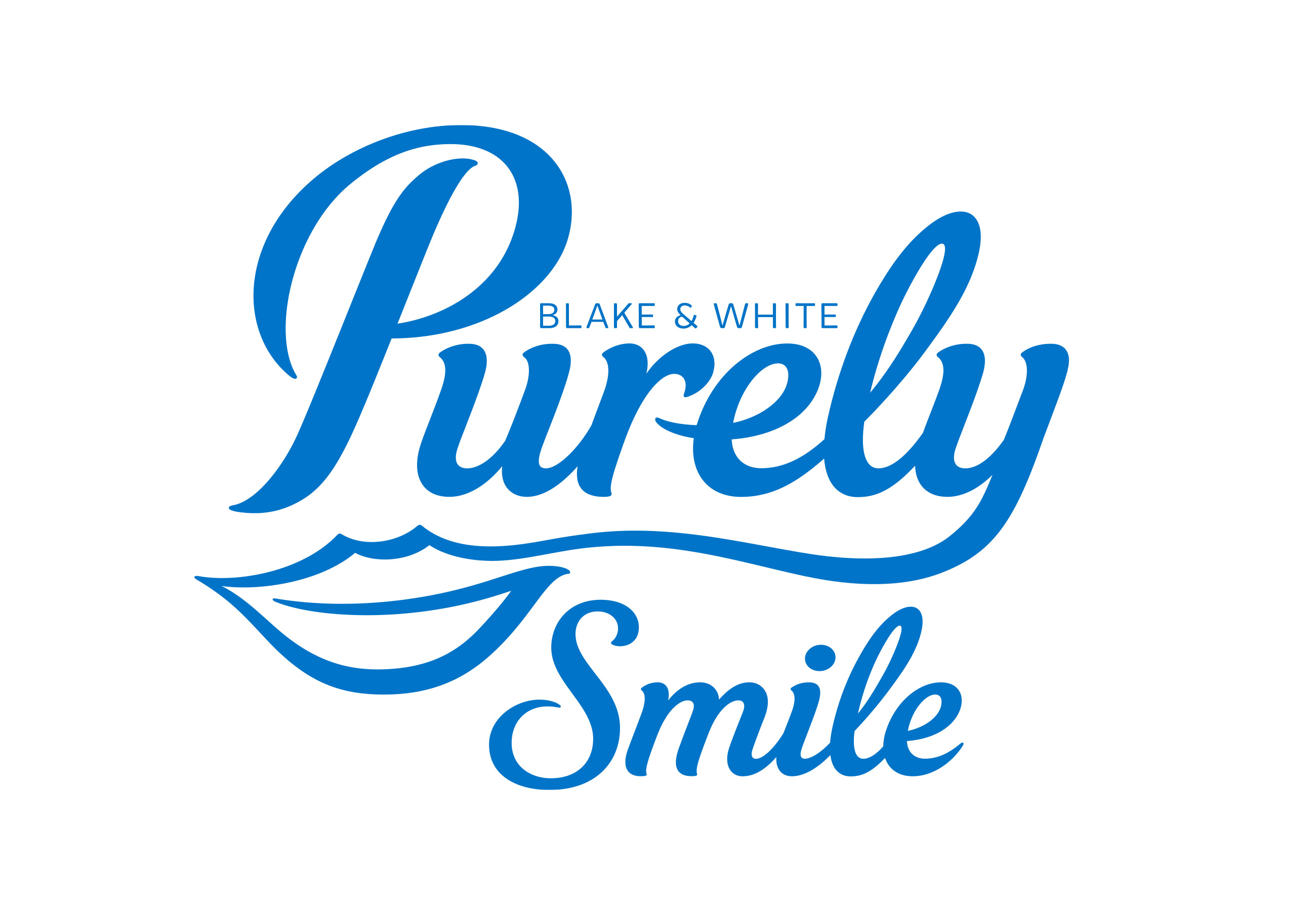
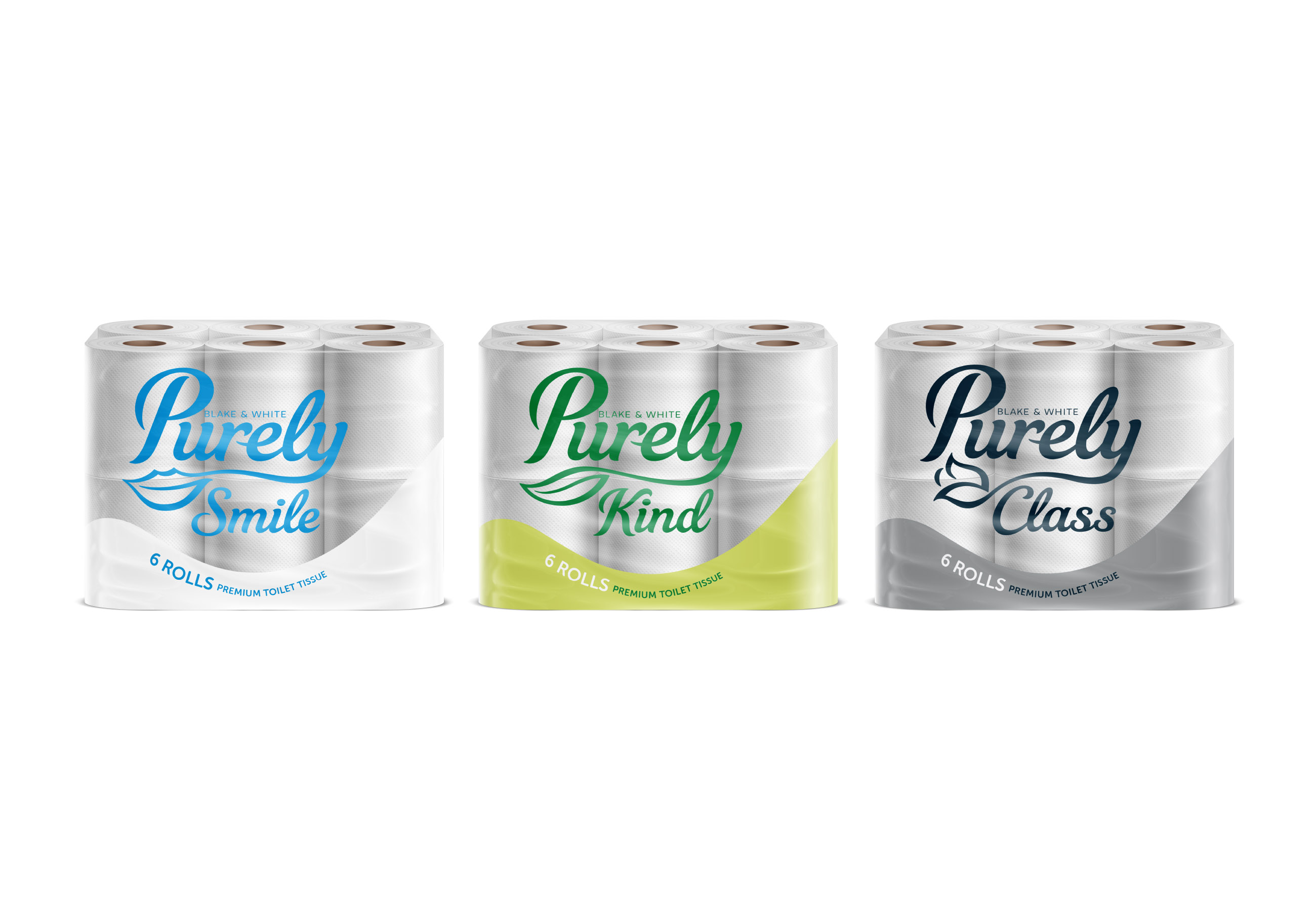
We developed a strong, clear word mark which has an integrated icon device that changes to reflect the sub brand. Purely Smile is your everyday products, Purely Kind (Leaf icon) is the environmentally friendly products, Purely Class (Dean iamond) are the more premium focussed products and Purely Protect (a shield). Each sub brand has a clean simple colour way to aid in identifying the range which married with the icons creates a clear continuity across the four product ranges and across all of their respective products.
CREDIT
- Agency/Creative: Pencil Studio
- Article Title: Packaging and Brand Design for Purely Janitorial Products by Pencil Studio
- Organisation/Entity: Agency, Published Commercial Design
- Project Type: Packaging
- Agency/Creative Country: United Kingdom
- Market Region: Europe
- Project Deliverables: Brand Identity, Brand Naming, Branding, Packaging Design, Product Architecture, Tone of Voice
- Format: Bottle, Bucket, Pouch, Tube
- Substrate: Glass Bottle, Plastic


