Ellie Pinney – JOLIE LAIDE
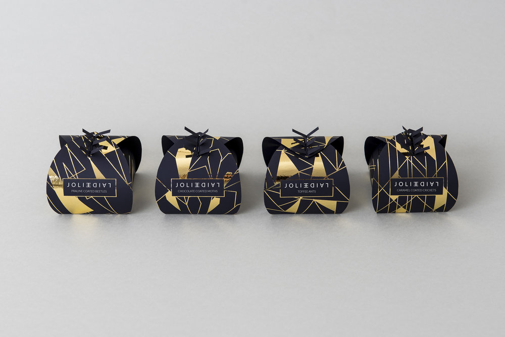
Insects are the sustainable superfood of the future. But while bugs are frequently enjoyed in other cultures, four out of five Brits find them too disgusting to eat. This response to a student brief aimed to frame edible insects differently by highlighting their complexity and elegance through high-end packaging. This brand celebrates seeing beauty in ugliness, a concept summarised by the French term ‘jolie laide’ (beautiful ugly).
Brand and visual identity
At the heart of JOLIE LAIDE is contrast: Seeing beauty in ugliness; taking something that is ‘disgusting’ and highlighting its benefits to the world. This idea is reflected in the logo, which literally turns ‘ugly’ on its head to sit beside ‘beautiful’. At the interface of the two words, the overlapping E’s create a six-legged, insect-like form, which can be used in isolation as the brand’s mark.
Boxes
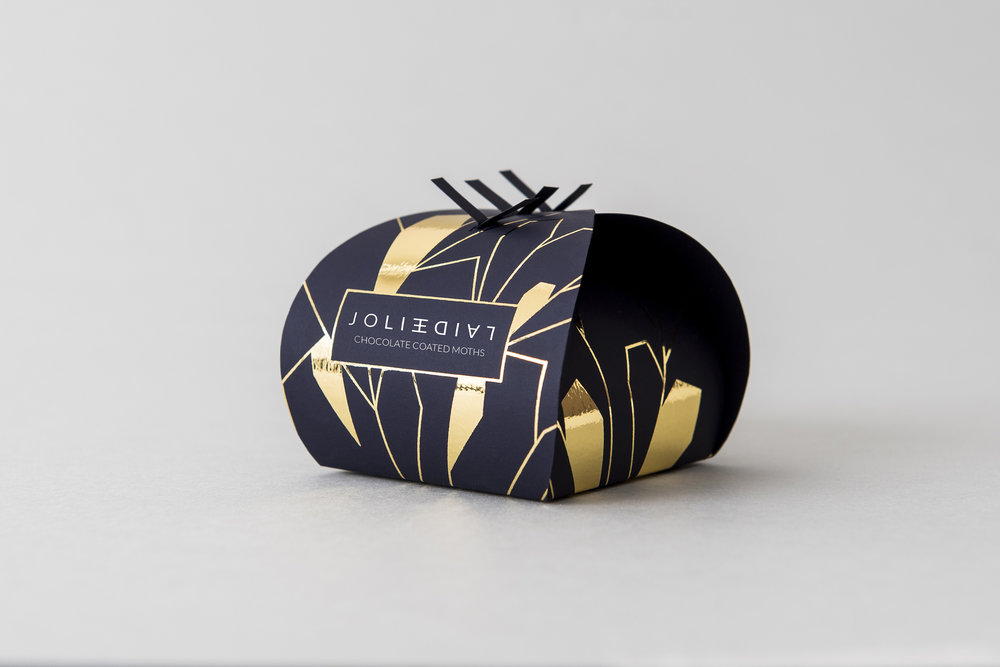
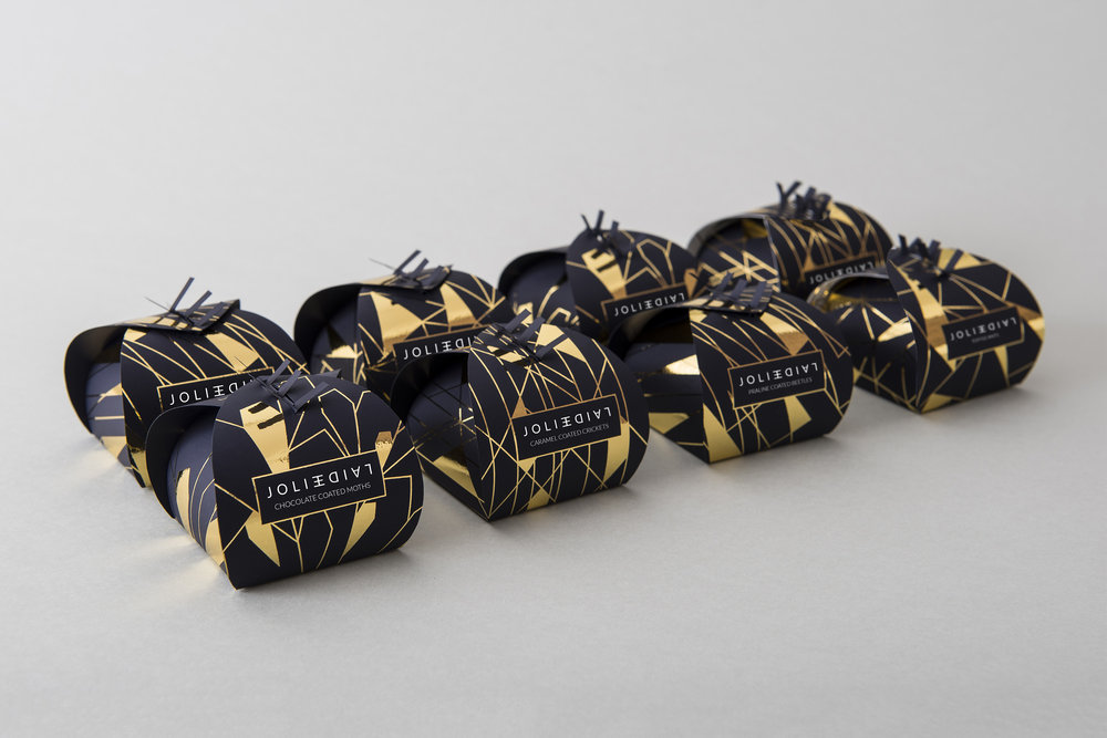
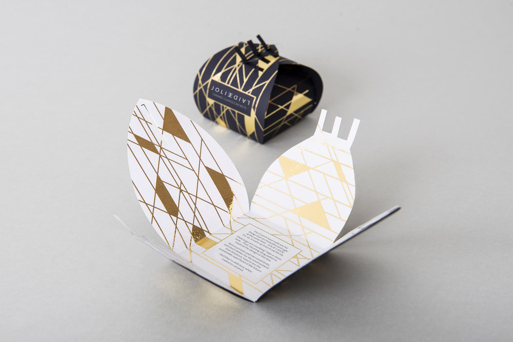
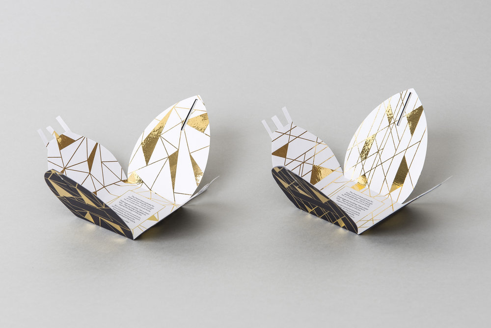
The patterns on the wing-like boxes are inspired by the markings of the edible insects within. The sides fasten at the top to form the JOLIE LAIDE mark, and the dark box exteriors fold away to reveal white interiors. The two contrasting faces are integrated and linked by a single, continuous gold foil pattern.
CREDIT
- Agency/Creative: Ellie Pinney
- Article Title: Packaging and Brand Design for Edible Insects
- Organisation/Entity: Student Concept, Non Published
- Project Type: Packaging
- Agency/Creative Country: United Kingdom
- Market Region: Europe
- Format: Box
- Substrate: Pulp Paper


