


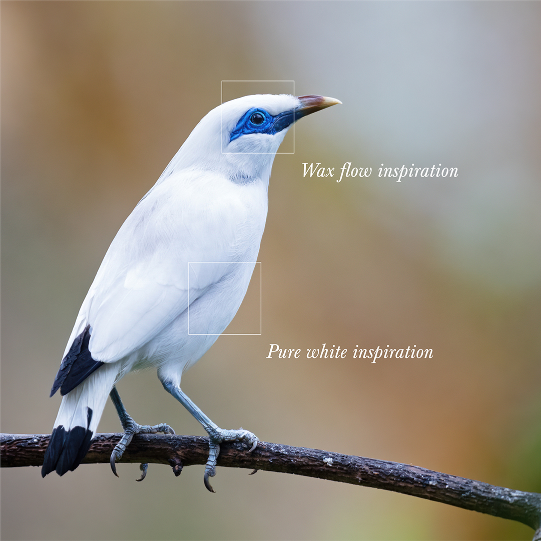
This concept redesign for the Balinese Arak brand KARUSOTJU explores the power of simplification by focusing on the brand’s most distinctive cultural symbol: the Jalak Bali bird, a rare species native to the island and widely recognised as an emblem of Balinese natural heritage. The bird is not only visually iconic but also represents the delicate balance between culture, nature and preservation on the island of Bali.
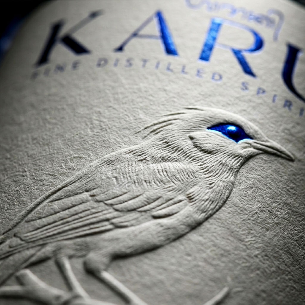
Rather than introducing additional decorative elements, the design approach was to remove visual noise and allow a single symbolic element to carry the identity of the brand. The embossed bird illustration becomes the central storytelling element of the label, emerging through subtle interaction with light and shadow. This restrained visual strategy creates a refined and contemporary aesthetic while respecting the cultural roots of the symbol.
Inspired by the bird’s distinctive white feathers and Bali’s pristine natural water sources, the label is printed on textured white paper that enhances tactility and material presence. The embossing technique allows the illustration to appear gradually as light moves across the surface, creating a quiet yet striking visual effect that reinforces the purity and authenticity of the spirit.
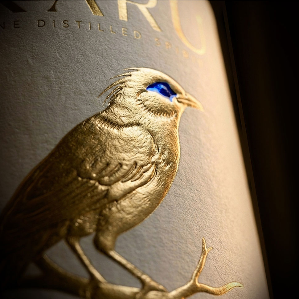
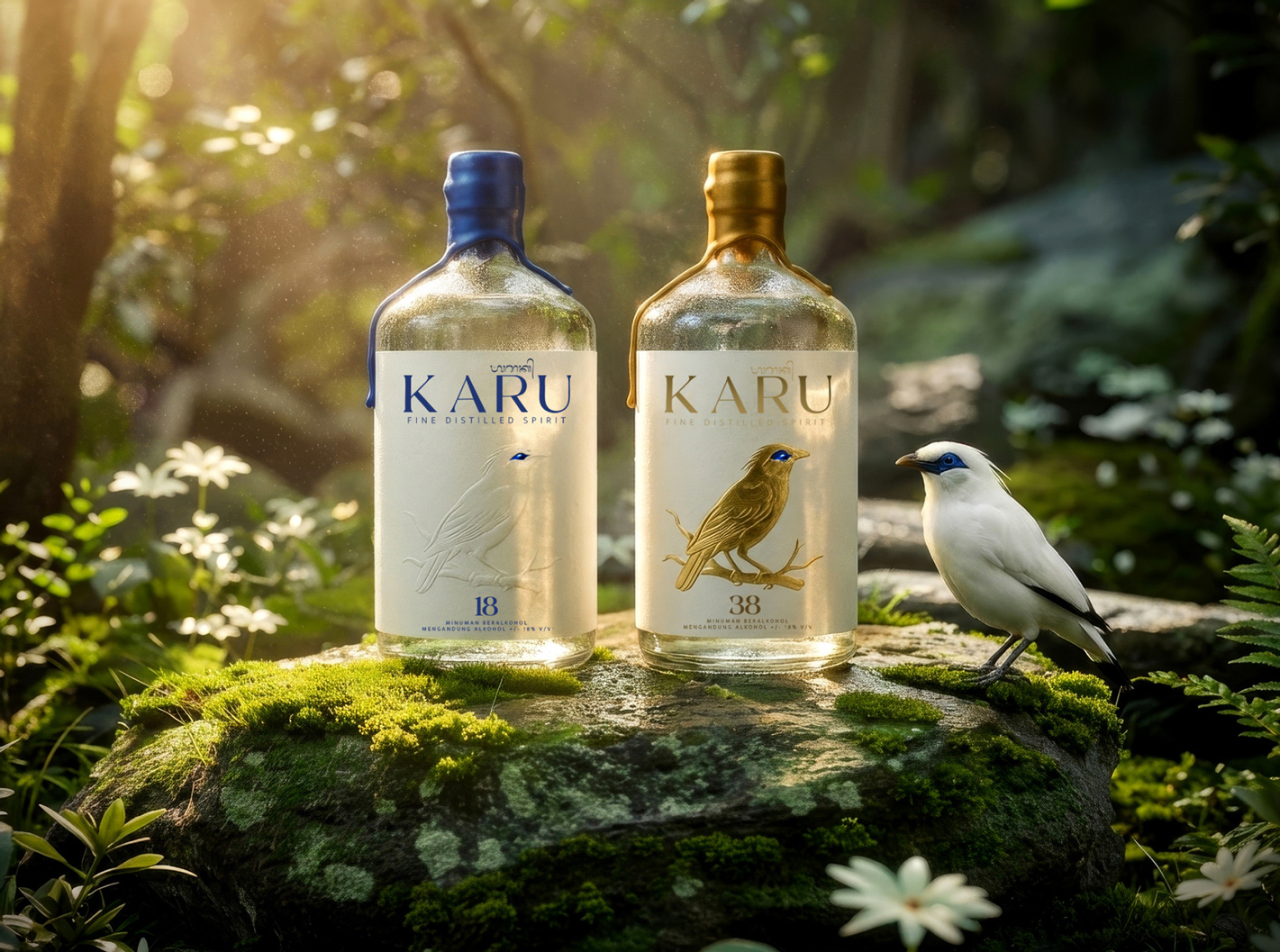
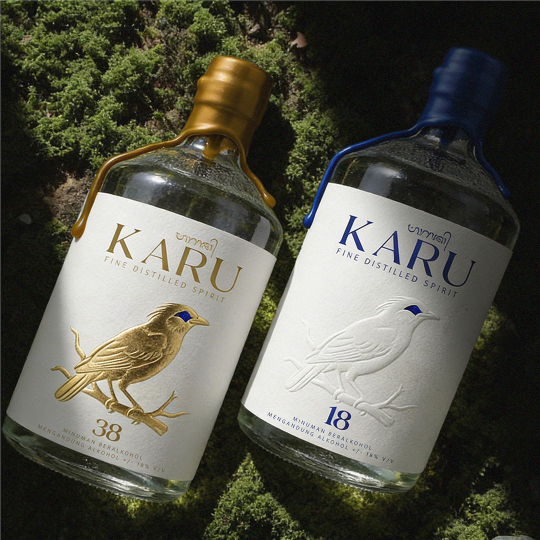
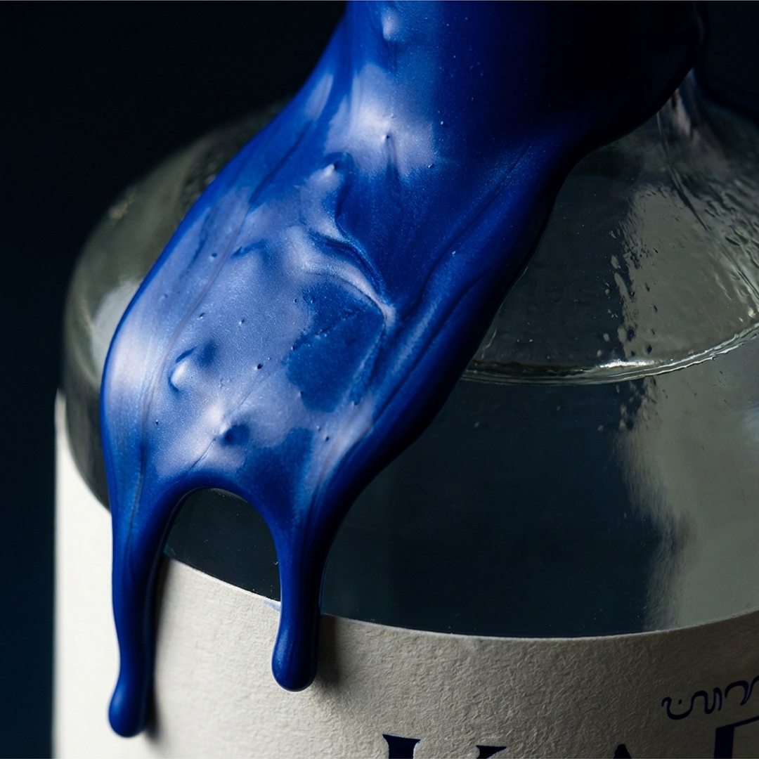
A metallic blue accent placed around the bird’s eye becomes the brand’s signature visual detail. This small but powerful element introduces a contrasting highlight within the minimal composition. The same blue tone continues beyond the label and transforms into a flowing wax seal on the bottle neck, creating a visual bridge between the graphic illustration and the physical packaging structure.
To further strengthen shelf presence and communicate the aging of the spirit in a premium and collectible way, two material expressions were developed: a pure white embossed edition that emphasises purity and minimalism, and a gold foil edition that elevates the sense of heritage and prestige. Both variations maintain the same restrained visual language while offering different sensory interpretations of the brand.
The result is a minimalist yet culturally rooted packaging concept where material, light, and symbolism work together to express the spirit of Balinese craftsmanship, transforming the Jalak Bali bird into the defining signature of the brand
CREDIT
- Agency/Creative: Packagenius / Erhan ÖZDEN
- Article Title: Packagenius / Erhan Özden Delivers Karusotju With Embossed Packaging Design Inspired by the Jalak Bali Bird
- Organisation/Entity: Agency
- Project Type: Packaging
- Project Status: Non Published
- Agency/Creative Country: Turkey
- Agency/Creative City: ISTANBUL
- Market Region: Asia
- Project Deliverables: Brand Redesign, Label Design, Packaging Design, Rebranding
- Format: Bottle
- Industry: Food/Beverage
- Keywords: Spirit Design, Label Design, Rebranding, Alcohol, Branding
-
Credits:
CD & Designer: Erhan Ozden


