


Da Won Kang, Art Center College of Design – See’s Candies Rebranding
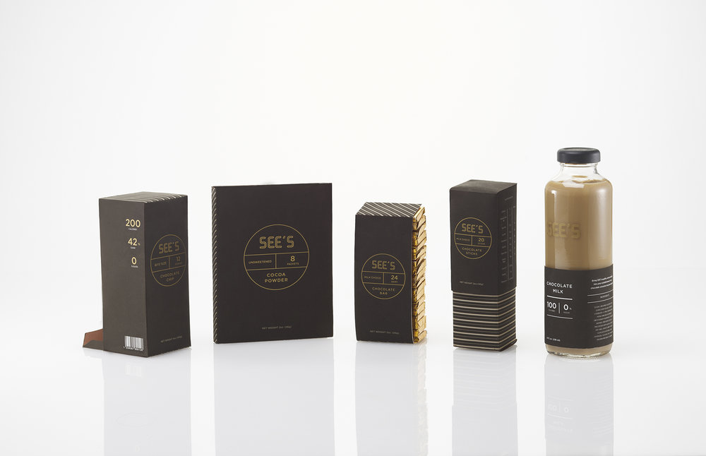
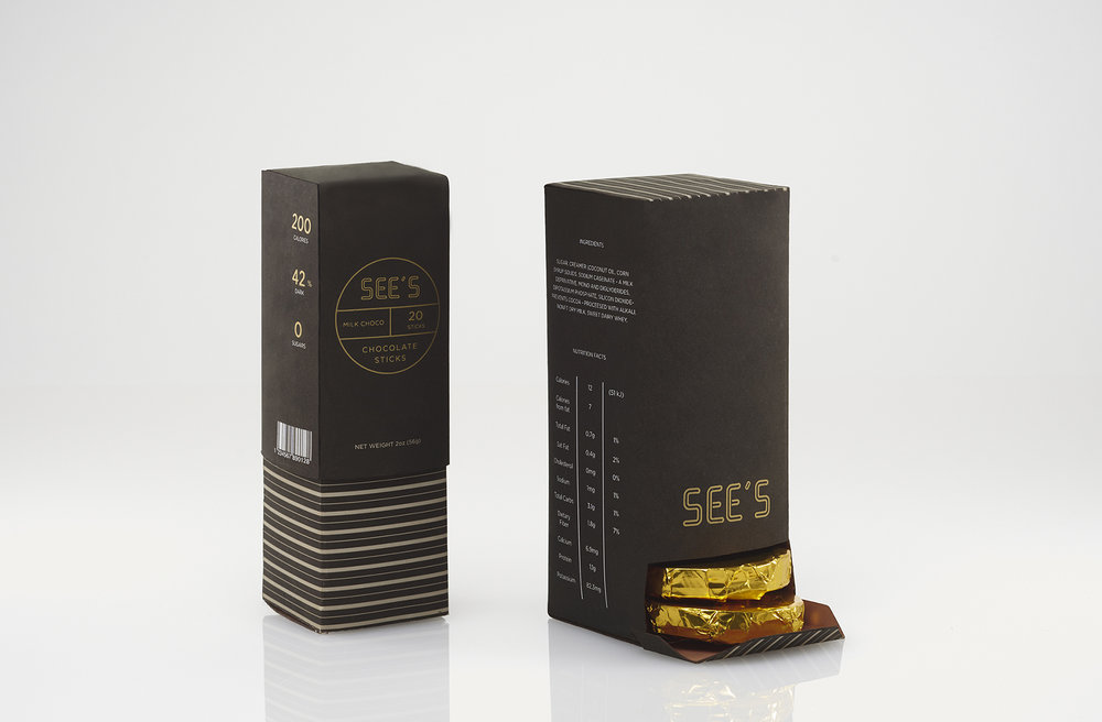
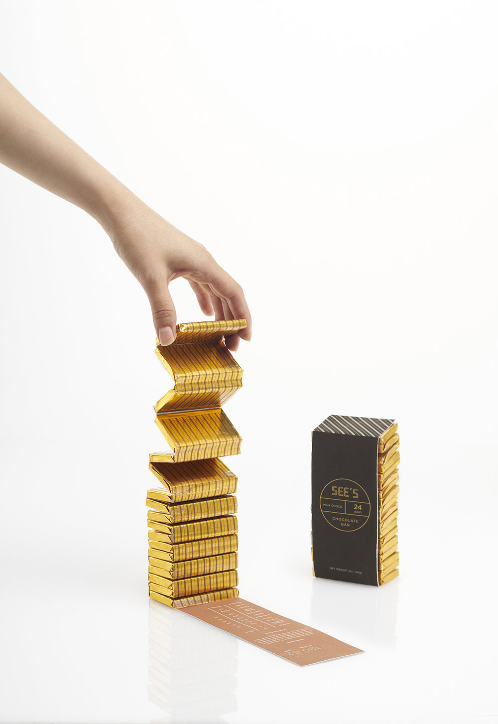
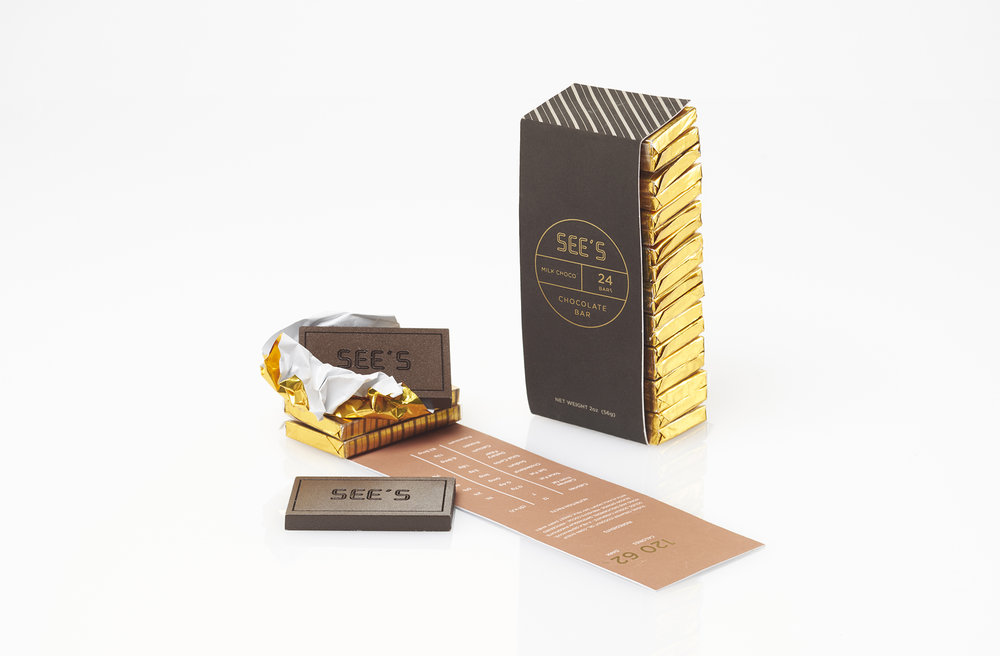
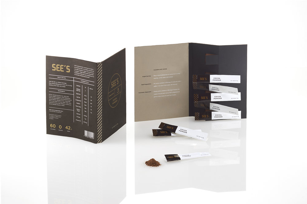
The redesigned SEE’s is super convenient and easy to prepare to eat. It also provides a rich and empowering experience to the urban, helping them feel confident and revived, making them just as alluring as the chocolate itself. I explored different form structures for SEE’S. Simple shapes and geometric angles were utilized in this stage of development. The focus was on how to make portable chocolate easier to eat anywhere. A slightly brighter variety of colors Inspired by the different colors of chocolate pallet decided, giving the identity system a bold, different experience from its current appearance.
CREDIT
- Agency/Creative: Da Won Kang
- Article Title: Package Design for See’s Candies
- Organisation/Entity: Student, Non Published Concept Design
- Project Type: Packaging
- Agency/Creative Country: United States America
- Market Region: Global
- Format: Box
- Substrate: Pulp Paper
FEEDBACK
Relevance: Solution/idea in relation to brand, product or service
Implementation: Attention, detailing and finishing of final solution
Presentation: Text, visualisation and quality of the presentation


