Anastasia Dunaeva – Aeril Laboratory
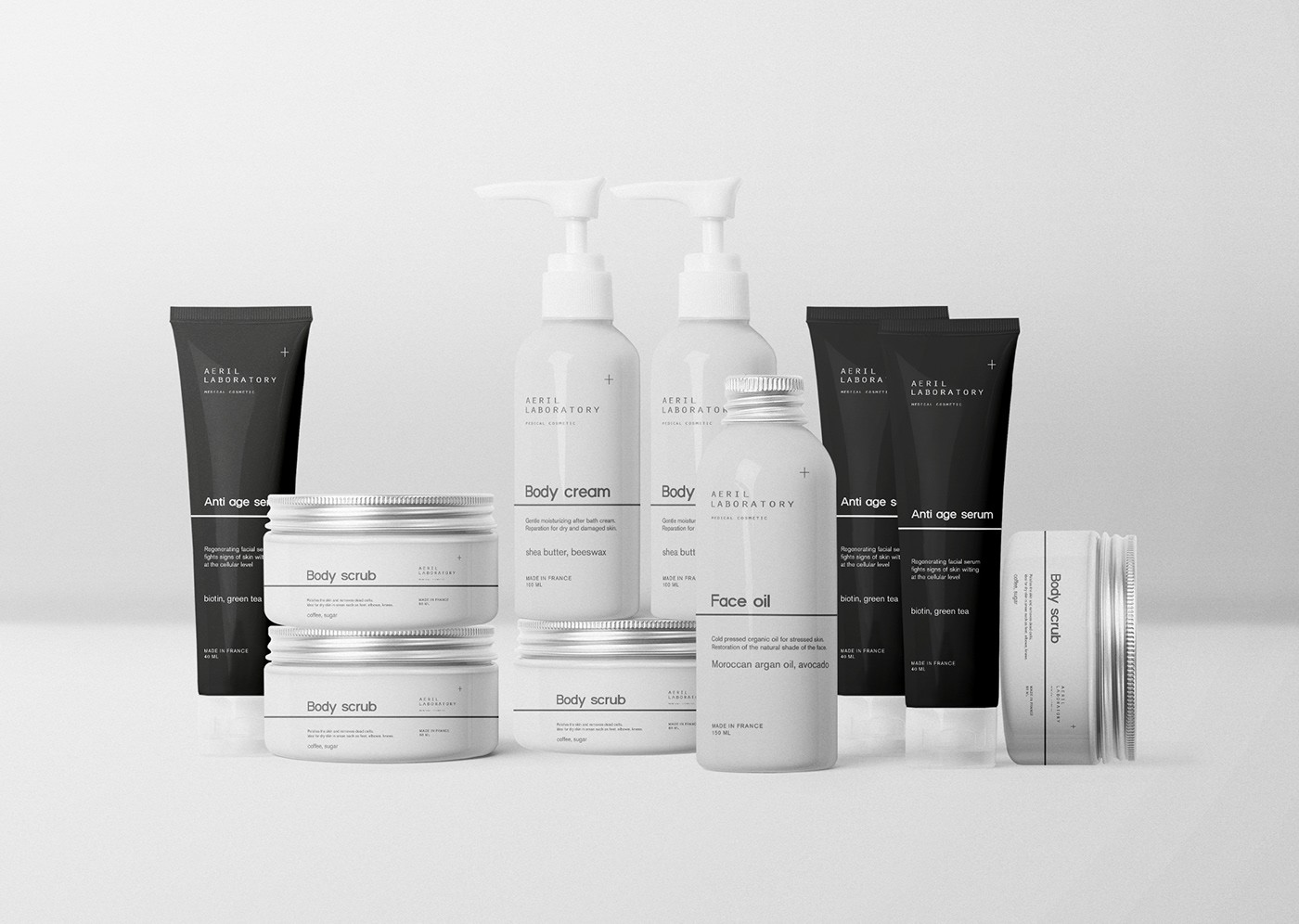
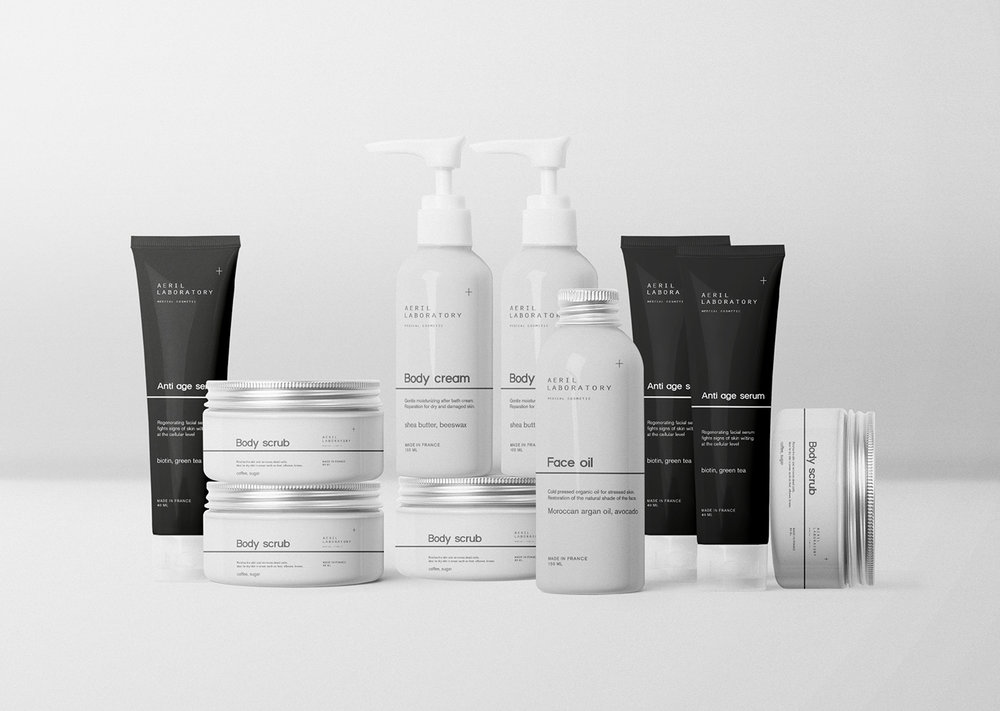
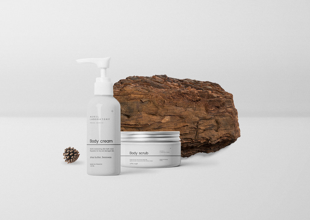
Aeril Laboratory is medical cosmetic brand based in France. Their main goal is to provide healthy, based on medical researches, solution for any type of problem skin. All products clinically tested and proved.
Task:
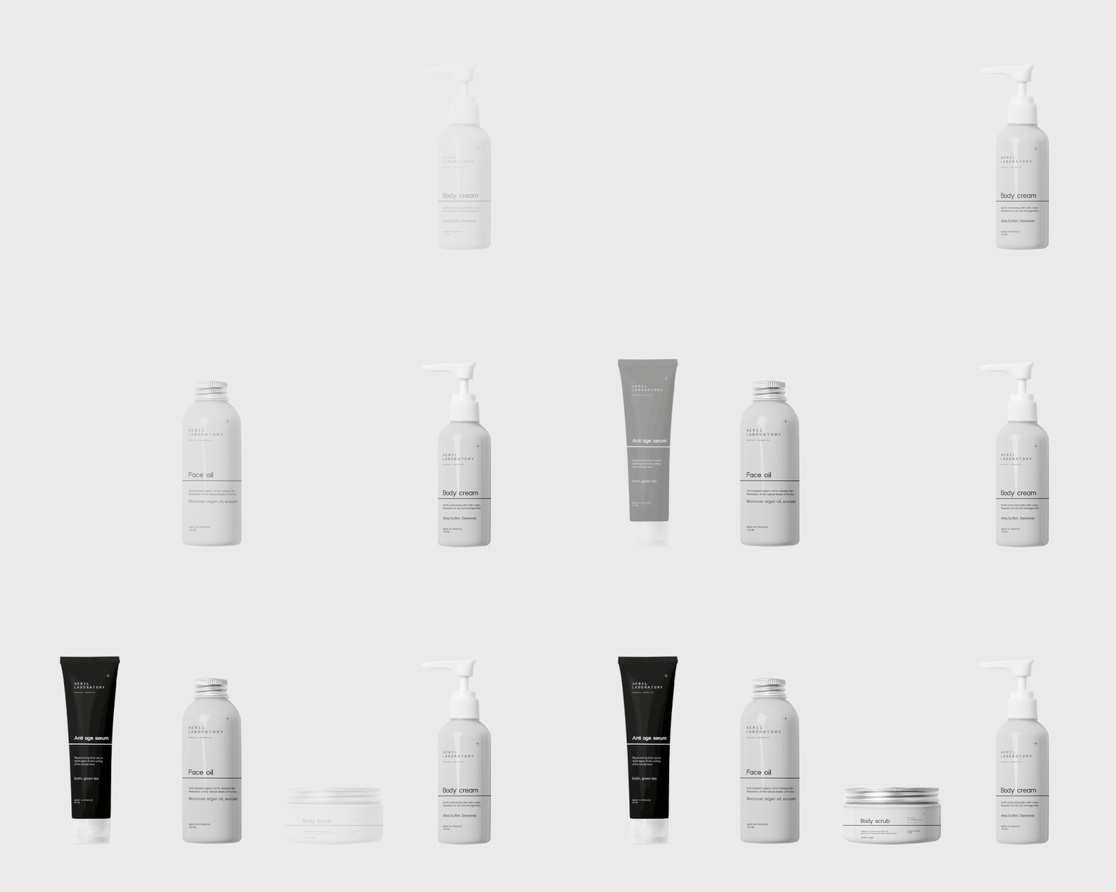
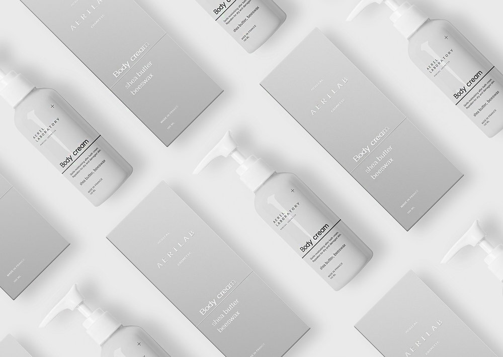
Aerilab starting hitting the market with full new skincare products. We’ve found the problem, that most of people usually buy only one product from series. Especially if it is a new line. Aeril founders wanted to solve this problem through the design. We decided to connect all products altogether and show the emphasis on need to have all products to achieve the strongest effect.
Solution:
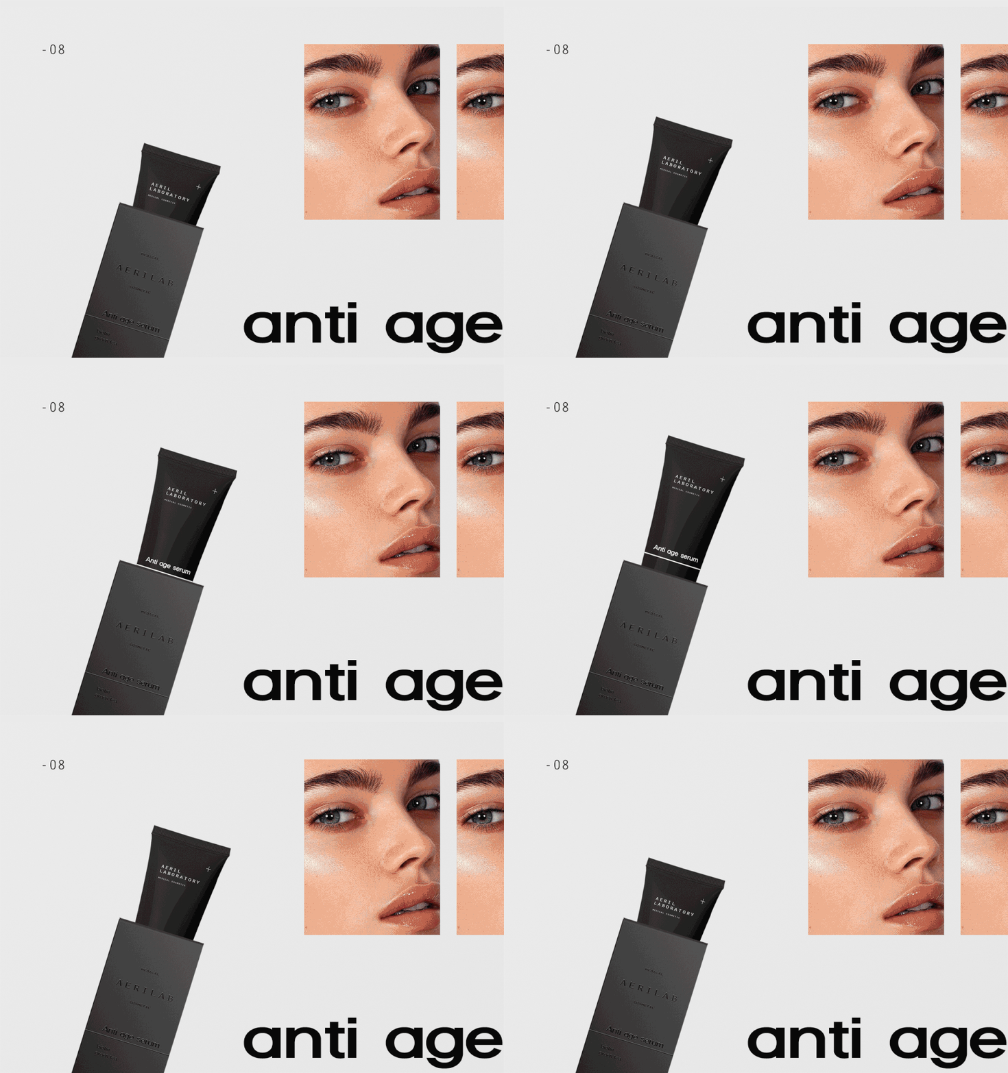
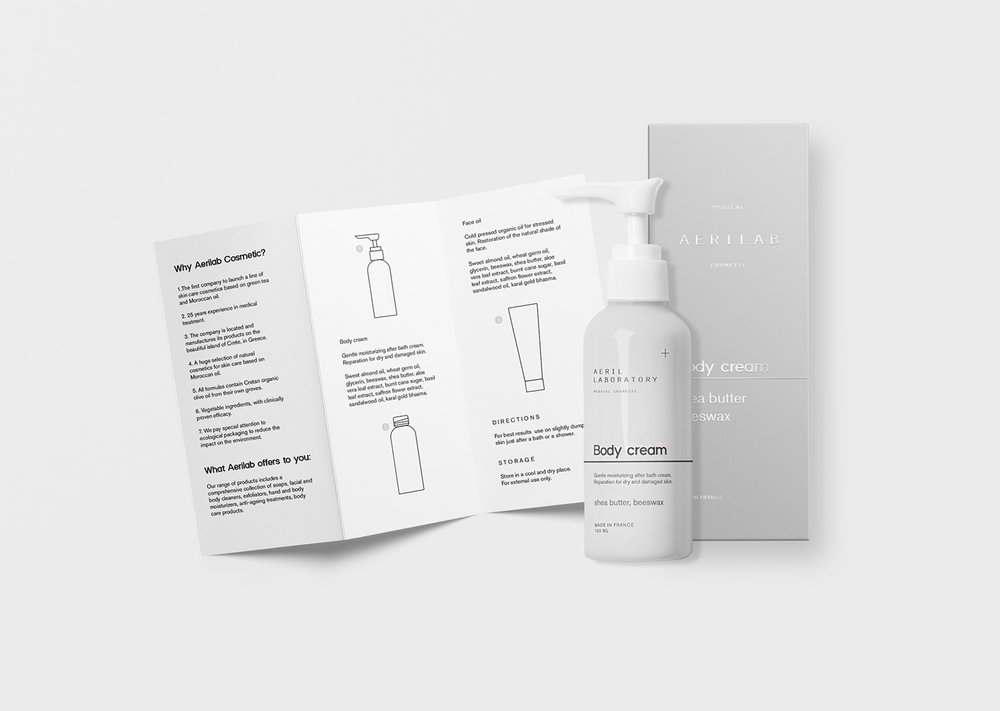
Were decided to show the complete care through design elements such as lines. They are symbolized the skincare stages. From the general – whole body, to the specific – under eye zone. First stage is the necessary main step, each next helps to improve skin on more deeper level. As a result, we have full product line with personal oriented approach.
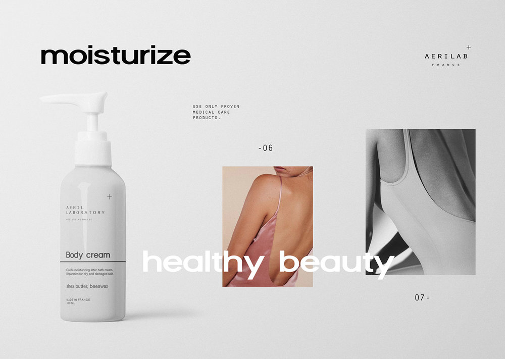
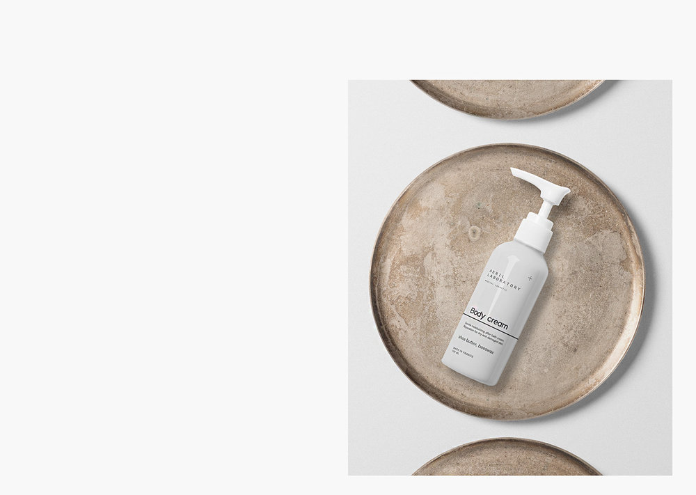
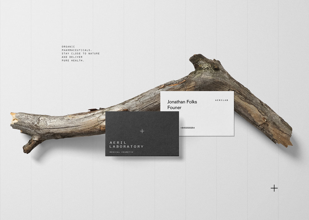
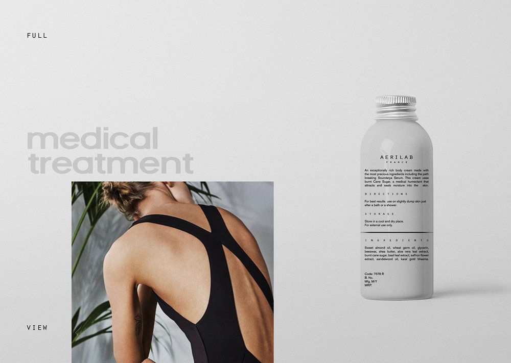
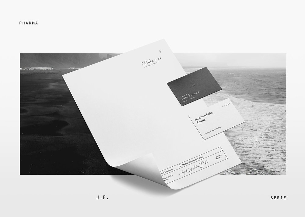
Also we did dynamic logotype which could be changed for any purpose. Aeril wanted to stay medical oriented but with a feel of fashion brand. To show young women that even medical care products could be on their everydaylife. In that case, we decided to use combination of bold strong fonts with modern chopped sans serif. To stay clean and healthy we used lots of white space and fresh images of nature and bright images connected to their main audience.
CREDIT
- Agency/Creative: Anastasia Dunaeva
- Article Title: Package Design for Cosmetic Brand Aerilab
- Project Type: Packaging
- Agency/Creative Country: Russia
- Market Region: Europe
- Format: Bottle, Jar, Tube
- Substrate: Plastic


