The challenge: Nestled in UNESCO World Heritage site Vega Islands, Øyhagen needed a brand identity that would do justice to their remarkable story. Operating from the idyllic Kvalholmen island, where human settlement dates back to the 1600s, they faced the complex task of translating their deep connection to nature into a contemporary visual language. Their challenge wasn’t just about creating an appealing brand — it was about capturing the essence of a place where tradition meets modern sensibility, where sustainable food production happens in harmony with nature, and where every product tells a story of heritage and craftsmanship.
The solution: Our journey began with intensive strategic work to understand the heart of Øyhagen’s mission. Through close collaboration, we developed a brand identity that speaks as much to their future vision as it does to their rich heritage.
At the strategic core, we positioned Øyhagen as ‘Modern Stewards of Tradition’ — a role that acknowledges their unique ability to preserve heritage while embracing contemporary approaches to working with nature. This positioning naturally evolved from their deep commitment to both skilled food production and environmental stewardship, captured in their vision: “In harmony with nature, for the future.” The visual identity grew organically from this foundation.
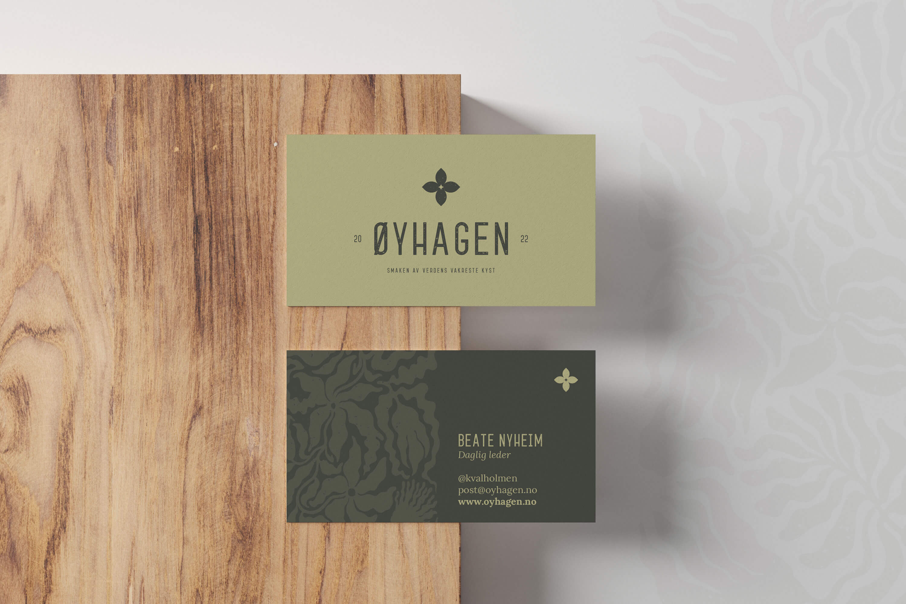
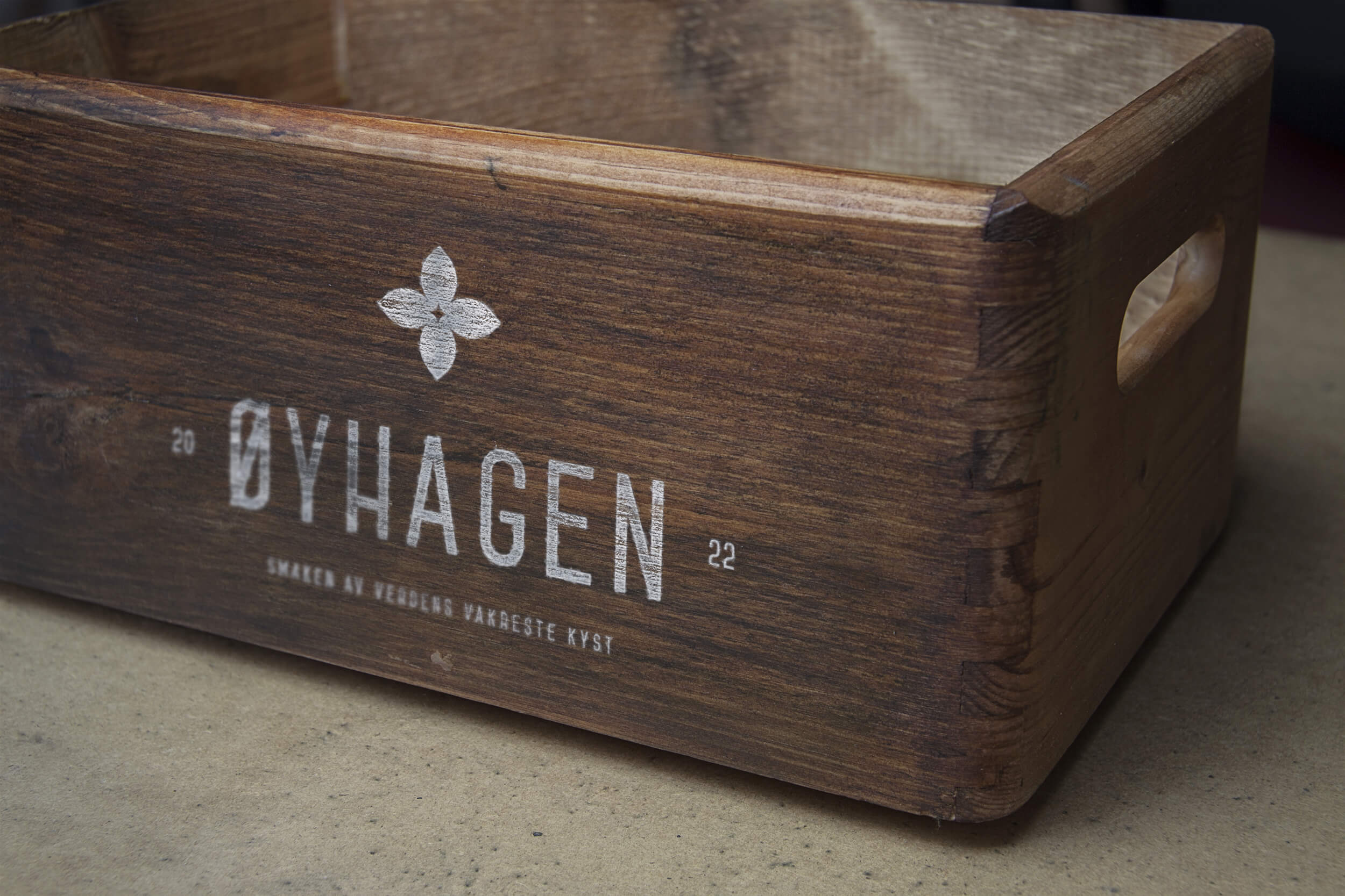
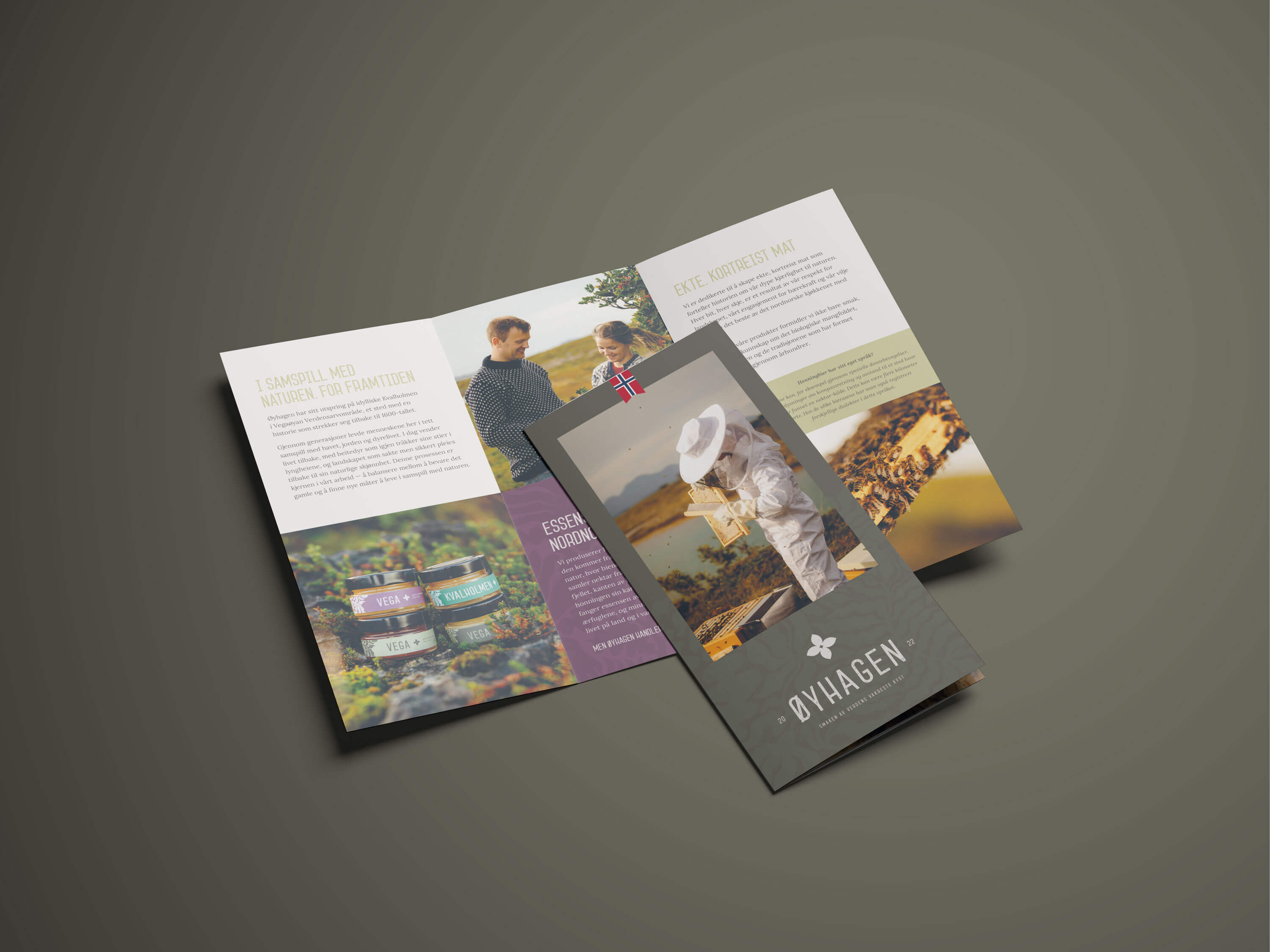
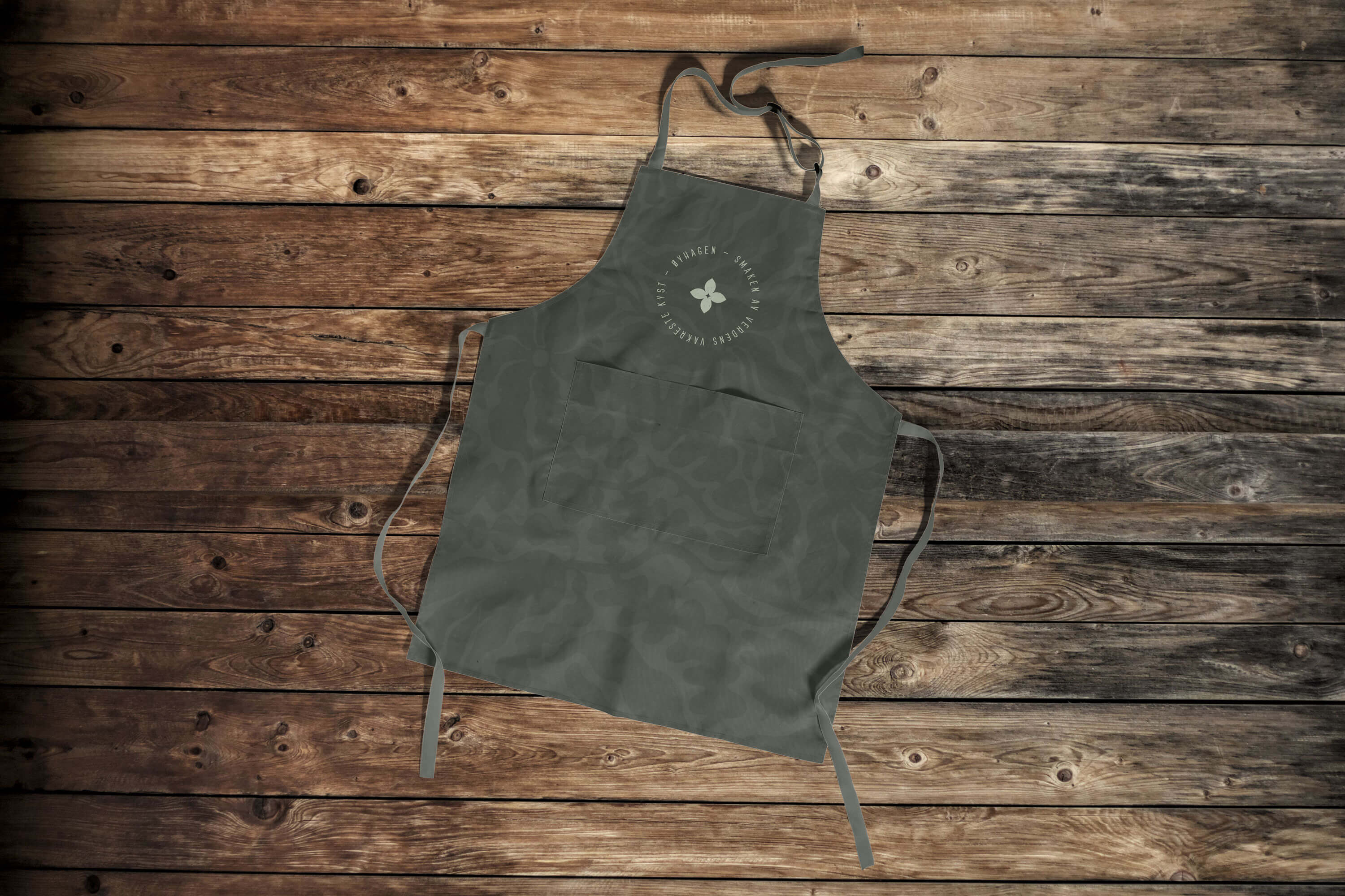
At its heart lies a thoughtfully crafted logo featuring a stylised Galium normanii flower — a plant found nowhere else in Norway but Vega. This clever use of local flora creates an immediate sense of place without falling into regional clichés.
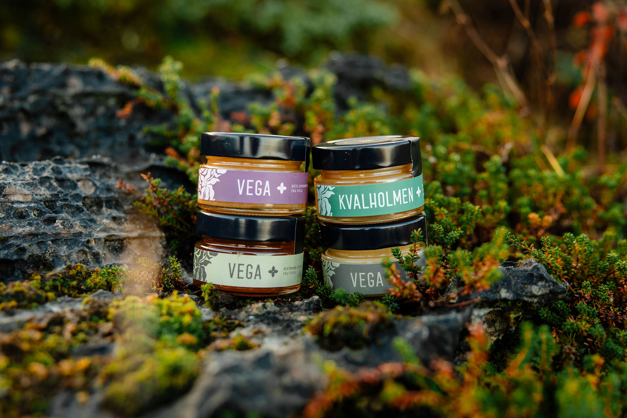
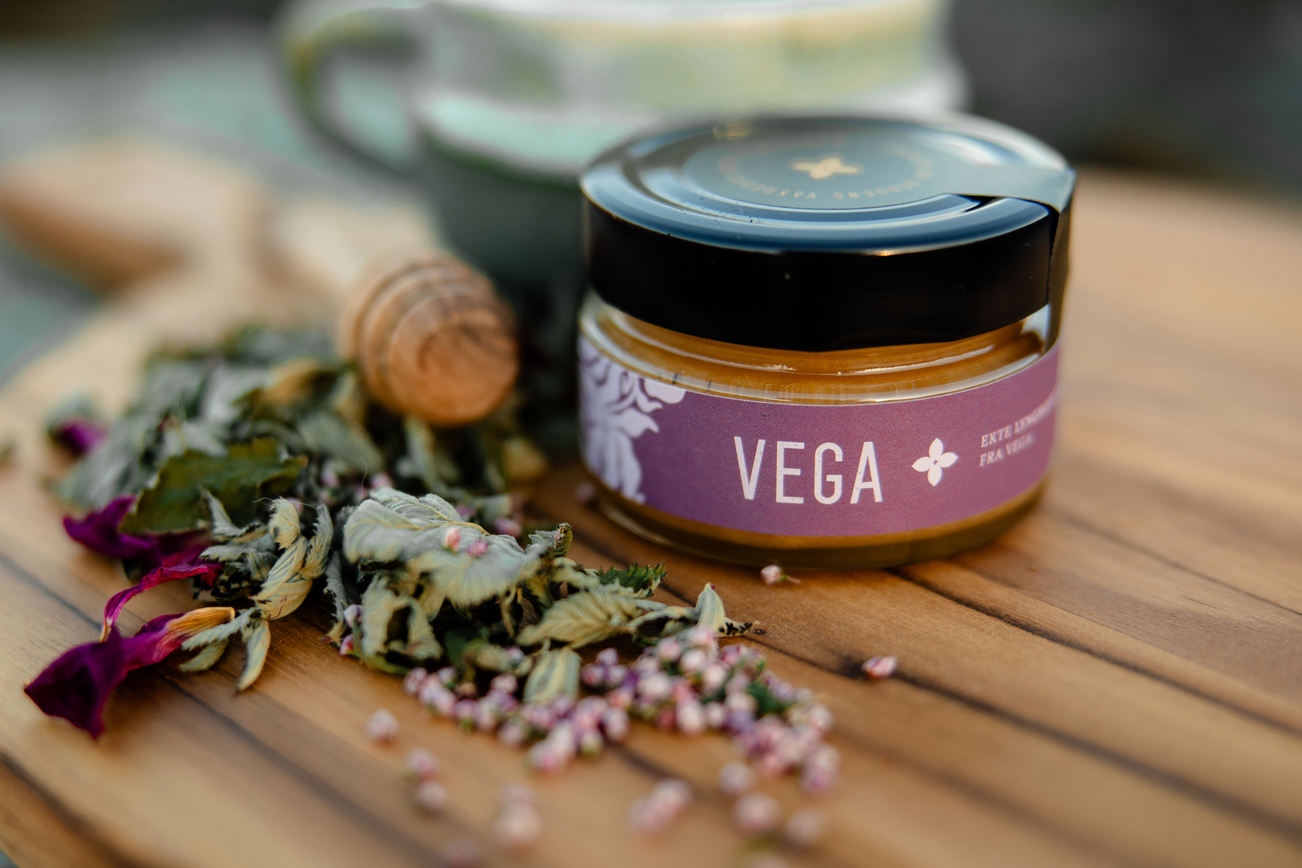
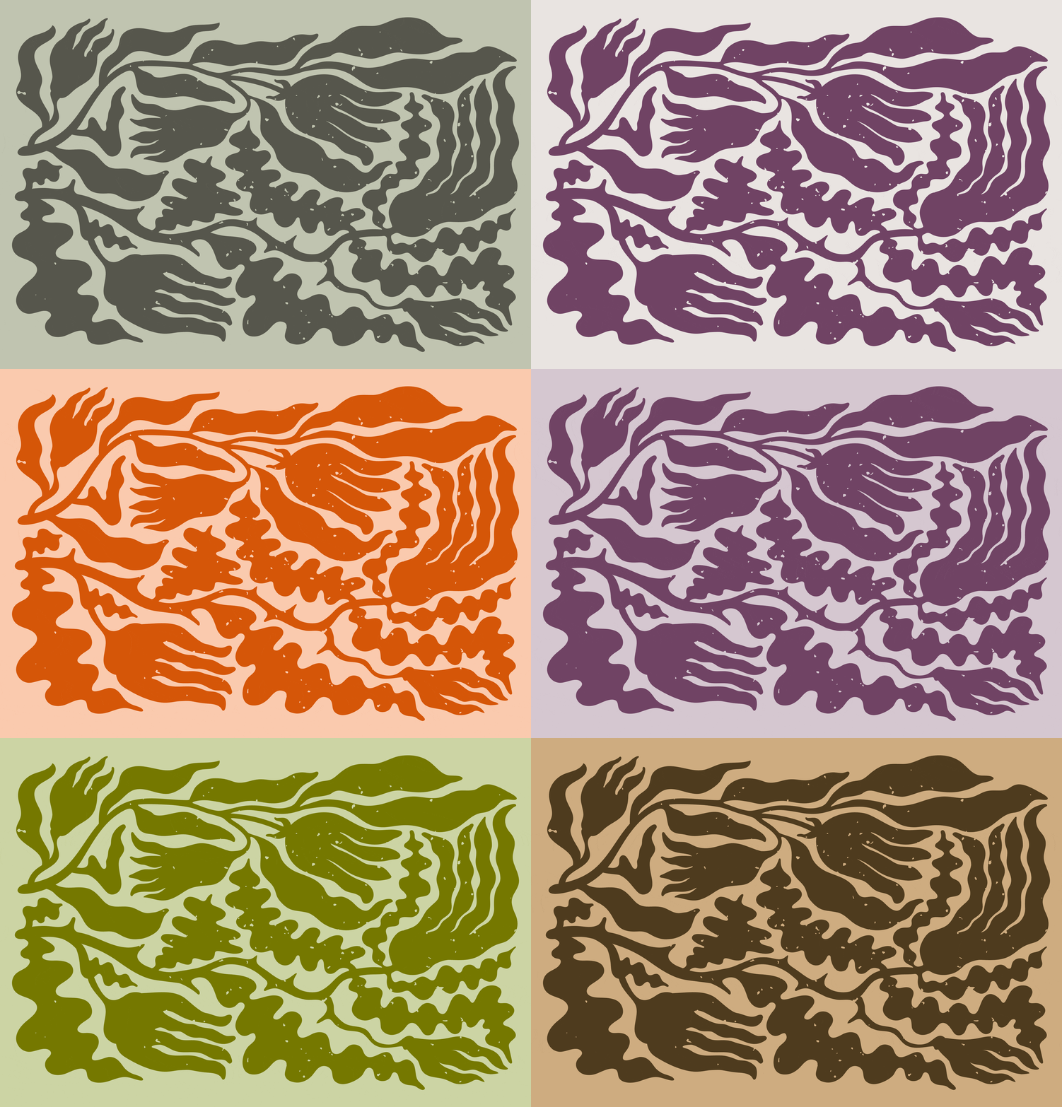
The colour palette draws directly from the landscape surrounding Øyhagen: the deep, warm grey of ancient bedrock; the muted green of summer meadows; the subtle grey-green reminiscent of eider ducks; and the gentle purple of heather in bloom. These colours work in harmony to ground the brand in its natural environment.
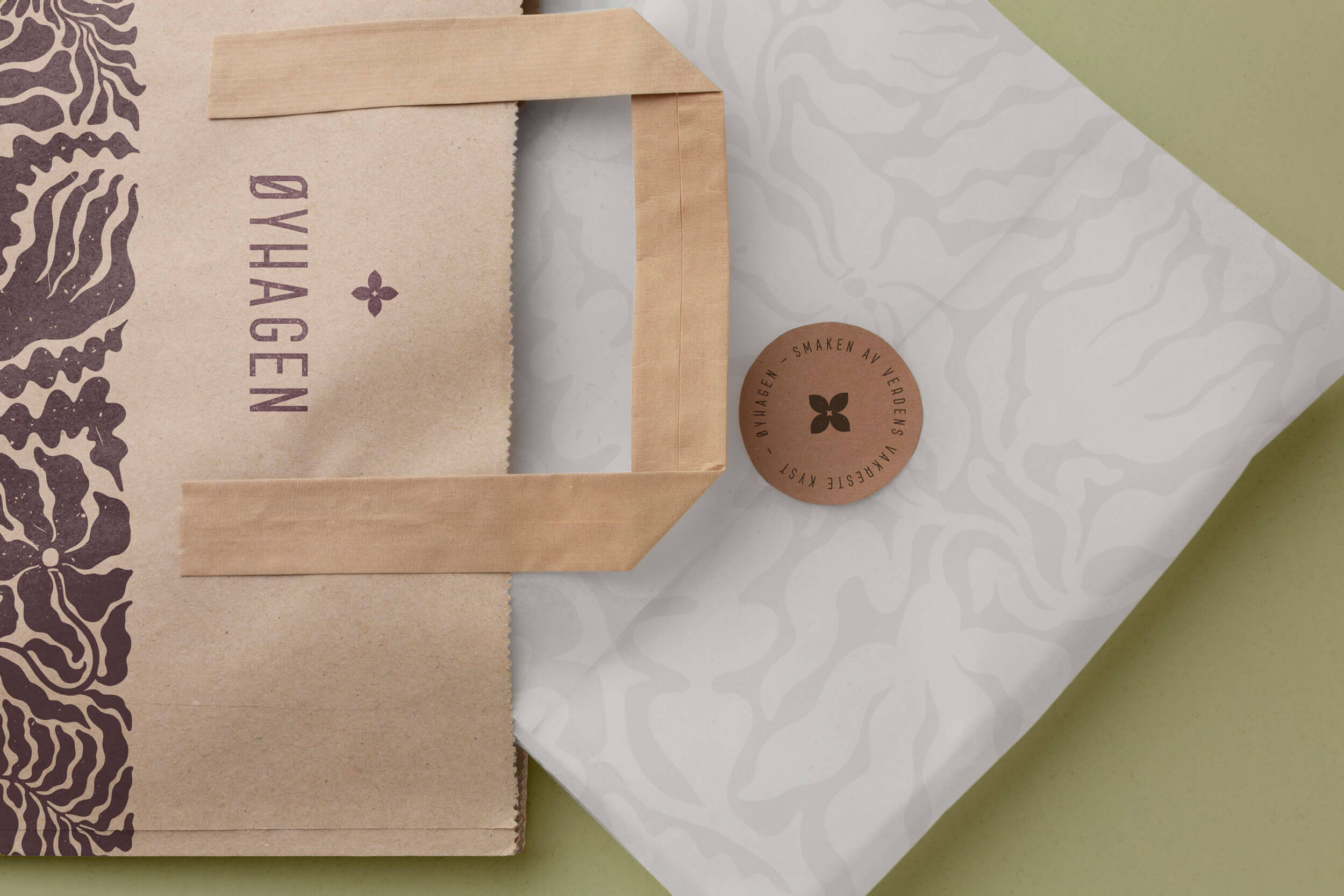
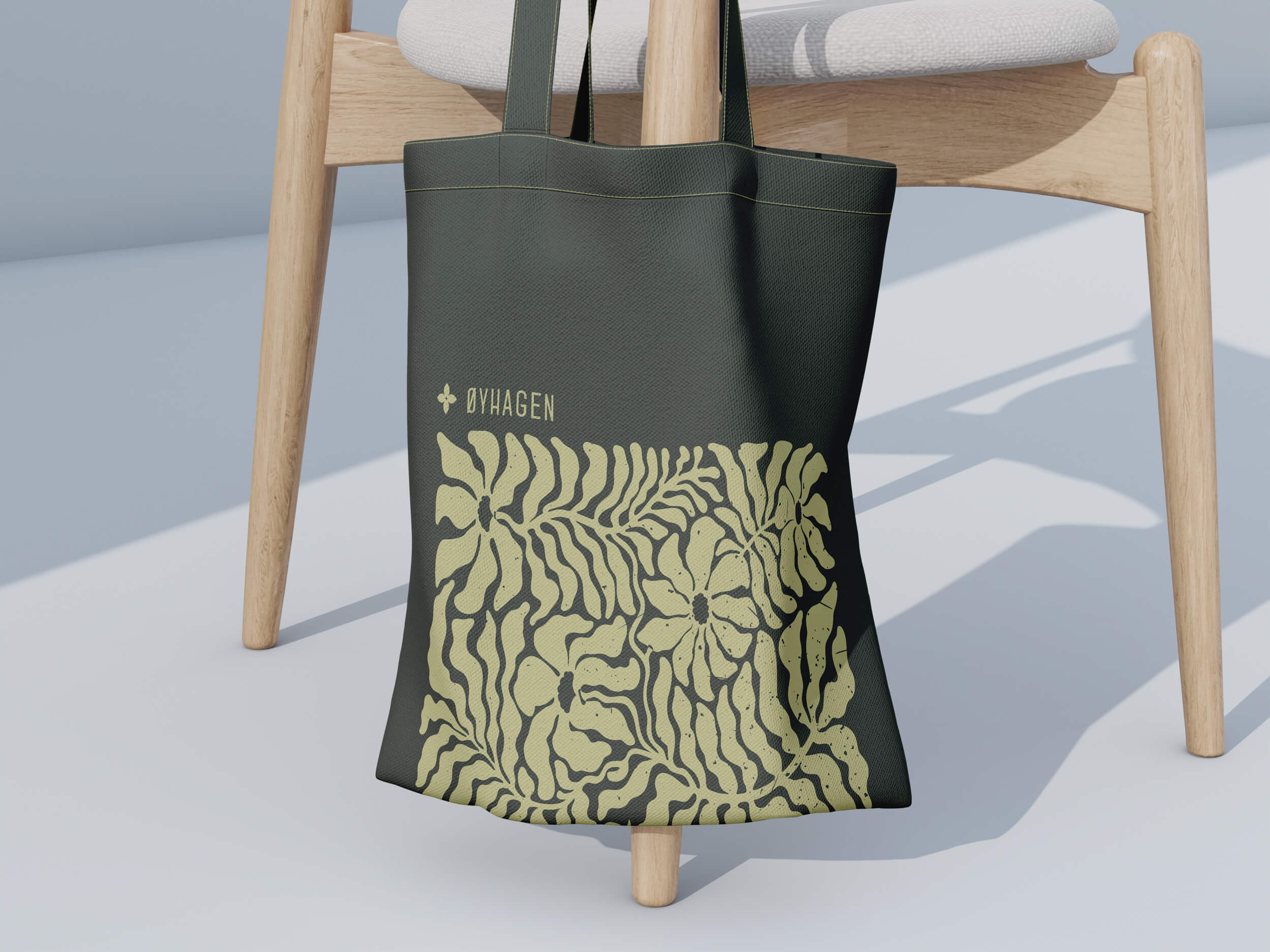
To complement these foundational elements, a semi-abstract brand pattern that weaves together multiple layers of Vega’s natural heritage.
The flowing, organic lines simultaneously evoke the island’s rich coastal flora and the gentle movement of seaweed in the ocean currents.
This intentionally ambiguous design creates a rustic yet sophisticated visual texture that works across applications — subtle enough to support the brand identity without overwhelming it, while adding a distinctive layer of storytelling that speaks to the archipelago’s unique position between land and sea.
Typography choices further reinforce this balance of heritage and modernity. For headlines, we selected Jameson SS Press, a rustic and compact sans serif that speaks to craftsmanship without feeling outdated. This is complemented by Lora, a modern serif with calligraphic roots, used for body text across both digital and printed materials.
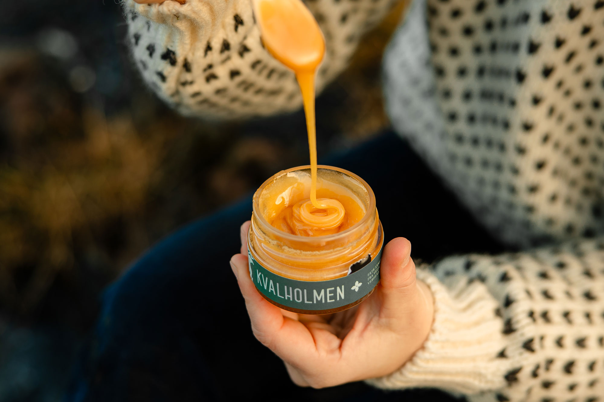
The impact: The new identity has transformed how Øyhagen presents itself to the world. It’s particularly evident in how they showcase their signature product — honey produced by bees that forage in the midnight sun, creating a taste that captures the essence of Nordic nature.
We then brought this identity to life across a cohesive packaging system and a simple yet evocative website, ensuring that every touchpoint reinforces their tagline: “The taste of the world’s most beautiful coast.”
Their brand now resonates deeply with their target audience — well-established, nature-conscious consumers who seek out sustainable, locally-produced food and value authentic experiences. These customers don’t just see Øyhagen as another food producer; they recognise them as custodians of both cultural heritage and natural resources.
Beyond aesthetics, the identity system provides Øyhagen with a flexible framework for growth. As they continue to expand their product range and reach new markets, their brand maintains its ability to tell the story of a unique place where traditional wisdom meets contemporary sustainability practices.
Most importantly, the brand now authentically represents Øyhagen’s mission to share their knowledge and love for nature through the flavours of Vega. It’s more than just a visual identity — it’s a testament to their approach as modern stewards of tradition, preserving and sharing the heritage of their remarkable corner of Norway.
Credit where credit is due: the brand and product photography by Marte Stormyr / Don’t be Negative truly complements and adds the final touch to this brand identity. Thanks also to the team at Digital Etikett, for top notch service and quality as always!
CREDIT
- Agency/Creative: Petchy
- Article Title: Øyhagen Strategic Brand Design by Petchy: Crafting the Taste of Norway’s Heritage Coast
- Organisation/Entity: Freelance
- Project Type: Identity
- Project Status: Published
- Agency/Creative Country: Norway
- Agency/Creative City: Kristiansund
- Market Region: Europe
- Project Deliverables: Brand Creation, Brand Design, Brand Guidelines, Brand Identity, Brand Strategy, Graphic Design, Logo Design, Packaging Design, Web Design
- Industry: Agriculture
- Keywords: branding, brand identity, brand strategy, logo design, web design, packaging design, print design, beekeeping, local produce, tourism, food, agriculture
-
Credits:
Strategic Brand Consultant & Creative Director: Solveig Petch
Brand Photographer: Marte Stormyr | Don't be Negative
Client: Øyhagen
Label Printing Company: Digital Etikett


