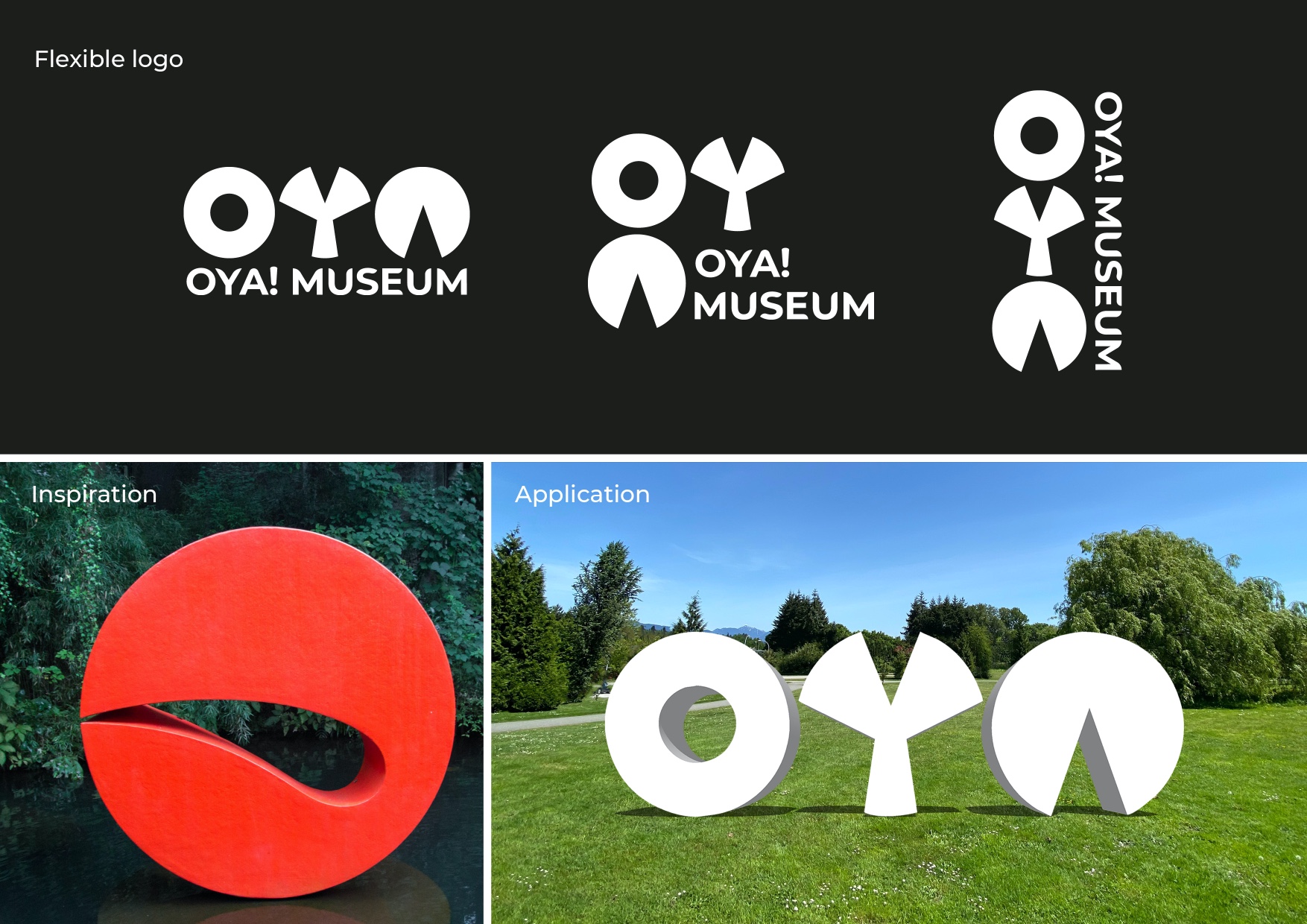
The OYA! Museum is the rebranding of the Hakone Open Air Museum (Japan) where the unexpected awaits!
The Hakone Open Air Museum is a must see-attraction in Japan, a world-class open-air gallery (with more than 120 sculptures across 70.000 square meters of wonderful garden). During the research phase (before I even looked at the current branding of the museum) I looked at visitor reviews and 2 key components appeared to be recurrent: it’s a very family friendly museum where children can even play with the sculptures and you never know what you will discover around the corner. Unfortunately the branding of the museum were not conveying those fundamentals aspects so I decided the develop and design a playful and intriguing new identify.
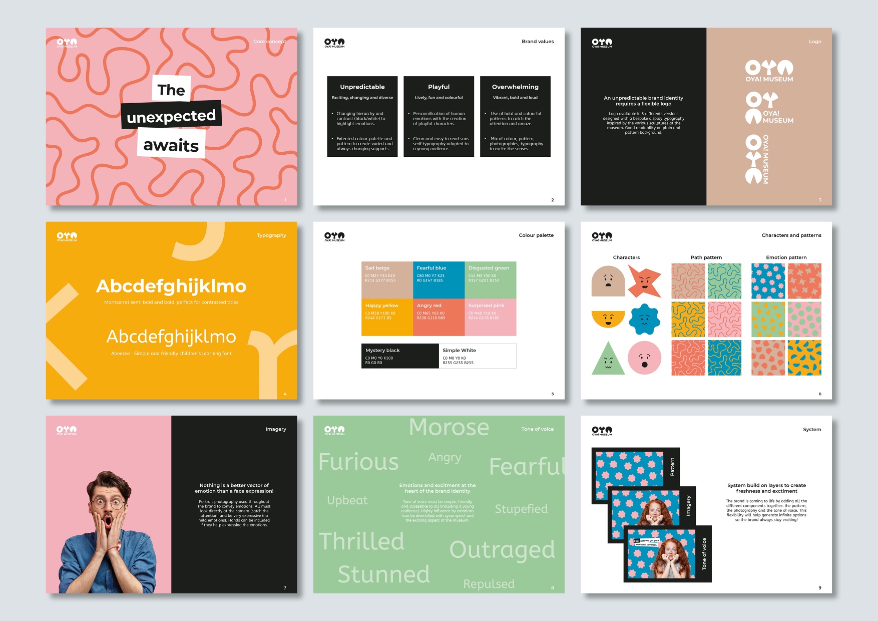
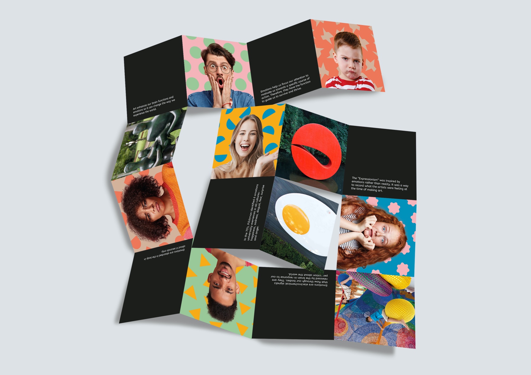
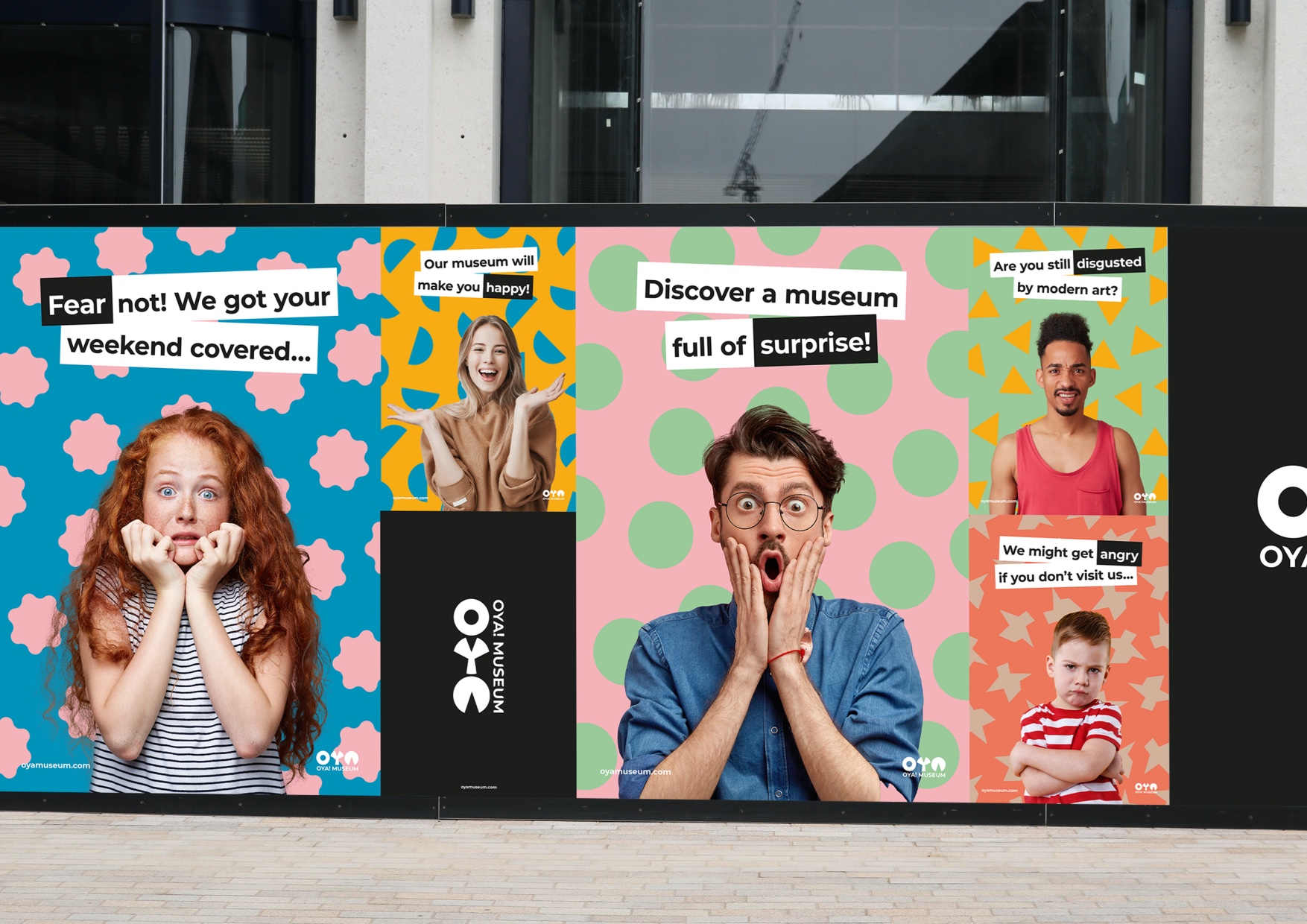
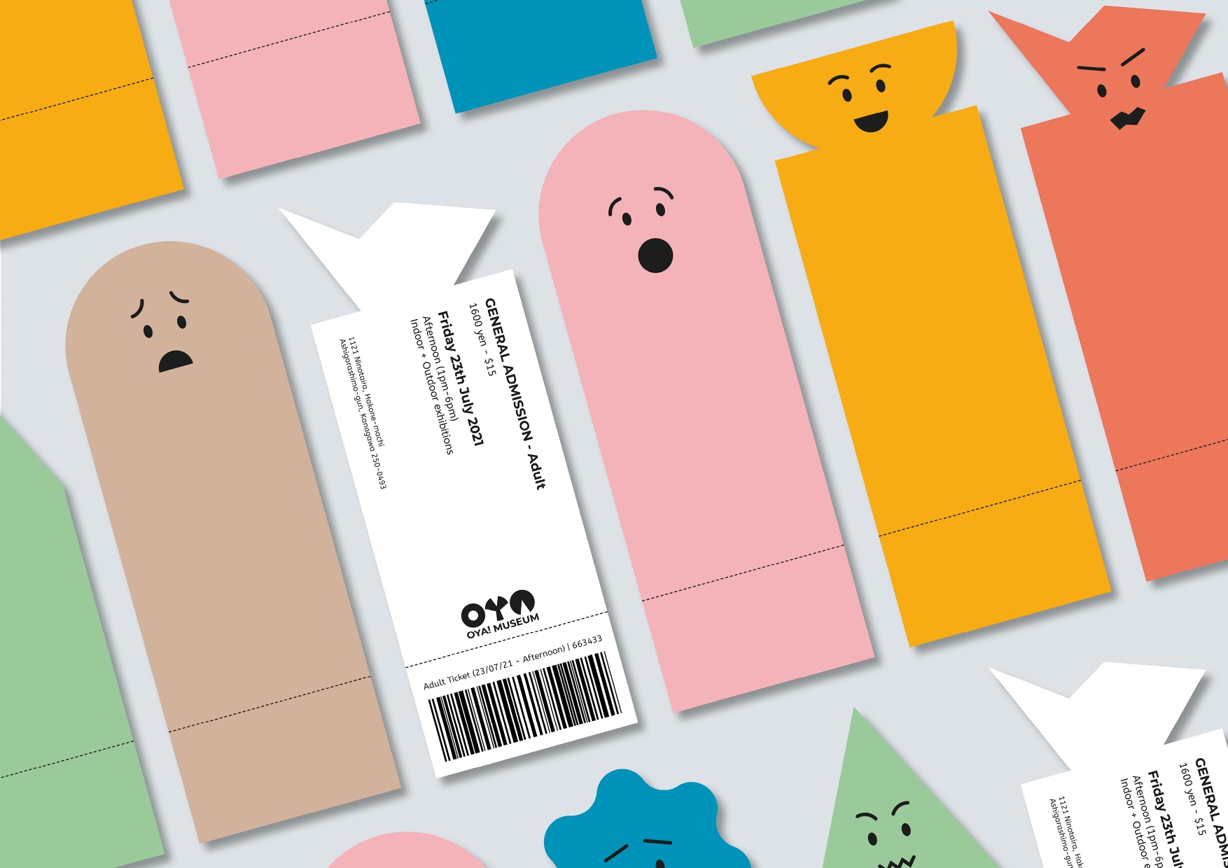
I based my concept around the 6 universal human emotions studied by the anthropologist Paul Ekman in the 1970s: anger, fear, surprise, disgust, happiness and sadness. Indeed, when visiting the museum and discovering unexpected sculptures, visitors will inevitable experience at least one of those emotions. In order to appeal to family and children, I have developed a system of colours and shapes to personified each emotion supported by a playful tone of voice (cf. brand guideline).
OYA! Museum, the new name adopted for this rebranding has been inspired by some of the sculptures at the museum and means “Oh” (like when you are surprised) in Japanese. The round shape of the bespoke font create for this logo makes it extremely fexlible and modular which has been perfect to use in on various supports (print, digital and environmental).
In order to make it extremely children friendly, Montserrat and Abeezee (children learning fonts) have been selected from readability perspective and because the curves of those sans-serif convey a caring yet playful spirit.
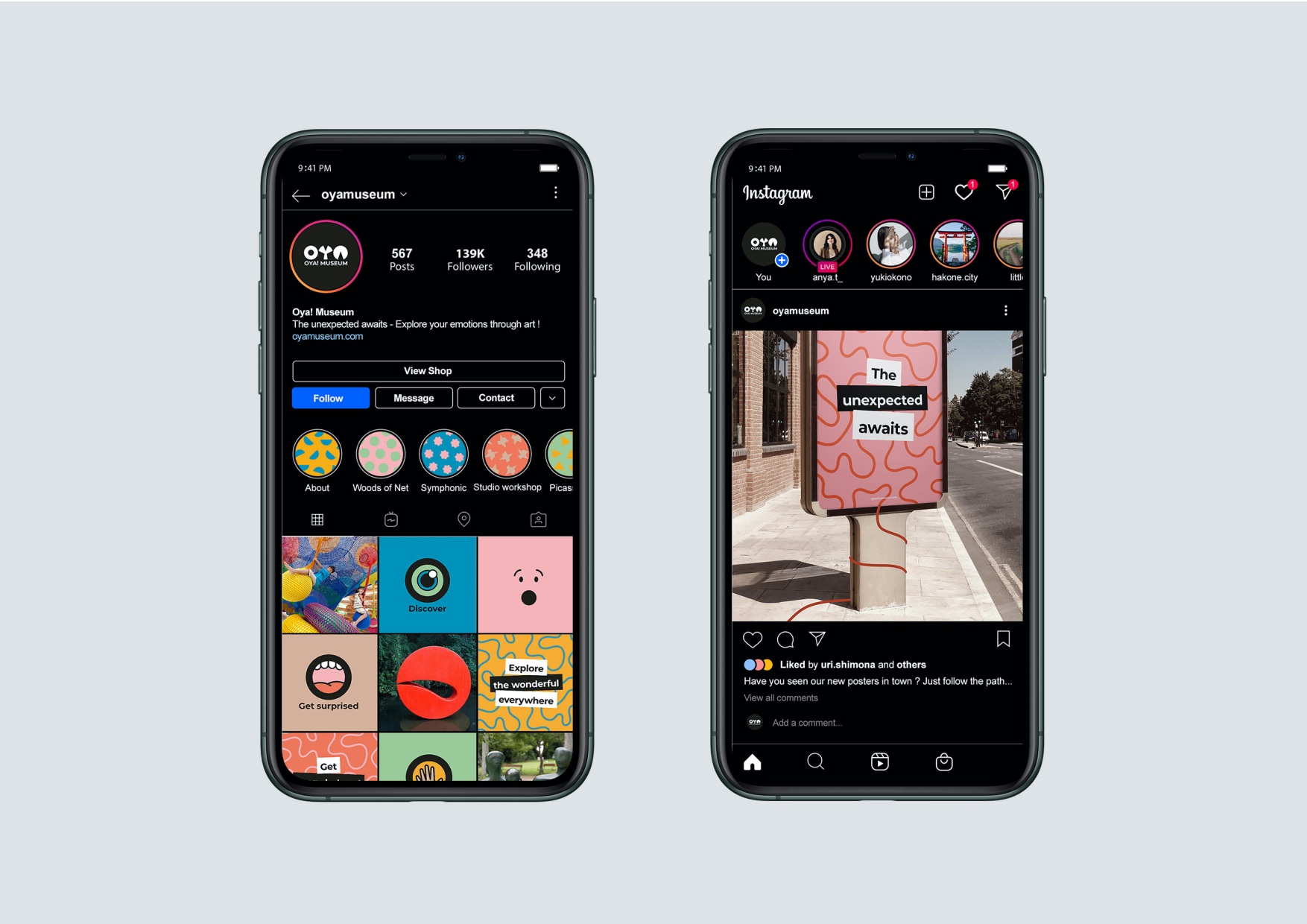
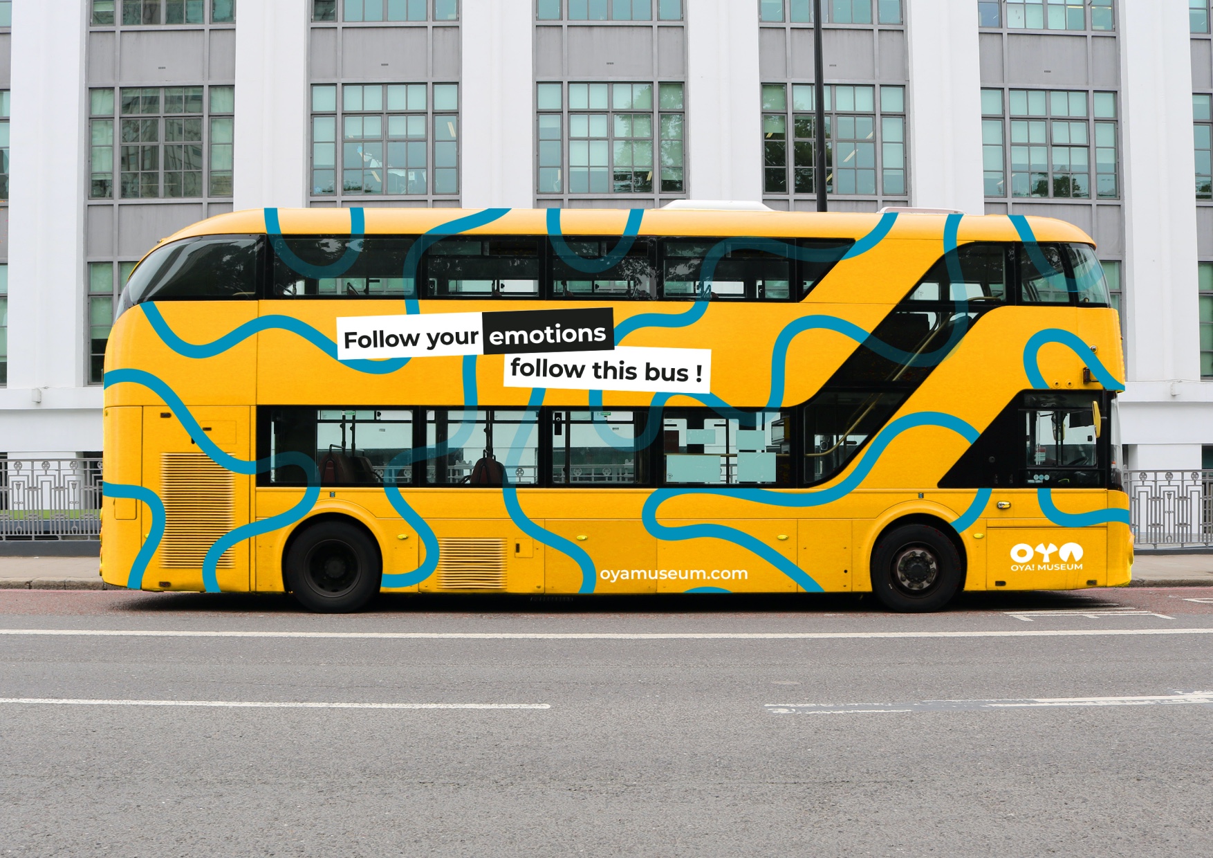
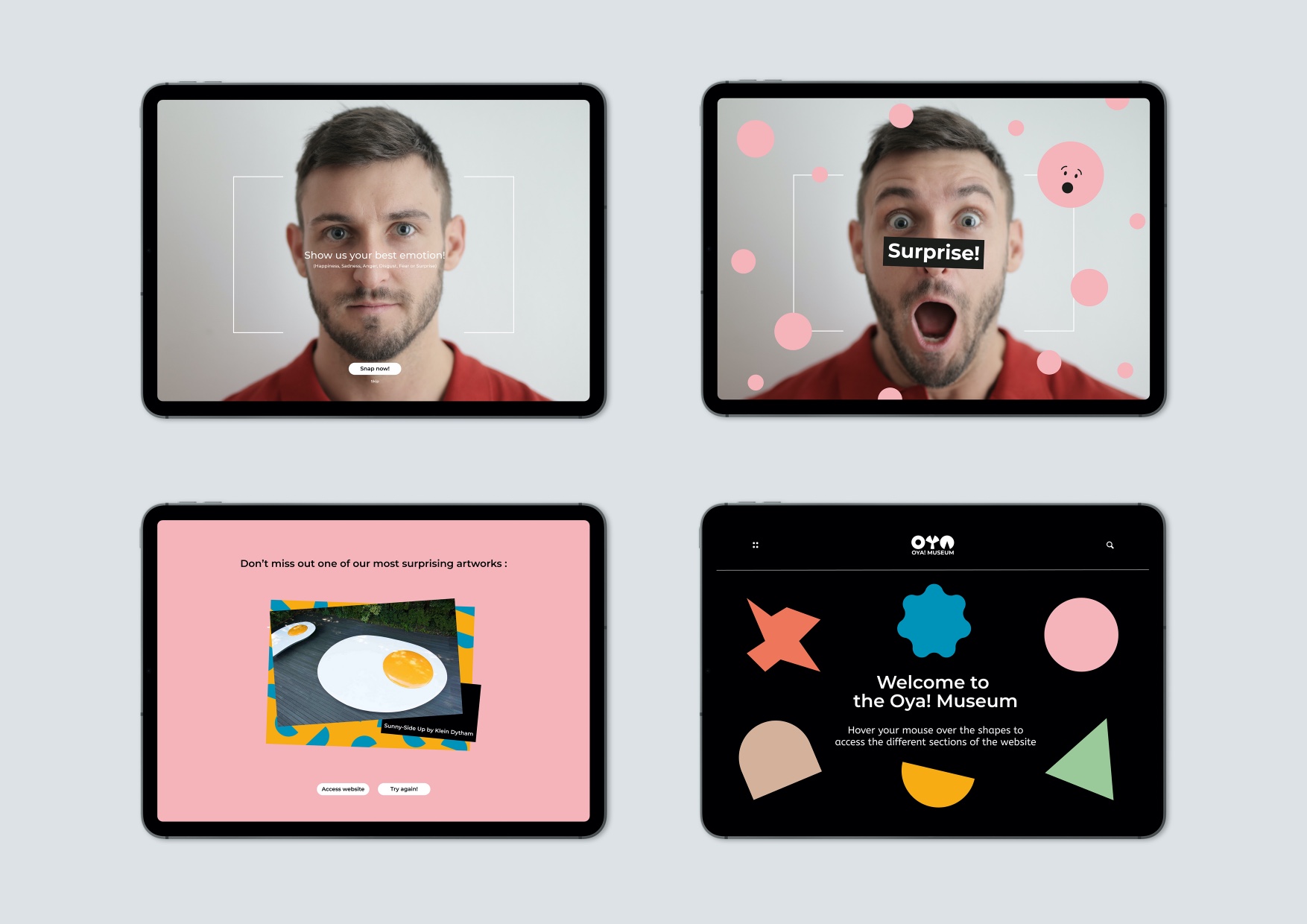
For this rebranding, various touch points have been considered: teasing and marketing campaign (with posters, billboards, buses and invastion of the “emotions” in town), traditional museum elements (website, tickets, wayfinding) and some environmental ones specific to the concept (spinning wheel so visitors don’t have to start in an expected way, emotion boards to share how they feel about sculptures and spark conversations).
CREDIT
- Agency/Creative: Marion Le Peutrec
- Article Title: OYA! Museum Rebranding by Marion Le Peutrec
- Organisation/Entity: Student
- Project Type: Identity
- Project Status: Non Published
- Agency/Creative Country: United Kingdom
- Agency/Creative City: Witham
- Market Region: Global
- Project Deliverables: Brand Design, Brand Identity, Graphic Design
- Industry: Entertainment
- Keywords: WBDS Student Design Awards 2021/22
-
Credits:
Educational Institution Name: Shillington Education
Educator's Name: George Simkin


