


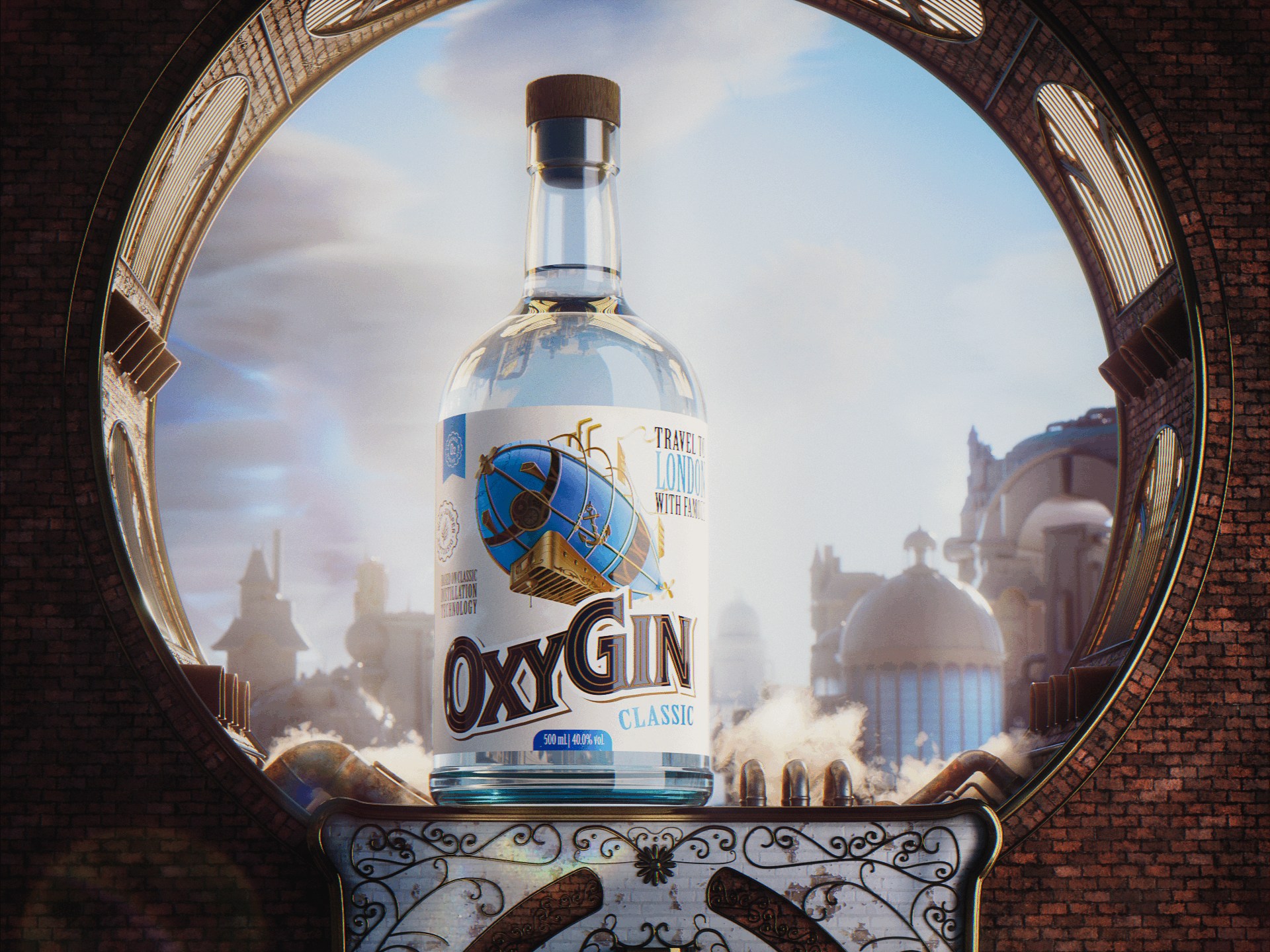
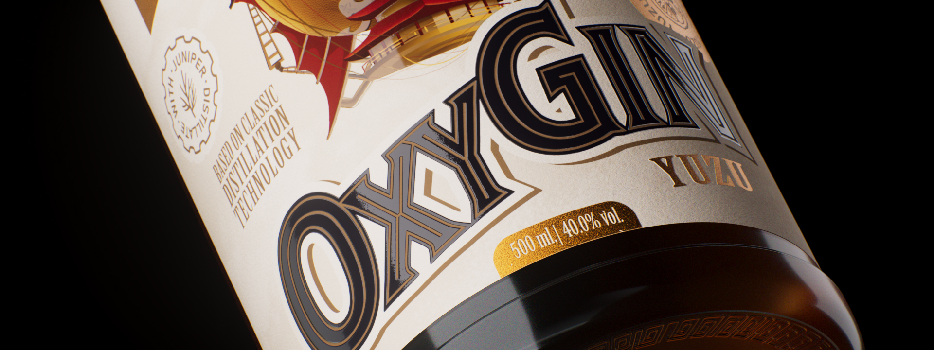
Lightness and drinkability are one of the main characteristics of this brand new gin. The name OxyGin hints at the main functional feature of the drink — during the production process, this gin is precisely enriched with oxygen, so the finished product, on the one hand, retains the bright juniper aroma and bitterness familiar to gin, and on the other hand, it is easy to drink and OxyGin has a unique mild taste profile.
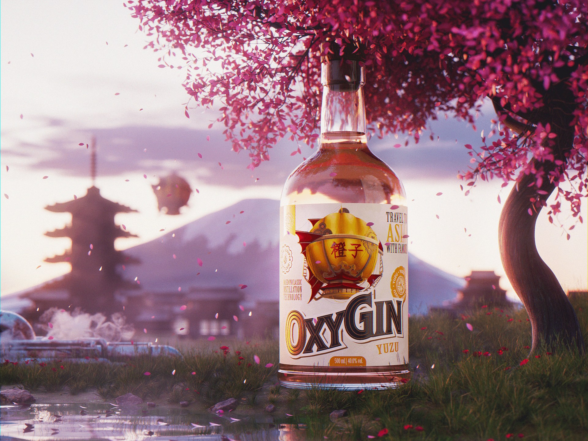
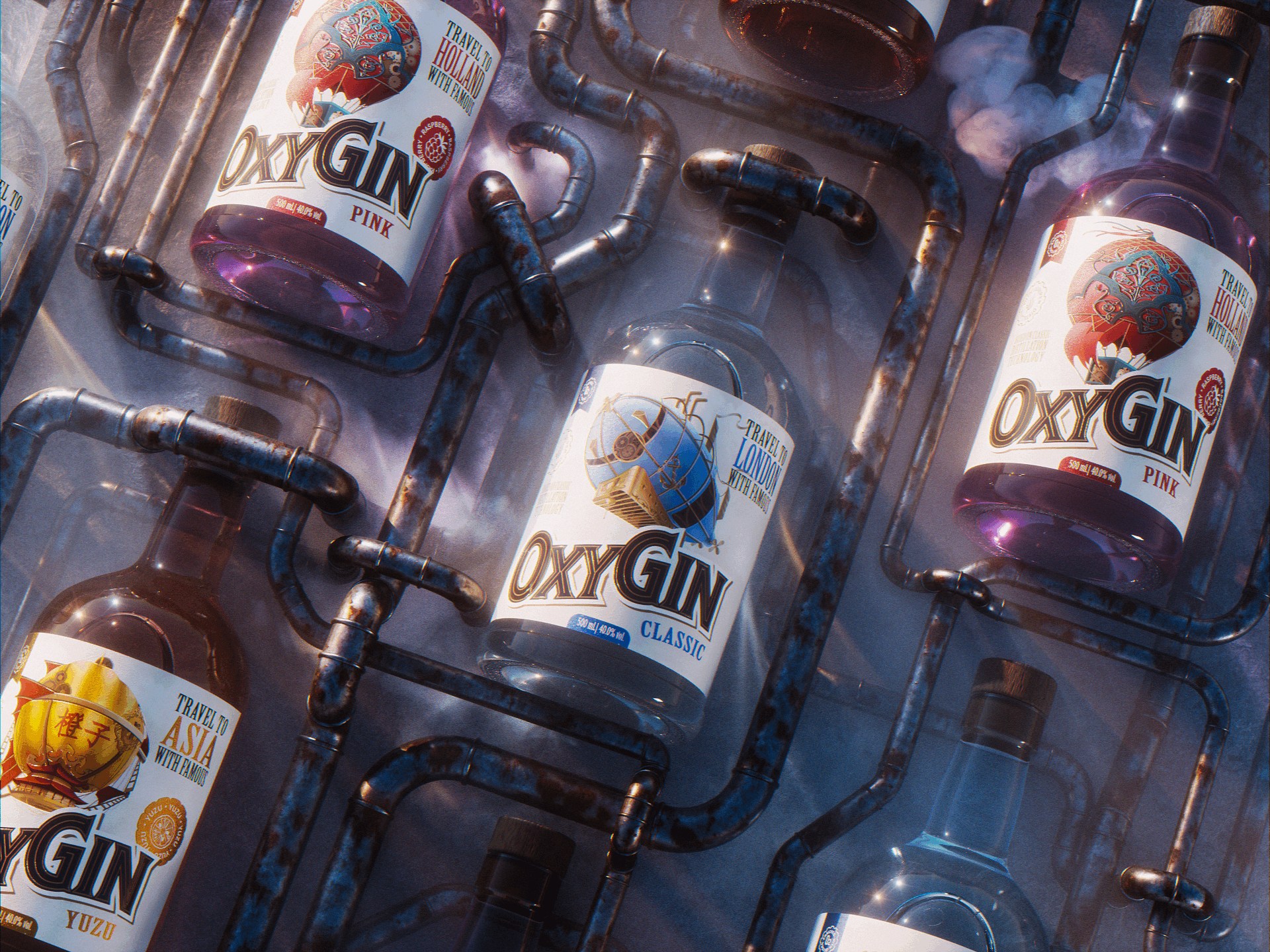
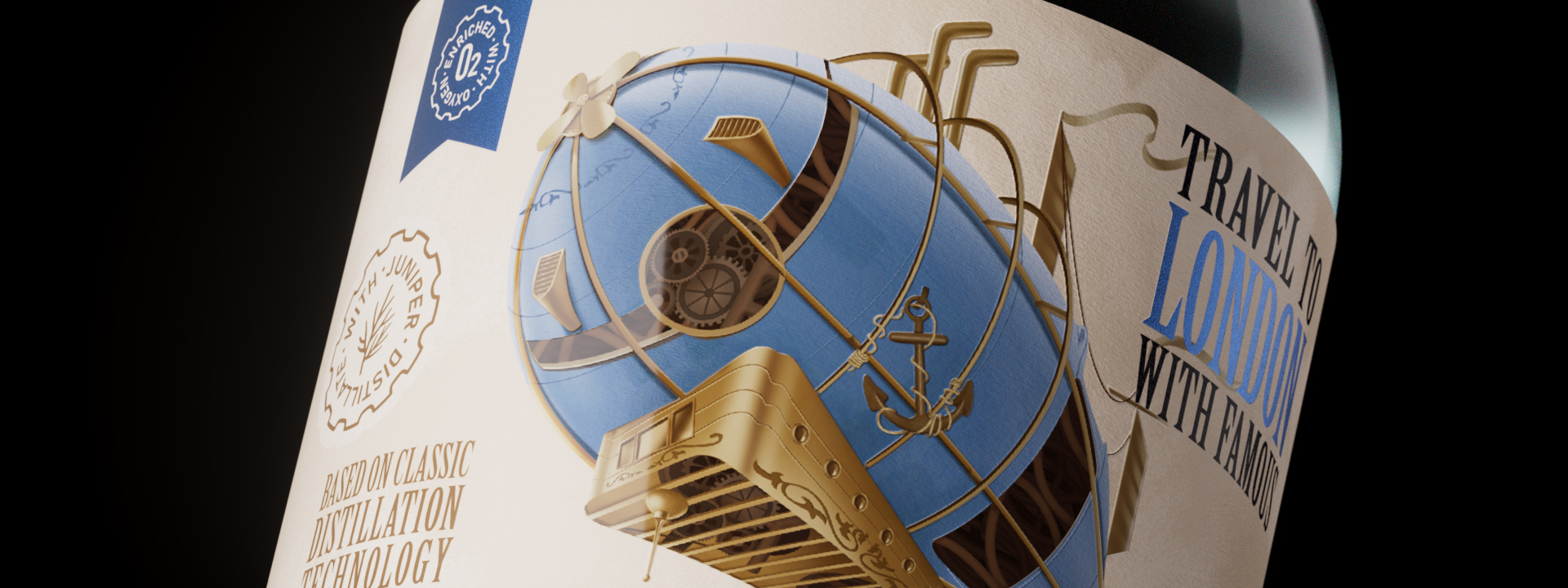
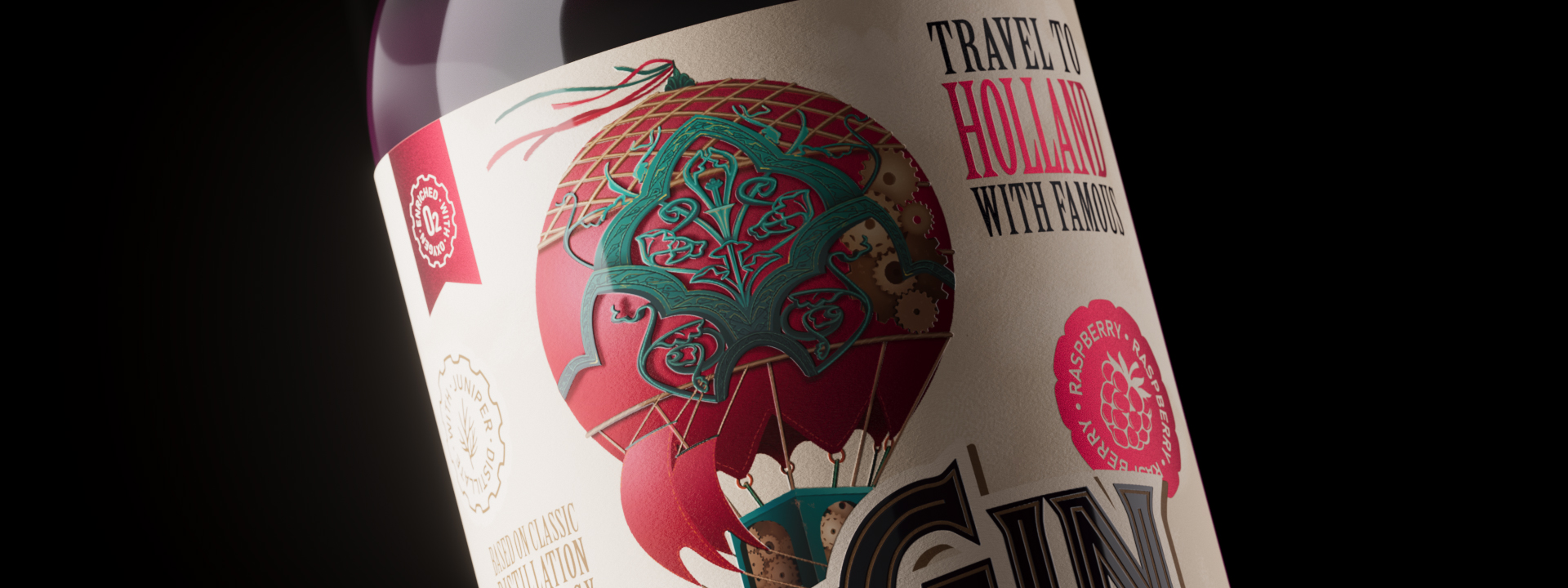
The design concept is built on the aesthetics of Victorian steampunk, which allowed us to tie together the most English of drinks, build a clear system for differentiating diverse SKUs and emphasize the idea of travelling on an airship. Why airships and balloons? This is a fairly typical steampunk type of transport, and the main visual marker is a huge dome filled with air, which underlines the name and once again — tells us about the lightness of the drink. In addition to the classic gin on a flight to London, you can head East and try a Yuzu gin or signature pink raspberry gin as the balloon floats gently into the sunset.
The depictions of airships reflect different directions that are best associated with taste. Here, a gradation is deliberately made by cities, countries and entire regions, so that in the future it would be possible to expand the line by several more products. The balloons themselves mimic one of the cultures, for example, the yuzu gin is represented by an Asian-style balloon, which in its shape and design resembles a traditional Chinese lantern. The European classic gin is represented by the classic zeppelin, which would most appropriately look in the sky over London.
In total, there are three tastes in the line now, but the concept itself suggests that further tastes can develop in other geographical directions. This opens up opportunities for seasonal branding as well, a brand can quickly bring a new gin to market with a new look and switch to other products just as quickly.
CREDIT
- Agency/Creative: PG Branding
- Article Title: OxyGin Label Design by PG Branding
- Organisation/Entity: Agency
- Project Type: Packaging
- Project Status: Published
- Agency/Creative Country: Poland
- Agency/Creative City: Warsaw
- Market Region: Europe
- Project Deliverables: 3D Modelling, Branding, Illustration, Packaging Design
- Format: Bottle
- Substrate: Glass Bottle
- Industry: Food/Beverage
- Keywords: gin steampunk packaging design
-
Credits:
u0421reative director: Dzianis Valianski


