“Overdrive: Experimental Graphic Design Exhibition” is a cutting-edge showcase that delves into the avant-garde realm of graphic design, where the traditional boundaries of aesthetics, typography, and composition are boldly reimagined. The exhibition, hypothetical in nature, is a tribute to the relentless pursuit of innovation and the breakaway from convention that marks the ever-evolving landscape of graphic design.
Spanning a series of five dynamic posters, the visual narrative of “Overdrive” is a vivid display of experimental typography, abstract graphics, and daring layouts. Each poster, while sharing a cohesive thematic thread, ventures into a unique stylistic territory, reflecting the diverse approaches of the featured designers. The exhibition honors the works of visionary figures such as Moonsick Gang, Phillip Kim, Wolfgang Weingart, April Greiman, David Carson, and Tyrone Drake, whose contributions have propelled the field of graphic design into new, uncharted territories.
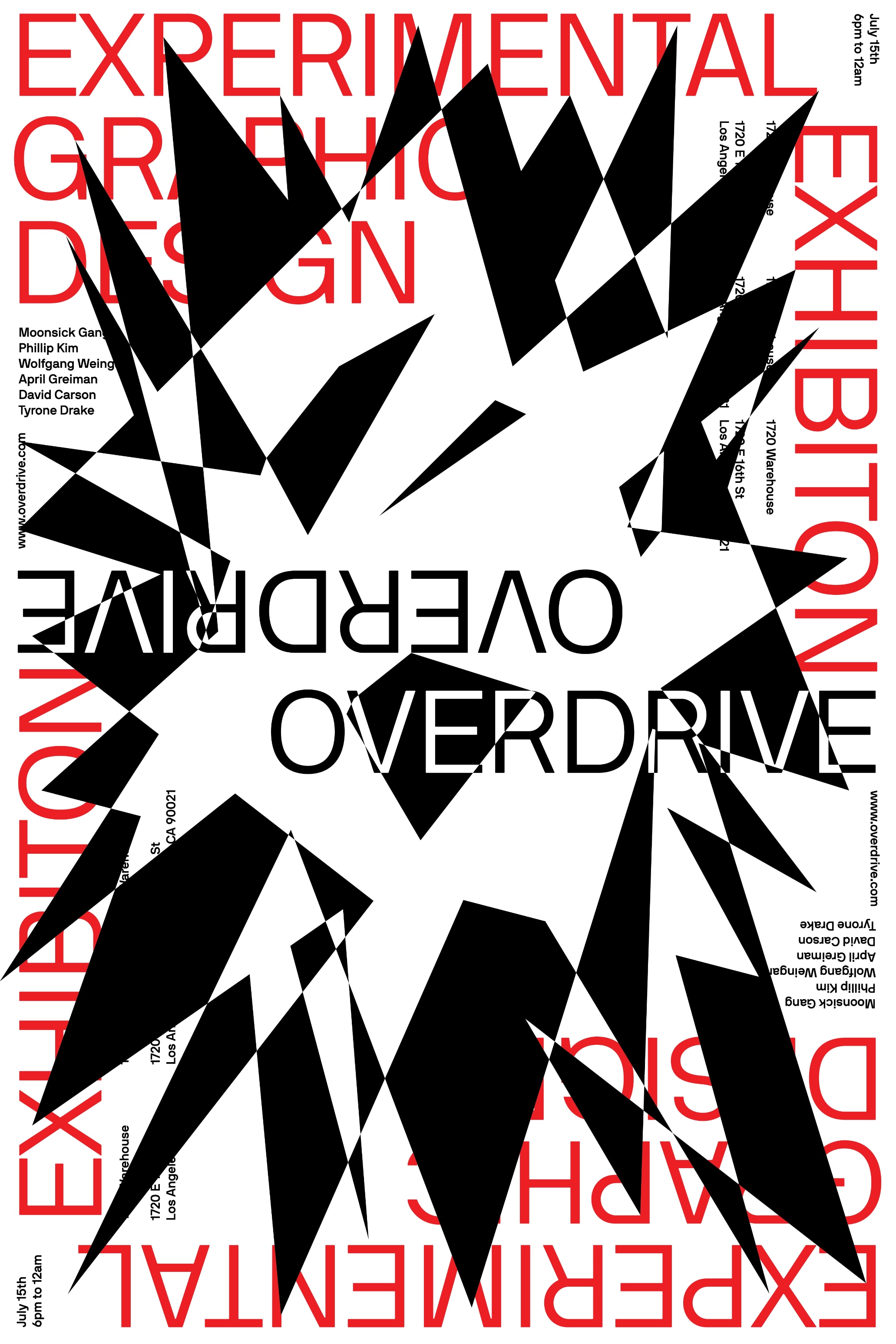
The first poster in the series sets the tone with its stark black and white contrasts punctuated by bold, red text, creating a visual explosion that mirrors the disruptive nature of experimental design. The fragmented typography and chaotic alignment challenge the viewer’s perception, pushing the limits of legibility and composition.
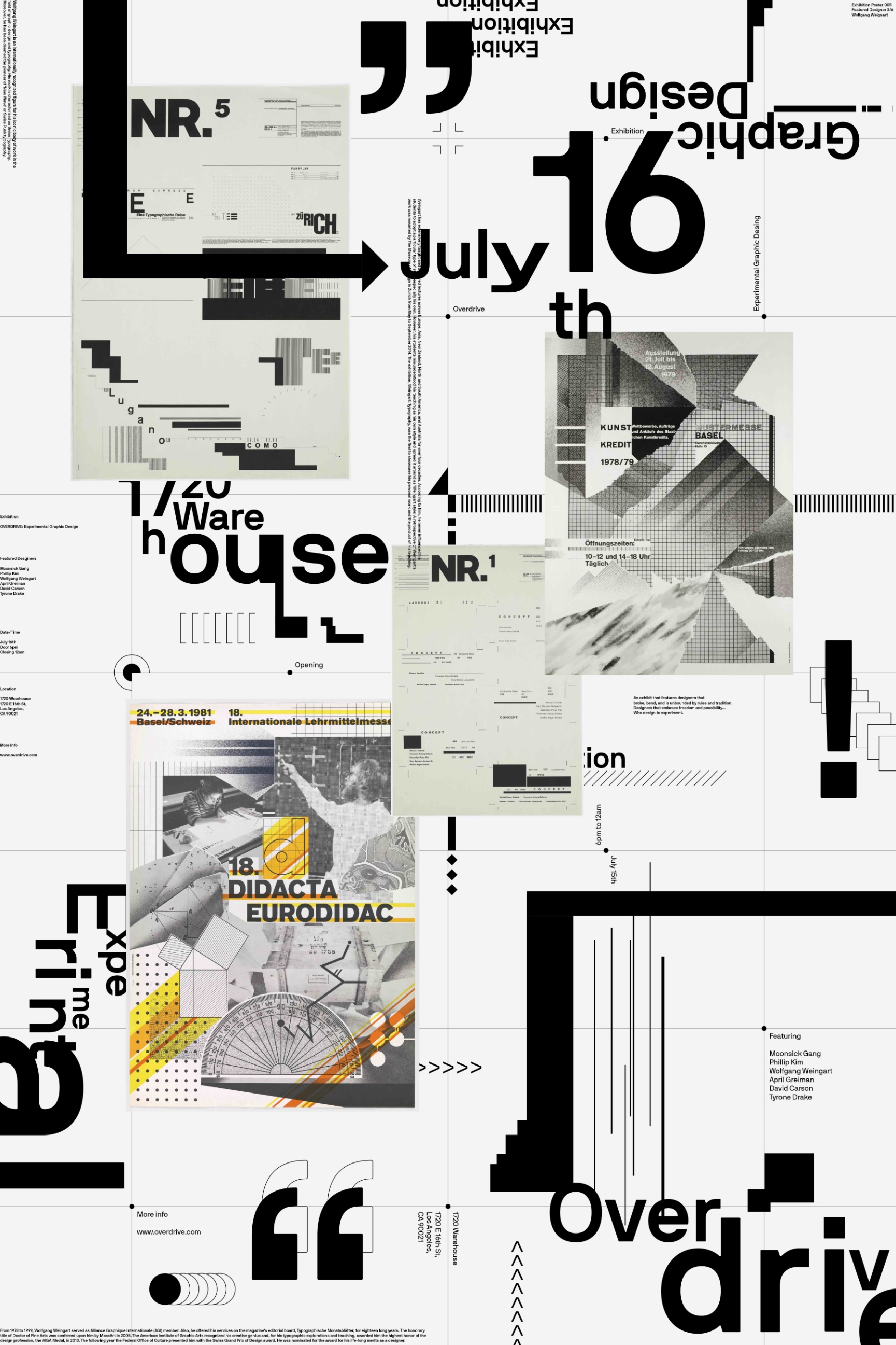
Transitioning to the second poster, the grayscale palette is maintained, but the introduction of varying textures and overlays of graphical elements suggests a layering that mimics the complex process of design evolution. Each layer can be seen as a metaphor for the historical progression and accumulation of design principles that these contemporary works build upon and, simultaneously, deconstruct.
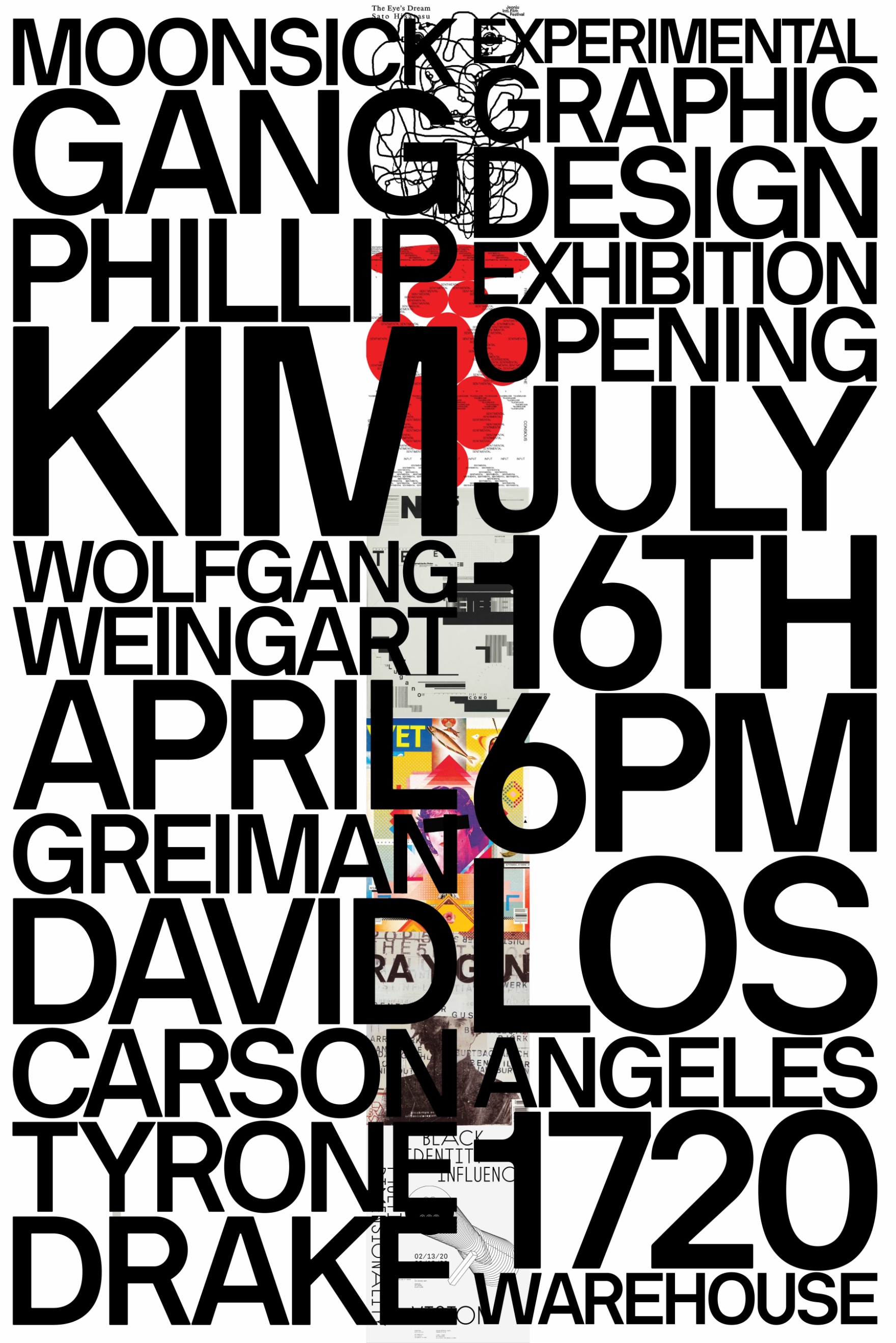
The third poster is a collage of images and typography, a cacophony of color and form that captures the eclectic and often unpredictable nature of experimental design. It is a visual representation of the idea that design does not exist in a vacuum but is a reflection of the cultural and societal milieu from which it springs.
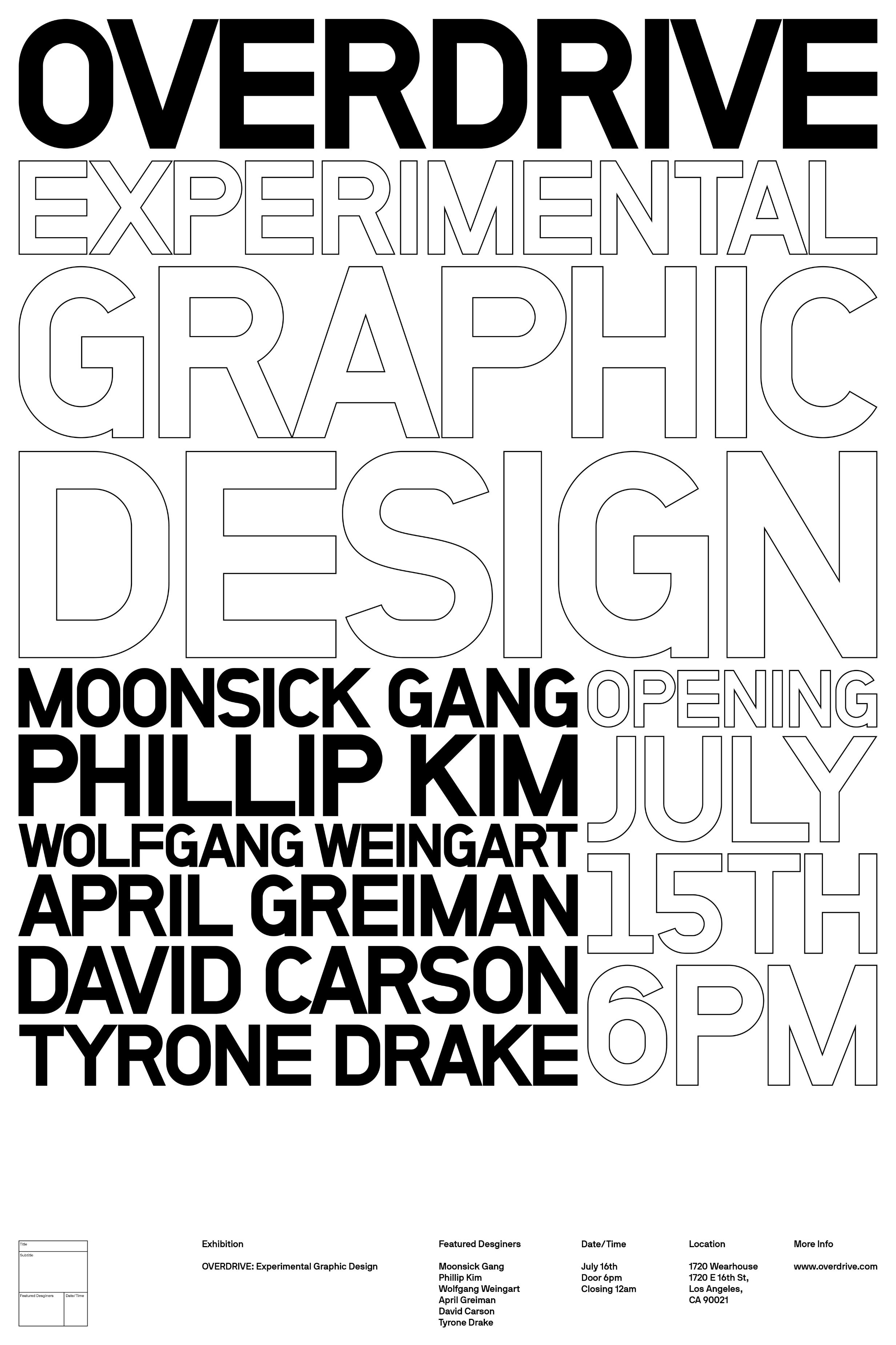
In contrast, the fourth poster employs a minimalistic approach with an expansive use of white space and structured typography that borders on the architectural. This design speaks to the foundational elements of graphic design – balance, alignment, and the grid – but presents them with a twist that defies expectation.
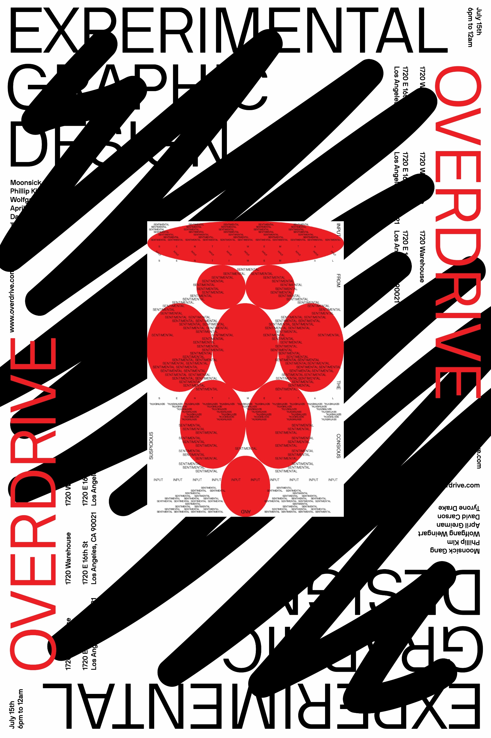
Finally, the fifth poster brings a sense of motion and fluidity, with sweeping black strokes and clusters of red circles that seem to move across the canvas. This poster could be seen as a representation of the creative process itself – dynamic, unceasing, and full of energy.
“Overdrive” is not just an exhibition but a statement on the transformative power of graphic design. It invites viewers to engage with the works not just as static pieces of art but as living dialogues between form, function, and the ever-changing definitions of beauty and communication in the digital age.
CREDIT
- Agency/Creative: Alan Xu
- Article Title: Overdrive: Experimental Graphic Design Exhibition Poster Series
- Organisation/Entity: Student
- Project Type: Graphic
- Project Status: Non Published
- Agency/Creative Country: United States
- Agency/Creative City: Union City
- Market Region: North America
- Project Deliverables: Poster Design
- Industry: Entertainment
- Keywords: WBDS Student Design Awards 2023/24
- Keywords: Graphic Design, Poster,
-
Credits:
Educational Institution: ArtCenter College of Design
Educator's Name: River Jukes-Hudson


