


Meantime, the Greenwich-based craft beer brewer, has unveiled a vibrant new visual identity by Bristol-based design studio Outlaw. Outlaw were responsible for the brand’s previous design, as well as a pipeline of limited and special edition brews over the last year.
Started in 1999 in a Greenwich flat, Meantime Brewing Co. was founded on a pioneering spirit and the belief that time is best spent doing what you love.
The visual identity was last refreshed in 2018. But four years is a lifetime in craft beer and the landscape had changed dramatically. Big craft players were outspoken and outspending Meantime, while smaller breweries were creating buzz through innovation that pushed the boundaries of brewing. Meantime risked being forgotten.
To breathe fresh life into the brand the solution was to move from ‘a beer from London’ to ‘the beer of Greenwich’. By giving the brand a clear sense of place, the design could harness the dynamism of modern Greenwich and share the value of time well spent with the world.
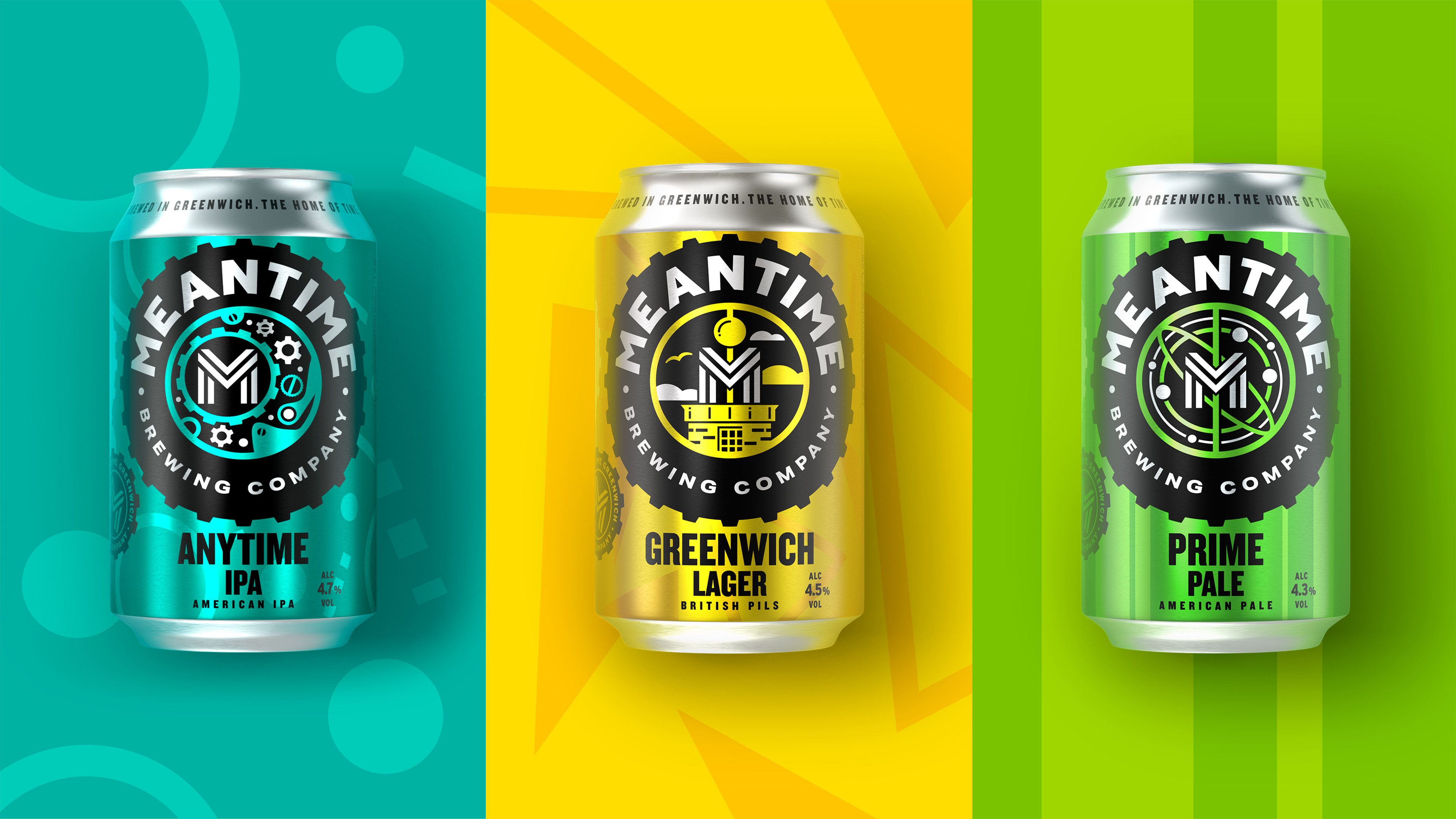
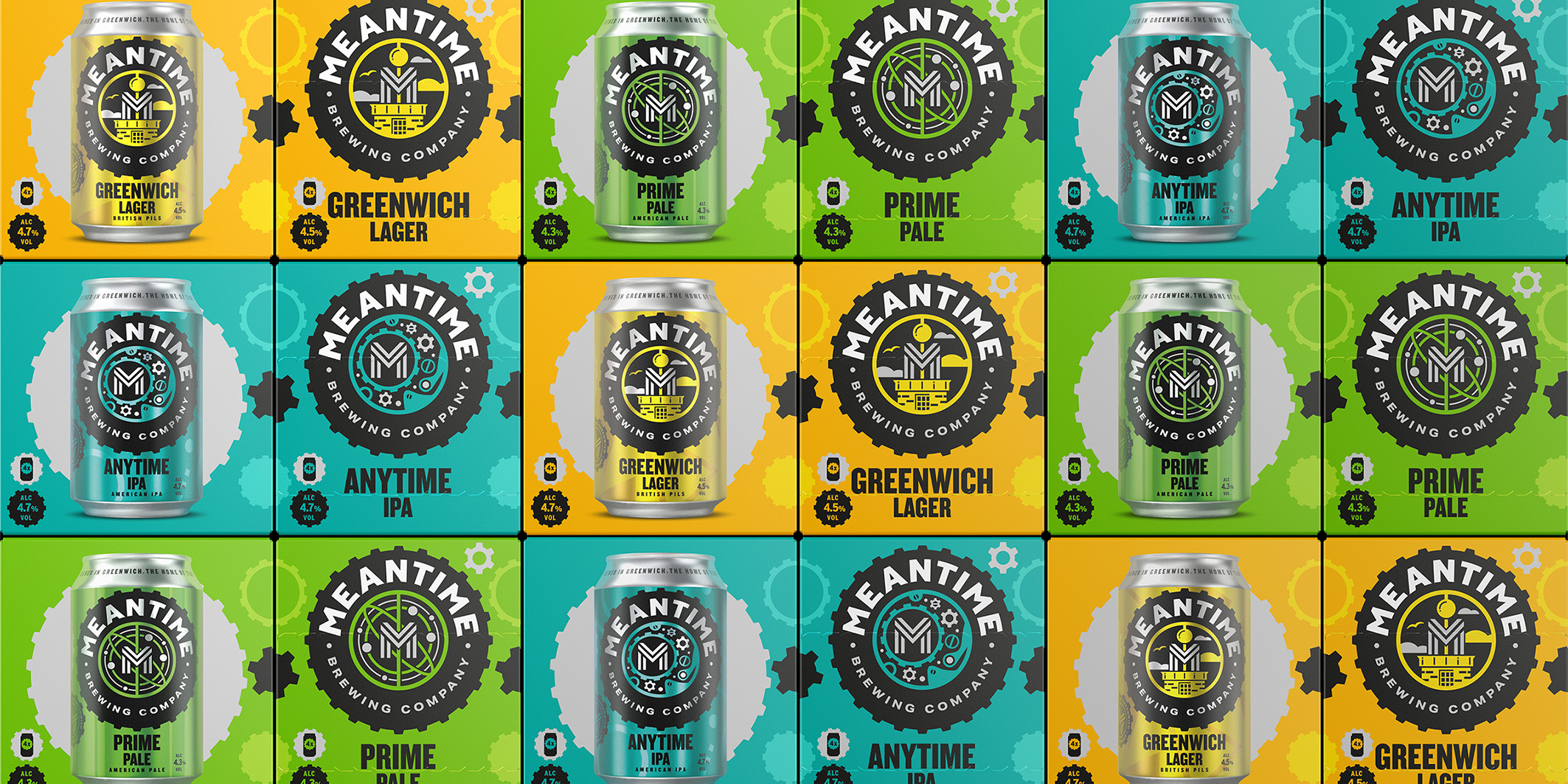
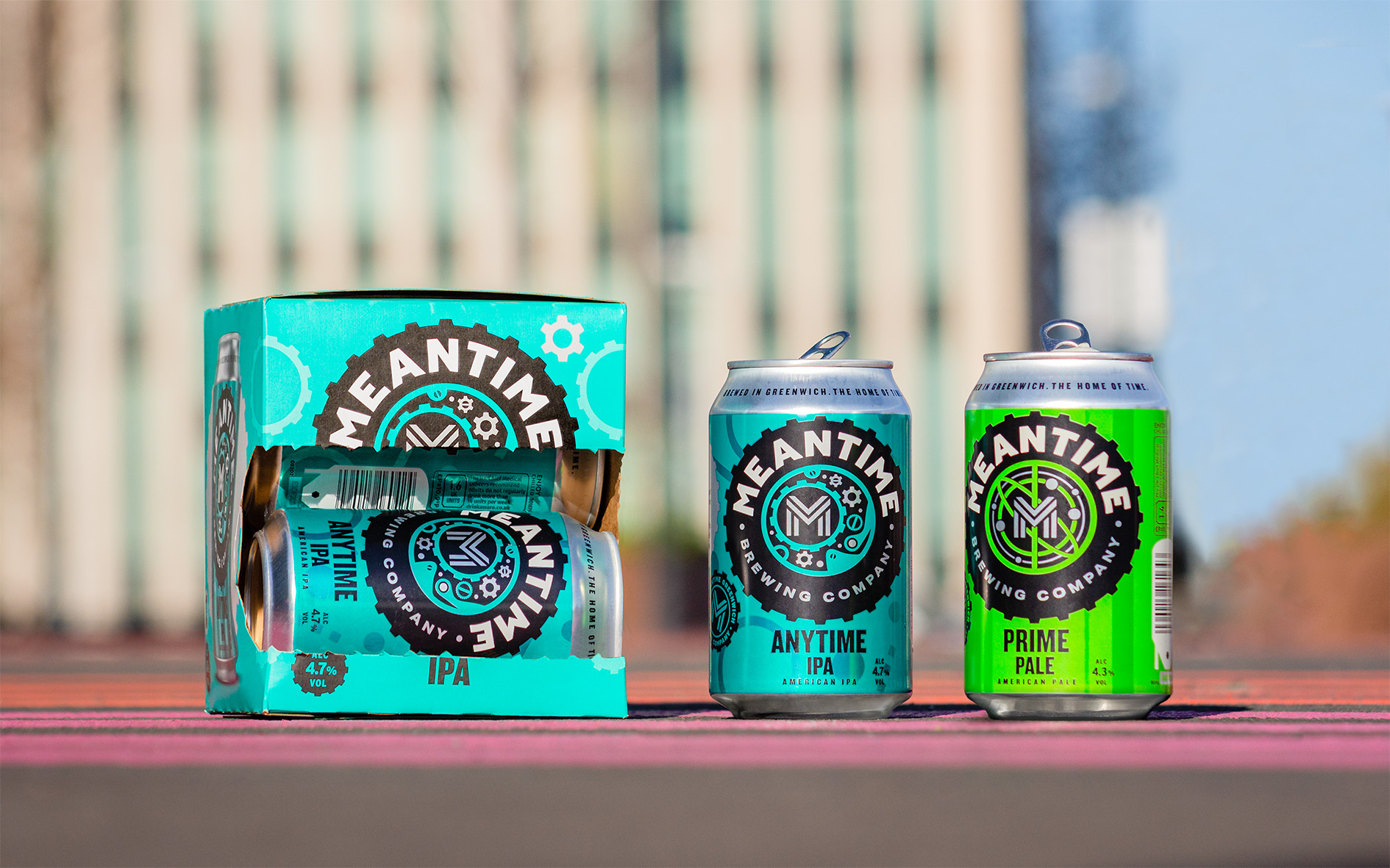
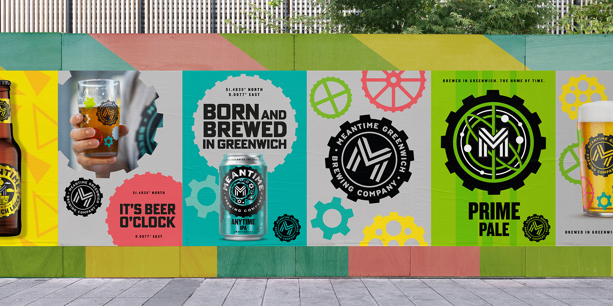
The new visual identity is underpinned by ‘Vibrant Contrasts’ as a design idea, with three principles which inform how the brand shows up wherever it’s seen – ‘creative communities’, ‘dynamic energy’ and ‘industrial craft’.
This has inspired a design which captures the vibrant spirit of modern Greenwich, each beer inspired by the iconic shapes and architecture of real locations – including the Greenwich Observatory, the Prime Meridian, the Greewich Peninsula and Design District – as well as the renaming of several beers in the range including ‘Prime Pale’ and ‘Greenwich Lager’.
The move away from predominant black in the previous design to a more vibrant palette with patterns communicates the depth and personality of the brand, drives taste appeal for each product and arms Meantime in its bid to attract a new generation of craft drinkers.
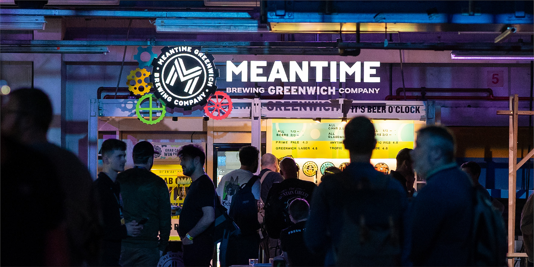
Meanwhile the cog device has been elevated and amplified from a subtle graphic element in the previous design to the heart of an ownable design system that represents both the brand’s home in Greenwich – ‘the home of time’ – as well as the closely connected, interdependent team that works tirelessly to create Meantime’s great craft beer.
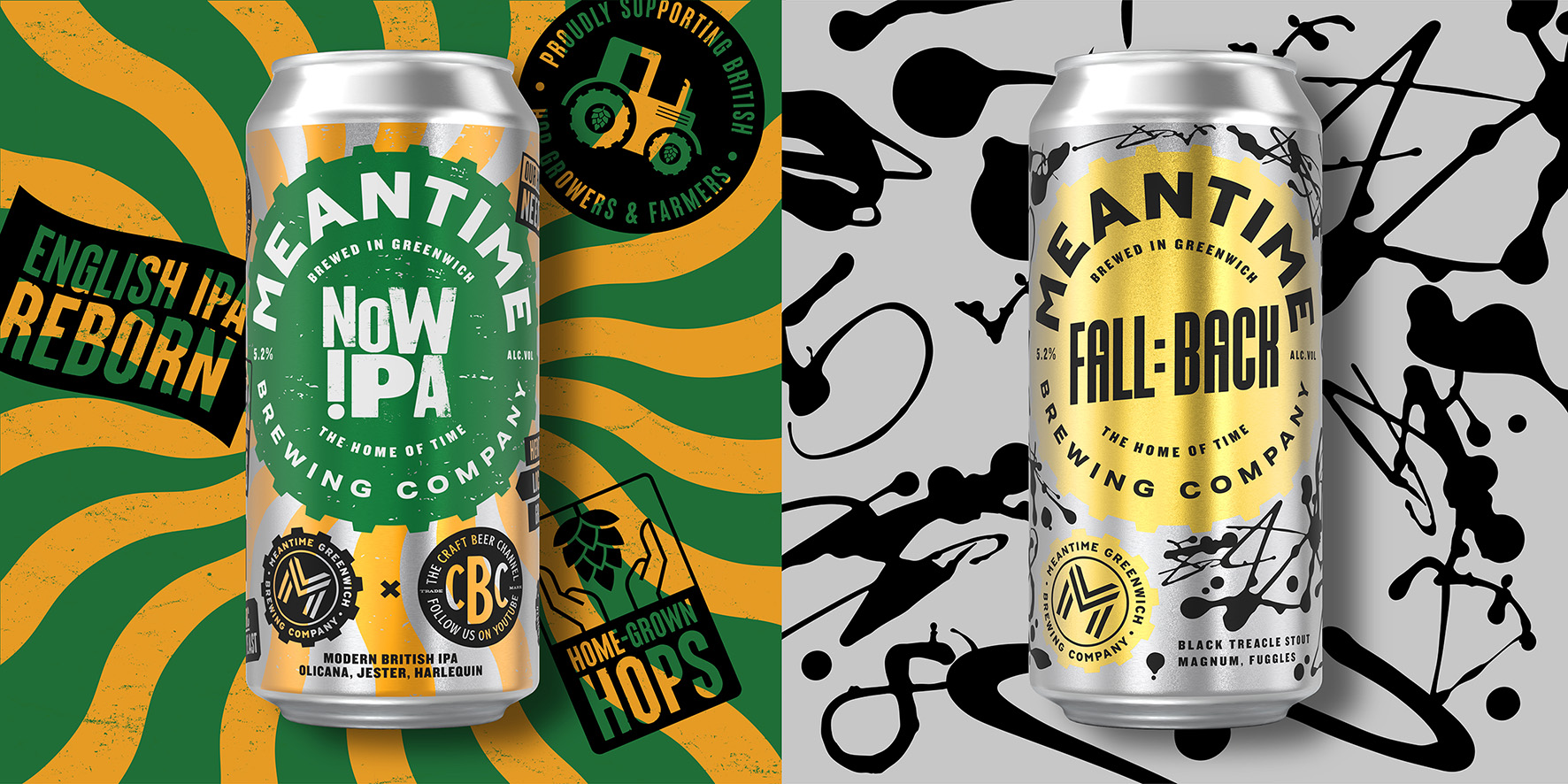
The result is a visual identity that builds on the past while arming Meantime for the future, seamlessly flexing from core ‘full time’ beers through to limited edition ‘part time’ brews, and easily extending to NPD and future innovation.
Outlaw said: “It’s not often a creative relationship between agency and client continues into a redesign of your own work. We took learnings from our redesign four years ago which gave the brand its iconic visual language back and blended this with the exciting work of a young team of experimental brewers, in a part of the city which is quickly becoming its own design district full of vibrant contrasts.”
Sam Rhodes, Marketing Director at Asahi UK, said: “Meantime’s new brand identity captures the heritage of our roots in Greenwich whilst reflecting the vibrancy of the craft beer movement today. Meantime played a central role in pioneering this and we want to keep delighting consumers with our exceptional beers – all inspired by the spirit of Greenwich, the home of time.”
CREDIT
- Agency/Creative: Outlaw
- Article Title: Outlaw Gives Meantime Brewery a Vibrant Visual Identity
- Organisation/Entity: Agency
- Project Type: Packaging
- Project Status: Published
- Agency/Creative Country: United Kingdom
- Agency/Creative City: Bristol
- Market Region: Europe
- Project Deliverables: Brand Design, Brand Identity, Brand Redesign, Brand Strategy, Brand Tone of Voice, Packaging Design
- Format: Box, Can
- Substrate: Metal
- Industry: Food/Beverage
- Keywords: Meantime, Greenwich, London, Outlaw, Packaging, Design, Rebrand, Branding, Craft, Beer,
-
Credits:
Strategy Director: Elissa O'Brien
Strategist: Harriet Stansall
Creative Director: Brett Stabler
Design Director: Alex Rexworthy
Designer: Emma Proven
Client Director: Laura Mackie


