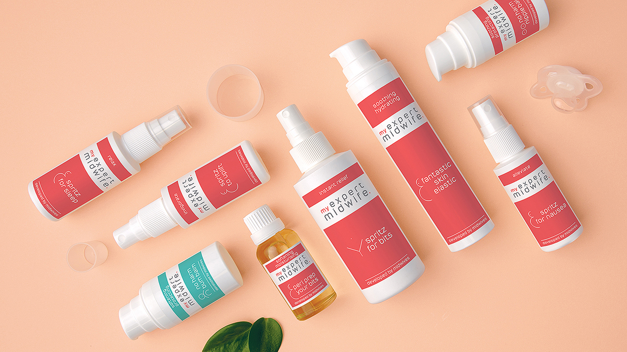
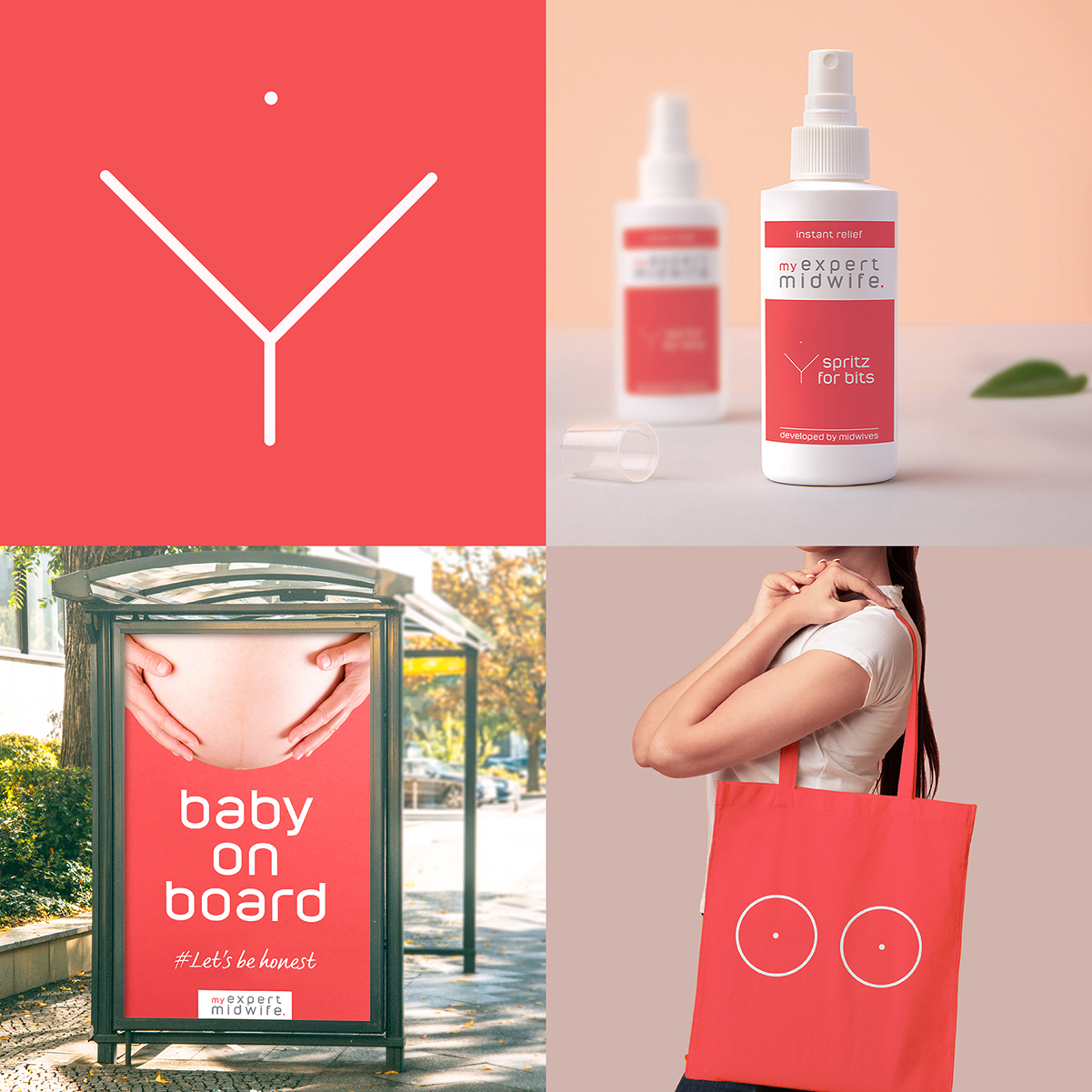
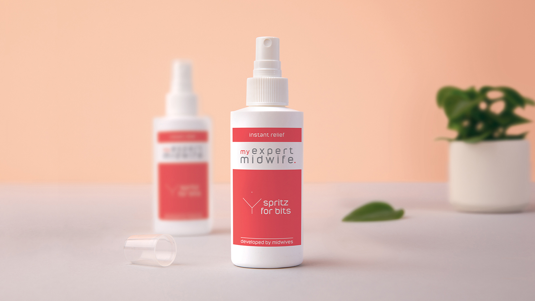
Integral to our design was the bold use of the brand colour, which now stands out proudly on many an Instagram hospital bag post, supported with softer, secondary colours, alluding to the all-natural ingredients and superior product quality.
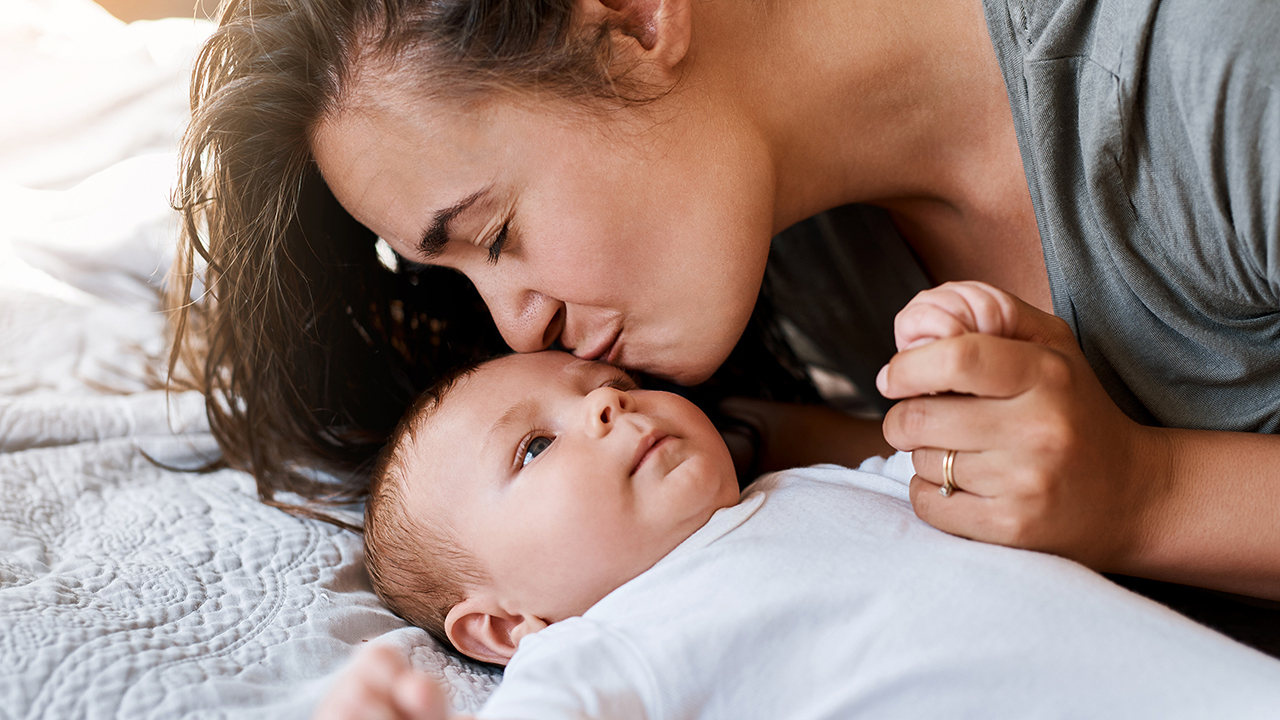
We introduced a simple, graphical illustration style with clean and modern product photography to convey quality, contrasted with real model shots being true to the sheer grit and raw reality of pregnancy and birth. Tone of voice plays a key role in conveying the no-nonsense, cheeky personality of the brand for an inclusive, supportive, “we know how you feel” conversational tone.
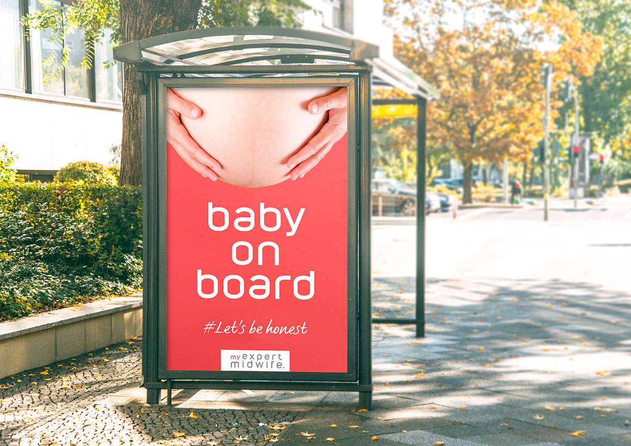
As part of our ongoing brand partnership, we are responsible for the graphical execution for all My Expert Midwife campaigns, ensuring a cohesive, targeted approach across all consumer online, social and paid media. Recent campaigns include ‘putting the u back into mum’ developed to raise the importance of self-care in motherhood, coinciding with the brands third anniversary.



CREDIT
- Agency/Creative: OurCreative.
- Article Title: OurCreative. My Expert Midwife
- Organisation/Entity: Agency, Published Commercial Design
- Project Type: Packaging
- Agency/Creative Country: United Kingdom
- Market Region: Europe
- Project Deliverables: Brand Advertising, Brand Architecture, Brand Identity, Brand Refinement, Brand Rejuvenation, Brand Strategy, Brand World, Branding, Graphic Design, Illustration, Packaging Design, Photography, Rebranding, Retail Brand Design, Tone of Voice
- Format: Bag, Bottle, Box, Case, Tube
- Substrate: Plastic, Pulp Board, Pulp Carton, Pulp Fibre, Pulp Moulded Fibre, Pulp Paper


