


Exceptional by Asda Illustrations
Background
Exceptional by Asda is the supermarket’s most ambitious own-label launch to date. It’s their premium tier designed to redefine how quality is perceived on supermarket shelves. Replacing the long-standing Extra Special range, Exceptional needed to feel unified across hundreds of SKUs spanning categories as diverse as fresh produce, meat, coffee, chocolate, and seasonal gifting.
Illustration became central to that challenge. Rather than treating illustration as an afterthought, we set out to make it a strategic brand device that could flex across categories, elevate perceptions of quality, and create a consistent, premium brand language that consumers would instantly recognise as Exceptional.
Brief
Our brief was to create a distinctive and ownable illustration system that would enhance the storytelling power of each pack and elevate taste perceptions through craft and detail. We also had to bring category-appropriate character without fragmenting the brand and tie every product together under one unmistakable premium identity.
Strategy
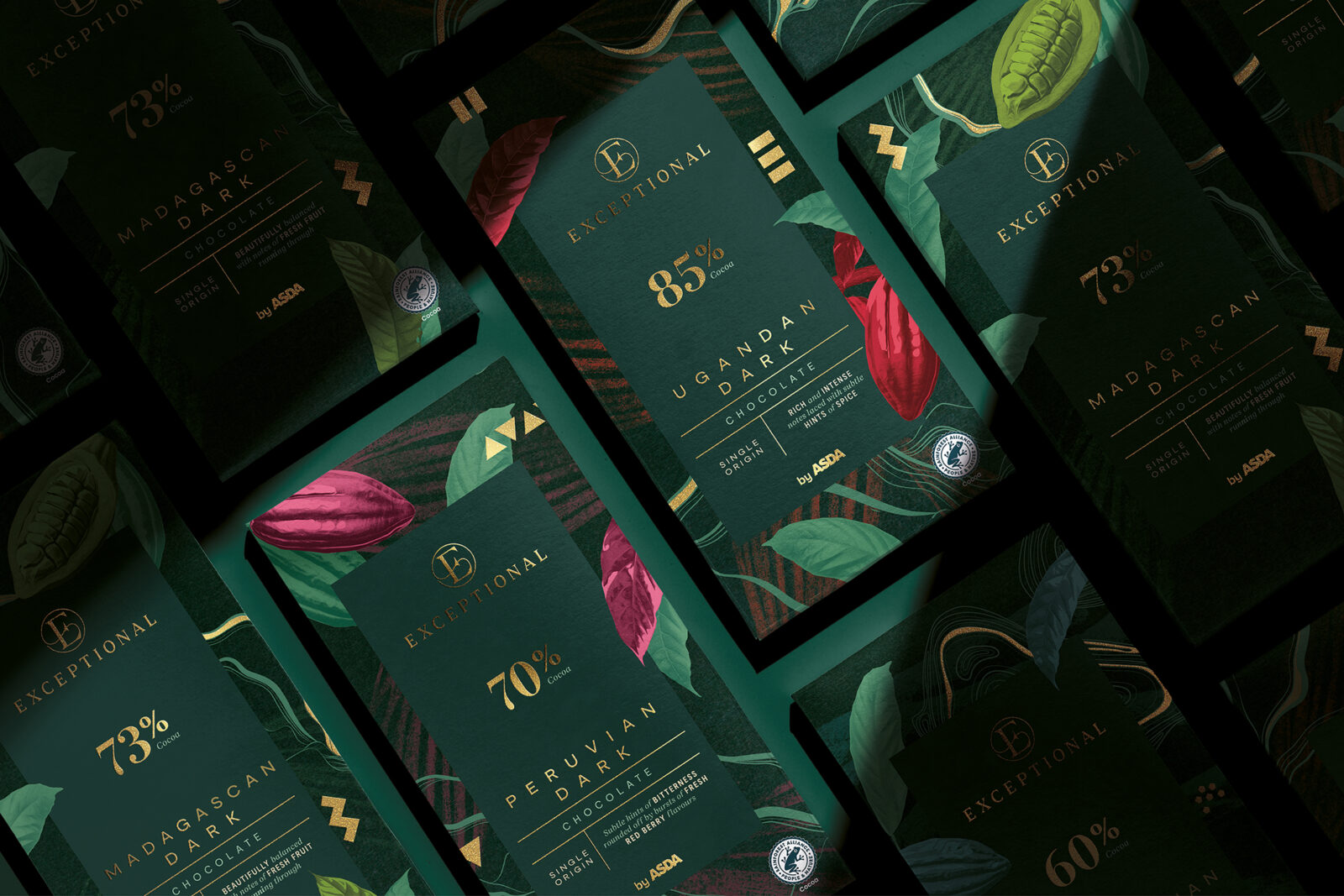
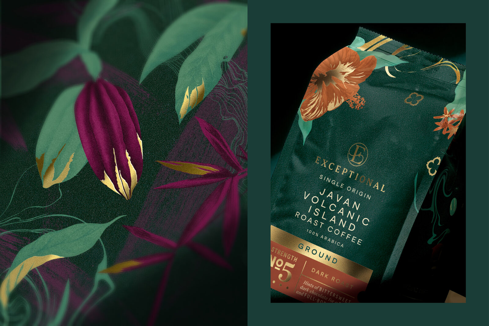
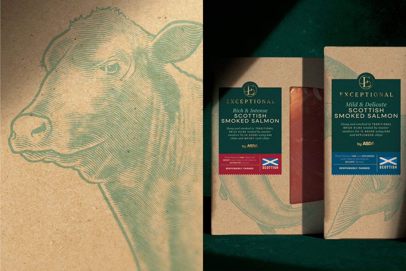
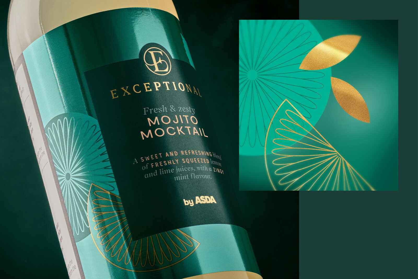
The solution was to build three bespoke illustration styles – each chosen for its ability to elevate different categories while still belonging to the Exceptional family. Consistency came from a shared colour system (anchored by jewel-like Exceptional green and premium gold accents) and the hand of a single illustrator. This created cohesion across the range, in stark contrast to Extra Special’s previously fragmented visual language.
Design Process
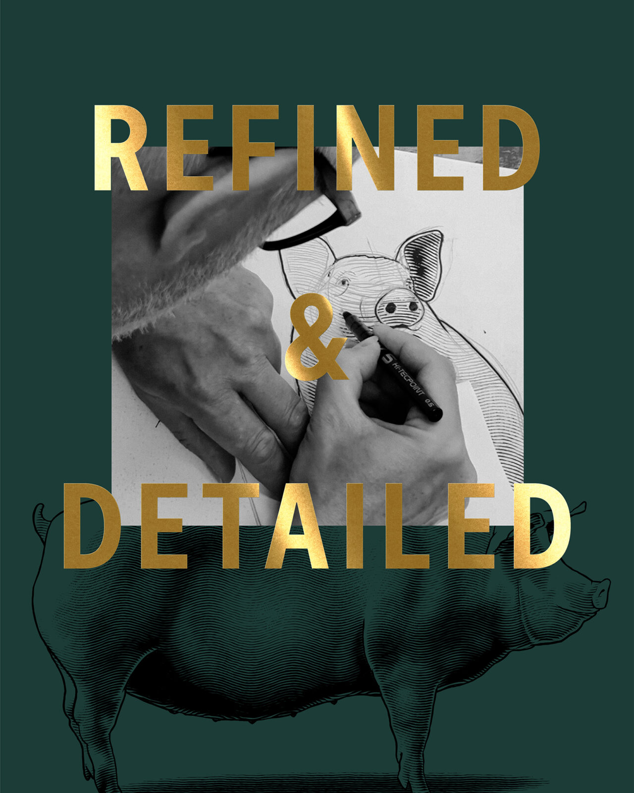
All illustrations were hand-drawn in-house by OurCreative.’s illustrator, Chris, ensuring both consistency and craft. Each style plays a precise role:
Woodcut style: Paired with craft paper textures to give products like fresh produce and deli lines an artisanal, farm-to-table feel.
Botanical collage style: Rich, layered illustrations with pops of vibrant colour and gold foiling – perfect for indulgent categories such as chocolate, coffee and luxury goods.
Line-work style: Inspired by flourishes of the Exceptional monogram, these elegant drawings bring refinement and simplicity to giftable products.
While distinct, the three styles are united by colour harmony and tone, with the signature green acting as a binding thread across every pack. The result is a range that feels both versatile and unmistakably cohesive.
Results/Impact
The illustrations give Exceptional its soul. They provide the craft, artistry and taste cues needed to lift Asda’s premium tier into a new league, while still allowing each category to shine in its own right. Compared to Extra Special’s fragmented approach, Exceptional feels focused, confident and consistently premium.
Since launch in late 2024, Exceptional has rolled out across Christmas lines and into core categories, bringing clarity to Asda’s tiering strategy and giving the retailer a powerful new tool in the own-label wars. In a market where premium ranges compete fiercely for consumer trust, illustration has proven to be the unifying visual language that makes Exceptional by Asda live up to its name.
CREDIT
- Agency/Creative: OurCreative.
- Article Title: OurCreative. Defines a Premium Illustration System for Exceptional by Asda
- Organisation/Entity: Agency
- Project Status: Published
- Agency/Creative Country: United Kingdom
- Agency/Creative City: Leeds
- Market Region: UK
- Project Deliverables: Brand Creation, Brand Design, Brand Guidelines, Food Photography, Illustration, Packaging Guidelines, Photography, Photography Styling, Product Photography
- Industry: Food/Beverage
- Keywords: WBDS Agency Design Awards 2025/26 , FMCG; packaging design; brand identity; supermarket; illustration; brand creation
-
Credits:
Design Director: Joe Wallis
Illustrator: Chris Charlton
Creative Director: Jon Dignam
Client Service Director: Sara Pollard
Production Director: Paul Porter
Managing Director: Kim Van Elkan


