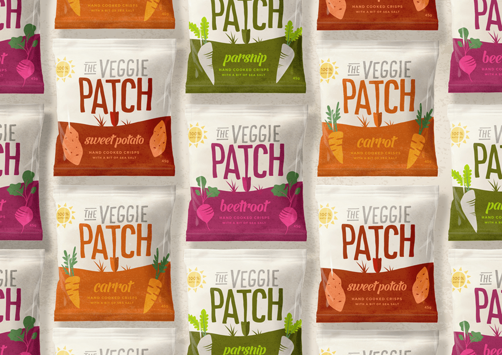
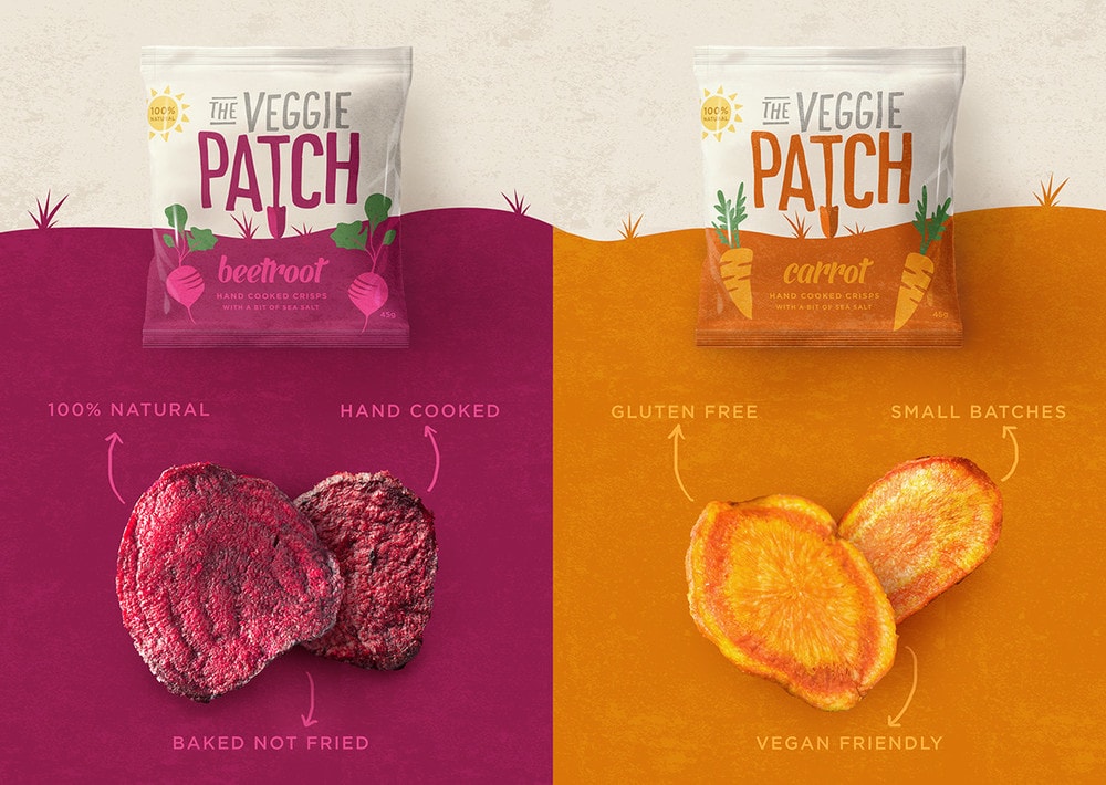
“Background: Deep in the English Gloucestershire countryside there is a veggie patch that rivals all other veggie patches. There, it grows a colourful medley of the finest root vegetables – sweet carrots, earthy beetroots, parsnips and potatoes. With the cheery growers cultivating an abundance of produce, they decided to create small batches of tasty hand cooked crisps* (*the oh so English term for chips). The recipe was simple; baked not fried, gluten free, vegan friendly and 100% natural – with the tiniest bit of sea salt seasoning.”
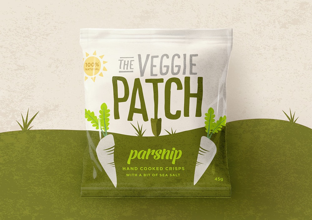
“Challenge: After proving to be quite the hit at the Farmer’s market, The Veggie Patch growers wanted to take their creation to the masses. But with many other vegetable crisp products out in the market already, they wanted to launch with a brand identity, packaging suite and narrative that set them apart. It needed to express their personality, tone of voice and most importantly the great credentials of their delicious product. Snack chips crisps packaging design, branding and packaging design by Our Revolution.
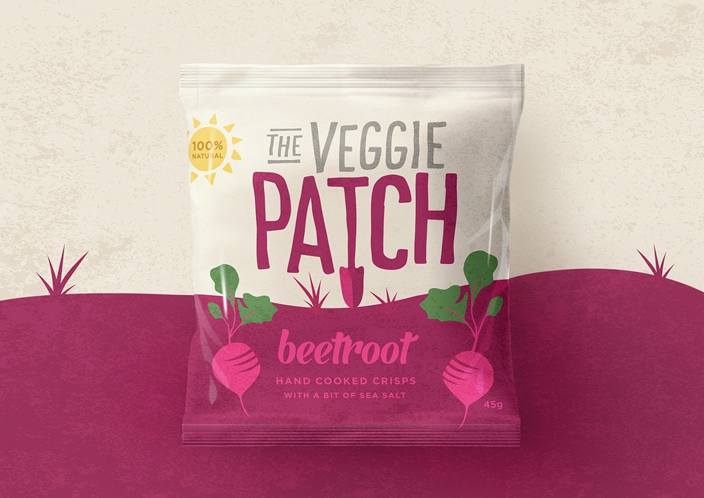
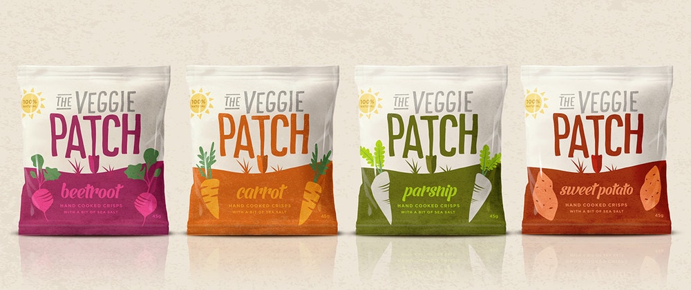
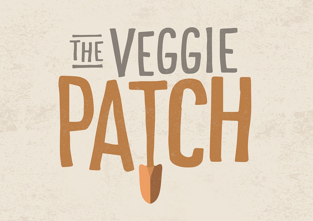
Solution: The growers and makers of The Veggie Patch crisps are truly eccentric characters. Their simple and humorous outlook is infectious and was the ideal tone of voice to inject into The Veggie Patch world that we created on pack. The brand identity adds the humour with the ‘T’ being the gardening shovel used to unearth the vegetables and its overall execution is simple yet joyful. The Veggie Patch ground on pack changes colour to navigate the variant and the root vegetable illustrations sit underground, showing what the crisp type is inside yet also nodding to the provenance of the ingredients. Overall, we created a charming, lively brand that has secured national distribution yet staying true to its humble roots.”
CREDIT
- Agency/Creative: Our Revolution
- Article Title: Our Revolution – The Veggie Patch
- Project Type: Packaging
- Substrate: Plastic


