Our Revolution – REACH Packaging Project
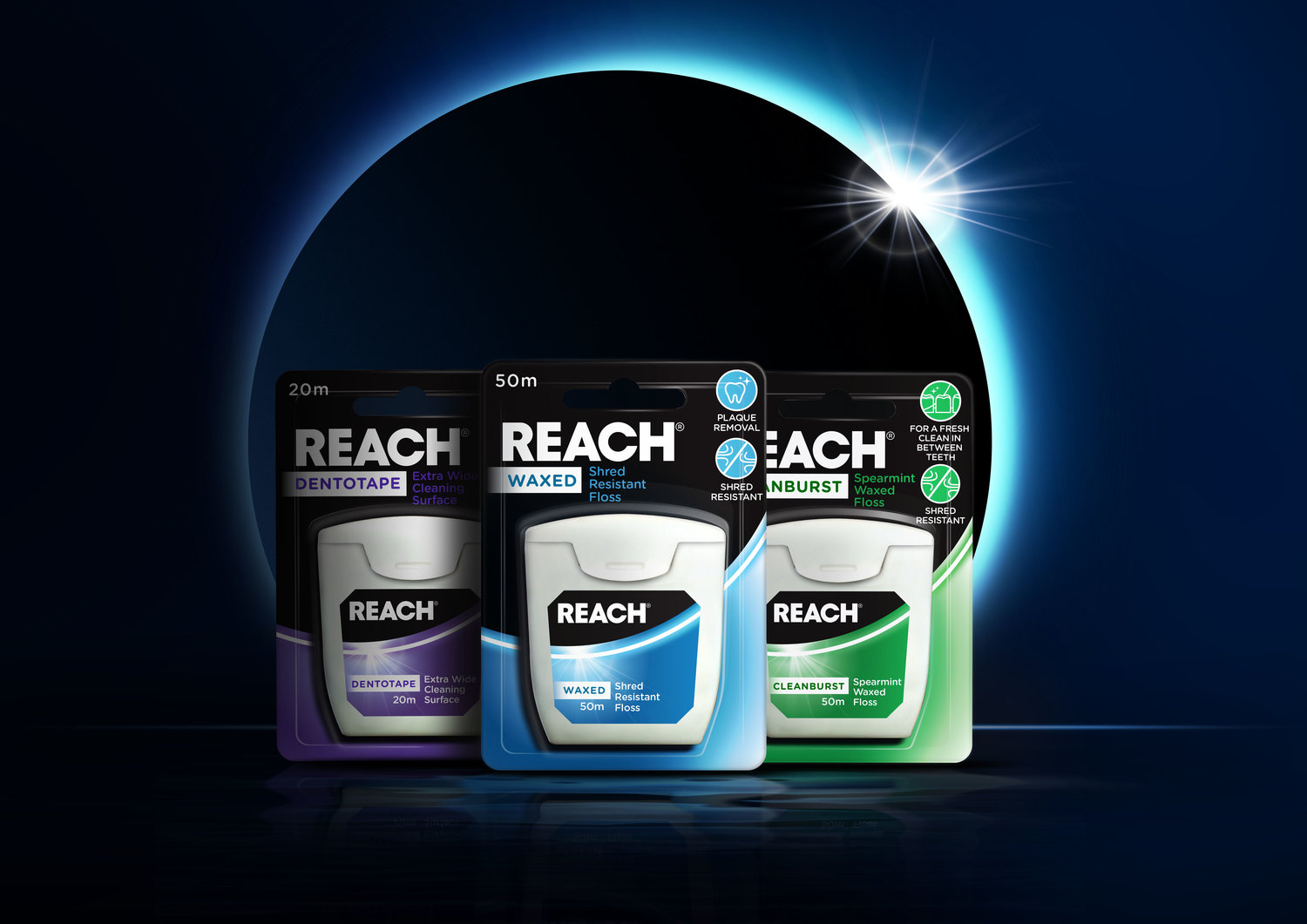
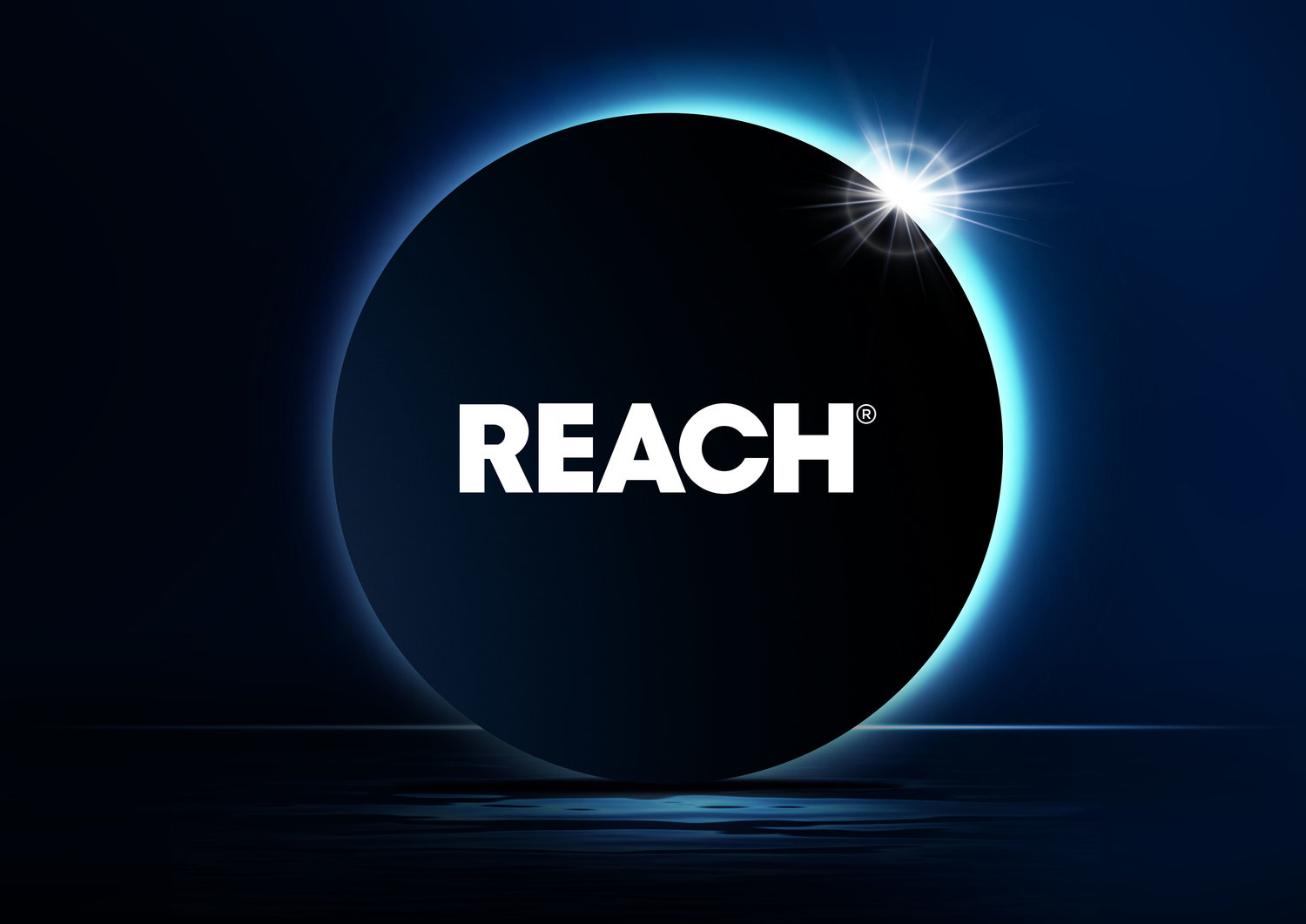
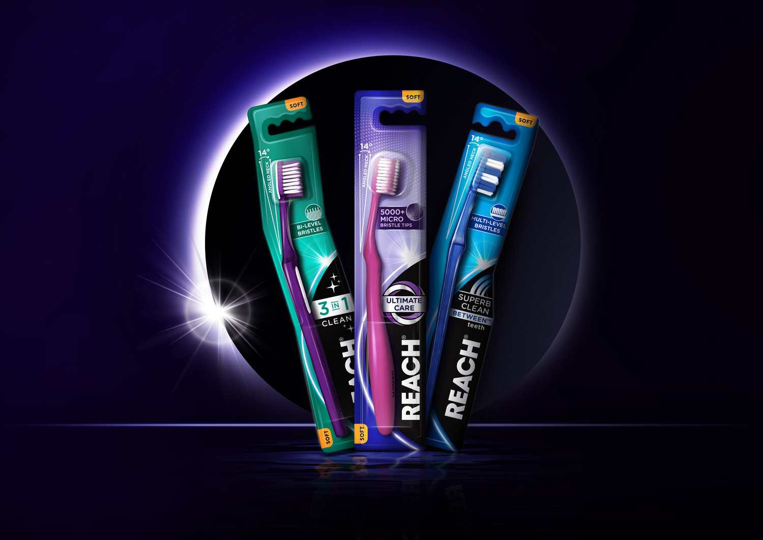
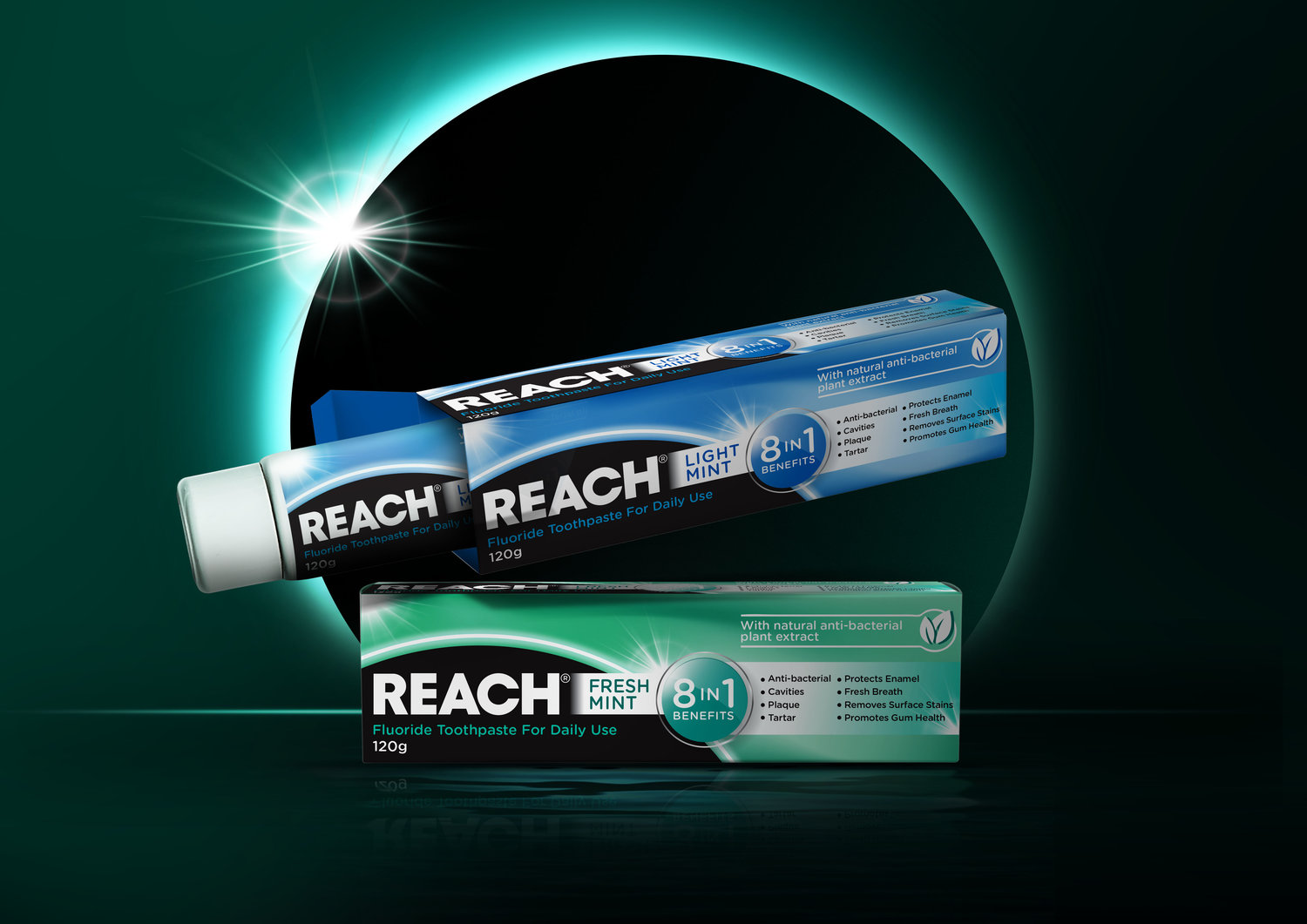
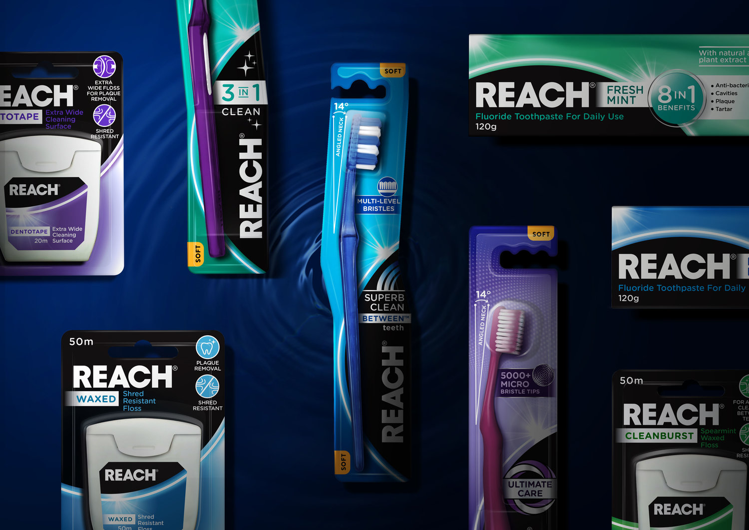
REACH has employed Sydney agency Our Revolution to add a little sparkle and polish to the decades-old oral care brand.Despite having almost 50 years of history and trust behind them, REACH had been somewhat struggling in a cluttered category, with consumer research suggesting the branding was ‘old’ and ‘irrelevant’. Australia needed to be re-introduced to this old favourite.“Our focus was to pull out the original, innovative characteristics of the brand through a new, progressive design,” says Jen Doran, Creative Director of Our Revolution.In a classic case of the problem providing the opportunity, the fact that consumers are confronted with too many choices in the dental-care section was the insight that drove Our Revolution’s repositioning of REACH.It turns out 60% of purchase decisions for the category are made in store, which meant packaging design was crucial in converting shoppers into buyers – even more important than external drivers like advertising. “The packaging was key in communicating the key attributes of the products. They needed to be clear and easy to understand for shoppers to navigate,” Jen says.“New master brand assets were created to support the original black and white identity. “The eclipse brand holding device can be used in off-pack communications. Whilst retaining familiar attributes of the brand like the black background, it also allows for more distinctive variant colours to come through, highlighting individual products.”The outcome thus far of this more sophisticated, contemporary design has been increased distribution and ranging.
CREDIT
- Agency/Creative: Our Revolution
- Article Title: Our Revolution Helps REACH to Brush Up
- Organisation/Entity: Agency, Published Commercial Design
- Project Type: Packaging
- Agency/Creative Country: Australia
- Market Region: Oceania
- Format: Blister-Pack
- Substrate: Pulp Carton


