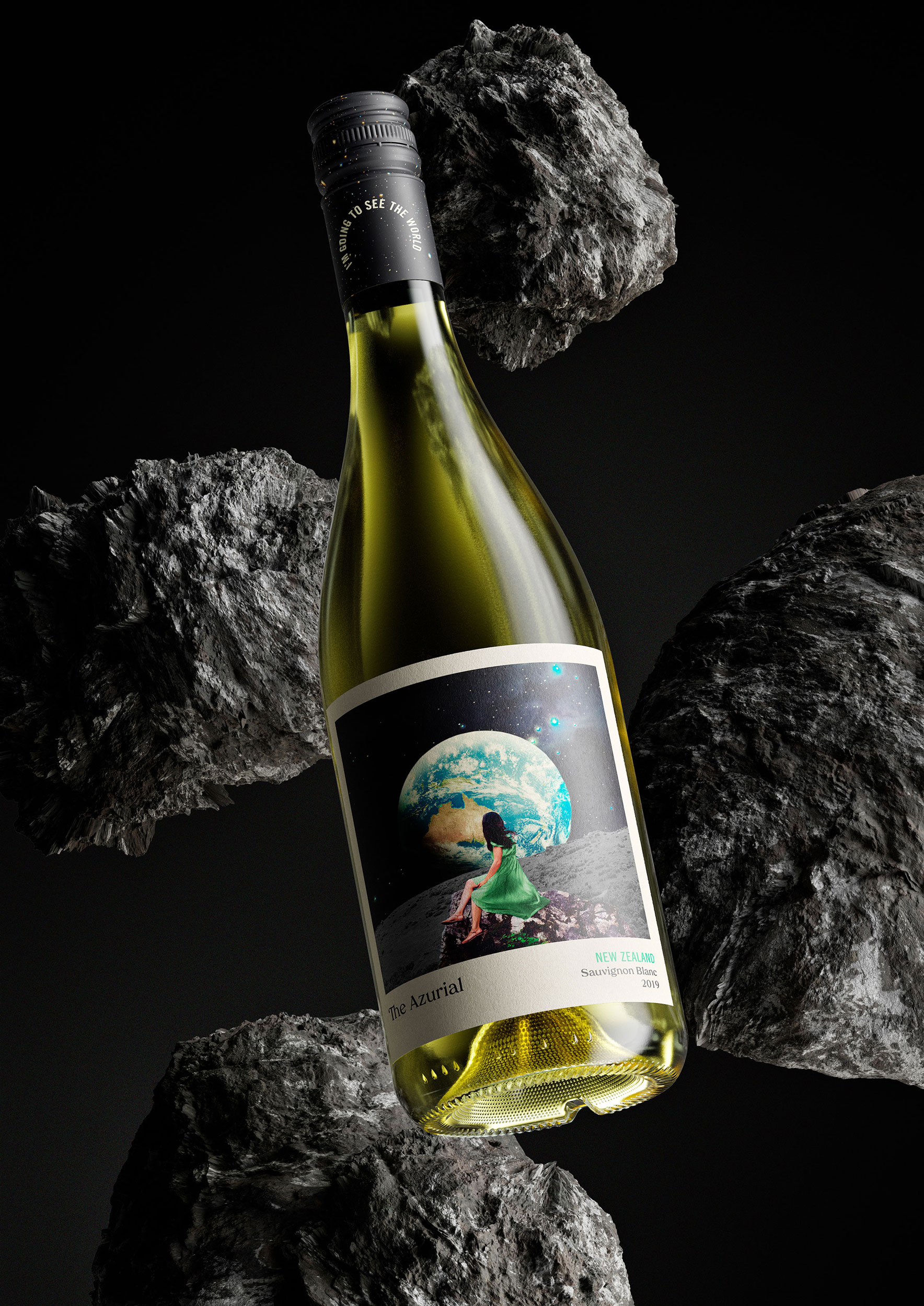
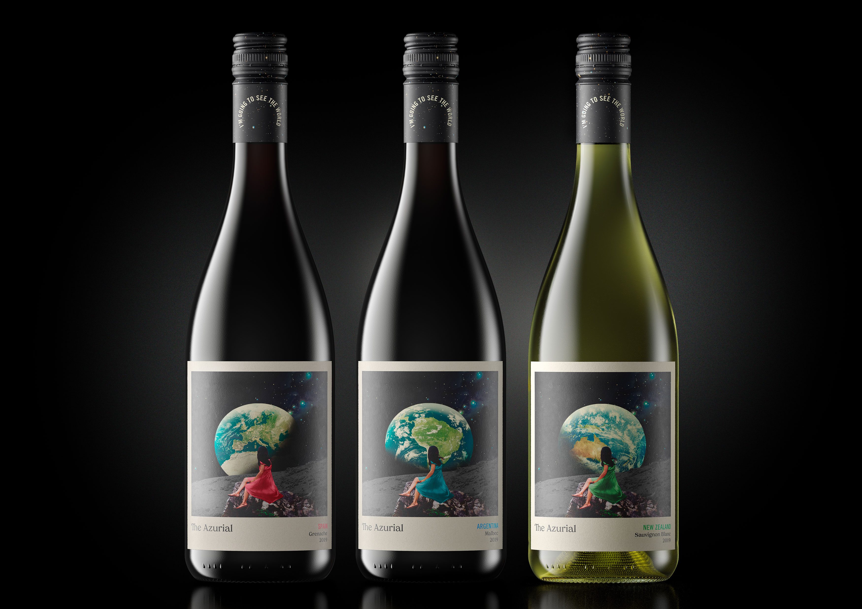
The Azurial is a collection of 3 global wines. A New Zealand Sauvignon Blanc, a Malbec from Argentina and a Grenache from Spain.
Our Revolution were briefed to combine these seemingly unrelated yet popular varietals into a cohesive contemporary range that has a consistent house style whilst noting the provenance of each international wine. It was important the design could also be easily extended to include additional varietals from the wine company in the future.
No specific background information was provided for the wines or their vineyards, therefore the challenge was to create a narrative that was intriguing for consumers, whilst also encouraging a cross-sell within the range. The Azurial is sold at a mid-range price point so could not appear either too premium or too basic. This requirement guided Our Revolution in their choice to avoid any unnecessary finishes, meeting the limit on the budget afforded to create the labels and caps yet still creating a design with the substance that felt accessible to all consumers.
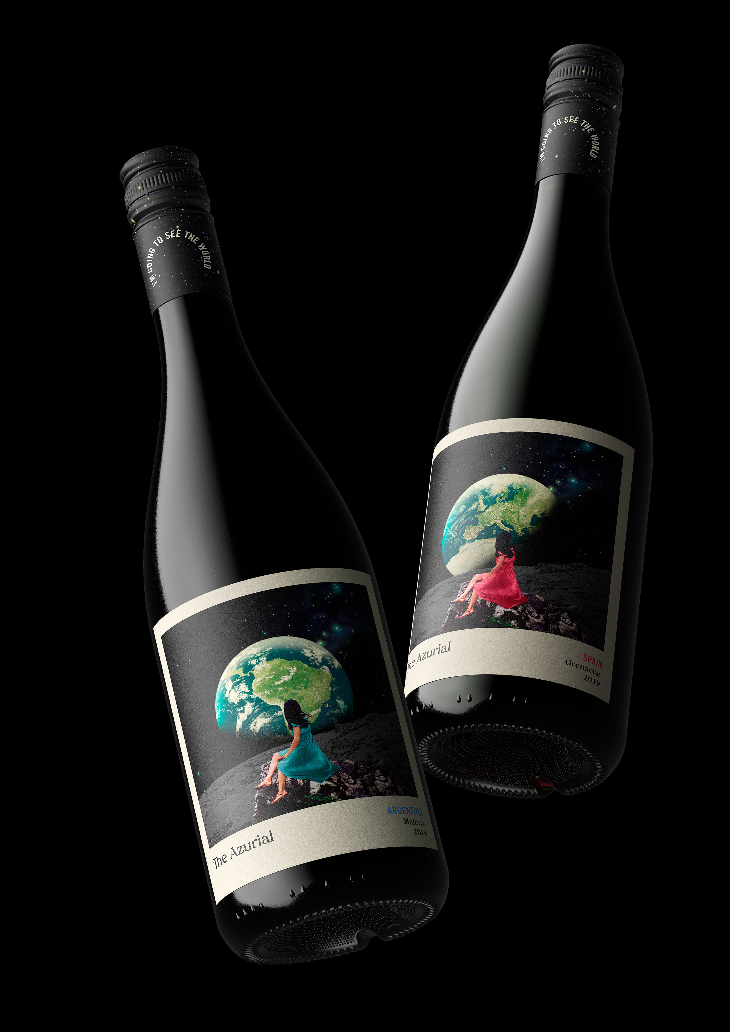
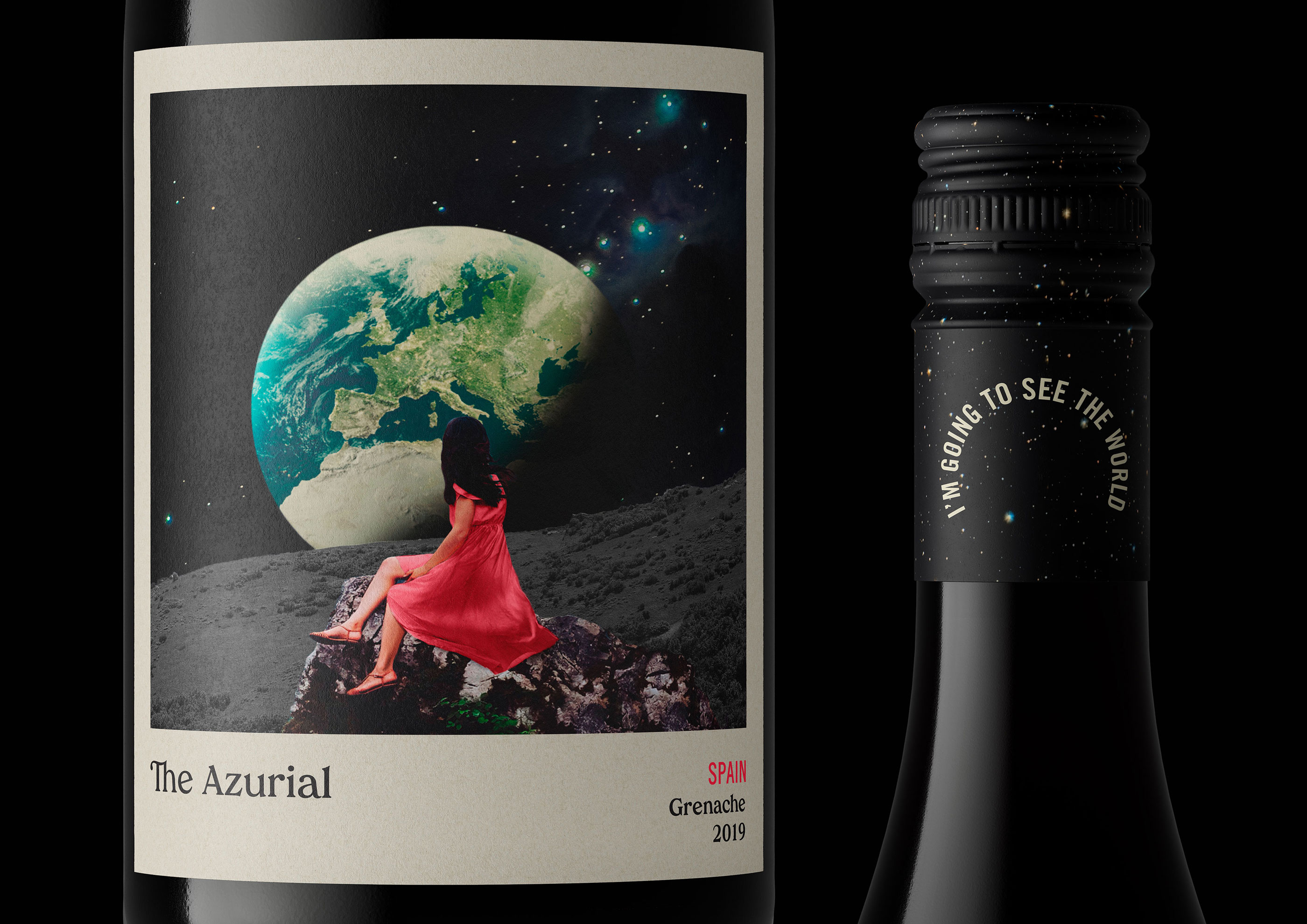
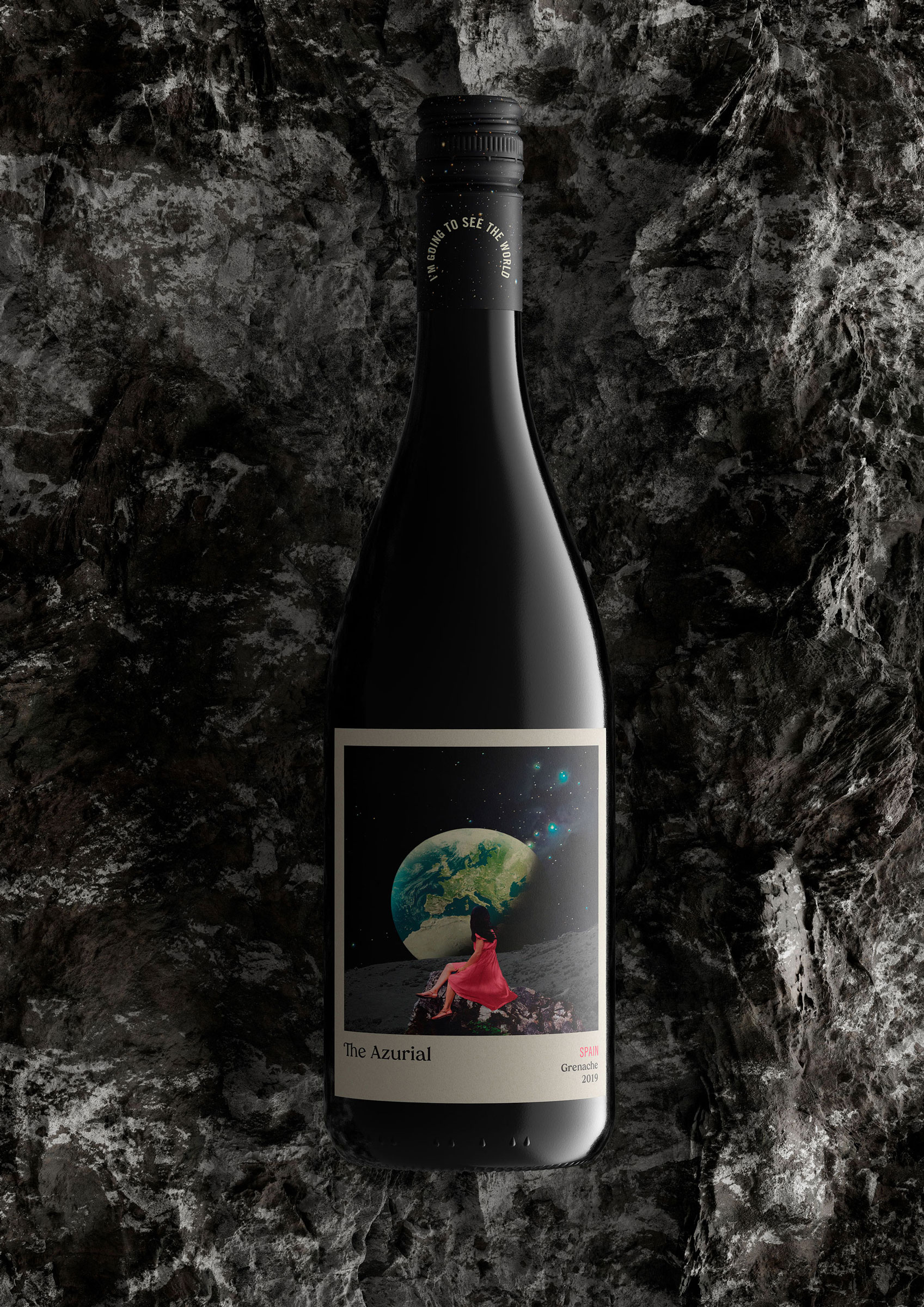
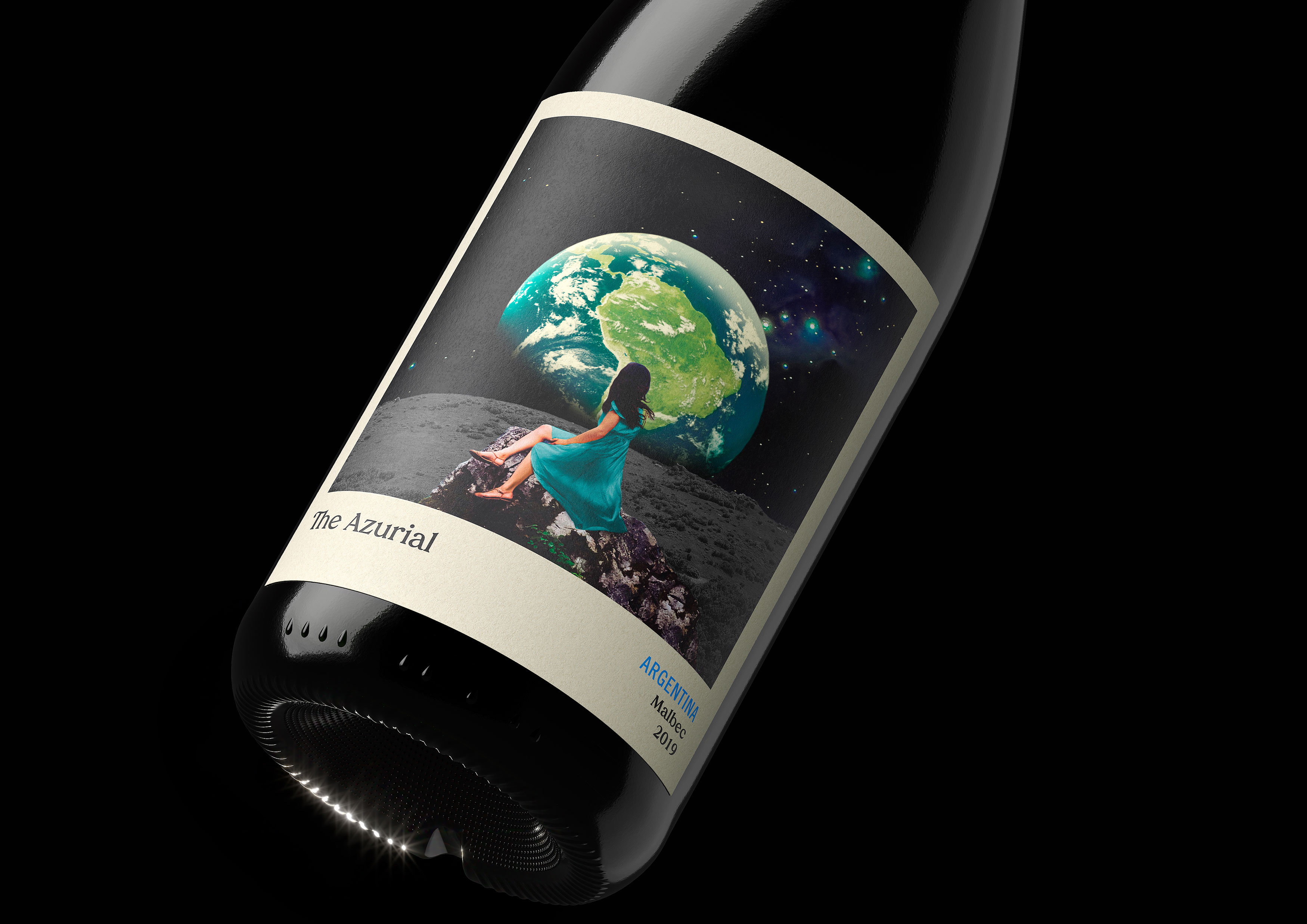
Creative Director, Jen Doran said ‘The arrival of this brief for a range of global wines in a time when we have never been more globally restricted was the spark for creative exploration.’ Each label captures an image of a sitting subject nostalgically gazing at a rotating Earth far out of reach. Our Revolution created a collage that has the composition of a sentimental vacation photograph. The subject sits nonchalantly in the centre of her surreal surroundings in a consistent layout to marry each varietal together. Yet within the label, there are subtle variations to identify each individual wine.
The view of the rotating Earth changes on each label to show a view relating to the region of the wine. This is a discovery to be made in each label by the consumer and allowed the designers to avoid having to default to any cliché regional design cues. The colouring of the subjects dress changes to compliment the type of wine, along with the provenance of the wine written below. ‘The Azurial’ name, meaning ‘Search Ends When Sharing Starts’ is depicted in a typeface synonymous with the body copy of traditional novels, with added intricacy to certain characters. This is housed within a matte label structure that is reminiscent of a polaroid picture that creates a wistful retro-future of seeing the world once more.
The cap that sits high above holds a galaxy, finished with the statement ‘I’m going to see the world’, offering us the invitation for our palates to take a journey and taste places we can’t reach.
CREDIT
- Agency/Creative: Our Revolution
- Article Title: Our Revolution Create The Azurial – A Collection of Three Global Wines
- Organisation/Entity: Agency
- Project Type: Packaging
- Project Status: Published
- Agency/Creative Country: Australia
- Agency/Creative City: Sydney
- Market Region: Global
- Project Deliverables: Brand Creation, Brand Design, Branding, Label Design, Packaging Design
- Format: Bottle
- Substrate: Glass Bottle, Pulp Paper
- Industry: Food/Beverage
- Keywords: Alcohol, Alcohol Design, Label Design, Wine Packaging, Wine, Wine Label, Wine Design, Packaging, Design, Creative, Packaging Design, WBDS Awards, Agency,
-
Credits:
Creative Director: Jen Doran
Design Director: Alex Tomkins
Client Services Director: Diana Yako


