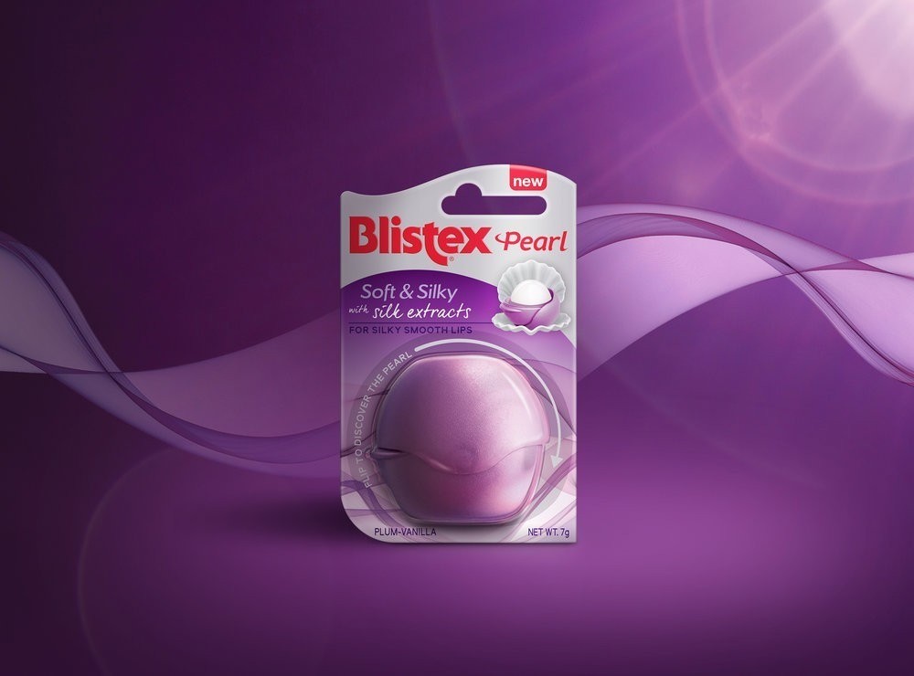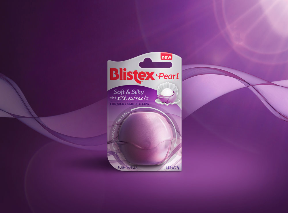
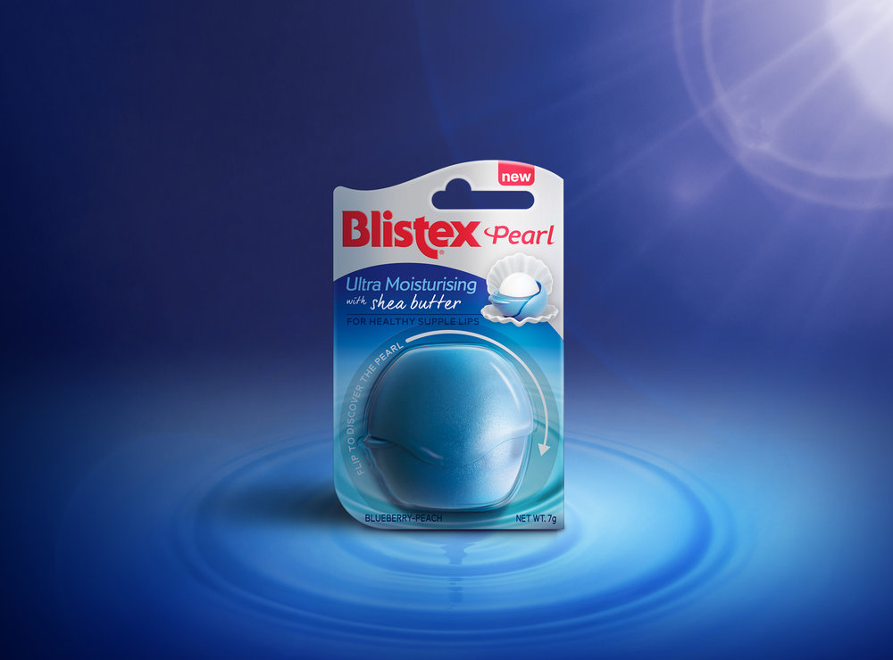
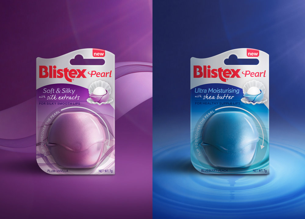
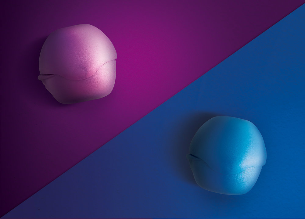
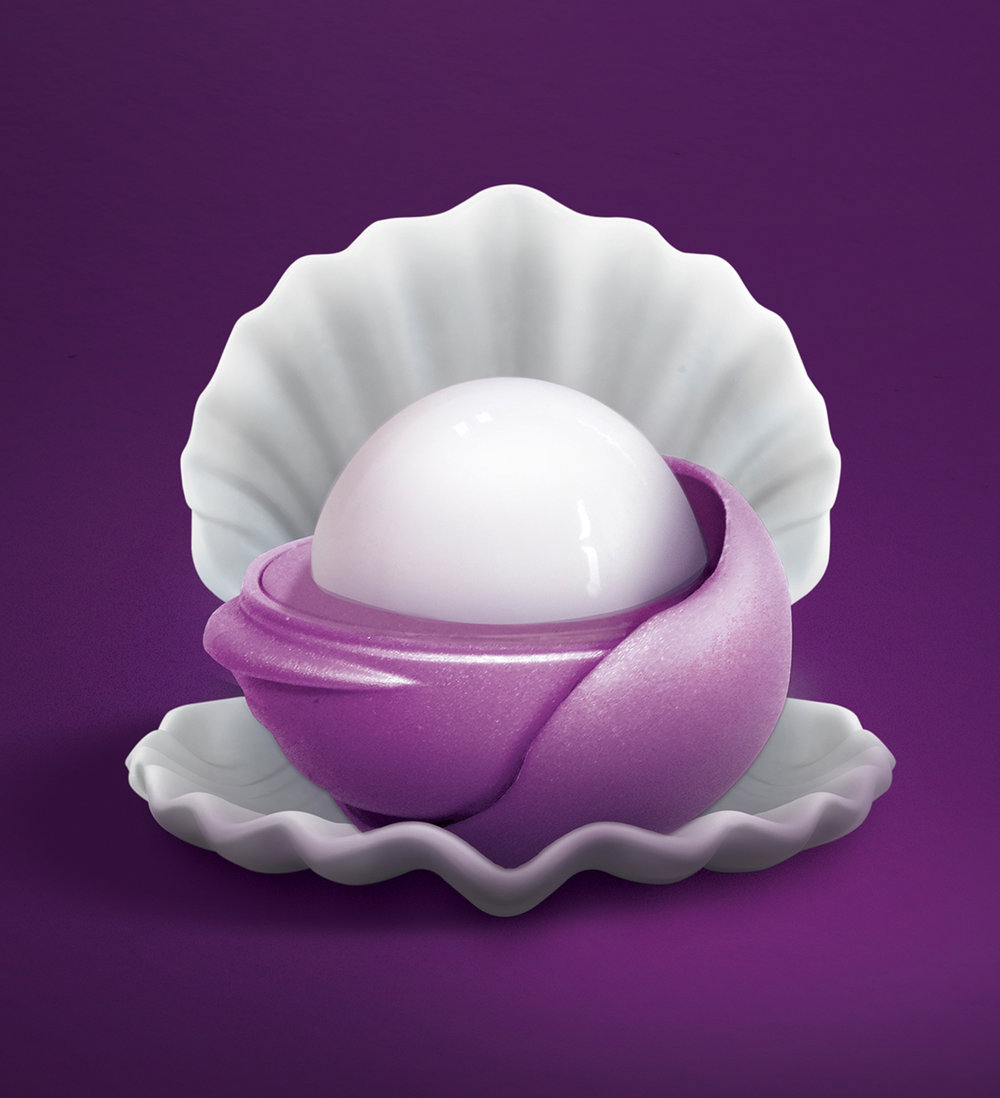
” Blistex is a renowned global lip care brand that has a rich history in producing effective lip balms created from premium ingredients. Being true to its origins of product innovation, Blistex introduced a new sub range to their portfolio that showcased a unique flip top packaging that rotates and stays attached allowing for easy use. The intended target audience was 18-40 year olds looking for an exciting, moisturising, everyday product to introduce to their daily routine. Each regional market was responsible for the creative expression of product whilst ensuring that the packaging design remained in line with the overall master brand global strategy.Our Revolution was engaged to develop the sub brand architecture and packaging design for the new Blistex range in Australia. A number of challenges were to be addressed within the brief. The overall packaging format is small and a large portion was covered by the physical product yet it was vital that the design still communicated the key product benefits through the imagery and typography.The packaging also had to clearly stand out to consumers and emphasis the uniqueness of the flip top lid and the new product format. An additional challenge was ensuring that the two variants were sufficiently pulled apart with the different moisturisation benefits for each SKU highlighted to encourage consumers to try both variants.Lastly, as a leader brand in lip care, the packaging design had to still support and promote the Blistex master brand. Though a new product offering it was important the look and feel still felt comfortable in the broader Blistex range.”
CREDIT
- Agency/Creative: Our Revolution
- Article Title: Our Revolution – Blistex Pearl
- Project Type: Packaging
- Format: Blister-Pack
- Substrate: Pulp Paper


