


Celino Armazém was born with a keen eye on everyday life and a listening ear to people. More than just a point of sale, it’s a place where relationships are built naturally, like good conversations at the counter, orders made with a glance, and the trust that comes with time.
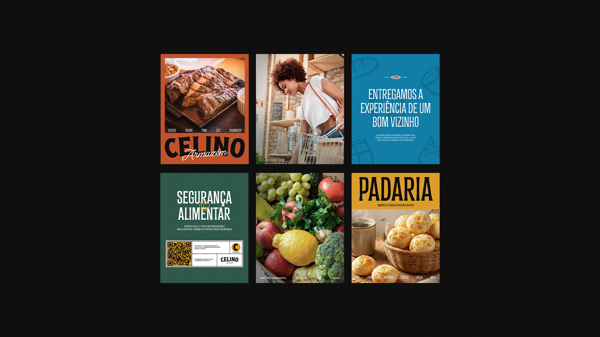
Exhibiting a familiar and neighborhood essence, Celino Armazém offers a shopping experience that recaptures the human warmth of everyday interactions. The brand unifies the fundamental pillars of local commerce to deliver selected products free of excess, all curated with proximity and trust.
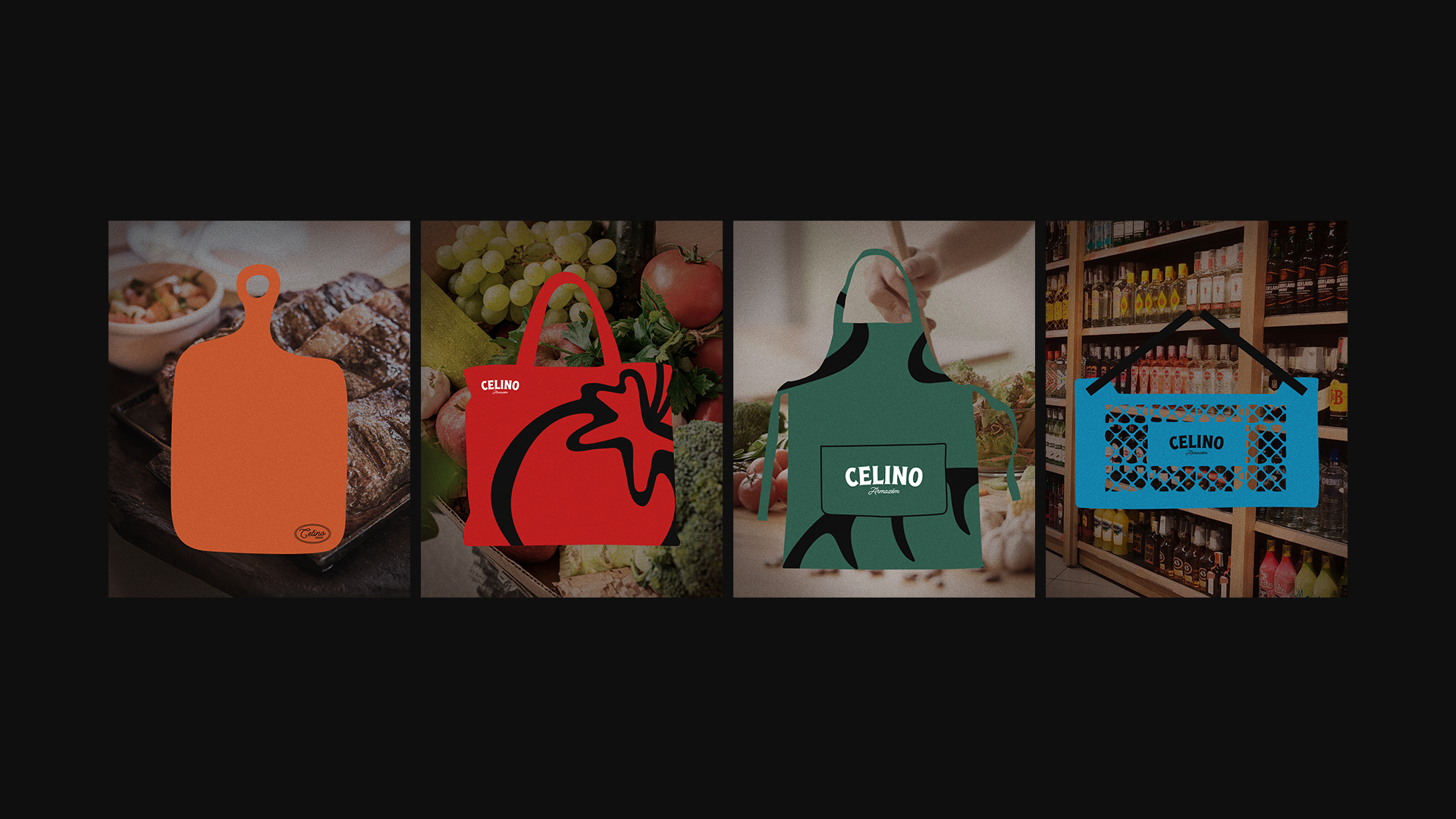
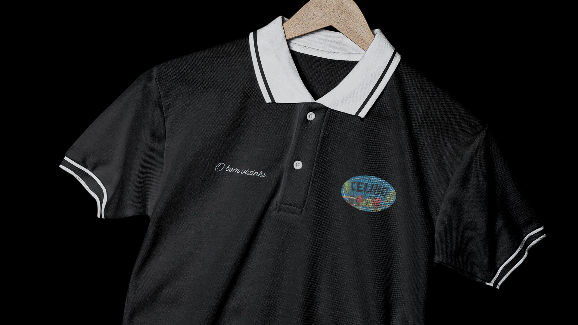
The visual identity and environment were designed to be accessible, honest, and vibrant, providing a space where customers can manage their routines with ease and feel a true sense of belonging. The visual signature is an extension of the brand’s presence as a trusted neighbor, always nearby when needed.
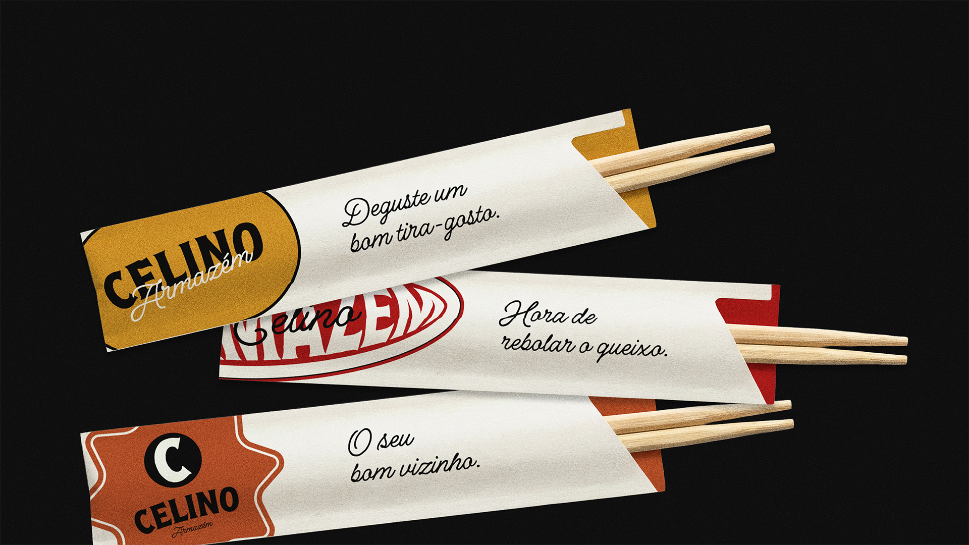
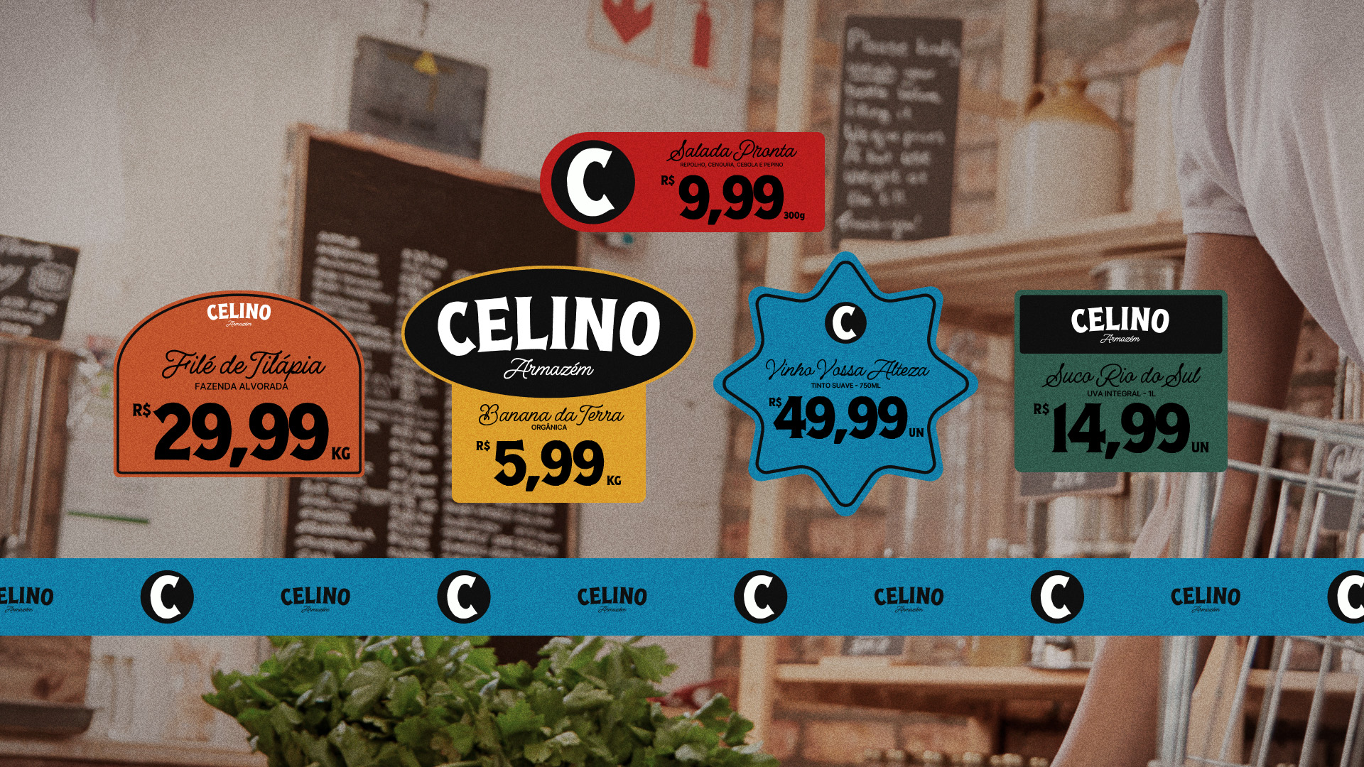
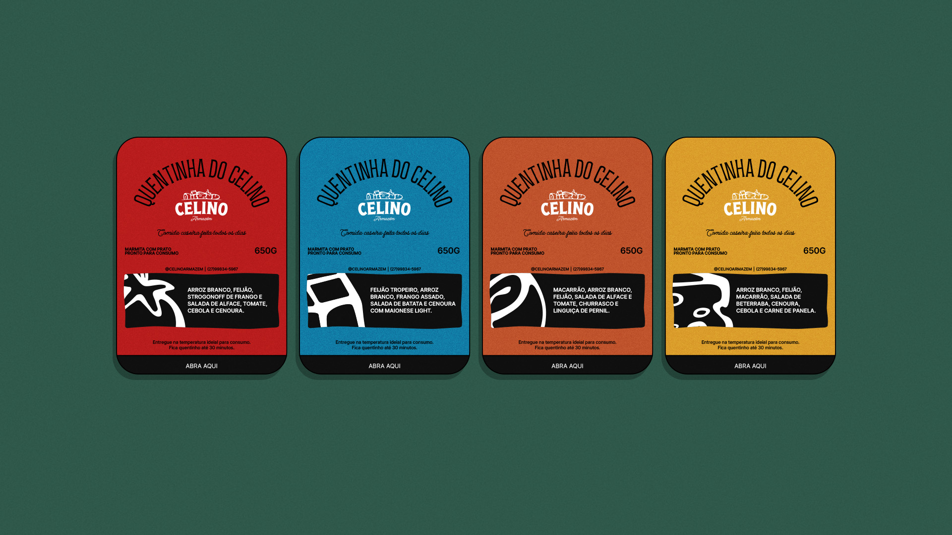
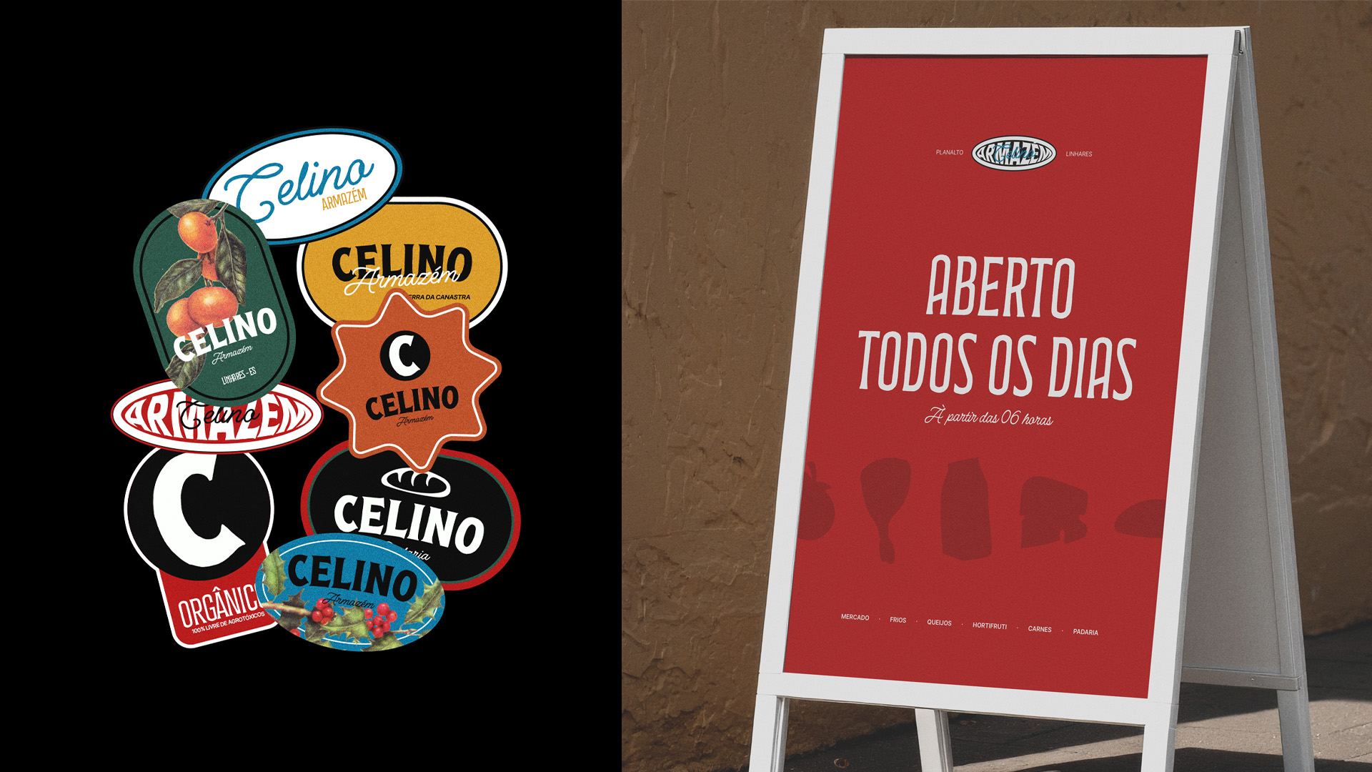
Our color scheme was built to convey the essence of the brand: a neighborhood store that is friendly, reliable, and accessible. Each color plays a functional and emotional role, representing not only the products sold, but also the diversity, freshness, and naturalness of the shopping experience at Celino.
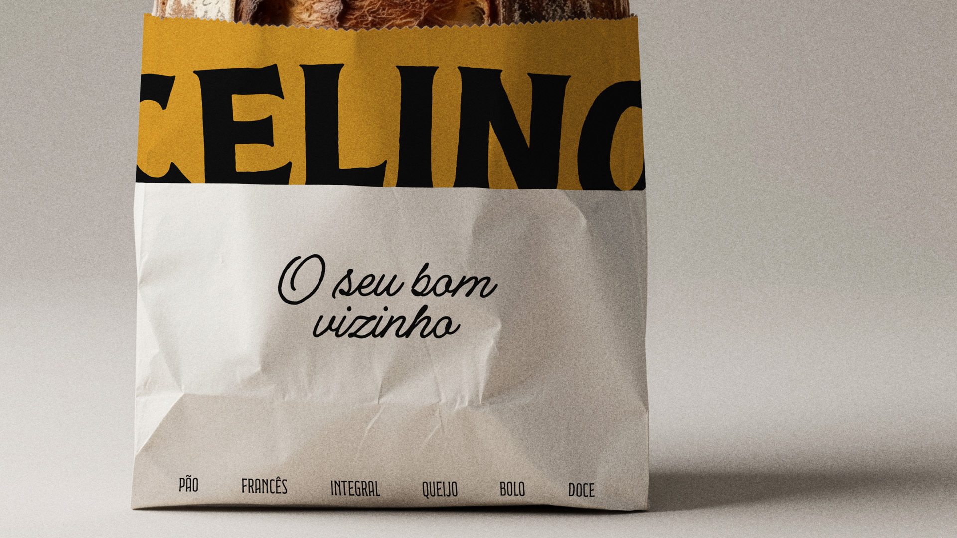
The typeface carries humanistic characteristics and hand-drawn strokes, reinforcing the idea of friendliness, care, and closeness to the daily life of the neighborhood.
The brand carries the history of the family that gives life to the business. More than a point of sale, Celino was built to be an extension of the customer’s home. The visual strategy avoids the coldness of large retailers to embrace the aesthetics of imperfection and welcoming.

CREDIT
- Agency/Creative: OTA.DSGN
- Article Title: OTA.DSGN Designs a Friendly Retail Experience Rooted in Everyday Life for Celino Armazém
- Organisation/Entity: Freelance
- Project Type: Graphic
- Project Status: Published
- Agency/Creative Country: Brazil
- Agency/Creative City: Linhares
- Market Region: South America
- Project Deliverables: Brand Identity
- Industry: Food/Beverage
- Keywords: market, mini-market, brand, identity, packaging


