


In 2018, Break, a specialized donut and creative cake company established in Riyadh, Saudi Arabia, set out to reinvent the dessert experience with unique flavors and concepts. With a focus on providing unusual flavor combinations, Break required a brand identity that showed its dedication to originality, quality, and customer satisfaction. OStudio was tasked with creating an engaging visual identity and packaging design that captured the brand’s ideals of simplification and simplicity.
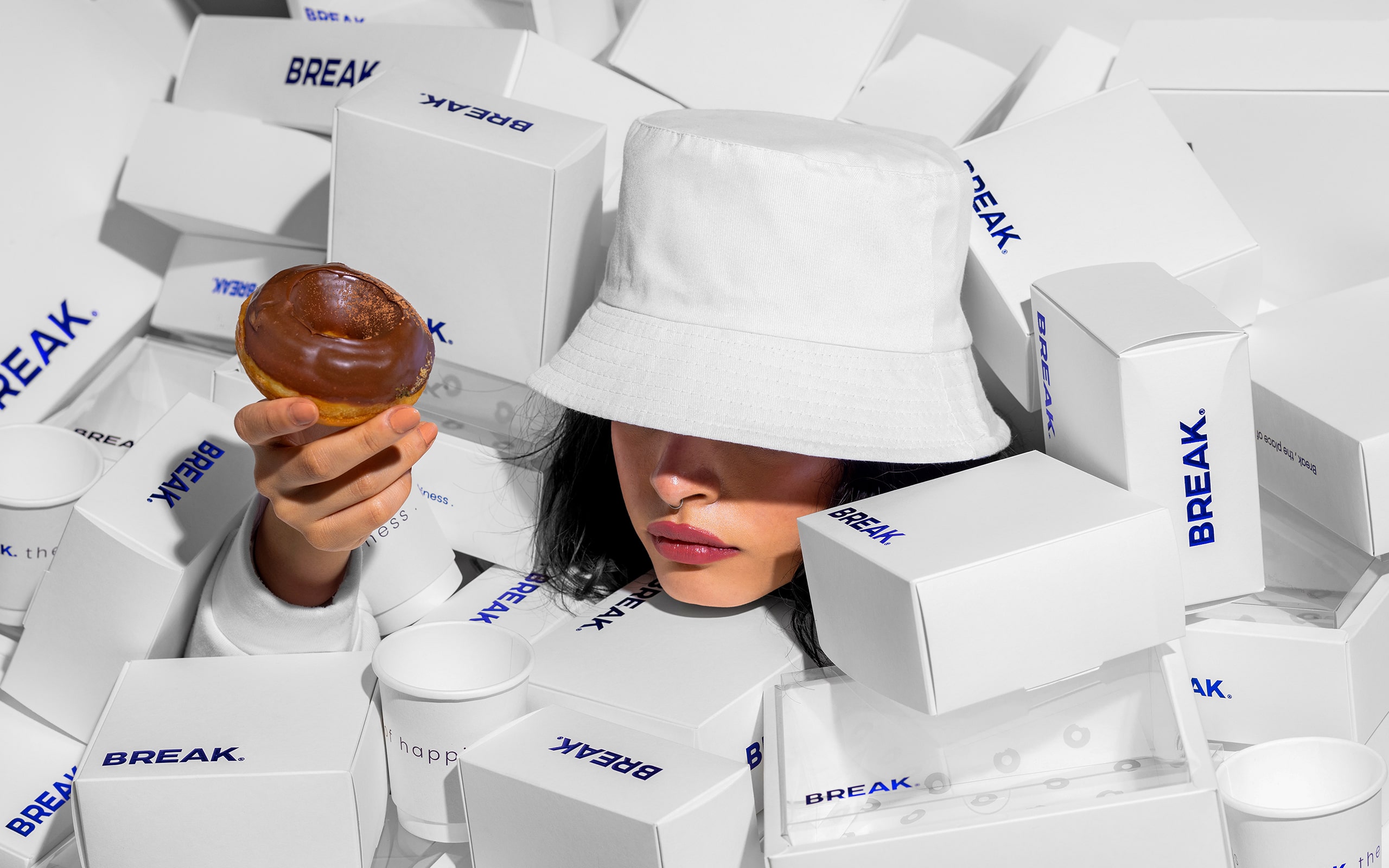
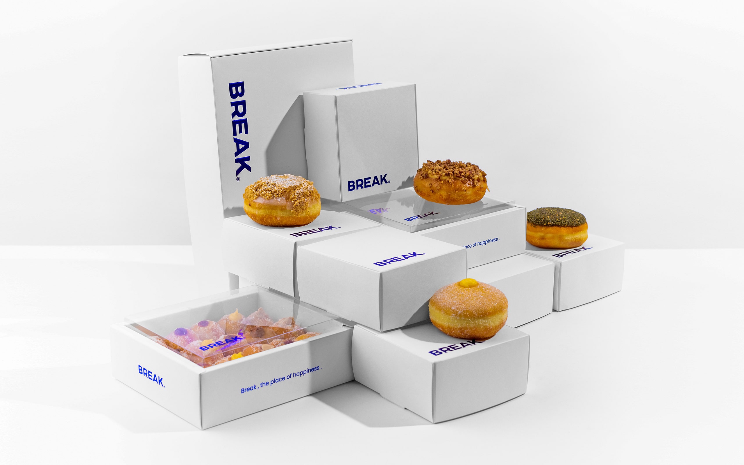
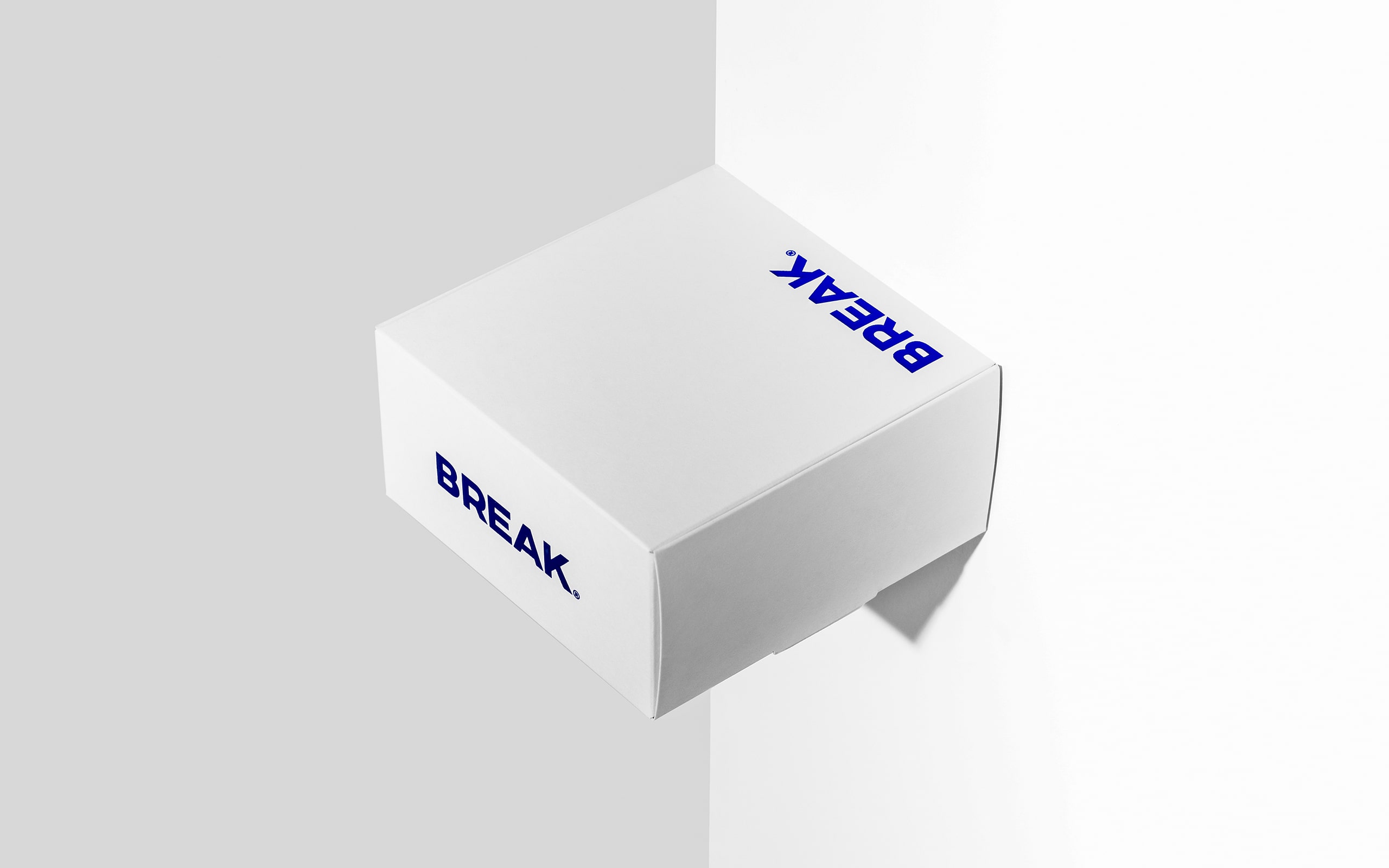
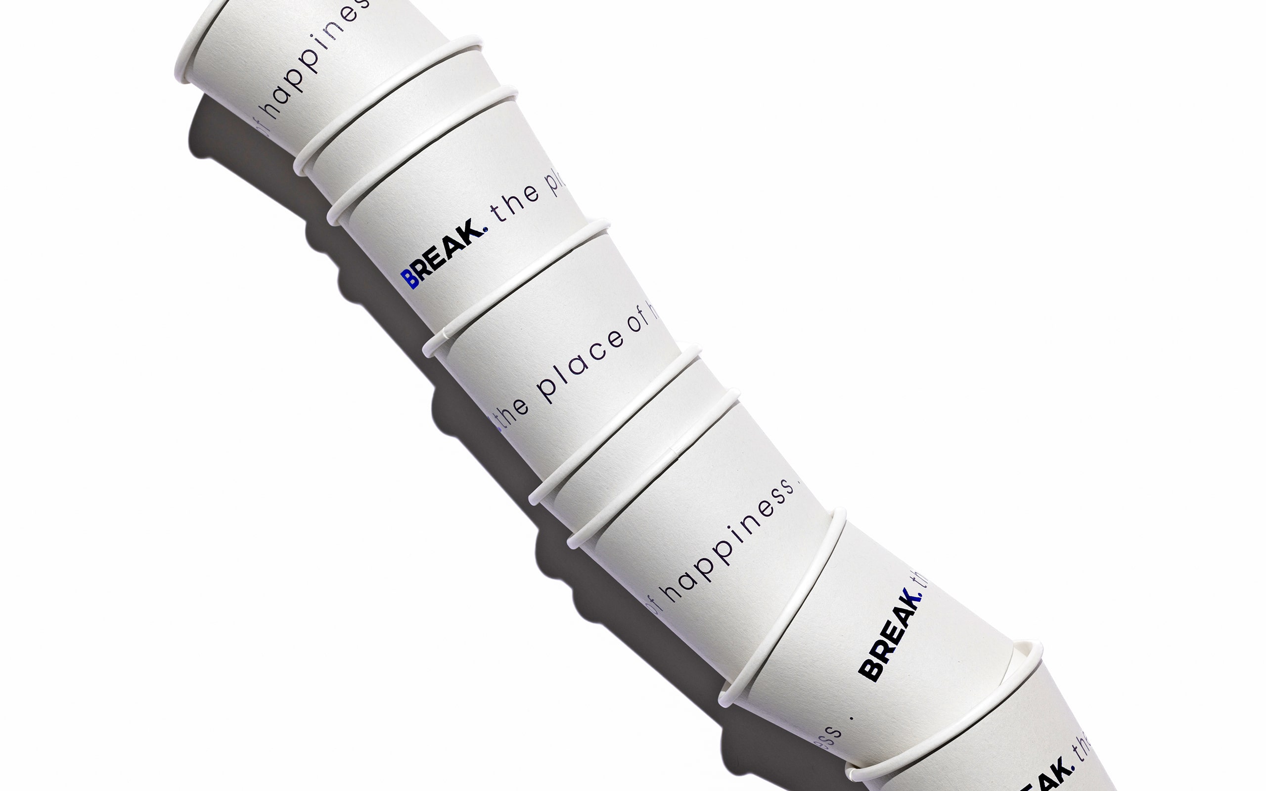
OStudio’s approach to Break’s branding was based on the concept of taking a “Break”—a time of indulgence that allows one’s imagination to fly. The logo was created to make a direct link with the product by including a prominent dark-colored letter that emanates elegance and distinctiveness while preserving an overall sense of simplicity and clarity. This design concept underscores the brand’s goal to provide enjoyable and satisfying experiences.
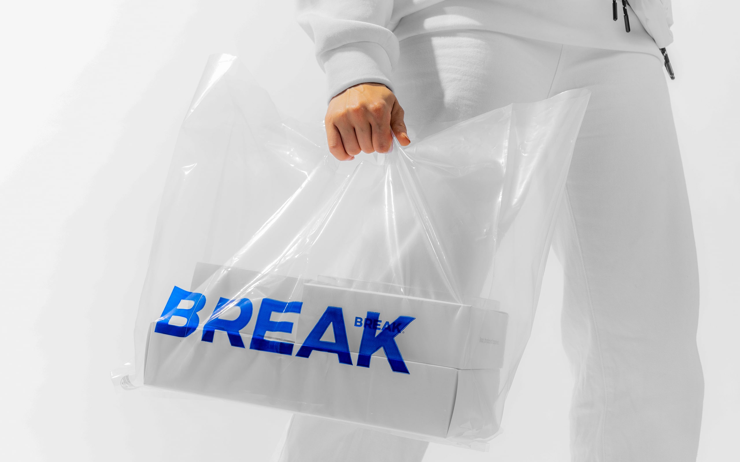
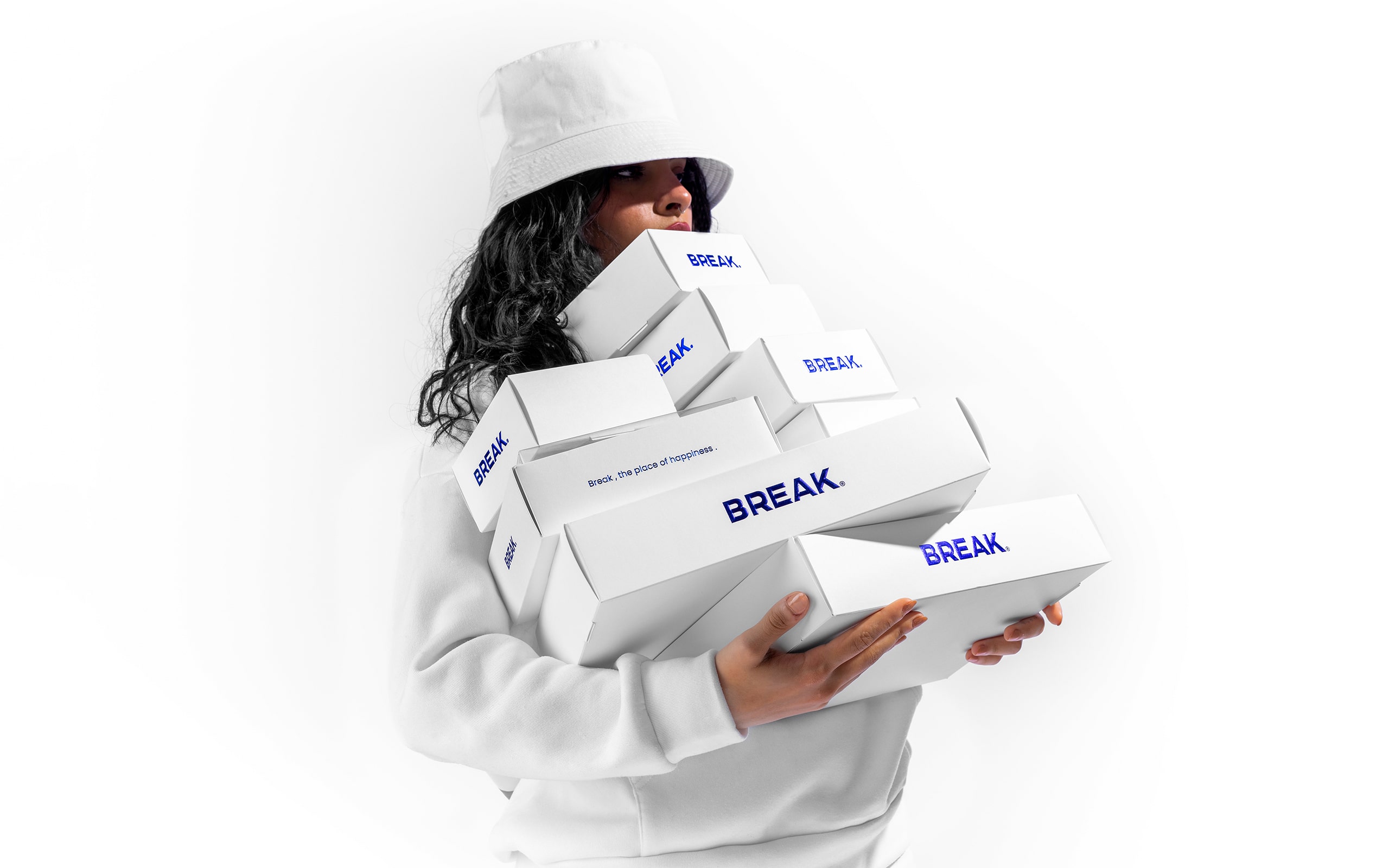
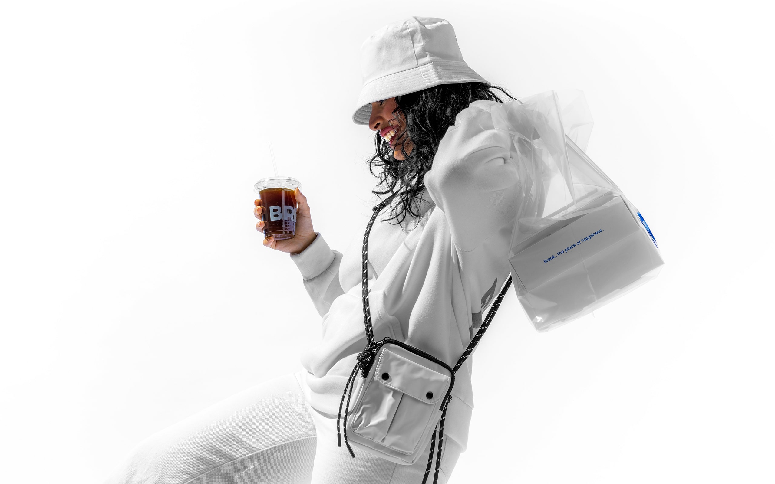
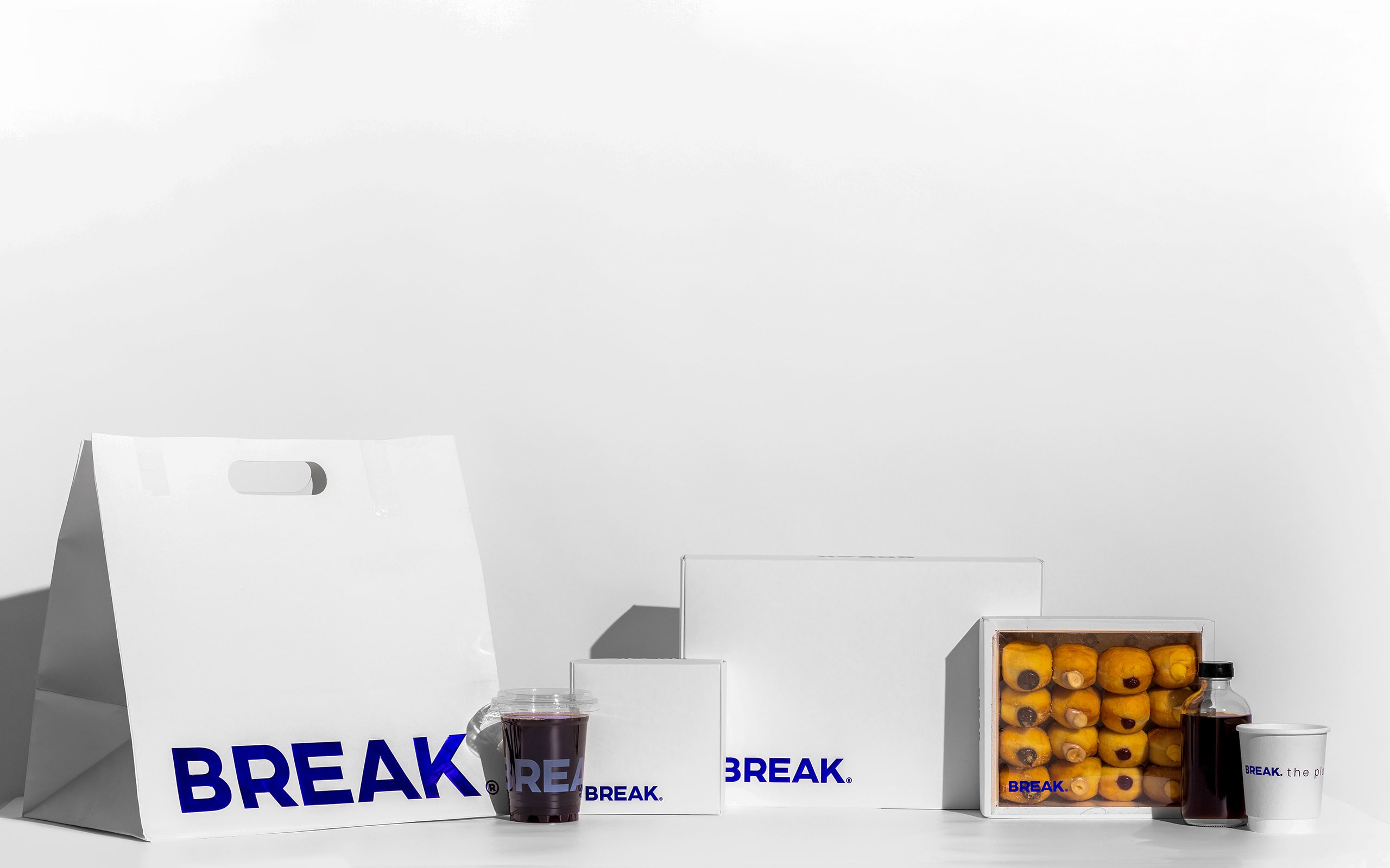
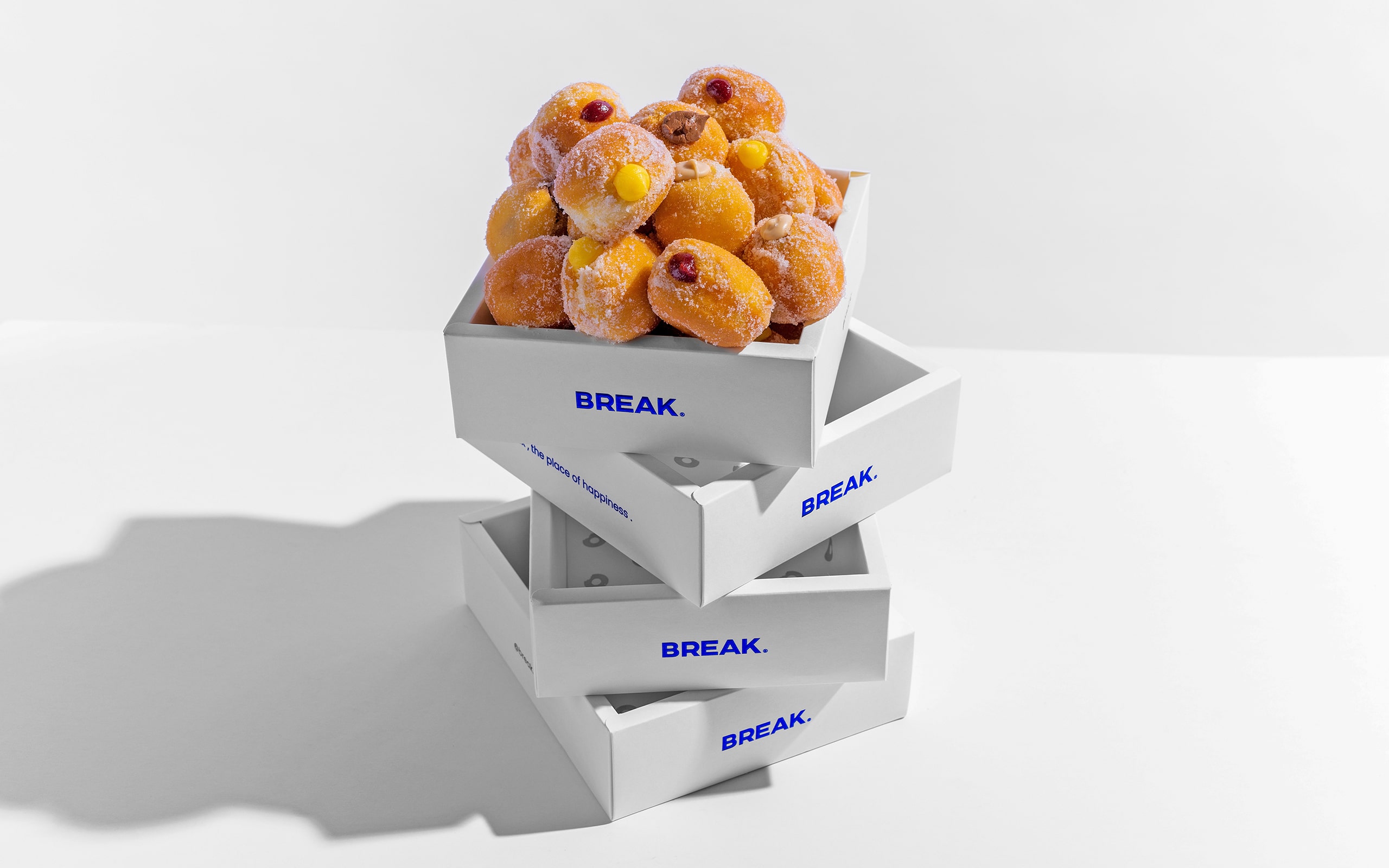
Break’s identity was heavily influenced by its color palette. The deep blue chosen as the major brand hue represents trust and reliability, resulting in an appealing yet refined appearance. To supplement this, bright and lively accent colors were used in packaging elements, adding brightness and reinforcing the values of fun, enthusiasm, and liveliness. The end result is a visually appealing brand that attracts clients’ attention and connects with them on an emotional level.
Beyond aesthetics, OStudio’s design strategy was based on integrated simplicity, which ensured that Break’s brand identity communicated ambition and exceeded expectations. The packaging design, which includes eye-catching stickers and playful visual components, improves the consumer experience by making each interaction with the product memorable.
The phrase “Break: The Place of Happiness” effectively reflects the brand’s primary theme of providing moments of joy through exquisite delicacies.
OStudio has played an important part in shaping Break’s journey by establishing a strong market presence while remaining true to its purpose of creativity and passion in the world of desserts.
CREDIT
- Agency/Creative: Ostudio.
- Article Title: Ostudio’s Creative Approach to Designing the Break Brand Identity and Packaging
- Organisation/Entity: Agency
- Project Type: Identity
- Project Status: Published
- Agency/Creative Country: Saudi Arabia
- Agency/Creative City: Riyadh
- Market Region: Middle East
- Project Deliverables: Art Direction, Brand Identity, Packaging Design, Photography
- Industry: Food/Beverage
- Keywords: Packaging, Brand Design, Brand Identity
-
Credits:
Creative Director: Omar Almoteq


