


The “Orozmani” wine packaging concept design project presented a unique challenge that required incorporating weather conditions into the packaging design while maintaining a logical classification. The objective was to create a visually appealing and cohesive concept that would resonate with consumers and effectively communicate the wine’s characteristics.
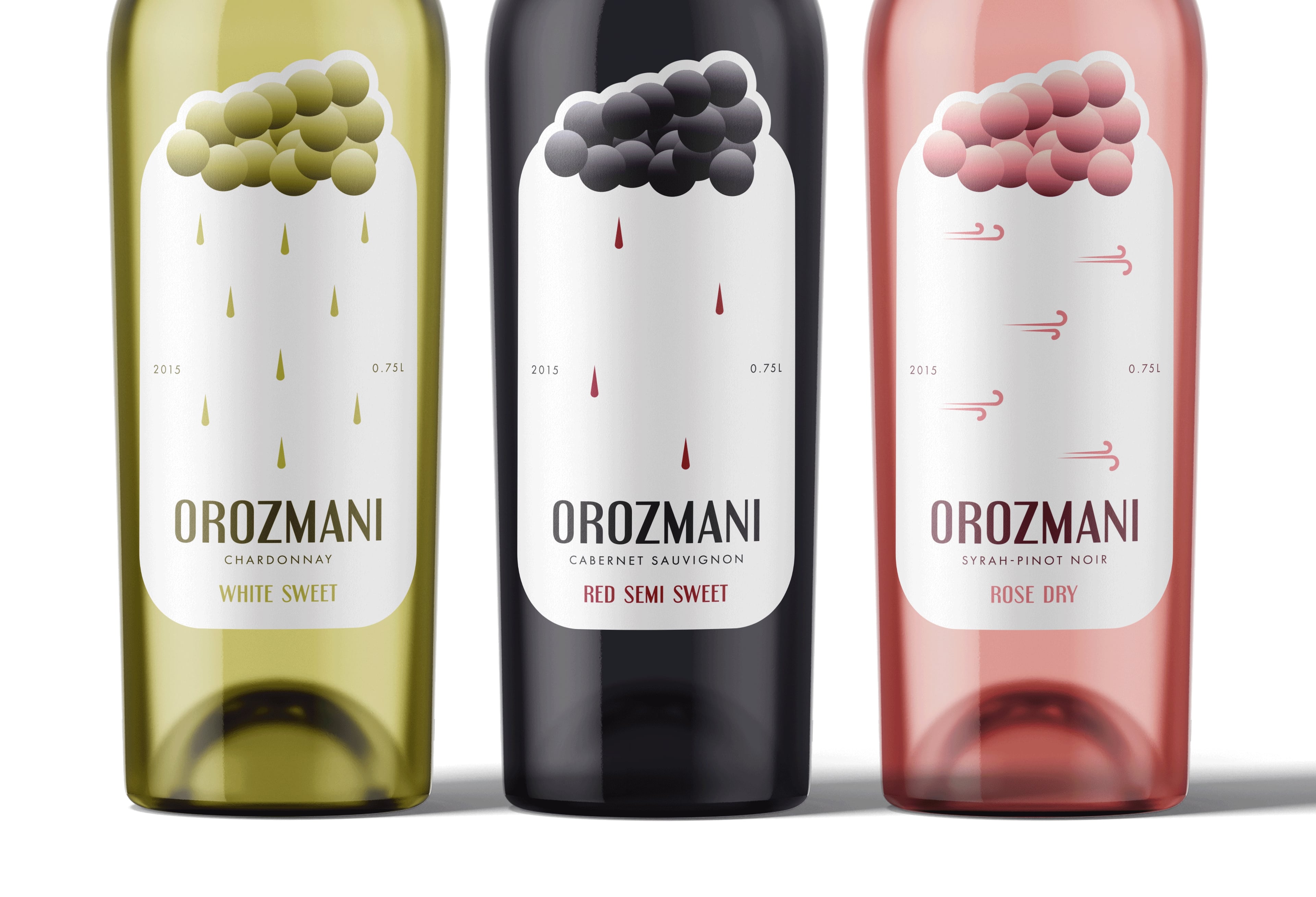
In response to this challenge, I devised a minimalistic metaphor that utilized the imagery of a bunch of grapes resembling clouds. This conceptual approach aimed to establish a connection between the weather and the wine’s taste, creating a cohesive and visually engaging design. The design not only serves an aesthetic purpose but also conveys information about the wine’s characteristics through the visual representation of weather conditions.
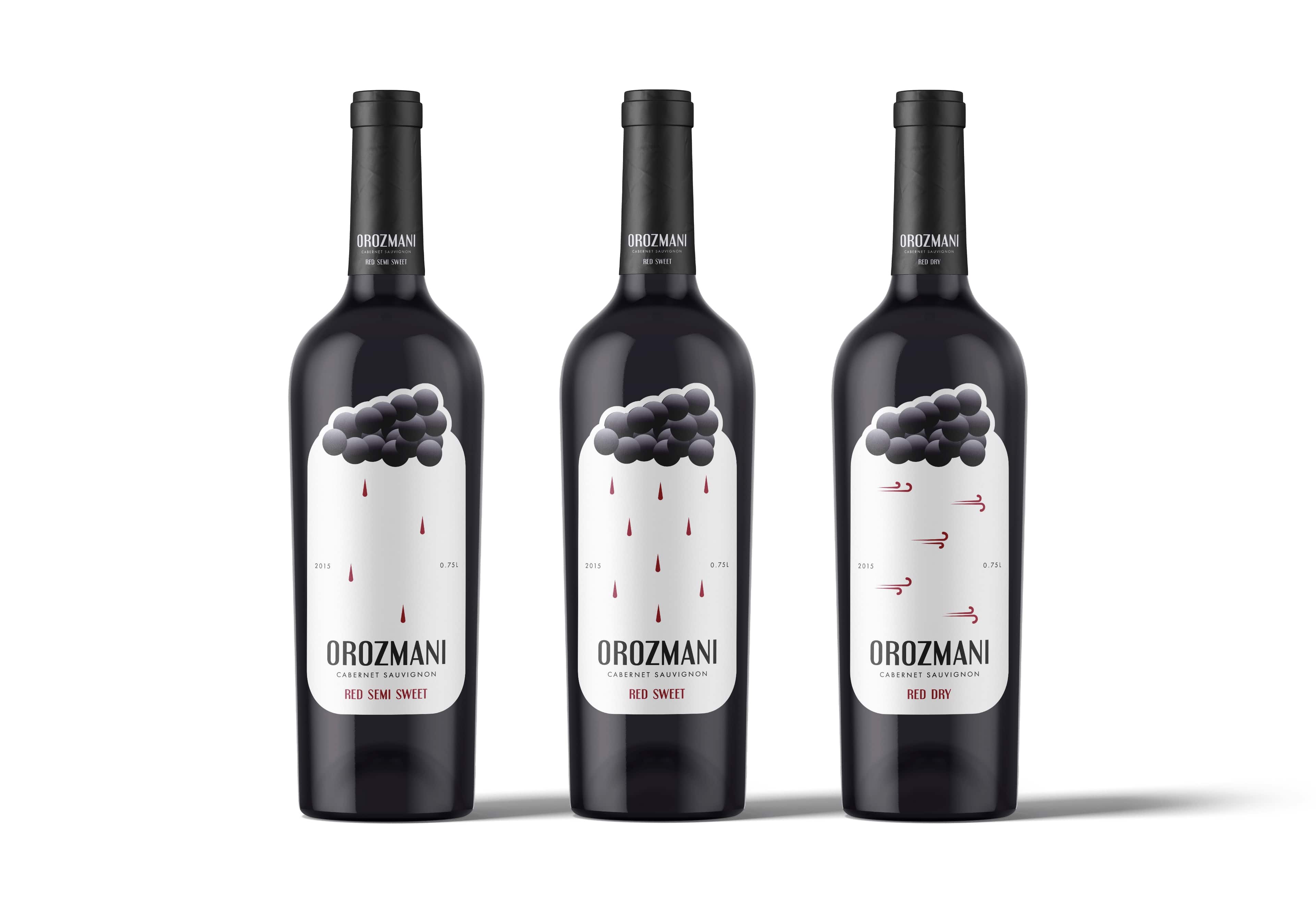
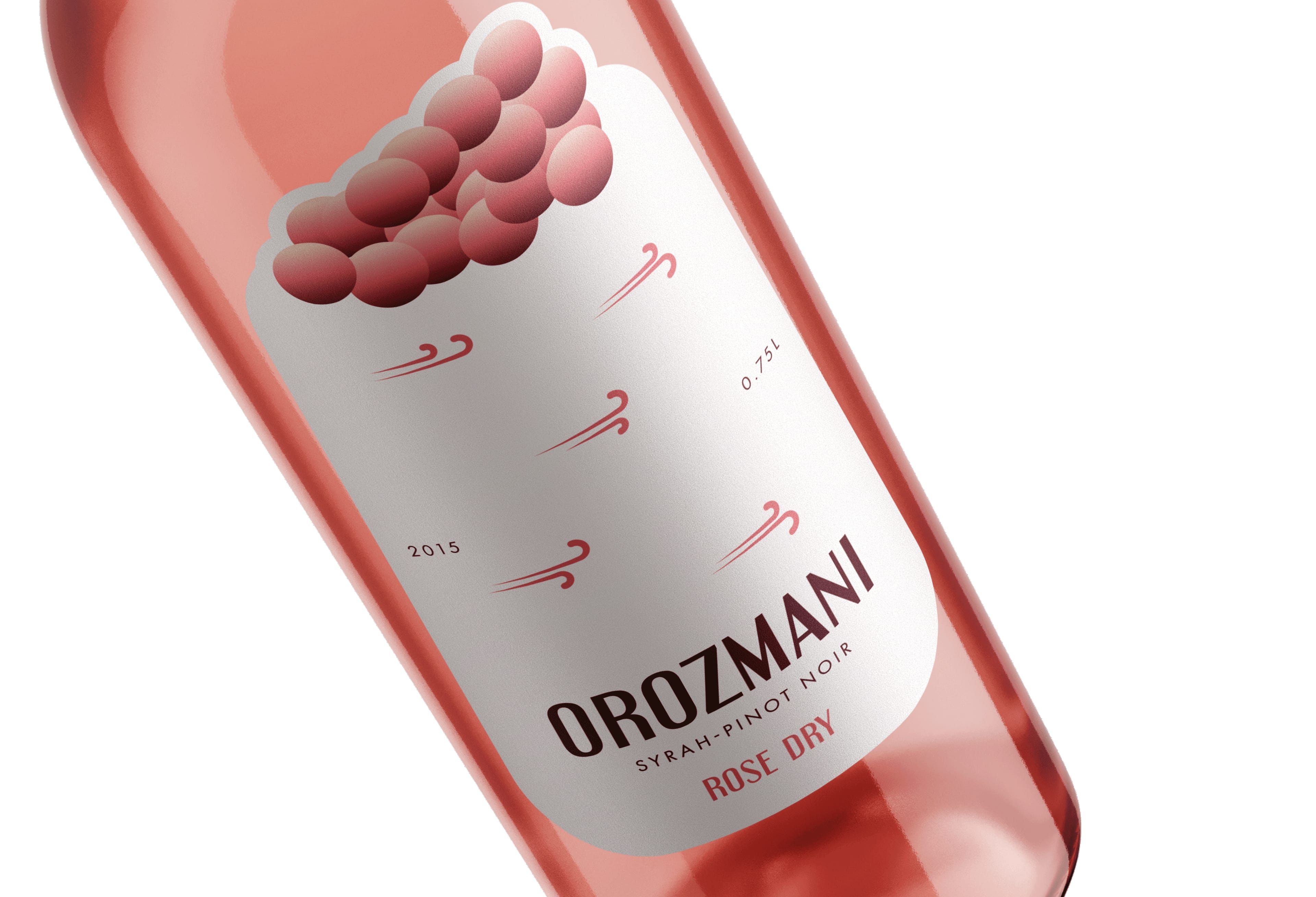
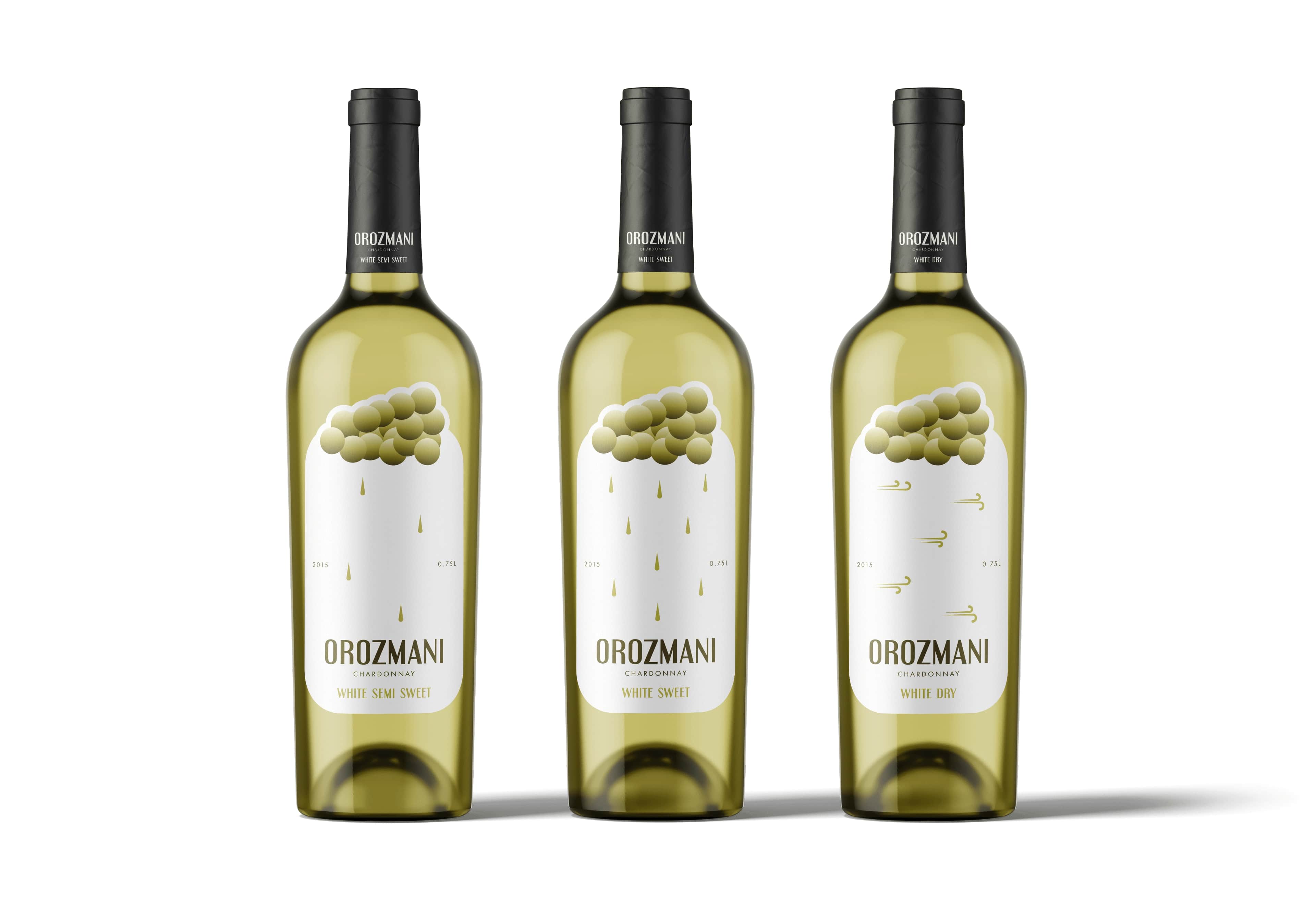
The packaging design skillfully utilizes different weather patterns to classify the wine varieties. For instance, light rain, rainy, and windy weather conditions are creatively integrated to symbolize distinct taste profiles of the wine. This innovative approach not only adds an element of uniqueness to the packaging but also allows consumers to easily identify and associate specific weather-inspired elements with their preferred wine choices.
Orozmani, being a Georgian wine brand, holds its cultural roots and traditions in winemaking. The brand boasts an alcohol content of 12%, striking a balance between the rich heritage of Georgian winemaking and contemporary preferences. The 750 ml packaging size is a standard choice, offering consumers a familiar and convenient option while exploring the brand’s diverse range of wines.
The Orozmani wine brand takes pride in its diverse selection, offering three distinct varieties: red, rose, and white. Each variant is meticulously crafted to deliver a unique and memorable tasting experience. The red wine embodies bold and robust flavors, the rose wine presents a delightful balance of fruitiness, and the white wine offers a crisp and refreshing taste.
The packaging design not only communicates the wine’s characteristics but also contributes to the overall brand identity. The use of the weather-inspired metaphor creates a cohesive visual language that extends beyond individual bottle designs, providing a consistent and recognizable branding element for Orozmani wines.
In conclusion, the Orozmani wine packaging concept design successfully combines aesthetics with functionality. The innovative use of weather-inspired elements adds a layer of storytelling to the brand, allowing consumers to connect with the product on a deeper level. This thoughtful and well-executed design contributes to the overall brand narrative, making Orozmani wines stand out in a competitive market.


CREDIT
- Agency/Creative: Edgar Muradovi
- Article Title: Orozmani Wines Packaging Concept
- Organisation/Entity: Student
- Project Type: Packaging
- Project Status: Published
- Agency/Creative Country: Azerbaijan
- Agency/Creative City: Baku, Azerbaijan
- Market Region: Europe
- Project Deliverables: Concept Art, Packaging Design
- Format: Bottle
- Industry: Food/Beverage
- Keywords: Wine, packaging, weather, rain, wind, student
-
Credits:
Designer: Edgar Muradovi


