


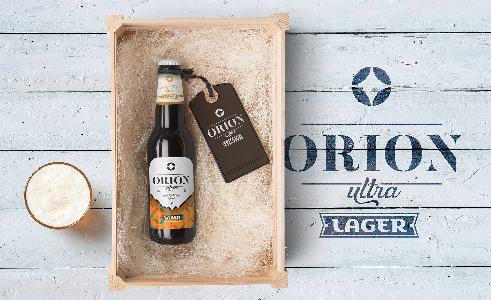
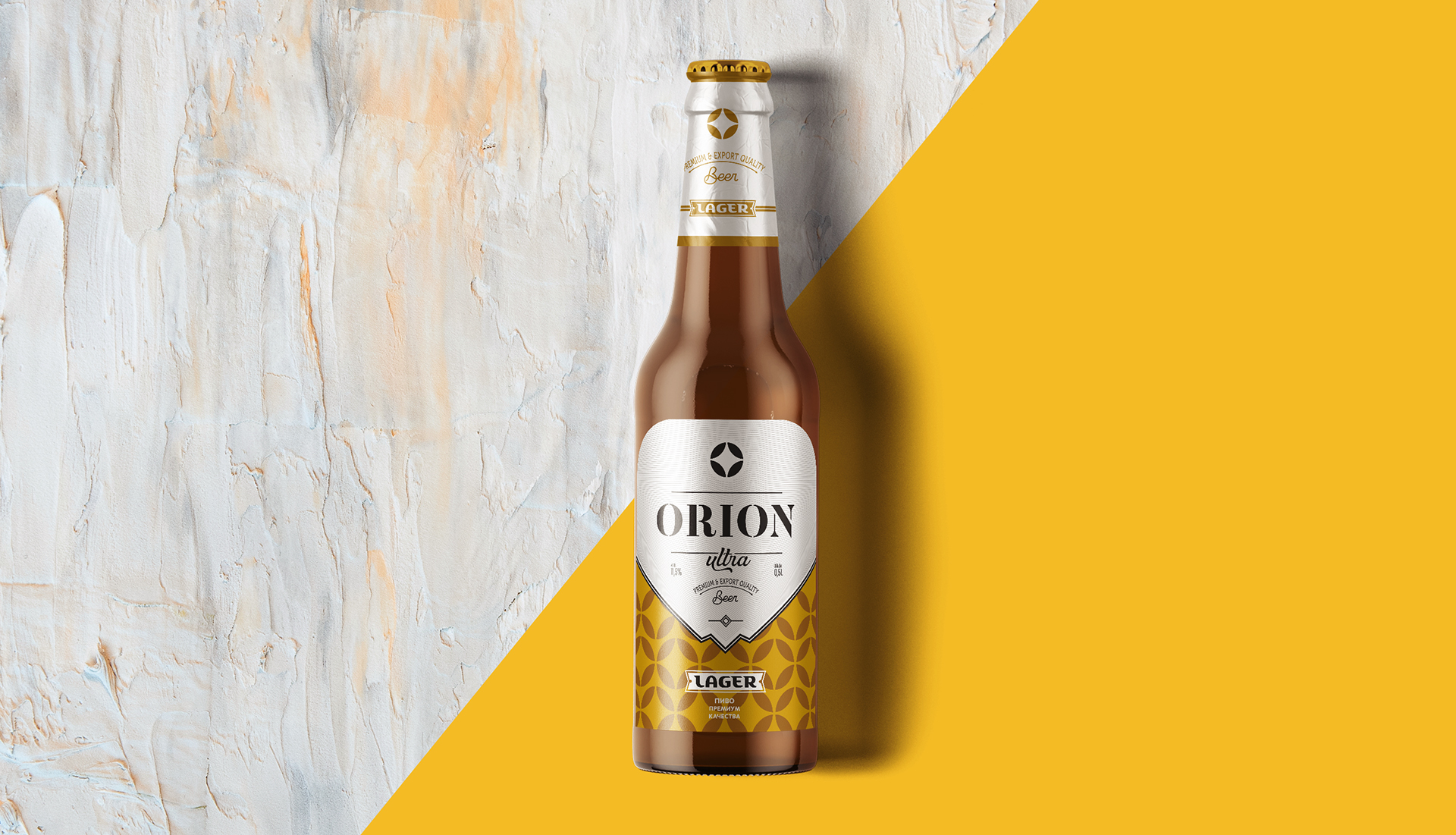
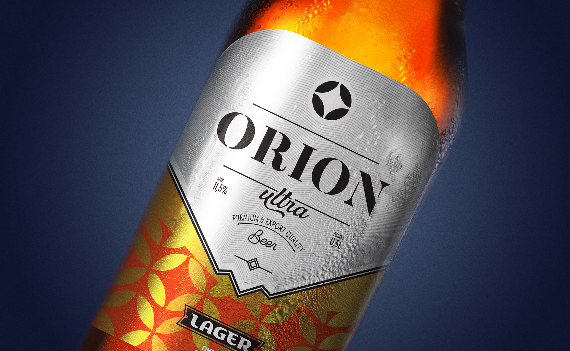
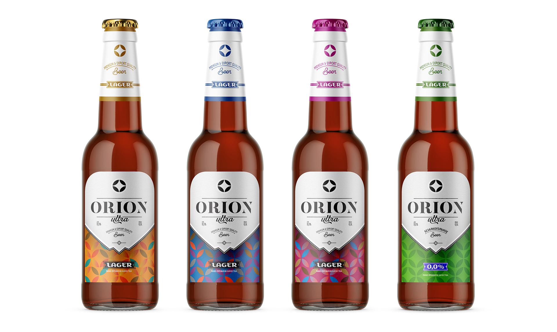
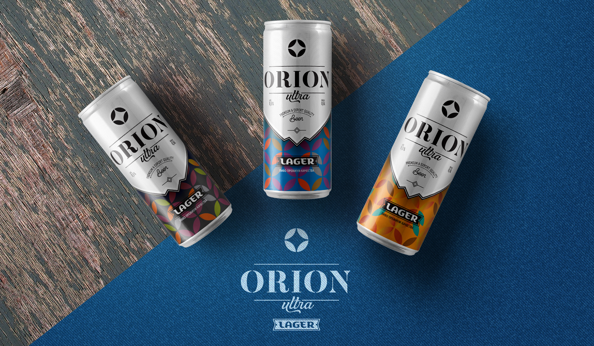
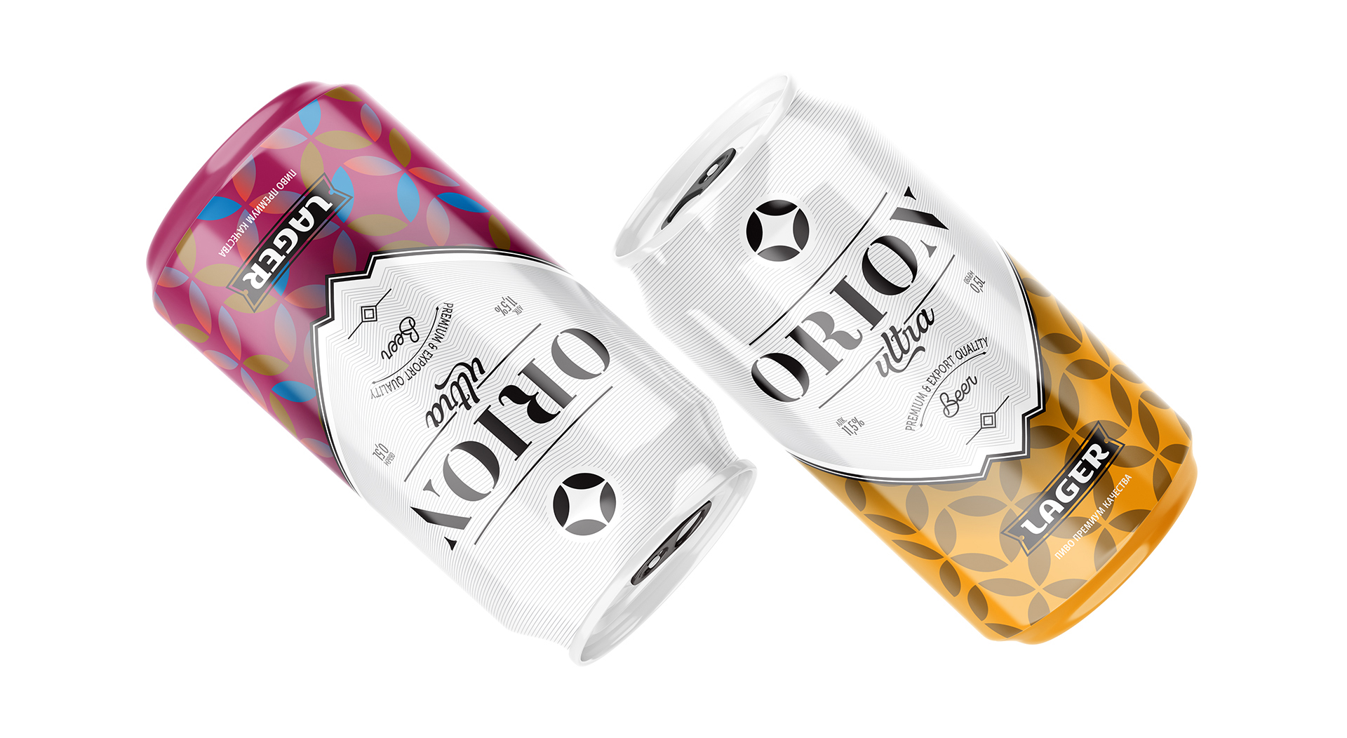
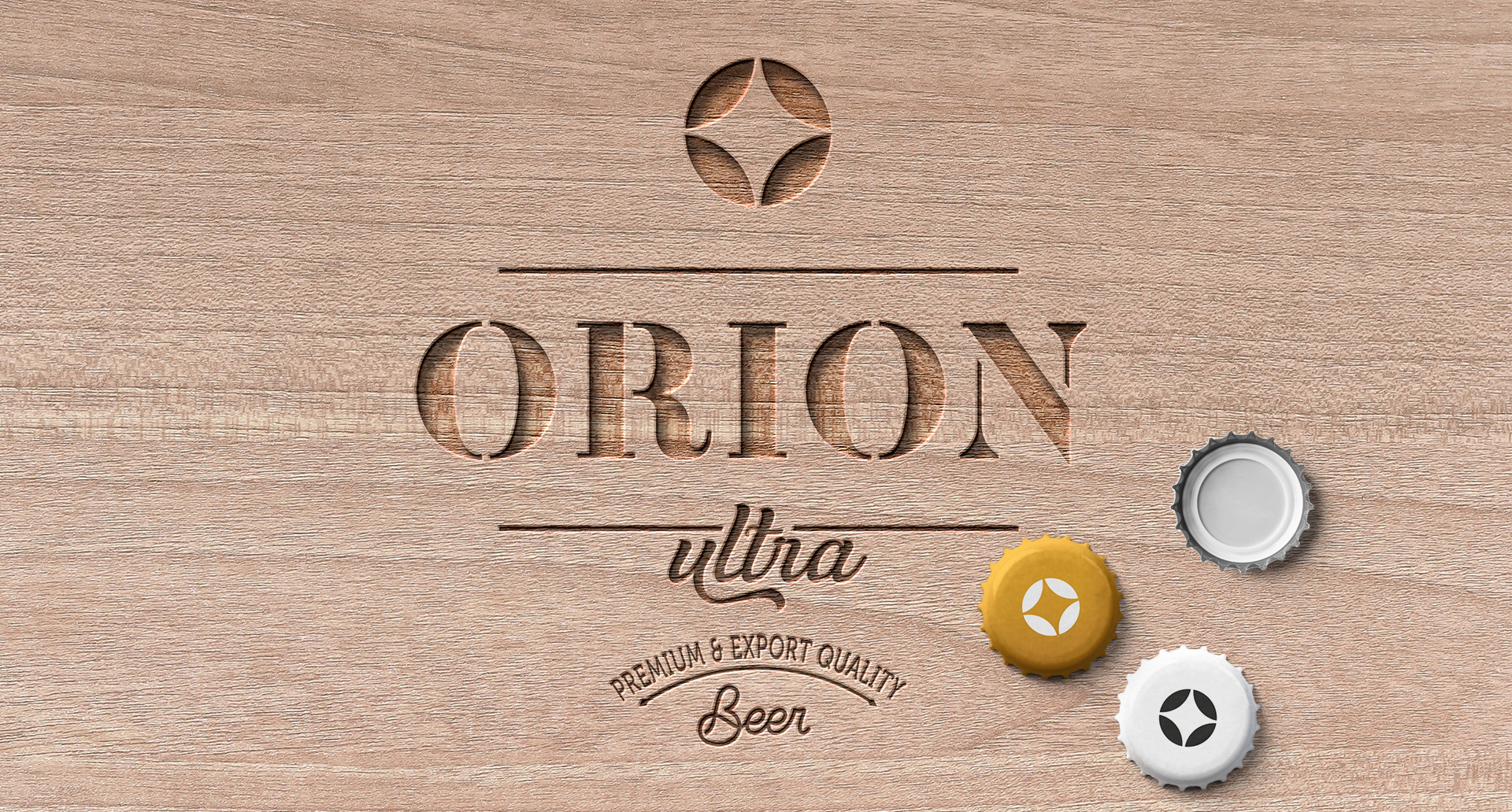
A logo, branding elements and packaging design were developed for this new product. A very simple and memorable symbol: this is the letter “O” and the symbol of ears of wheat and the symbol of a Orion Star. “Black top” and “colored bottom” serve as design motives. The brand symbol has become the basis for the brand pattern involved in product design.


CREDIT
- Agency/Creative: Alexey Lysogorov
- Article Title: Orion Ultra Lager Beer from Kyrgyzstan Designed by Alexey Lysogorov
- Organisation/Entity: Freelance, Published Commercial Design
- Project Type: Packaging
- Agency/Creative Country: Kyrgyzstan
- Market Region: Asia
- Project Deliverables: Brand Identity, Brand Strategy, Packaging Design
- Format: Bottle, Can
- Substrate: Glass Bottle
FEEDBACK
Relevance: Solution/idea in relation to brand, product or service
Implementation: Attention, detailing and finishing of final solution
Presentation: Text, visualisation and quality of the presentation


