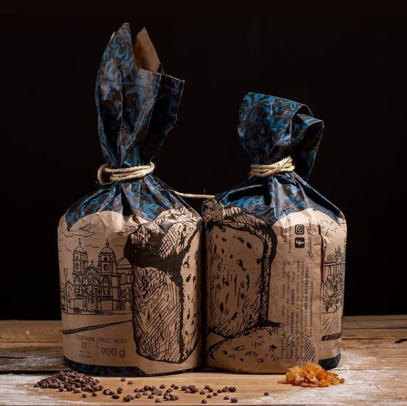
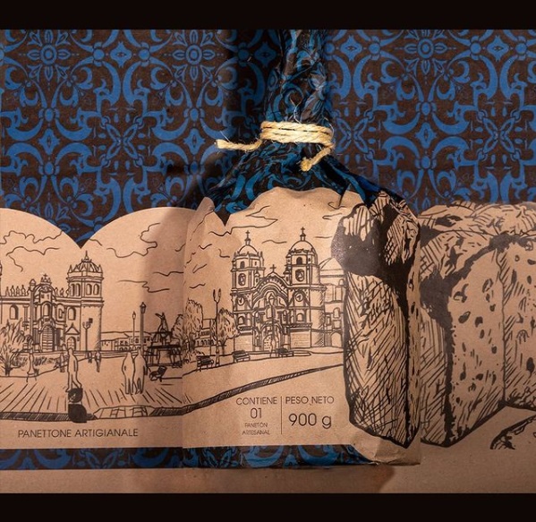
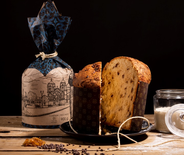
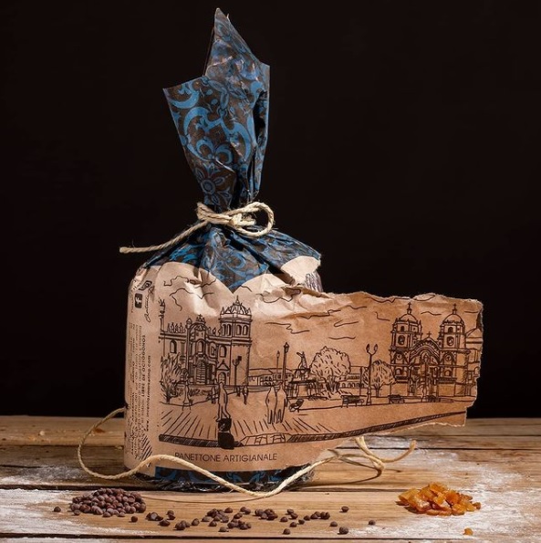
Bianco is a Panettone brand located in Cusco, Perú. His products are artisan and they have a small batch production. The chef is originally from Puglia, Italy, but has been living in Cusco, Perú for about 10 years where he has a family and a pastry shop. He came to us with the idea of graphic design to promote social media, however after the insights were gathered in a focus group, we stablished that a new packaging could seal the deal to increase audience and sales. The packaging design reflects the artisan tradition and highlights the origin of the Italian Chef mixing it with his 10 years living in Cusco, portrayed in the illustration and italian patterns. The target/audience is broad, because Panettone is traditionally very popular in Perú. We wanted to evoke the feeling of the unique ingredients as well, which comprise sourdough and chocolate chips, a recipe that is not very common in Peru for Panettone, but is for artisan Panettone in Italy. We achieve this with photography and social media advertising, the packaging reflects the eco-friendly business with the use of Kraf Paper instead of the traditional cardboard boxes. As we mentioned, a focus group was carried on in order to determine what people was looking for in a Panettone. The insights revealed a search for a Panettone that could be digested easily and brought the family together around Christmas (time of the year where Panettone is consumed in Peru). The family tradition was represented by the illustration of the main square of Cusco, a place where people hang out with friends and family. The sourdough is the ingredient that perfects the recipe to make it more digestible.
To comply with regulations, the main ingredients, total net weight, units, and nutritional value where added on a card including the barcode for retail purposes.
Some extra information such as Facebook, Instagram and the chef’s signature where added in the packaging.The use of kraft represents an economical and eco-friendly decision, while giving customer the feeling of an artisan and handmade product. A piece of artisan rope is added to conceal the package and give extra feeling of handmade small batch, adding the perception of a premium quality.


CREDIT
- Agency/Creative: Origami Estudio
- Article Title: Origami Estudio Packaging Design for Panettone Artigianale
- Organisation/Entity: In-house, Published Commercial Design
- Project Type: Packaging
- Agency/Creative Country: Peru
- Market Region: South America
- Project Deliverables: Packaging Design, Research, Structural Design
- Format: Wrap
- Substrate: Pulp Paper


