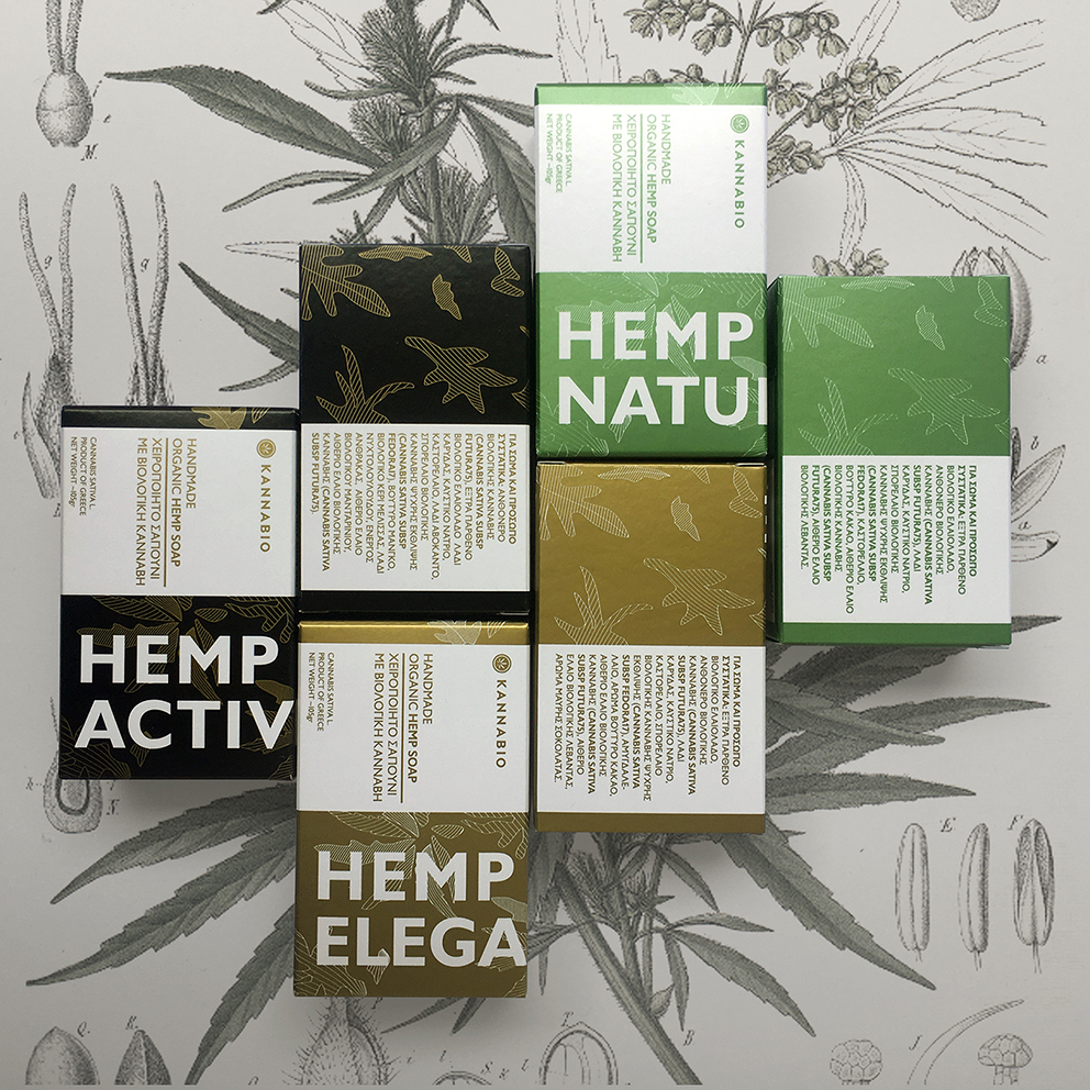
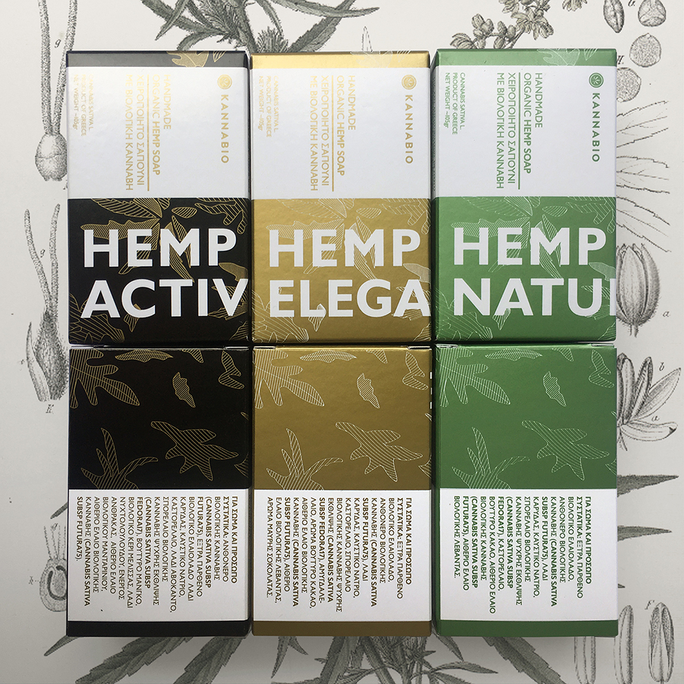
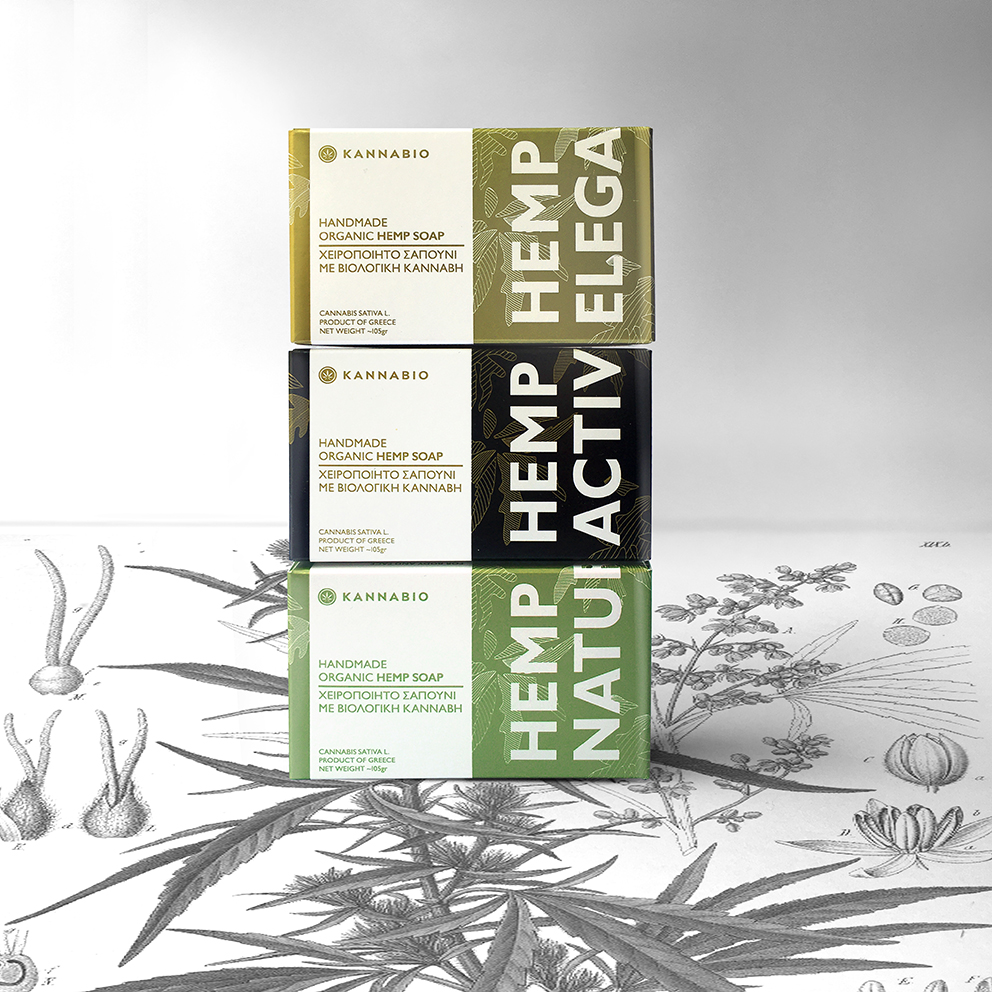
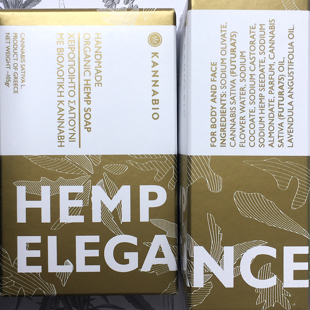
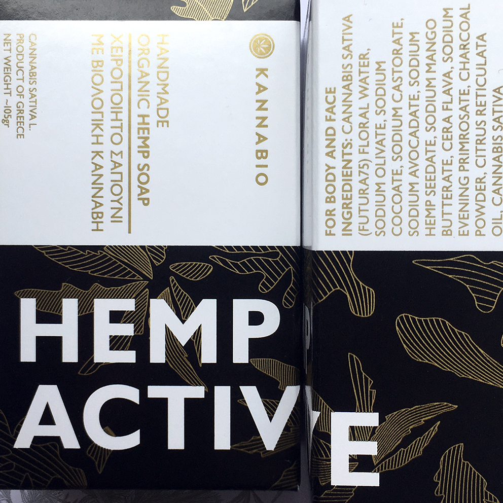
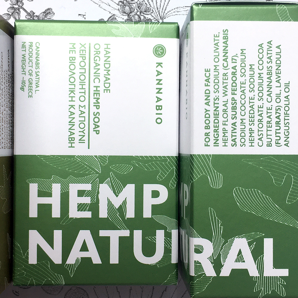
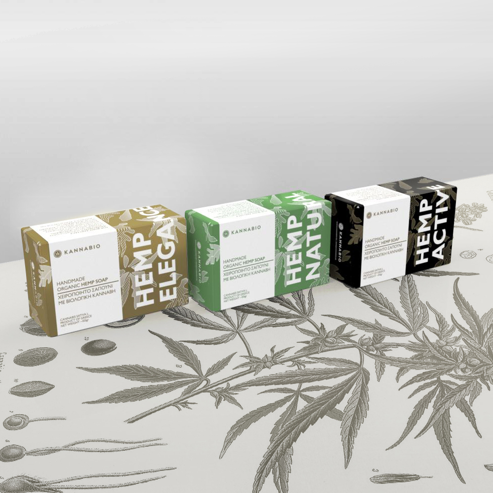
We were asked to design a series of packaging for organic hemp soap for our client Kannabio coop. The initial brand guidelines that we set during the rebranding of the company, were followed throughout the design of the series. Common characteristics, of the brand that are being followed through the majority of the identity applications, include the clear structural bilingual typography always designated at a clear white space (or unobstructed space), an abstract outline depiction of cannabis leaves. During our rebranding process, we suggested to our client to avoid any use of common images of cannabis and cannabis leaves that have been so much overused sending a different and wrong to our case visual message. Three main colours were used to differentiate each product. Two metallic pantones (gold and green) and 1 coated pantone. The choice of the metallic pantone colours, associate the product with an experience of luxurious care according to taste of product preference, while the minimum amount of colours keep the production costs low with no loss in quality and user experience.
CREDIT
- Agency/Creative: deworks.co
- Article Title: Organic Hemp Soap packaging and Branding Designed for Kannabio Coop.
- Organisation/Entity: Agency, Published Commercial Design
- Project Type: Packaging
- Agency/Creative Country: Greece
- Market Region: Multiple Regions
- Project Deliverables: Brand Architecture, Brand Experience, Brand Identity, Brand Redesign, Brand Rejuvenation, Branding, Graphic Design, Identity System, Packaging Design, Photography, Rebranding, Research
- Format: Box
- Substrate: Pulp Paper


