


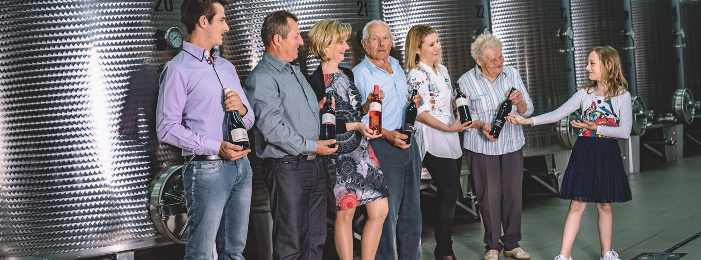
Creating wine labels almost always turns you into a wine traveler and explorer. My last design trip sent me to Erzetic winery in Slovenia. This is a family winery located in Vishnjevik, Brda, which history dates back to 1725! Wow! I was impressed from the very beginning – first because of the great history behind the winery and then because of the beautiful region known for its great wines.
The first project I started working on for Erzetich was the Orbis series.
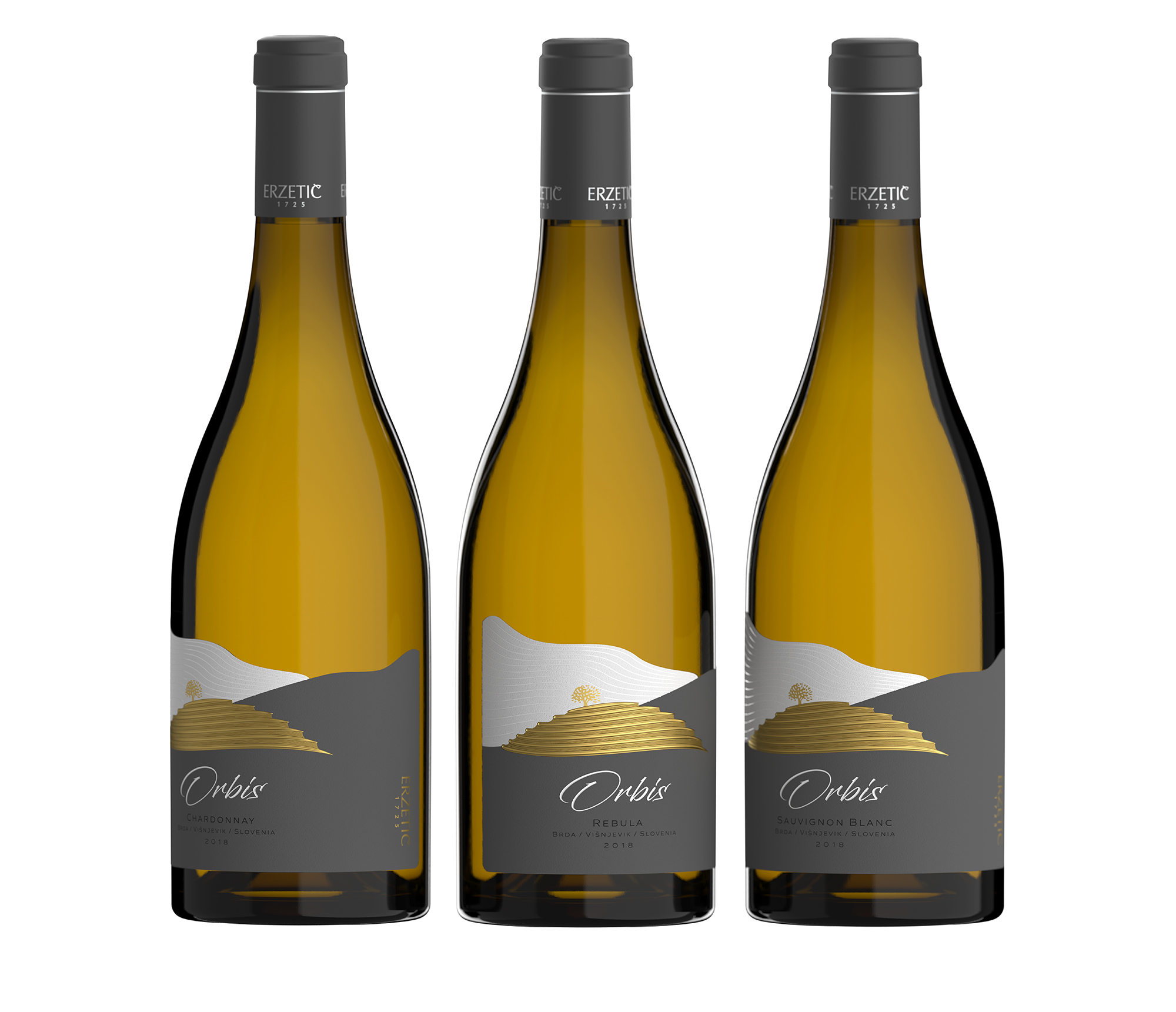
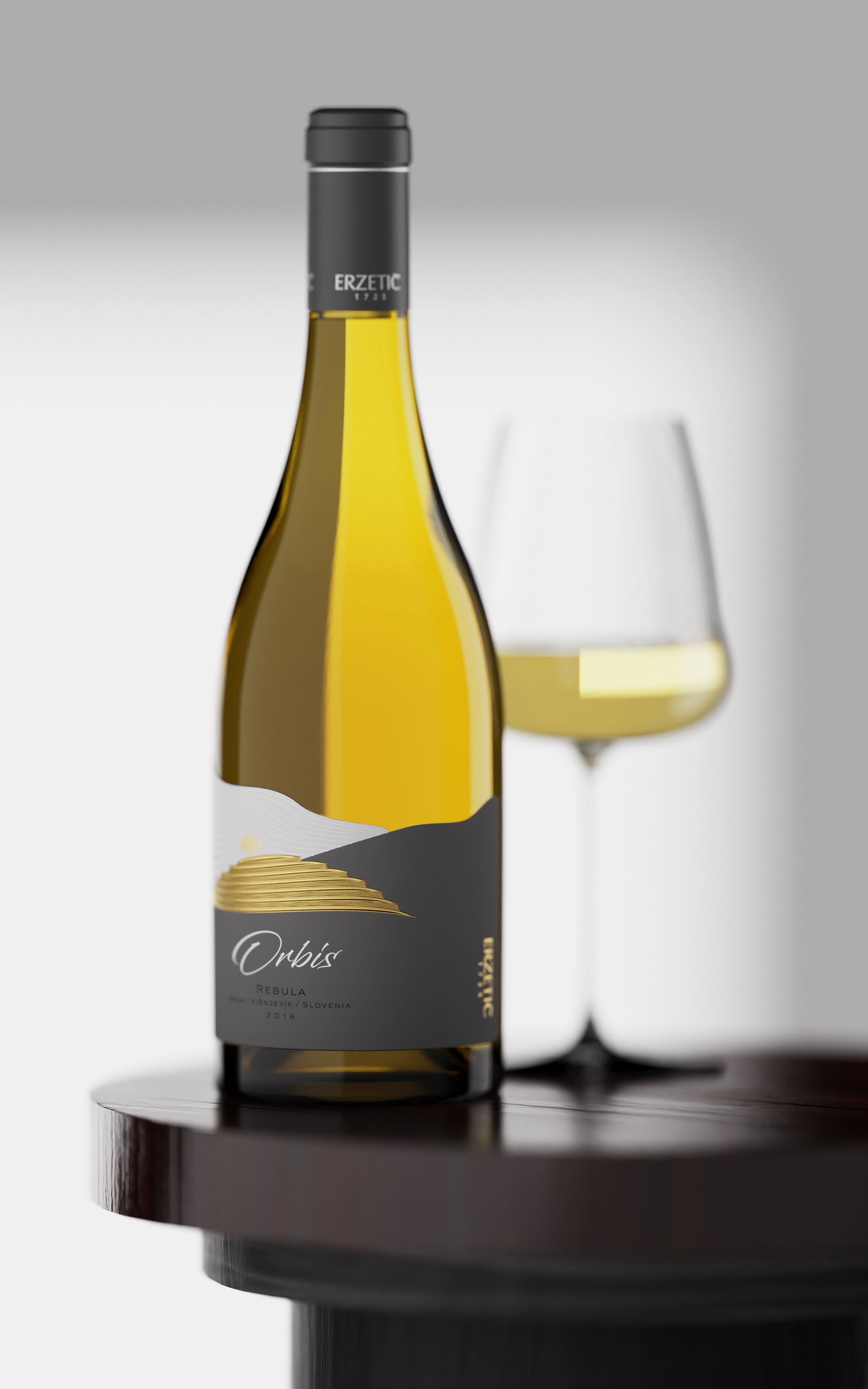
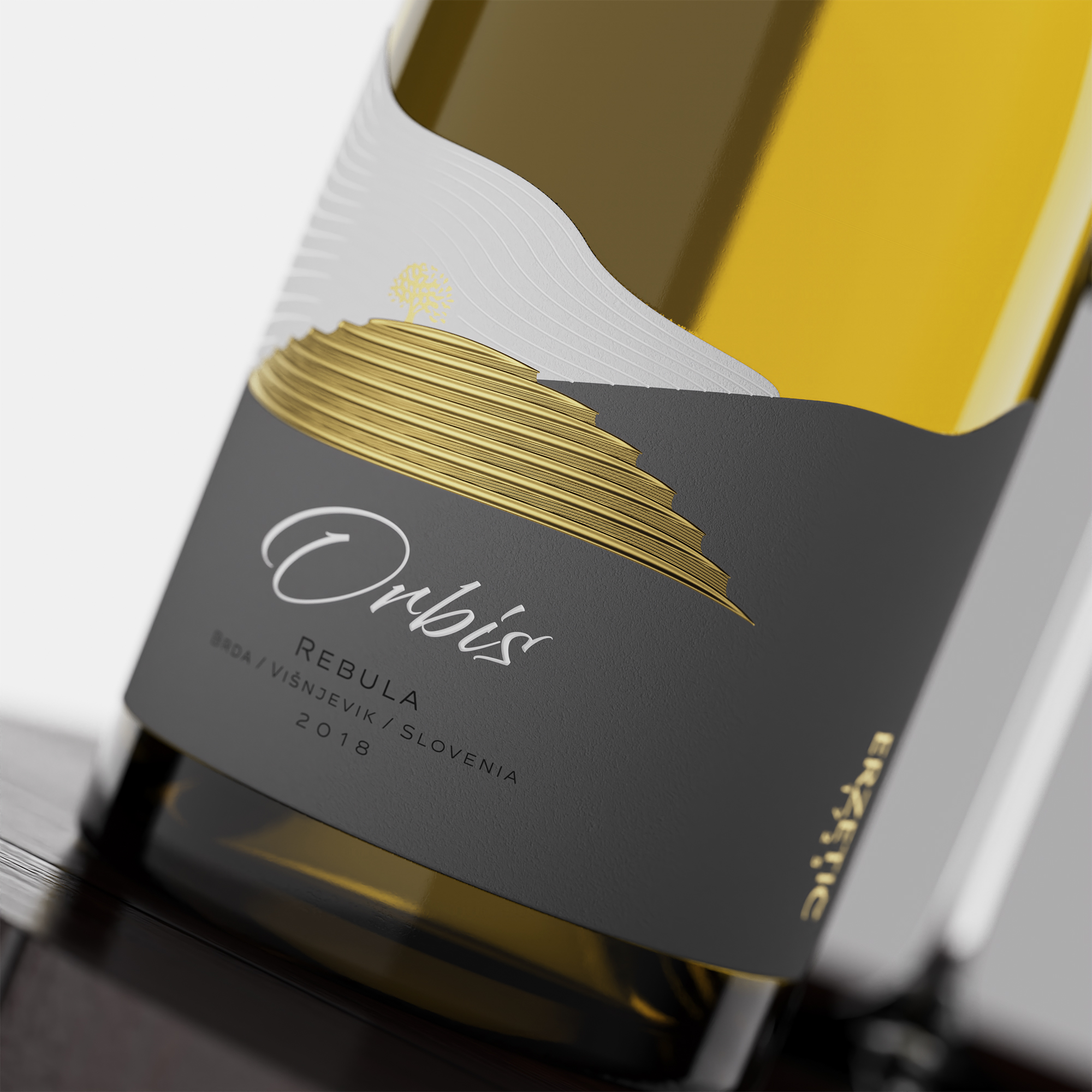
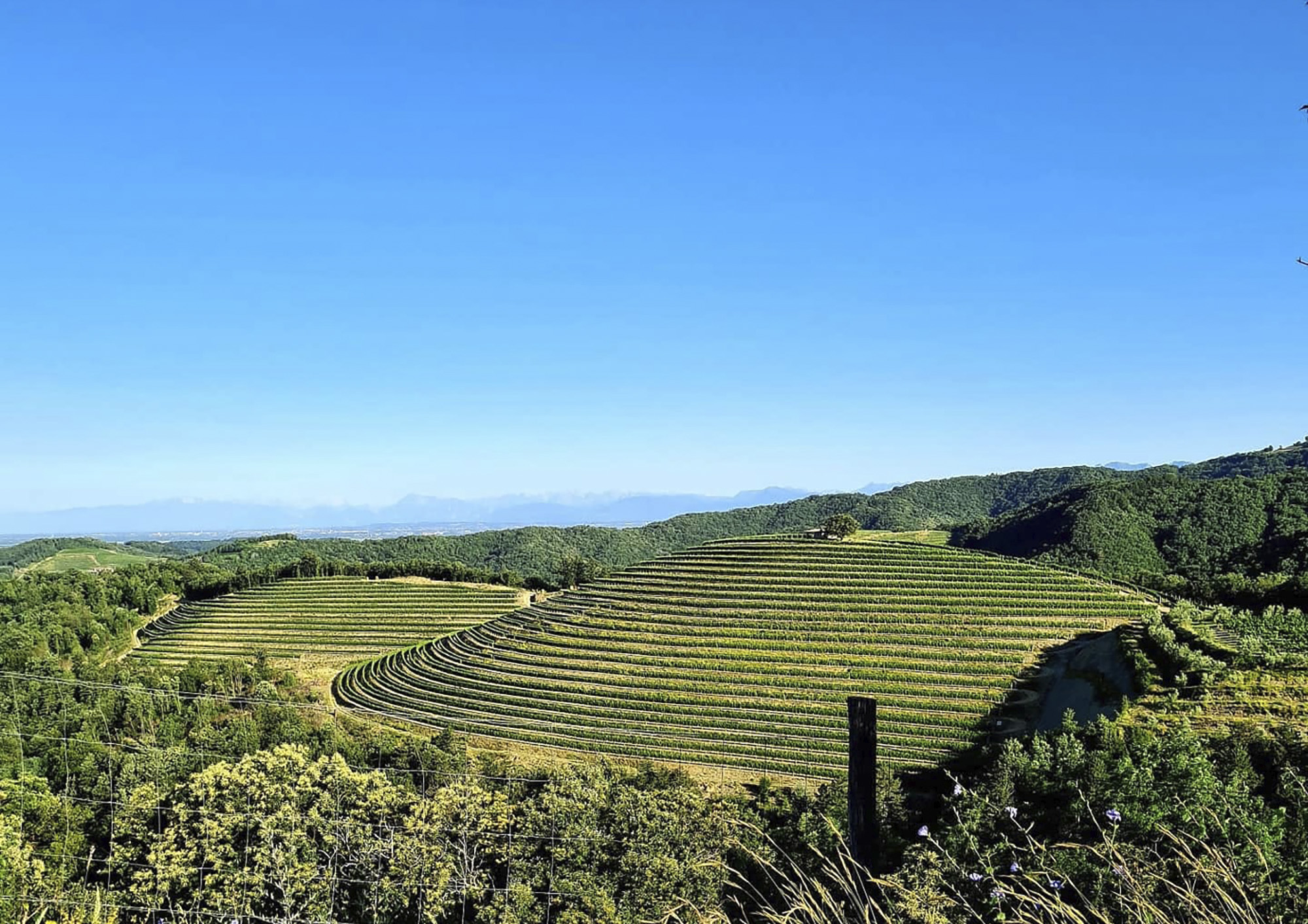
The name of the brand comes from the Latin word ‘orbis’ – an orb, a sphere. With this name, we wanted to show that the wines themselves are complete as the sphere itself shows completeness and perfection. Of course, for such a serious brand, I had to design a really serious label. From the very beginning, I wanted to somehow recreate the unique landscape of the region. Extremely beautiful area with soft hills, beautiful views and very clean nature. Undoubtedly, the most famous natural landmark was Velik Vrh (the Great Peak) – the highest point in the region. Erzetic’s most elite vineyards are located on its slopes. Luckily, for me as a designer, the peak itself was very beautiful and immediately provoked me to put it on the label. Of course, I didn’t want to use photography or any engraving on the peak itself – I wanted to create an image of it that would show the character of the peak itself, but at the same time look very modern and recognizable. This is how the Velik Vrh stylized picture came out, which from the very beginning I was tempted to make all in gold, because these are actually the golden vineyards of Erzetic. The rows of vines on the Velik Vrh somehow looked like very gentle waves. At the highest point there was a huge old tree, under which you could hide from the summer sun. Low below is the plain and in the distance, you can see the foothills of the Alps. This whole breathtaking landscape is at the heart of my design. I paid the most attention to Velik Vrh, of course, but in the label, you can see everything else from this view. I used very active embossing to recreate the relief on Velik Vrh, at the same time I used different colors and relief lines to depict the mountains that were in the distance.
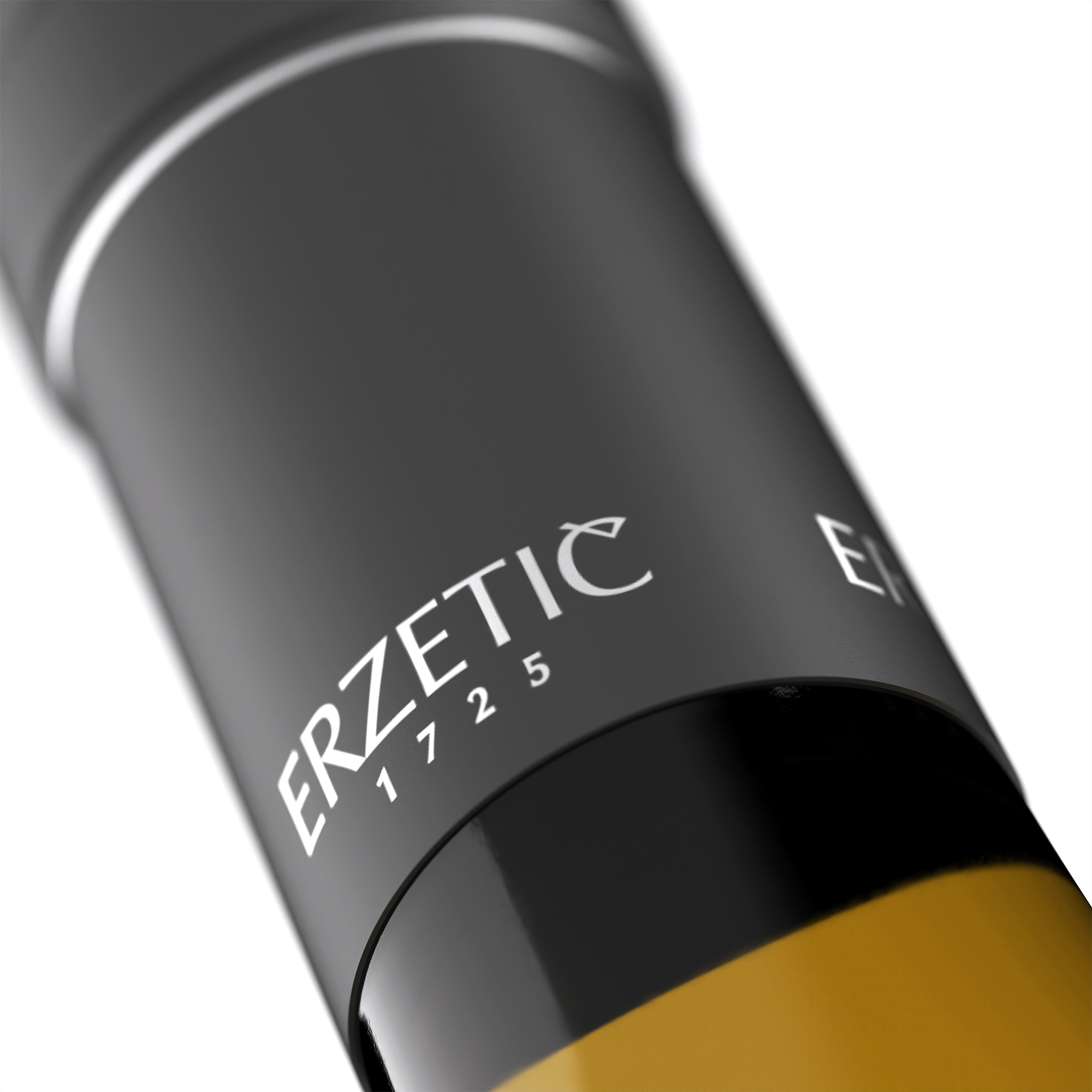
The dieline of the label has become very unusual and largely easy to remember and recognize among other wines on the shelf. The bottle is very beautiful and solid with an elegant transition from the base to the neck. We paid special attention to the capsule that we wanted to match the dark gray background of the label. Here again, my mates from Dagaprint did wonders to sculpt every detail, as well as to achieve full harmony in the colors between the label and the capsule. The series is currently featuring only three white wines – Sauvignon Blanc, Chardonnay and the indigenous Rebula. Personally, as a designer, I would be very happy to see at least one red wine in the series in the future, because it would look great in this bottle.
CREDIT
- Agency/Creative: the Labelmaker
- Article Title: Orbis Wines The Great Peak of Erzetic Winery Label Design Created by the Labelmaker
- Organisation/Entity: Agency
- Project Type: Packaging
- Project Status: Published
- Agency/Creative Country: Bulgaria
- Agency/Creative City: Sofia
- Market Region: Europe
- Project Deliverables: 3D Art, Brand Creation, CGI, Graphic Design, Label Design, Product Photography
- Format: Bottle
- Substrate: Glass Bottle
- Industry: Food/Beverage
- Keywords: the labelmaker, wine label art, wine label designer, wine label design, wine design, wine branding, wine label print, hot foil stamping, microembossing, gold hot foil, jordan jelev, slovenia, brda, velik vrah, orbis wines, visnjevik, erzetic, erzetic winery, wine of slovenia, rebula, chardonnay, sauvignon blanc, wine label printer, wine label print, gold embossing, microembossing, hot foil die, gold hot foil label
-
Credits:
Client: Erzetic Winery
Design: Jordan Jelev


