


The Art of See-Through Labels Unveiled
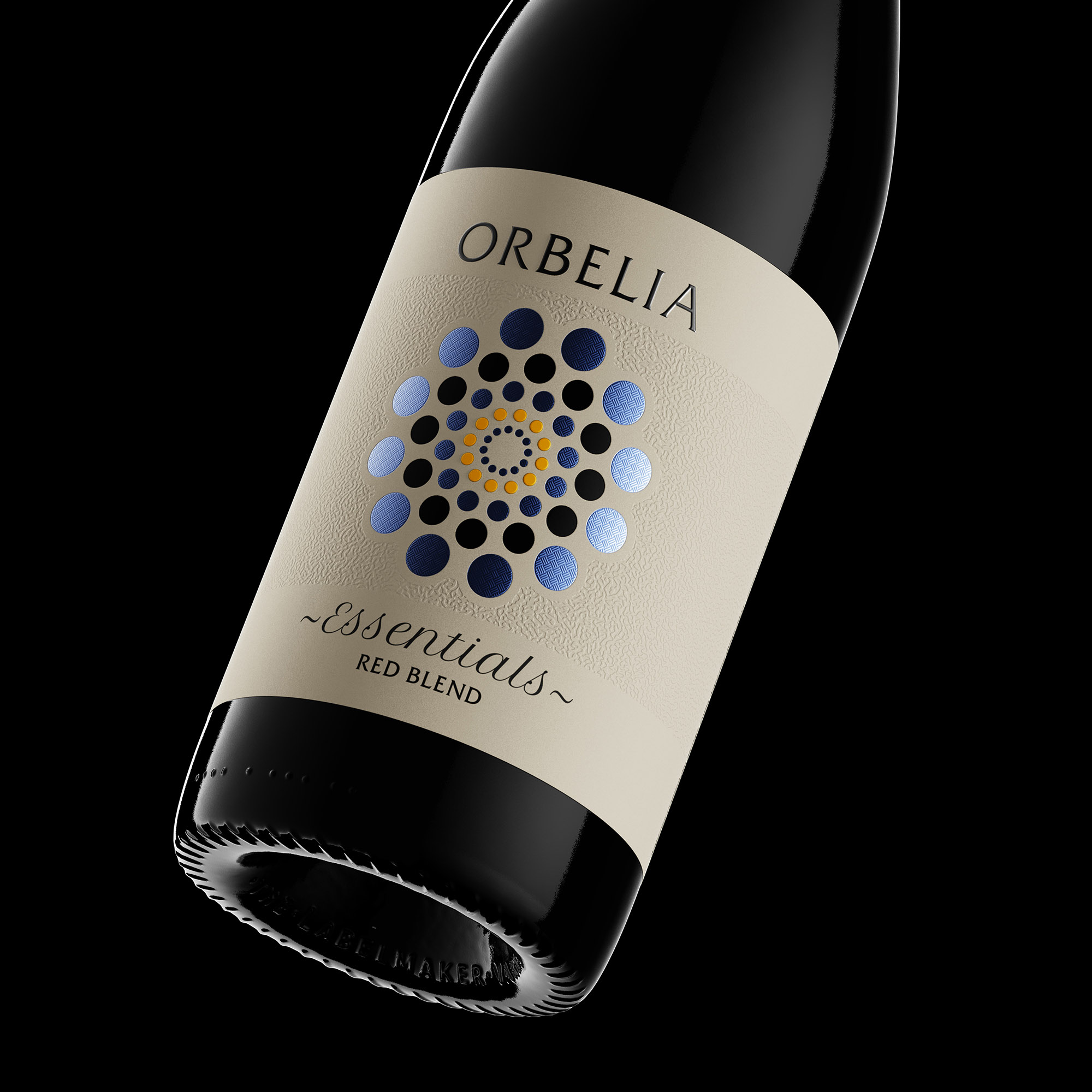
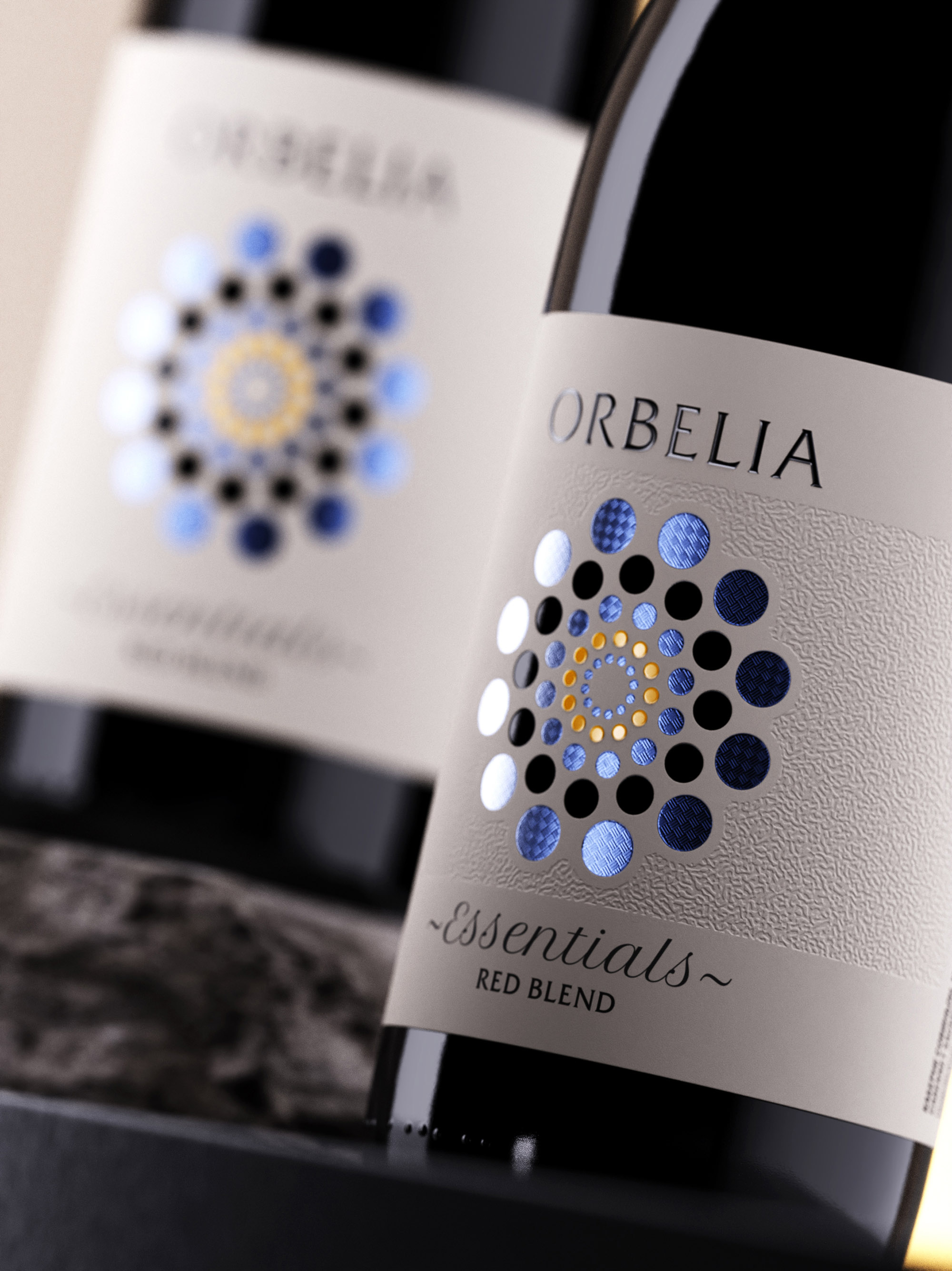
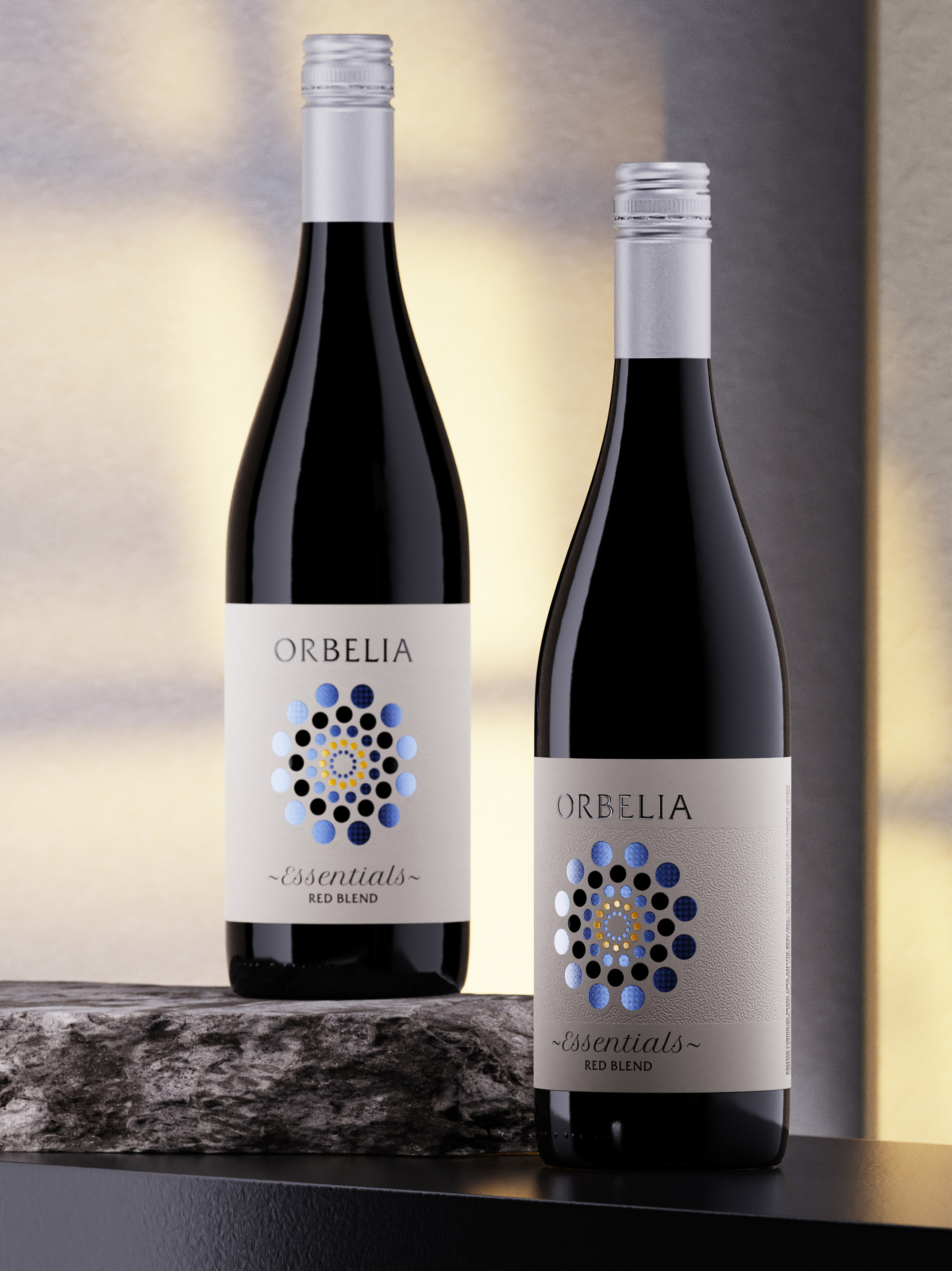
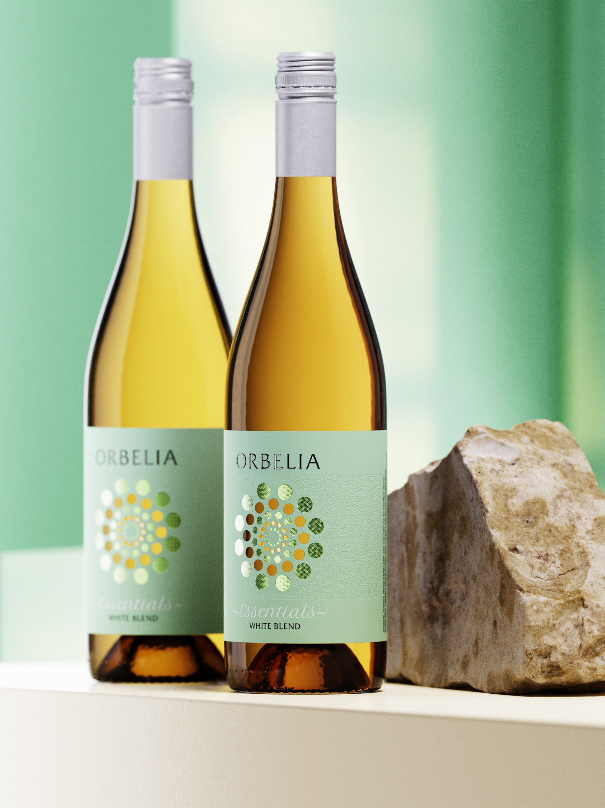
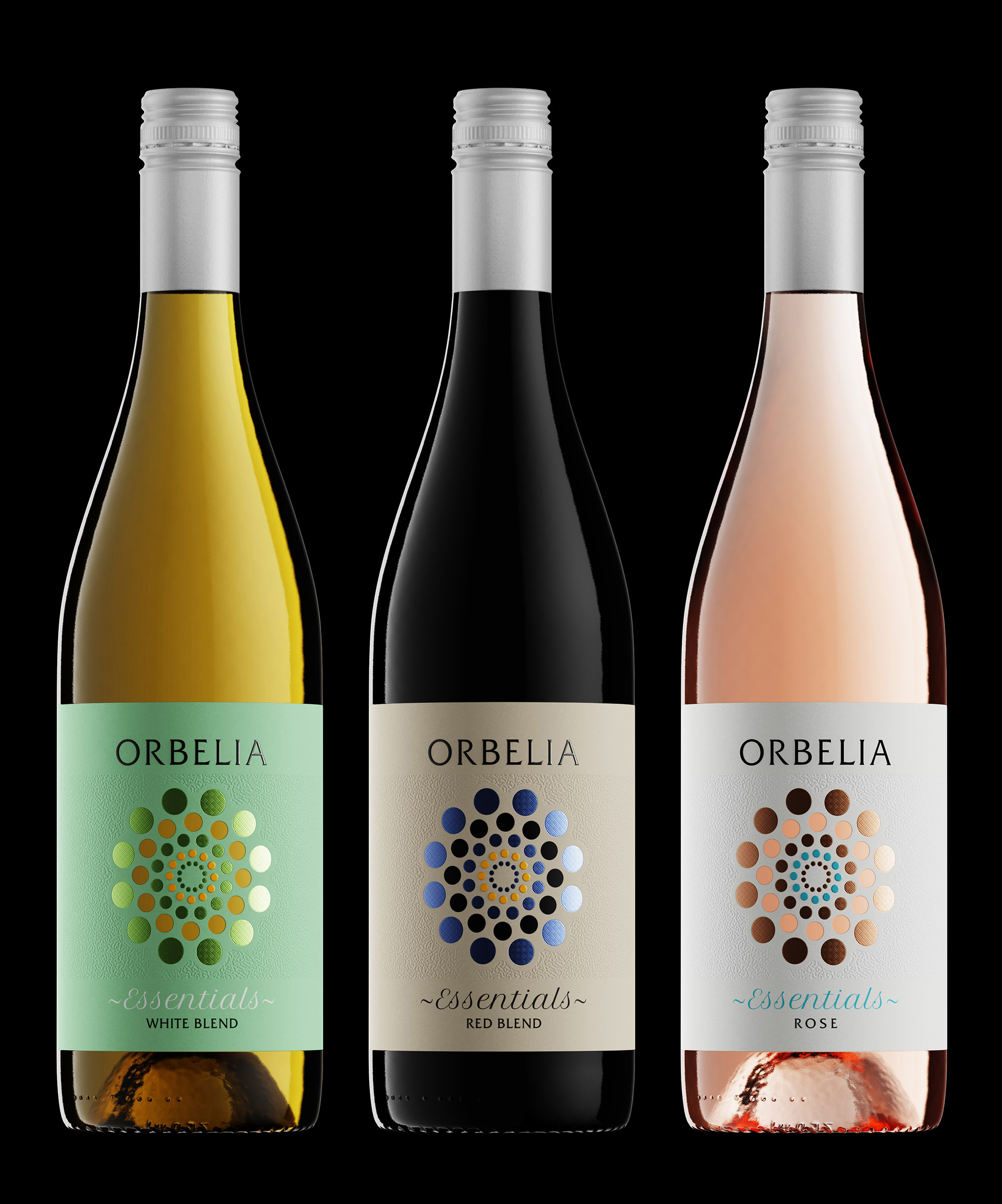
The Orbelia Essentials See-Through wine label design stands as a striking testament to modern elegance, capturing the eye with its meticulously crafted design. The visual centerpiece of the label is an intricate array of circular motifs, harmoniously blending various shades of blue and black. This geometric pattern not only lends a contemporary flair but also evokes a sense of depth and movement, drawing the viewer into its hypnotic rhythm.
Background
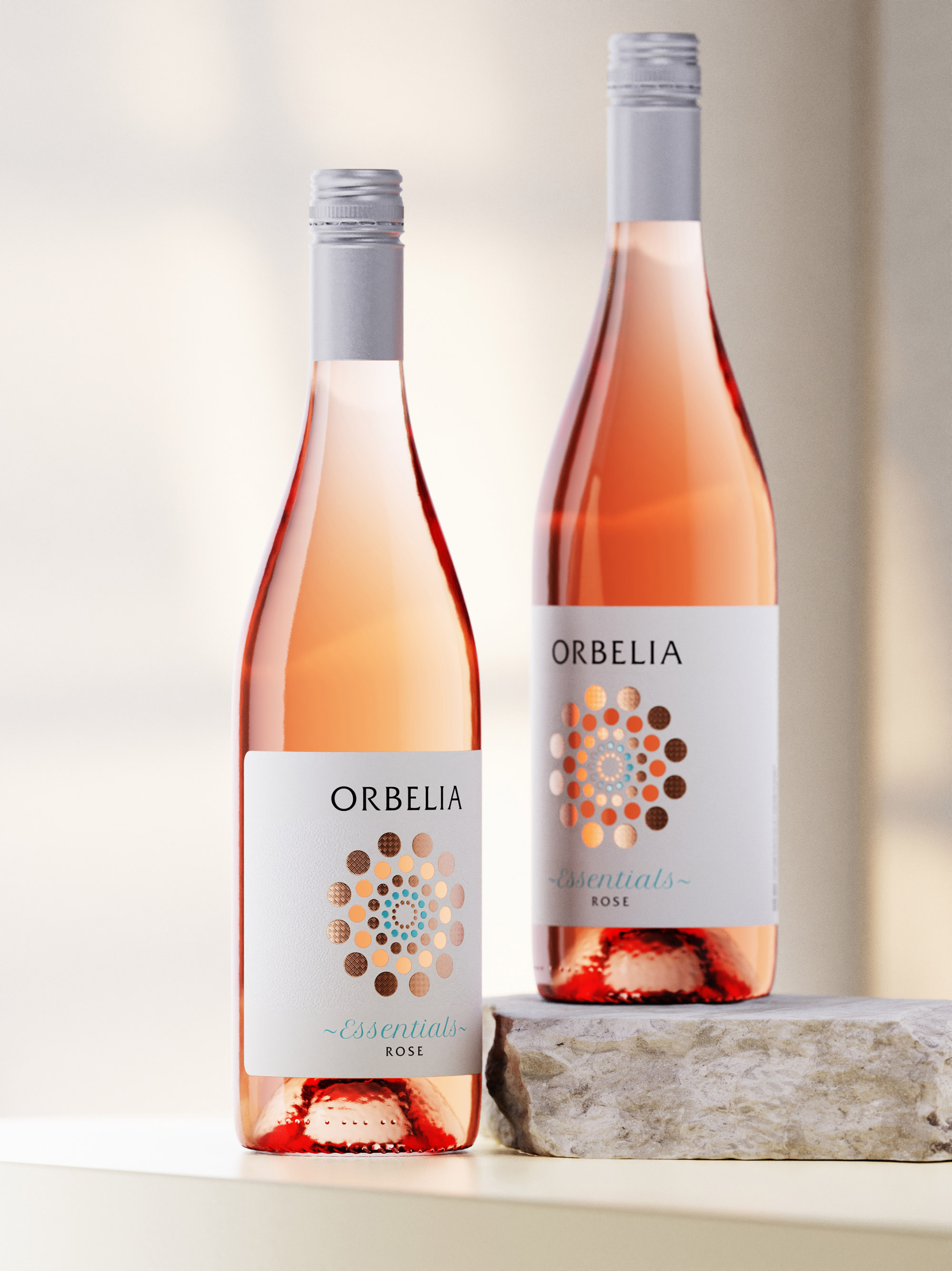
Orbelia Winery, nestled in the rich terroir of the Struma River Valley, brings a deep heritage of winemaking to each bottle. The Essentials Tier is a reflection of their commitment to quality and innovation, blending tradition with a contemporary twist. This label is a perfect embodiment of Orbelia’s philosophy, merging their historical roots with a modern aesthetic to appeal to today’s sophisticated wine enthusiasts.
Design Thinking
The design process for this label was driven by a desire to create a connection between the consumer and the wine itself. The choice of typography is impeccable, with the brand name “Orbelia” rendered in a refined serif font that exudes sophistication and timelessness. Below, the label’s designation, “Essentials”, is scripted in a delicate, cursive typeface, adding a touch of personal, artisanal charm to the overall aesthetic. Orbelia brand and some of the circles are printed with raised varnish as we aimed to evoke both a visual and tactile experience, ensuring that the label not only looks stunning but also feels intriguing to the touch.
Challenges
One of the most innovative aspects of this label design is the incorporation of a see-thru design element. In the second inner circle of the motif, the dots are actually precise die-cut holes in the paper. This allows consumers to see and touch the glass, and even glimpse the wine inside, creating a direct sensory connection with the product. Crafting this die line was a significant challenge, requiring a lot of precision to ensure the integrity of the paper and the overall design. This intricate feature enhances the label’s depth and interactivity, setting it apart in a crowded market.
Favorite Details
A favorite detail of this label is undoubtedly the interplay of textures, foils and colors. The label’s background is a textured debossed surface, providing a subtle yet effective contrast to the vibrant engraved foiled elements and the sleek bottle. This neutral base enhances readability while ensuring the design elements stand out prominently. The tactile quality of the textured paper invites consumers to engage physically with the bottle, enhancing the overall sensory experience. Additionally, the subtlety of the see-thru dots in the inner circle adds an unexpected layer of sophistication and curiosity, making the wine not just a beverage, but an experience.
In conclusion, the Orbelia Essentials See-Through wine label design is our latest attempt in modern design, balancing bold visual elements with sophisticated typography and a thoughtful use of texture and color. It effortlessly conveys a sense of quality and refinement, making it a standout choice for discerning wine enthusiasts. Carefully mastered to perfection by our friends at Dagaprint.
CREDIT
- Agency/Creative: the Labelmaker
- Article Title: Orbelia Essentials See-through Wine Label Design by the Labelmaker
- Organisation/Entity: Agency
- Project Type: Packaging
- Project Status: Published
- Agency/Creative Country: Bulgaria
- Agency/Creative City: Sofia
- Market Region: Europe
- Project Deliverables: Brand Design, Label Design, Packaging Design
- Format: Bottle
- Industry: Food/Beverage
- Keywords: seethrough label design, wine label design, wine label art, foiled wine label, debossed paper label, modern wine, inspirational wine project, orbelia winery, bulgarian wine, jordan jelev, the labelmaker, dagaprint
-
Credits:
Design & CGI: the Labelmaker


