


Challenge:
The client approached Minim Design with the task of creating a competitive meat semi-finished brand (chicken and beef cutlets) for the Uzbek market — one that would instantly inspire trust, since in this category consumer confidence in halal quality outweighs price sensitivity. The objective was to deliver a culturally relevant name, logo, and packaging design that communicate honesty, naturalness, and strict adherence to Islamic values.
Research & Insights:
Our analysis uncovered three crucial findings:
72% of Central Asian consumers are willing to pay more if confident in halal quality (Euromonitor, 2021).
Clear halal labeling leads to a 35% higher repeat purchase rate (Halal Market Report, 2022).
Competitors often rely on bright, overloaded packaging without building consistent brand systems.
The market demanded a clean, honest, and value-driven brand identity.
Creative Solution:
Naming:
We proposed the name Onur, meaning “value, honor, dignity” in Turkish. This culturally rooted word resonates strongly in Uzbekistan, symbolizing honesty, respect, and tradition. Studies (HBR, 2020) confirm that value-based names generate significantly higher consumer trust.
Logo:
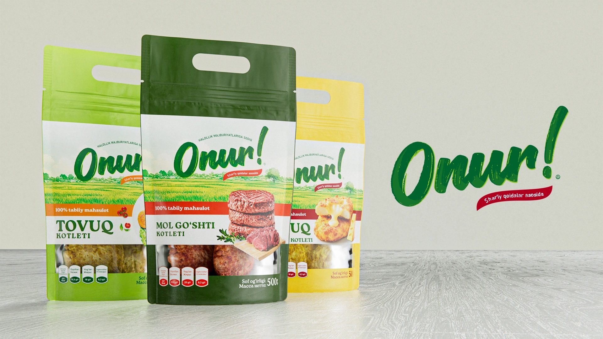
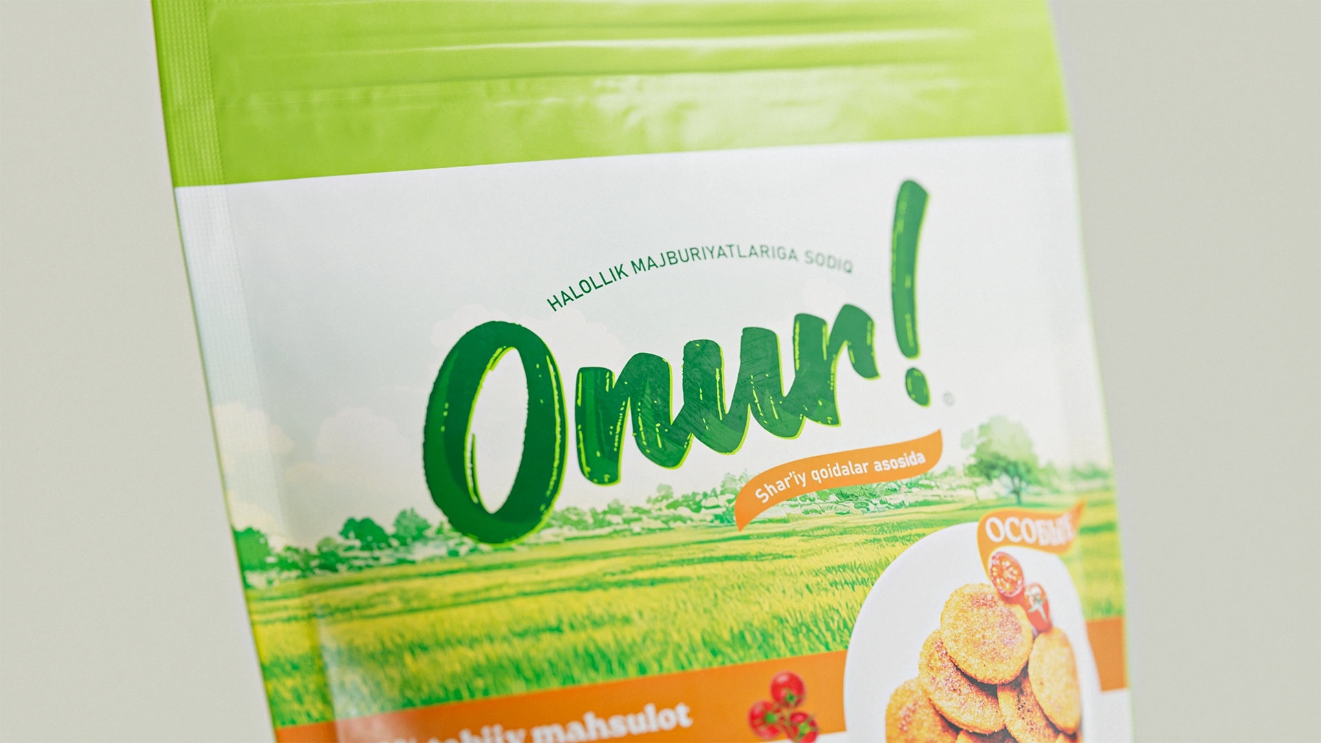
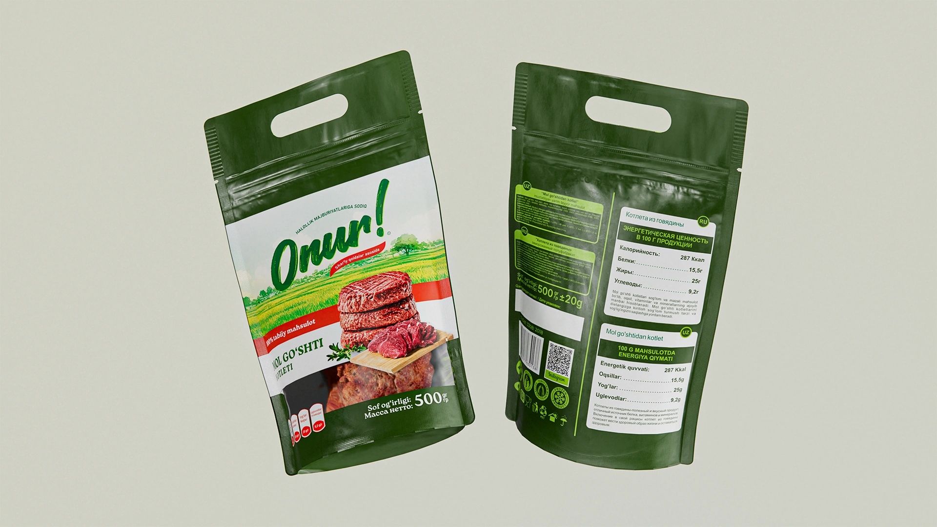
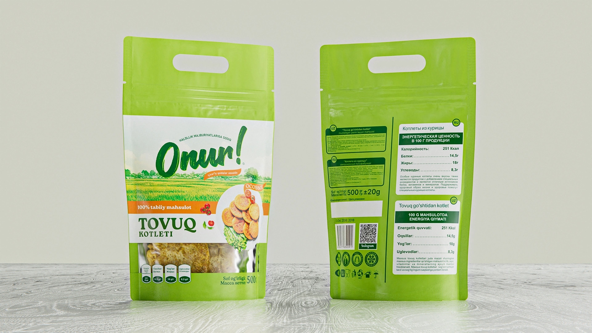
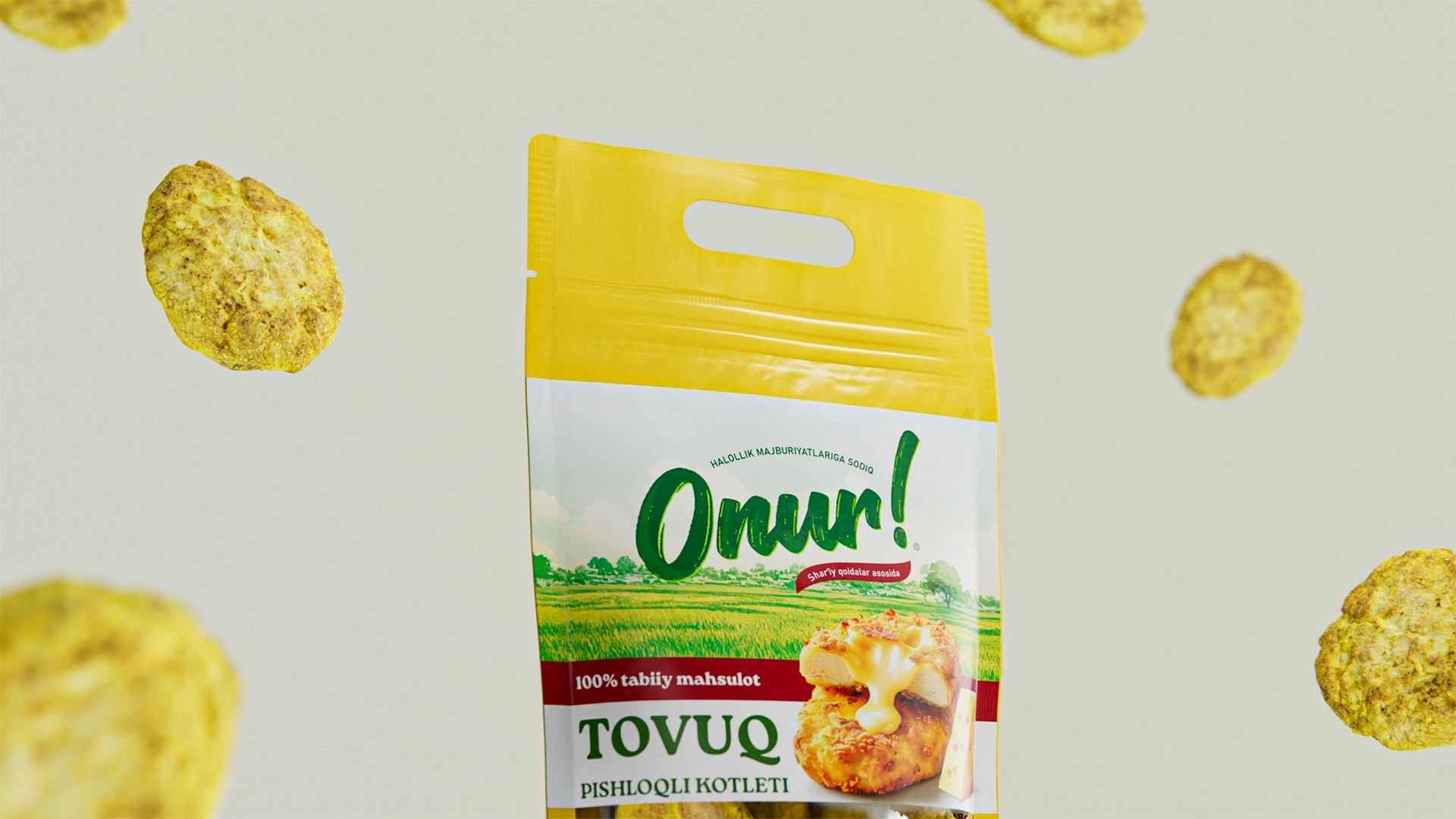
The logo was developed in a handwritten style, highlighting authenticity and natural energy. Green was chosen as the primary color to reinforce freshness and purity. An integrated ribbon with the inscription “Based on Shariah norms” emphasizes halal compliance as a key purchase driver.
Packaging Design:
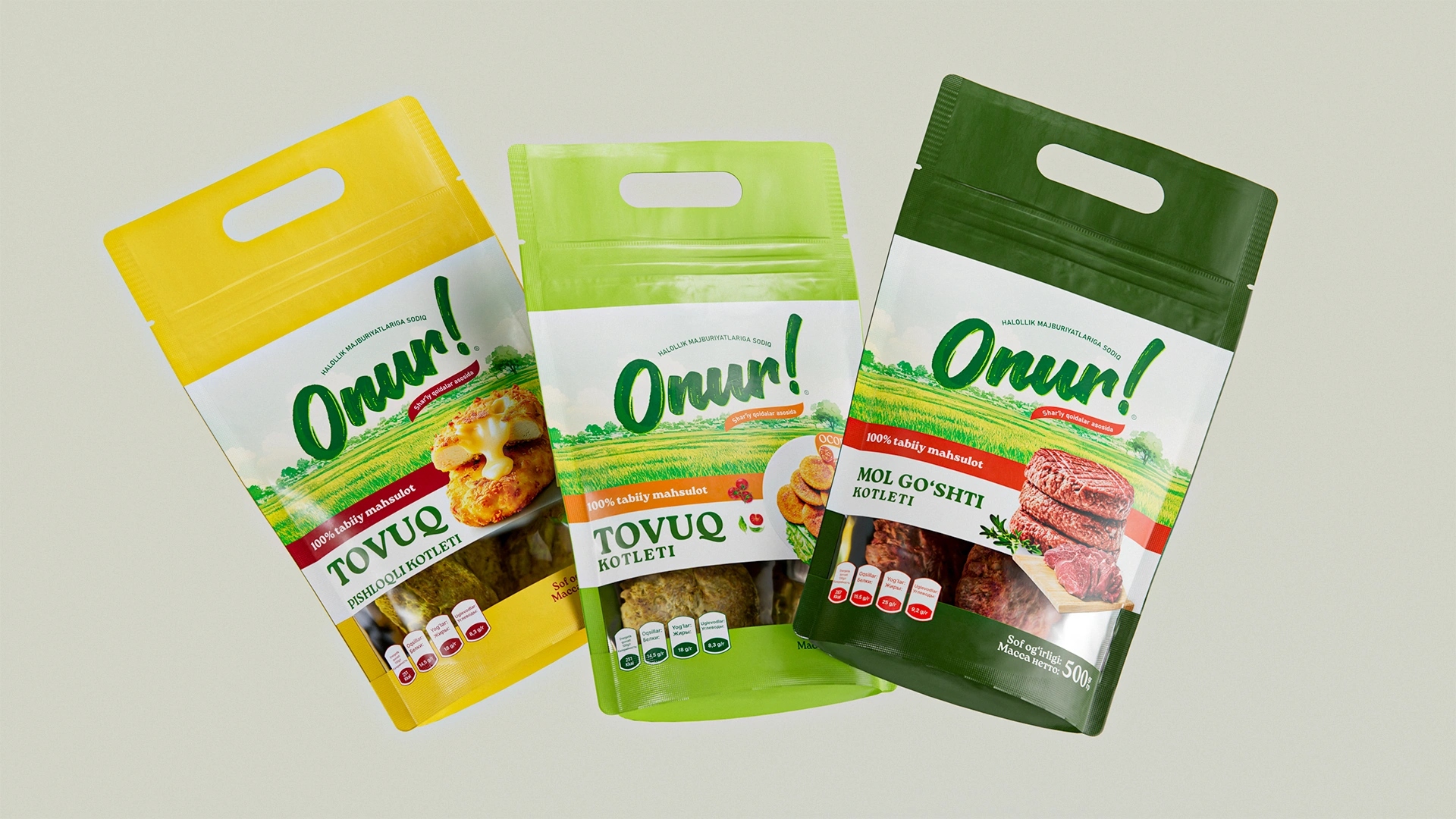
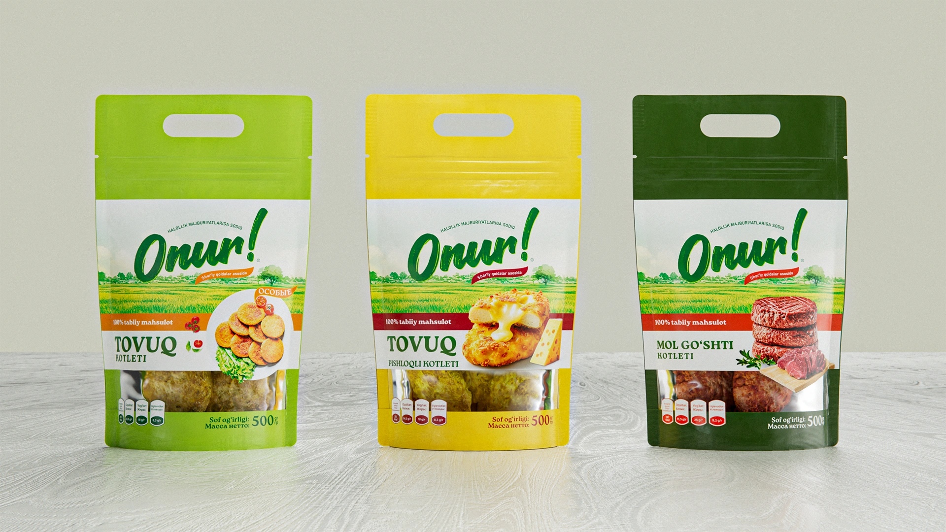
We built a modular, trustworthy packaging system that addressed three business goals:
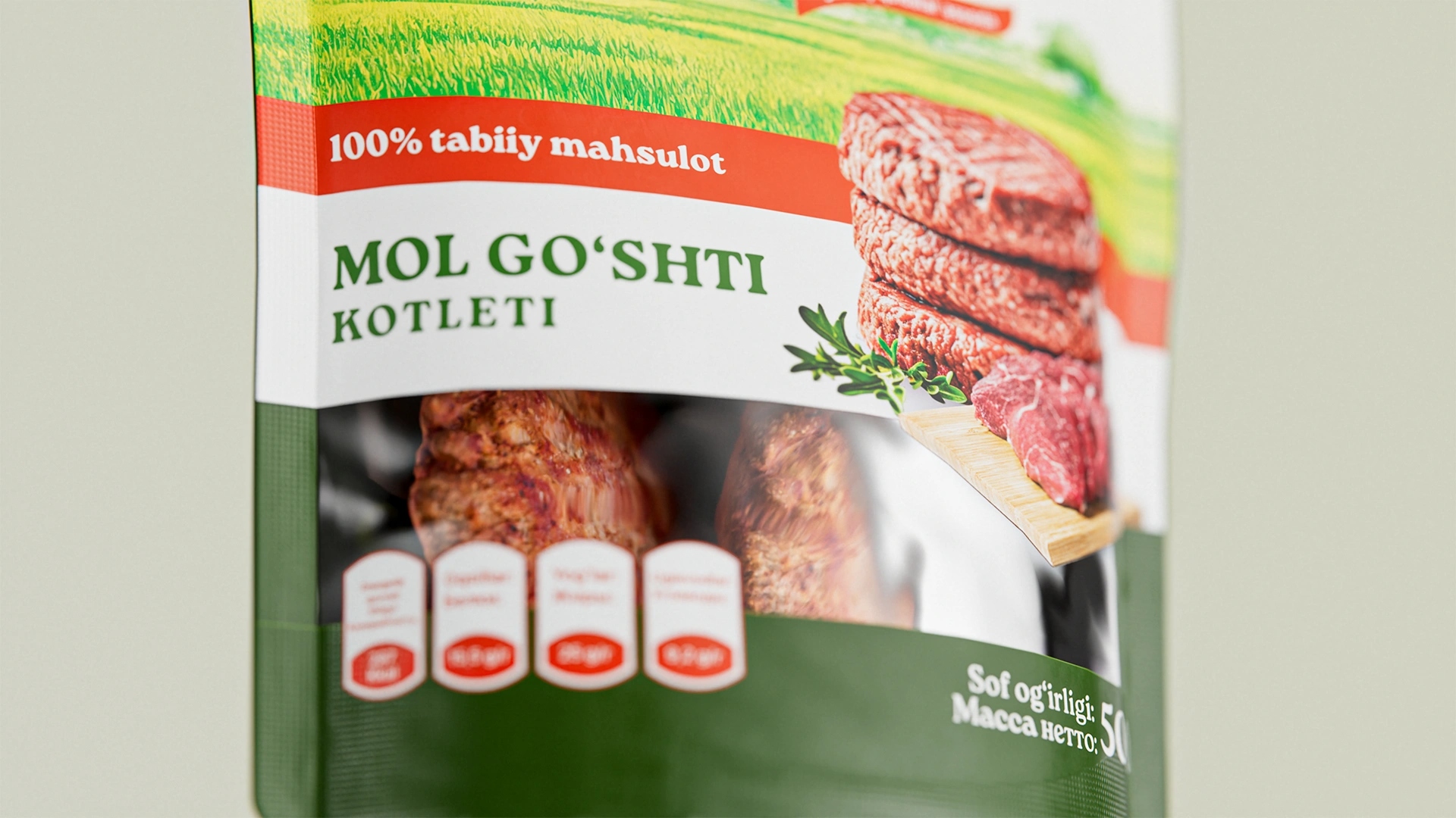
Transparency: Clean layouts and a product window strengthen the perception of honesty.
Halal Focus: Icons and inscriptions highlight compliance, enhancing consumer confidence.
Unified Assortment: A consistent visual family with clear differentiation by color: green (chicken), yellow (chicken with cheese), and dark green (beef).
Results:
Onur successfully entered the market with a strong, value-driven identity. The name, logo, and packaging design built on trust and tradition enabled the brand to quickly attract its first loyal customers. Today, Onur stands as proof that in food branding, values and cultural respect are the strongest differentiators.
CREDIT
- Agency/Creative: Minim Design Agency
- Article Title: Onur – Naming and Packaging Design for Meat Semi-Finished Products by Minim Design
- Organisation/Entity: Agency
- Project Type: Packaging
- Project Status: Published
- Agency/Creative Country: Uzbekistan
- Agency/Creative City: Tashkent
- Market Region: Asia
- Project Deliverables: Brand Identity, Logo Design, Packaging Design, Product Naming
- Format: Flow-Pack, Wrap
- Industry: Food/Beverage
- Keywords: Packaging Design, Meat Products, Naming, Halal, Branding, Logo Design, Visual Identity, Trust, Consumer Goods, Uzbek Market, Food Packaging, Cultural Branding
-
Credits:
Agency: Minim Design


