Challenge
The task was to design branding for Onside Football Academy. The challenge lay in creating a novel graphic language that merges the lively and spirited energy of football with the structure and convention of an academy.
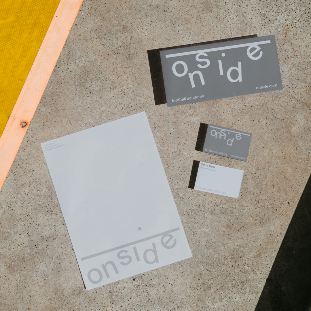
The visual identity should not only appeal to young players and distinguish itself among more formal, standard styles, but should also have more restrained options to uphold a professional image. Both facets of the identity form a consistent brand image. The visual system is adaptable to different formats while maintaining its core essence.
Naming
As a football academy, Onside covers the basics — the rules of the game. “Onside” represents a correctly played ball, leading to a validated goal. The name conveys that the academy is the place to learn the game correctly and excel at it.
Dynamic Logo
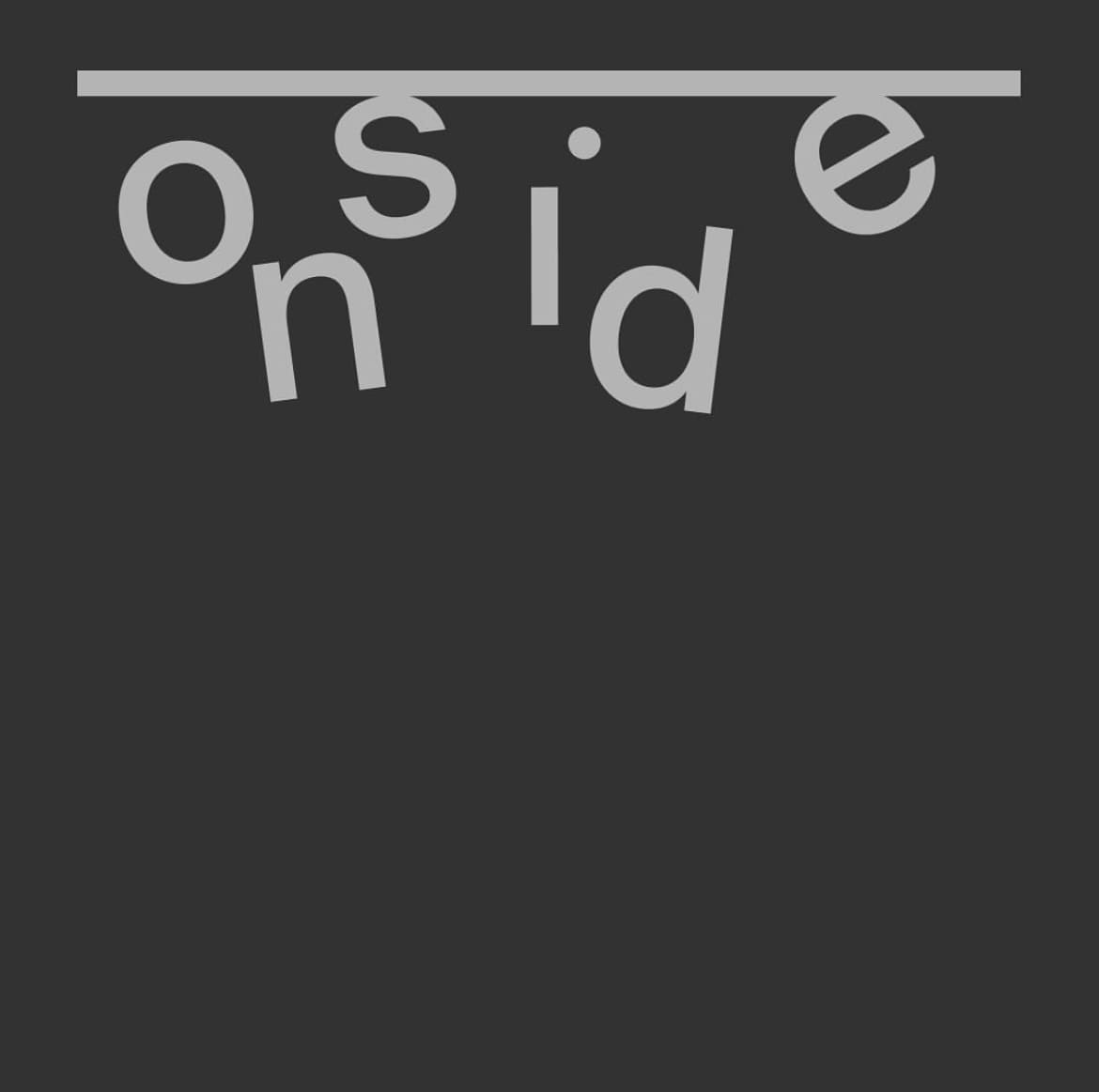
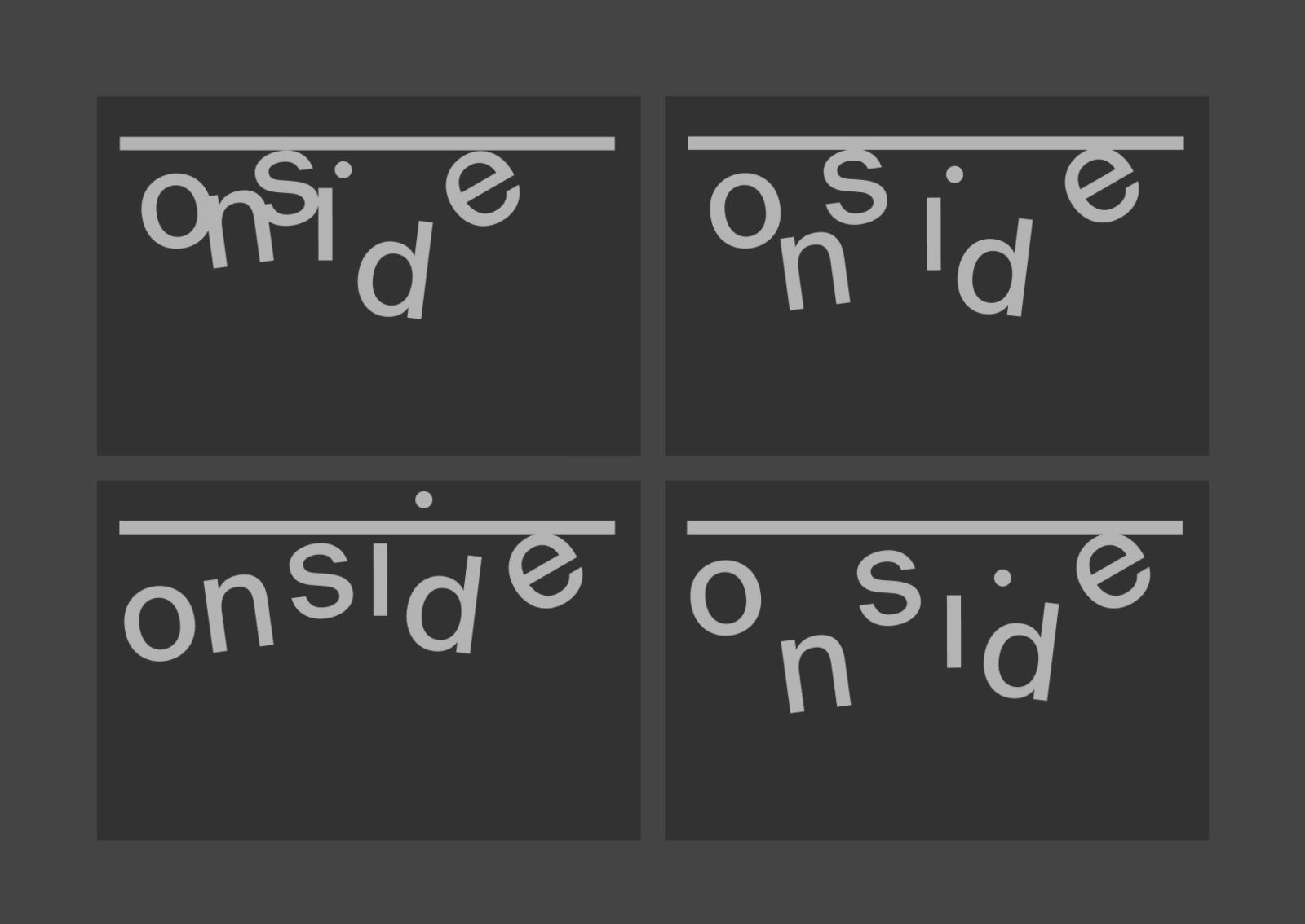
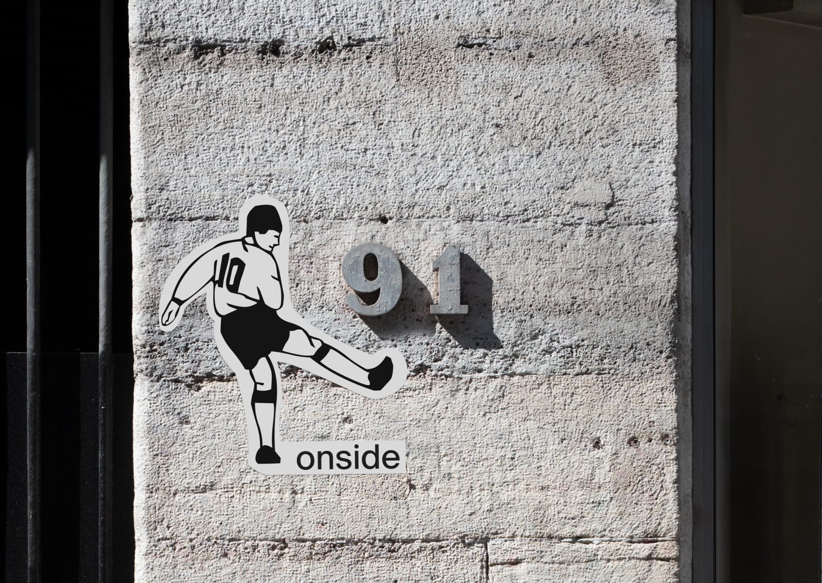
Varying positions of the letters emulate the constant movement of players on the field, leading to a multitude of logo variations. These can be tailored to specific mediums and the variations keep it fresh while preserving the unique essence of the design.
Typography
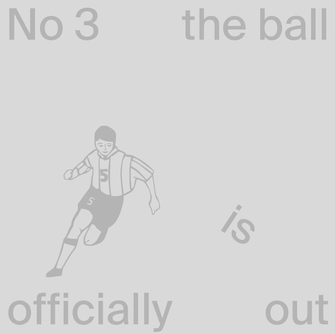
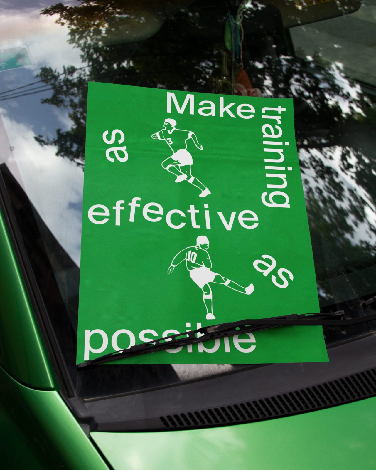
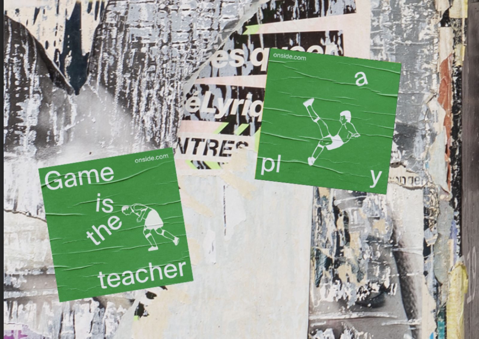
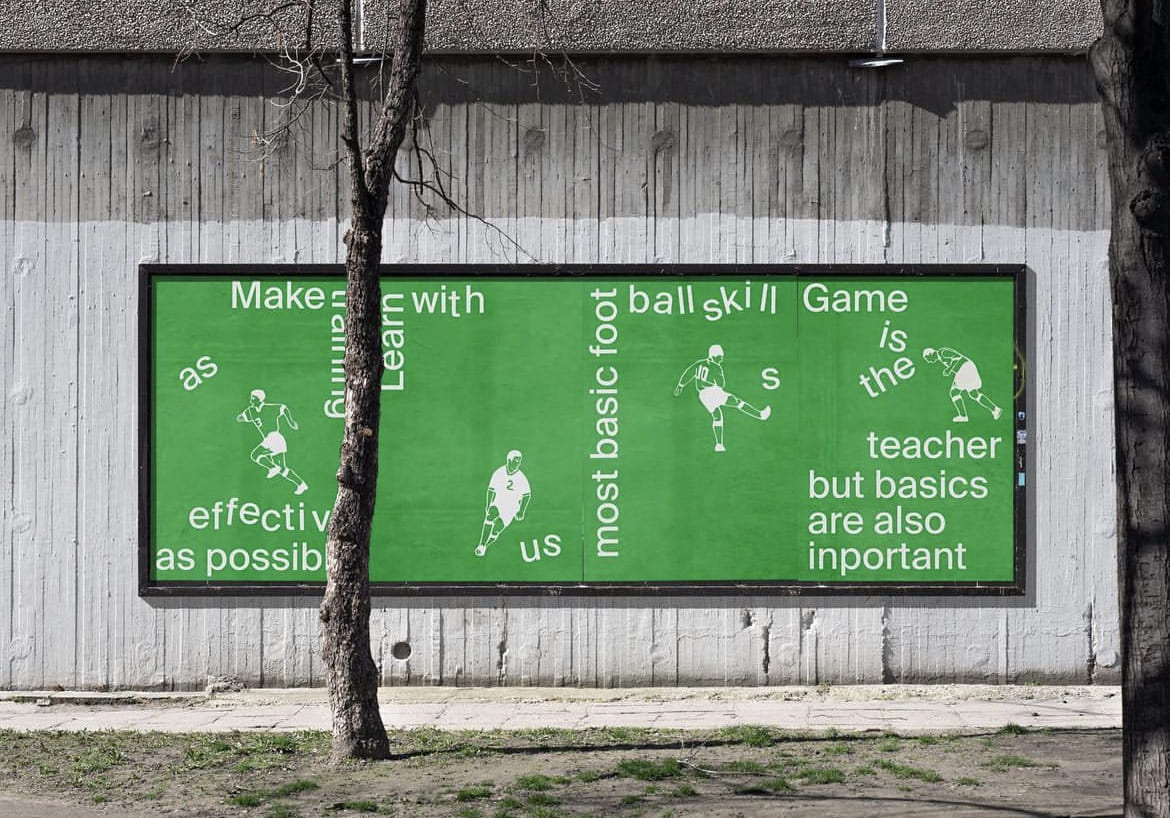
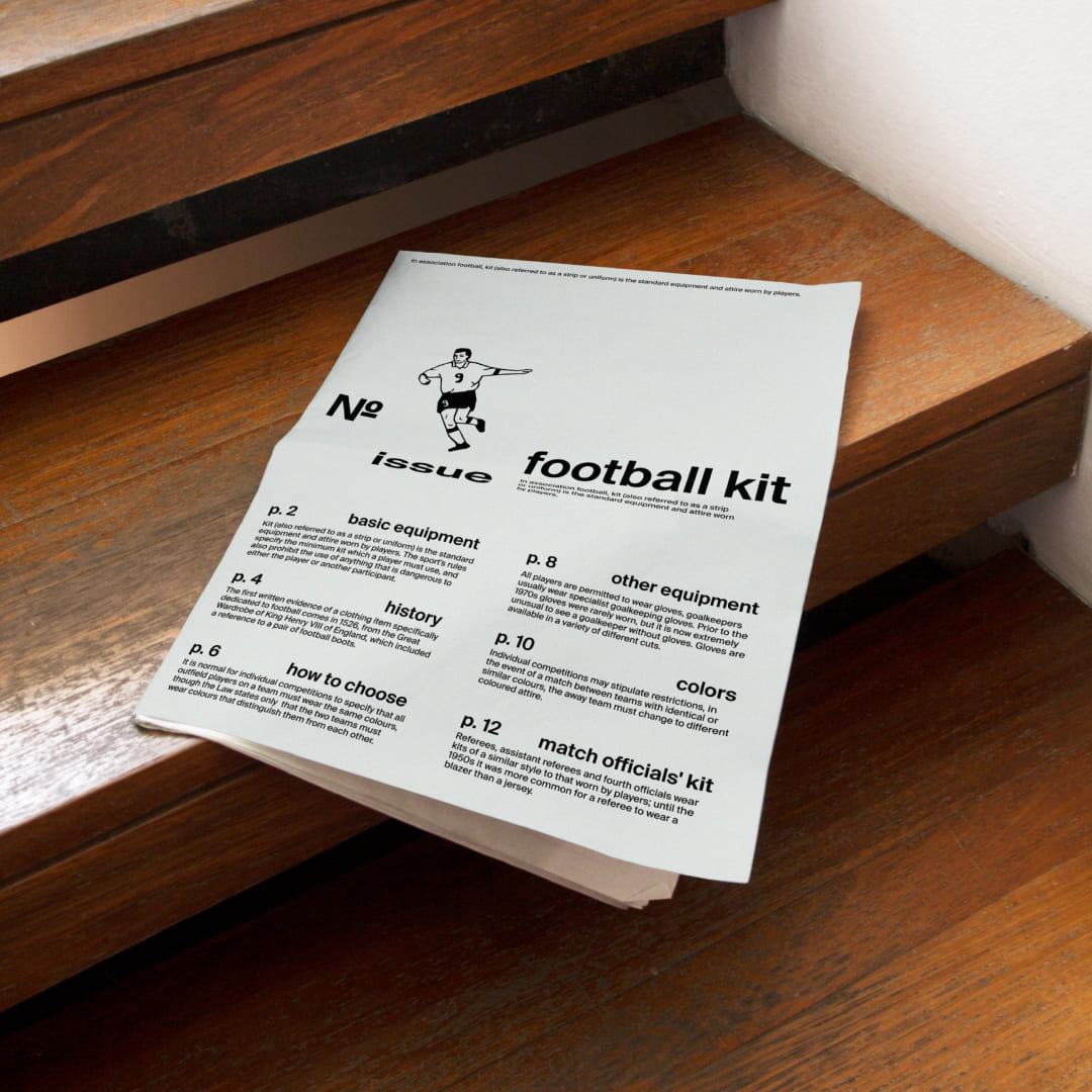
Sport is about cooperation and engagement. Therefore, there is an interaction between typography and graphics in an intriguing and non-obvious way. The brand should attract and stand out to a younger audience — and the typography addresses this need. Emphasis is given to placement and layout. Hence, Suisse Intl was chosen, a neutral and understated font that doesn’t detract attention from the graphics. Assembling formats and scaling the style is simple — just incorporate football players from Soccer Dance and supplement with Suisse Intl.
Colors
The visual identity revolves around two main colors. Gray and its shades are used for more formal mediums like envelopes, business cards, and letterheads. The typography is distinctive enough to be eye-catching, eliminating the need for color accents. The secondary color is green, representative of the grass on a football pitch. This color is used for livelier formats, such as posters, to elicit a vivid image and sensation of a football game in viewers.
Extra Possibilities
The visual language incorporates additional, less conventional communication formats. For instance, the interaction between graphics and typography allows for its introduction into the urban environment, where anything can become part of the game.


CREDIT
- Agency/Creative: Alexandra Chulkova
- Article Title: Onside Branding for a Football Academy by Alexandra Chulkova
- Organisation/Entity: Student
- Project Type: Identity
- Project Status: Non Published
- Agency/Creative Country: Russia
- Agency/Creative City: Moscow
- Market Region: Europe
- Project Deliverables: Brand Creation, Brand Design, Brand Identity, Brand Naming, Identity System
- Industry: Education
- Keywords: WBDS Student Design Awards 2023/24
- Keywords: football identity typography branding
-
Credits:
Designer: Alexandra Chulkova


