


Pirate (formerly Pirate Studios) is a global network of creative studios empowering the next generation of musicians, producers, podcasters and dancers. With 24-hour access to over 600 studios worldwide, Pirate are breaking down barriers to creativity, offering fully equipped professional spaces at the most affordable price point.
As the business had grown, so too had a disconnect between the brand’s corporate identity and the creative community that it served. Only were commissioned to produce a brand identity to capture the spirit of Pirate and to provide a platform to celebrate their community.
There is a democratic and collaborative spirit that radiates from everything at Pirate. Working closely with the team, we identified ‘democratising creative space’ as a founding principle of the business. The process would take Pirate back to basics; presenting an authentic brand that promised to empower people to ‘create something real’.
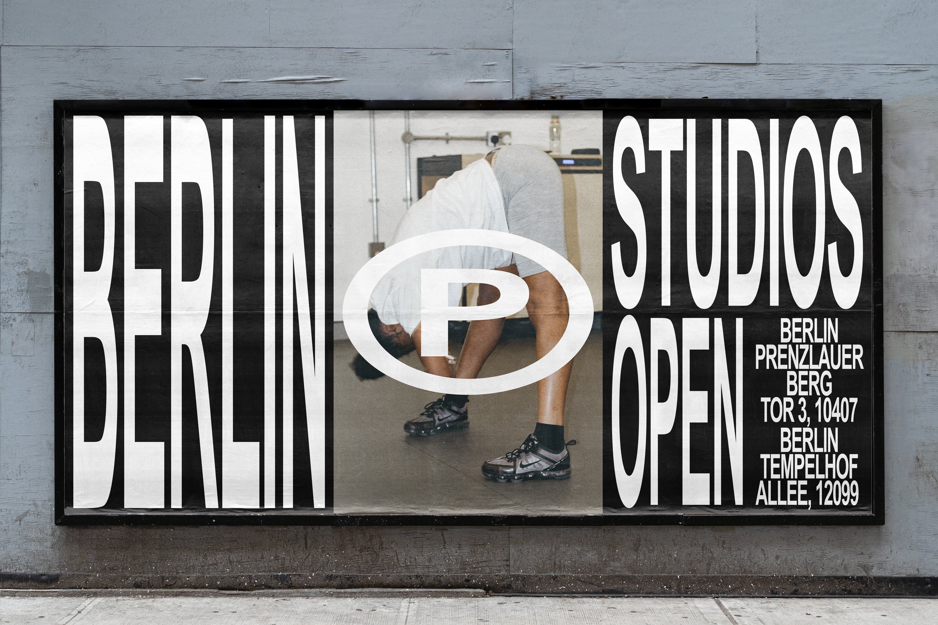
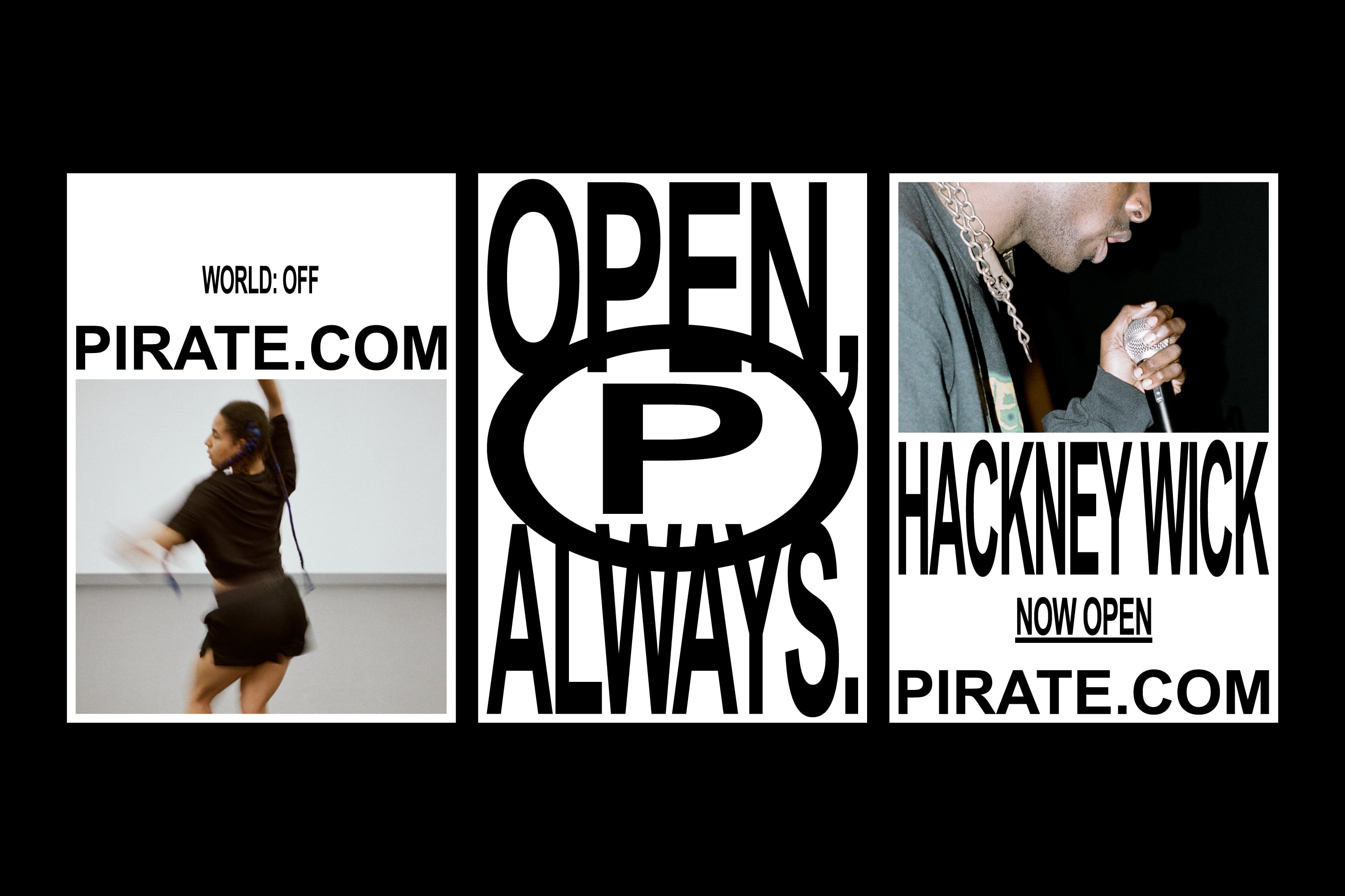
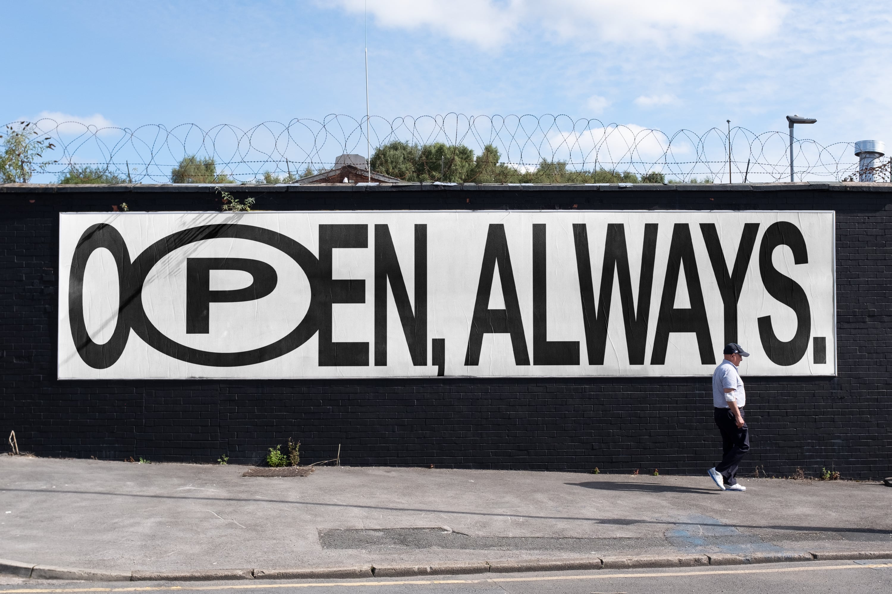
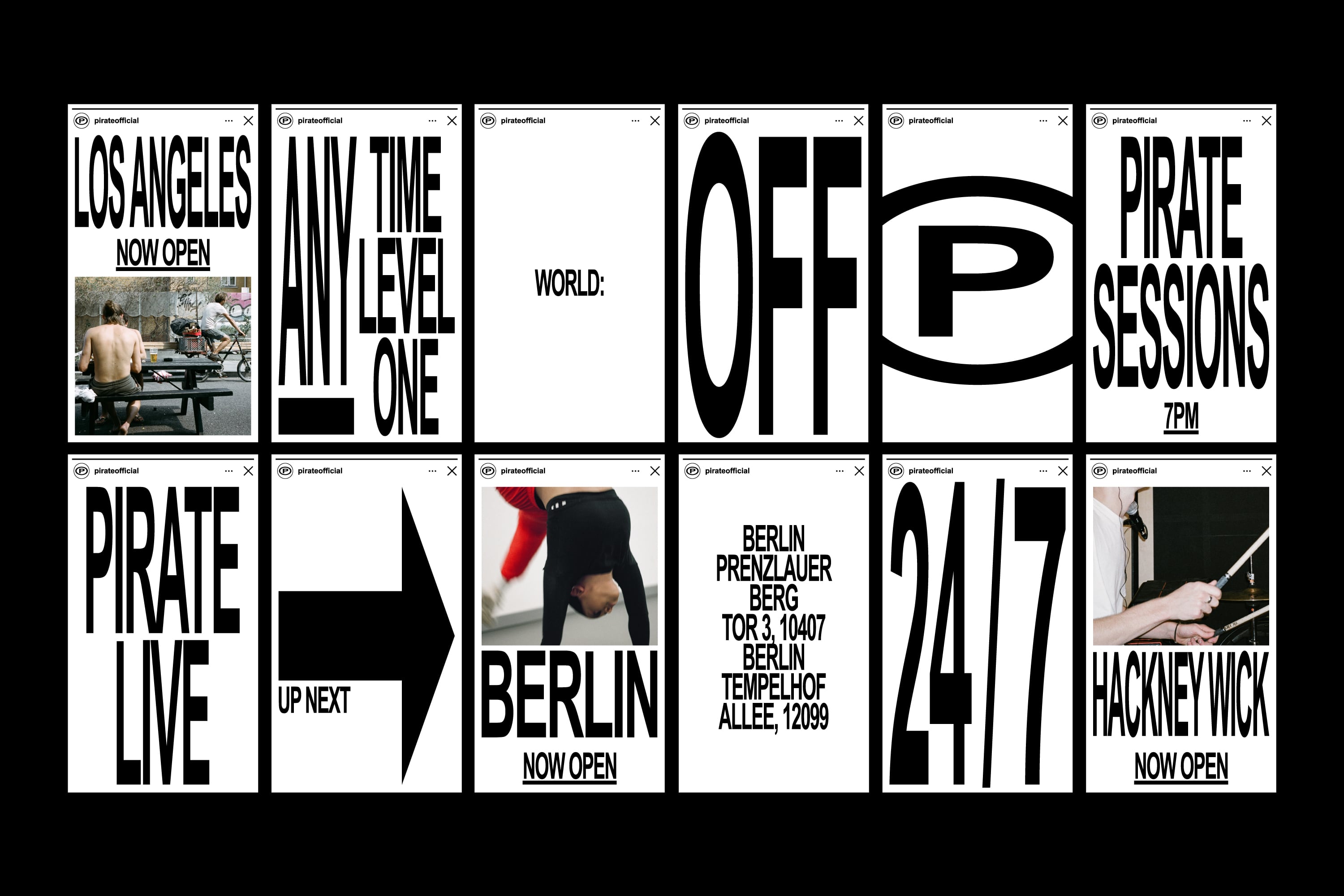
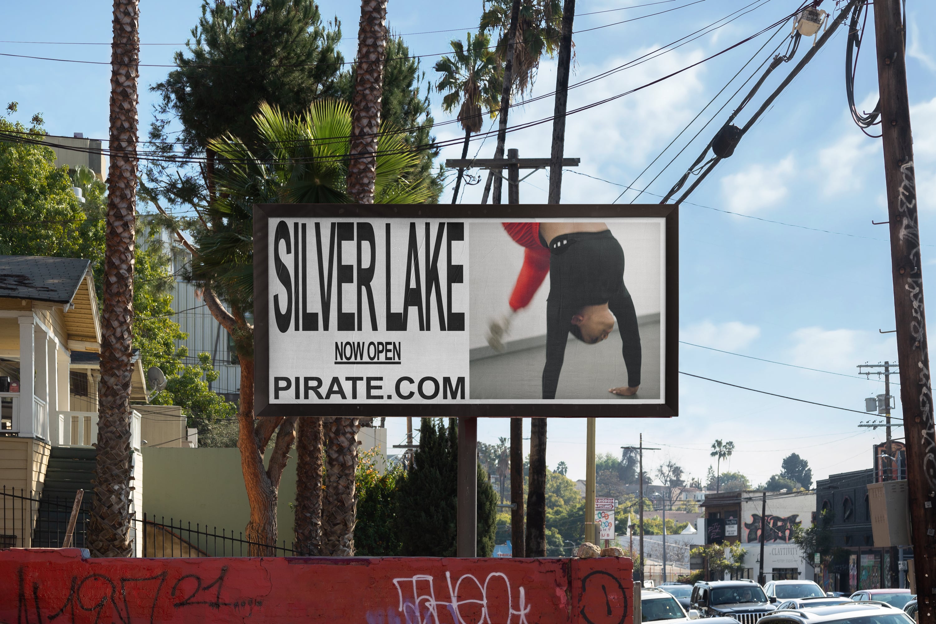
The first step was to lose the corporate logo. The URL would instead become the calling card—clear, direct and operative. Against the status quo.
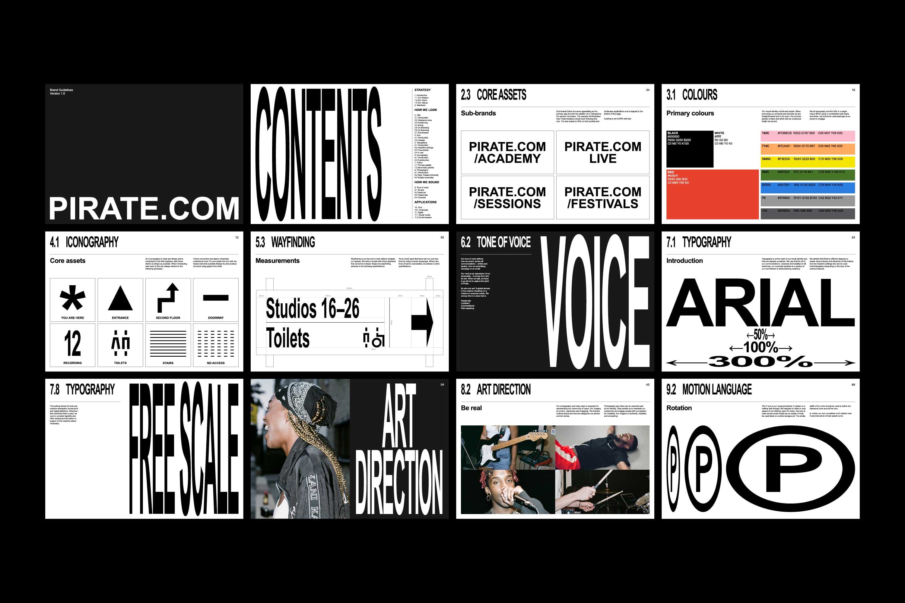
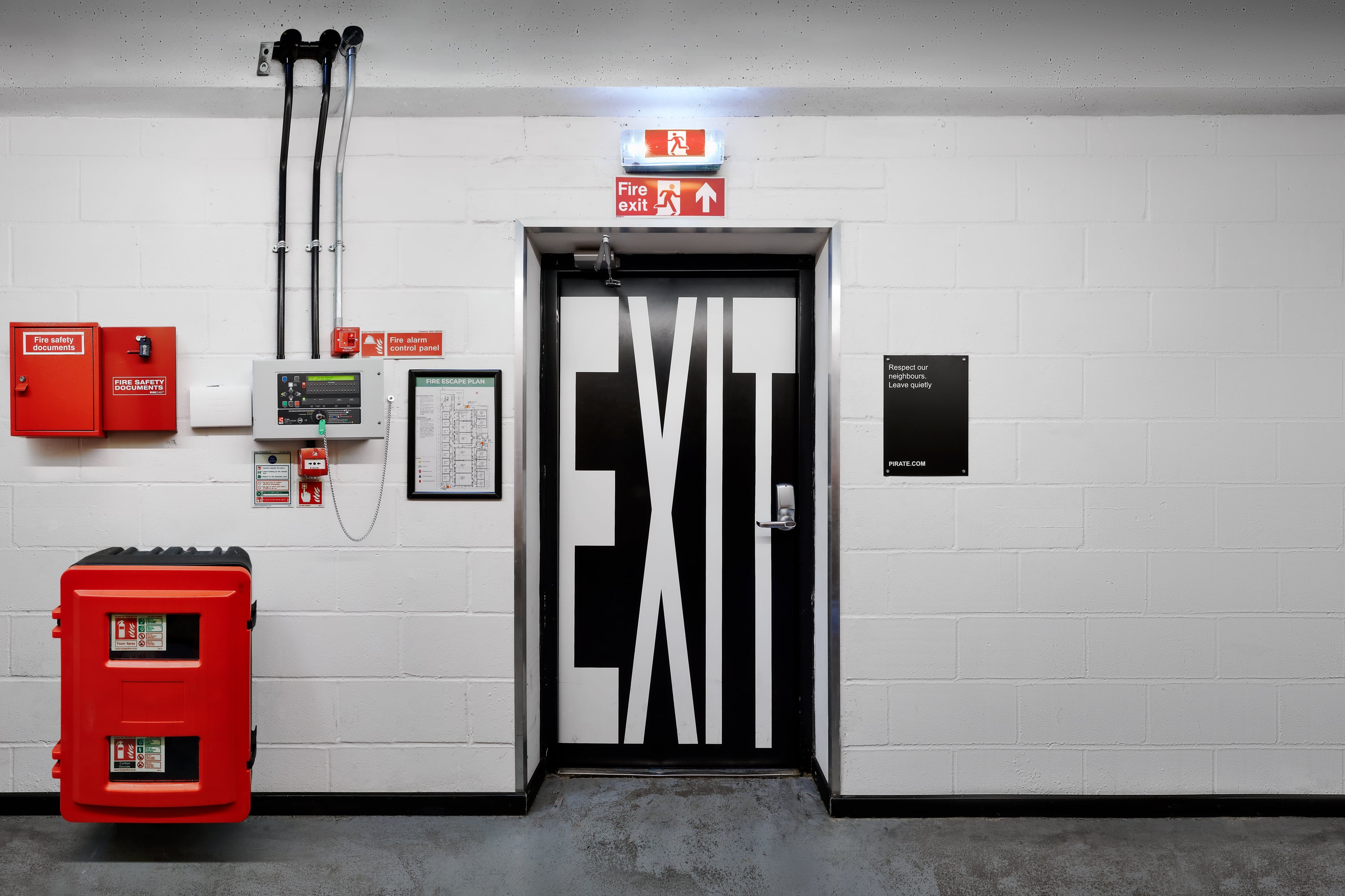
For the wider identity, it was important that creative assets could be produced easily, by anyone, anywhere, without obstacle. Arial was selected as the brand’s corporate typeface—one of the most democratic, widely available and freely licensed fonts in the world. Three settings of stretch create a distinctive aesthetic and provide the necessary hierarchy for information. The sound recording symbol P has been adapted from the Arial glyph set to act as a digital shorthand.
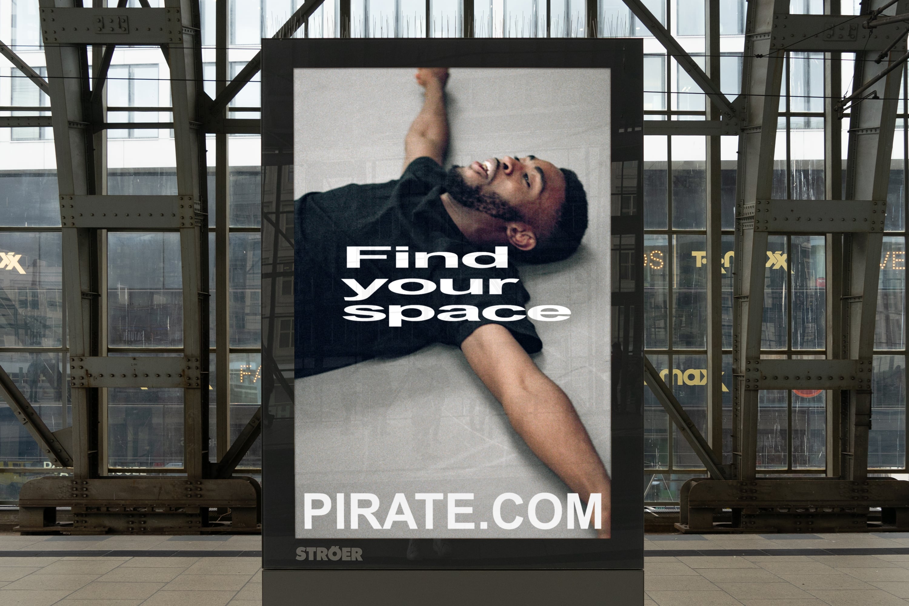
Combined with an inclusive approach to photography and a diverse secondary palette comprised of widely available Pantone inks—the identity celebrates the passion, diversity and authenticity of the Pirate community.
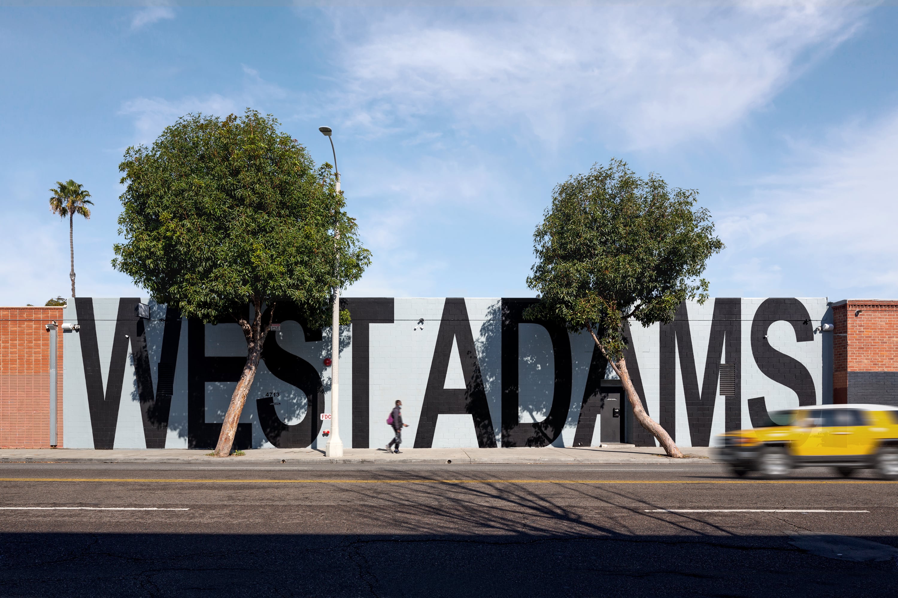
Across studio locations, place names are free-stretched on exterior frontages in recognition of the local area. An interior wayfinding system repurposes an off-the- shelf modular racking system, reducing fit-out costs in a way that is both ownable and utilitarian.
The transparency and openness at the heart of the rebrand has been overwhelmingly well-received by the Pirate community at a time of heightened distrust of large corporations. The brand has enabled Pirate to engage with their community online, in new ways, and with record success.
In a commitment to live the brand, Pirate have launched a series of new initiatives designed to make creative space available to some of the most underserved creative communities in cities around the world.

CREDIT
- Agency/Creative: Only
- Article Title: Only Help Pirate Democratise Their Creative Spaces
- Organisation/Entity: Agency, Published Commercial Design
- Project Type: Identity
- Agency/Creative Country: United Kingdom
- Market Region: Europe
- Project Deliverables: Brand Architecture, Brand Guidelines, Brand Identity, Brand Naming, Brand Strategy, Branding, Graphic Design, Identity System, Product Architecture, Rebranding
- Industry: Entertainment
- Keywords: Pirate, Creative Spaces, Arial


