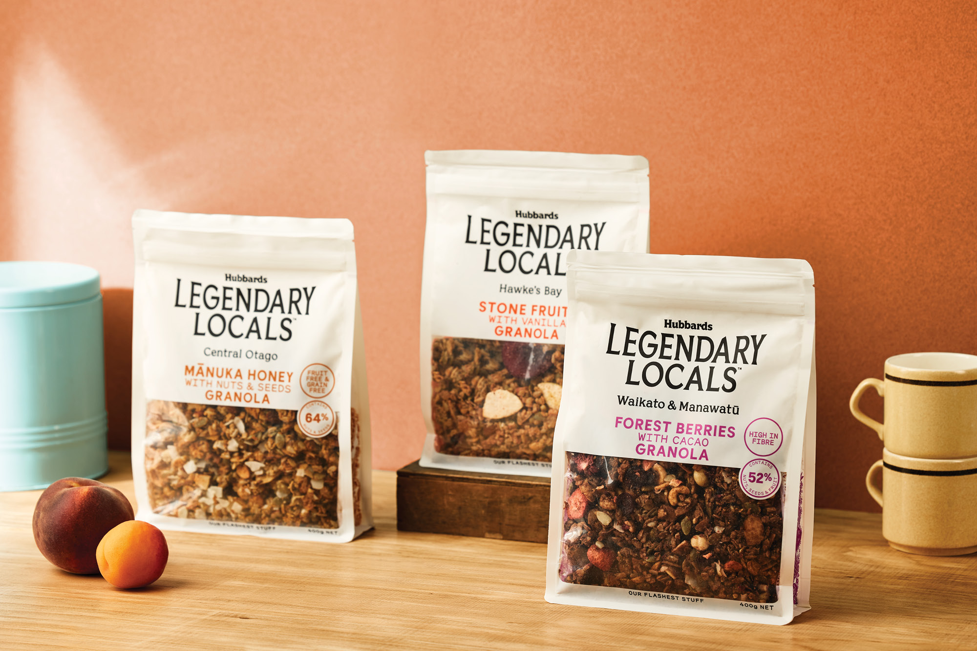
What would Dick do? This question that nods to the founder, Dick Hubbard, is always a yardstick for the brand when creating new breakfast food ideas. This was the deciding factor for Legendary Locals. In their 30 years of making muesli, Hubbards has been up and down the country, trekking the gravel roads to meet local growers who produce the best ingredients. While the brand is one of New Zealand’s much-loved mainstream breakfast food staples, it had not entered the super-premium price category, which has proved popular with muesli and granola lovers. In these Covid lockdown times, consumers have also started to concentrate on homegrown brands and products, purposefully seeking out products that let them experience their home country. Subsequently, brands have begun to make locally grown ingredients a principal on-pack message. It was time that Hubbards showcased their experience and expertise and what they could bring this experience-seeking consumer, seeking the very best taste and texture experience to be found in New Zealand. This is the flash stuff.
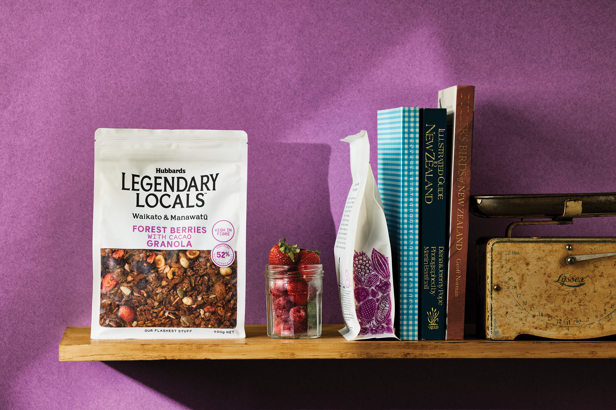
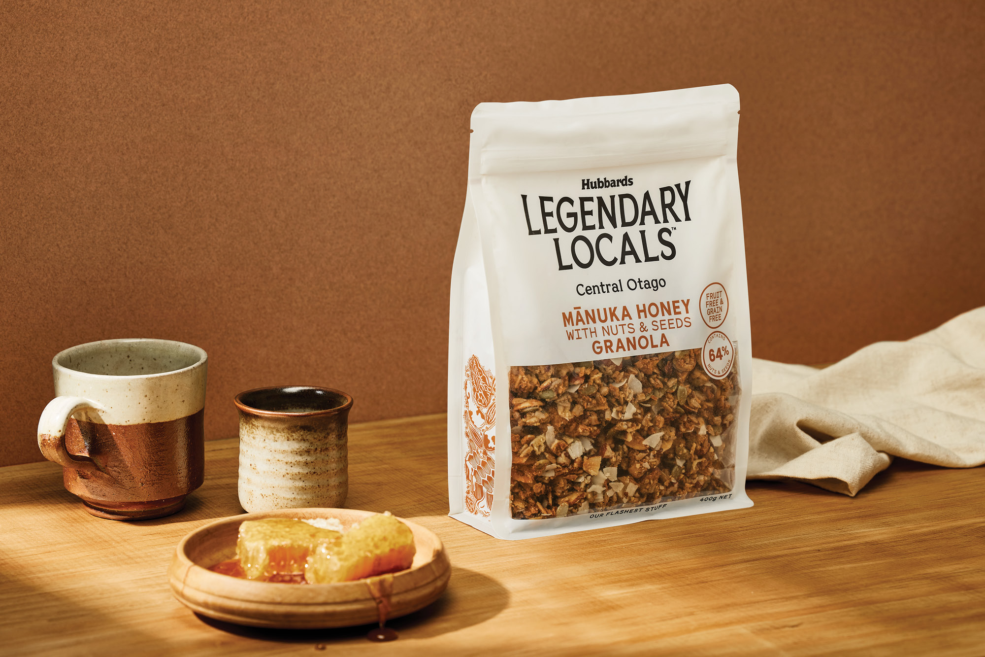
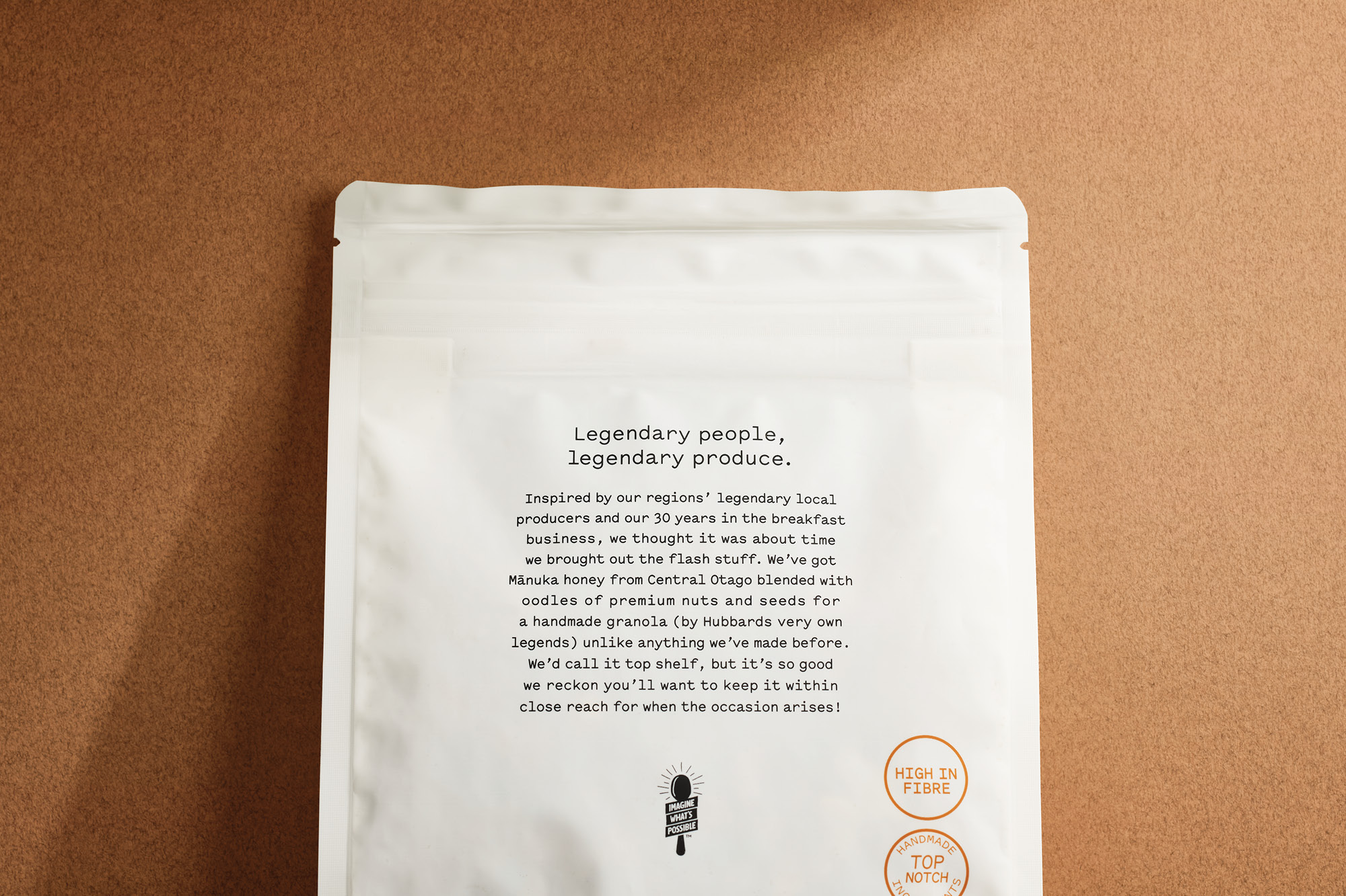
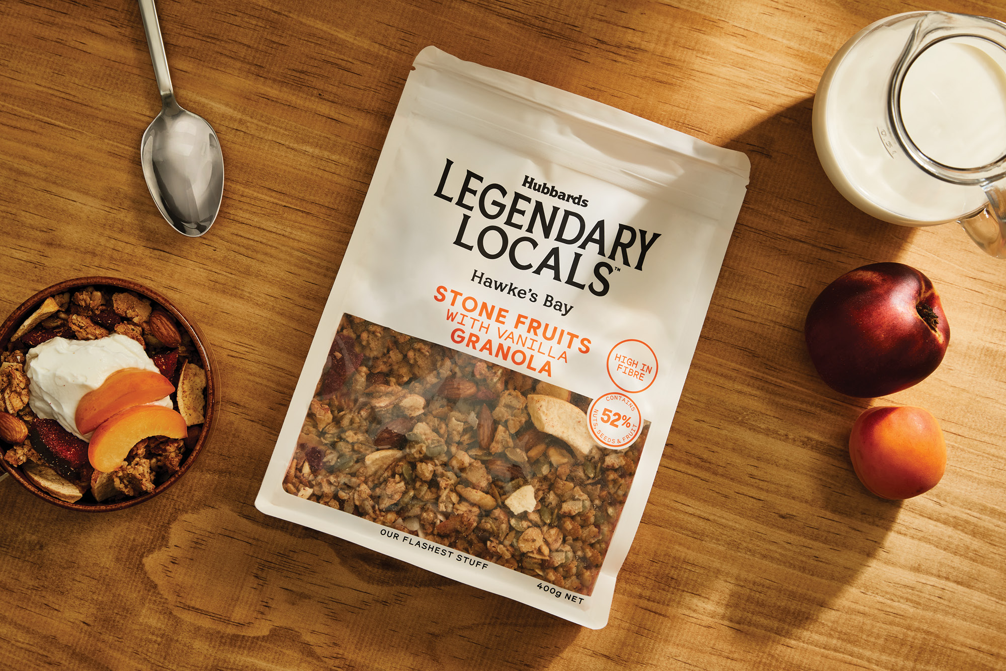
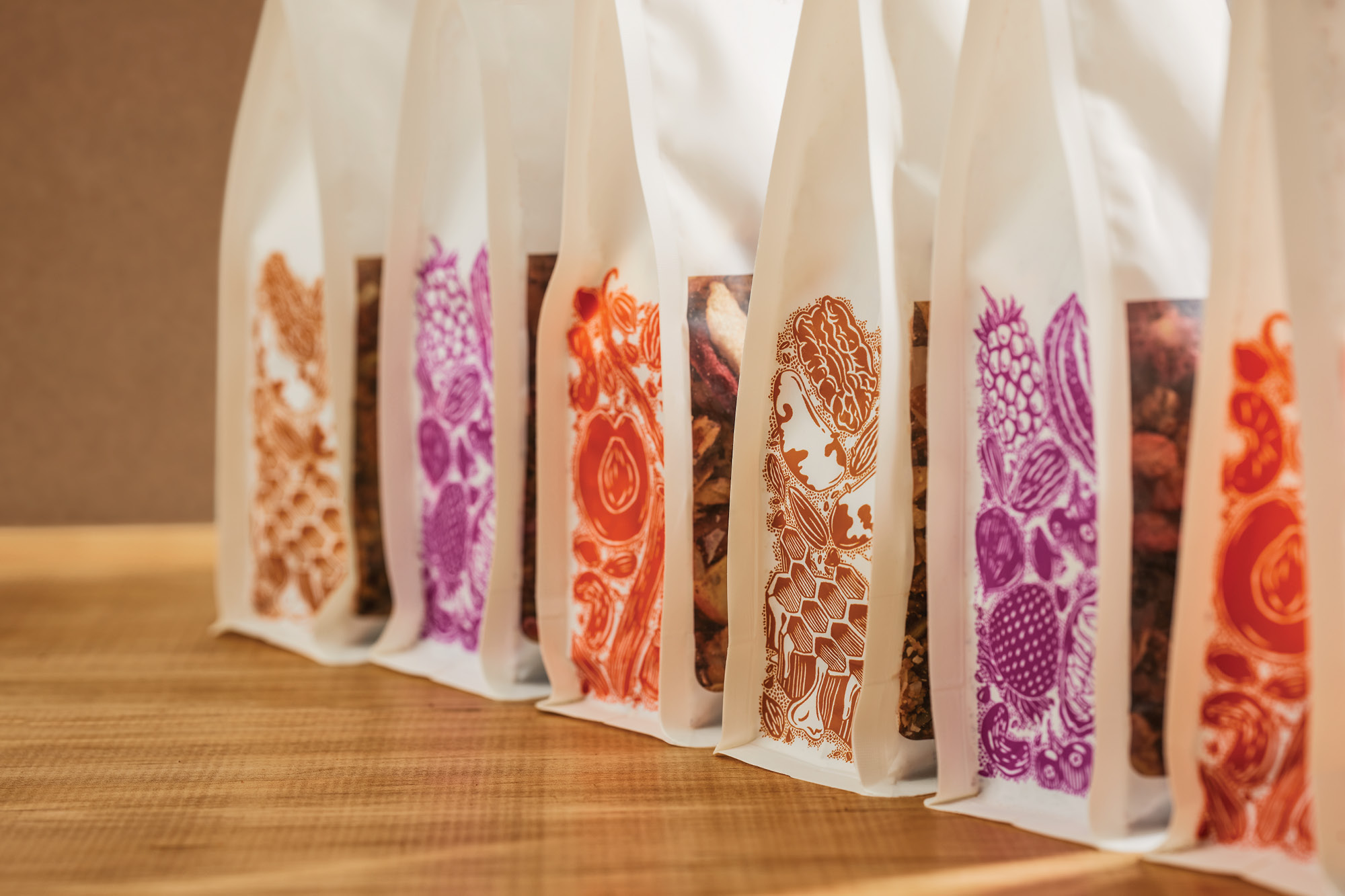
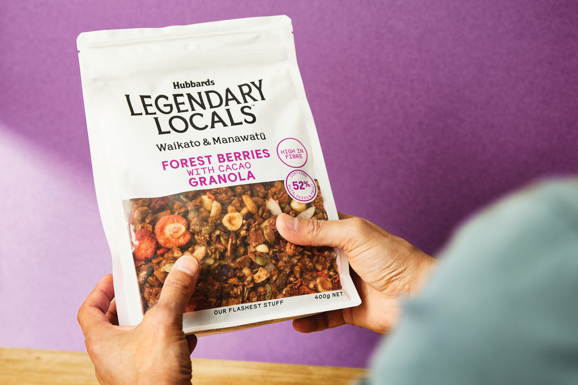
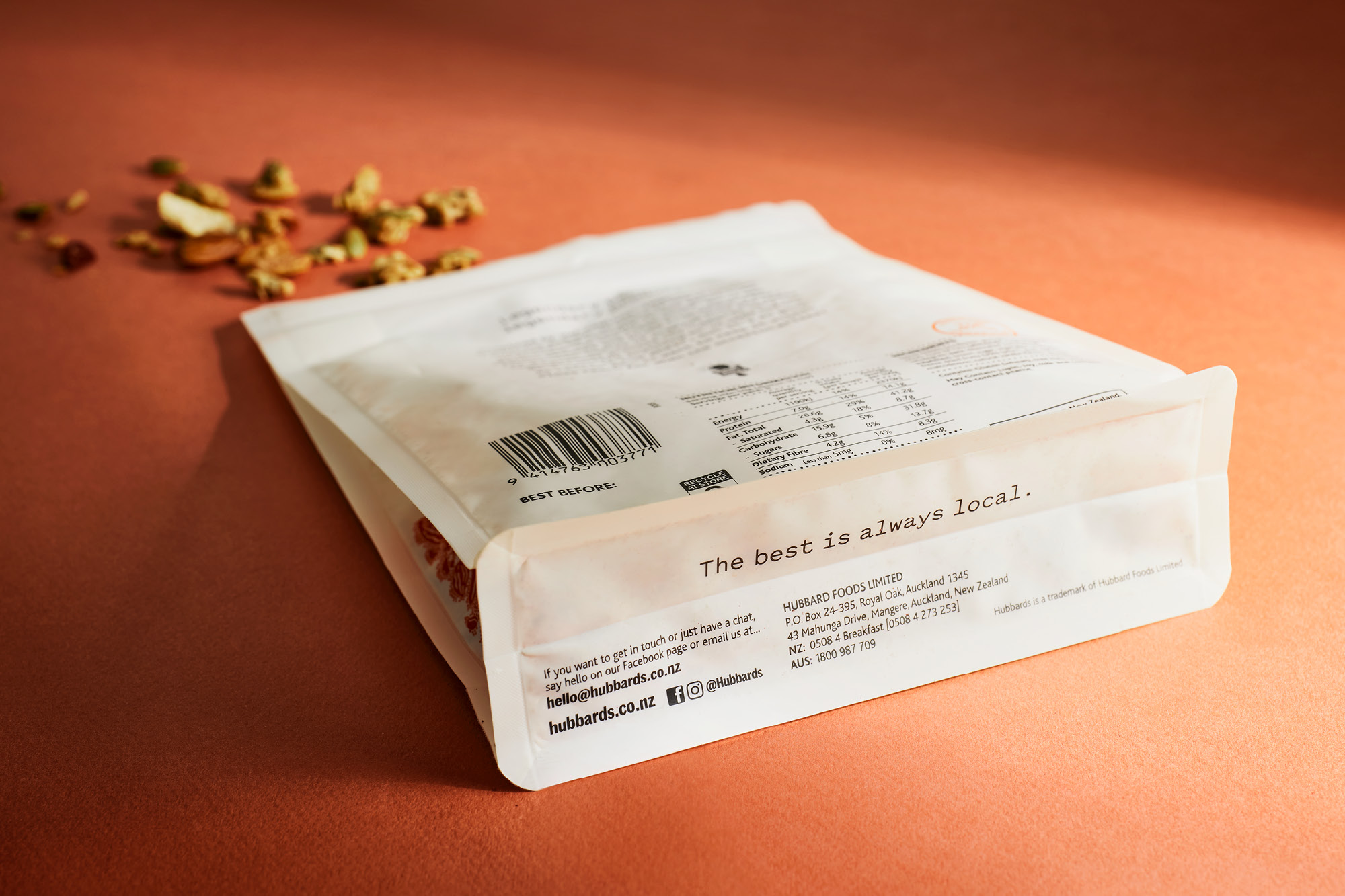
We positioned this new range in typical Hubbards fashion. For Kiwi’s, being ‘legendary’ is a moniker used for people, experiences and food that are genuinely exceptional, unexpected and dependable. Honest and down-to-earth, the packaging is all about showcasing the beautiful granola while eliminating all the usual embellishments (foils, dark rich colours, faux textures) and design language elements that are usually employed at this price category. Premium but unpretentious, the mix of typography is carefully refined, understated and quintessentially Kiwi. The understated exuberance of the flared sub-brand type is balanced with a simple provenance statement. While the product details are only pop of colour on an otherwise minimal pack front. This careful mix of type allows the ingredients and granola chunks to sell the premise in an oversized window. Back of pack is equally minimal with all the attention on a short manifesto, the reason why Hubbards is showcasing this incredible produce from some amazing farmers and producers.
This is Hubbards at it’s understated best!
CREDIT
- Agency/Creative: Onfire Design
- Article Title: Onfire Design Creates Packaging Design for Hubbards Legendary Locals
- Organisation/Entity: Agency
- Project Type: Packaging
- Project Status: Published
- Agency/Creative Country: New Zealand
- Agency/Creative City: Onfire Design / Auckland
- Market Region: Oceania
- Project Deliverables: Art Direction, Brand Creation, Brand Mark, Copywriting, Graphic Design, Lettering, Packaging Design
- Format: Pouch
- Substrate: Plastic
- Industry: Food/Beverage
- Keywords: Breakfast, food, granola, packaging design, typography
-
Credits:
Creative Director: Matt Grantham
Design: Matt Grantham
Design: Michael Nicholls


