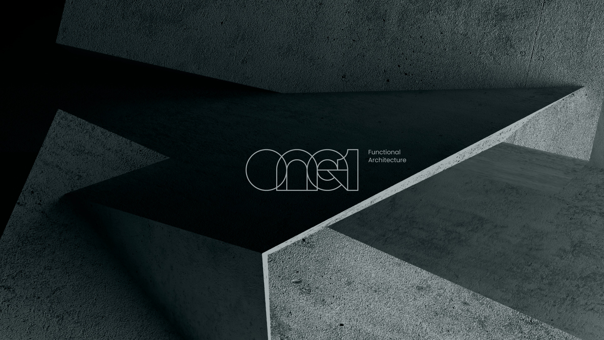
One1 is an architecture firm located in Texas, United States, specializing in functional projects that prioritize human needs, without neglecting contemporary design development.
The name behind the brand refers to the idea of being the first architecture office that comes to the mind of the client, that is, it is a brand objective to be a leader in the market segment in which the company operates. The repetition of the “1” in the form of a number after the “One” is a move that reinforces the self-affirmation of the brand’s market positioning.
The concept behind One1’s logo and visual identity is functionality, based on the pillars: Plan, Project, Balance and Function. The idea is to visually convey the main characteristic of the projects developed by the office, which consists of thinking about how they can be functional and efficiently meet the needs of users and residents, without compromising contemporary and sophisticated design.
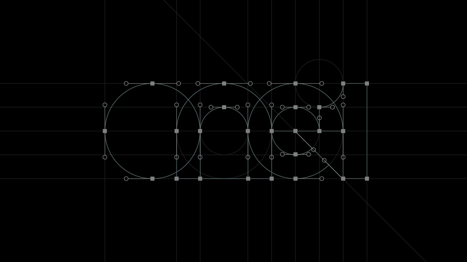
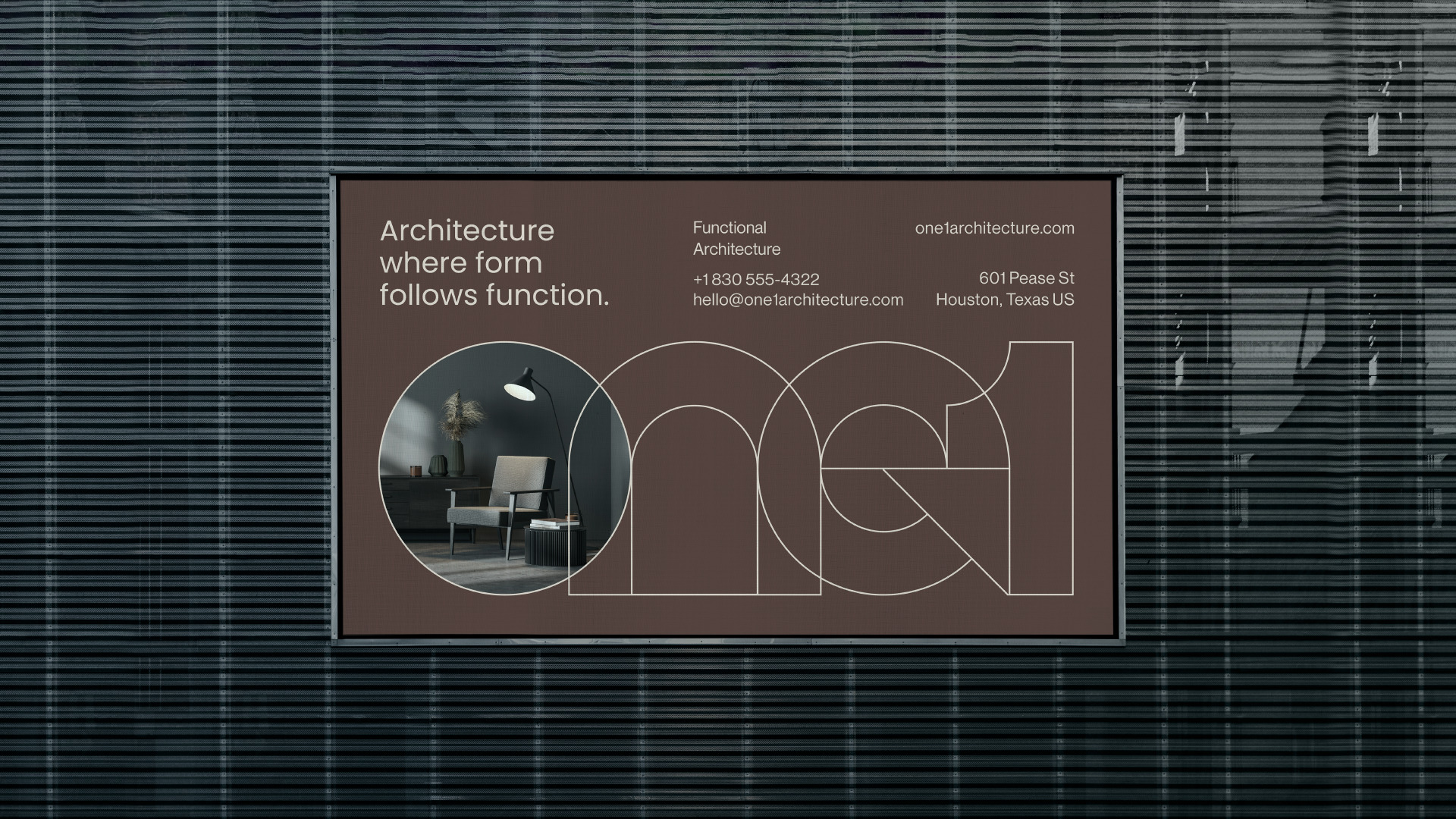
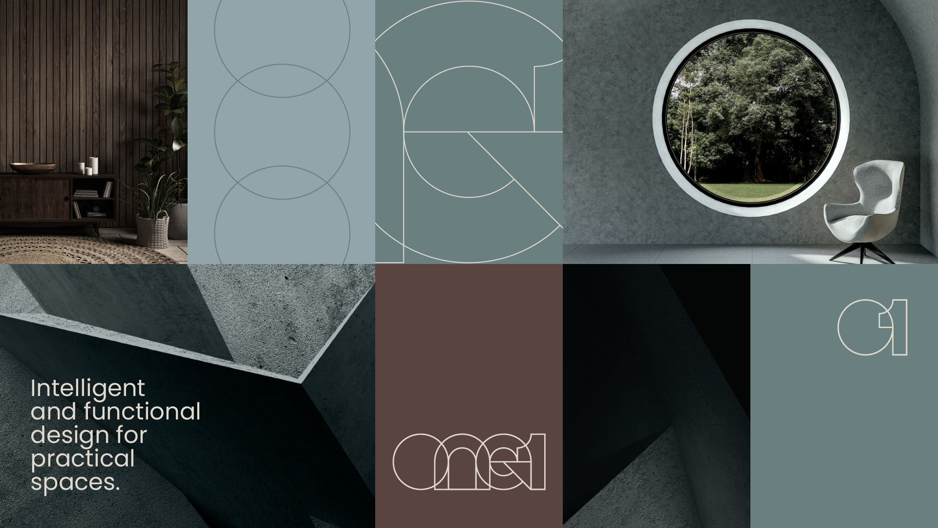
Based on the brand’s attributes, the logo created for One1 was thought to convey, through its fine and regular lines, and the overlapping of all the letters and numbers contained in the name, the association with an architectural project plan.
The precise geometric shapes that build the logo were also strategically used to convey the idea of functionality. In addition, there is an arrow pointing upwards at the junction between the letter “e” and the number “1”, giving the idea of progress, evolution and function.
The final shape of the logo features a typography that may be strange at first, but which, even so, conveys the feeling that everything is organized in its proper place. It is precisely the purpose of the brand through its projects printed in its main visual representation: function with refined aesthetics.
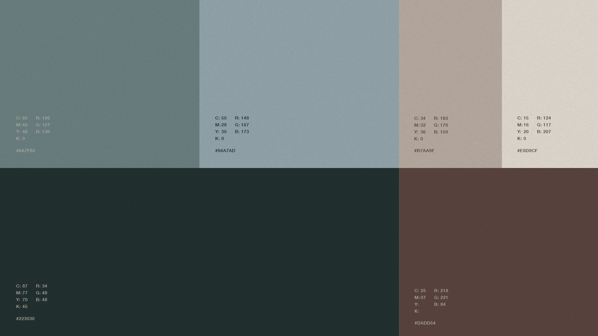
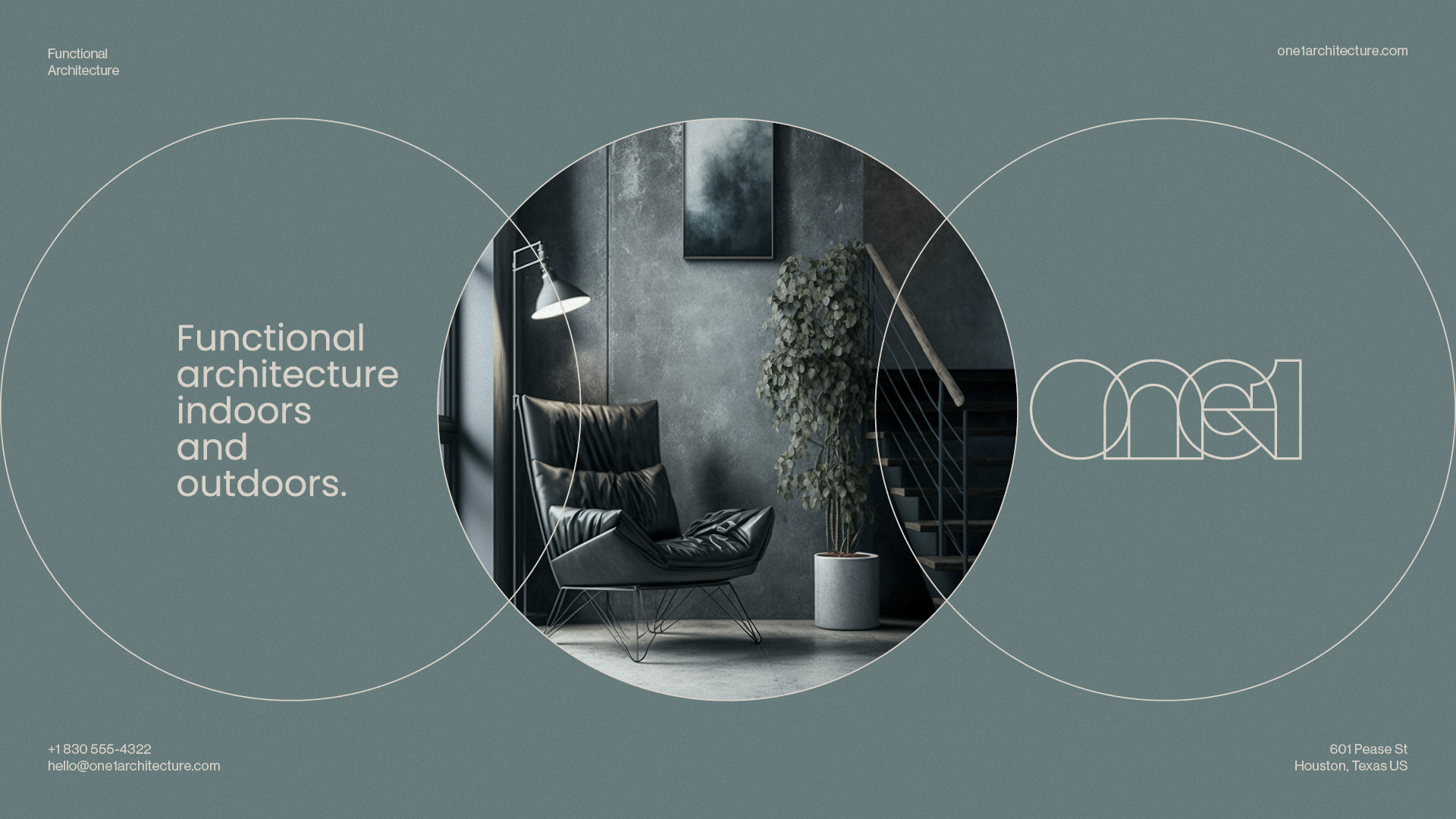
The choice of color palette for the visual identity of the One1 brand was carefully made to convey the company’s values and characteristics. The combination of cooler blue tones with brown tones creates an interesting, modern contrast that reflects the company’s approach to functional and contemporary design.
In addition, the combination of blue and brown is a growing trend in graphic design and fashion, conveying modernity and sophistication. The choice of colors guarantees the consistency of the brand’s visual identity in different contexts.
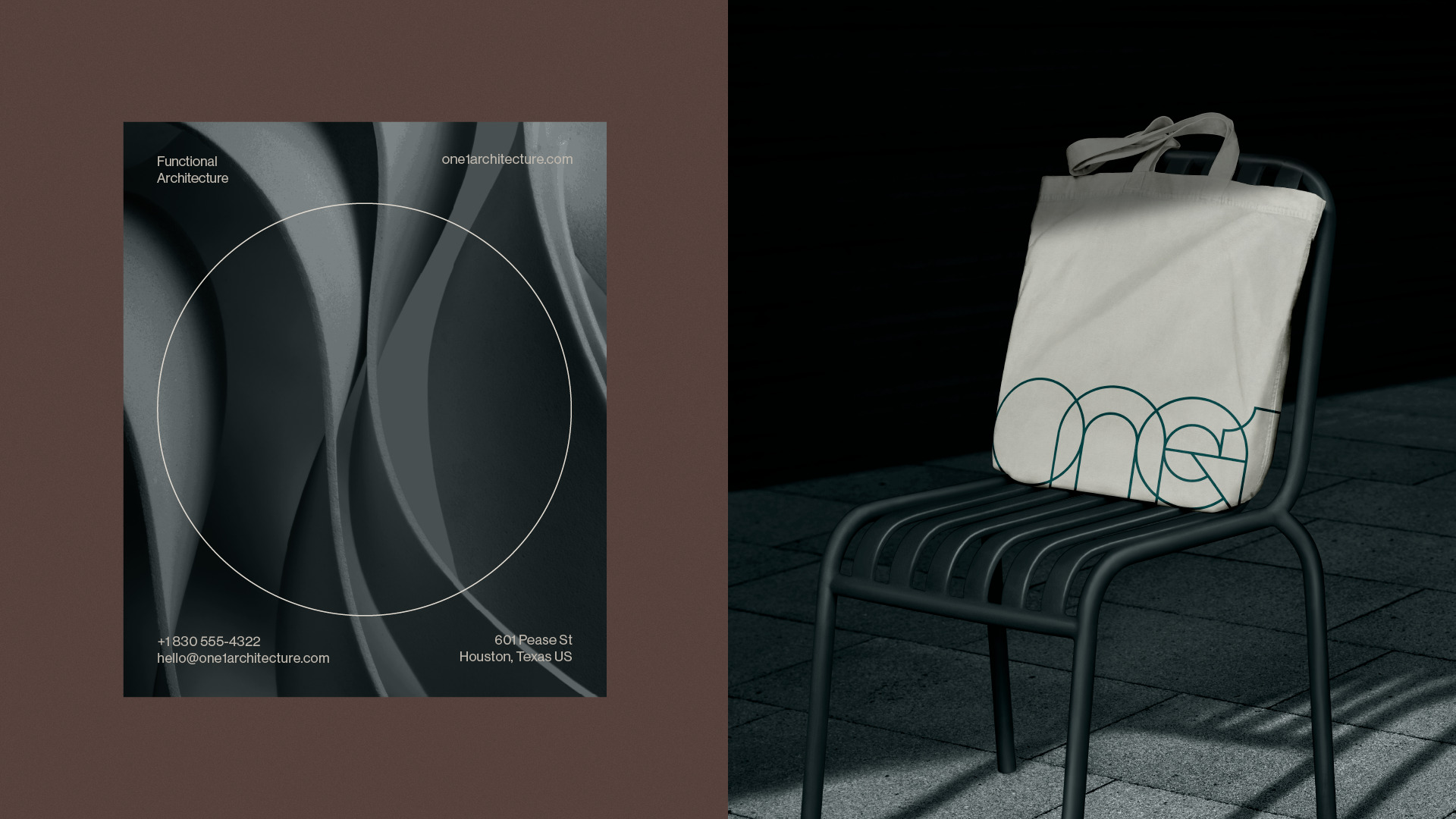
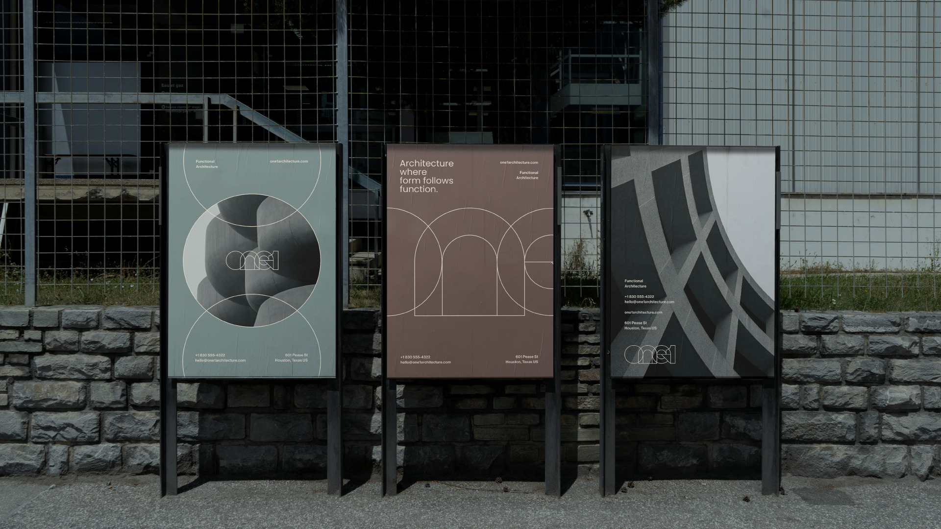
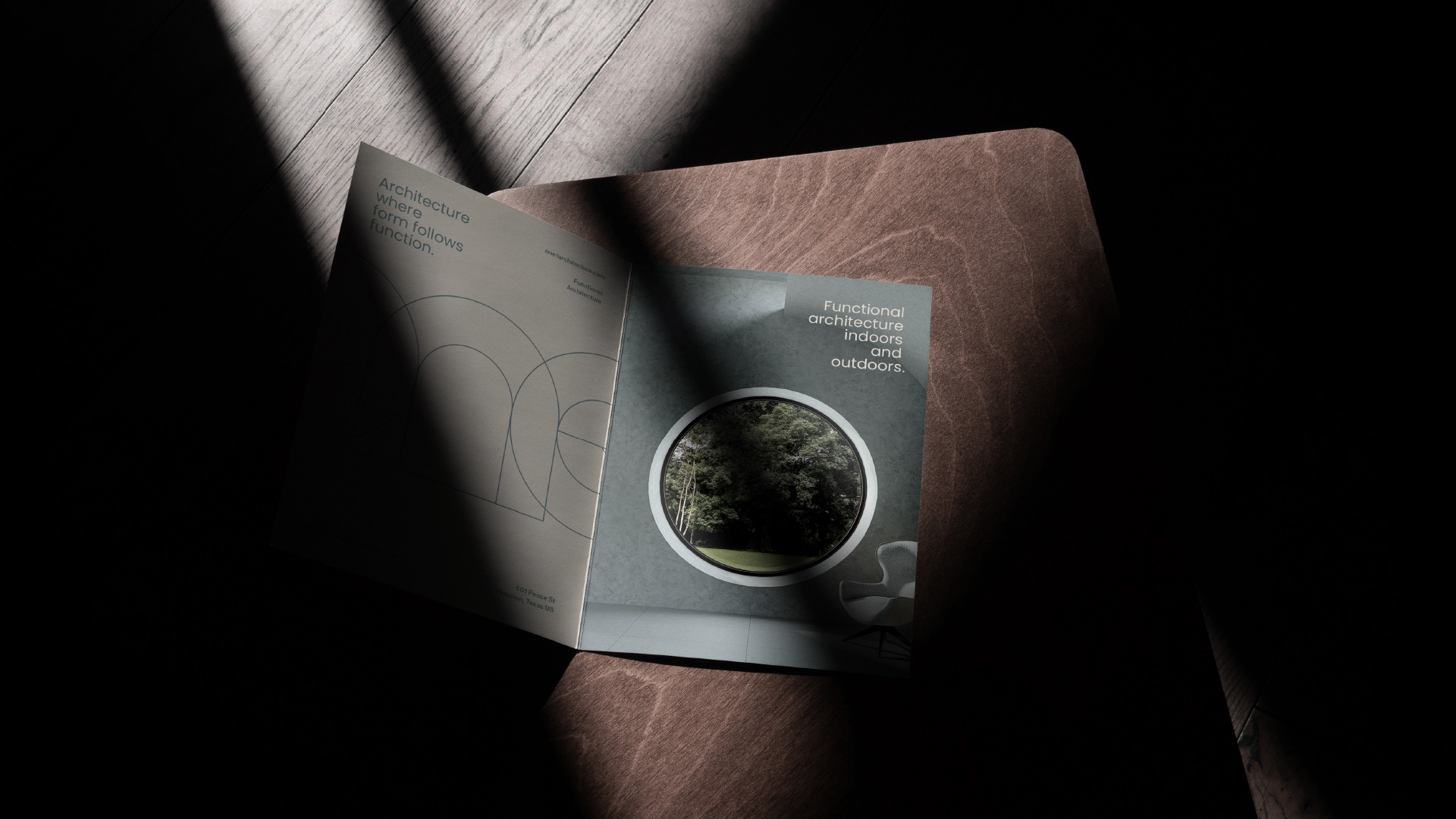
The visual elements created for the visual identity of “One1” were created based on the shapes of the logo, and aim to convey the essence of the company in relation to architecture and design.
The combination of geometric shapes with superimposed thin and precise lines creates an image that recalls the graphic design of an architectural plan, conveying precision and detail.
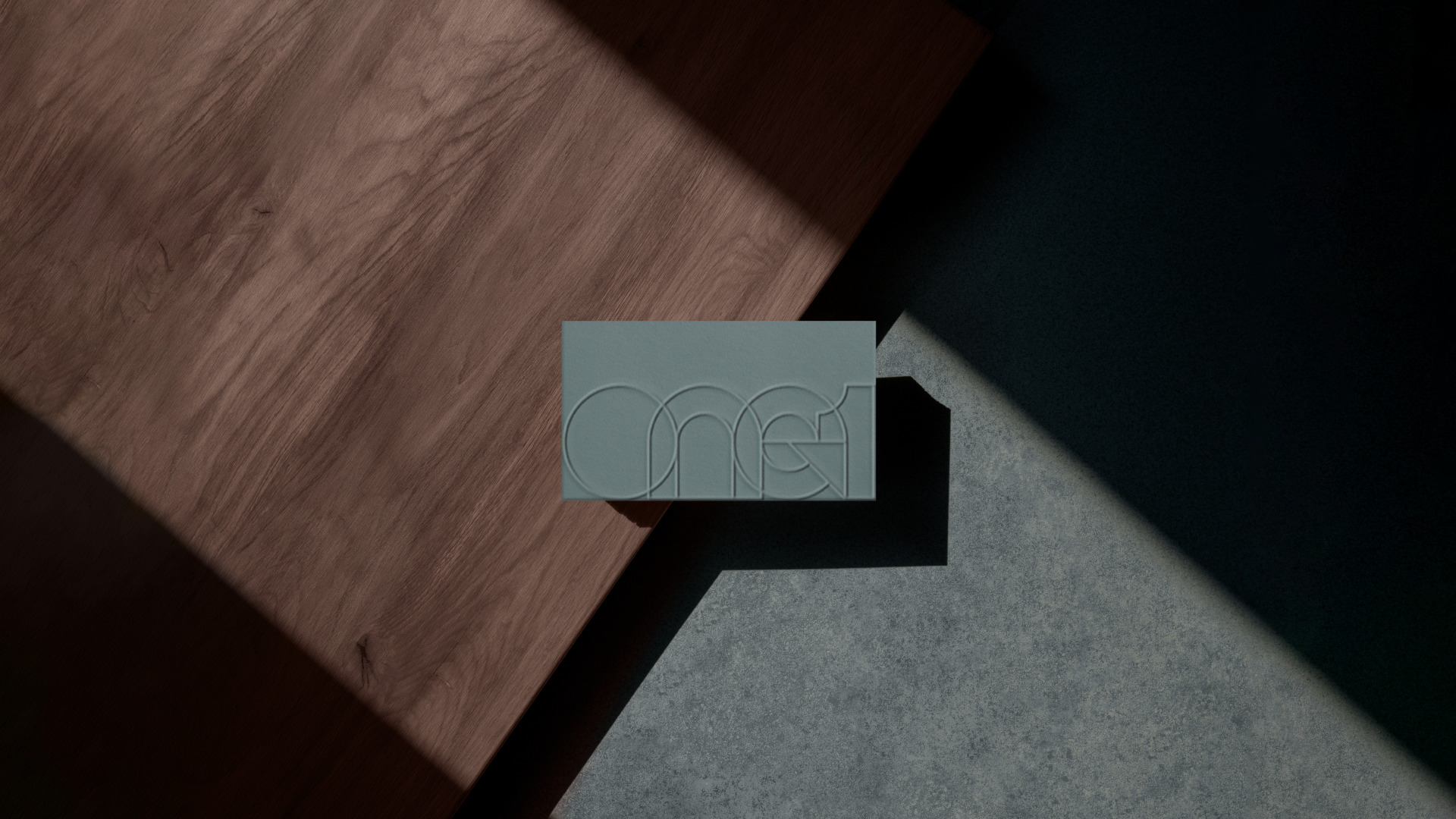
In addition, these visual elements reinforce the company’s image in relation to technology and innovation. The application of these elements in different materials guarantees the consistency of the brand’s visual identity, reinforcing its image of excellence and professionalism.
CREDIT
- Agency/Creative: Matheus Ferreira & Co.
- Article Title: One1 Visual Identity by Matheus Ferreira & Co.
- Organisation/Entity: Agency
- Project Type: Identity
- Project Status: Published
- Agency/Creative Country: Brazil
- Agency/Creative City: Lençóis Paulista
- Market Region: South America
- Project Deliverables: Art Direction, Brand Design, Brand Identity
- Industry: Real Estate
- Keywords: Logo Design, Architecture, Construction, Houses, Brand, Brand Identity, Visual Identity, Brand Design
-
Credits:
Art Director: Matheus Ferreira


