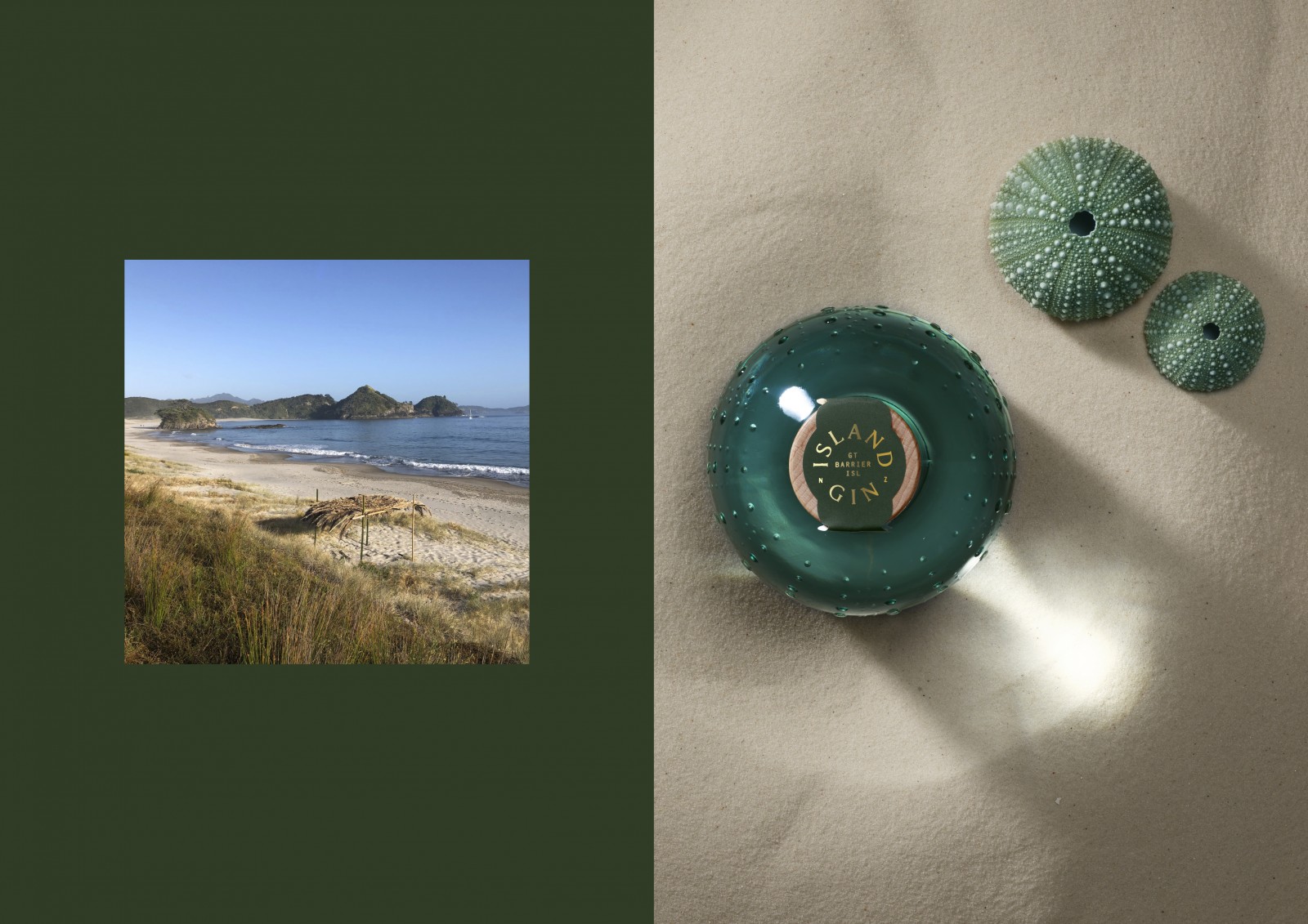
Island Gin is crafted five hours off the coast of New Zealand in a small distillery on Great Barrier Island. With a population of less than 1,000, the remote island is unrivalled in its natural beauty – it is one of only 12 dark sky sanctuaries in the world – and the small community’s dedication to preserving its unique landscape.
Distilled with 100% pure New Zealand base spirit, organic Macedonian juniper, hand foraged botanicals mostly grown on the Island and cut with water sourced from a 100 year old island spring, the unique profile of Island Gin is led by locally harvested Island Bush Honey and Coriander.
A small bach at Medlands, and a love affair with island living (and G&Ts) compelled our client Andi Ross to create and distill this handcrafted, off-grid gin. She required a distinct brand with packaging that would sit comfortably alongside other ultra-premium gins, while directly speaking to its provenance.
Our challenge was to marry the distinct, wild nature of Great Barrier Island with the sensibility of a world class gin, conveying the beauty of the Island as well as the premium nature of the spirit.
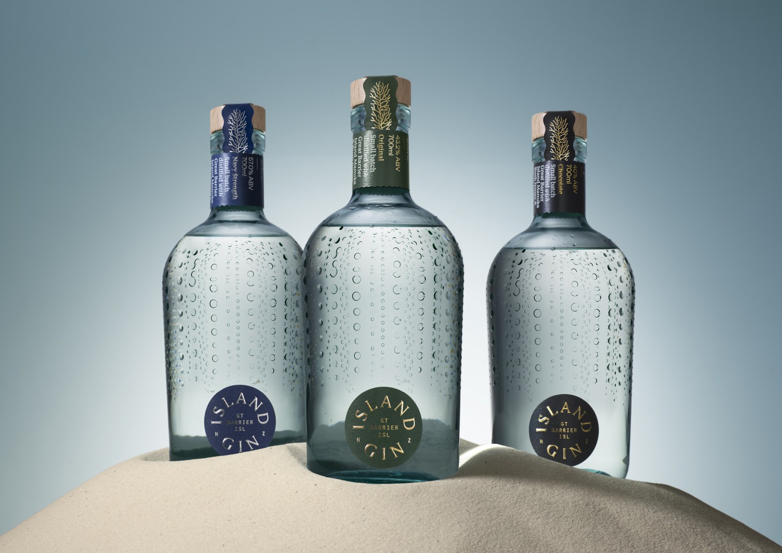
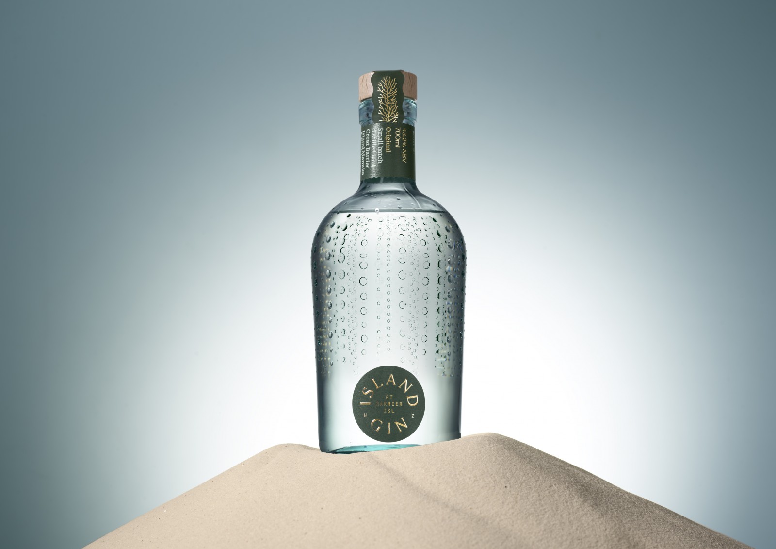
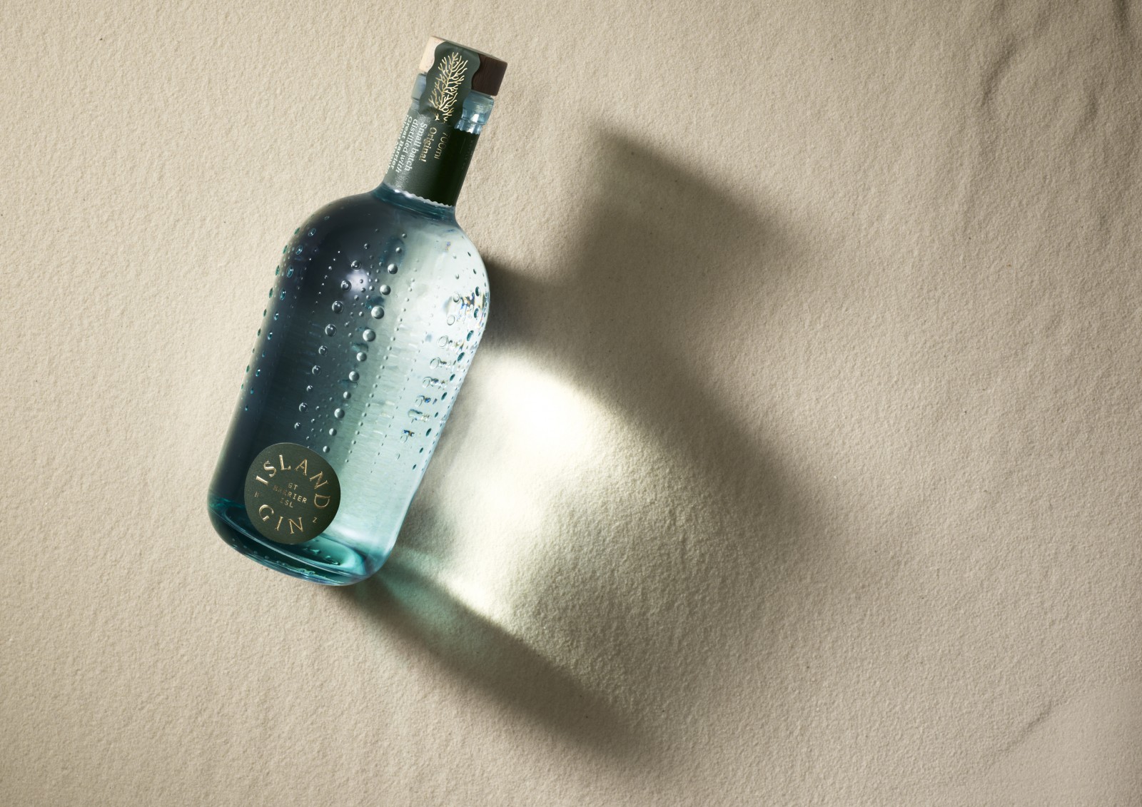
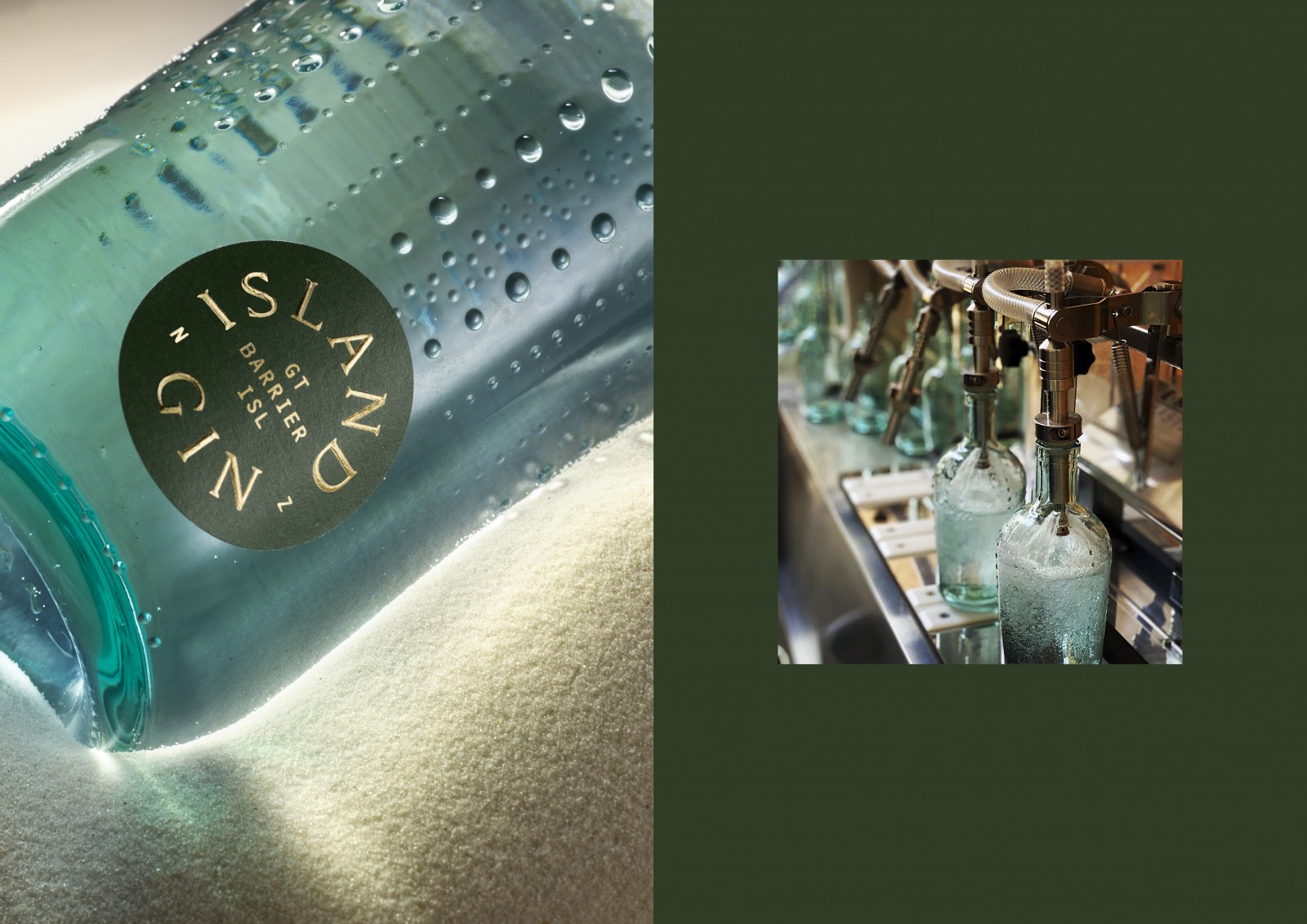
The recycled glass bottle was directly inspired by the kina shell – endemic to the coastline of Great Barrier Island and New Zealand, which gives it a unique sense of place and identity.
Working closely with OI Glass Andi manufactured the perfect bottle using recycled sea glass from the Island itself. The transition phase of the glass manufacturing process (where the colour transitions from flint to artic blue) formed the first run with the unique kina mould. The pale green glass, a result of this transition phase, works beautifully to further enhance the kina identity which is naturally green in colour.
The circular label design references both the kina and the recycled sustainable ethos of the brand putting Great Barrier Island at the heart both metaphorically and physically. Each flavour is distinguished by hues from nature, inspired by the land and sea. These raw muted colours are juxtaposed with a sculptured foil emboss which assists brand positioning in the ultra-premium space.
Island Gin is consciously guided by nature and the principles of the local community with an ever-increasing percentage of pack produced sustainably.
CREDIT
- Agency/Creative: One Design
- Article Title: One Design Creates Packaging Design for Island Gin
- Organisation/Entity: Published Work
- Project Status: Published
- Keywords: WBDS Agency Design Awards 2020/21


