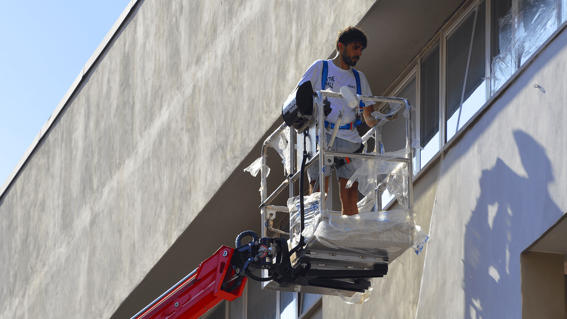
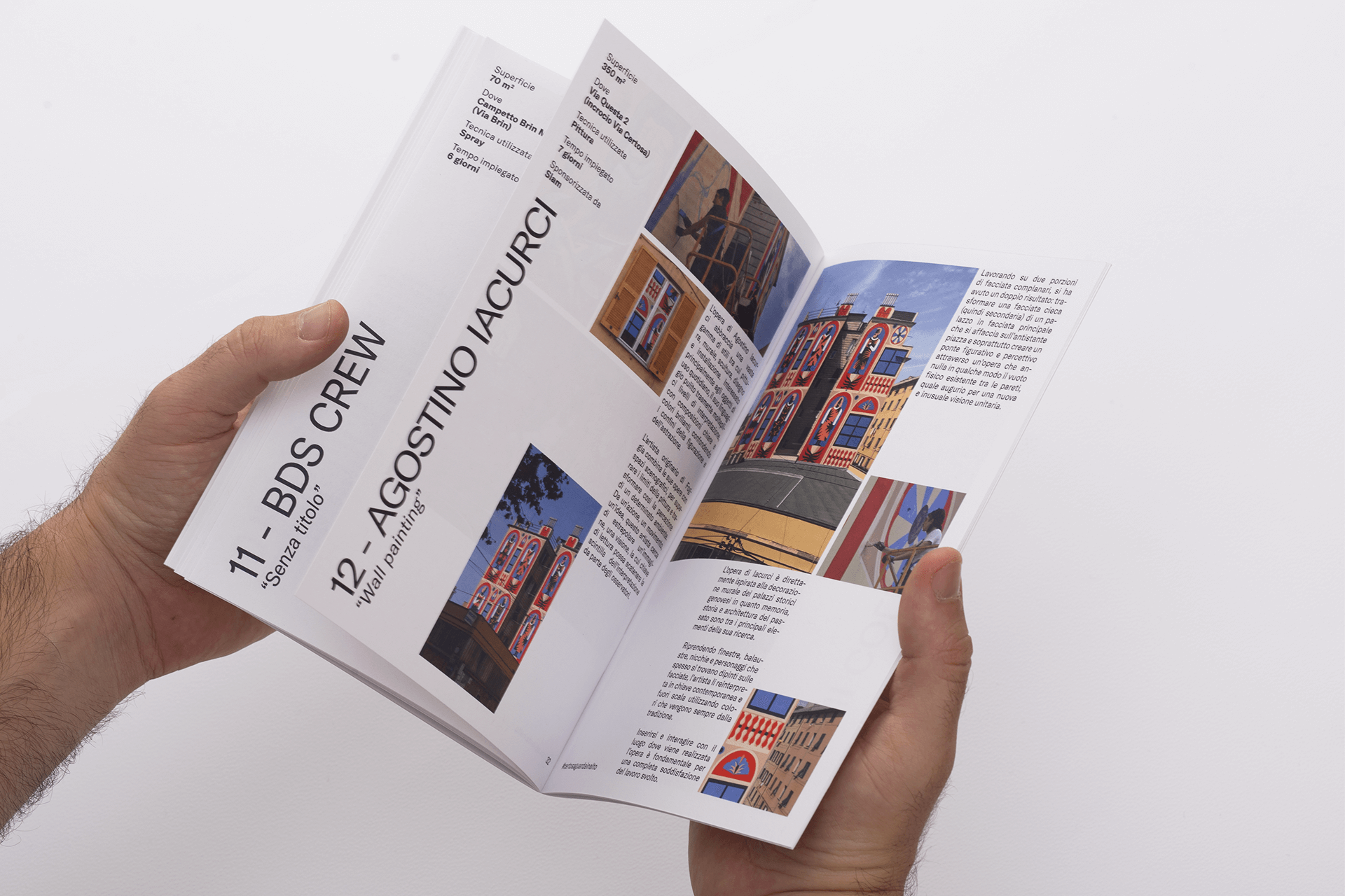
On The Wall was an initiative of the Genoa Municipality realized in collaboration with the Linkinart association within the street art project Walk The Line. On The Wall is the urban regeneration project in the area most affected by the collapse of the Ponte Morandi through the most controversial art there is. Street art has transformed the Certosa neighborhood into an open-air art gallery, through the intervention of world-class artists.
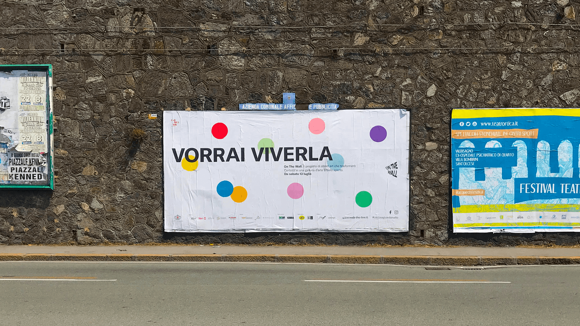
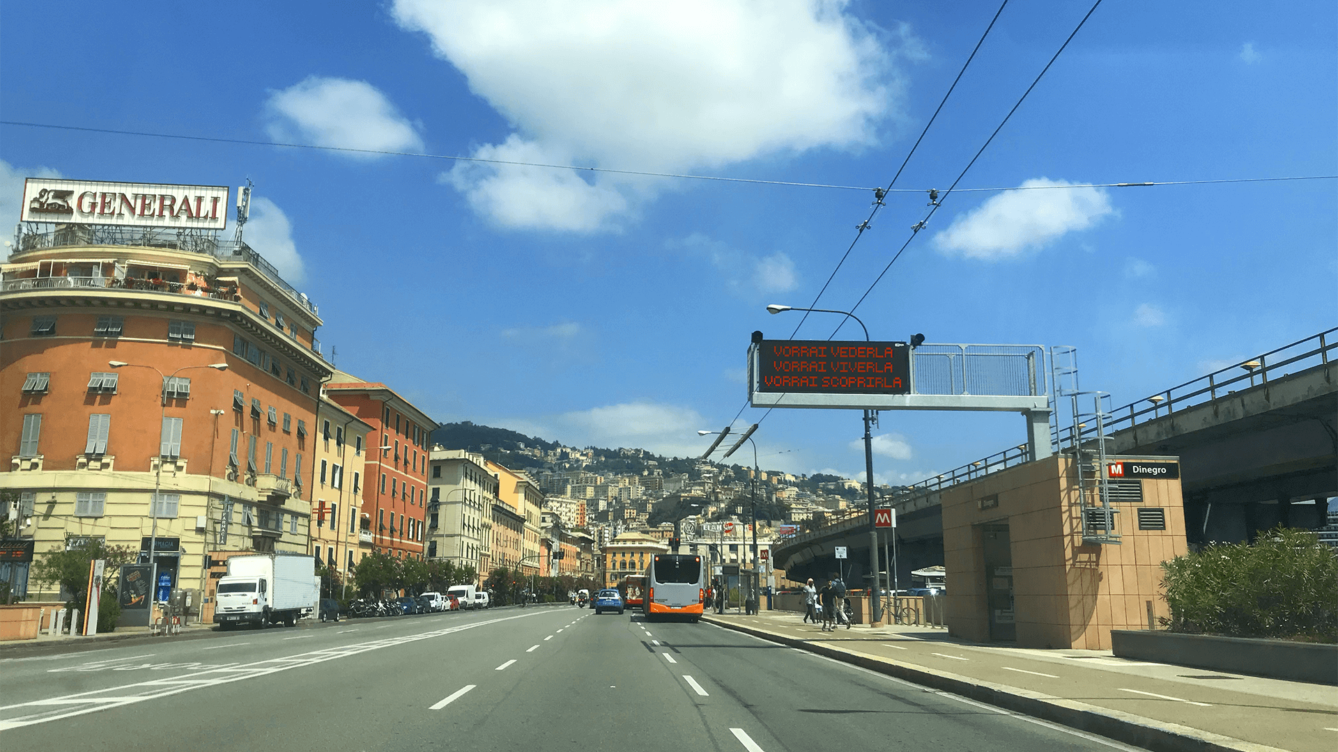
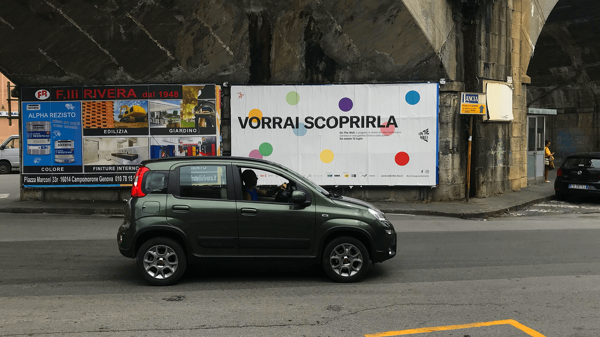
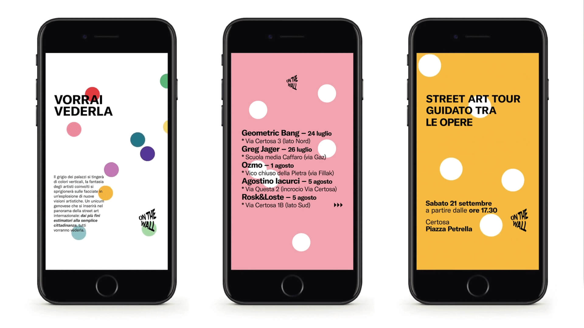
The communication project has had more fields of application: outdoor posters, cinema, social networks, printed materials, newspapers. More graphic elements have been designed that could interact with each other, both abstractly and figuratively. The concept of the communication campaign starts from the desire to depict in a simple and clear way what will be the project:
color, dynamism, transformation, interaction.
Brand
It has a figurative style and represents a form of megaphone through the name of the project written with a font that represents one of the key elements of the project: canister to paint. A simple and clear brand to directly understand what you are talking about in order to be understandable by the majority of the population.
Geometric shapes
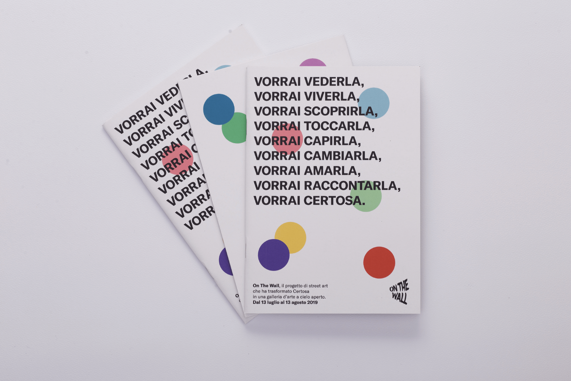
We decided to use simple geometric shapes to represent these concepts through light colors: the people who move and interact, the project that moves forward, the street art works that come to life, the area that transforms. Multiple meanings that are translated through a simple, direct, relaxing language.
Color: the colored geometric shapes are light and arranged in such a way as to allow the text to be readable. Applying these shapes on a white surface is an attempt to explain that OTW will be a design that will “apply” color to a surface that color does not have. The chosen shades try to convey lightness, relaxation and empathy with the project.
Dynamism: the colored circles take on a different position (random) within the various materials thanks to the use of Processing (generative graphics software that allows, by altering the composition parameters, to always have a different result). In the first part of the campaign, the animations have an accelerated and very lively rhythm (the choice of audio goes in this precise direction, balancing the choice of color). The feeling of sudden change and “shock” is what On The Wall wants to be.
Transformation: the colored shapes increase in size in every communication material as the event continues trying to infuse a concept of change. The position is never the same and the random arrangement supports this idea.
Interaction: close, distant, overlapping, juxtaposed. The forms interact with each other, speak and support the textual part within the materials, continuously stimulating the eye.
Phrases and text
An integral part of the communication campaign were enigmatic phrases that were revealed as we approached the project, trying to instill a sense of curiosity in the observer: the verb to have indicates the desire that Certosa will unleash in people to perform an action and selected verbs can be traced back to actions that will be triggered when the project is completed with respect to the neighborhood. Certosa is an area with little artistic / cultural / tourist relevance but with a long history behind it that has contributed in an important way to the development of Genoa: now it is experiencing a moment of difficulty but the intent of the project is to show the neighborhood from a different, attractive and aesthetically relevant point of view.
The hashtag #certosaguardainalto that accompanies all the releases about On The Wall (press, social media, outdoor posters, etc.) is an abstract invitation to look ahead and look at the future with hope and at the same time a direct invitation to admire the works that now make Certosa a famous district throughout Italy.
Video
The promotional video of the event is a summary of all the concepts expressed above. In addition to being widespread on social networks, it was shown in cinemas in northern Italy thanks to the partnership with Uci Cinemas.
A social project
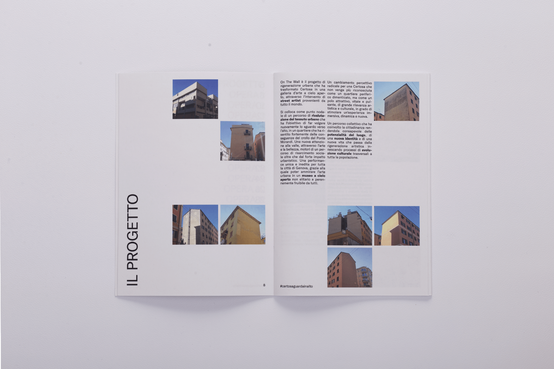
The project is a focal point of a revaluation path of the urban fabric which has the objective of turning its gaze upwards again, in a neighborhood that has been strongly affected by the consequences of the collapse of the Ponte Morandi. A new attention to the valley, through art and beauty, driving a path of social compensation as well as a strong urban impact. A unique and unpublished performance for the whole city of Genoa, thanks to which it is possible to admire urban art in a non-elitist open-air museum that is always accessible to all.
A radical perceptive change for a Certosa that is no longer recognized as a forgotten suburb, but as an attractive, vital and pulsating center of great artistic and cultural importance, capable of stimulating an immersive, dynamic and new experience. A collective journey that involved citizenship making it aware of the potential of the place, of a new identity and of a new life that passes from artistic regeneration triggering processes of cultural evolution transversal to the whole population.
CREDIT
- Agency/Creative: Matteo Pulina / Maria Francesca Marano
- Article Title: On The Wall Communication Campaign
- Organisation/Entity: Freelance, Published Commercial Design
- Project Type: Identity
- Agency/Creative Country: Italy
- Market Region: Europe
- Project Deliverables: Brand Advertising, Brand Strategy, Graphic Design, Identity System, Research, Tone of Voice
- Industry: Non-Profit
- Keywords: Graphic Design, Visual Design, Street Art, Graffiti, Social Project, Geomtetry, Genova, Adv, Motion Design, Inspire


