


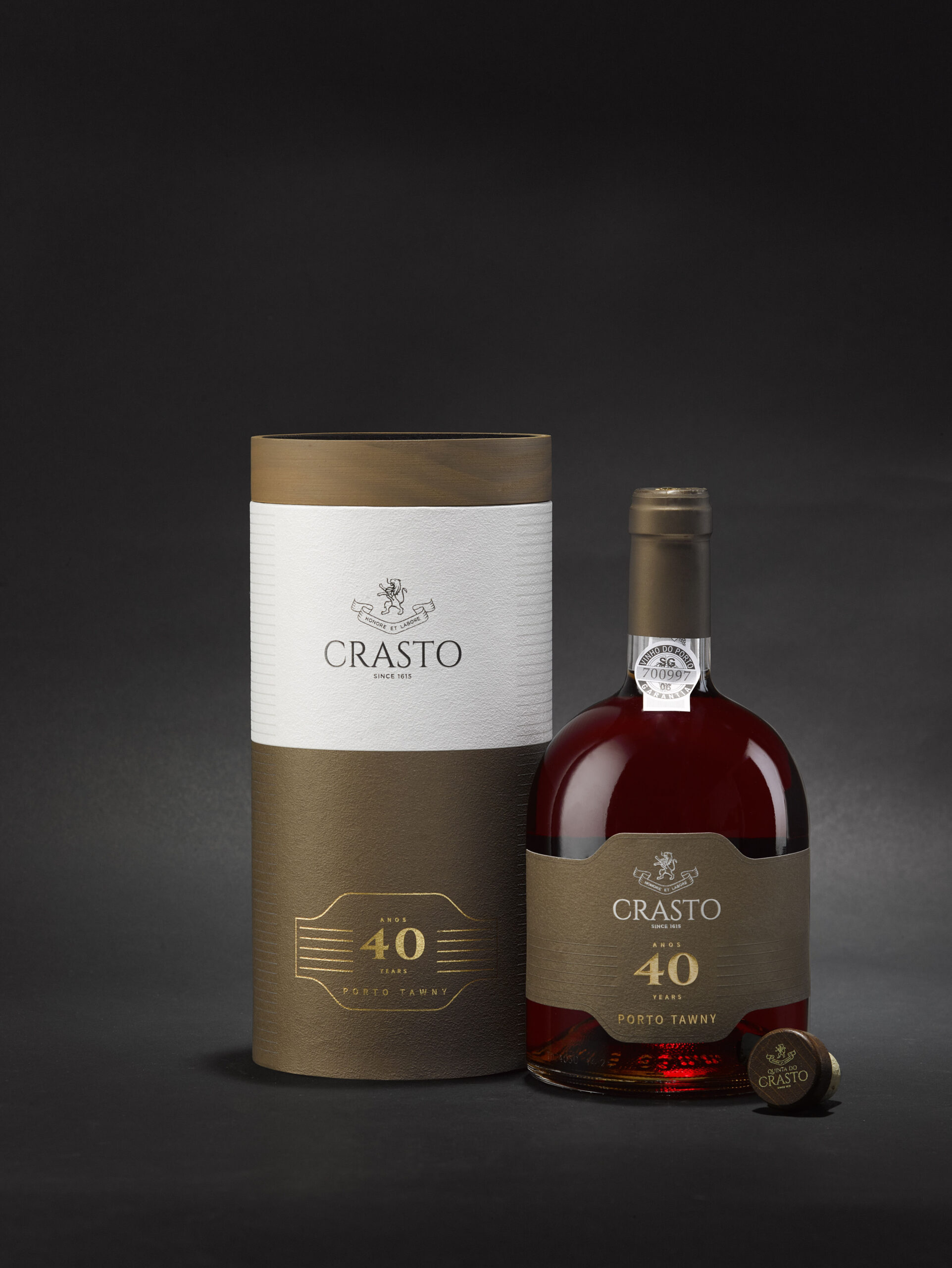
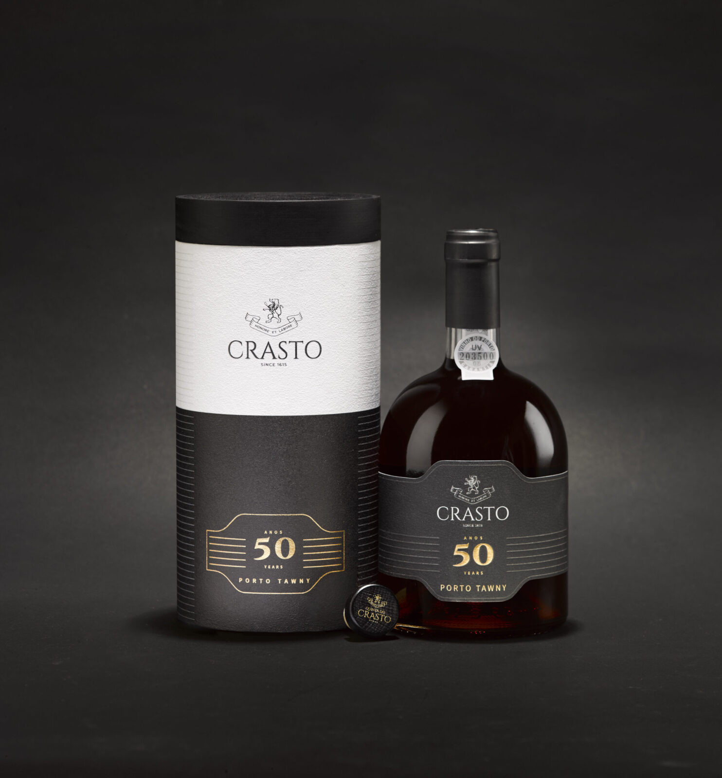
Omdesign® was responsible for the rebranding of Quinta do Crasto, one of the most renowned Douro and Port wine producers. This new identity was elevated through redesigned packaging, defined by a clean, sober, and minimalist aesthetic that reflects and reinforces the superior positioning of this prestigious brand.
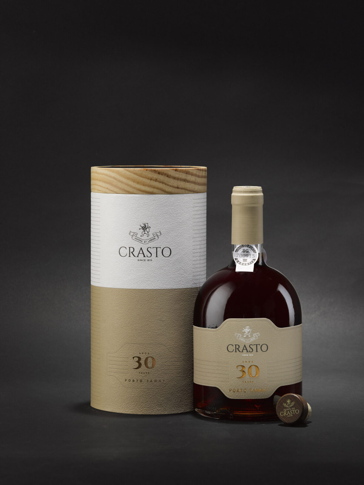
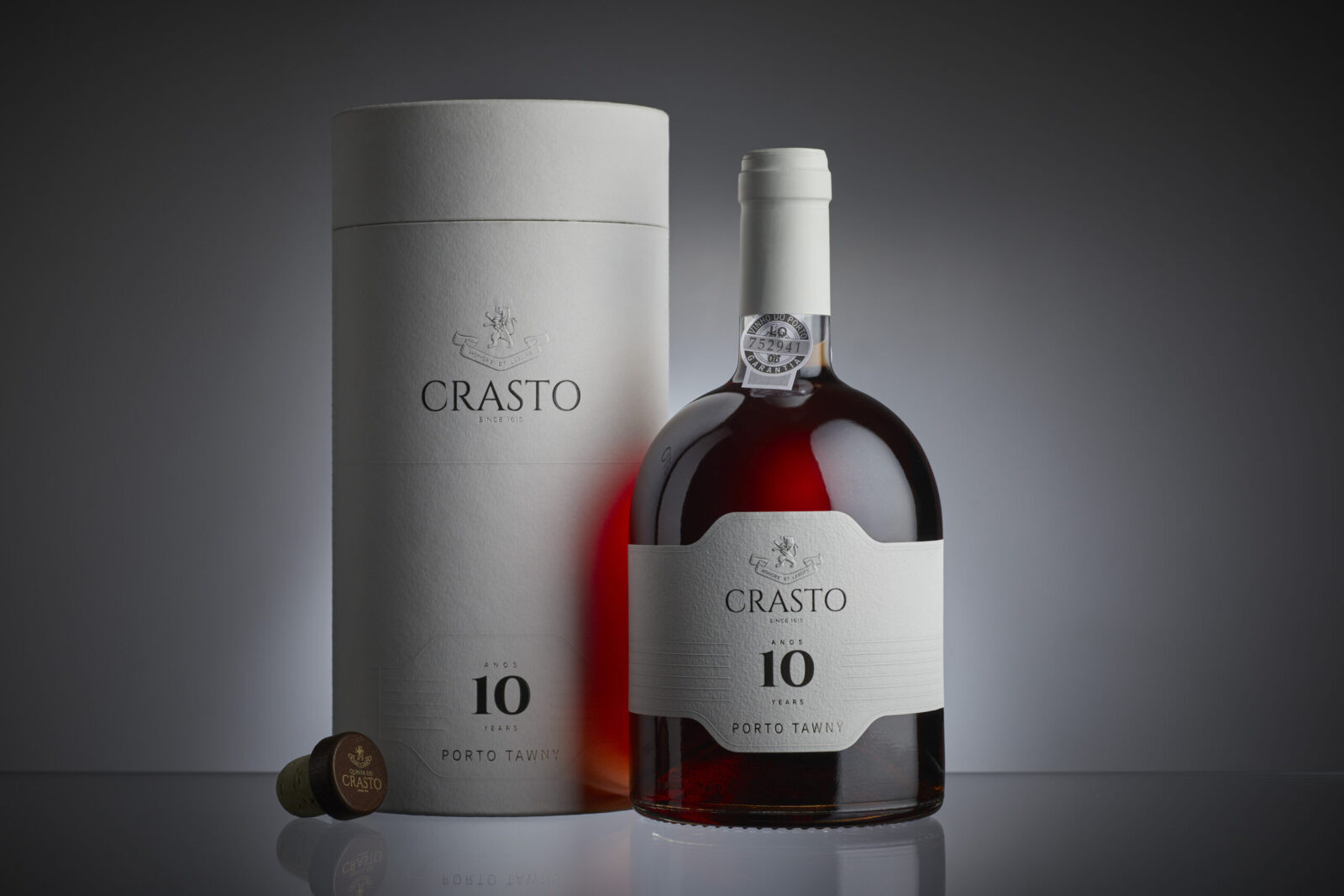
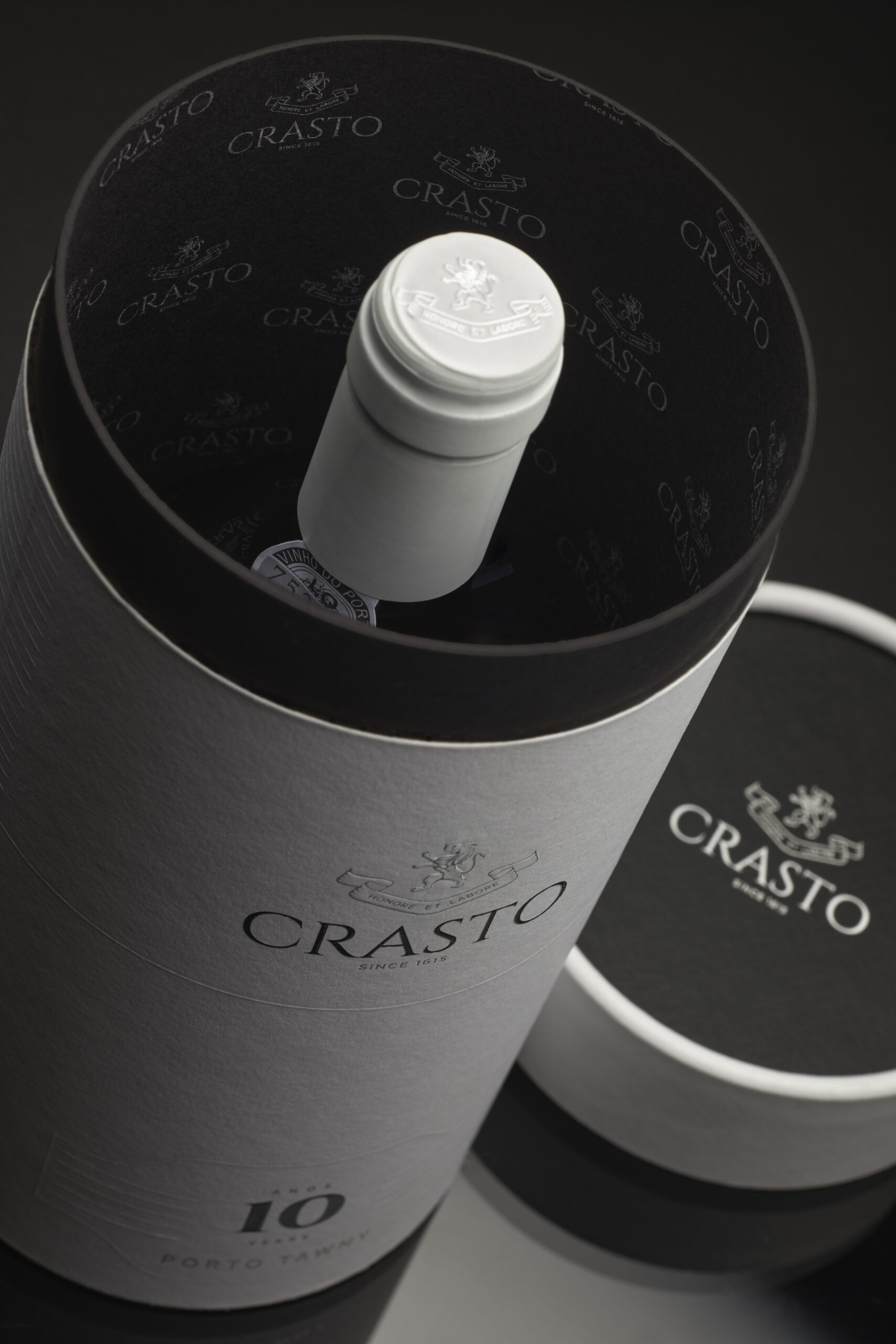
The agency developed the entire packaging range – from Douro wines to Ports – carefully considering labels and gift boxes. The result highlights elegant and distinctive elements that strengthen the premium character of each reference while ensuring a cohesive identity across the portfolio. At the same time, the design clearly differentiates categories and product positioning within each line.
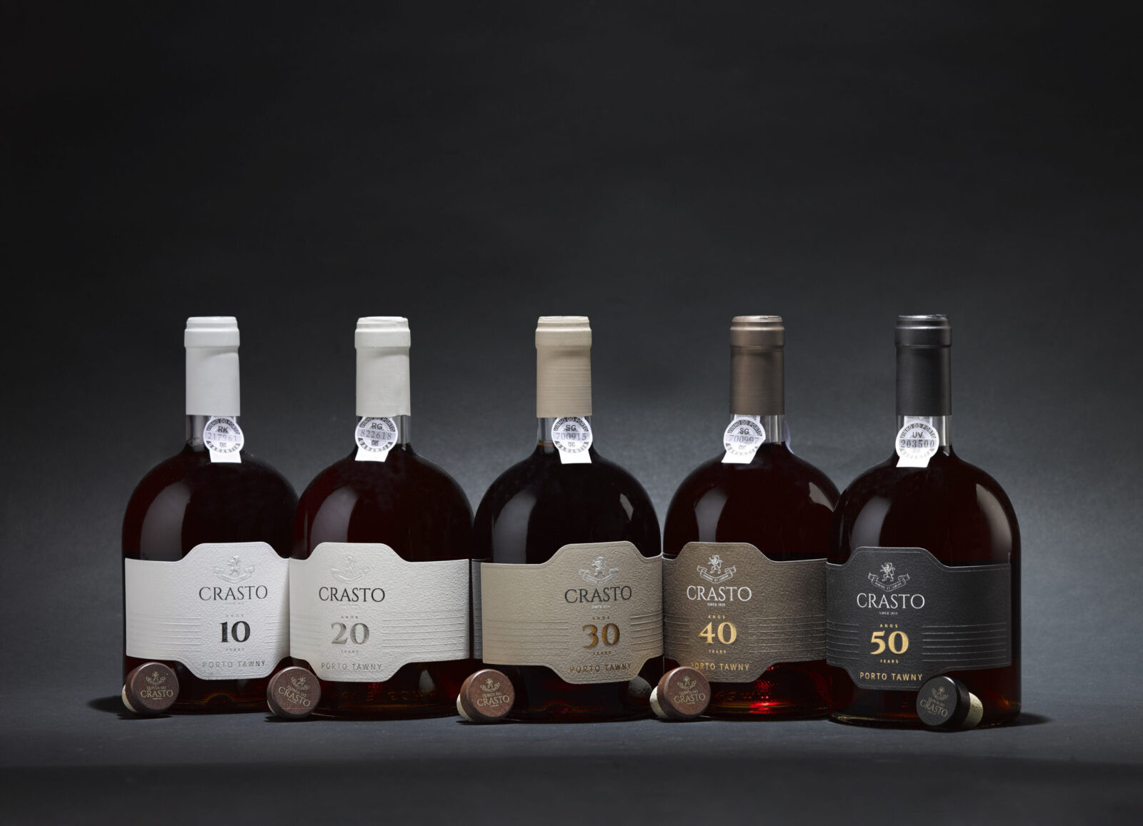
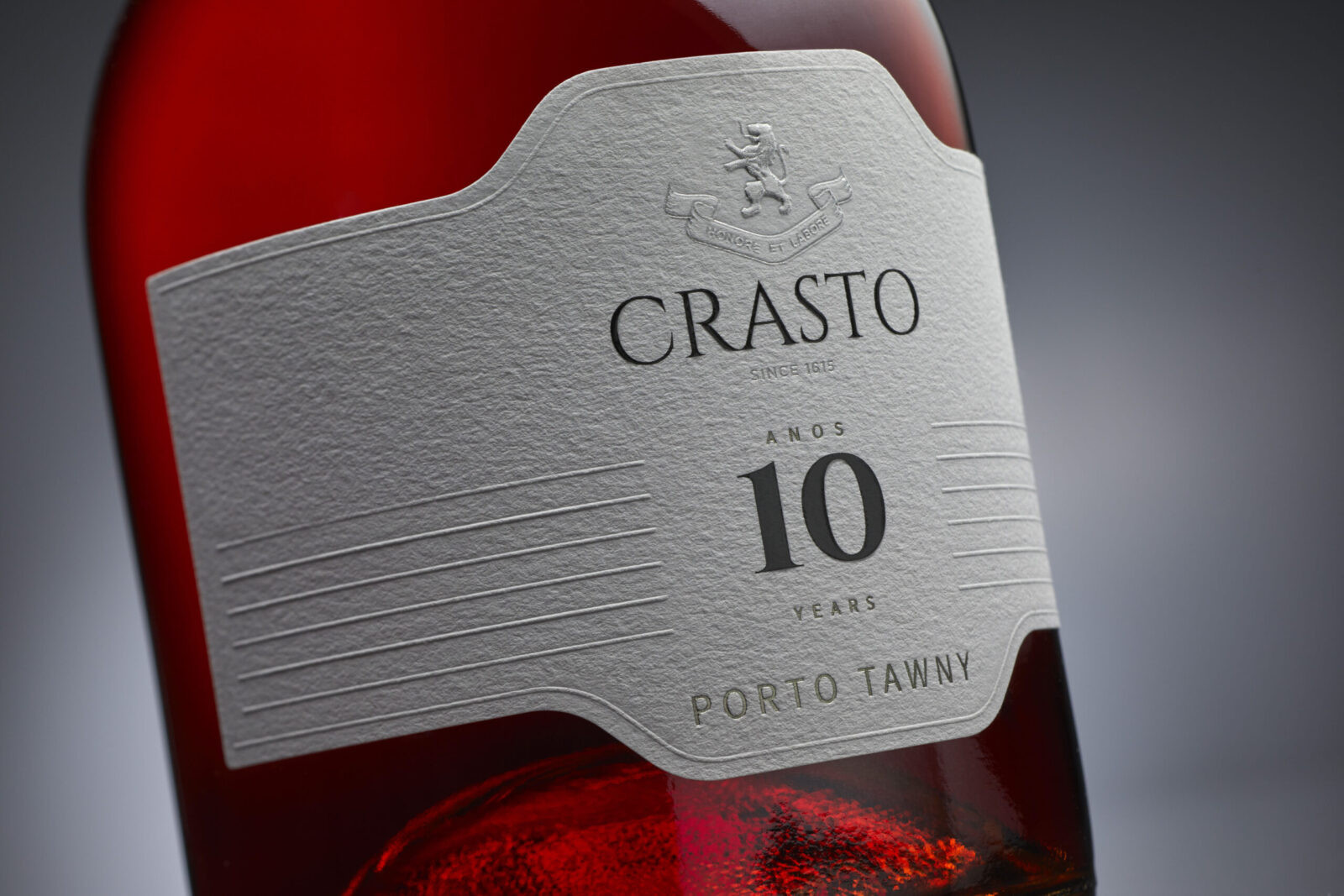
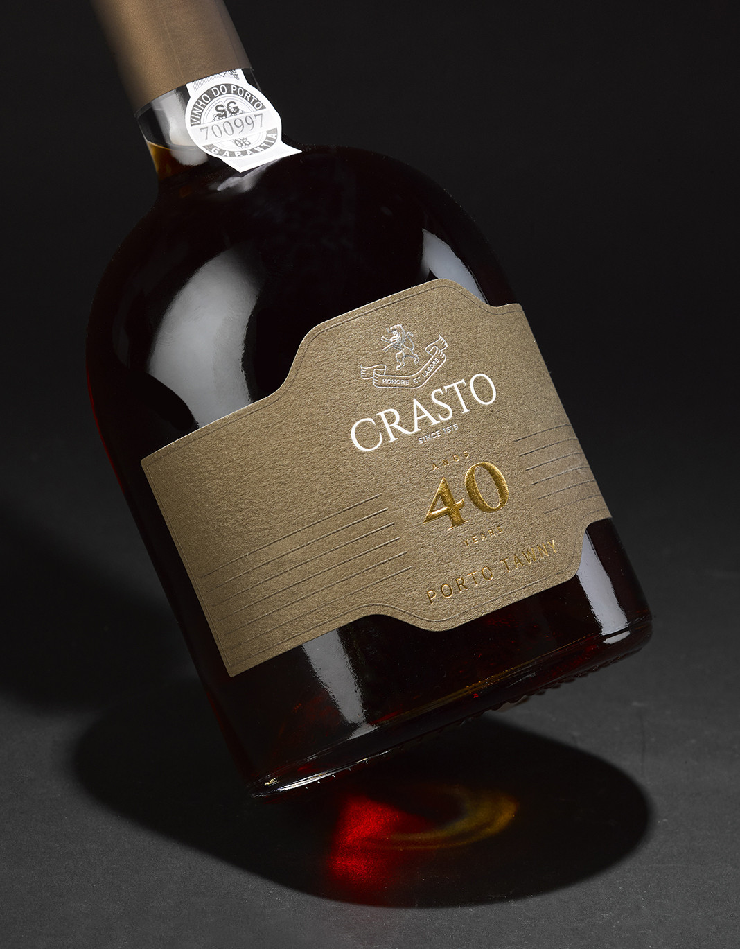
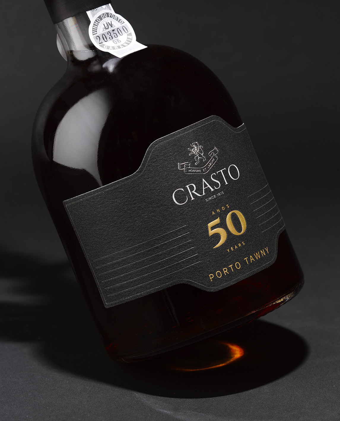
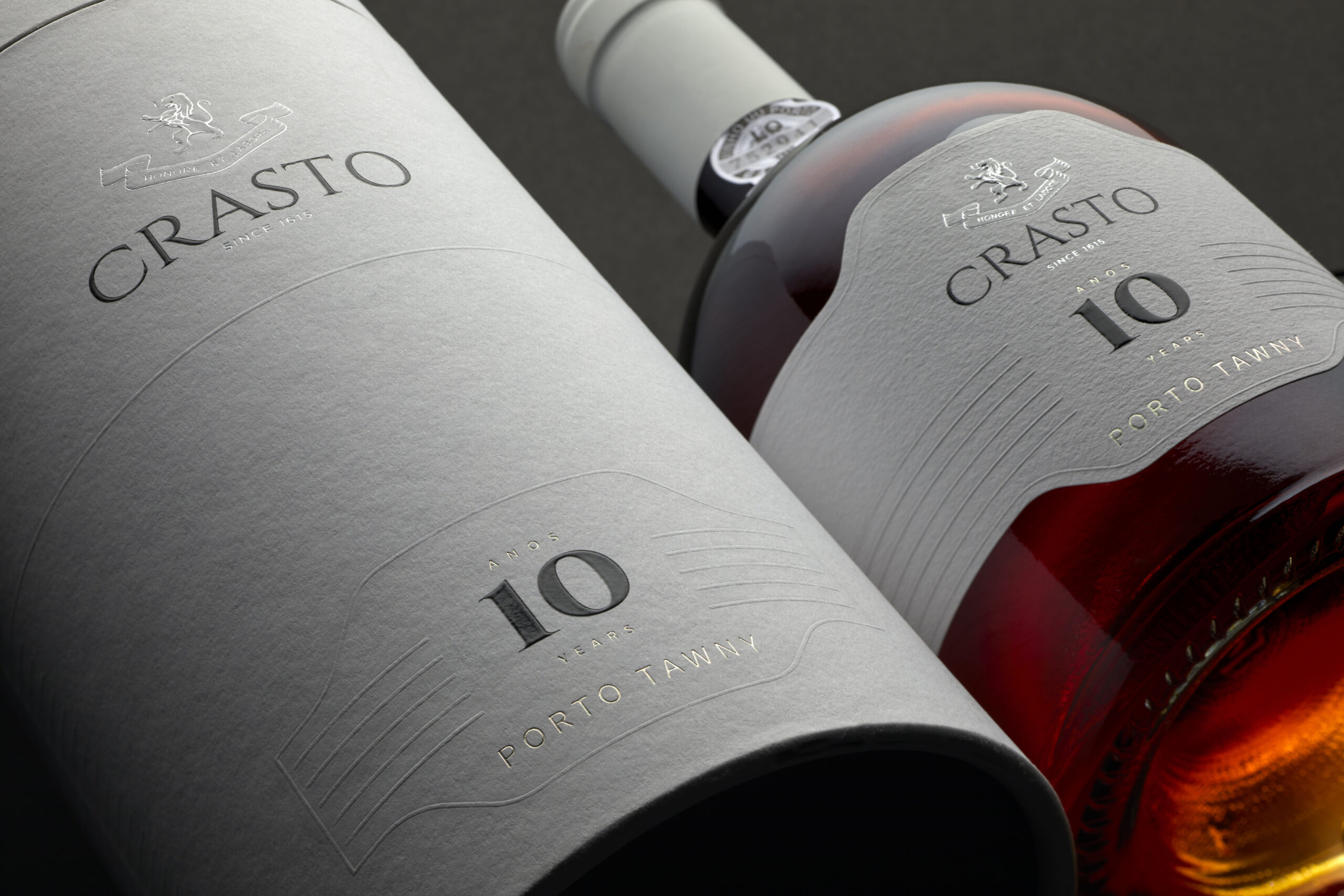
The new image is distinguished by its refined finishes and materials, such as hot stamping, embossing, debossing, fine papers, velvet and wood, which together create packaging that is both elegant and distinctive. For the Port range, the label shape takes inspiration from Honore Port – one of Quinta do Crasto’s most luxurious releases that celebrates de 400 years of the Estate – and is echoed in subtle details across the collection. The iconic linear motifs featured throughout the design pay tribute to the emblematic terraces of the Douro Valley, mirroring their unique and timeless landscape.
About Quinta do Crasto:
Quinta do Crasto is a renown Portuguese company dedicated to Douro and Port wine production. Its headquarters is in Gouvinhas, in the municipality of Sabrosa in Northern Portugal. This is the heart of the Douro Valley, the first demarcated and regulated wine region in the world, recognised as a World Heritage site by UNESCO in 2001. Quinta do Crasto benefits from exceptional conditions for producing wines and olive oils of the highest possible quality.
Each year, Quinta do Crasto produces around 1,500,000 bottles of Douro and Port wines. Sixty per cent is sold domestically and the rest is exported for 54 markets worldwide, on all continents.
CREDIT
- Agency/Creative: Omdesign
- Article Title: Omdesign Shapes a Timeless Visual Identity for Quinta do Crasto Douro and Port Wines
- Organisation/Entity: Agency
- Project Status: Published
- Agency/Creative Country: Portugal
- Agency/Creative City: Matosinhos
- Project Deliverables: Brand Design, Design, Graphic Design, Label Design, Logo Design, Packaging Design, Product Design
- Industry: Food/Beverage
- Keywords: WBDS Agency Design Awards 2025/26 , Quinta do Crasto, Port, Tawny, Portugal, Douro, Design, Label, Packaging


