


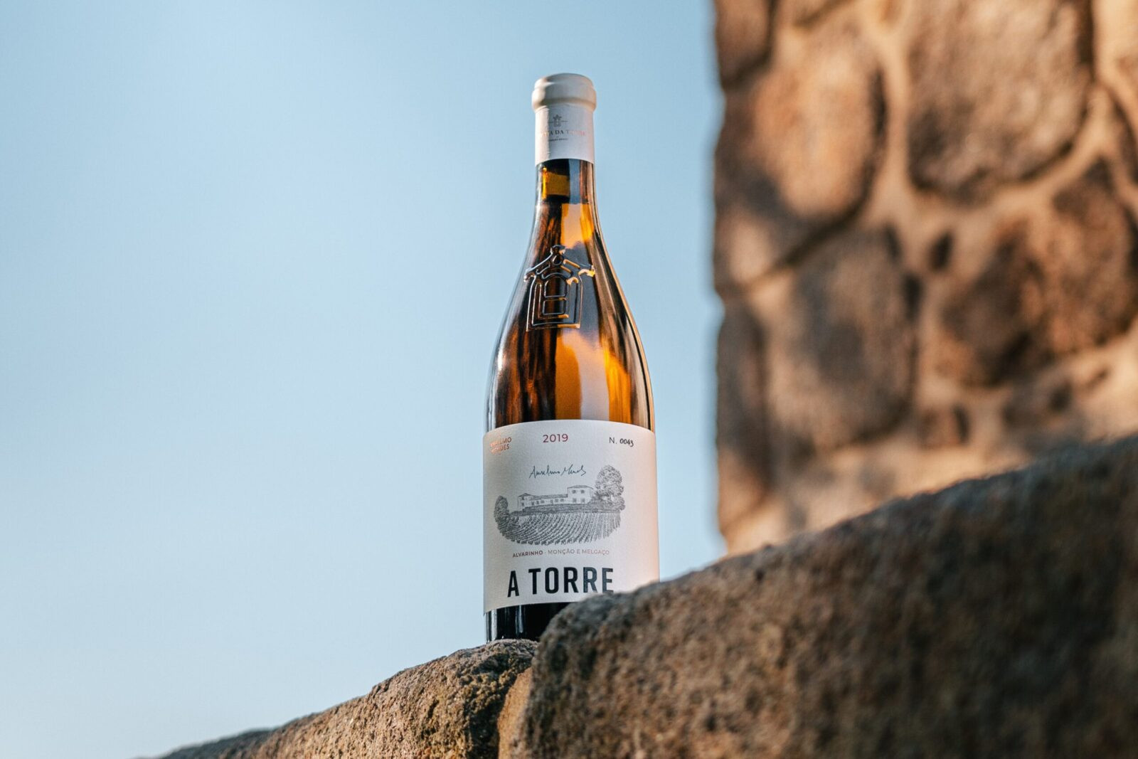
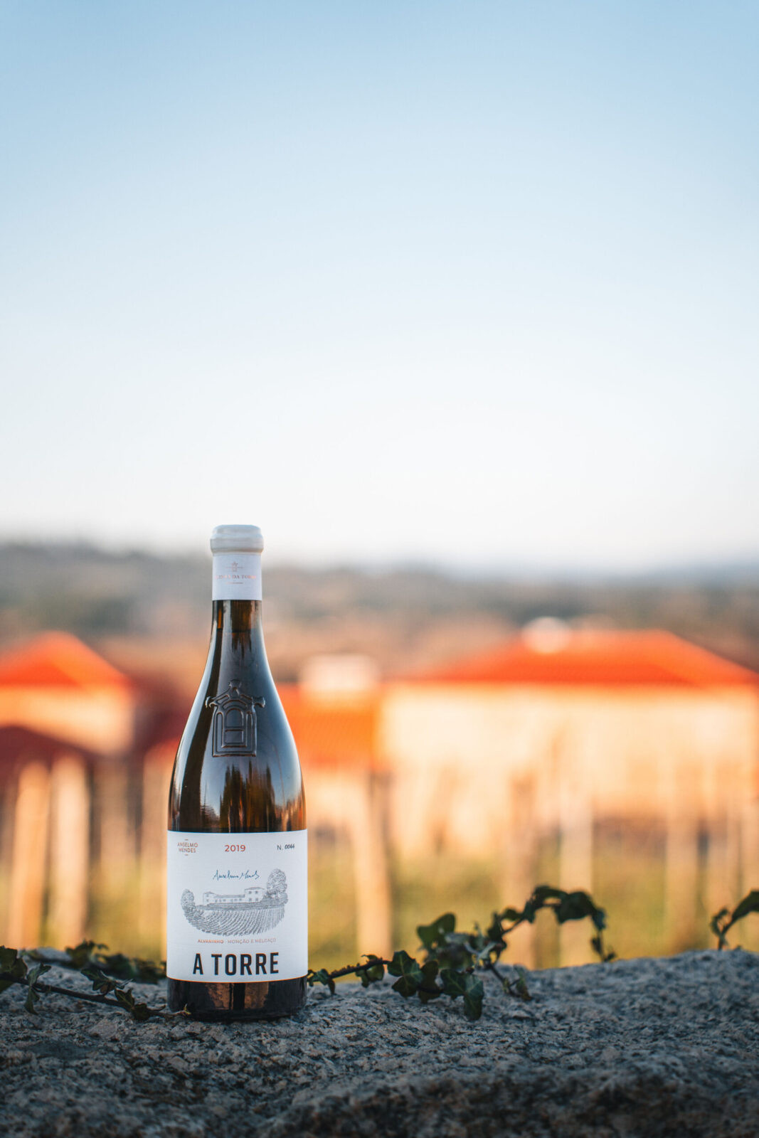
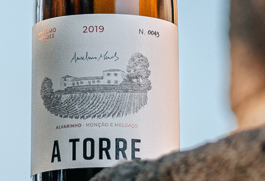
Conceived by Omdesign® and signed by Anselmo Mendes, this project captures the essence of a Portuguese estate revered for its viticultural essence. At its core is a bespoke illustration of the Quinta da Torre estate, executed with intricate detail and restraint. This exclusive artwork anchors the label with a sense of place and permanence, a visual homage to tradition that aligns the wine with the world’s finest.
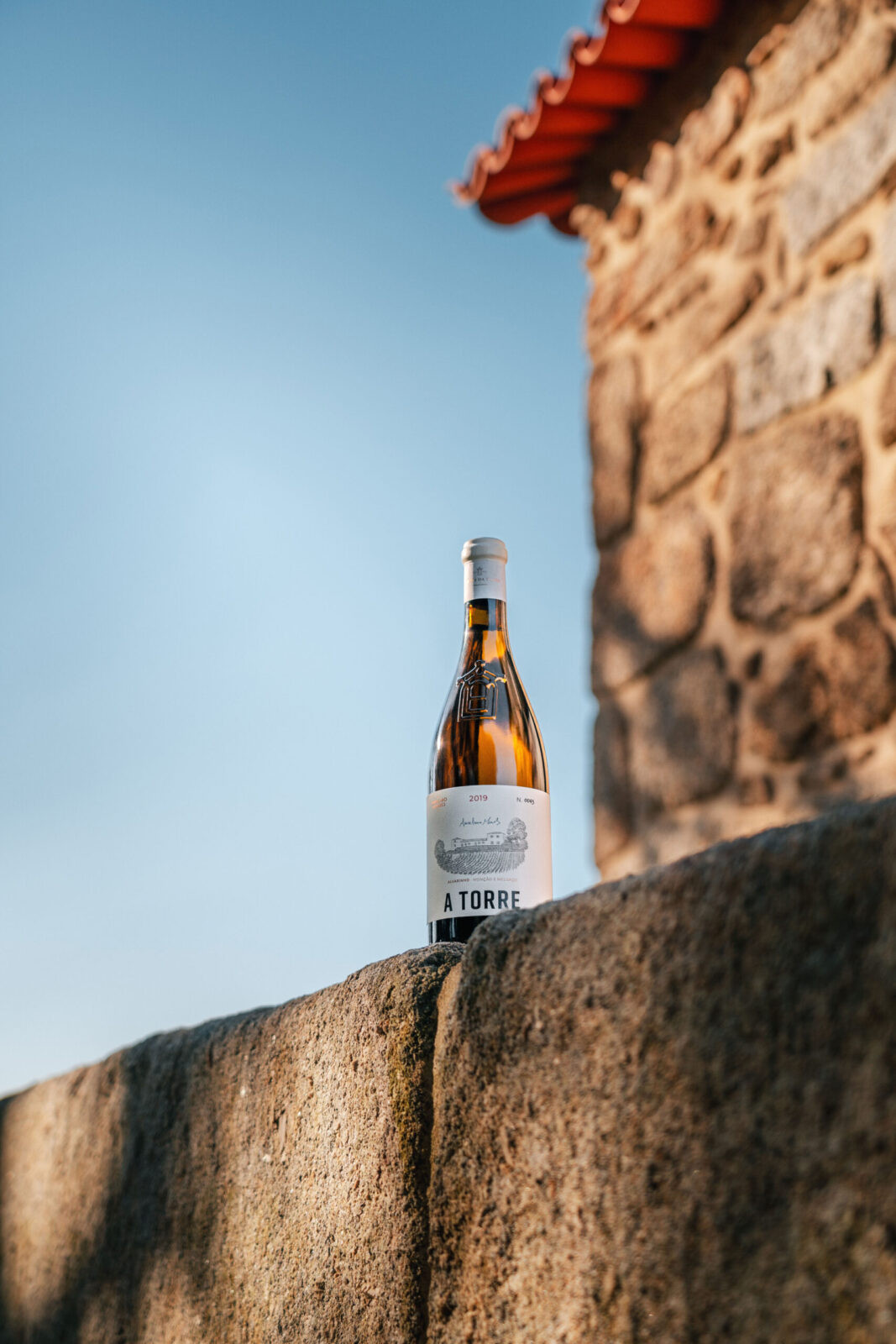
The clean design speaks with deliberate clarity and simplicity. The minimalist layout draws attention to what matters: the name of the wine, the storied producer behind it, and the identity of the brand — all presented with precision and hierarchy. It’s a more contemporaneous expression of classic elegance.
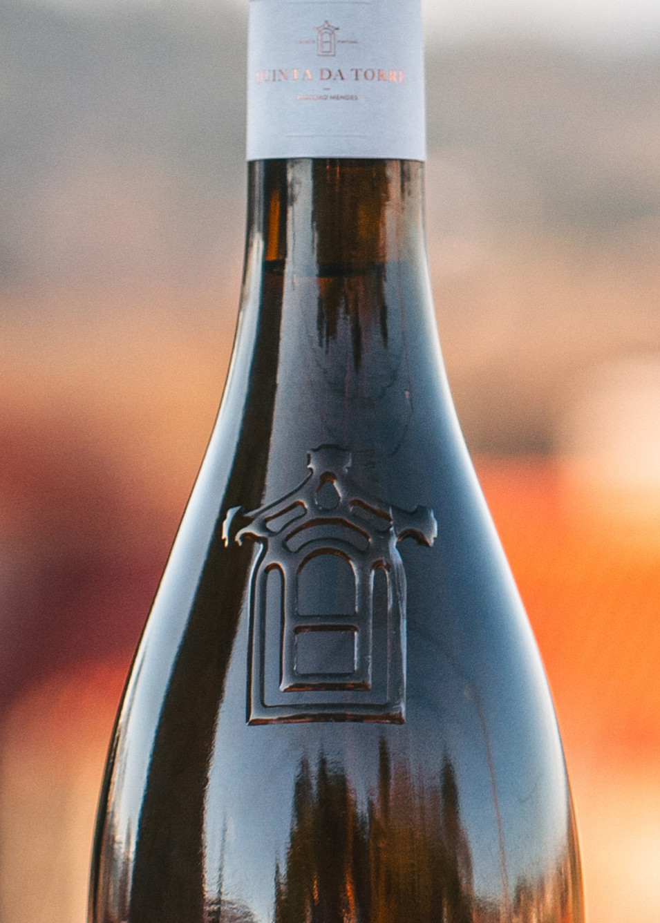
Materiality plays a defining role in this edition. Textured fine paper, coupled with sophisticated embossing, debossing, and targeted varnishes, creates a tactile dimension that invites touch as much as admiration. These noble finishes are decorative and declarative, reinforcing the wine’s exceptional quality and high positioning.
A defining feature of the design is the estate symbol that was applied directly on the glass bottle, a gesture that transforms visual identity into physical form. This detail blurs the boundary between packaging and product, fusing brand and bottle in a seamless experience.
The finishing touches, as a refined neck label and wax seal, speak to craftsmanship, uniqueness, and rarity. They complete the narrative of exclusivity and elevate the bottle into a collectible an attractive design.
With A Torre, Omdesign® delivers a visual manifesto, a statement of identity, superior value, and excellence. This is design not only as representation, but as reverence, since every choice reflects purpose, and every detail honours the story it tells.
ABOUT ANSELMO MENDES:
Anselmo Mendes is recognised not only for the excellence of the wines he produces but also for the surprising and consistent way he innovates. Combining the use of age-old techniques, such as fermentation on skins, with bold winemaking methods such as the fermentation of Alvarinho in oak casks, he is established in Portugal and abroad with an original design and his own identity.
Anselmo Mendes wines are the result of a long, faithful connection to the land, an experimentalist and studious spirit and a philosophy of respect for the ecosystem that translates into methods of integrated production.

CREDIT
- Agency/Creative: Omdesign
- Article Title: Omdesign Introduces a Collectible Label Design for Anselmo Mendes’ A Torre Wine
- Organisation/Entity: Agency
- Project Status: Published
- Agency/Creative Country: Portugal
- Agency/Creative City: Matosinhos
- Project Deliverables: Brand Design, Design, Graphic Design, Icon Design, Label Design, Logo Design, Packaging Design, Product Design
- Industry: Food/Beverage
- Keywords: WBDS Agency Design Awards 2025/26 , A Torre, Anselmo Mendes, Wine, Vinho Verde, Portugal, Omdesign, Design, Label, Packaging, Logo


