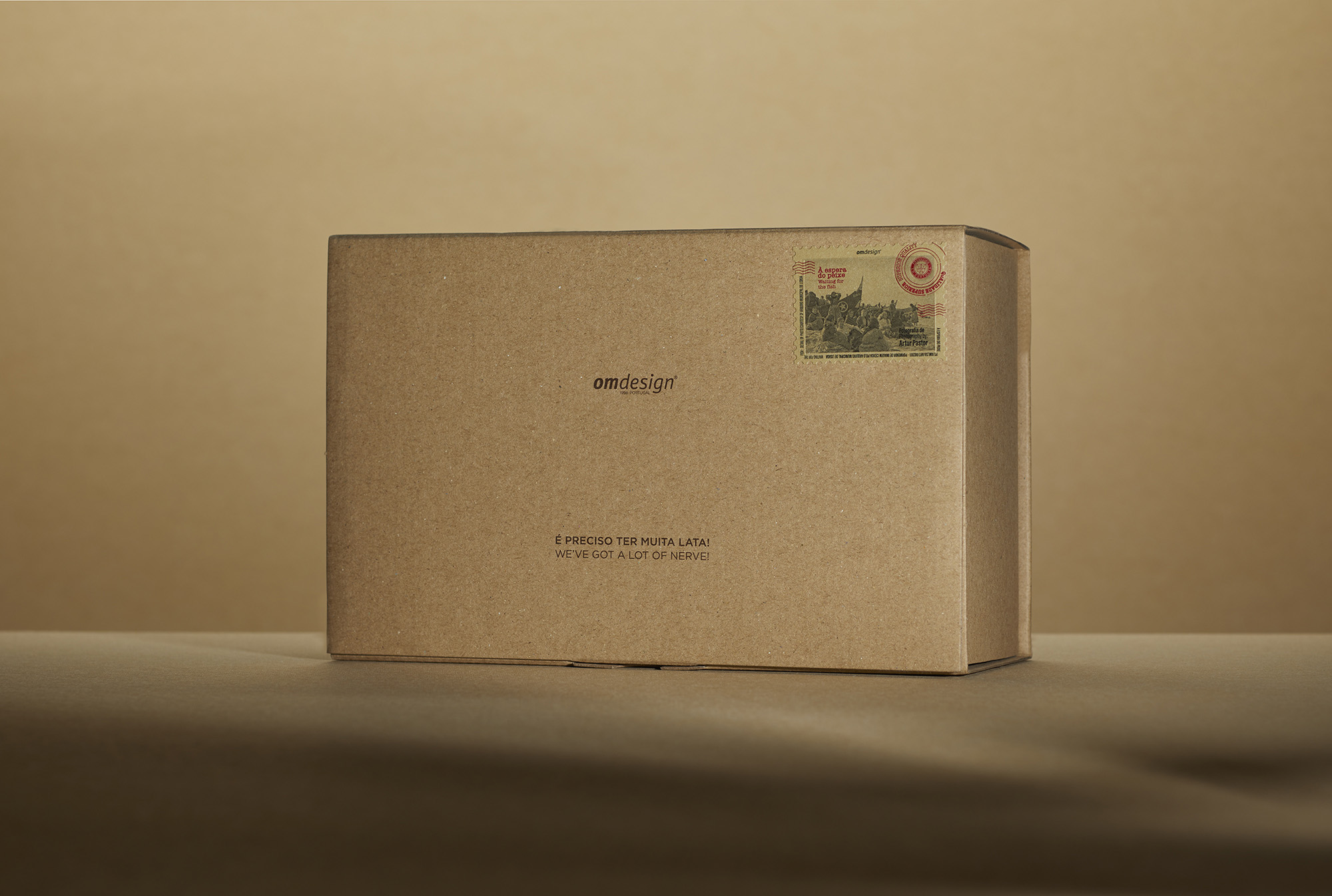
Omdesign 2020 packaging – We’ve got a lot of nerve!
2020 was a year of extreme challenges for all of us due to the pandemic. We were all like “canned sardine”, we stocked up our larder with cans and more cans for a confinement that we have never imagined, we didn’t change our convictions, we came out of the can every day and never lowered our guard.
At Omdesign, we conserve, since 1998, the same values that inspire us and so we created this special and ecological packaging, which carries the best that the sea gives us, along with what is only born in the Douro. We gathered two ambassadors of Portugal – canned fish and Port wine – to give life and soul to this project.
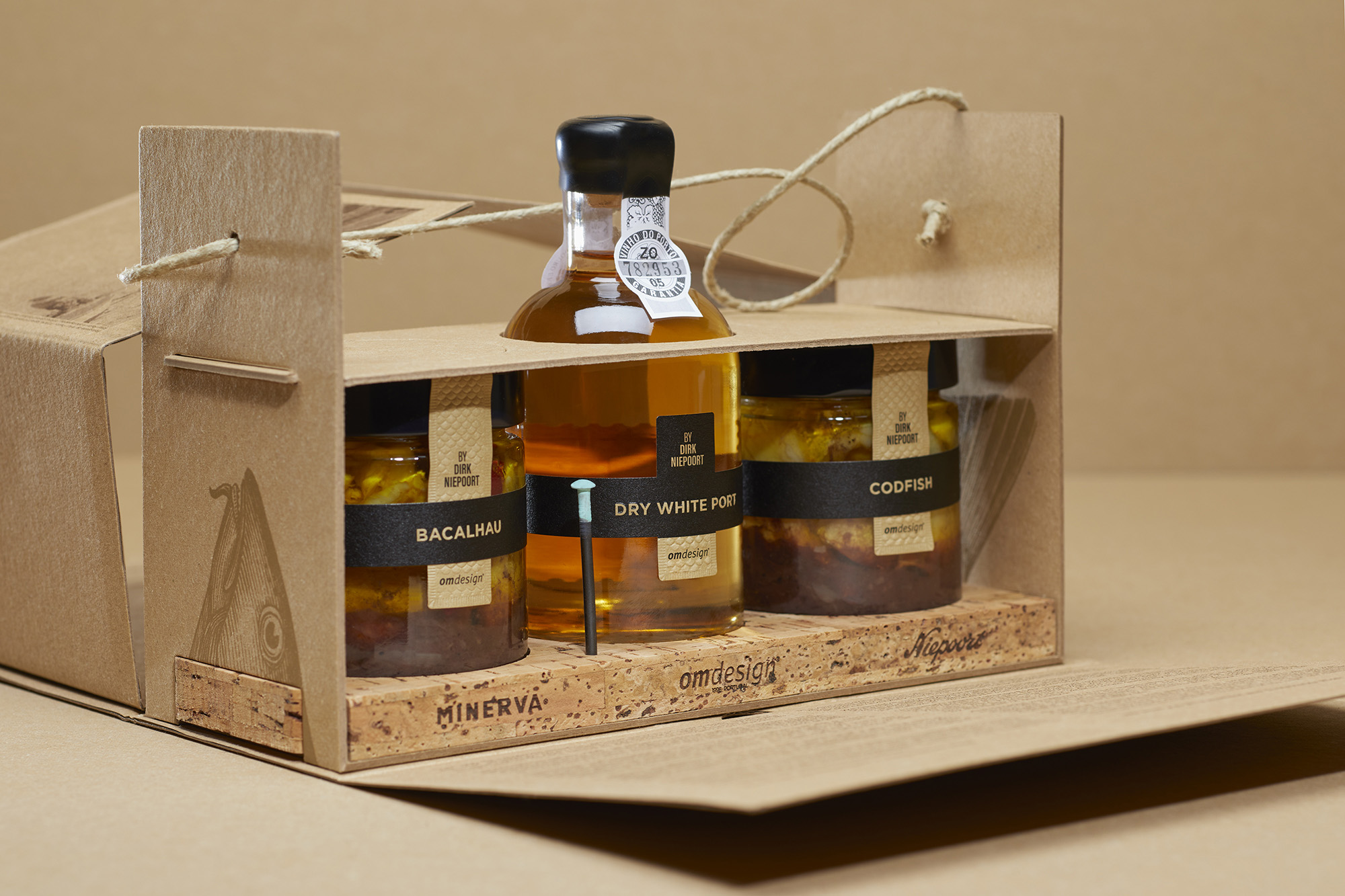
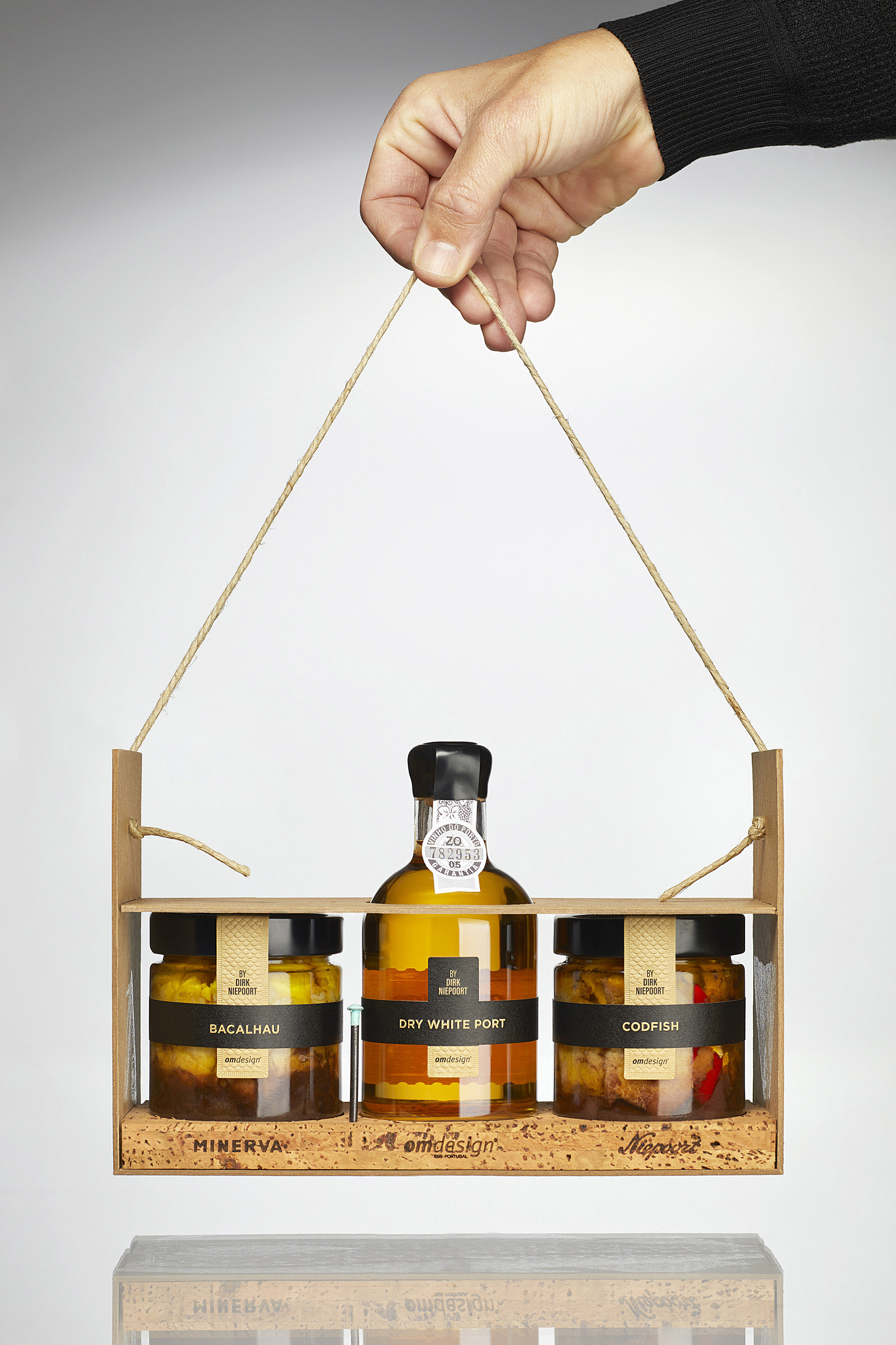
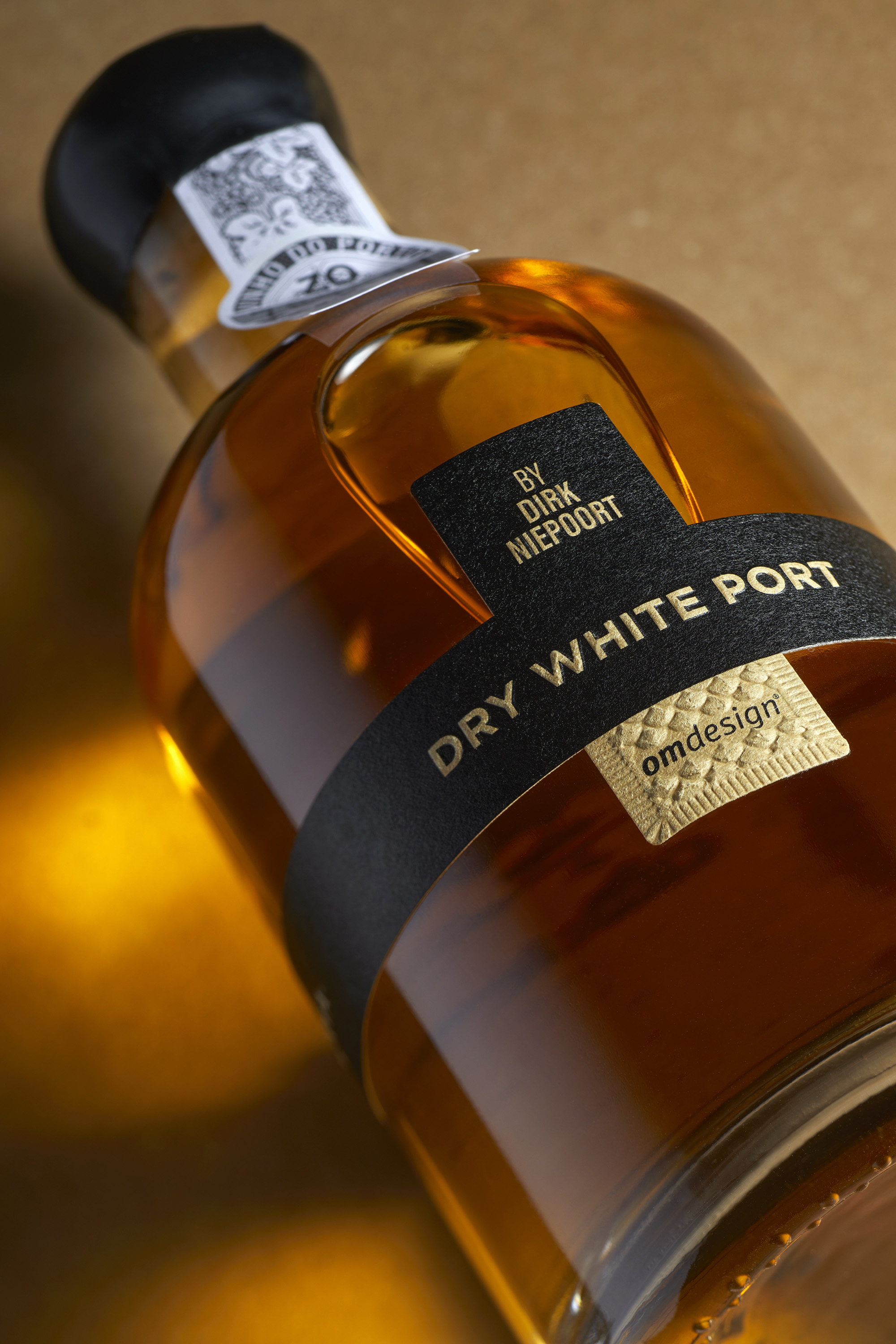
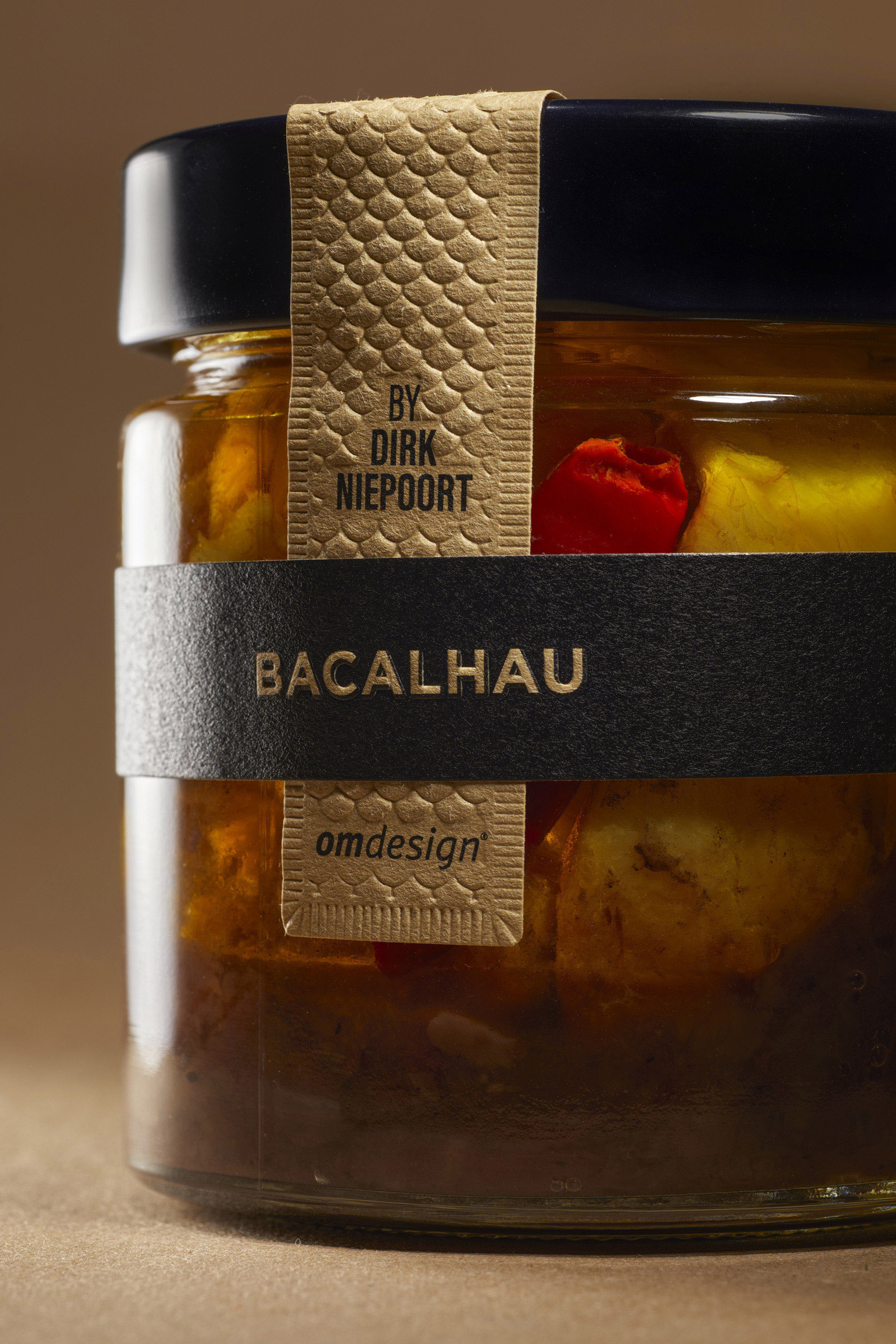
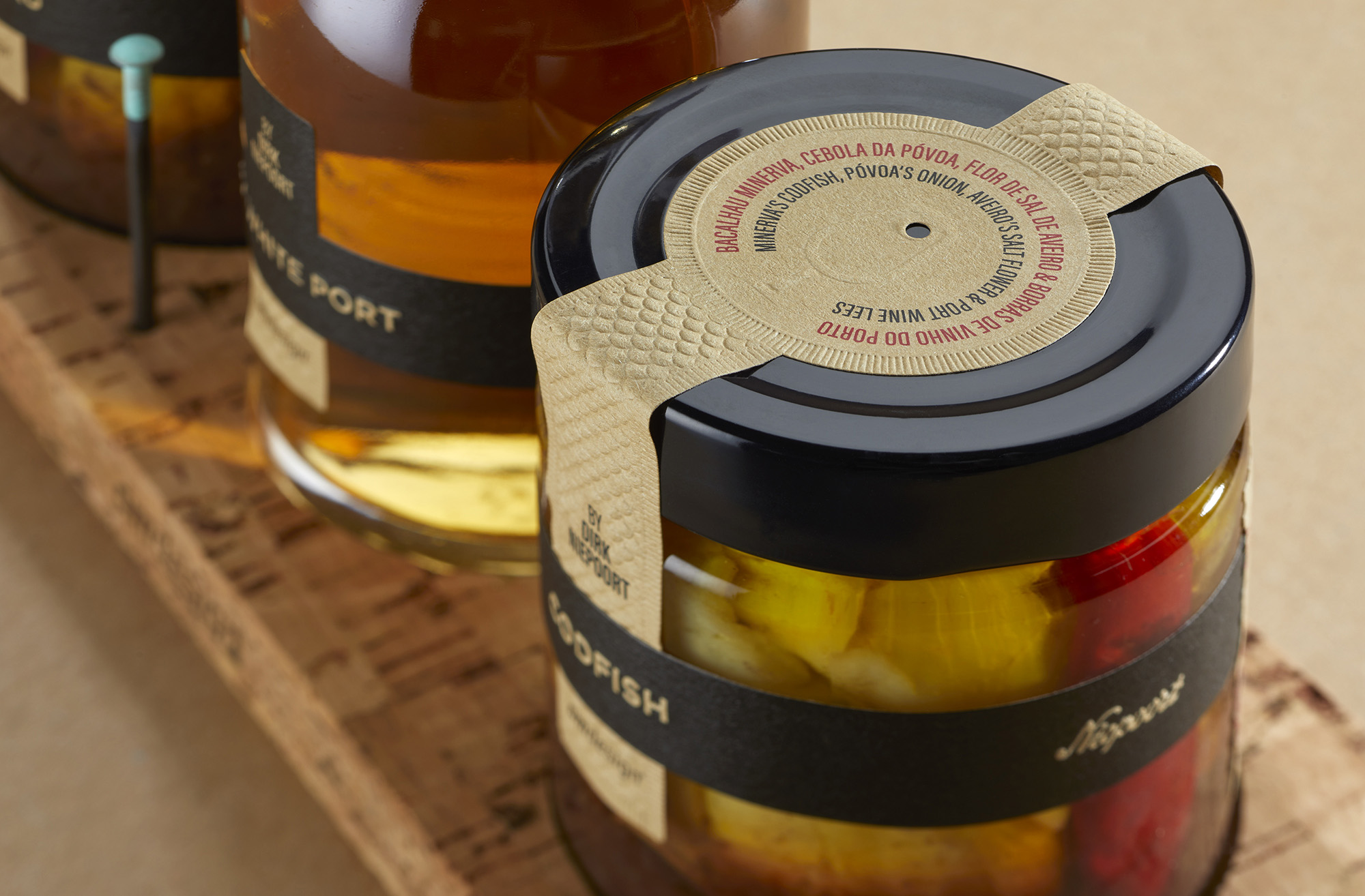
We challenged Dirk Niepoort, undeniable ambassador of Port wine, to create an original recipe that combines Niepoort’s Port wine with Minerva’s canned codfish, two iconic and genuine national brands. We selected the best ingredients of our country to enhance the excellence and the flavors of what is more genuinely made every day in Portugal.
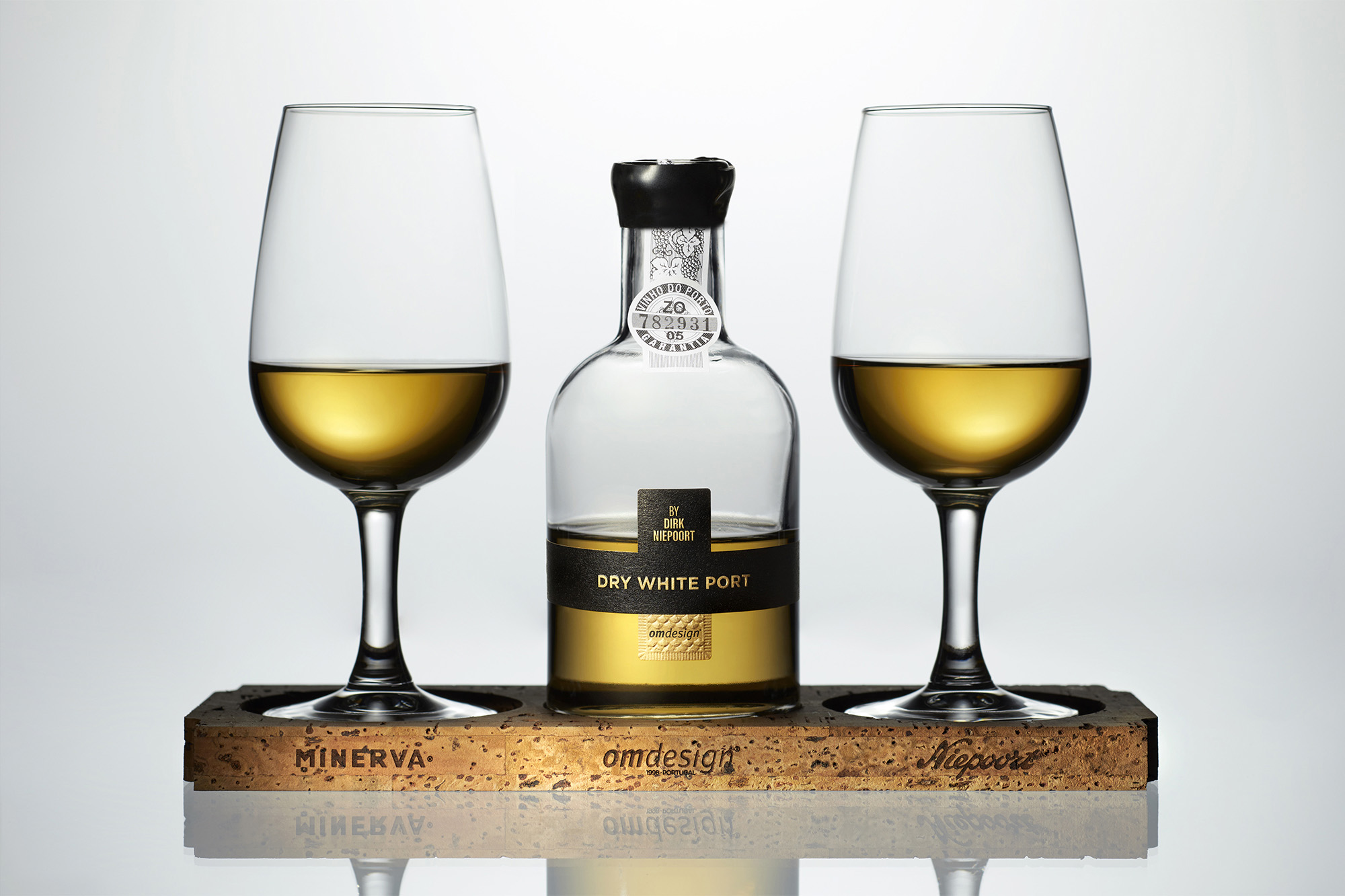
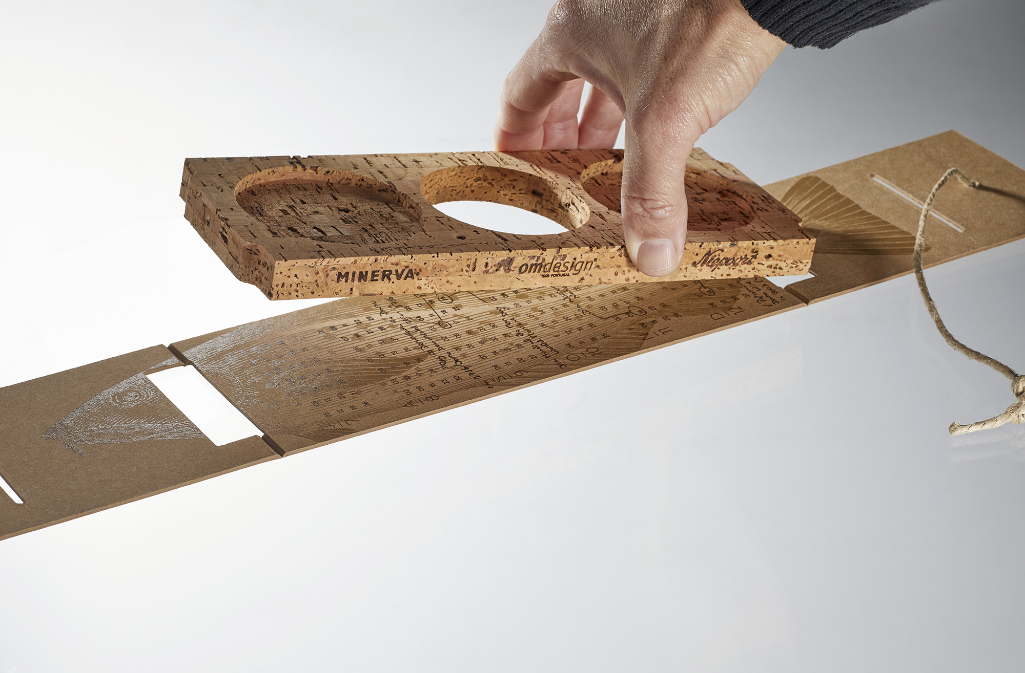
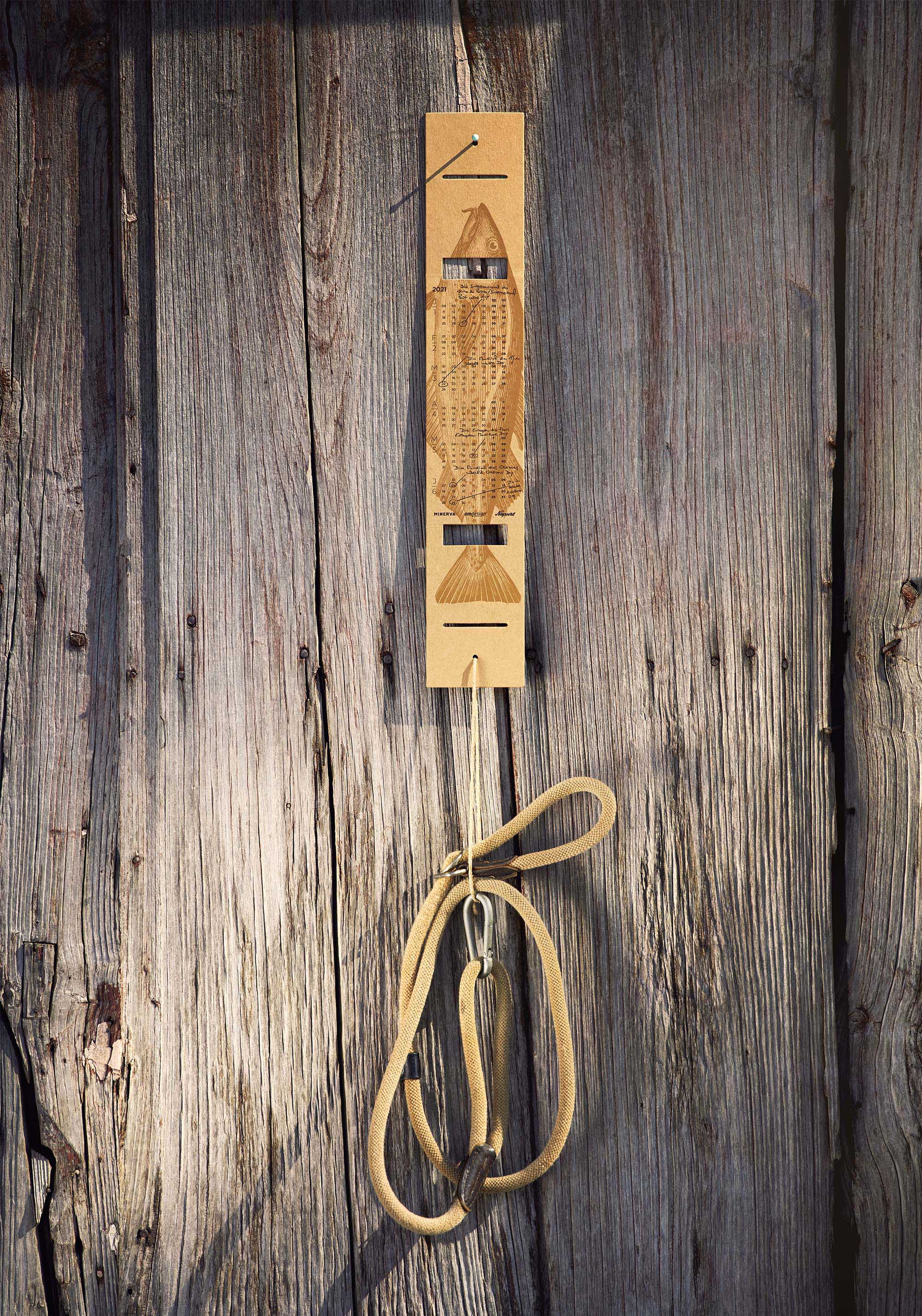
With resource to innovation and new eco-friendly alternatives, in line with our commitment to contribute to a greater environmental preservation, always with focus on reduction, we found the solution by a natural color solid cardboard called Eska Brown, produced by Eska B.V. in the Netherlands. It is a 100% recycled cardboard (post-consumer waste) with very sustainable production parameters and natural texture. We adopted this cardboard to give shape to the interior of this self-promotion package that we invite to be reused in everyone’s daily life as a calendar or a coaster, among other purposes. Its organic origin makes it biodegradable, compostable and recyclable and also holds the FSC recycled 100% claim and 100% PEFC certifications.
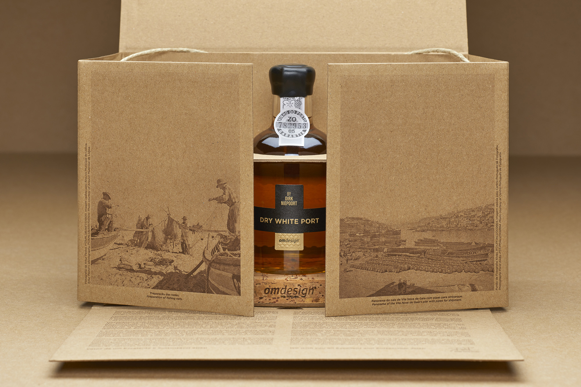
And because we believe that consistency is in our DNA, we developed this project with exclusive resource to recycled, recyclable and biodegradable materials, such as cork, paper and cardboard. The minimalist aspect of the eight pieces that compose this packaging was reinforced with very few fishing, but at the same time differentiating, as high and low modeled relief to illustrate the scales on the labels and the frames around the collectible stamps; the screen printing and the special cutting of the calendar allusive to sea and Douro, with application of two milling cutters on 90º; and also the perforation of the detachable coasters. All the elements are assembled by fitting the pieces, without resource to any kind of glue, enhancing the sustainable facet of this Omdesign’s edition, also fortified by the nature and earth tones adopted.
We resorted to the Portuguese Photography Centre and to the Lisbon Municipal Archive to revive the photographic patrimony of the two arts that are illustrated in this Omdesign’s packaging.
CREDIT
- Agency/Creative: Omdesign
- Article Title: Omdesign 2020 Self-Promotion Packaging Design
- Organisation/Entity: Agency
- Project Type: Packaging
- Project Status: Published
- Agency/Creative Country: Portugal
- Agency/Creative City: Matosinhos
- Market Region: Global
- Project Deliverables: Calligraphy, Graphic Design, Packaging Design, Structural Design
- Format: Bottle, Case, Jar, Tray
- Substrate: Glass Bottle, Glass Jar, Pulp Carton
- Industry: Food/Beverage
- Keywords: WBDS Agency Design Awards 2021/22
- Keywords: Omdesign, Design, Portugal, Packaging, Packaging Design, Wine Design, Wine Packaging, Illustration, Portuguese Design, Port Wine, Canned fish, codfish, self-promotion, Minerva, Niepoort, Dirk Niepoort
-
Credits:
General Manager: Diogo Gama Rocha


