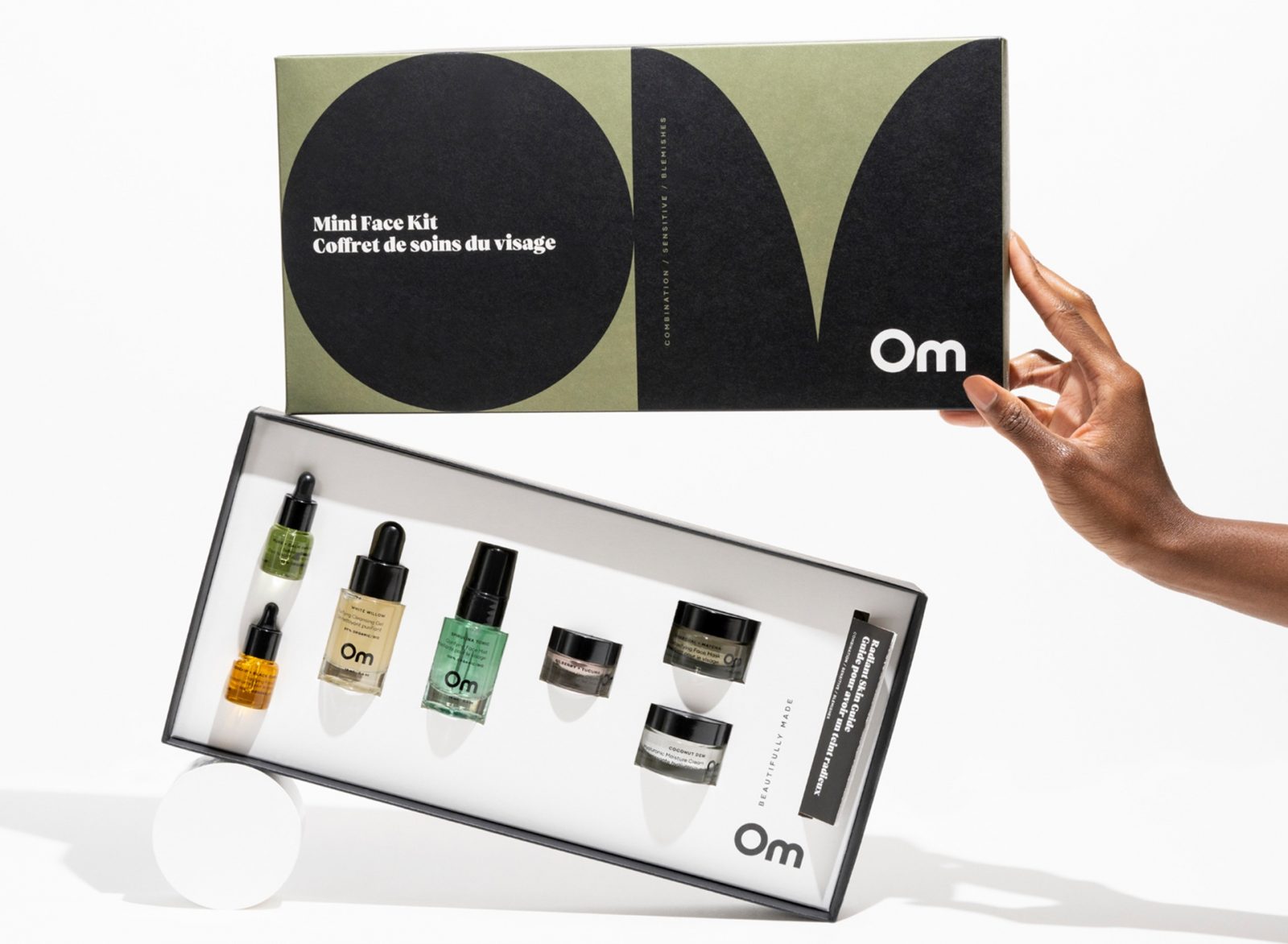
Crew’s bold rebrand of Om Organics Skincare was focused on creating a deeper story and emotional connection with the brand’s audience. Our challenge was to create distinction within the green beauty category through a deeper connection to Om’s already-present core values and audience. Om was repositioned to celebrate and honour those who have been worn by time, stretched by circumstances and scarred by challenges…and still refuse to give in. Om unequivocally says that we do not need fixing, altering or retouching. Om knows that we are beautifully made.
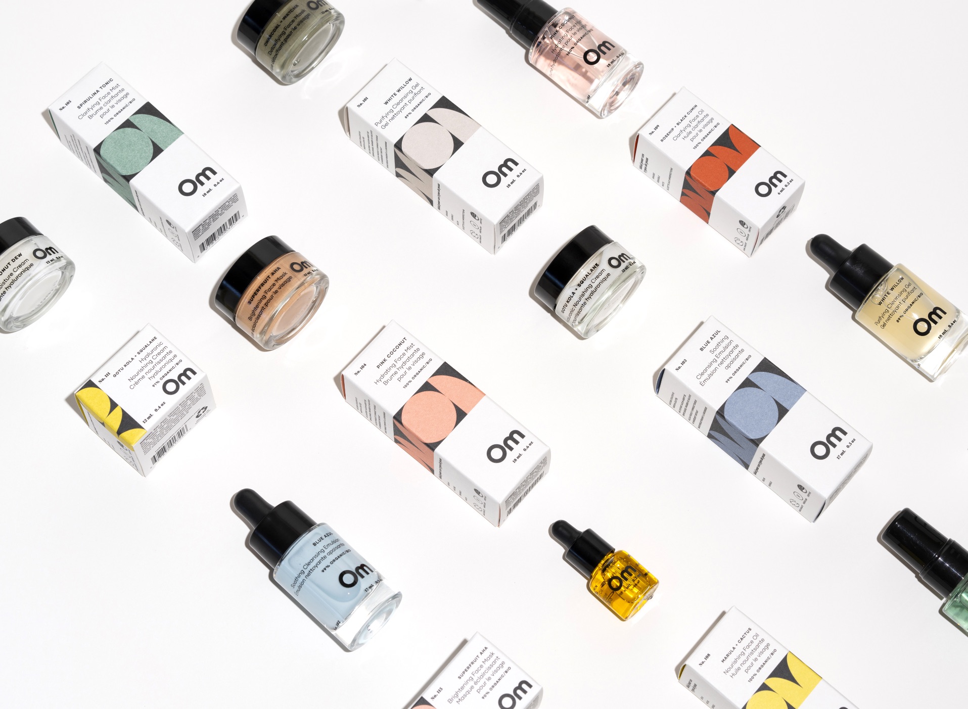
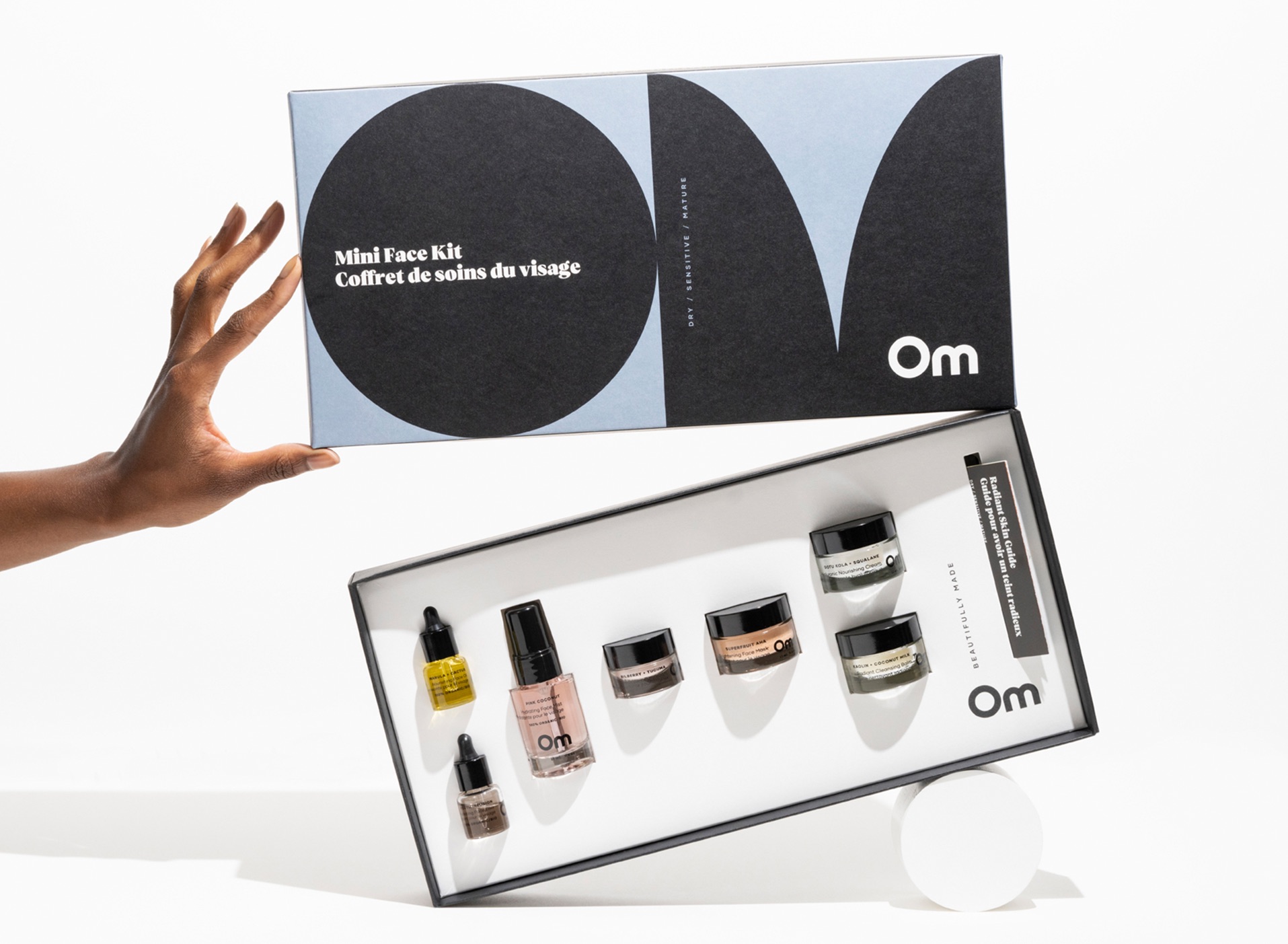
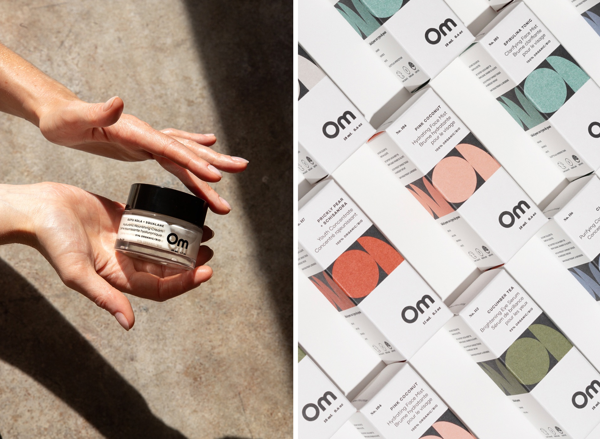
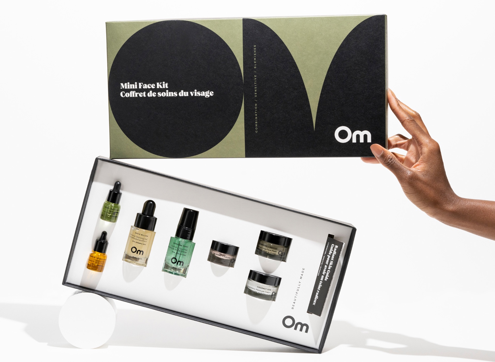
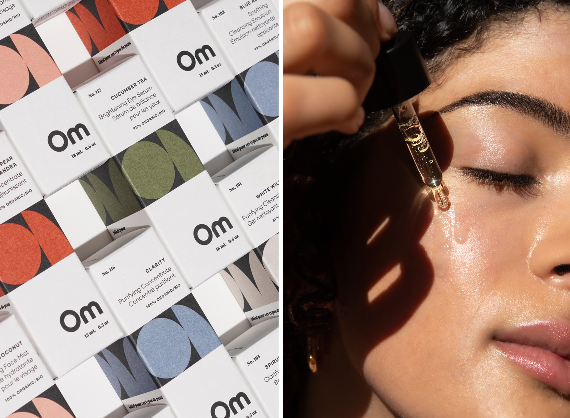
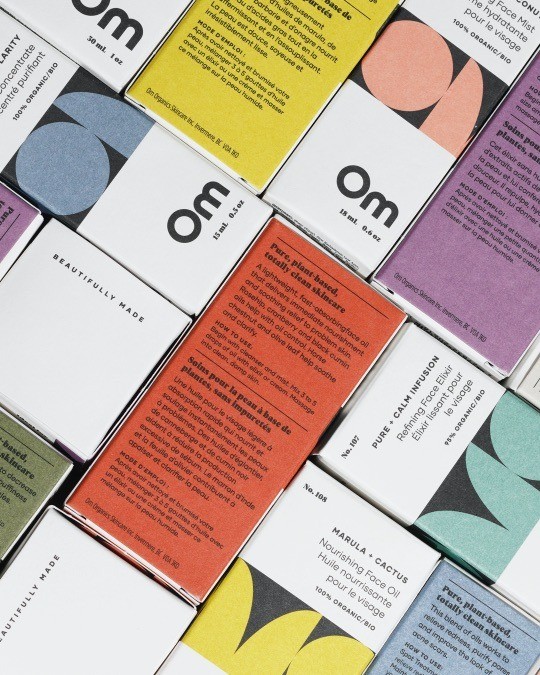
Drawing inspiration from mid-century, modern graphics and neutral, earthy colours, the design pulls on the root of the name Om. By referencing yoga-like shapes depicting curves and the strength of the human form, the identity is anchored with black and white, balancing both strength and softness.
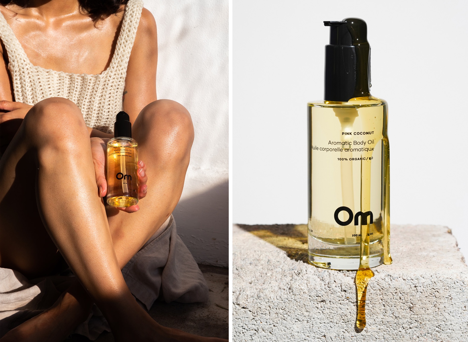
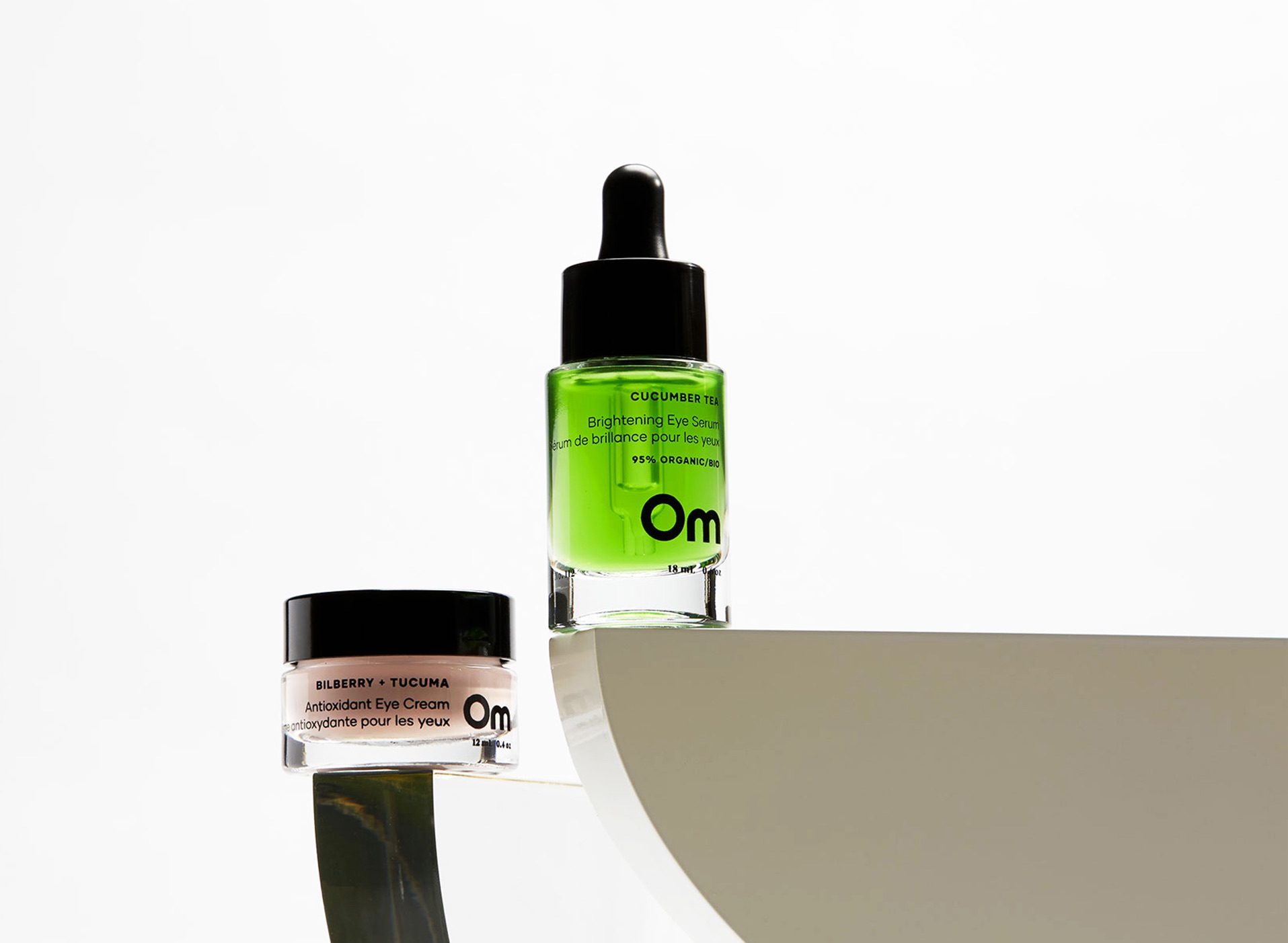
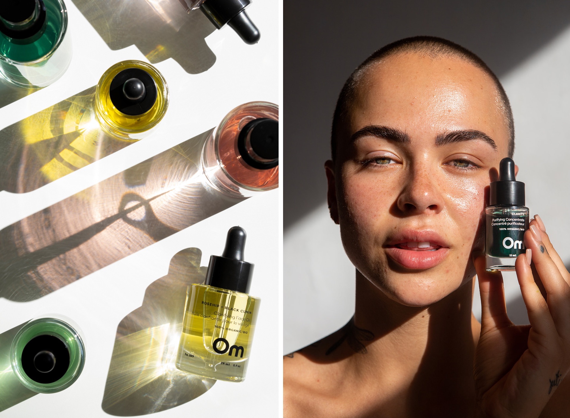
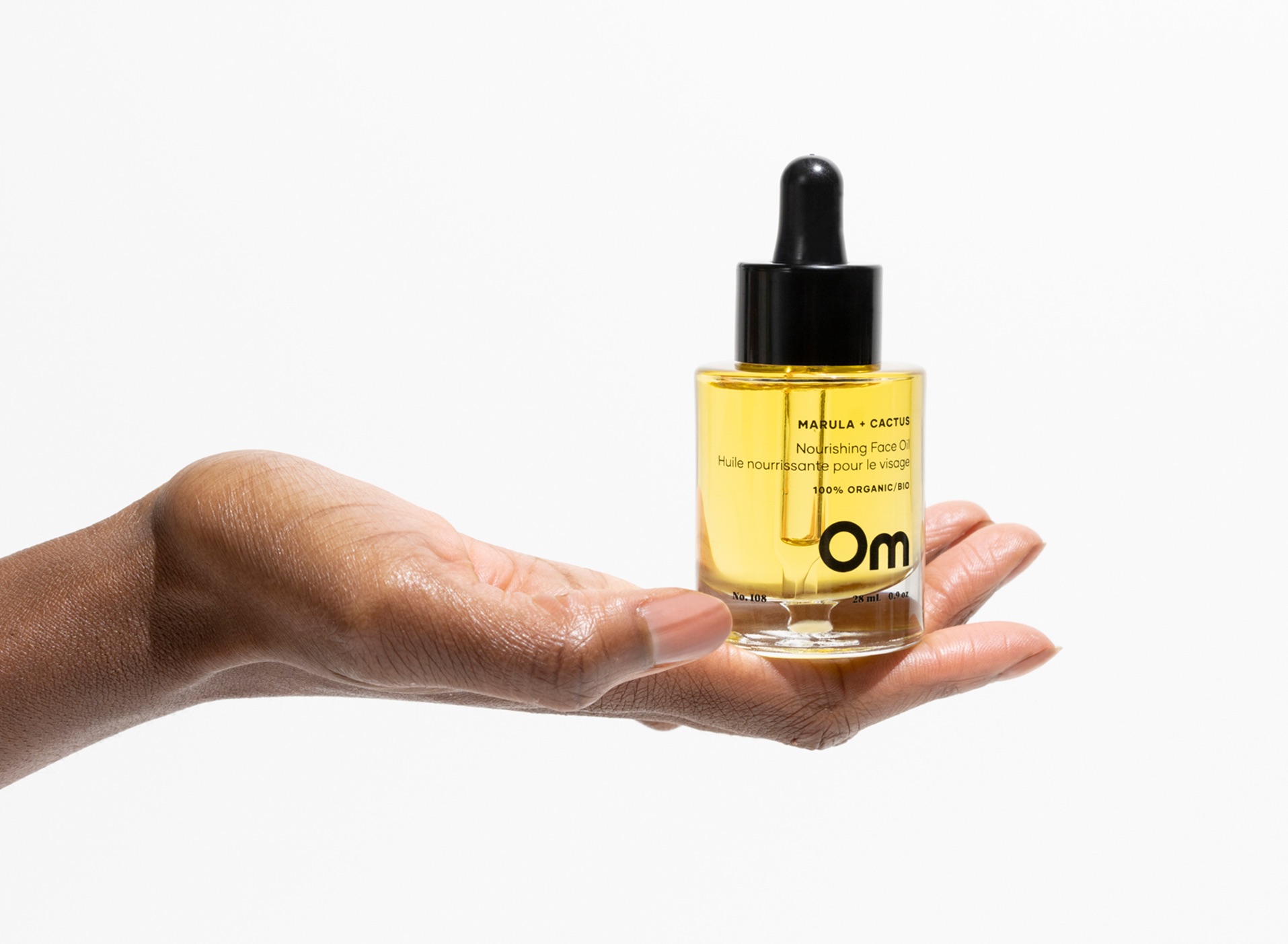
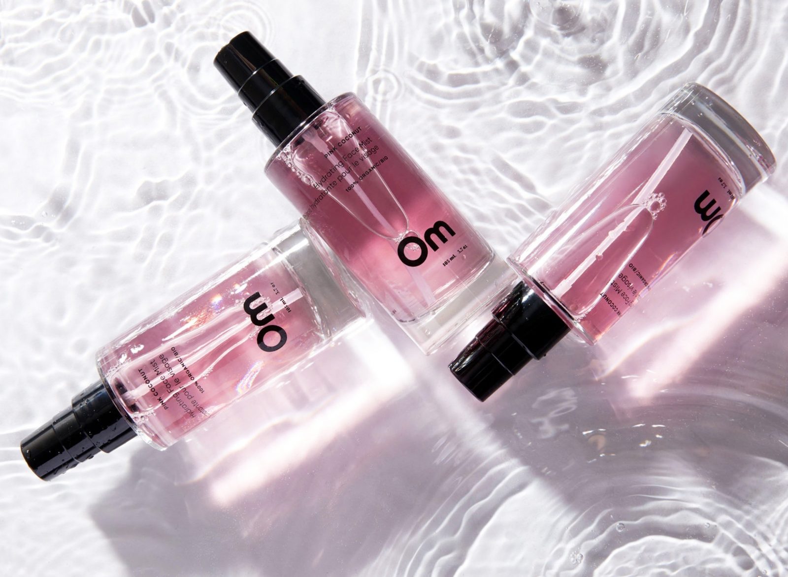
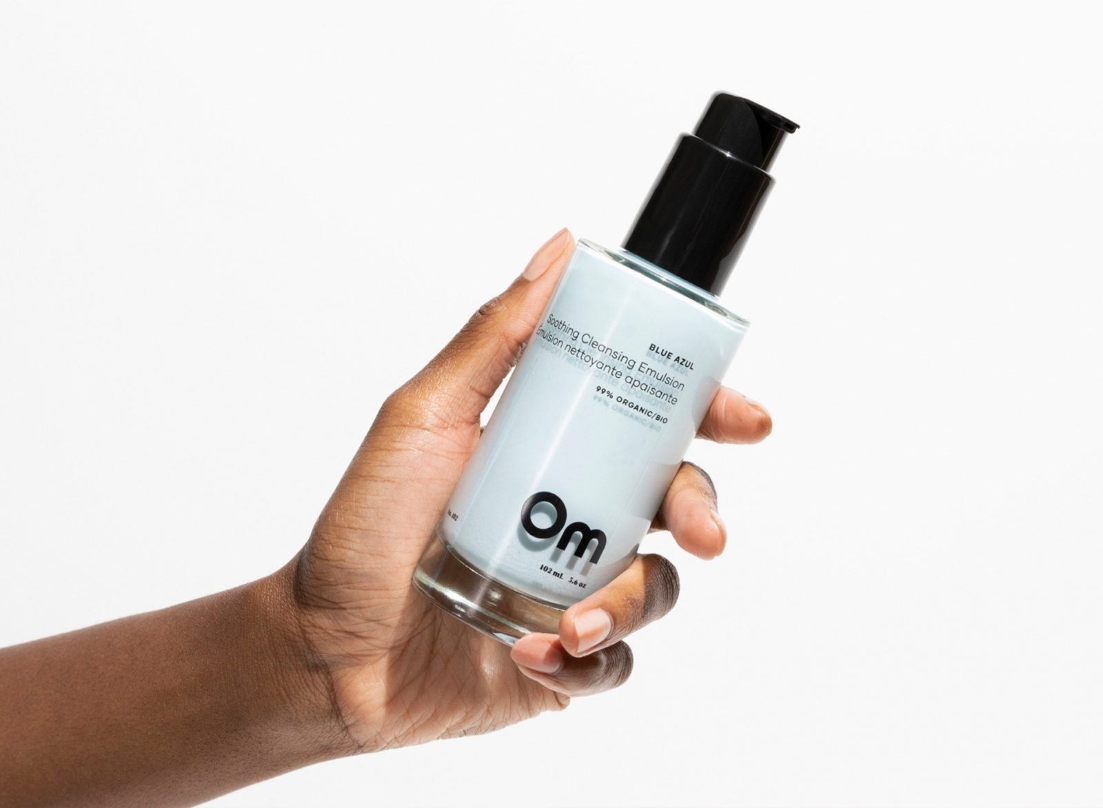
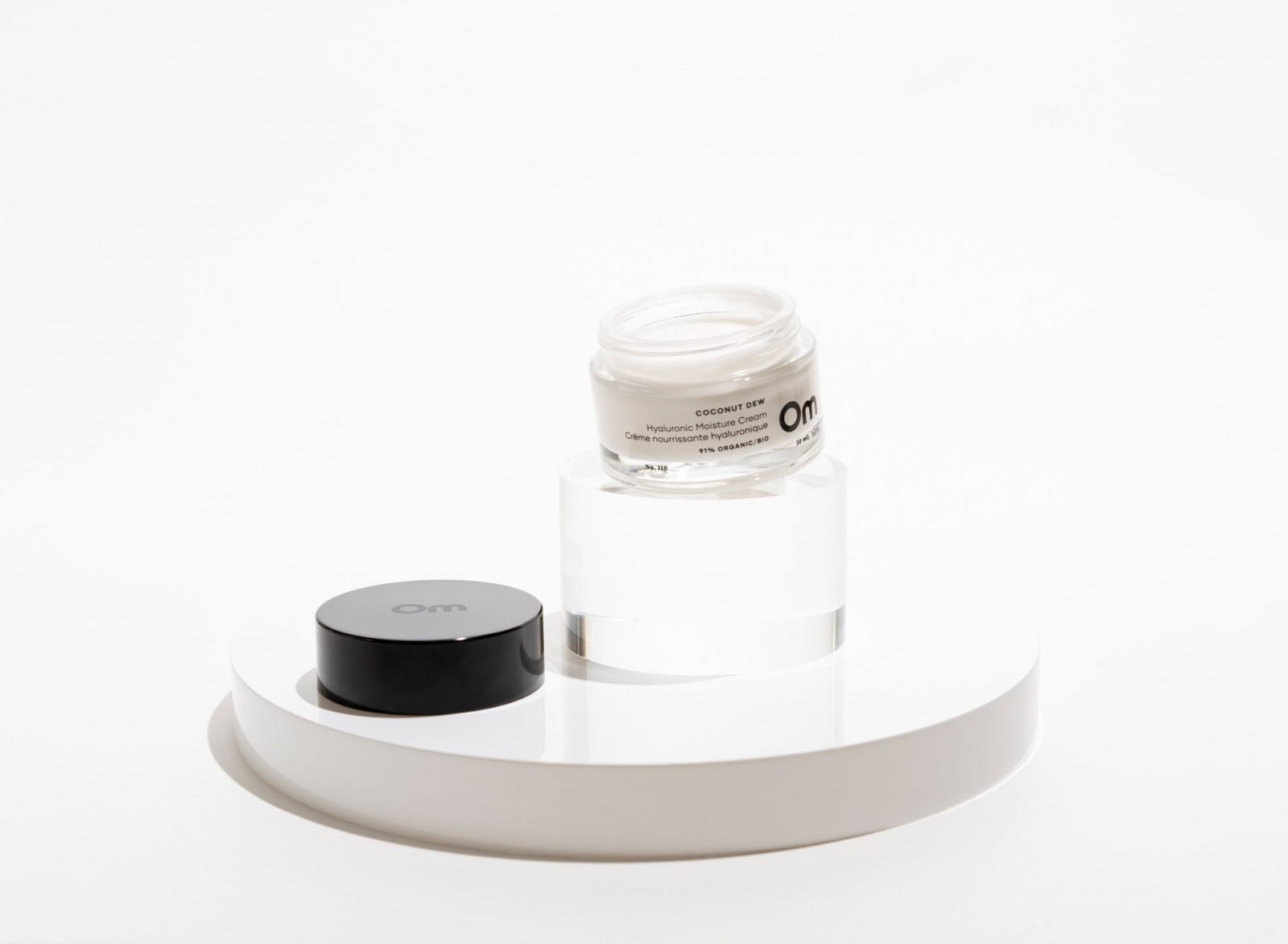
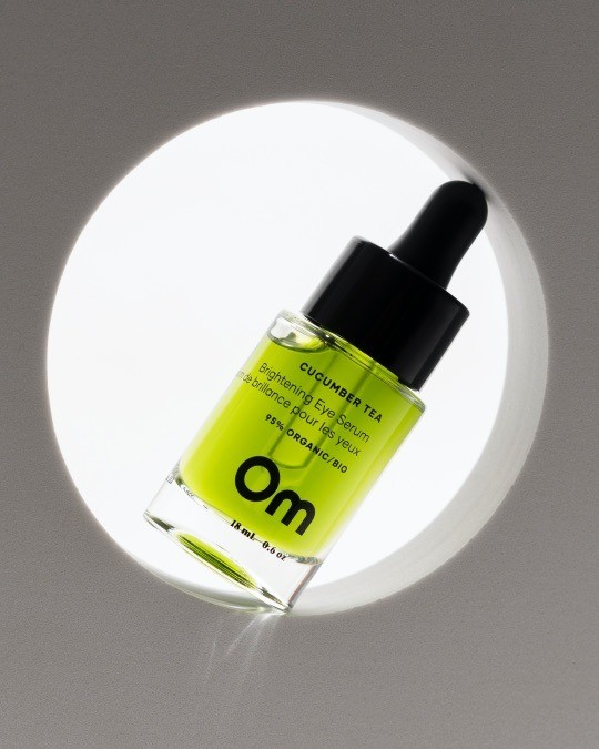
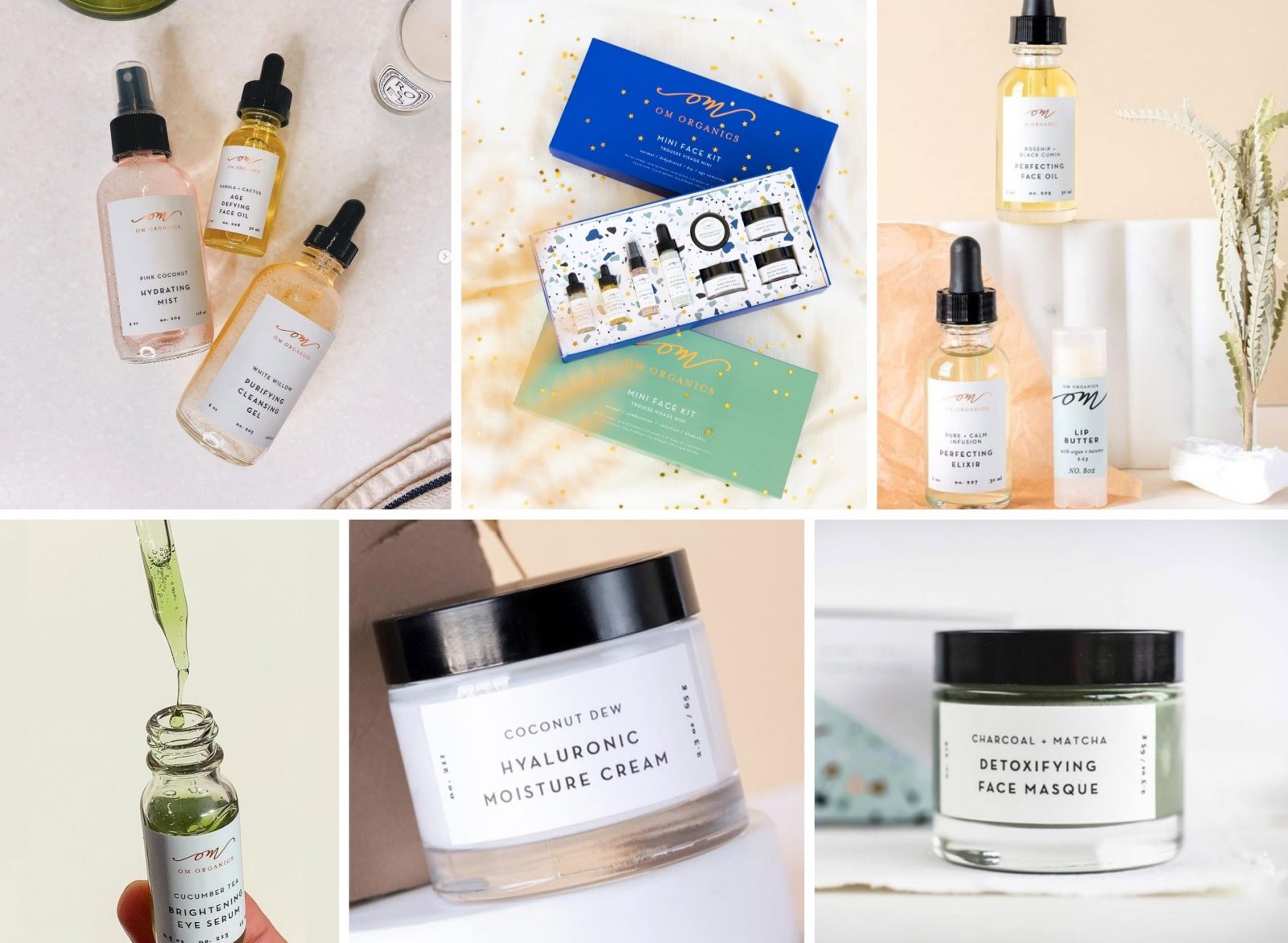
The logo and packaging was reimagined, speaking to the purity and simplicity of Om’s ingredients and products. A hand-drawn wordmark was created to exude modern strength and beauty, and provide optimal visual presence whether on shelf or online. Drawing a parallel to what Om stands for and the community they are creating, all glass components were stripped of labels and replaced with a simple 1C imprint, allowing the products pure, natural state to shine through.
Packaging redesign included over 65 SKUS, which supported a variety of products from creams and oils, to mists, cleansers and more. Plastic components contain post-consumer plastics. All boxes are made using FSC certified, carbon neutral stock. Combined with the removal of labels and shift to glass bottles and jars, the environmental foot-print for each product was significantly reduced.
The result: Eco-friendly packaging that looks and feels luxurious. The new design authentically communicates the beauty of Om products and their desire for each individual to embrace themselves, as they are, beautifully made. Within one month of launching the new brand and packaging, the full line was picked up by Indigo.ca, Om’s first major retailer.
CREDIT
- Agency/Creative: Crew Food & Beverage Marketing Partners
- Article Title: Om Organics Skincare Brand Design
- Organisation/Entity: Freelance
- Project Type: Identity
- Project Status: Published
- Agency/Creative Country: Canada
- Agency/Creative City: Surrey
- Market Region: North America
- Project Deliverables: Brand Design, Brand Identity
- Industry: Health Care
- Keywords: WBDS Creative Design Awards 2021/22
-
Credits:
Chief Creative Officer: Gerald Schoenhoff
Associate Creative Director: Rachel Latkolik
Account Lead: Jessica McCullough
Design: Rachel Latkolik
Photography: Sheena Zilinski
Photography: Oly Shamrik
Photography: Nathan Lang


