


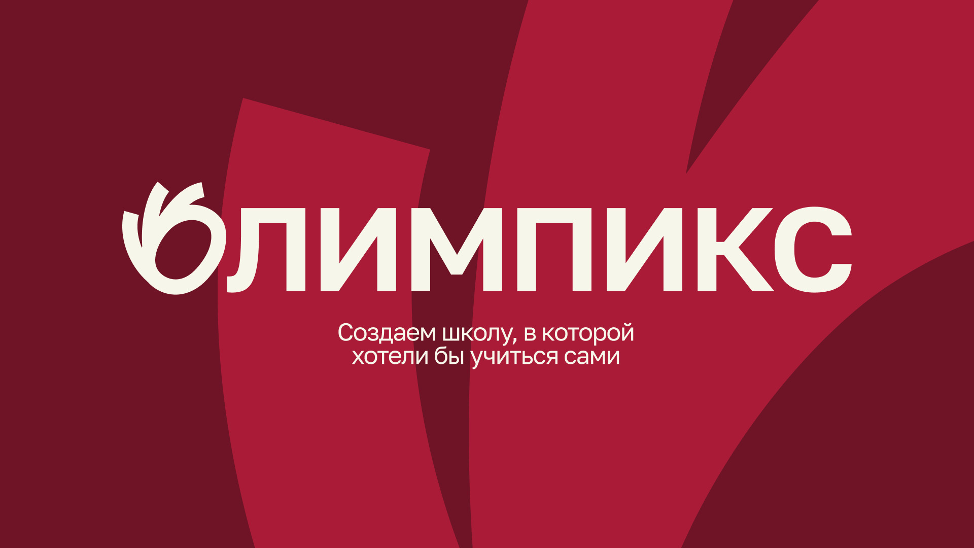
BWDS Studio developed branding and digital experience for OLYMPICS — an educational ecosystem where traditional learning meets modern approaches. The project combines an offline academy, an online platform, and educational trips, creating an environment that inspires teenagers while giving confidence to their parents.
Task
To create a visual system that works equally well for two audiences: teenagers and their parents. For teenagers, it is a space for self-expression, communication, and exploration. For parents, it is a structured and reliable system focused on quality education.
The challenge was to combine these two perspectives into a single identity — balancing emotional engagement and creativity with clarity, structure, and trust.
The scope included positioning, visual identity, website design, and a scalable system adaptable across digital and offline touchpoints.
Main idea & metaphor
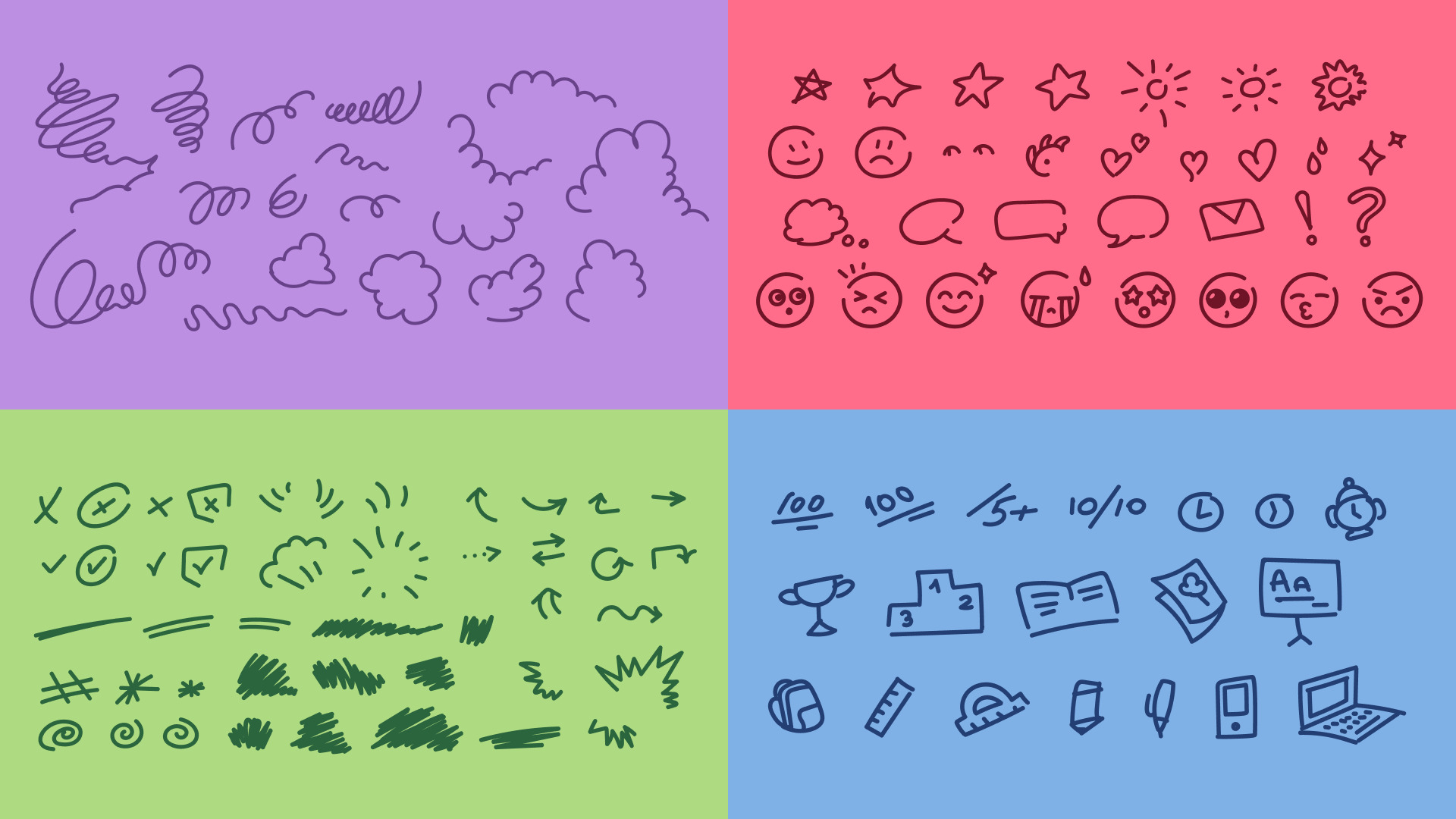
The identity is built on the concept of a two-layer visual language.
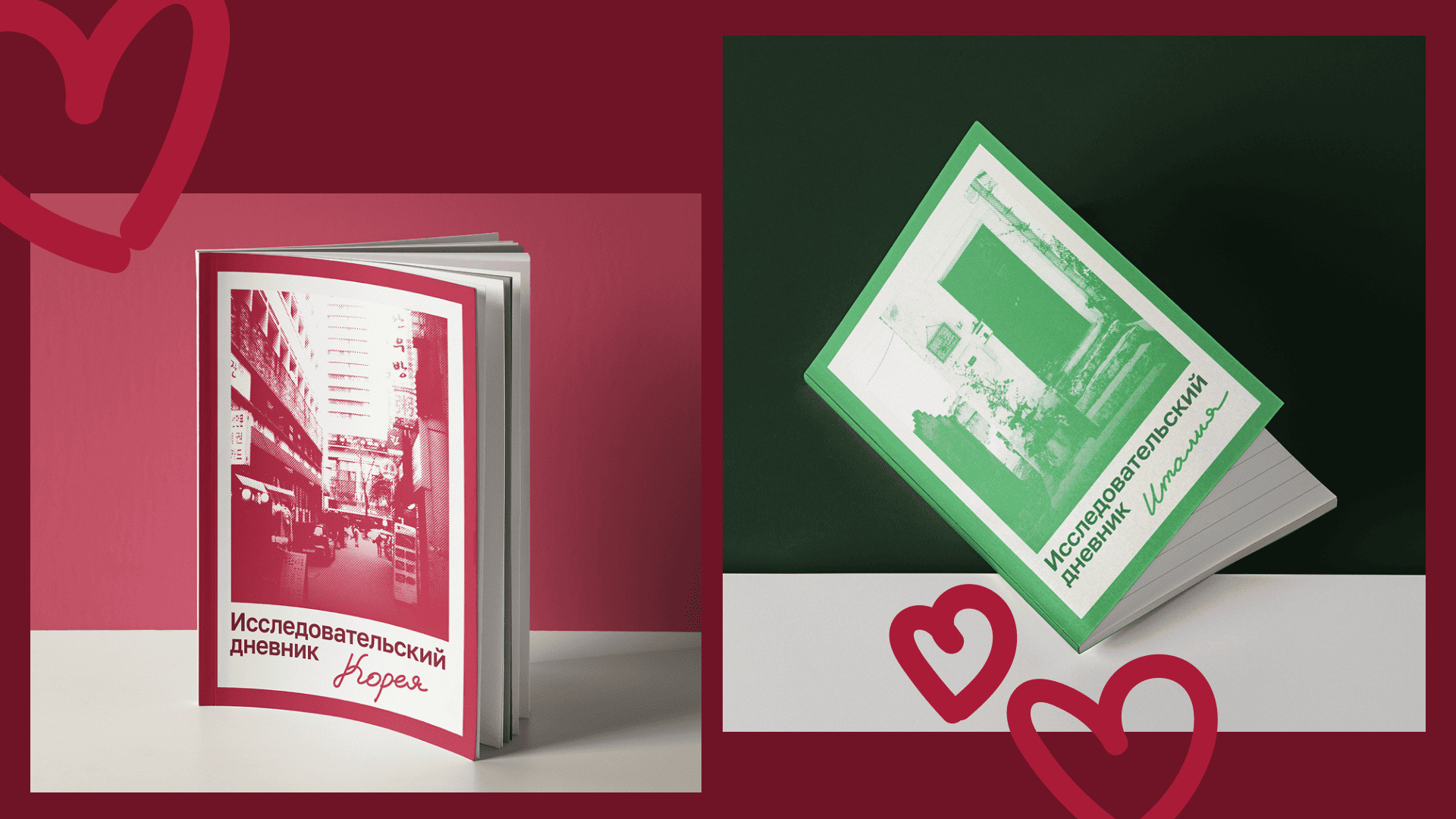
The base layer consists of strict typography and a clear grid, creating a sense of order and trust.
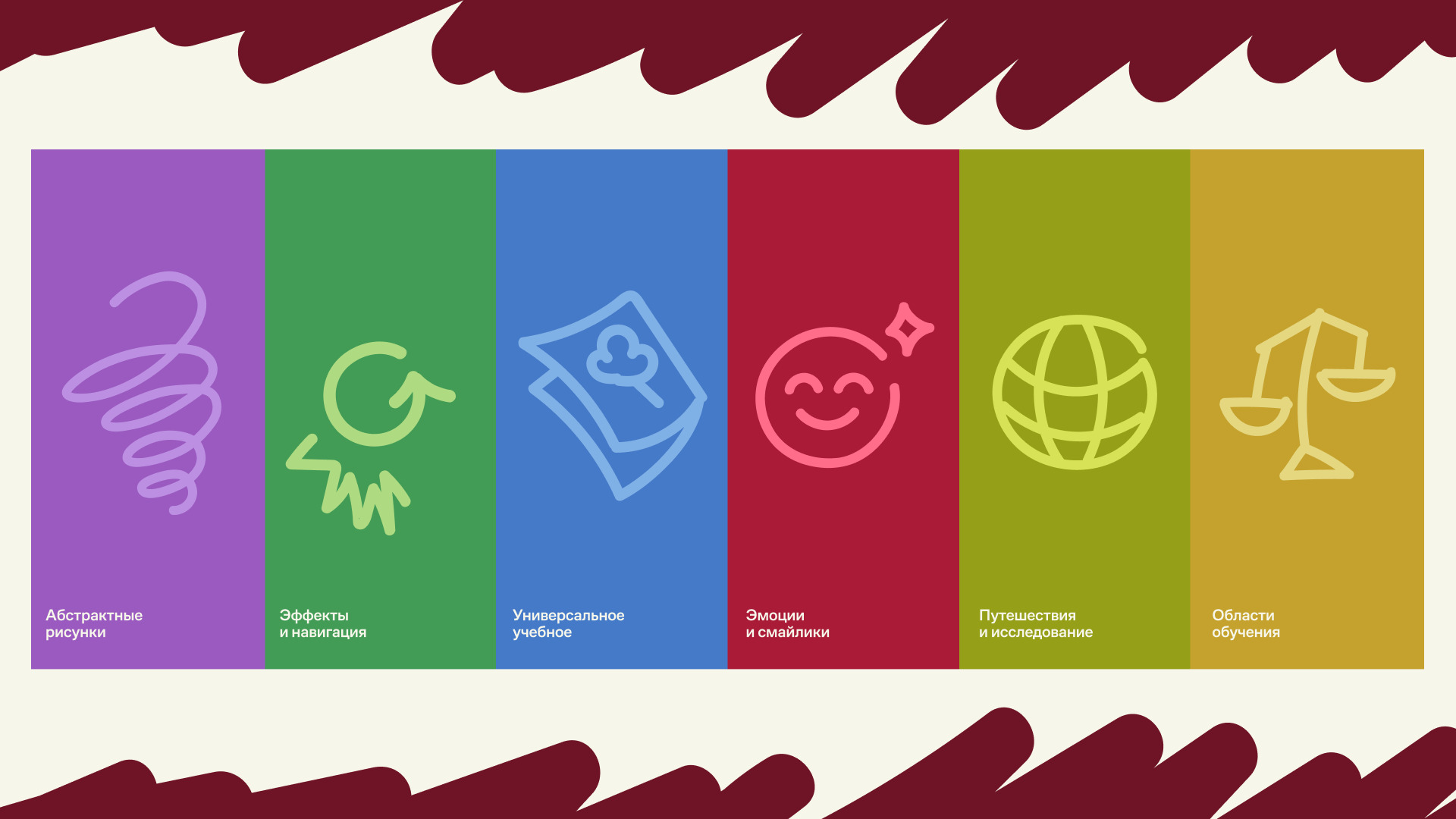
On top of it — expressive handwritten elements, notes, crossed lines, and dynamic shapes that reflect the energy and creativity of teenagers.
This approach combines structure and freedom within one cohesive system.
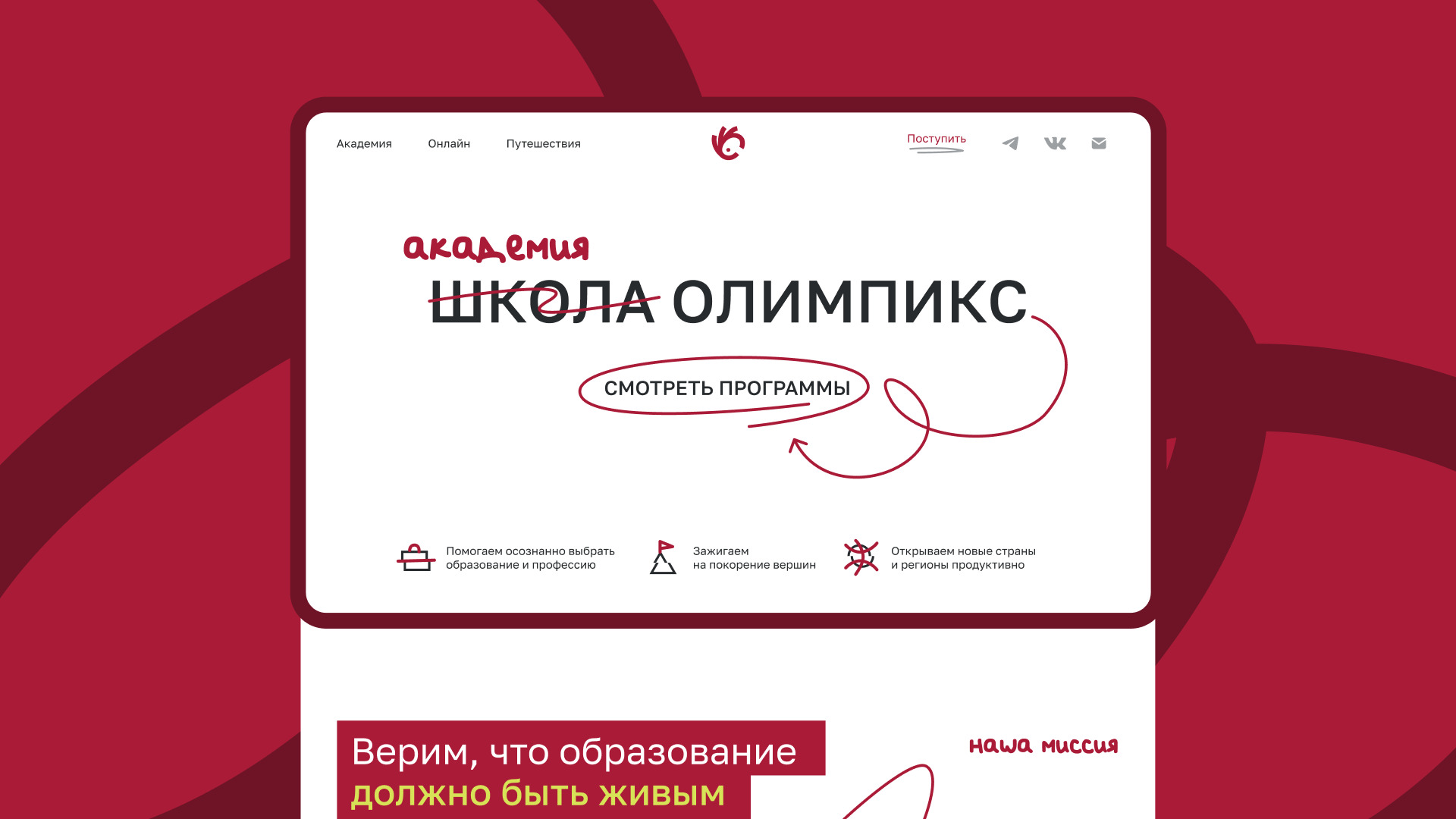
Digital experience
The website became the main embodiment of the concept. It was designed as a central touchpoint where the brand fully comes to life.
Clear information architecture and intuitive navigation create a sense of reliability and ease for parents.
On top of this structure, a layer of handwritten elements — notes, sketches, arrows, and spontaneous marks — adds energy and engagement for younger users.
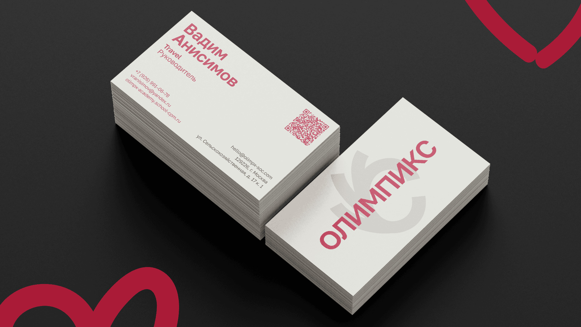
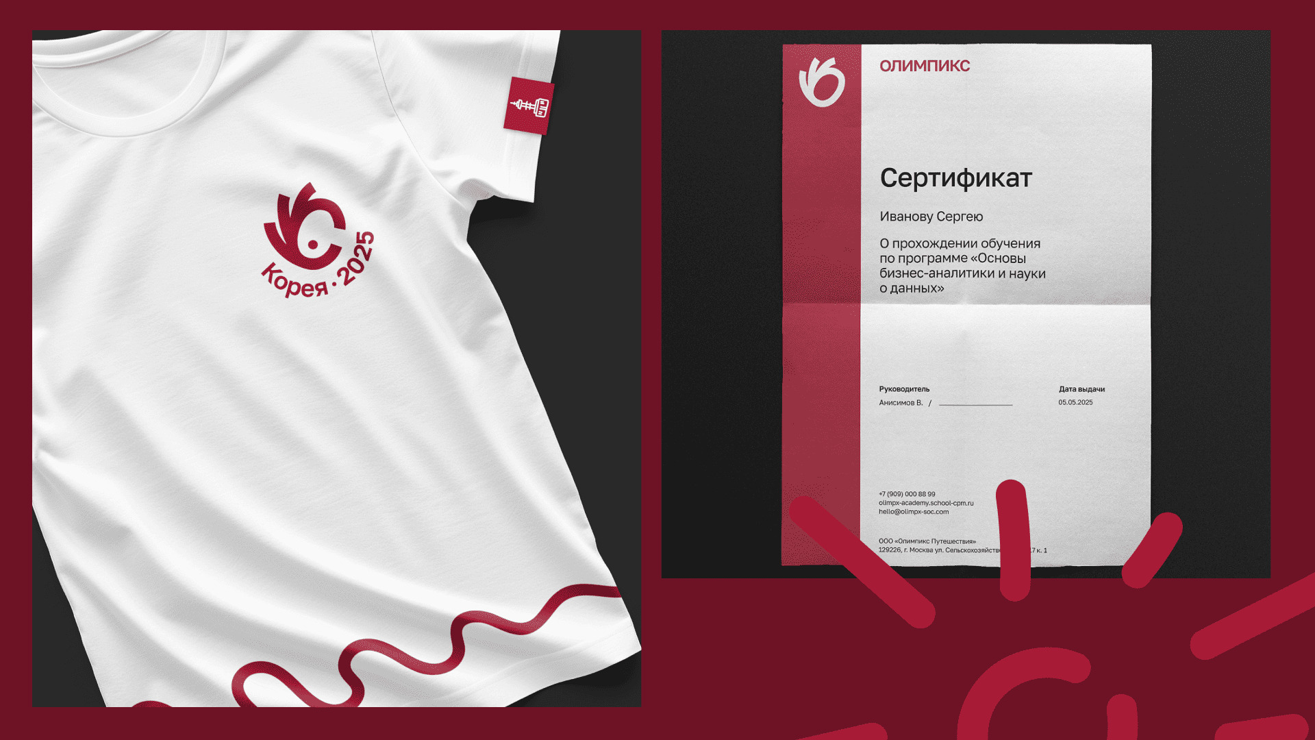
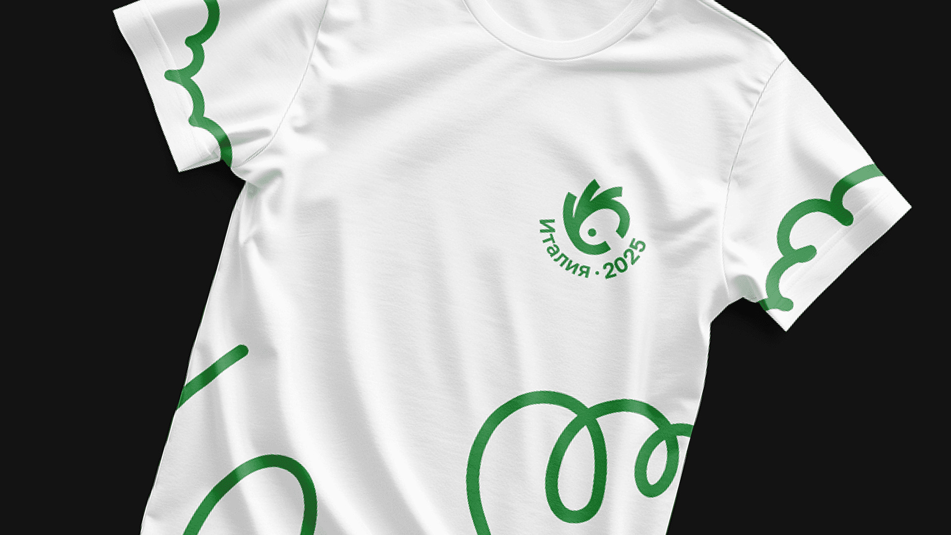
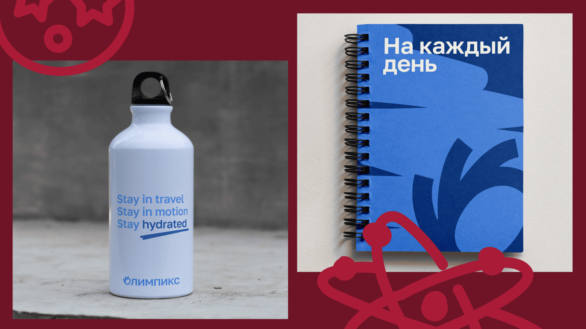
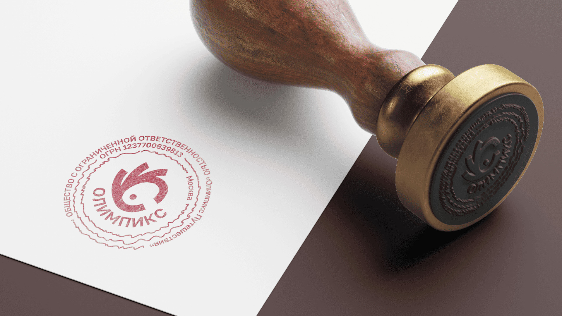
Brand system & applications
The identity extends across all touchpoints — from digital platforms and social media to educational materials, merchandise, and offline environments.
The system is consistent yet flexible, easily adapting to different formats while maintaining a unified visual language.
Result
The result is a branding system that resonates with both audiences.
OLYMPICS does not just look modern — it becomes a bridge between generations, creating an environment where learning is engaging for teenagers and a confident choice for parents.
CREDIT
- Agency/Creative: BWDS
- Article Title: Olympics — Branding and Website for an Educational Ecosystem
- Organisation/Entity: Agency
- Project Type: Identity
- Project Status: Published
- Agency/Creative Country: Russia
- Agency/Creative City: Moscow
- Market Region: Europe, Global
- Project Deliverables: Brand Design, Brand Identity, Identity System, Web Design
- Industry: Education
- Keywords: Branding, school, education, identity, web platform
-
Credits:
Art Director: Veronika Potapova
Brand designer: Tatiana Chestnova


