


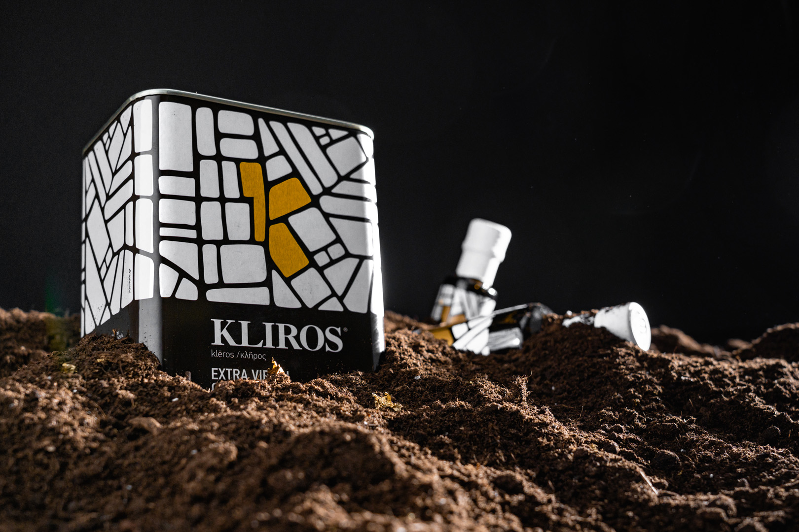
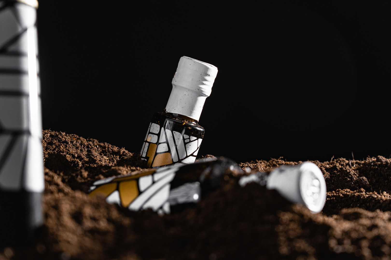
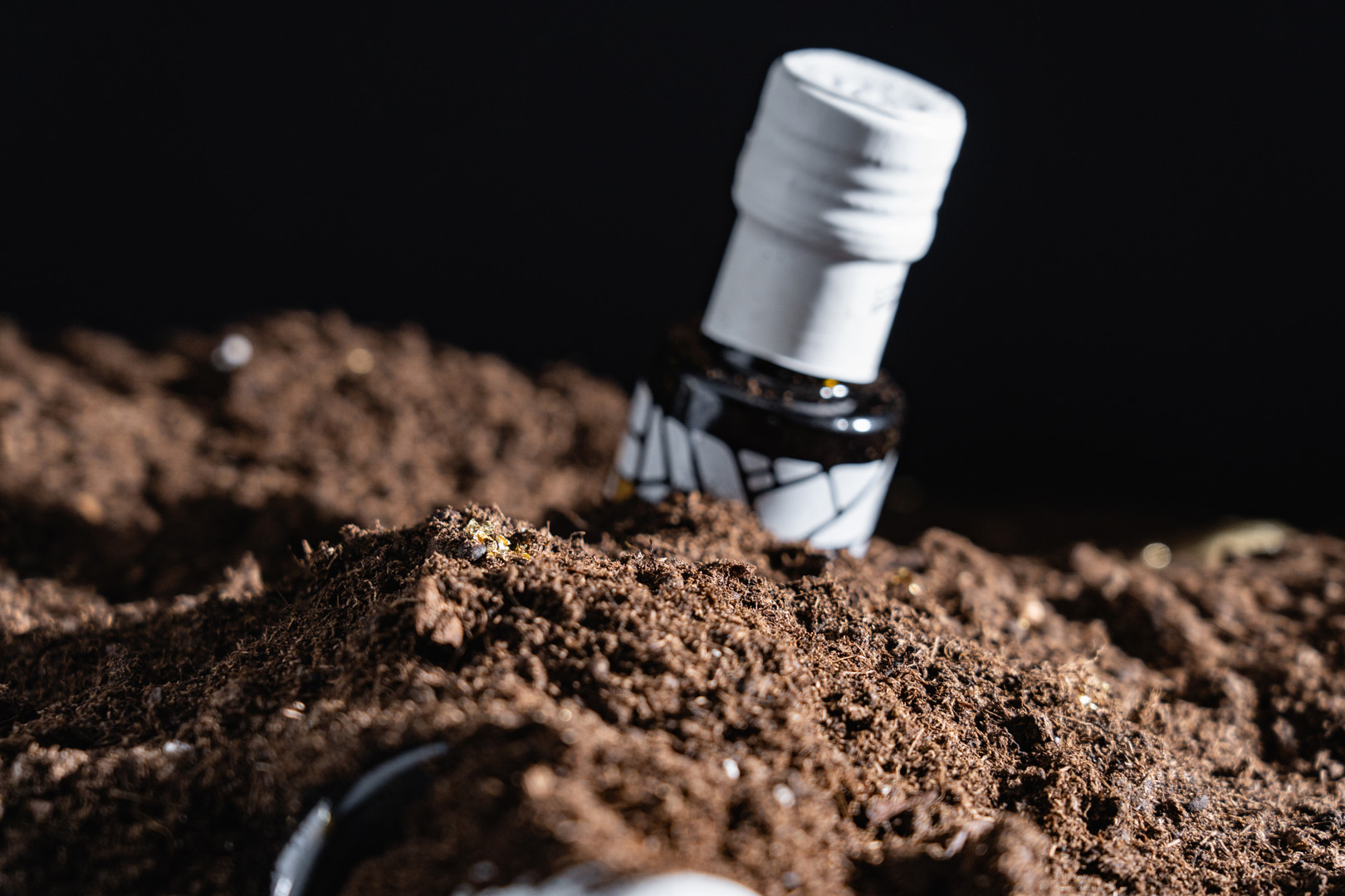
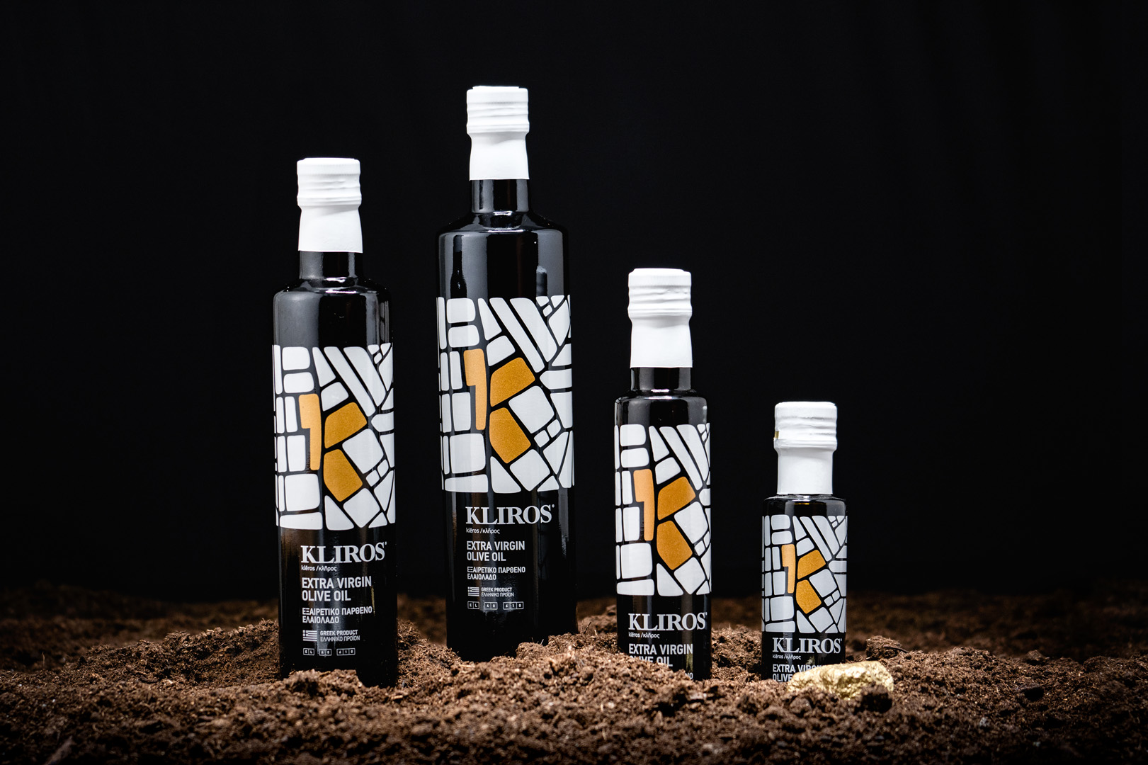
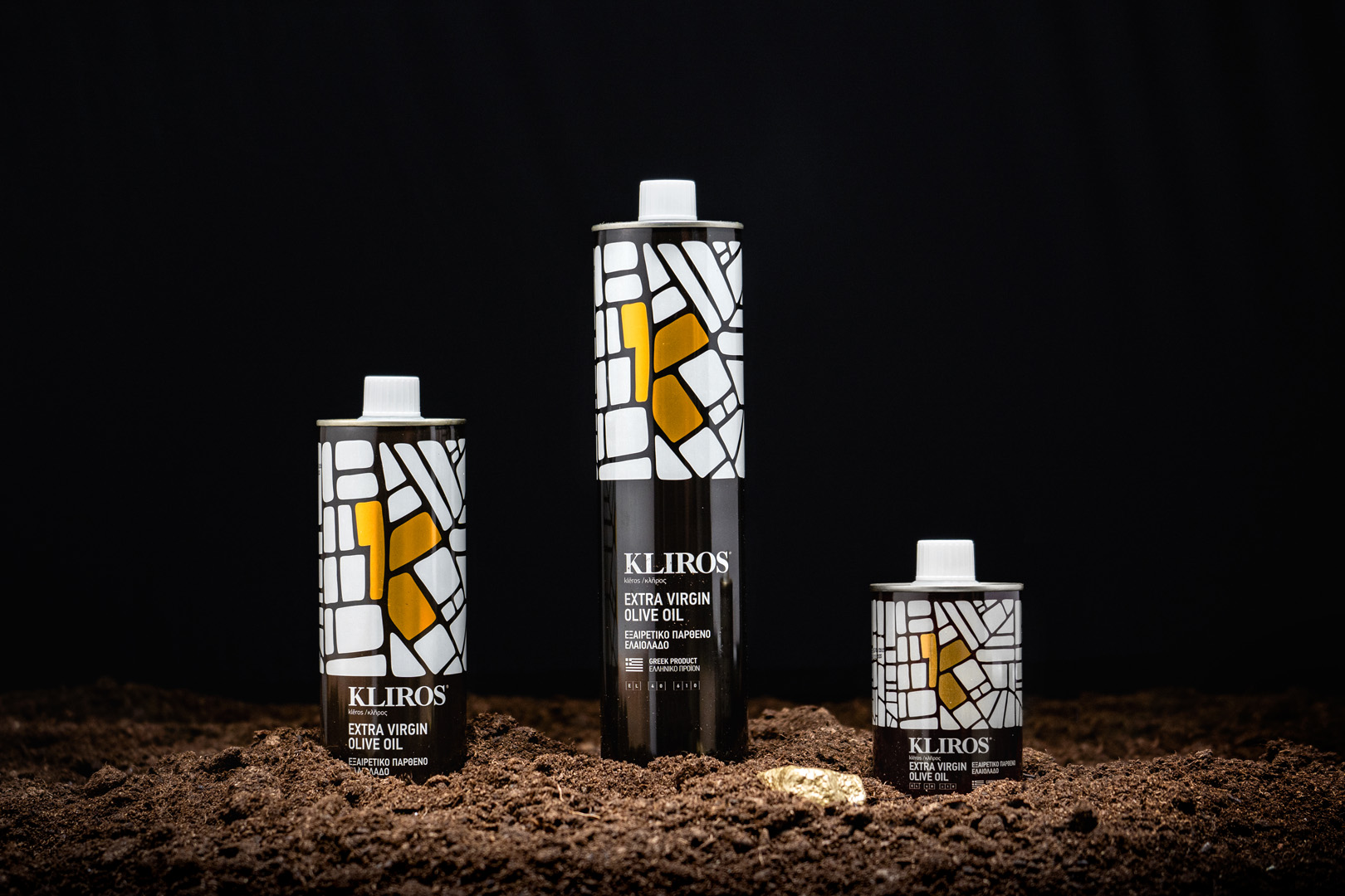
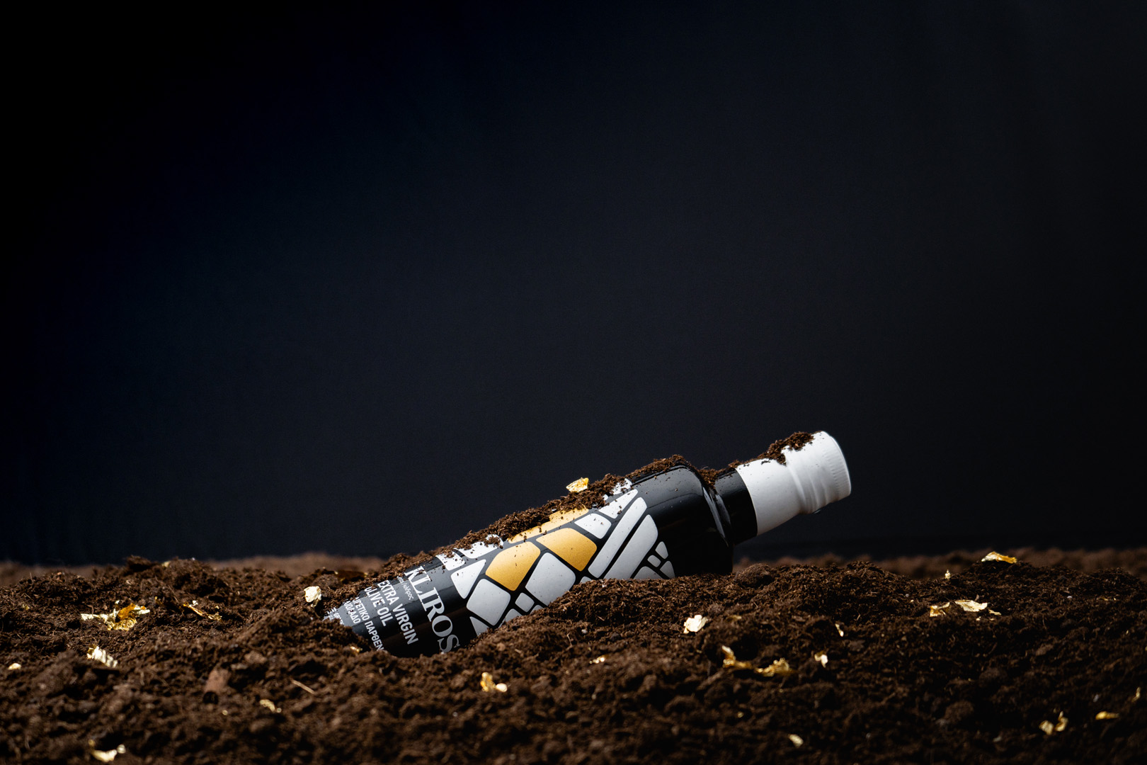
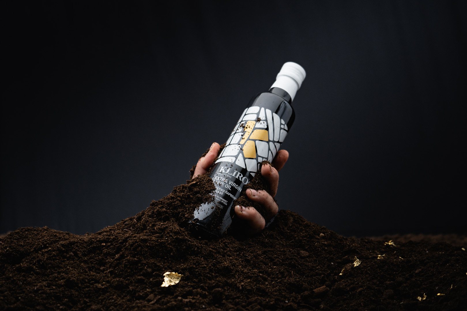
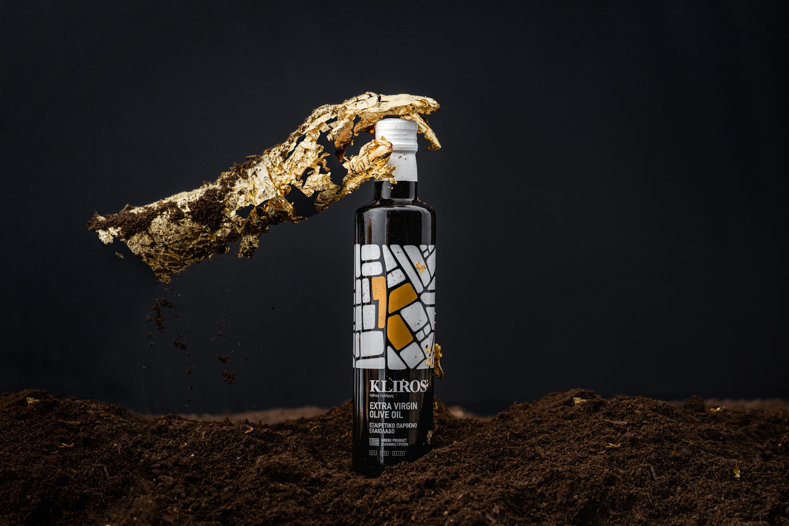
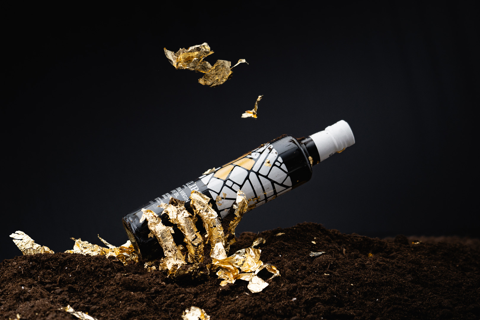
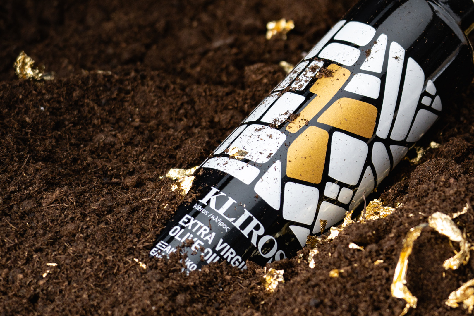
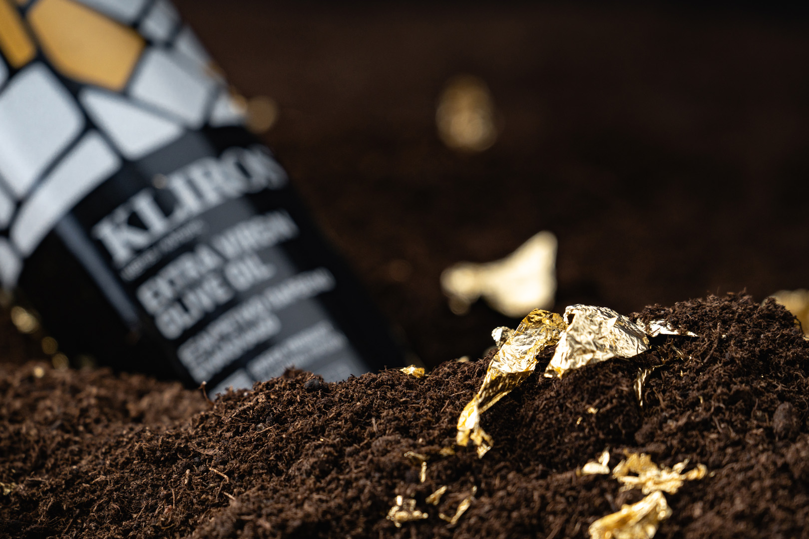
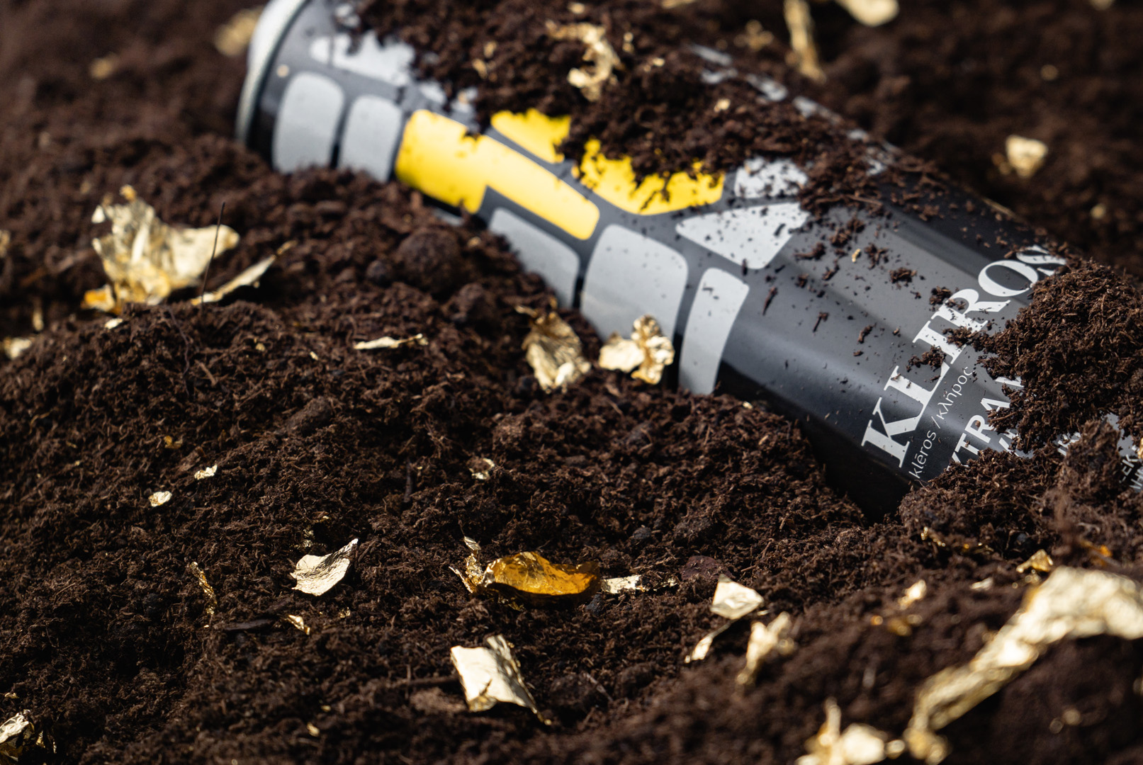
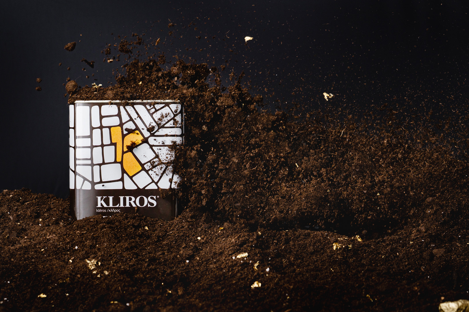
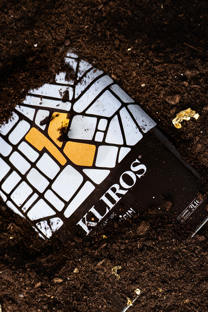
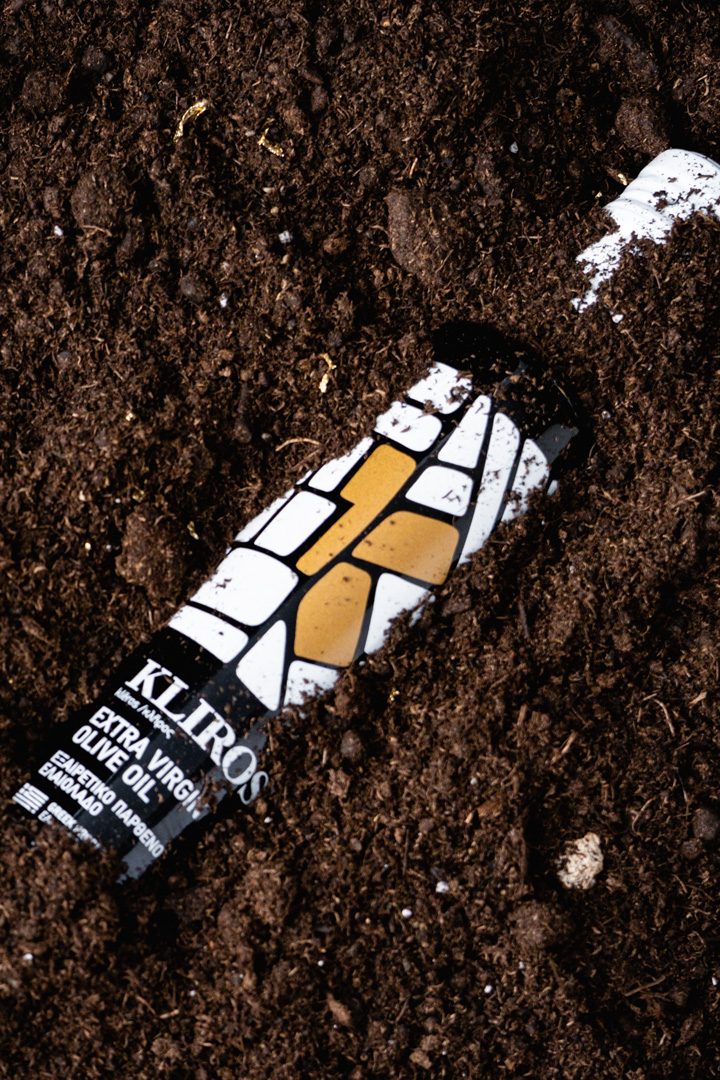
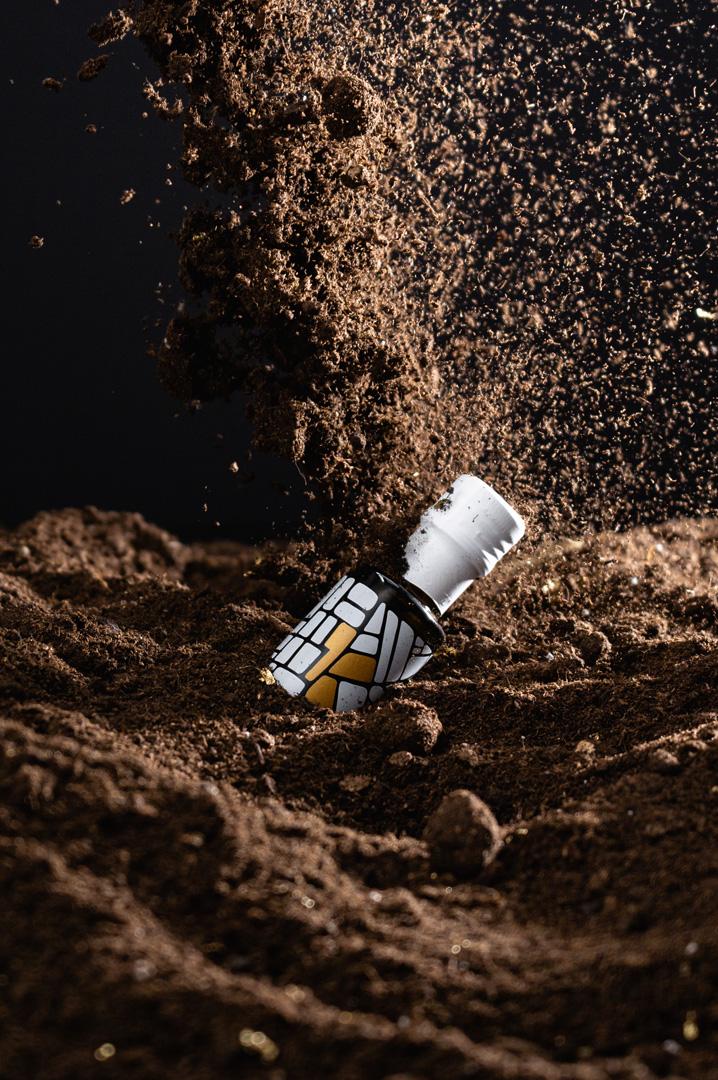
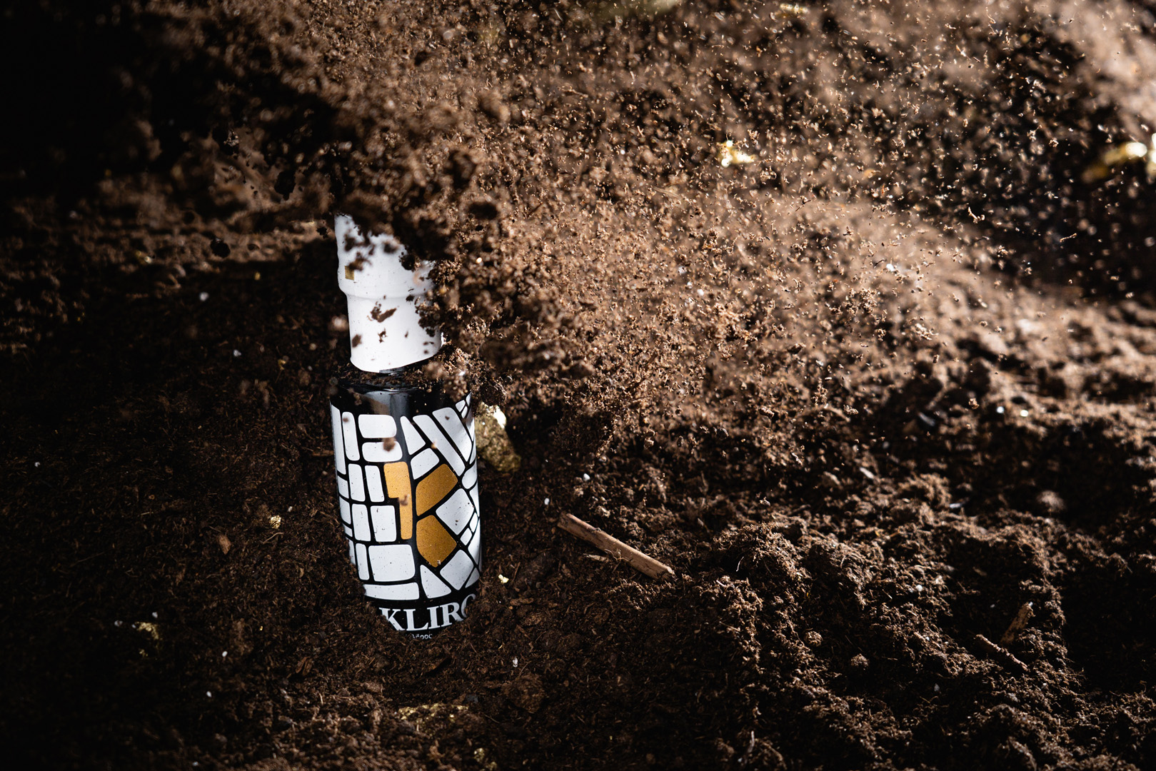
Designing eleven different volume versions of glass and metallic bottles, cans and canisters for this precious product, our intention was to fully integrate all the brand’s characteristics into the visual aspect. Printed on the dark glass or metal surface a white pattern resembling a topographic map of allotments. At the centre of this patters with the white depiction of allotments, there are three fields in gold, forming the letter k, the initial letter of the word Kliros. Thus, the purity and the qualities of the product are also implied by the element of gold.


CREDIT
- Agency/Creative: Artware
- Article Title: Olive Oil Packaging Design by Artware
- Organisation/Entity: Agency, Published Commercial Design
- Project Type: Packaging
- Agency/Creative Country: Greece
- Market Region: Europe
- Project Deliverables: Brand Naming, Branding, Packaging Design, Product Architecture, Product Naming
- Format: Bottle, Tin
- Substrate: Glass, Glass Bottle, Metal
FEEDBACK
Relevance: Solution/idea in relation to brand, product or service
Implementation: Attention, detailing and finishing of final solution
Presentation: Text, visualisation and quality of the presentation


