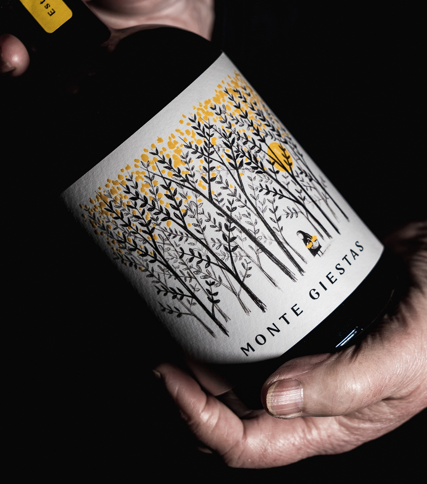
Monte Giestas is an olive oil produced manually in a village in the Douro region, Portugal. After producing olive oil for its own consumption, the family decided to start selling Monte Giestas. The Olive groves are cultivated in a sustainable manner, without using chemical fertilisers or pesticides. The trees are carefully handled and preserved to produce exceptional quality olive oils and because they help sustain the vineyard’s biodiversity. An olive oil with an interesting characteristic, because as the name says, the olive trees grow in the middle of the olive trees, creating a fantastic and beautiful scenery, where the yellow color stands out among the branches and leaves of the trees that sway in the wind.
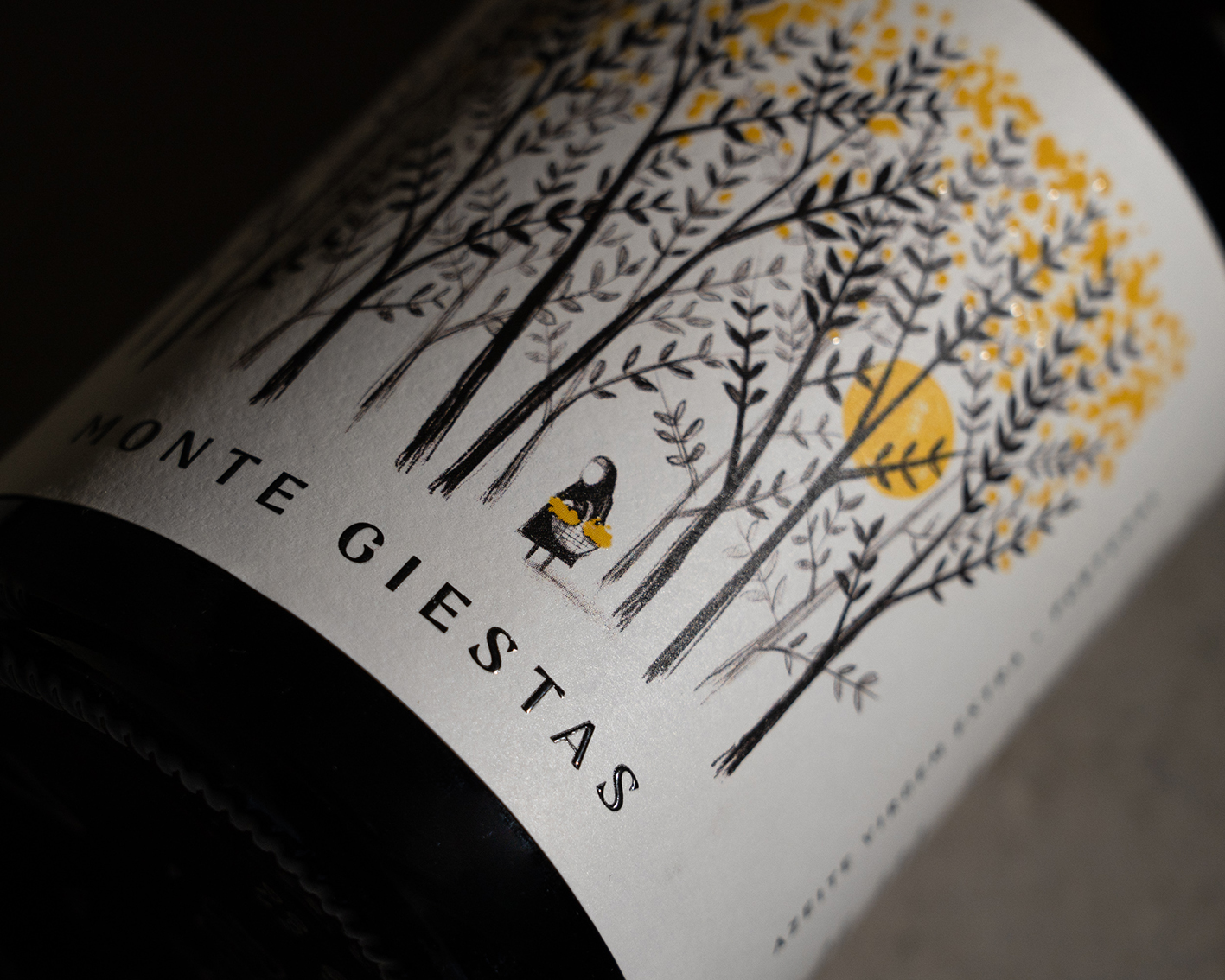
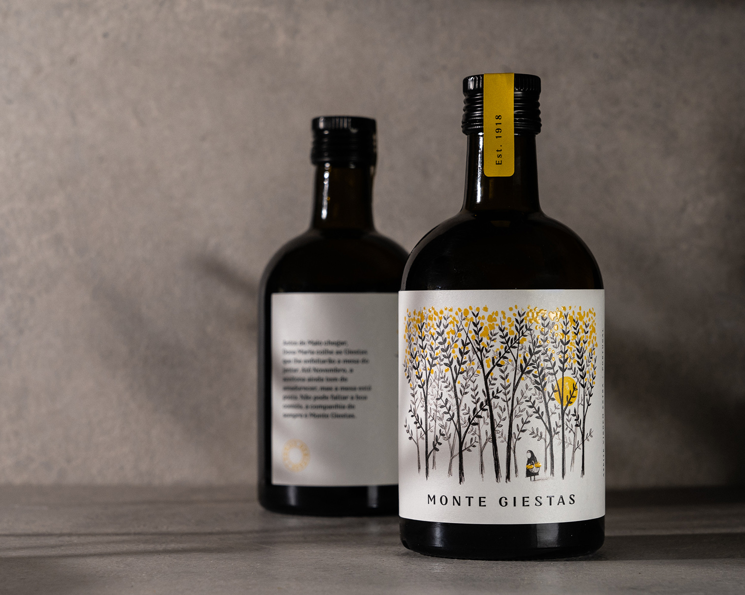
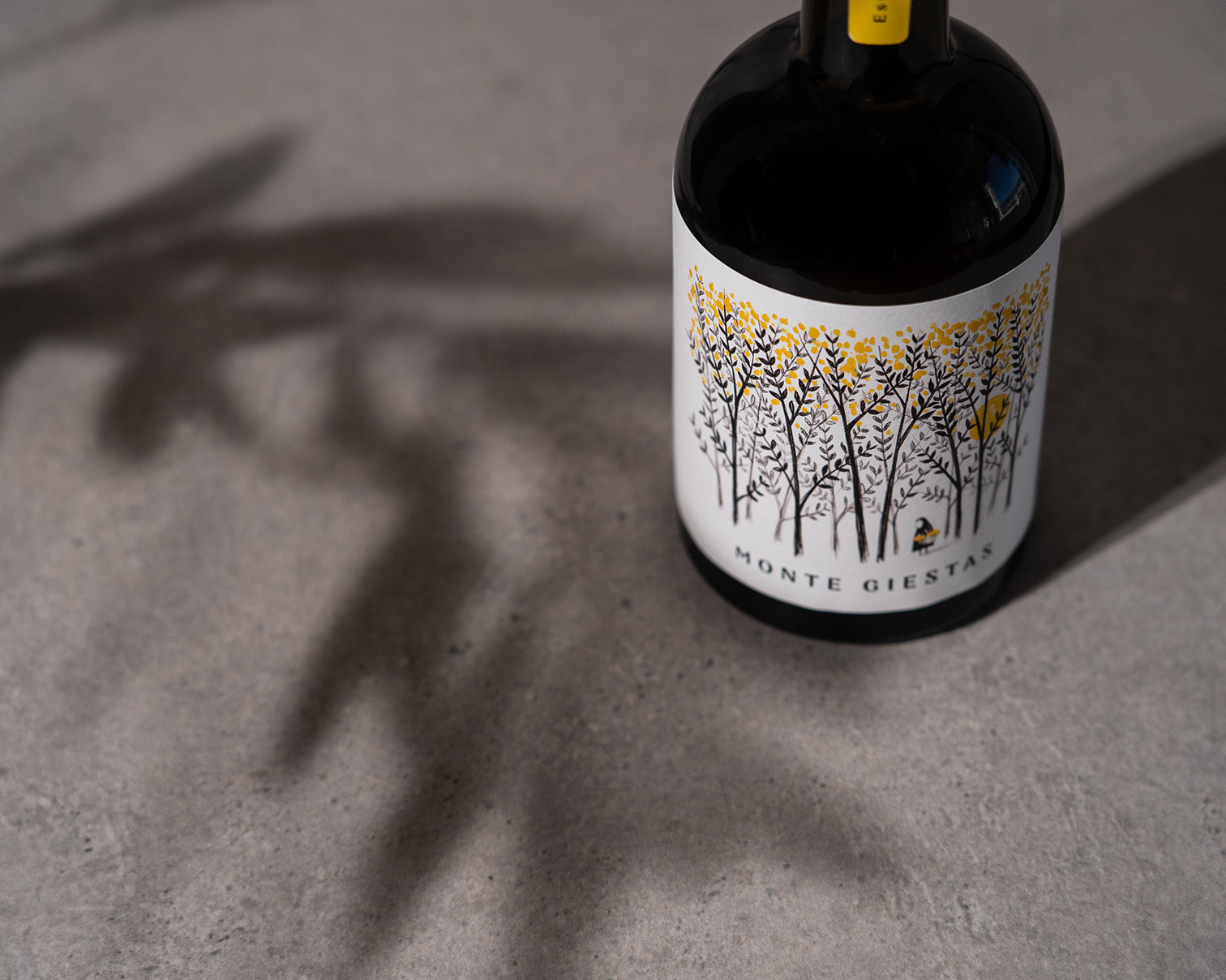
Our goal was to tell the story of this product through a bottle. Thus, we created an illustration that represents an old lady who goes to the mountain to get the broom to decorate the dinner table and receive her family. The yellow colour had to be highlighted, since all that picturesque scenery remained in our memory. The contrast with the black color that represents the old days, the tradition.
With this bottle, we try to honor the people of that village, create conversations at the table, revive old memories and tell stories to the little ones.
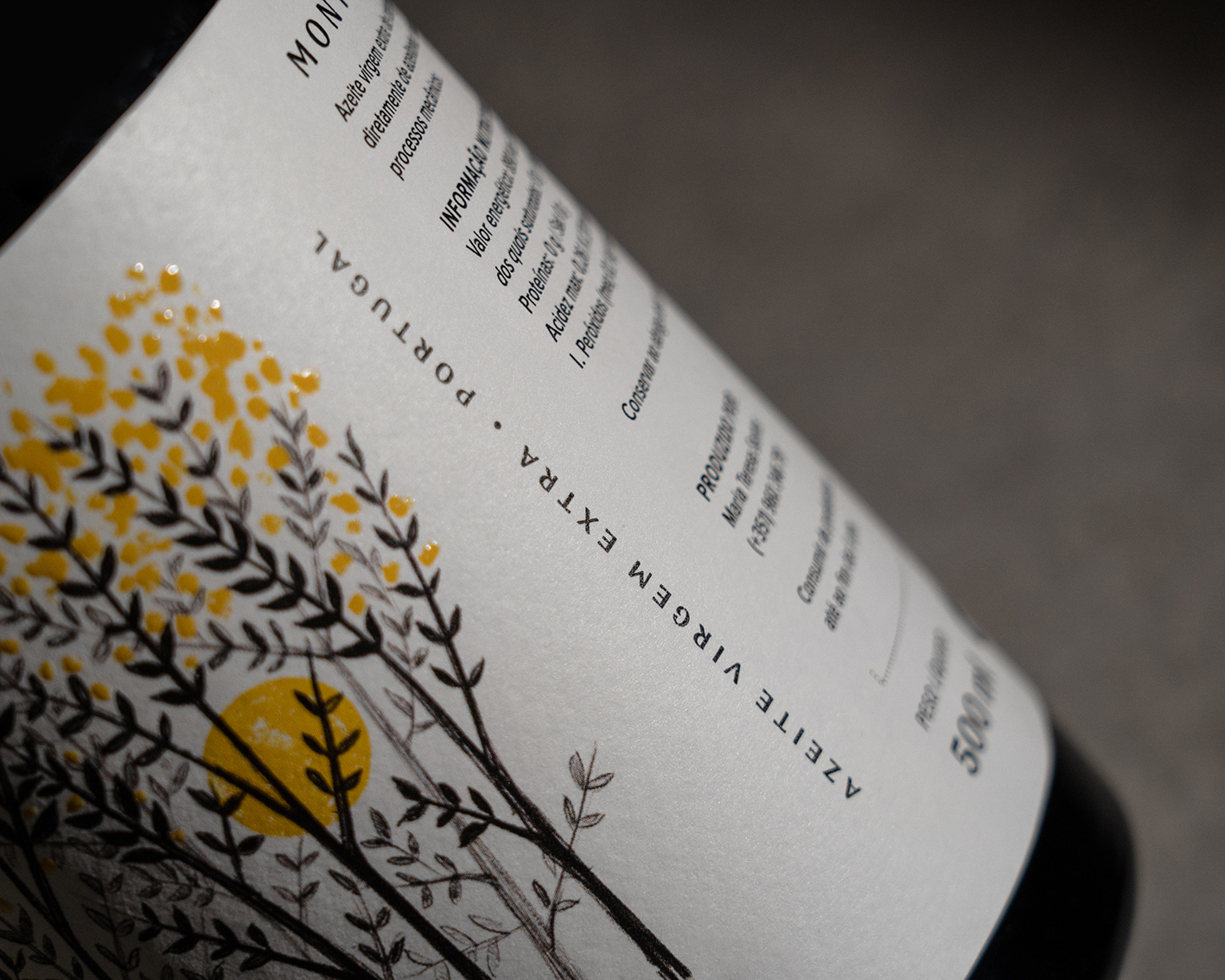
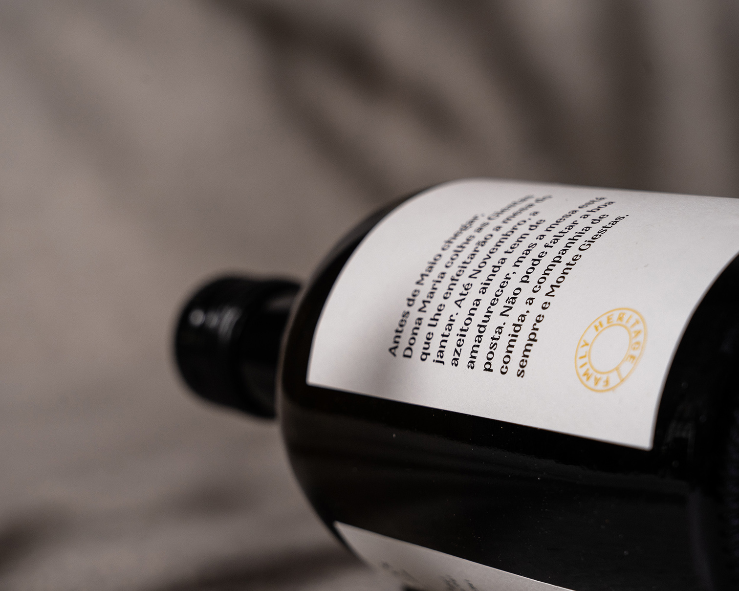
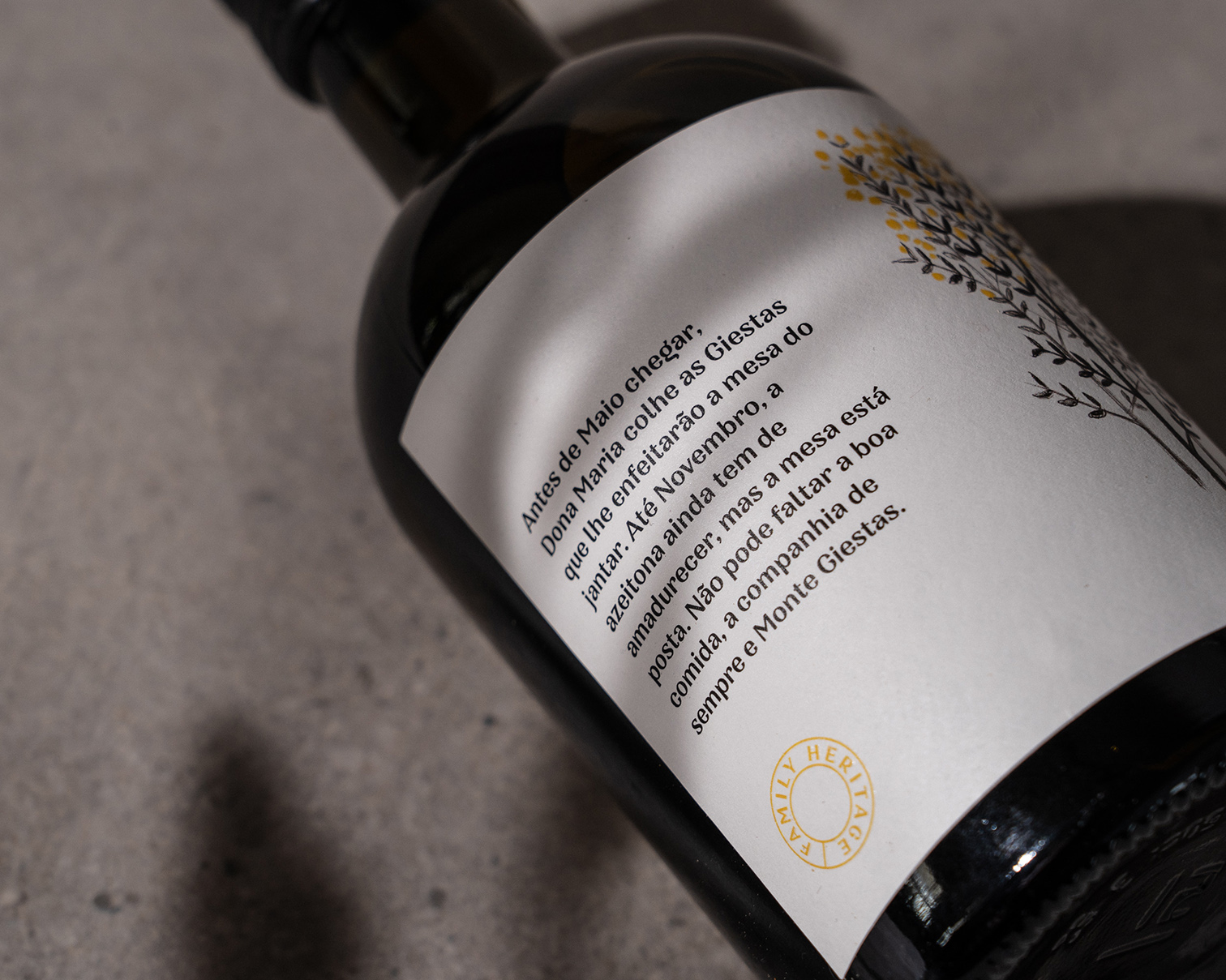
The result is a traditional bottle, full of memories and tradition, that transports us to the life of that old lady.The customer was very satisfied with the result, since his product stands out from all other bottles of olive oil. “The public wants to know more about the history of Monte Giestas and is interested in visiting the village,” he says. The following description in Portuguese appears on the back of the label: “Before the month of May arrives, D. Maria collects the broom that will decorate the dinner table. Until November the olives are not yet ripe, but the table is set. You can’t miss the food, the usual company and Monte Giestas. ”
For us it was a very interesting and enriching challenge, as the objective was to create a genuine image, full of tradition and values.
Respect for the product and the people of the land was very important for the creation.
CREDIT
- Agency/Creative: Vinco Studio
- Article Title: Olive Oil Label Design Creates by Vinco Studio
- Organisation/Entity: Agency, Published Commercial Design
- Project Type: Packaging
- Agency/Creative Country: Portugal
- Market Region: Europe
- Project Deliverables: Brand Creation, Brand Strategy, Graphic Design, Illustration, Packaging Design, Photography, Research
- Format: Bottle
- Substrate: Glass Bottle


