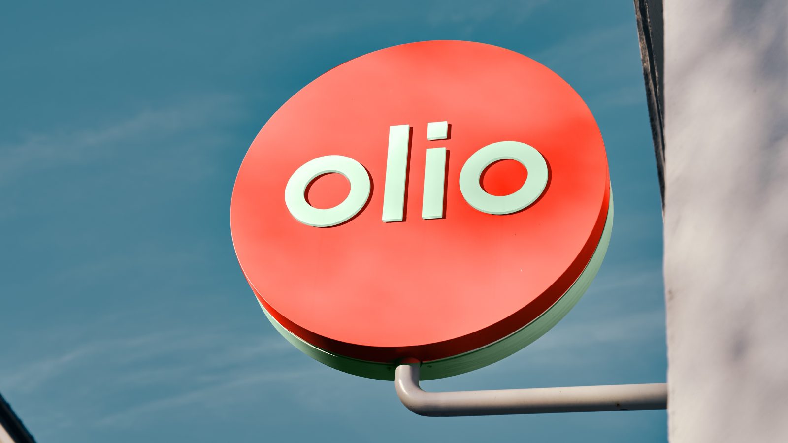
A new type of wellness – From cheek to cheeks
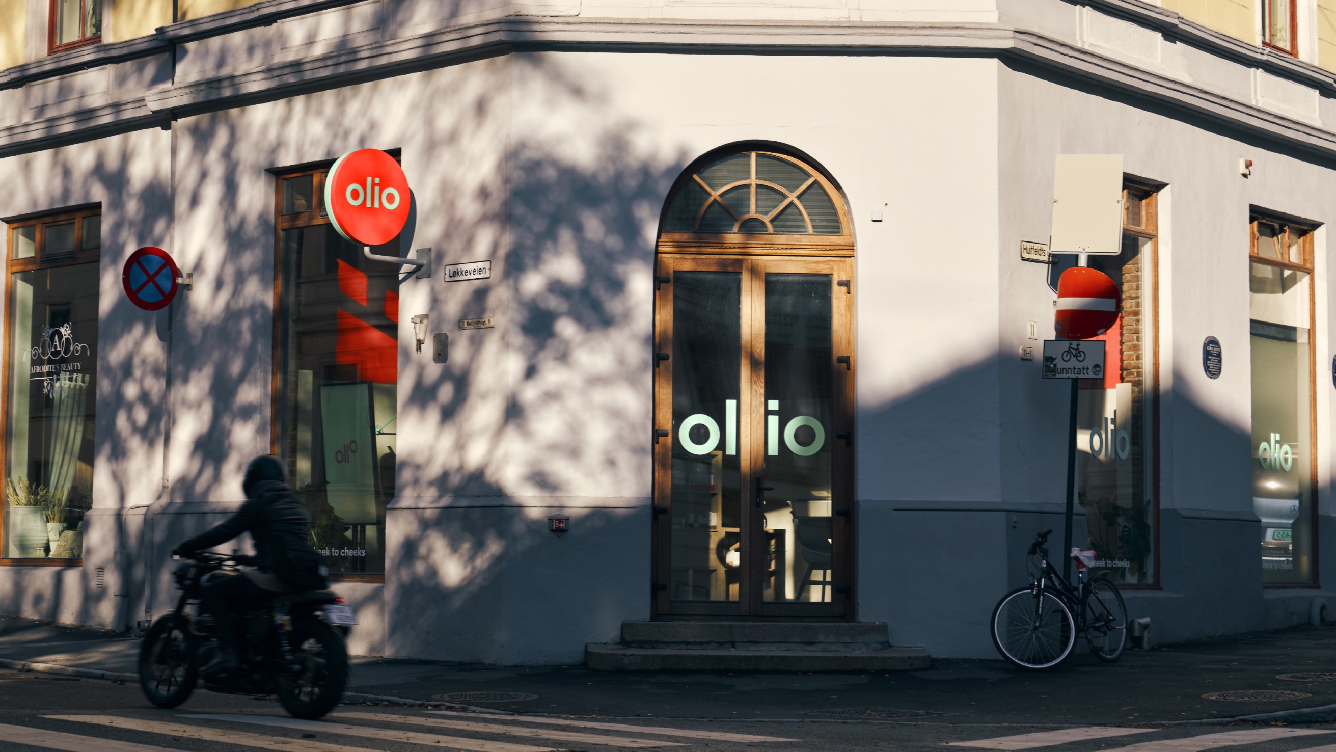
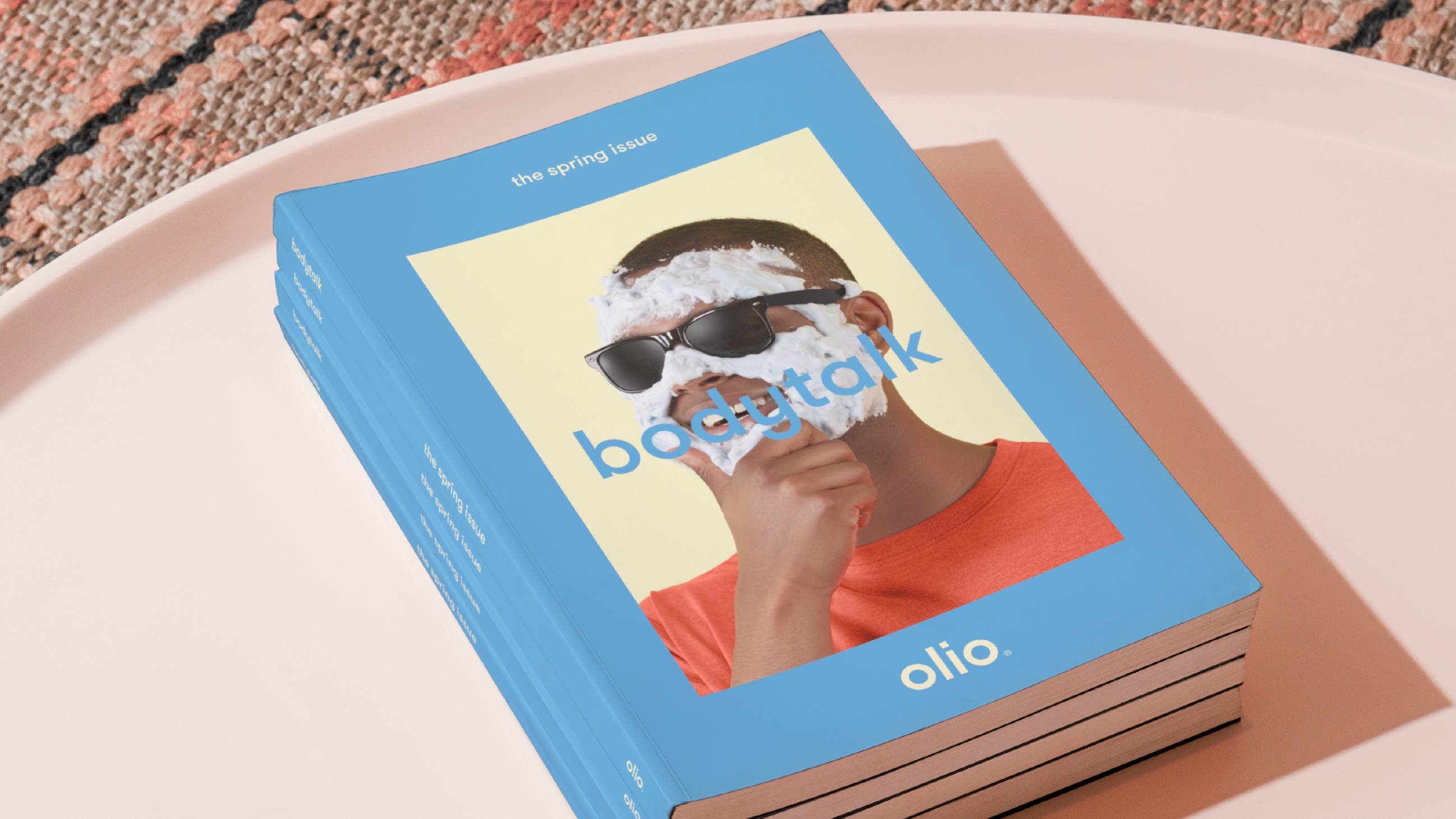
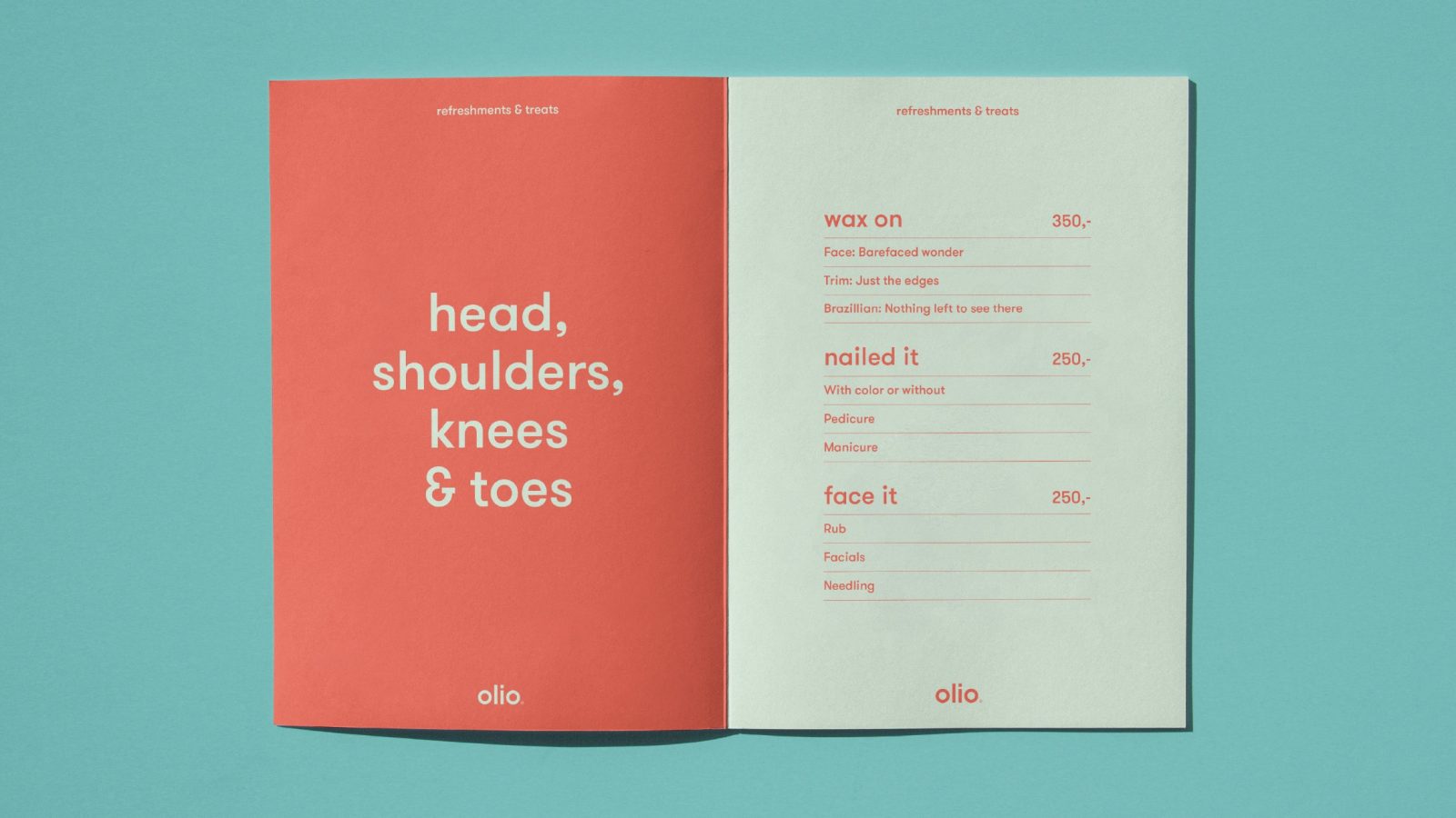
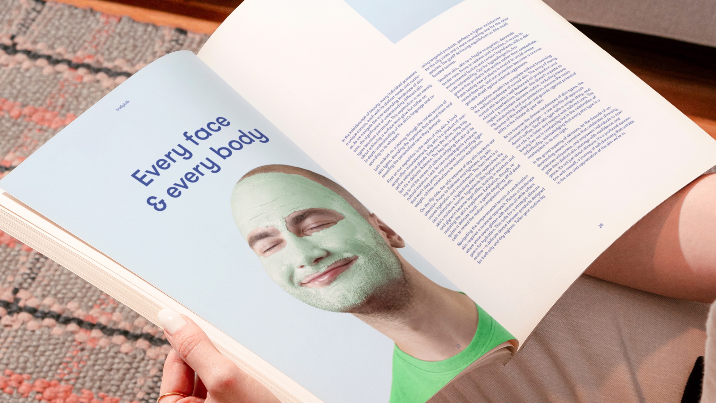
KIND has created a colourful and playful brand for Olio, a fresh-faced wellness salon chain. The owners wanted to create a salon to contrast all the feminine beauty-centred salons in Scandinavia — a wellness-focused salon for everyone from young men to old ladies. The salon offers treatments from head to toe – body, nails, feet and face.
Considering the inclusive brand positioning, we wanted to create a name far removed from the stereotypical beauty salons. The name needed to be short, simple, fun, and with a meaning that would add some depth.
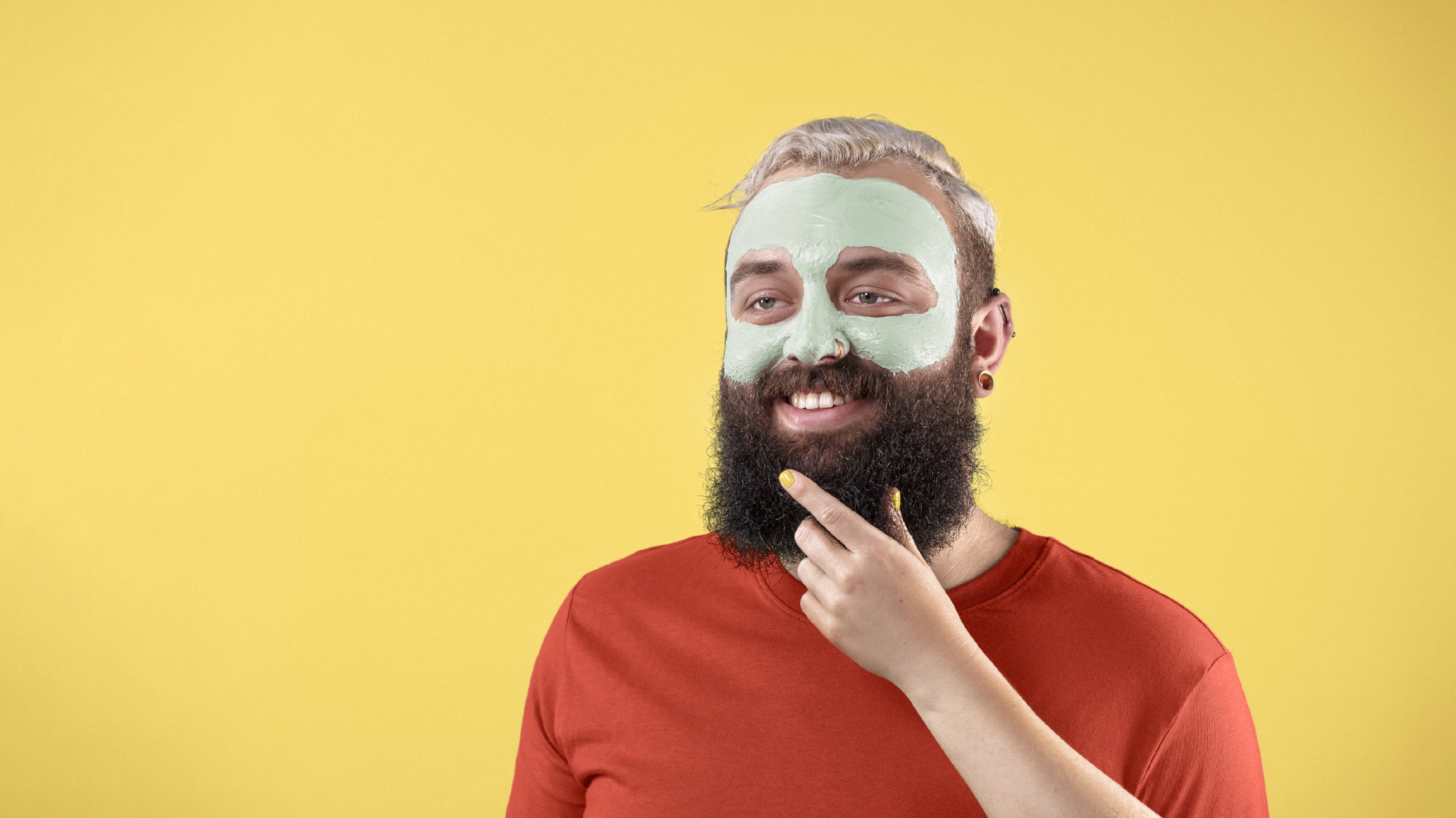
The name became Olio – a word that means ‘A miscellaneous collection of things’. For us, this means the miscellaneous variety of people, treatments and products the store offers. It encapsulates our vast customer base, including Eric, aged 22, to Edith, aged 83 – and anyone in between.
The word also means oil in Spanish and Italian, which resonates well with the natural oil in the skin and, therefore, is a common word within skin treatments.
Olio is a unique and catchy name that has, in a short amount of time, become a household name in Norway, with many stores and a strong brand presence.
Introduction:
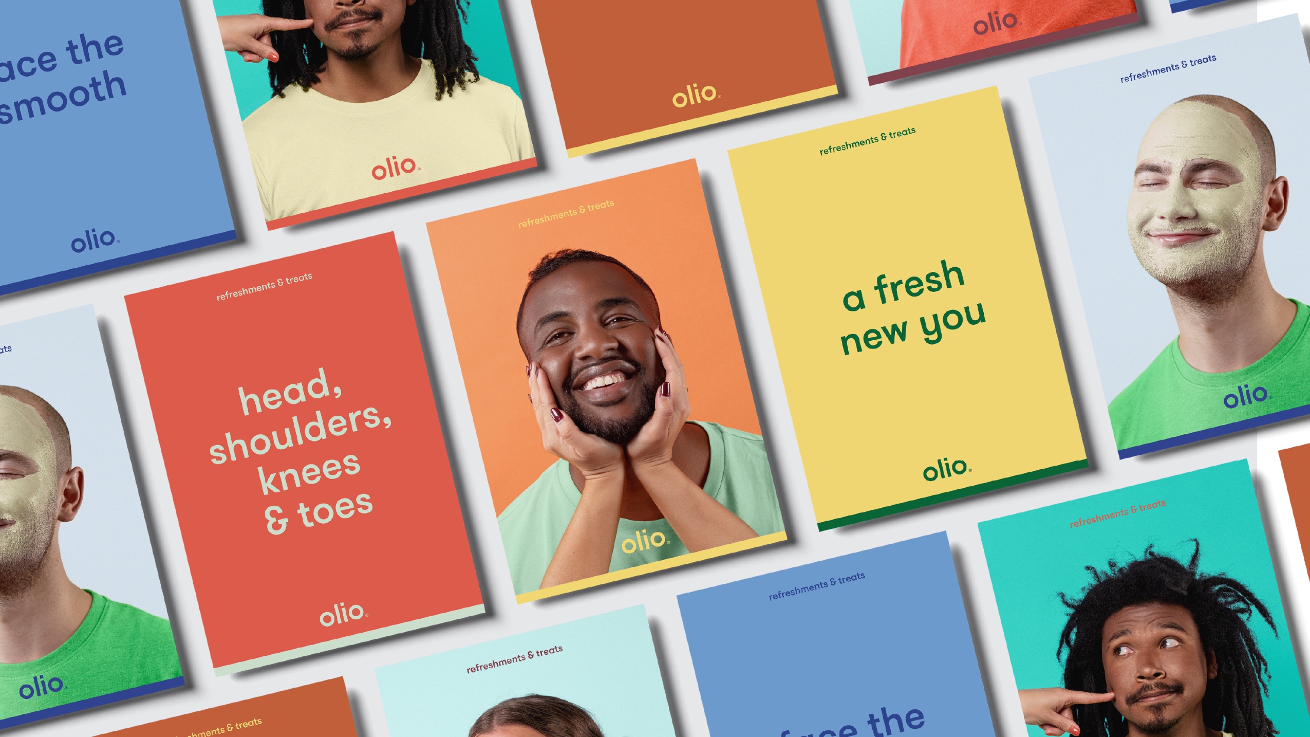
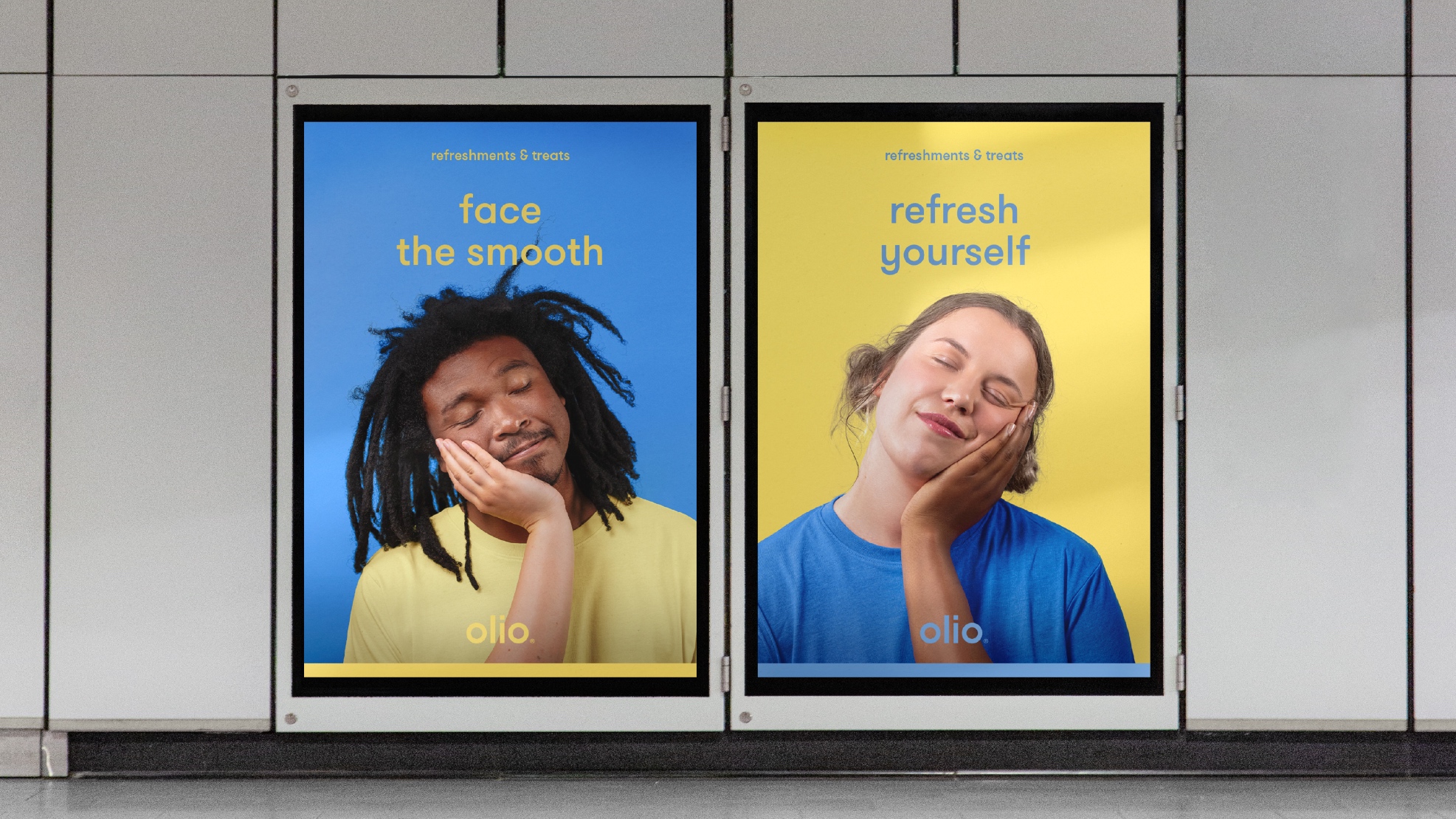
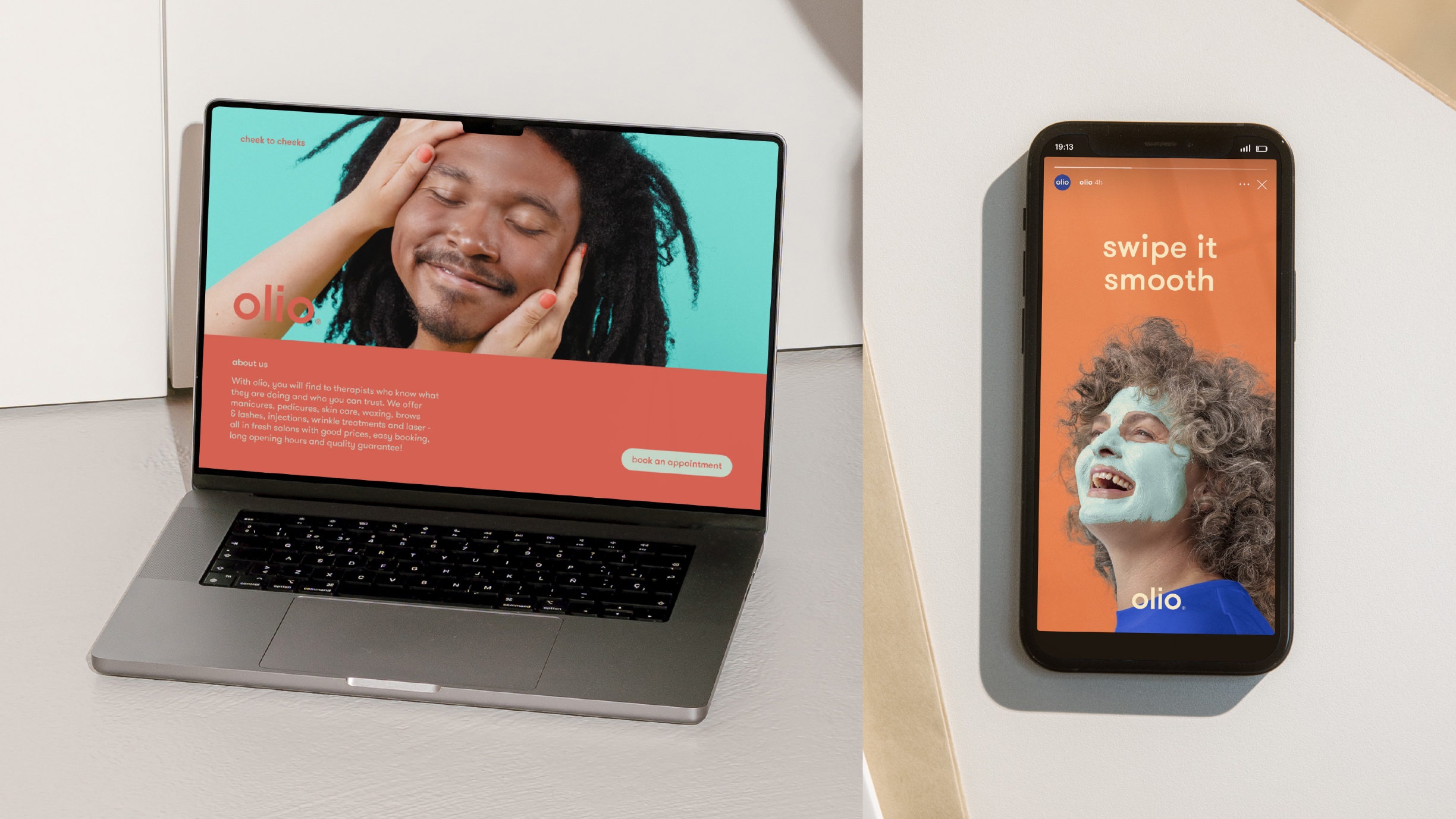
Olio, meaning a miscellaneous collection of things, stands as a welcoming beauty sanctuary for individuals of all ages, shapes, and sizes. At Olio, diversity is celebrated, and the salons offer an eclectic mix of treatments and products tailored to a diverse clientele.
An Olio of People:
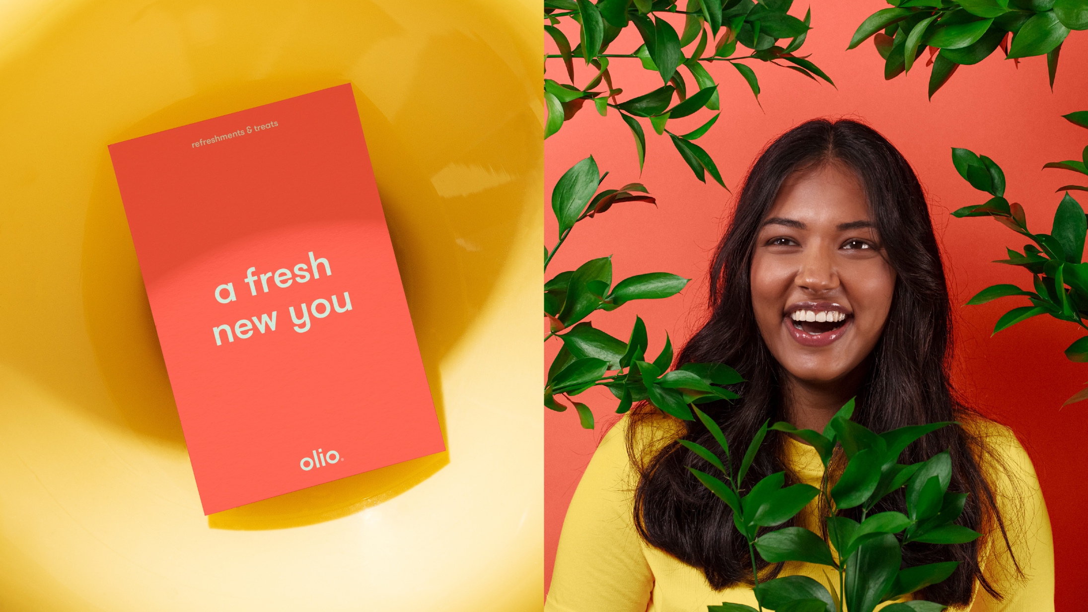
Diversity takes centre stage at Olio. Whether in age, body type, personality, background, size, or colour, Olio strives to create a space that brings together diverse individuals. The salon becomes a haven for well-being and relaxation, catering to the unique needs of each guest.
A Playful Identity:
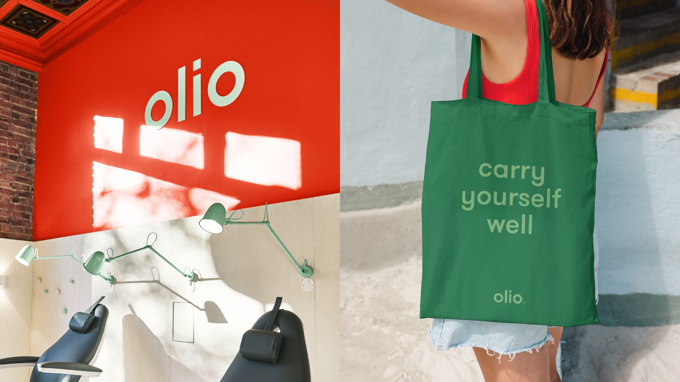
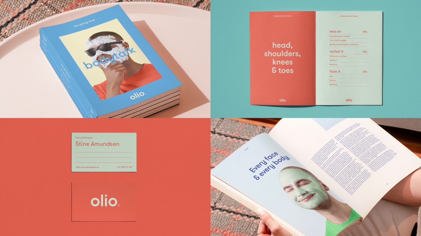
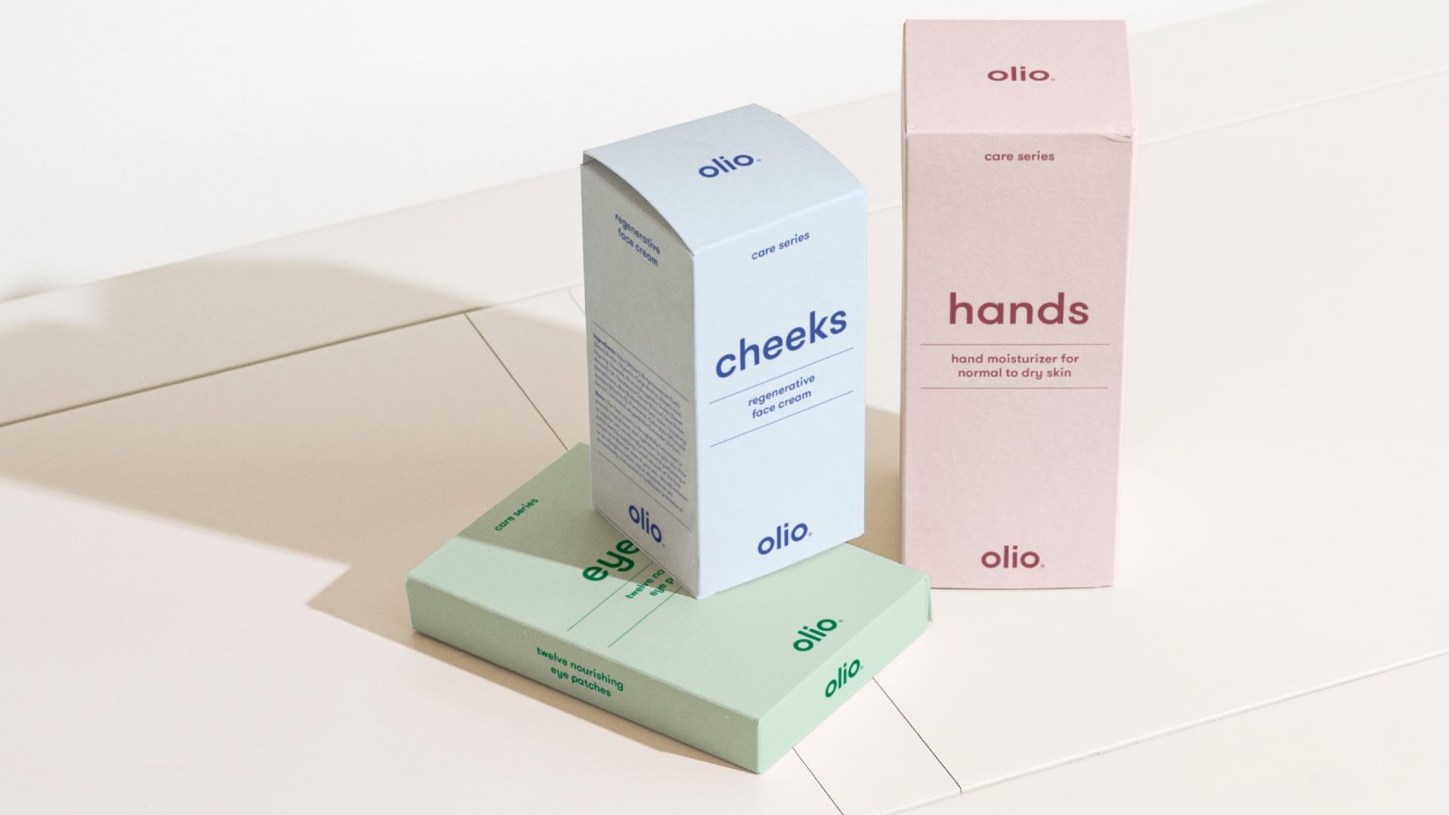
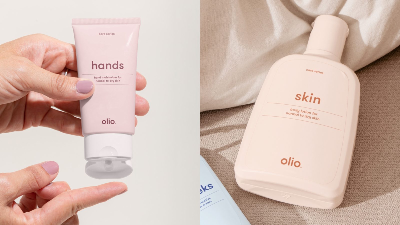
Reflecting the spirited personalities of both the staff and the visitors, Olio’s identity is playful and vibrant. The treatments offered are straightforward, providing efficient and affordable care. Olio believes that full-body care doesn’t have to be expensive or complicated. The product lines, marked by simplicity and humour, aim to create a relaxed and cosy atmosphere, inviting guests to unwind in a warm and friendly setting.
Cheek to Cheeks Experience:
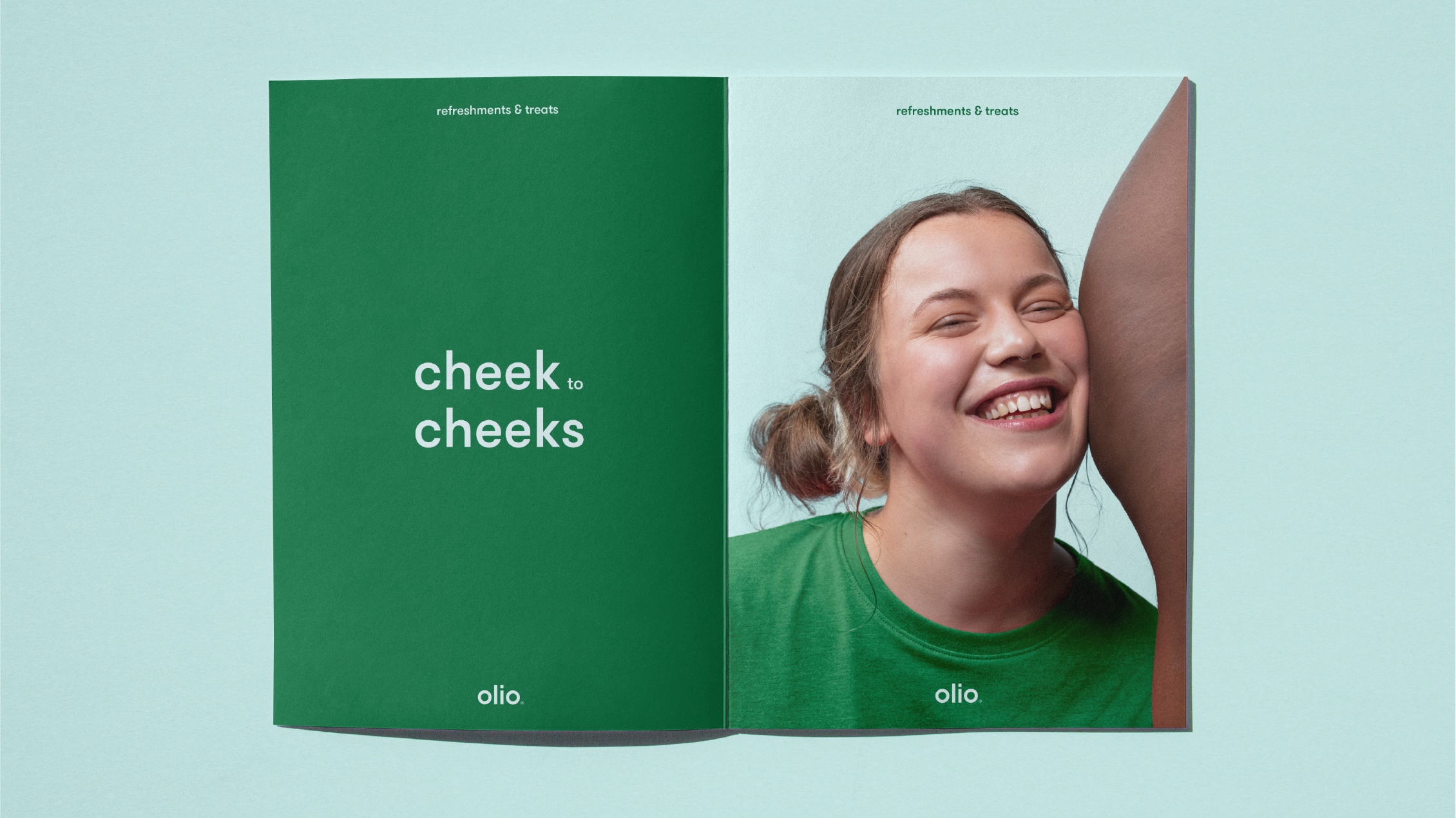
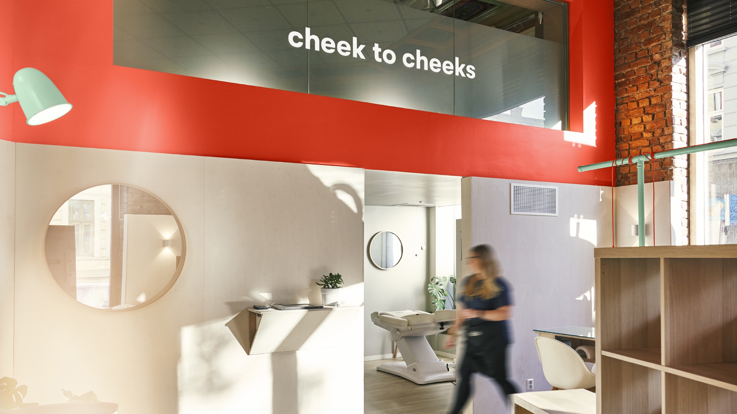
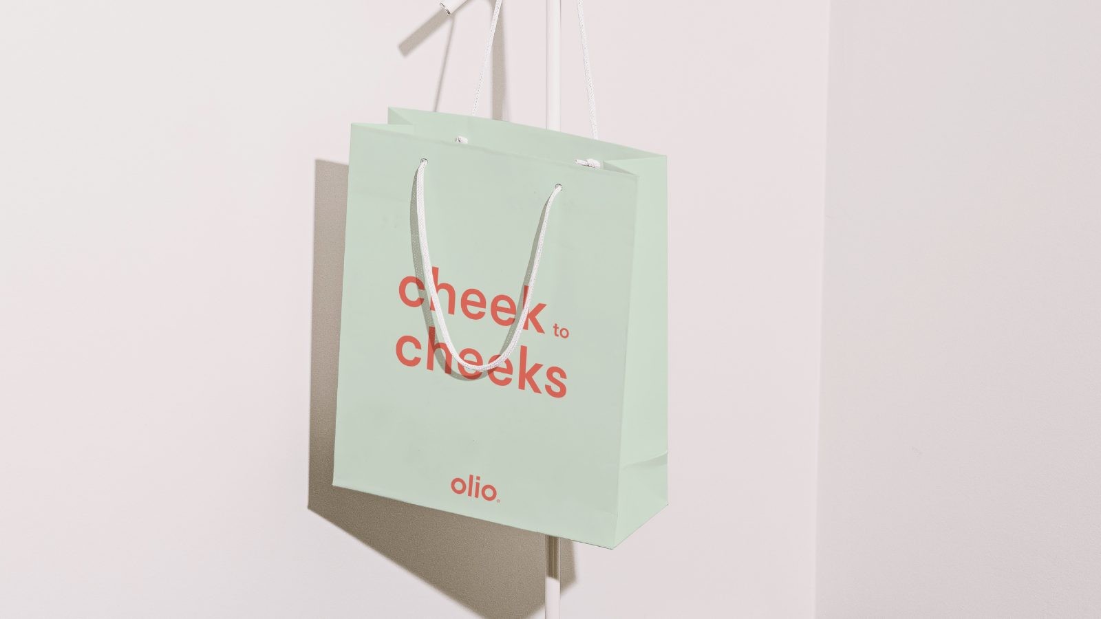
Olio’s comprehensive approach encompasses treatments for nails and skin, extending from “Cheek to Cheeks.” The play on words adds a touch of humour and reinforces the idea that pampering oneself should be a delightful experience.
Affordable Luxury:
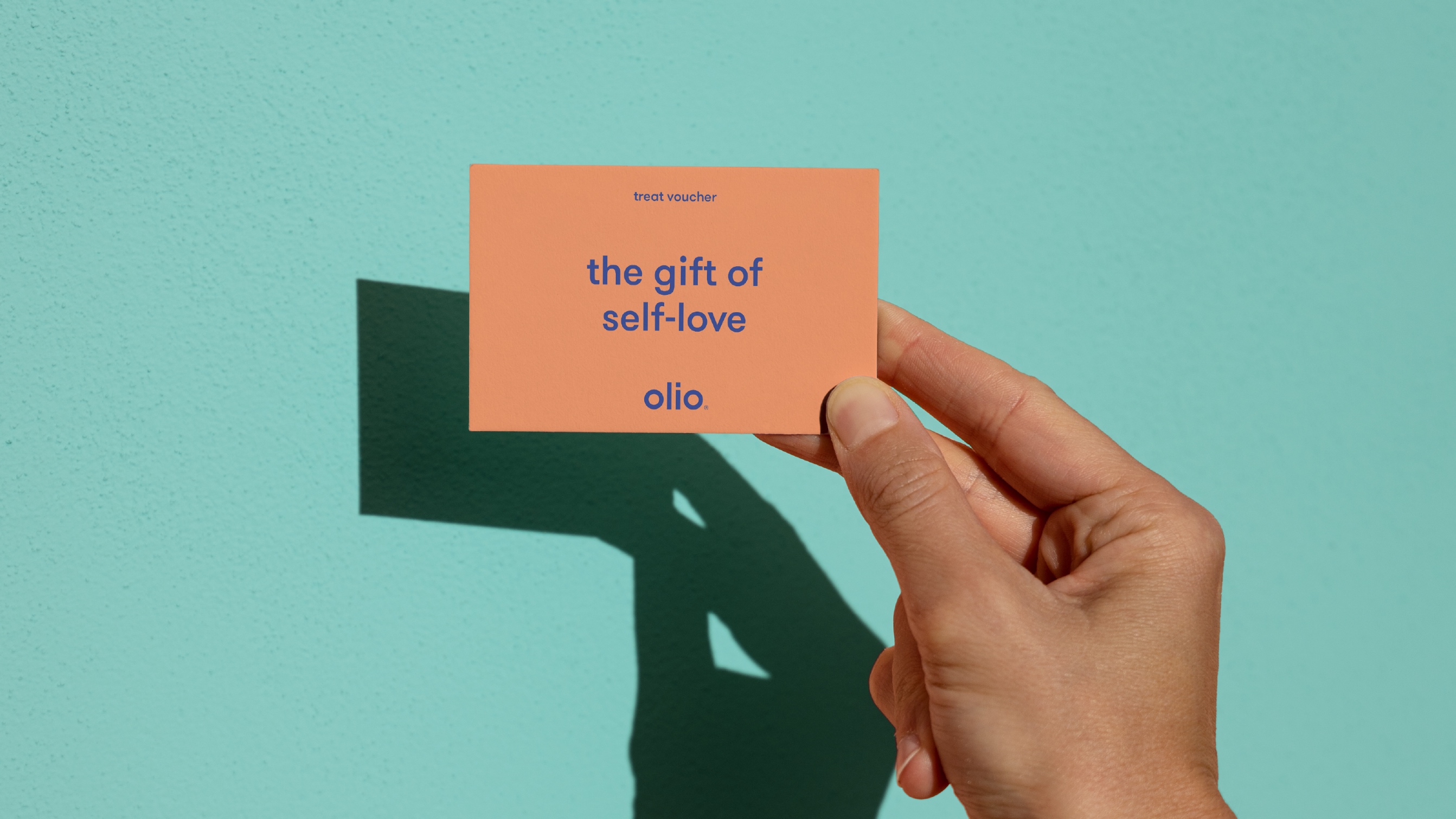
Olio challenges the notion that self-care must come with a hefty price tag. The concept revolves around providing simple and quick treatments at a friendly cost, making well-deserved pampering accessible to all. Olio’s product lines align with this philosophy, offering quality care without unnecessary complexities.
Culminating in Comfort:
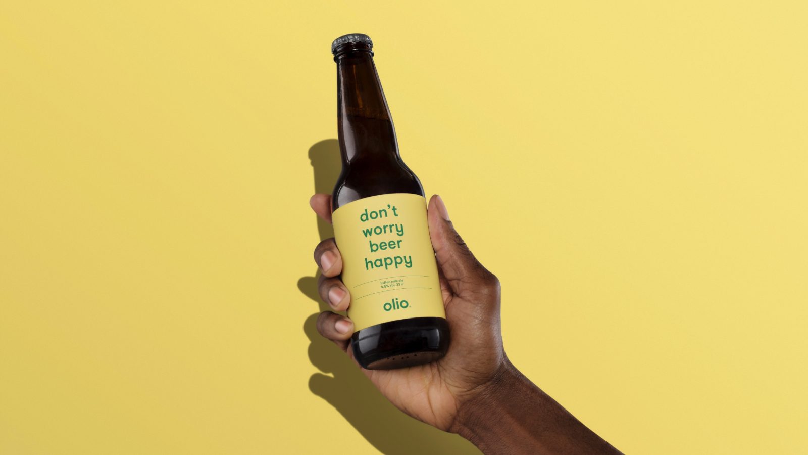
To enhance the overall experience, Olio provides a relaxed ambience where guests can enjoy a simple selection of beer and wine while indulging in delightful care for both body and mind. The aim is to create an atmosphere where guests can unwind, rejuvenate, and embrace a moment of tranquillity.
Olio is more than a beauty salon; it celebrates diversity, simplicity, and affordable luxury. With a playful identity, a welcoming environment, and a commitment to accessible well-being, Olio emerges as a haven where everyone can relax, rejuvenate, and revel in the joy of self-care.

CREDIT
- Agency/Creative: KIND (Conceptual Branding AS)
- Article Title: Olio Writing and Brand Identity
- Organisation/Entity: Agency
- Project Type: Identity
- Project Status: Published
- Agency/Creative Country: Norway
- Agency/Creative City: Bergen
- Market Region: Europe
- Project Deliverables: Brand Design, Brand Identity, Writing
- Industry: Health Care
- Keywords: Agency Design Awards 2023/24
- Keywords: Identity,Brand Design Creation, Writing, Brand Naming
-
Credits:
Chief Creative Director: Tom Emil Olsen
Design Director: Knut Harald Longva
Graphic Designer: Kristine Flatland
Senior Designer: Agnieszka Gawlik
Senior Designer: Emil Olsen
Senior Designer: Saurabh Kumar
Senior Designer: Lorenzo Galbiati
Graphic Designer: Mihail Mihaylov
Graphic Designer: Tiare Hernández Payano
Graphic Designer: Clara Auda
Graphic Designer: Piotr Deres
Video/Photographer: Isak Norum
Cinematographer: Stian Servoss
Director of Photography: Christoffer Meyer
Key Account Manager: Beate Myren Romslo
Key Account Manager: Marianne Erdal Holm
Project Manager: Laure Mediavilla
Strategic Brand Director: Thomas Danielsen
Strategic Brand Consultant: Jan Willy Skju00f8lberg
Strategic Brand Consultant: Brede Lie Reime
Photographer: Dag Sandven


