The olive tree has always been closely linked to the Olympic culture. In its origins, the branches and olive oil were given to the Olympic winners as recognition, a symbol of peace and brotherhood.
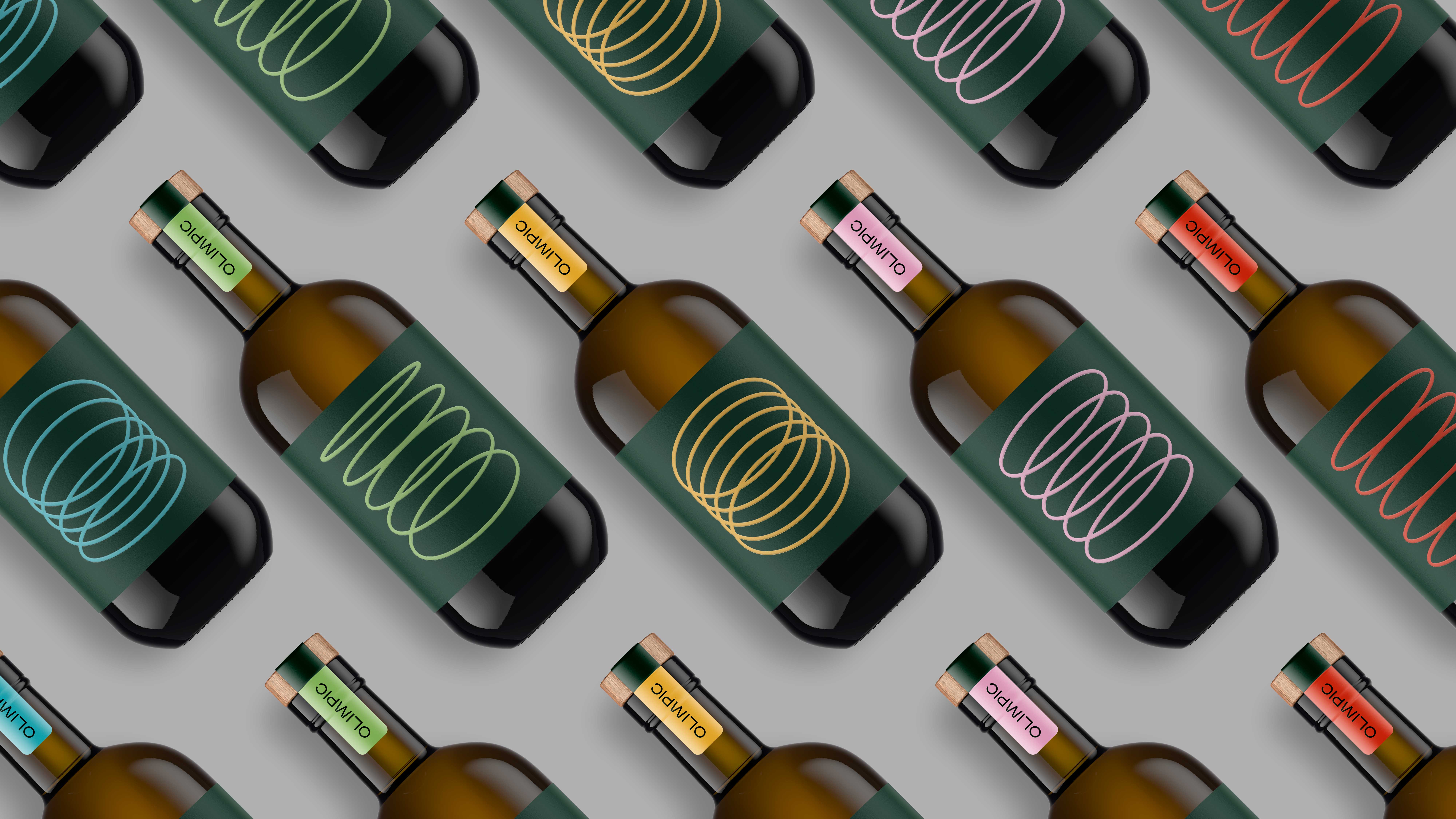
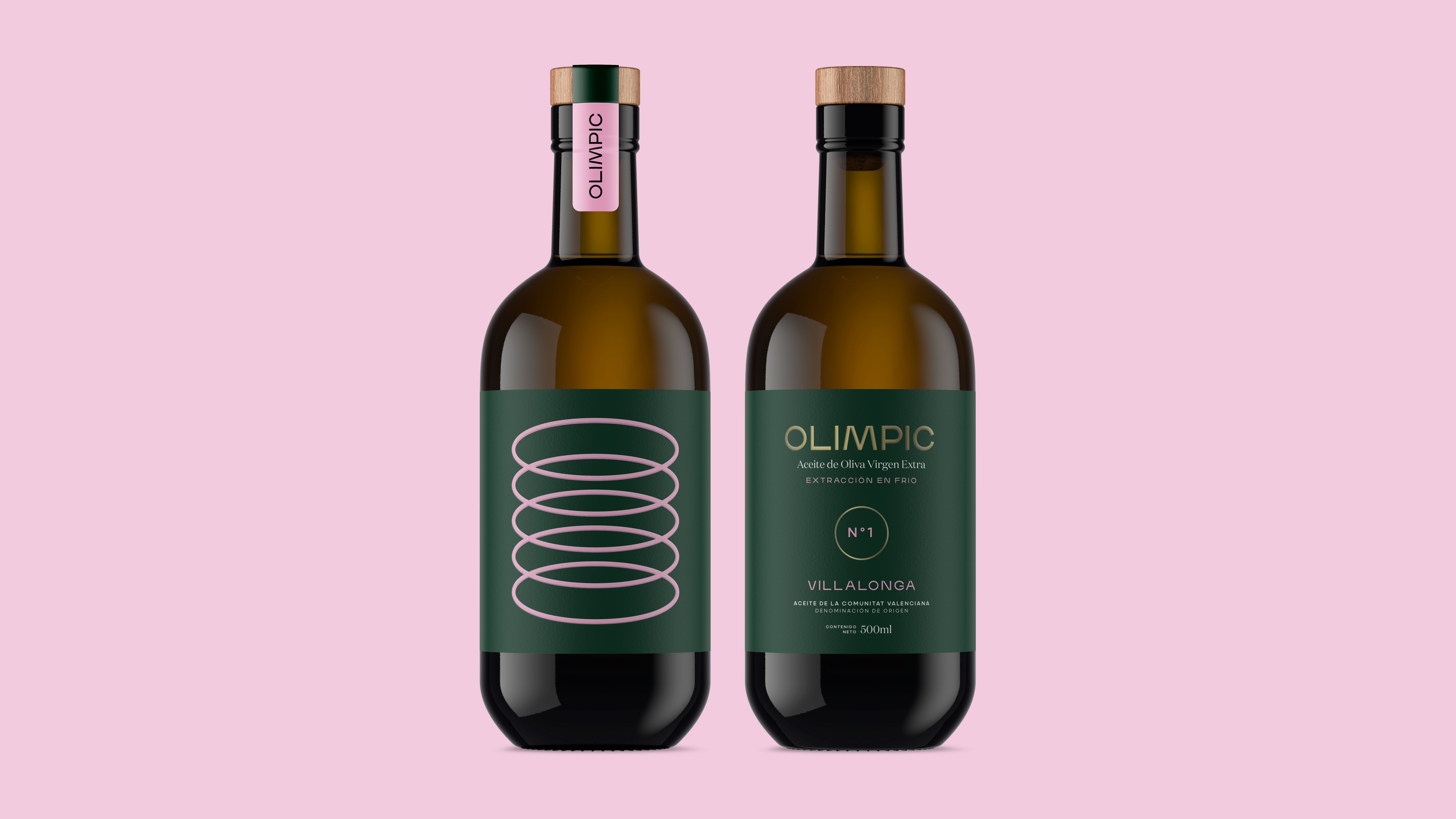
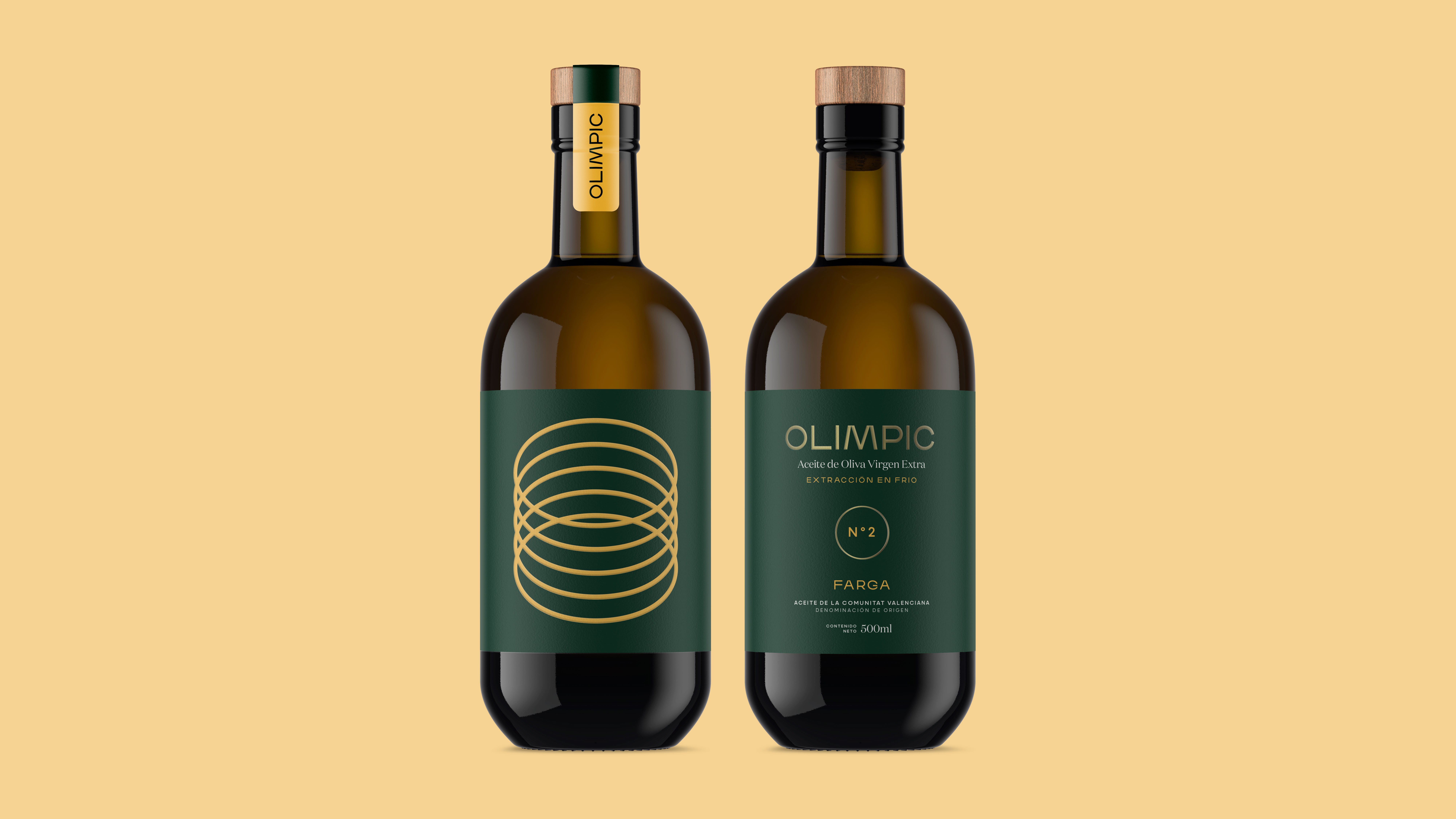
From this connection Olimpic arises, a brand of EVOO that recalls the links between the olive tree and Olympic culture. Through a visual identity inspired by the Olympic rings, different compositions are generated whose arrangement is reminiscent of the classic columns that adorned the Greek temples around which Olympism was conceived.
CREDIT
- Agency/Creative: Dailos Pérez. Branding & packaging design
- Article Title: Olimpic – Extra Virgin Olive Oil Packaging Concept
- Organisation/Entity: Freelance, Non Published Concept Design
- Project Type: Packaging
- Agency/Creative Country: Spain
- Market Region: Europe
- Project Deliverables: Brand Identity, Graphic Design, Packaging Design, Product Naming
- Format: Bottle
- Substrate: Glass Bottle
FEEDBACK
Relevance: Solution/idea in relation to brand, product or service
Implementation: Attention, detailing and finishing of final solution
Presentation: Text, visualisation and quality of the presentation


