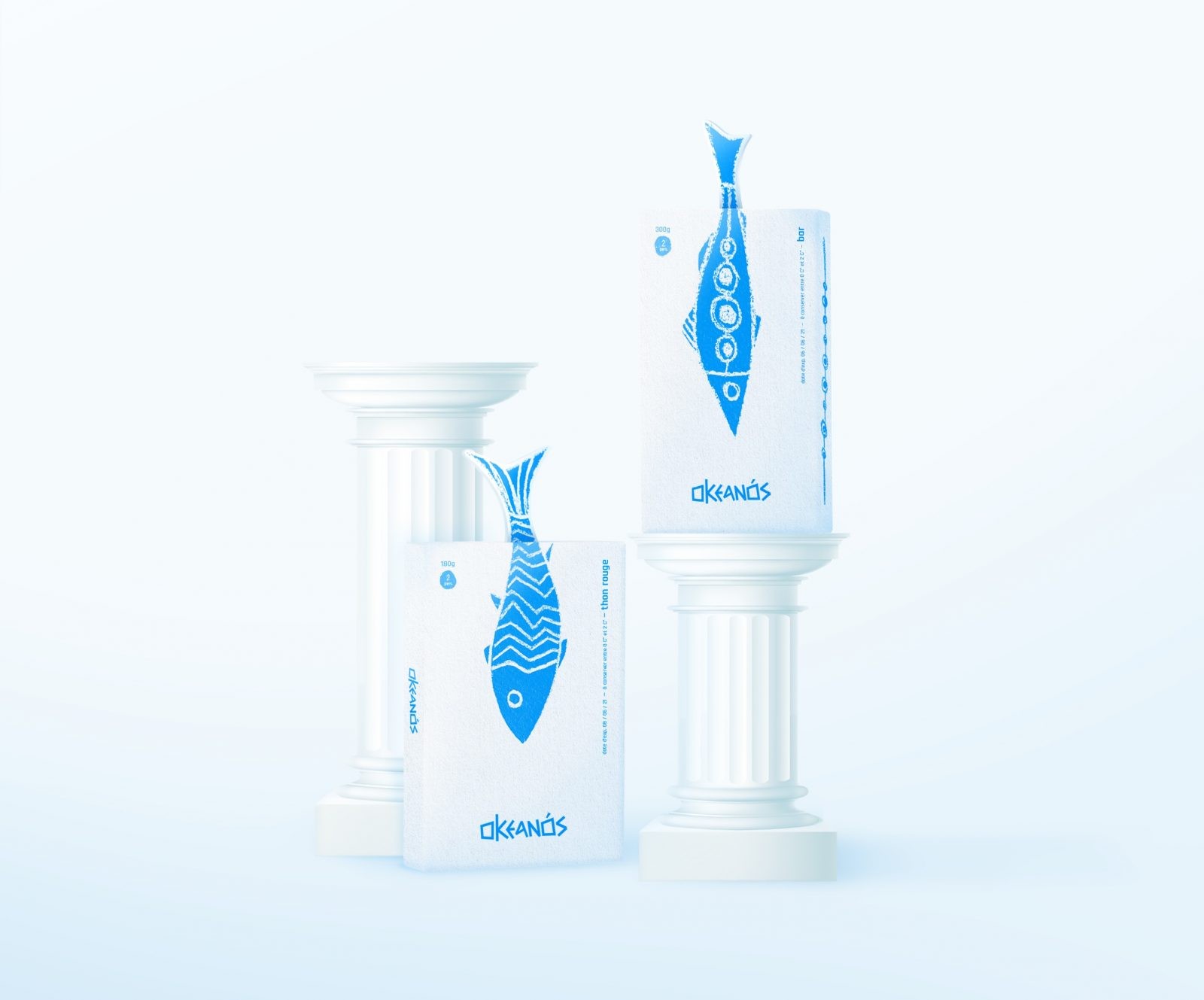
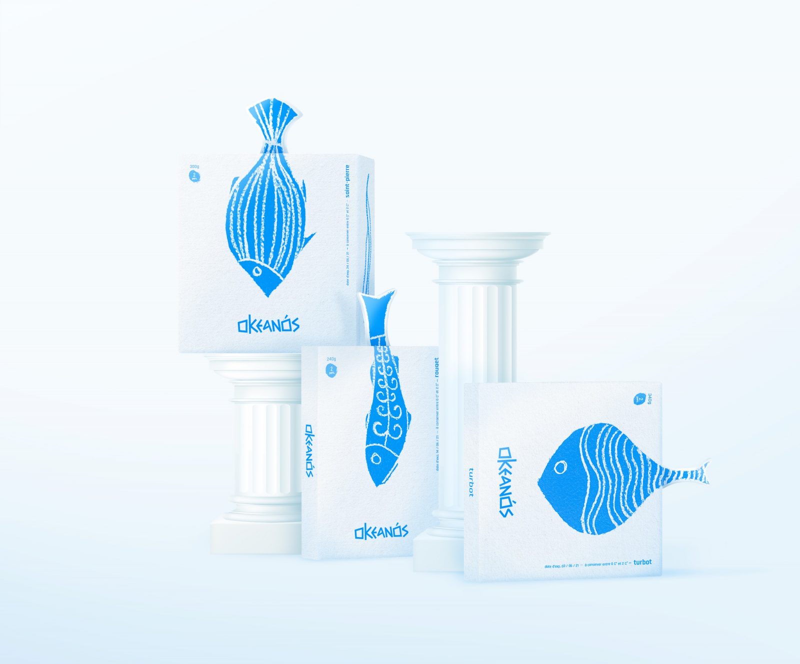
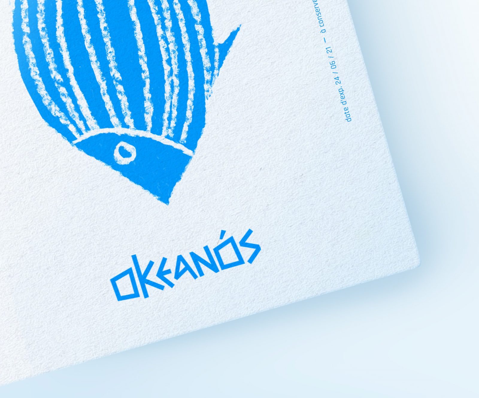
ln Greek, Okeanós means the ocean. I made this choice to give the brand a top of the range feel. Similar to the words in the sustained vocabulary, it brings a certain nobility to this visual identity, just like the products offered by Okenanós. The name inspires Greece and its freshness in the colors, with a bright white and an intense and characteristic blue. The typography, with its “engraving” look, is taken from the Greek style. The logo has a lot of personality.
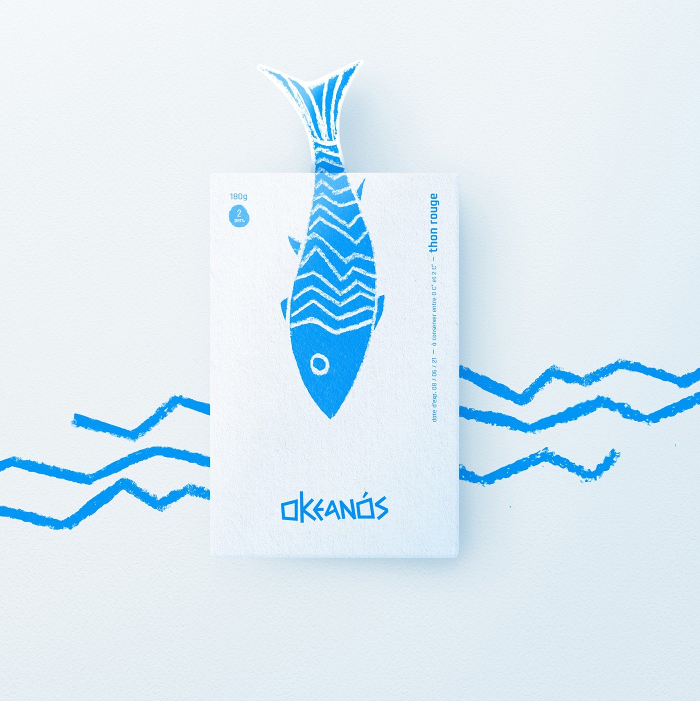
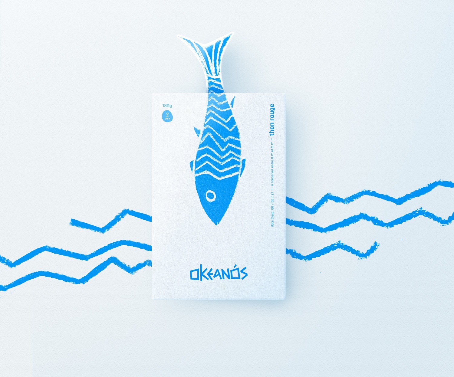
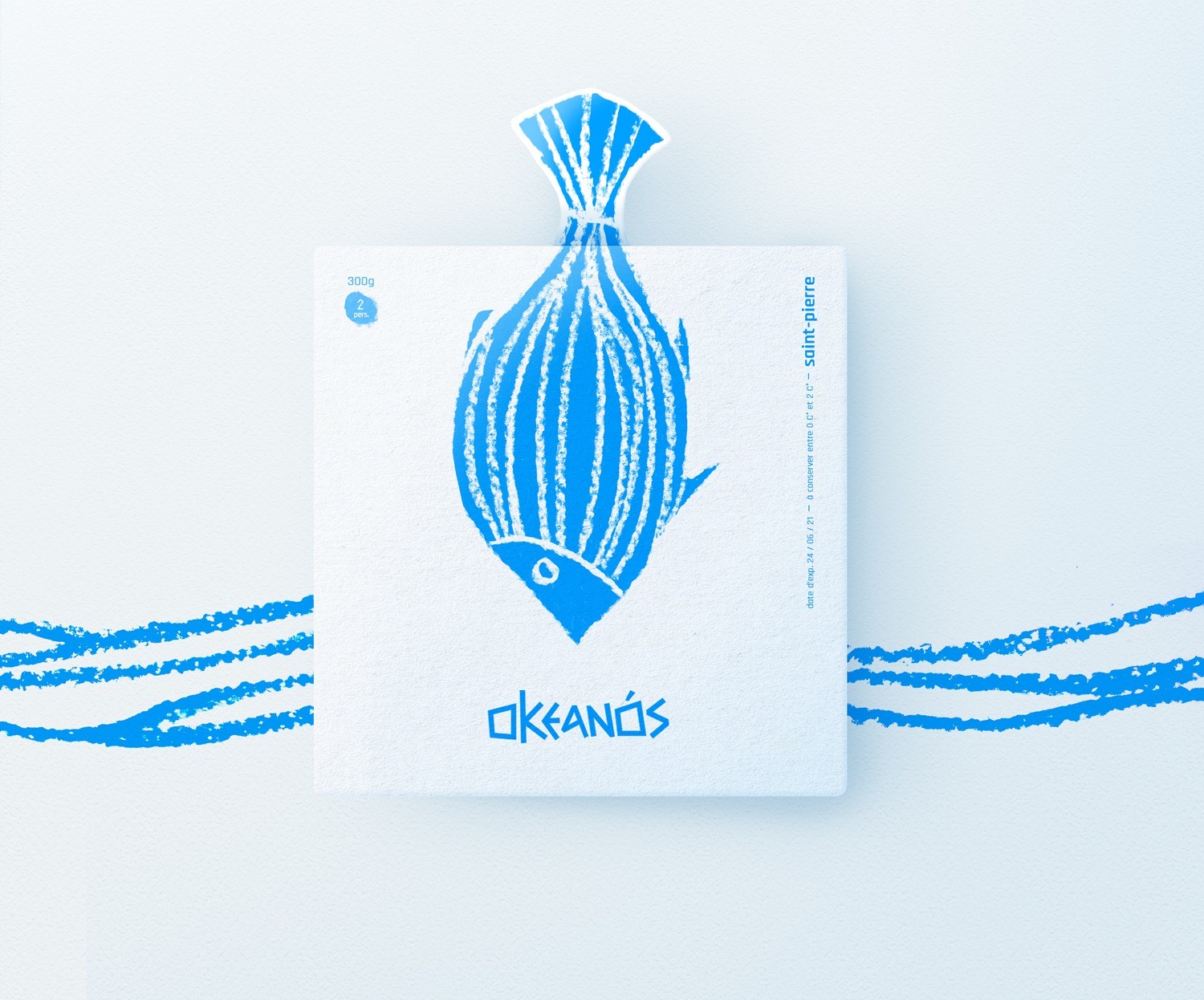
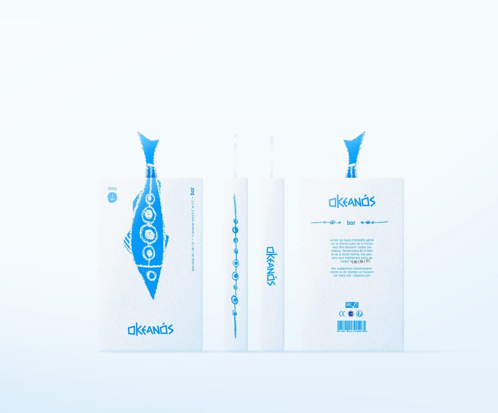
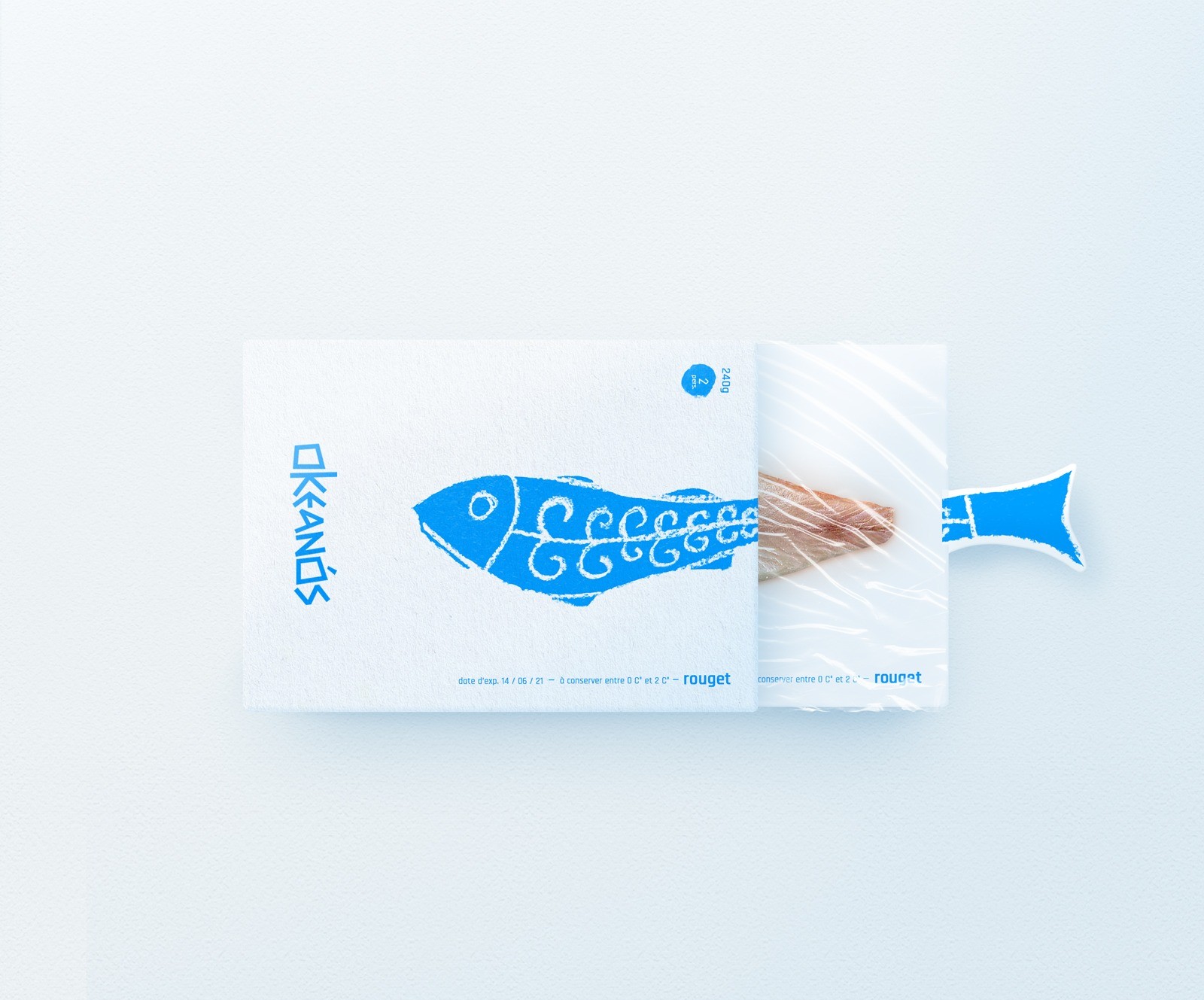
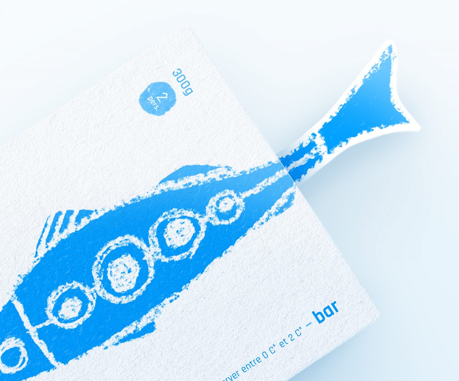
The fish illustrations are the essence of the Okeanós packaging. The grain of the paper is felt on the illustration and gives charm while keeping the typical Greek “white stone” spirit. The graphie motifs contrast with the simple, even basic shape of the fish. The principle of opening the packaging is common, but combining it with the illustration, making it part of it, is new. By doing so, the packaging gains in originality and is recognizable, it even becomes its main characteristic. The typography chosen complements the very angular logo perfectly. lt brings a touch of modernity while remaining in line with the brand’s universe. The small details such as the circle made in the same way as the illustration, the side motif that takes up that of the fish and the “stamp” on the back confirming the date of fishing of the product bring a “handmade” side and emphasize all the traditionalism in fishing that Okeanós promotes.
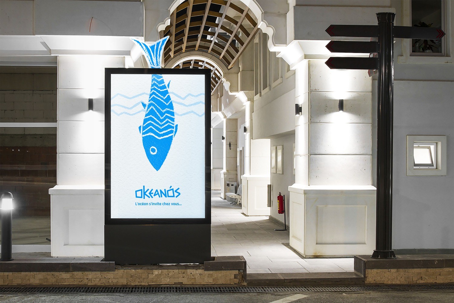
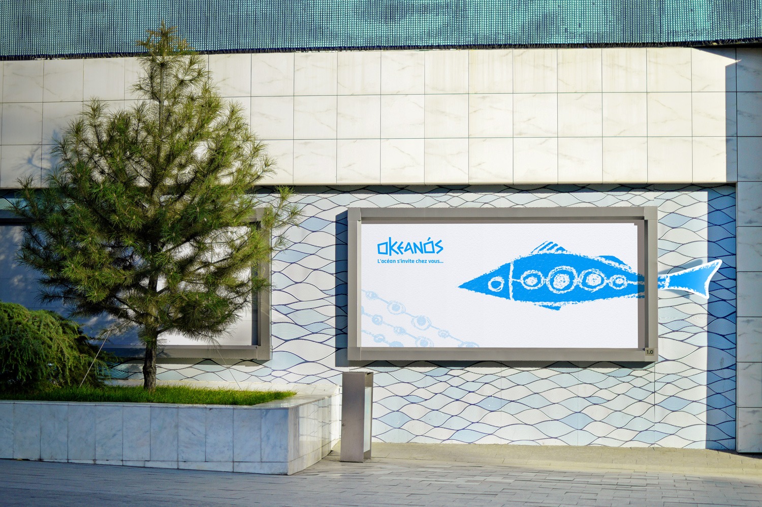
The Okeanós advertisements are logically linked to the packaging by taking up the main feature of the packaging. The fish tail that emerges from the frame symbolises the ‘bridge’ between the consumer and the ocean. The fact that it is out of the billboard shows the consumer that there is a closeness between him and the brand (through the fish, of course). The slogan “the ocean invites itself to your home” is in reference to the fish that protrudes from the billboard, which emphasizes the freshness of the products. The advertisements remain consistent and are similar to the Okeanós’ packaging, which makes it easy to recognize the products.
CREDIT
- Agency/Creative: Hurtikonn
- Article Title: Okeanós’ Fishes Steps Out of the Box Branding and Promotion
- Organisation/Entity: Student
- Project Type: Packaging
- Project Status: Non Published
- Agency/Creative Country: France
- Agency/Creative City: Hayange
- Market Region: Europe
- Project Deliverables: Advertising, Brand Creation, Brand Design, Logo Design, Packaging Design
- Format: Box
- Substrate: Pulp Carton
- Industry: Food/Beverage
- Keywords: Packaging design, Packagings, Fish Packaging, Greek, Fish, Logotypes, Logo, Brand, Brand identity,
-
Credits:
Graphic Designer: Mattéo Tabutieaux


