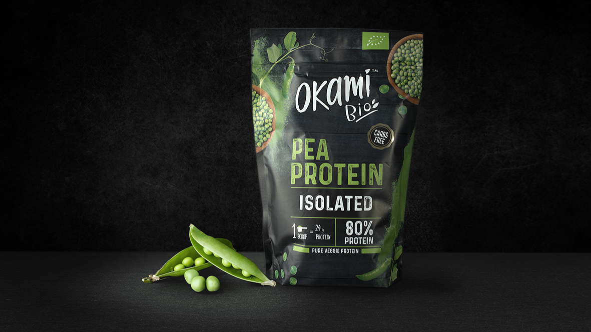
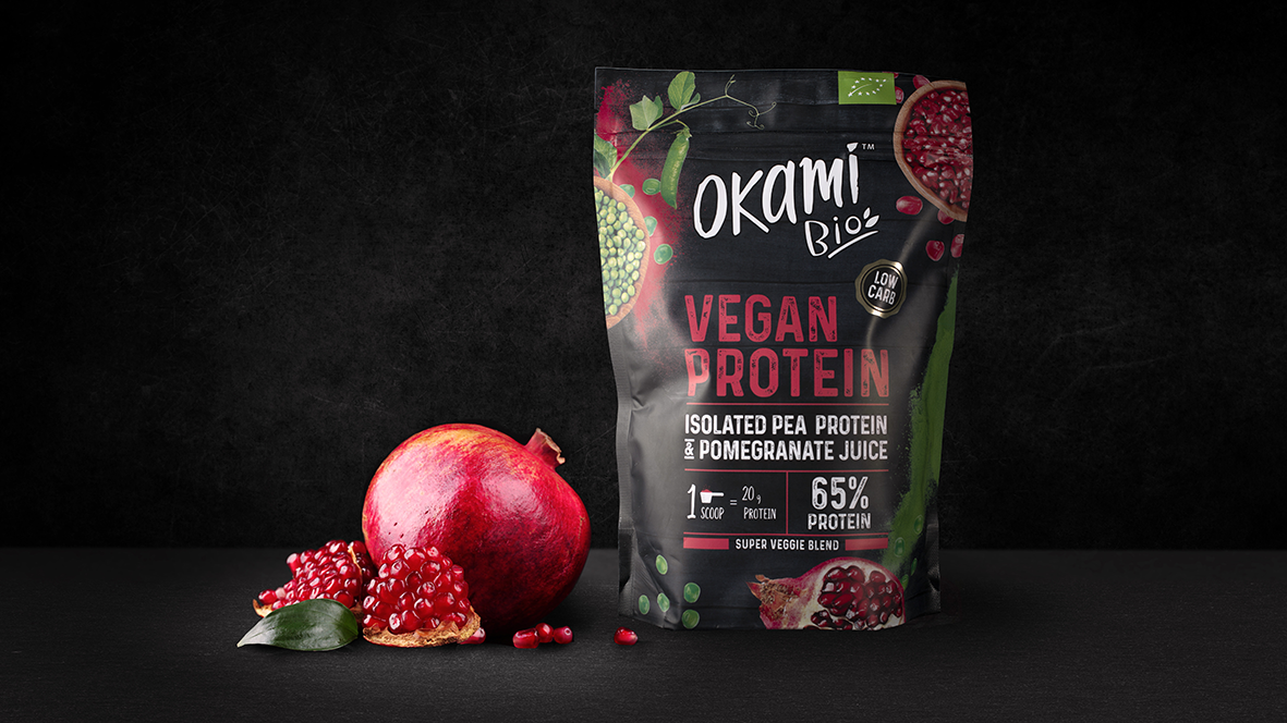
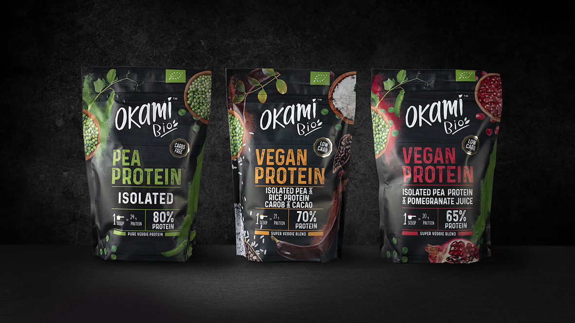
Okami is a brand that wants to revolutionize the world helping people to eat in a positive and fun way. Beyond maintaining an healthy lifestyle, Okami wants to be the ambassador of a tasty and suitable way of taking care of ourself. A products’ portfolio designed for people looking for healthy supplements for their daily lives.For this reason, when they told us about their idea to launch a range of organic Proteins, without additives and suitable for vegetarians, we knew that we had to create a packaging that competed strongly in this category but without losing the essence of Okami.
We chose a very identifying background color from this category and combined it with modern and vibrant tones. We seek the balance between Okami’s current tone of voice and the representation of naturalness, thanks to fresh and juicy ingredients. We chose a very clear and legible typeface so that the messages had a lot of relevance in the pack and were visually attractive


CREDIT
- Agency/Creative: lacía Packaging Design
- Article Title: Okami Brand, Protein Packaging Design Created by lacía Agency
- Organisation/Entity: Agency, Published Commercial Design
- Project Type: Packaging
- Agency/Creative Country: Spain
- Market Region: Europe
- Project Deliverables: Brand Architecture, Brand Identity, Brand Strategy, Branding, Graphic Design, Identity System, Packaging Design, Tone of Voice
- Format: Flow-Pack
- Substrate: Plastic


